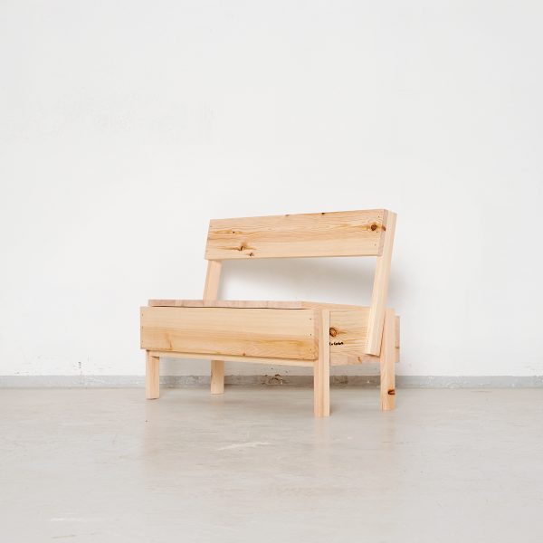
FLOW LGS Autoprogettazione by Yamamoto Daisuke

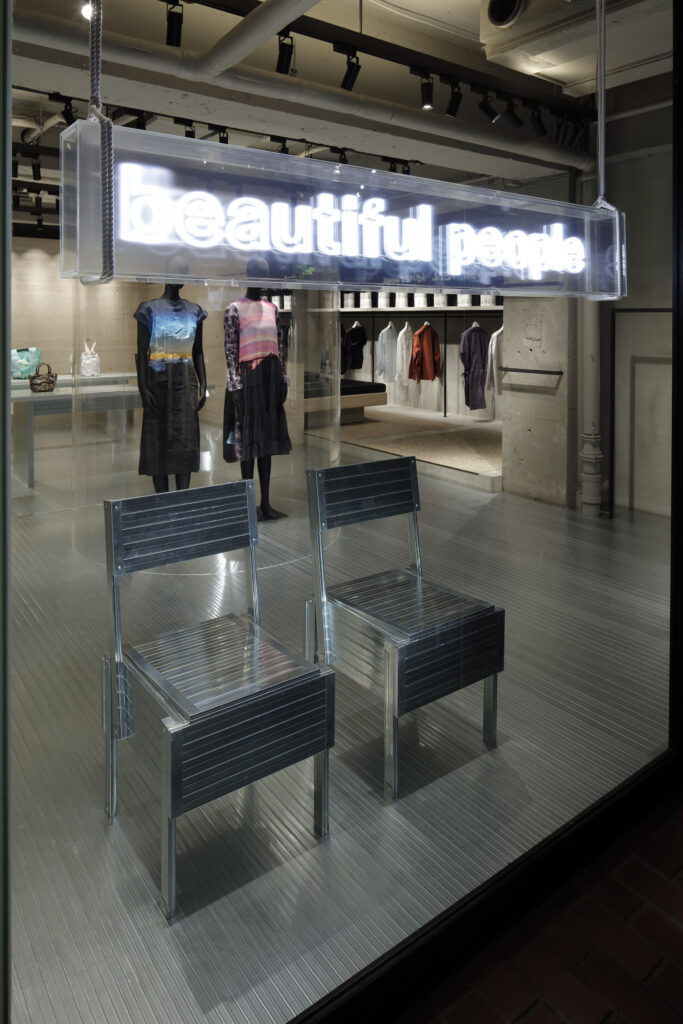
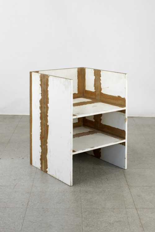
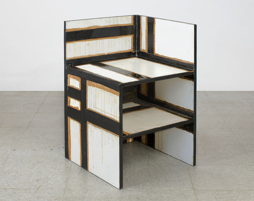
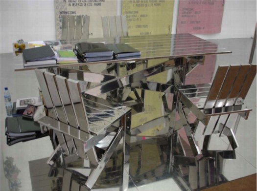
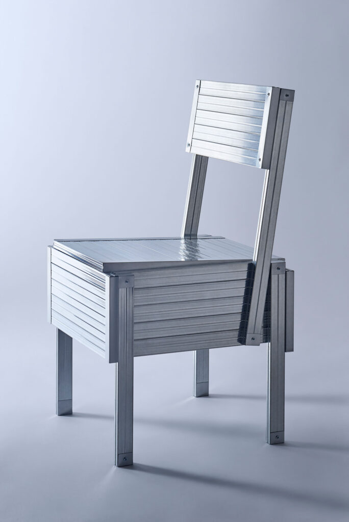
Flow Homage to Enzo Mari, 2022, low gauge steel, for beautifulpeople by Daisuke Yamamoto

Does the algorithm have me? I was unable to resist the suggested instagram post featuring this Enzo Mari autoprogettazione project at the Salone in Milan. But I at least did track down the actual designer and the actual project, rather than credit the insta-clout-chasing design aggregator.

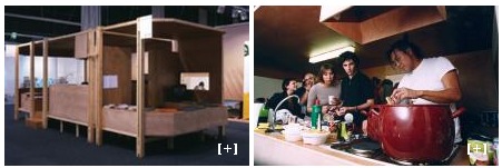
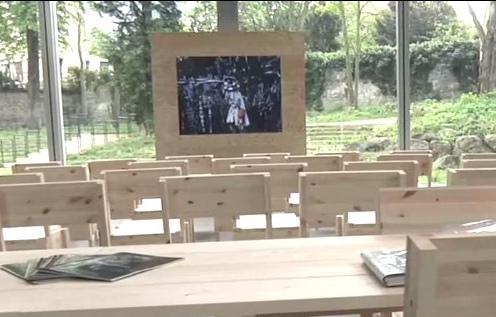
beautiful people unseen archives pop-up made of LGS, including these Enzo Mari chairs, by Daisuke Yamashita, photo Kozo Takayama via IDREIT

Daisuke Yamamoto’s FLOW project is an exploration of material reuse and recycling that proposes to make furniture out of decommissioned light-gauge steel (LGS) beams. In Milano Yamamoto made chairs not only by Enzo Mari, but by Gerrit Rietveld and others. The origins and evolution of the project are documented by the Melbourne-based Japanese design site IDREIT.

Continue reading “FLOW LGS Autoprogettazione by Yamamoto Daisuke”

Autoprogettazione, Autodistruzione

Designer Enzo Mari and his wife, critic Lea Vergine, passed away one after the other in October 2020, the pre-vaccine stage of the COVID pandemic. Disegno Journal assembled a roundtable reminiscence of them, with Mari’s longtime assistant, Francesca Giacomelli; designers Martino Gamper and Corinna Sy; design historian Cat Rossi; and curators Hans Ulrich Obrist and Lorenza Baroncelli. Thanks to greg.org reader/hero Doug for sharing the transcript, which has recently been republished.

When Mari died, my regret at never sending him information about my Mari X IKEA table exploration was quickly subsumed by my outrage over the fate of his archive and studio. Mari’s archive, his research, his documentation, his journals, his vast collections, all come up many times in the extensive and fascinating discussion:

Francesca: “This archive is a complex codified diary in which Mari collected and conserved his projects and wider programme of revolutionary ideas; it is his life’s work, the essence of his research. For Mari, “The research is the design, not the product”. Now we need to rediscover those methods and ideas, preserve them, and celebrate their astonishing transformative potential.”

Hans Ulrich “Francesca has this immense knowledge and there are literally 2,000 projects or more that Enzo created during his career – she knows each of those 2,000 projects by heart. There’s no-one on the planet who knows more about Mari than her, but this idea of knowledge production was key for Enzo. He wanted design to convey knowledge and so the exhibition in that sense also has to be about producing knowledge. It would be absolutely contrary to his idea of work if the exhibition was about objects and not research.”

Martino “He was also a collector and had a really big knife collection, for instance. Whenever he traveled, he would buy knives. I wanted it for my Serpentine show [Martino Gamper: Design Is a State of Mind, 2014, ed.], but he wouldn’t lend it. He was an avid collector of everyday objects – a bit like Castiglioni, but actually a lot more. I don’t know what’s going to happen with his private collections. They’ve never been shown. He must have kept the knives in his house, because I never saw them in his studio.”

Lorenza “His studio was impressive. It’s going to be destroyed, in accordance with his wishes, but every room was devoted to a topic. One room for materials; one room for prototypes; and all the chairs were stored in the bathroom. The most interesting room was the kitchen, because that was where they produced objects. He was also obsessed with the archive, so created two books with the list of all the objects in the studio and all the documents. He gave Arabic numbers to every object and catalogued everything in those two books. This programmatic system was the basis of his work and I think is the reason why there was no difference between art and objects and graphic design – for him, it was all part of one unique path.”

Wait what? Yes, you read that right. His studio was going to be destroyed, in accordance with his wishes. And his archive, given to the City of Milan, is sealed from public view for “two generations,” forty years.

On the one hand, and it’s a big hand for me, this is basically the rest of my life. On the other hand, it just feels optimistic, maybe even a little dangerously naive, to entrust one’s legacy to a world as it will exist forty years from now. Maybe that’s the bigger hand, the non-zero possibility that society, much less the Milan municipal government, will not be around to open the Mari box in 2060. Between Francesca and Hans Ulrich, can we not crack this open a little sooner please?

Enzo Mari was a Universe [disegnojournal, s/o designnow]
Cucula: Lampedusa Autoprogettazione X Refugees

cucula_ambassador_chair_still.jpg
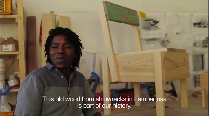
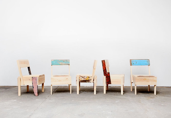
I do not know how this slipped by me all this time, but Cucula is a Berlin organization that works refugees to make furniture. It started in 2013 by making Enzo Mari’s Autoprogettazione designs out of the wood from refugee shipwrecks on the Italian island Lampedusa.
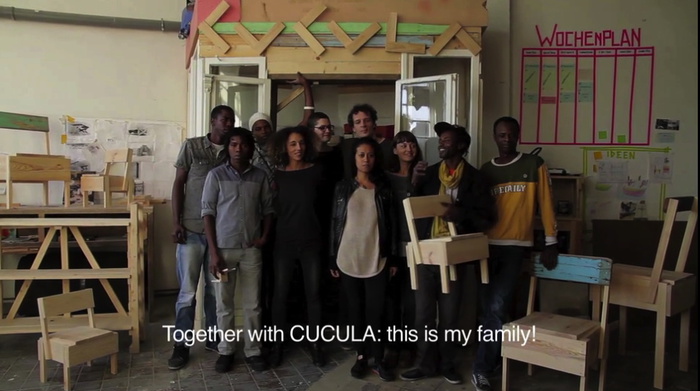
Lampedusa, of course, became synonymous with the first widely publicized tragedies of massive refugee deaths in perilous transit. Cucula, a West African word meaning, basically, colabo, was started by designers Corinna Sy and Sebastian Daeschle, first to help Nigerian and Malian refugees fleeing war in Libya to stabilize their situation in Germany. Actually, their first idea was to help the refugees build furniture for their rooms; the refugees said they’d rather have jobs, danke.
cucula_lampedusa_wood.jpg
The first products were Mari’s Sedia I, and were apparently called Lampedusa Stuehle. On the webshop now, though, they’re called the Ambassador. Whatever the nuance of the shift, it makes me think of how time, geographic shifts, and the exponentially worsened plight of refugees has kind of swamped the Lampedusa brand.
Actually, what it really does is make me uncomfortable by aestheticizing and productizing the deaths of so many people. I fully support the mission of Cucula. I will not be shaken in my support of efforts to help refugees, especially those who have been through so much and have traveled so far at such great danger. I am a longtime admirer of Enzo Mari, and applaud his support for Cucula’s use of his designs beyond their original, DIY-only context.
Cucula_Lampedusa-Stuehle.jpg
But the transformation of wrecked ships into premium, virtue-signaling, small batch designer furniture gets rightupthisclose to Ai Weiwei levels of disaster pornsploitation for me. The only thing that makes it work, imho, is that it’s actually refugees learning the skills, doing the work, and reaping the benefits. I hope. [Curbed reports that Mari’s license stipulates that only refugees can make the furniture, which in this case adds to the layers of complication, partly because the refugees cannot officially be classified as employees who earn wages.]
cucula_bambino_vid_still.jpg
How many kinds of complicated are there again? Because it feels like a couple of designers stepping in to fulfill a moral obligation we all [should] feel, and doing it in an impossibly, obviously, unscalable way. And the rest of us, our role is to shop.
No. I don’t mean no, don’t shop. I mean, no, the rest of it. Why not take Cucula as an imperative, an example of the value of individual and collective care and involvement in building communities with and for refugees? If a designer can organize a workshop that supports a team of refugee craftsmen by building esoteric furniture, there is something you can do, too.
cucula_bambinooo_kids_bench.jpg
Meanwhile, maybe the Cucula solution is two-fold: first, get some stock-standard Autoprogettazione furniture made from regular pine. None of it is particularly expensive, considering, and the Bambinooo extended mini-chair with built-in storage bin is especially nice. Also go full Lampedusa-meets-Piet Hein Eek, and get a custom chair made entirely out of wreckwood. Then start inviting some refugees to dinner.
CUCULA [cucula.org, h/t monique]
Meet CUCULA, the Berlin Furniture Company Seeking to Empower Refugees [curbed]
Previously, related: Enzo Mari X Ikea Mashup, Chaper: The Last [or not, obv]

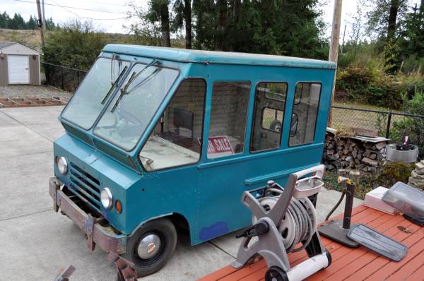
Inspiration For My Quiet Place Everywhere: 1965 Kaiser Jeep Fleetvan

1965_jeep_van_corner.jpg
Except for every Grumman LLV I pass, I’ve never wanted to turn a mail truck into a slicked out room-on-wheels as much as I want this 1965 Kaiser Jeep FJ-6A Fleetvan.
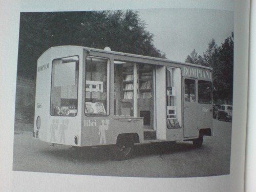
mari_librimobile1.jpg
And since the USPS is not letting the Grummans loose in the wild yet, this Jeep may be my best chance. I mean, check out that glass, it may even be better. I could totally park that as an office somewhere. Or a roving gallery. Or a podcast studio. Or an Enzo Mari mobile bookstore. This is Cabin Porn™ I can get behind.
Hm, actually, after reading through all the projects, rat rods, parts salvages and failed snowcone stand dreams in the FJ boards at ewillys.com, I may pass.
Hard to find 65 FJ-6A Fleetvan – $3500 (Grapeview) [seattle.craigslist.org via bringatrailer.com]
Which, given the ad histories here, seems a little high [ewillys.com]
Previously, most definitely related: Bombiani Librimobile, 1955, by Enzo Mari

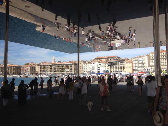
Marseille Vieux Port Clubhouses By Foster+Partners

marseille_foster_01.jpg
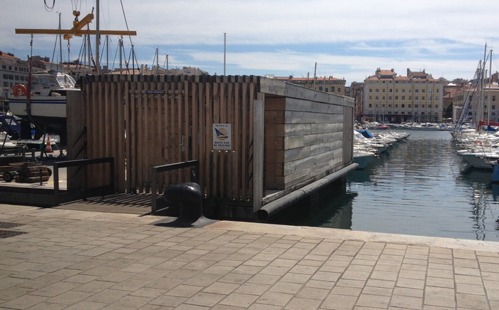
Marseille fixed its Vieux Port for their stint as European Capital of Culture last year, and it turned out pretty great. The biggest win was to pedestrianize it. It’s now wide open and full of people.
The flashiest change is the addition of a kind of ridiculous mirror-finish awning on the east end. I guess if you’re going to stick a giant awning/pavilion structure on your vast, bare waterfront, you should make it pop, and it does. It actually steals all the attention from what was my favorite element of the port’s makeover: these awesome little timber clubhouses that line the north side, along the Quai du Port.
marseille_foster_clubhouse_04.jpg
I was ready to move into one on the spot, even before I realized they were designed by Foster + Partners.

Continue reading “Marseille Vieux Port Clubhouses By Foster+Partners”

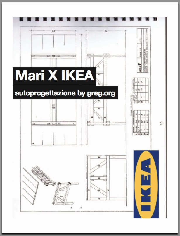
Mari X IKEA: autoprogettazione by greg.org (2010)

Three years ago, I was thinking about what to do with the posts I’d written about the project I’d begun six years ago. Which I guess means it’s time to release the results.
mari_x_ikea_gregorg_cov.jpg
So here’s Mari X IKEA, a PDF compilation I made in 2010 aboutfmy 2007-09 project to construct an Enzo Mari autoprogettazione table out of Ikea furniture components.
I was not entirely pleased with the way it read all together, and so I didn’t publish it back in the day. But I realize now that my inner archivist and inner editor will never agree on things, and I/we are becoming OK with it. So the tabloid-style publication contains all the original blog posts and images documenting the project, and that includes a fair amount of recapping and repetition. Meanwhile, my inner publicist wants to emphasize that this is not a bug, but a feature, like the catchy chorus of a song.
I’m still quite stoked about the project–and the table, for that matter, which I am using at this very moment–and it continues to influence and inform my thinking about stuff: art, design, originality, authorship, authority, appropriation, systems, craft, utility. So I’m very happy to get information on the project out there in a more easily consumable format.
I should also give a shoutout to The Newspaper Club, the amazing publishing company, then just starting out, where I had originally contemplated printing Mari X IKEA in 2010. This PDF was made using their easy publishing/layout tool. And though I ended up not pulling the trigger on this particular project, they regularly make me want to turn this blog, and many other things, into a newspaper.
Mari X IKEA: autoprogettazione by greg.org, 2010 [PDF, 2.8mb]

Gerrit Rietveld Chair Crate

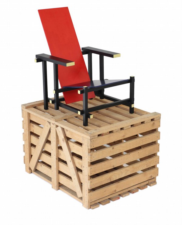
Not sure how I never considered this, but I suddenly came across a couple of strong connections between Enzo Mari’s autoprogettazione furniture and Gerrit Rietveld.
VIVID_Rietveld_Crate_sm.jpg
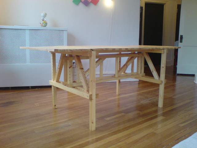
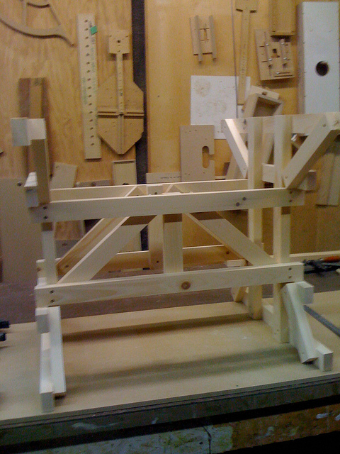
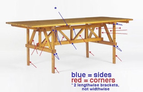
For one, check out the crate that this 1965 version of Rietveld’s Red Blue chair came in; this one’s from Galerie VIVID in Rotterdam. I’ve never seen this before. Maybe that’s just how they used to make crates in the 60s. But it sure looks like the underside of my Enzo Mari X IKEA table, the EFFE model.
Ikea x Enzo Mari Mashup Table
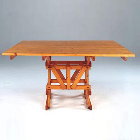
It looks even more like the structure of the Tavolo Quadrato, the square autoprogettazione table.
mari_dining_table.jpg
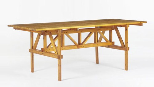
Then there’s Rietveld’s 1923 Military Table, designed for the Catholic Military Home in Utrecht, and in and out of production ever since. This unfinished Oregon pine example’s from the 60s, and was in Marseille, via 1stdibs. [I have never paid much attention to Rietveld’s Military Table, but suddenly it is looking pretty sweet.
rietveld_military_table_1d.jpg
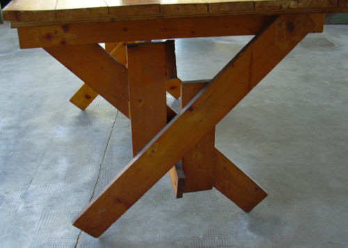
The top is fixed onto these cross braces. It’s a solution that Mari eventually used as well. The crosspieces are not in the original autoprogettazione plans, but they did turn up in the kit of precut parts that were sold under the Metamobile name in the early 70s.
mari_effe_kit.jpg
Even though Rietveld’s autonomous approach to furniture is an obvious precedent for Mari’s; and I knew from hands-on experience that the autoprogettazione designs have a lot more “design” than their basic function requires; I guess I never imagined that Mari would make overt references to what had come before.
Previously:
The making of an Enzo Mari dining table
Enzo Mari X IKEA Mashup Recap

Where Is Enzo Mari’s ‘Where Is The Craftsman?’

In what is probably the most ideologically analytical essay ever written about paperweights, curator Barbara Casavecchia notes that many of the 60 paperweights she selected from Enzo Mari’s collection “are the product of a manual labor–serving as fragmented evidence of the persistence of non-alienating forms of work, specifically within the craftsman-like dimension inherent to production that Mari has investigated for years.”
One incarnation of Mari’s investigation was an exhibition and discussion forum he organized in 1981 titled, “Dov’e l’artigiano”/”Where is the crafstman”. It was presented first at Fortezza da Basso in Florence, and then at the Triennale in Milan. There was a catalogue published–which I can’t find anywhere–and at least one review–which I can only find a few quotes from, but otherwise, the Italians have not yet processed or digitized their contemporary design history yet.
In his latest book, Venticinque modi per piantare un chiodo/25 ways to drive a nail, Mari says the objective was to “illustrate the unresolved ambiguity of the relationship between industrial design and ‘handmade.'”
Excerpts from an Ottagono review of “Dov’e l’artigiano” place the show and Mari’s critical view of the alienating labor conditions of mass production at the center of the debate over Italian design, culture, business, even a national identity of sorts. On the one hand, some Italian producers, still modernizing, hid the fact that their consumer products were partially made by hand because they “did not want to lose the noble title” of industrial design. And others hid the fact that they’d begun using industrial manufacturing processes because they didn’t want “to lose the prestigious title of an object ‘made by hand.'”
enzomari_artigiano_maddamura.jpg
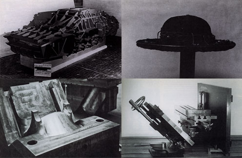
As he had done in 1973 with his autoprogettazione plans, exhibition, and product line, Mari eschewed theoretical arguments in favor of a “didactic exhibition” of objects and the close analysis of their creation. For the show he uncovered hundreds of examples of artisanal and craftsman-like processes being used to make mass-produced industrial design. Here are the objects and categories I’ve been able to find so far:

  • Industrial prototypes and models made by craftsmen, such as hand-formed auto body parts by Italdesign’s Giorgetto Giugiaro and Aldo Mantovani for Alfa Romeo [top left, I think]
  • Scale models and testing prototypes of turbines.
  • A hand-made mold for high-quality plastic chairs [bottom left].
  • The schematic drawing for an integrated circuit, which apparently took over 1800 man-hours to create. [I believe it]
  • “Technological masterpieces” such as US nuclear submarines, one-off industrial objects.
  • An 18th-century-style table with legs “built in series with industrial machinery, but finished with a stroke of the chisel to make it ‘unique.'”
  • A Borsalino custom-made for the Pope [top right].
  • A machine-like sculpture by Mari collaborator Paolo Gallerani [bottom right].

Oh yeah, and the whole show took place inside a geodesic dome.
I’ll add more objects and pictures if/as I find them. It’s hard to process a 30-year-old exhibit you’ve only just found out about. But it makes me think of things like, well, obviously, pen plotters and that insane William Shatner integrated circuit drawing movie. And NASA workers using giant clothespins to glue the mylar strips toghether for Project Echo satelloons. And Richard Serra sculptures made in defunct shipyards and Richard Prince car hoods. And hand-embroidered Gap kids’ dresses that turn out to have been made by children in India. And etsy and custom Nikes and pre-stressed jeans. And Ikea furniture that offloads all the non-alienating labor processes onto the customer.
Which is all by way of saying I have no grand theories on the current state of the relationship between craft and industrial production; but I think they’ve turned out to be not quite as incompatible as they seemed in 1981.
LINKS/RELATED
This all started with the catalogue essay for Enzo Mari: Sixty Paperweights, An Intellectual Work, which just closed in Berlin. [kaleidoscope-press.com, tanyaleighton.com]
Maddamura’s discovery of the Ottagono review is one of the few online sources of info on the “Dove’e l’Artigiano” show [image, too: maddamura.eu]
Mari’s new book, 25 Ways to Drive A Nail, is not available in English yet. [google books tho]

Sachs X Ikea X Judd: Great Minds Think Ikea

sachs_ikea_judd_2.jpg
For he that hath eyes and was paying attention last year, The Selby let him see. For the rest of us, the show at Sperone Westwater is the first time to see Tom Sachs’ awesome Donald Judd furniture hacked together from particleboard scraps from the IKEA AS-IS department.
sachs_ikea_judd_1.jpg
Hacked is, of course, not the right word. The chairs are constructed with Sachs’ characteristic attention to craft and process: they show every drip of resin, every bubble and lump in the fiberglass joinery.
sachs_ikea_judd_3.jpg
For me, the best part is that the pieces date from 2009. And in November 2009, the first issue of Bricolage Magazine, Tom’s zine, included a feature titled, “Ikea vs Judd.” Because as awesome as they are on their own, they’re even better for not being Enzo Mari furniture.
Tom Sachs: WORKS, Nov 4 – Dec 17, 2011 [speronewestwater.com]
Tom Sachs site [tomsachs.org]
6.14.10 Tom Sachs in his studio [theselby]
Tom Sachs studio film, by The Selby [vimeo]
Previously, resonant, not related: Enzo Mari X Ikea mashup

Transactional Aesthetics, Or The Highly Collectable Rirkrit Tiravanija

I’ve been writing this post in my head for months, years, even, but so many pieces have piled up in my browser tabs, it’s slowing my computer down. And plus, this weekend MoMA announced that they acquired and will exhibit Untitled (Free/Still), the original [sic] free-Thai-curry-in-a-gallery work, so it’s time to step back and look more closely at Rirkrit Tiravanija’s art practice. First, by starting with what we are fed. Here is a small sampling platter of familiar statements by and about the artist and his work:

“It’s part of what has been called ‘relational aesthetics,’ ” said Ann Temkin, chief curator in MoMA’s department of painting and sculpture. “Joseph Beuys created social sculpture; it’s the act of doing things together, where you, the viewer, can be part of the experience.”

That’s from MoMA’s press release in the NY Times.

You could say his art is all about building “chaotic structures.” Then again, it’s about lots of things; his work is so open-ended and departs so radically from the art market’s orientation toward precious objects, that it’s earned many labels, many – like utopian or chaotic – that only tell part of the story. But one that’s stuck, for better or worse, is French theorist-critic Nicholas Bourriaud’s “relational aesthetics,” the idea of judging the social relationships sparked by an artwork instead of merely considering the object.

That’s Paul Schmelzer, now/again of the Walker Art Center, an early and frequent supporter of Rikrit’s work, writing in 2006.
rirkrit_caravan_musac.jpg

Tiravanija’s art is free. You only need the experience. In fact, the essence of his work resides in the community, their interrelationships, and chance. Make art without objects, their purpose is a complaint against the possession and accumulation.

The Museo de Arte Contemporáneo de Castilla y León, which owns Untitled (Caravan), a 1999 plywood model of a camping trailer, with kitchen, above.
Rirkrit as quoted by Bruce Hainley in Artforum, 1996:

“Basically I started to make things so that people would have to use them,” he has said, “which means if you [collectors, museum curators, anyone in these roles] want to buy something then you have to use it. . . . It’s not meant to be put out with other sculpture or like another relic and looked at, but you have to use it. I found that was the best solution to my contradiction in terms of making things and not making things. Or trying to make less things, but more useful things or more useful relationships. My feeling has always been that everyone makes a work – including the people who . . . re-use it. When I say re-use it, I just mean use it. You don’t have to make it look exactly how it was. It’s more a matter of spirit.”

rirkrit_print_aia.jpg
And here’s Faye Hirsch in Art in America this summer, perfectly teeing up her making-of story for Untitled (the map of the land of feeling), [above] an extraordinary 84-foot-long print edition Rirkrit has worked on for the last three years with students and staff at Columbia’s Leroy Neiman Center for Print Studies:

Rirkrit Tiravanija has never been known as a maker of elaborate objects. In a market-riven art world, he has remained, since the early ’90s, a steadfast conceptualist whose immaterial projects, enmeshing daily life and creative practice, have earned him a key role in the development of relational art. At galleries and museums around the world, he has prepared meals and fed visitors, broadcast live radio programs, installed social spaces for instruction and discussion, set up apartments–where he or visitors might live for the duration of a show–and dismantled doors and windows, leaning them against walls. At two of the three venues for his 2004 retrospective, the “display” consisted of a sequence of empty rooms referencing (in their proportions and an accompanying audio) his selected exhibitions over the years.
When Tiravanija does make objects, they are generally of a modest nature–most often multiples and ephemera connected with exhibitions. At his show this spring at Gavin Brown’s Enterprise in New York, for example, he set up a room where an assistant screenprinted white T-shirts with his signature terse, block-print headlines, ranging in tone from vaguely political (LESS OIL MORE COURAGE) to hospitably absurd (I HAVE DOUGHNUTS AT HOME). They cost $20 apiece.

Ah yes, the t-shirts. Not sure if I ended up being the only one, but I was apparently the first to order a complete set of all 24 shirts. So there’s that.
rirkrit_playtime_gavin-thumb.jpg
I have been an admirer and follower of Rirkrit’s work since his earliest shows at Gavin’s, and Untitled (Playtime), the awesome, ply&plexi, kid-sized replica of Philip Johnson’s Glass House he built in MoMA’s sculpture garden in 1997 [above] bought him at least a decade of good karma in my book.
And so it’s only very recently that I’ve started to watch and wonder if I’m the only one who– See, this is why Faye Hirsch’s quote is so perfect: because it encapsulates exactly how people talk and write and think about Rirkrit’s work, and it’s perfectly and exactly wrong.
I’m sorry, that’s the overdramatic hook in this post. What I really mean is, as his social, experiential, ephemeral practice, his “art without objects” has taken off, Rirkrit has also been making some of the blingiest, sexy-shiniest, most ridiculously commodified luxury objects around. I love them. Why can we not talk about them more?

Continue reading “Transactional Aesthetics, Or The Highly Collectable Rirkrit Tiravanija”

Autoprogettazione Items I Didn’t Win On eBay

enzo_mari_picnic_ebay1.jpg
Mondo Patrick tipped me off to this a little while back, and for a while there, it was kind of turning my table world upside-down.
enzo_mari_picnic_ebay2.jpg
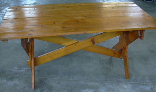
It’s an autoprogettazione table by Enzo Mari, of course, model 1123 xE, one of the most picnic tabliest of them all, made from the original 1970s precut wood kids produced by Simon Gavina.
It was really tempting, but ultimately the condition issues–there were some split and badly repaired wood pieces on one side which would probably mean losing some of the original wood–and really, the shipping from somewhere outside Torino to, wherever really, where am I going to put a second table project on no notice? And maybe if I could wait for the euro to collapse it’d make financial sense, but–anyway, I passed on it.
rirkrit_autoprojettazione.jpg
That hammered, golden patina still shines in my dreams, though. Let’s watch the European auctions for a while and see if this bad boy reappears. Meanwhile, I still have this image of Rirkrit’s chrome ghost of 1123 xE to keep me company.

Eyeballed Autoprogettazione

Enzo_Mari_Szemeredy.jpg
Toronto-based designer Maté Szemeredy didn’t have the plans to make Enzo Mari’s Autoprogettazione Square Table, so he eyeballed it, based on online photos and published dimensions of finished tables. I’d say he got pretty damn close–those crosspieces may be inside-out and upside down, or maybe they just look cleaner that way–and he got a pretty sweet finish. And all in just two days, too. Nice.
Enzo Mari Autoprogettazione photoset by Datum-Datum [flickr]
Szemeredy’s blog, Things Take Time

What Ikea Lack

Once again, I’m getting burned for procrastinating on a project. And once again, I’m forced to reckon with how susceptible we are to the illusion a company can create of cultural stability and reliability, even as it constantly effects changes that suit its own business purposes.
mari_effe_ikea_wood.jpg
Which is a lot to pile onto a tiny, cheap-ass Ikea Lack side table. Even before I finished my Ikea X Enzo Mari autoprogettazione table in 2009, I had the idea of making another one.
For the first, I’d found the single Ikea product that felt closest to the original lumber Mari specified for his designs: the unfinished pine components of the Ivar shelving system.
ikea_side_table_lack.jpg
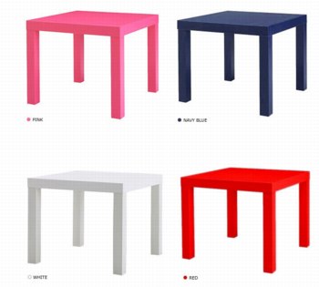
I wanted to realize the second table, though, in the product that felt the most Ikea: the Lack table. The Lack collection is pure Ikea: high modern, highly engineered, and super-cheap. The Lack is a marvel of perfect crappiness: sawdust legs and honeycomb cardboard tops encased in a structural plastic shell. You can’t cut a Lack without destroying it, but the series’ tables and shelves all share proportional dimensions, so it’s possible to tile them together.
mvrdv_boijmans_depot.jpg
my favorite Lack reference: MVRDV’s 2007 proposal for the Boijmans von Beuningen Museum Depot in Rotterdam. Alas, unbuilt.
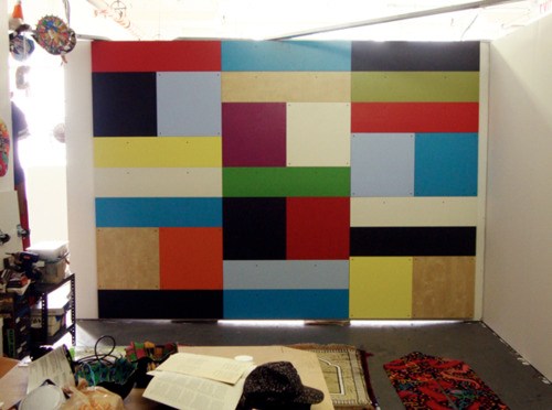
The other day when Man Bartlett posted on his tumblr about visiting Brent Birnbaum’s studio, this awesome image made my heart leap–off the Ikea ferry, and then to promptly sink into the East River.
brent_birnbaum_ikea.jpg
On the wall of Birnbaum’s studio is a piece called Untitled (Ikea), which is assembled from a veritable rainbow of Lack tables and shelves the artist has collected around town. It’s like, “WHOA, DOUBLE RAINBOW!” And exactly the patchworked minimalist look I was hoping for.
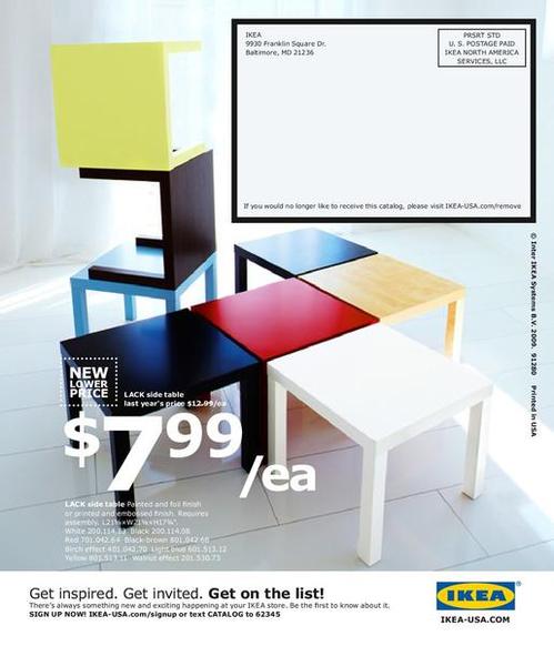
And the killer thing is, when I came up with the idea 2+ years ago, there was a literal rainbow of Lack side tables stacked in a spiral on the catalogue cover and in every store. But when I finally decided to make it about eight months ago, I found that after introducing a bunch of pastel colors in 2010, Ikea had all but discontinued colored Lack, leaving just red, white and black, and just a couple of wood “effect” finishes. [Seriously “birch effect” is such a sad concept.]
ikea_lack_catalog_2010.jpg
I had some pieces that I’d stashed or stored: a navy blue shelf, dark grey and dark green side tables, and either dumped or gave away a while ago because seriously, it’s Ikea. Just go get another one. But it’s precisely this misplaced belief that it’ll always be there that tripped me up. Ikea IS always full, and it DOES always look and feel the same in its way, but the specific products, even the iconic ones, are constantly in flux.
There were hints, warning signs, which I chose to ignore. A Lack side table was always ridiculously, disposably cheap: $12 or something. But in 2010, Ikea began value engineering them, eliminating packaging, and tweaking the materials a bit, to get the price even lower. For a while, they were $5.99. Now I think they’re $7.99. Rationalizing inventory and SKUs was obviously part of this ongoing, profit-wringing process.
And that brings up the implications of Ikea’s product choice winnowing, which are thoroughly depressing, yet fascinating. I’ve been scanning craigslist for months, trying to find any colorful Lack pieces. I’ve missed a couple in New York because I couldn’t get them in time, and I found one pink table in Alexandria, Virginia. But otherwise, the craigslist selection is relentlessly constrained: it’s almost entirely these fake wood finishes. And I can’t tell what came first: Ikea’s eliminating all color from their lowest-end table offerings, or the [$5 table-offloading] public’s total embrace of printed plastic that simulates [and poorly] actual wood.
The greatest/saddest listing I saw was from an American University student, who described his Lack side table as, “exactly the same table that everyone else has.” And it’s becoming even more so every day.
So anyway, if you have a lead on some colorful Lack side tables or hanging shelves [medium or small], definitely drop a line. Because I’m definitely buying.

Autoprotestazione

mari_cartier_designboom1.jpg
image: designboom
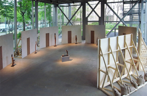
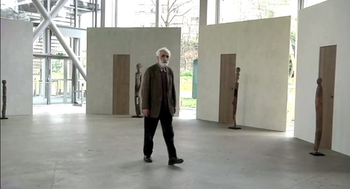
Enzo Mari was brought in to design the exhibition at the Fondation Cartier, Vaudon-Vodun, African Voodoo Art from the Collection of Anne and Jacques Kerchache. It’s simple and spectacular, and designboom has, as usual, rather comprehensive visual coverage of the project.
Above, a “film set” Mari calls The Village, autoprogettazione-esque backdrops to evoke the original context in which Kerkache would have first encountered the impressive household guardian figures. At least that’s how Mari explains it in the exhibition’s making-of interview video:
mari_cartier_vodun_3.jpg
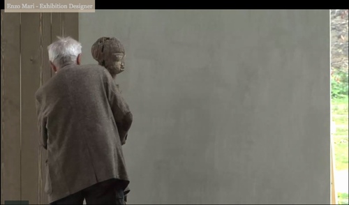
Holy smokes, filmmakers having Mari manhandle one of the guardians! Whether it’s our aging Maestro or the conservators, your insanely staged B-roll stunts are gonna give someone a heart attack!
mari_cartier_vodun_2.jpg
You don’t bring in a legend like Mari for his finesse at grouping sculptures. You bring him in to fill your glitzy Nouvel folly of a museum with endearingly humble-deluxe, purpose-built pine furniture!
mari_cartier_designboom2.jpg
image: designboom
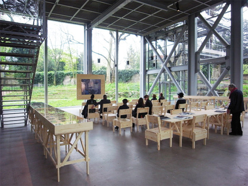
For the major autoprogettazione moment in the film/lecture/reference/public event space, with EFFE tables and SEDIA I chairs. Mais, qu’est ce-que c’est ca? New additions to the series? What’s that wood-framed flatscreen?
mari_cartier_vodun_1.jpg
And are those DIY display vitrines ringing the room?
mari_cartier_designboom3.jpg
images above via designboom.com
Because the laborer should be able to knock together his own home theater–autoprogezzione?–and a case for his ephemera collection in a weekend using just the most humble materials from the corner hardware store. Or as designboom puts it, and quotes Mari:

the showcases, designed for this exhibition, partake of the same vocabulary.
“‘autoprogettazione’ has been a project for making furniture that the user could assemble simply from raw planks of wood and nails. a basic technique through which anyone with a critical mind could address the production of an object.”

So it’s for the [vitrine] user with a critical mind. Autoprogettazione as Institutional Critique. Can I have my show now, please?
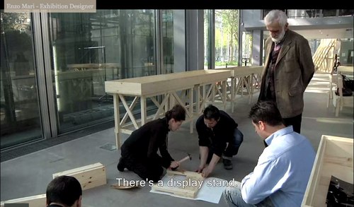
Let’s go to the tape: “There’s a display stand.”
mari_cartier_stand_1.jpg
No no, no pressure, just Enzo #$()%ing Mari watching you build his iconic chair there.
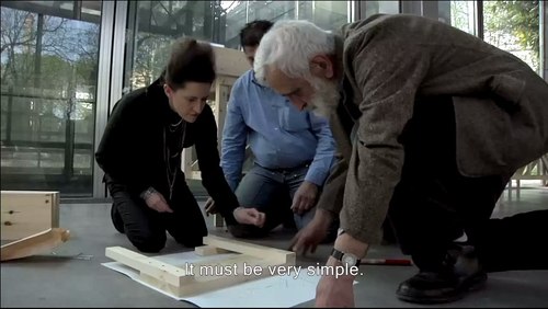
“It must be simple.” Oh no, you B-roll knucklehead don’t do–
mari_cartier_stand_2.jpg
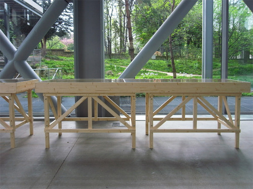
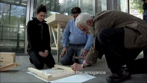
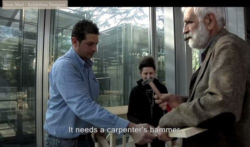
“A stand without the arrogance” YOU DID IT! YOU MADE HIM PICK UP THE HAMMER!
mari_cartier_stand_3.jpg
Oh, the horror. Why not just take him to a computer and make him fake type something for you? Or walk faux-purposefully down the Boulevard Raspail? How could– No.
mari_cartier_stand_4.jpg
You did not just ask Enzo Mari to hammer something while he was holding it. If you can’t get your $#)(%ing shot, that’s your problem, don’t take it out on a great man like Prof. Mari. “It needs a carpenter’s hammer”? It needs a revolution. Langlois did not lose his job at the Cinematheque so that museum marketing video directors could wrap their late capitalist tyranny in the honorable flag of auteur theory. To the autoprogattazione barricades!
Right after we lock down the salvage rights to those 30 chairs, four tables, eight vitrines–and one flatscreen.
_
Here’s a shot, though, from Comrade Elena Vidor’s flickr.
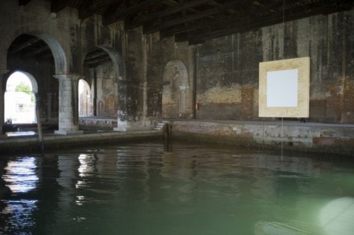
UPDATE woo-hoo, and here’s an update from Venice, where Bruno Jakob has installed Breath, a very similar-looking, seven-part series of invisible paintings in and around the Arsenale.
bruno_jakob_breath_arsenale.jpg
Breath, 2011, via peterkilchmann
Vaudou-Vodun, runs through Sept. 25 [vaudou-vodun.com]

Miami Seat: Mari Thirteen By Jonathan Monk

monk_mari_miami.jpg
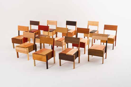
Add Jonathan Monk to the list of artist Enzo Mari fans. For the Brussels gallery D&A Lab’s show at Design Miami Basel Miami Wynwood Art Week Whatever Fair last month, Monk created Mari Thirteen, an edition of Mari’s autoprogettazione chair, Sedia 1. The design calls for 13 pieces of wood, so Monk used thirteen different types of wood, none of them pine: Koto, Padouk, Ash, Maple, Oak, Cherry, Pearwood, Wengé, Afzelia, Ovang, Mahagony, Birch and American Nutwood.
As I understand it, there was one set of 13 chairs to be sold individually for like $9,000 apiece, and one set of 13 to be kept together. No doubt destined to surround some Russian oligarch’s beach-cast, triskaidecagonal Max Lamb dining table.
D&A Lab’s owner Isolde Pringiers says of the project:

Jonathan Monk’s interpretation is just one possible version of the ‘Sedia 1′ of Autoprogettazione and hence in essence is very much part of and a continuation of Enzo Mari’s project but with the appropriation layer, typical of Jonathan’s work. With Autoprogettazione Mari went a step further than Ikea in his time in democratizing design. It broke down barriers in terms of what established design and good taste was. Monk, on the other hand, crosses back over those boundaries in as much as his interpretation offers a fully finished, conceptual object which is anti-Ikea. Enzo Mari offered the liberty of the project and Monk fully indulged.

Which, wow, I think I take issue with just about every single aspect of that statement.
Monk Makes Mari at DesignMiami [designmiamiblog.com]