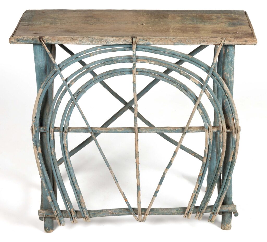
I have no place for an Appalachian twig side table in my house or my life, but I am woefully tempted to find a place for this one in my storage. Or in the trunk. Instead I am posting it here, so that I and you and everyone else can appreciate its elegant simplicity, and its details—like the notches in the top to hold those three twigs. And maybe bringing other peoples’ attention to it will thwart any notion I might have to impulse bid on it.
In the late 1940s, anthropologists came into the sights of the anticommunist crusades known as McCarthyism. The AAA formed a committee to protect the individuals targeted by the McCarthyist witch hunts, but it was quickly undermined by the ultraconservative anthropologist George Peter Murdock, who got himself appointed as chair.2 Murdock denounced his own colleagues in a letter he wrote to FBI director J. Edgar Hoover. Thanks to David Price’s (2004) historical research, we now know the identities of ten of the twelve anthropologists Murdock betrayed: Irving Goldman, Jules Henry, Melville Jacobs, Alexander Lesser, Oscar Lewis, Richard Morgan, John Murra, Morris Siegel, Morris Swadesh, and Gene Weltfish. All but one was Jewish, and all were involved in antiracist activism, either by public writing, speaking, and broadcasting or by political advocacy and direct service (e.g., Gene Weltfish wrote an antiracist pamphlet with Ruth Benedict that was mass distributed and adapted in a union-produced short film; Richard Morgan, an archaeologist, was an NAACP member and active campaigner against race-restrictive real estate covenants in Columbus, Ohio).
The McCarthyists and FBI also persecuted Black scholars, including W. E. B. Du Bois and St. Clair Drake, along with many other white anthropologists, such as Robert Armstrong, Cora Du Bois, Kathleen Gough, Jack Harris, Ruth Landes, Ashley Montagu, Philleo Nash, Marvin Opler, Paul Radin, Jerome Rauch, Earle Reynolds, Vera Rubin, Bernhard Stern, and George Stocking. Many lost their jobs and left anthropology. Many suffered distress, humiliation, and often financial ruin. Armstrong and Swadesh emigrated from the United States. Their examples spread fear, leading other anthropologists to censor themselves and steer clear of activism. This is undoubtedly part of why antiracist causes were largely “silenced” in US anthropology for years to come (Price 2004, 64, 71–75, 79, 110ff., 344–45; 2019, 15; see also Maxwell 2015; Stocking 2006, 129–31, 158–82).3
Remembering this can help us grasp the importance of preparing now to protect our fellow anthropologists, this time skillfully, from the neo-McCarthyist attacks being launched today against antiracist initiatives and teachers in US schools, universities, and companies. [paragraphing added to lure people to read it]
I’m trying to modulate the moral, ethical, and spiritual effrontery associated with the upcoming auction at Sotheby’s Hong Kong of a collection of around 300 sacred Buddhist relics which were extracted from the bones and ashes of a person believed to be Siddhartha Gautama. They are being sold by the descendants of the British colonist who excavated the Piprahwa Stupa in Uttar Pradesh in 1898, an Ashokan-era gravesite that some scholars argue was created to hold the eighth portion of the Buddha’s remains given to his Shakya clan after his cremation.
The Buddhist practice of relic, or śarīra, worship holds that visiting relics of the Buddha gives merit, but also that offerings of carved and natural gems, beads, gold, and other precious objects become “contact relics” by being mixed in with the Buddha’s remains. The Sotheby’s lot essay reads like a legal brief arguing for these objects’ unparalleled religious and historic significance, while also laying out the case against the extractive colonialism that stripped them from their religious context:
The first contact relic to be revered was the clay pot retained by Brahmin Drona after the subdivisions. Gem relics donated as relic offerings by Buddhists seeking merit, became contact relics after being mixed in with the bone relics of Shakyamuni Buddha. For Buddhist pilgrims, to visit the sacred landscape of places where the Historical Buddha had passed through and lived was also as much a part of this cult of relic worship as the veneration of relics themselves.
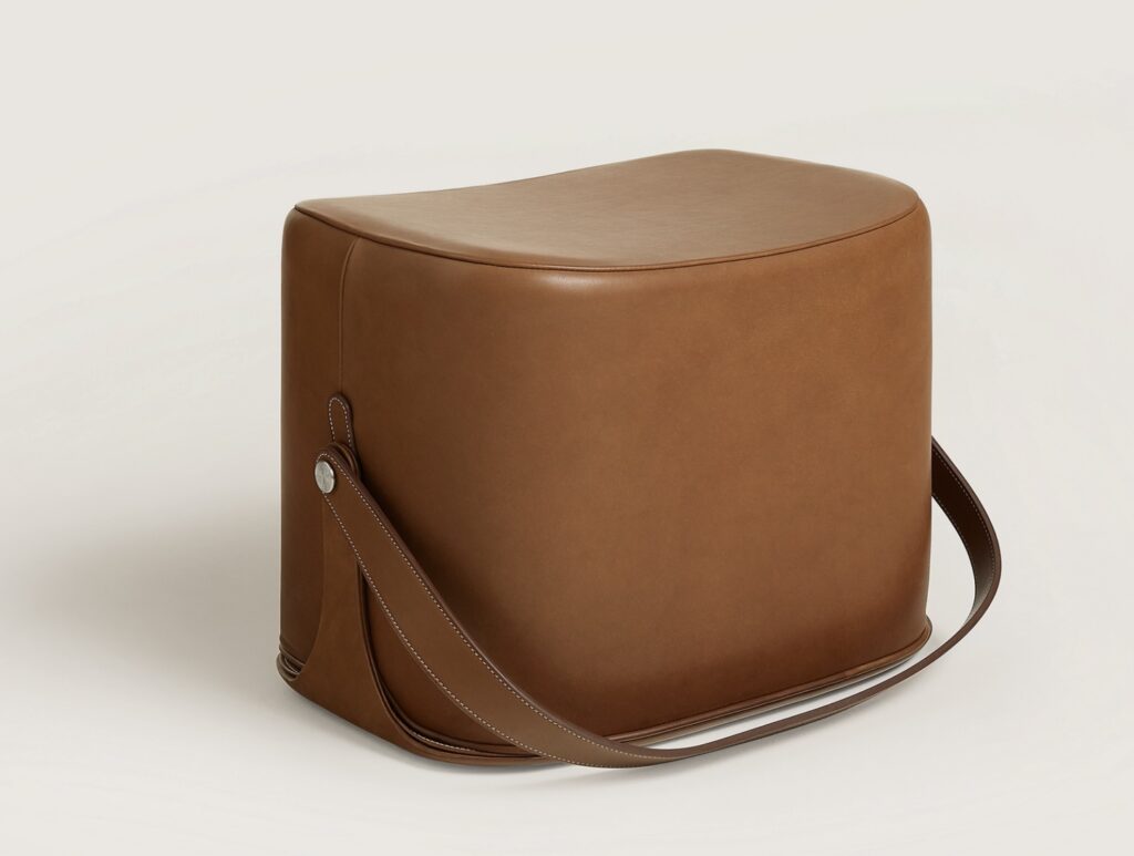
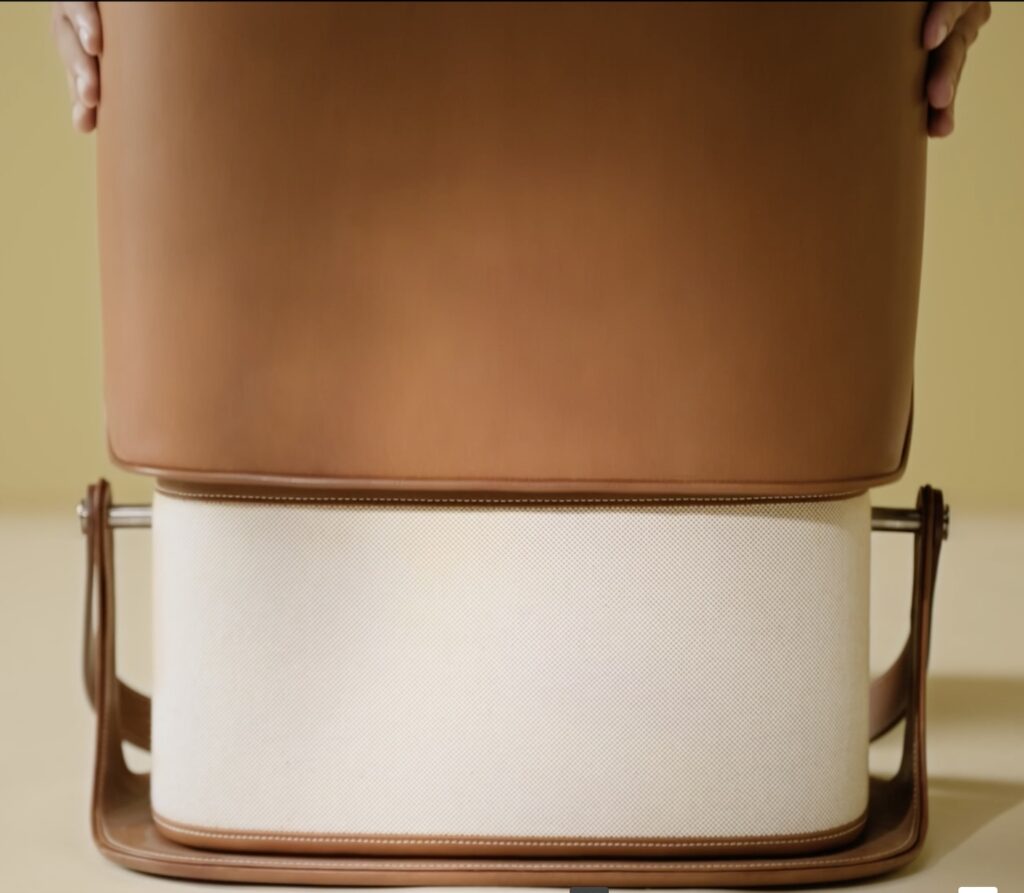
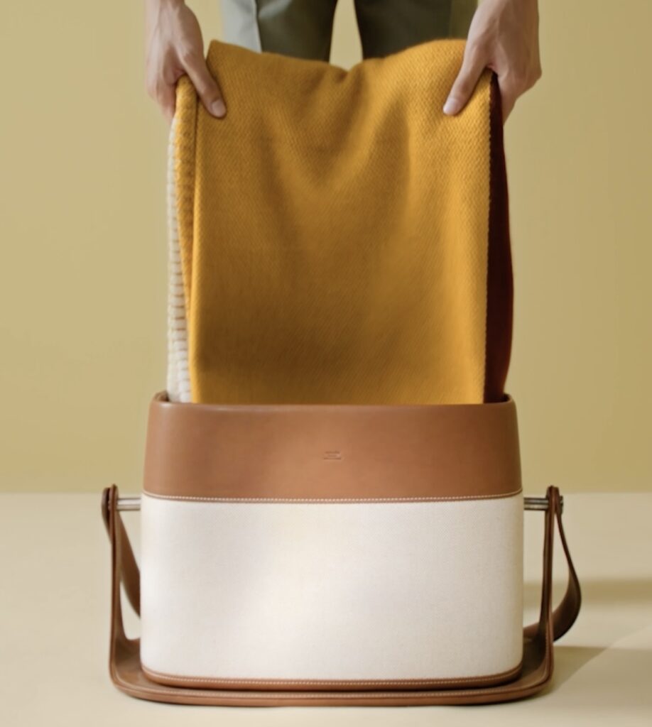
In January I was watching an Hermès making of video for something I don’t remember in the Necessaires d’Hermès collection, I think, and there were brief shots of this incredible-looking object. I scoured the website to figure out what it was, and it looks like it’s not available in the US, which serves us right, frankly.
But it turns out to be an ottoman, but it also has storage, and a handle. The whole top slides off, and it can hold a blanket, as these screenshots show. For something that doesn’t seem that capacious or actually portable, it sure is beautiful. I will keep it in the necessaires column.
OK, it was a Necessaires video, which is on the product page, and I had to have been watching it for the Groom wardrobe stand, or the Long Bench, a name which loses the sense of the French: Cheval d’Arçon, pommel horse.
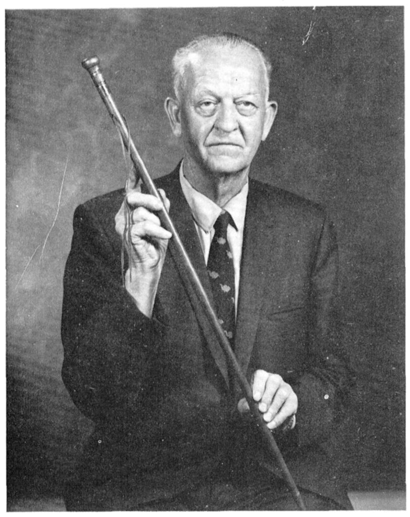
Raymond Taylor, son of the third Mormon prophet John Taylor, holding the Dimick Huntington Cane in an undated photo, republished by Steven Barnett in “The Canes of the Martyrdom,” 1981
In June 1844, the Mormon prophet Joseph Smith and his brother Hyrum were killed by a mob in Carthage, Illinois, where they were being held in jail for treason. [Joseph, who in addition to being the founding president of the Church of Jesus Christ of Latter-day Saints, was also the mayor of the Mormon-dominated city of Nauvoo, had destroyed the printing press of an anti-Mormon/anti-Smith newspaper and declared martial law. This led to his arrest for treason against the state of Illinois, but somehow none of that is particularly important to this blog post.]
The bodies of Joseph and Hyrum were brought back to Nauvoo, 22 miles away, in hastily constructed coffins of oak lumber. They were buried in a Smith family home, then moved to another site seven months later.
The blood-soaked wood from the temporary coffins was cut up and distributed to a few church leaders and friends of the Smiths by their widows, to be made into canes. When the bodies were reinterred, clippings of the Smiths’ hair were collected, distributed, and incorporated into the heads of some of the canes. These canes became known as Canes of the Martyrdom, and in a religious culture that officially eschews such things, they have become ersatz relics.
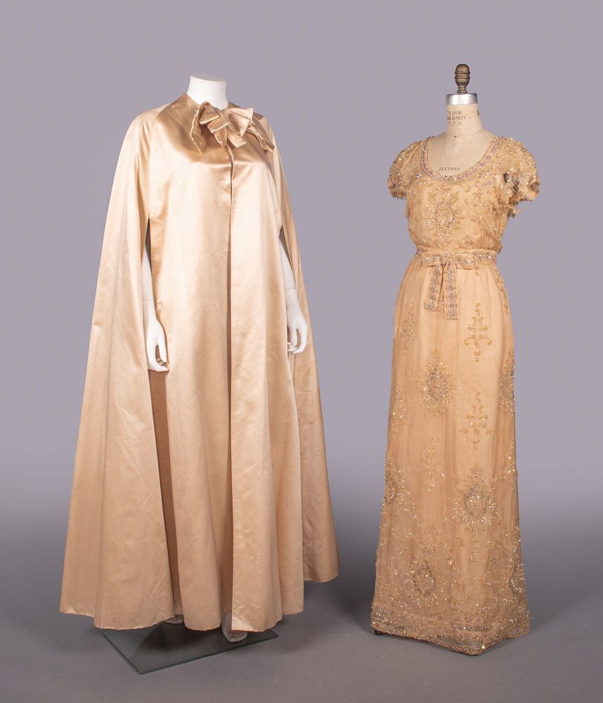
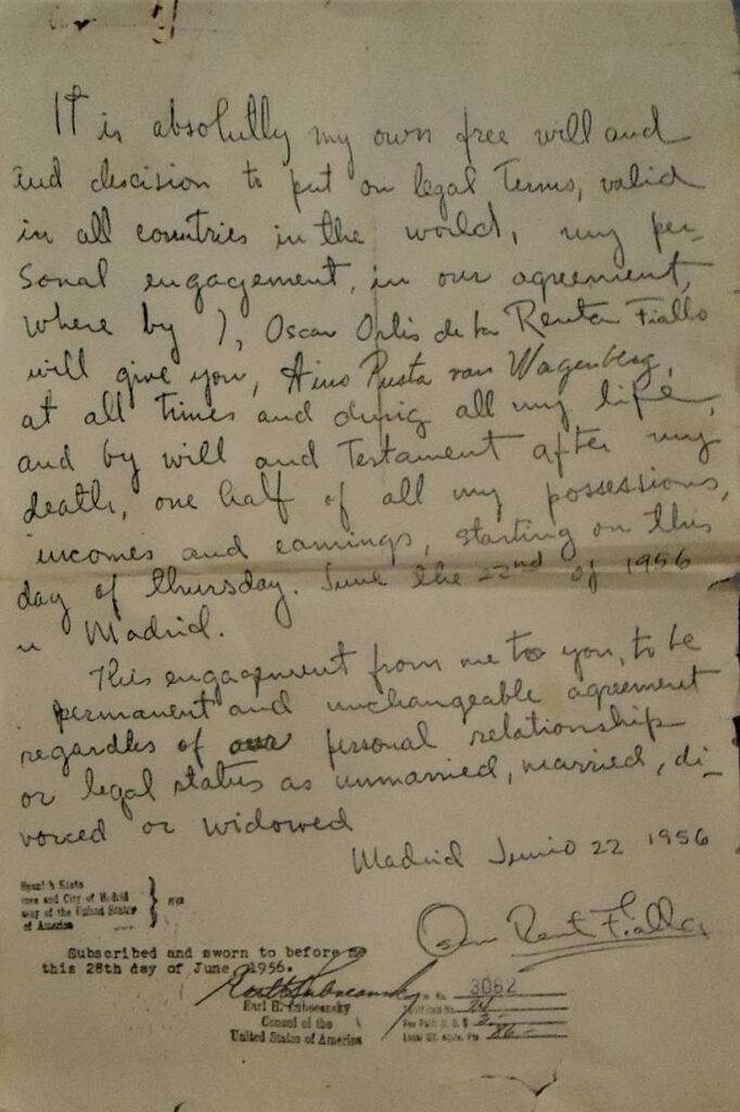
This couture cape in peach paduasoy and the sequin and crystal embroidered chiffon gown are both from Jeanne Lanvin, circa 1961. The cape, at least, is attributed to Oscar Renta Fiallo, who that year left his apprenticeship with Cristóbal Balenciaga to work with Antonio del Castillo, the Spanish designer brought to Paris to revive Lanvin. Both garments belonged to Baroness Aino de Bodisco.
I had to look up paduasoy, which is maybe a Spanish term for peau de soie, a variant of silk satin. Which is absolutely the least important thing in this situation. Because the auction listing of these two items also includes a copy of the mindboggling, handwritten pledge the 24-year-old man who would become known as Oscar de la Renta made to Bodisco in June 1956.
As I try to manage my news intake, I have been rescued and refreshed by First Light Radio, artist Man Bartlett’s monthly music show on East Village Radio. It’s live on the third Friday of the month, from 8-10AM, and the archive is growing, but it’s still early, so it’s small. Fortunately, there is a whole discography to fall back into. I confess, I’ve never opened my cassette tapes of any of the Space On Earth recordings; I just use the mp3 technology.
James Bridle responds to the Schelling Architecture Foundation’s rescinding of an award because of Bridle’s public support of a cultural boycott of Israeli institutions that support genocide.
Getting Hannah Arendt quoted back at you should be a wakeup call for Germans, but I guess not yet.
Germany is far from alone in this situation. The far right, and the denial of genocide that accompanies it, are on the march everywhere. But the logic of Strike Germany is simple: if it is illegal in Germany to call for cultural change in Israel, then it becomes necessary to call for cultural change in Germany itself. Late enough to be ashamed, but never too late, I sign my name.
Because we have some people from there, a ways back. And when a name like Mozingo turns up in Nahunta in your family history, it sticks in your mind.
And now I want to make Nahunta: Mi Gente t-shirts, which me and maybe like one cousin would appreciate.
Or maybe I need to make a new visit. Maybe the Nahunta Pork Center is just the most front-facing participant of a larger hardworking community of pork processors and their families. They are no less me gente than the farmers I came from.
Maybe Joan Didion’s 1975 commencement speech at the University of California Riverside was better when it was ‘lost’ and all we had were the YOLO excerpts from the end. Well, it’s all here now:
I think what you might be blinded for, what you ought to watch out for, is the habit of saying no, the habit of not believing anybody or anything. You’ve got to watch out for moving into a world where you don’t think there’s any objective reality, where there’s only you and that tree you just planted. There’s an objective reality, there is an objective social reality. Take it on faith.
All I want to tell you today, really, is not to do that. Not to move into that world where you’re alone with yourself and your tree. I want to tell you to live in the messy world, throw yourself into the convulsion of the world.
I’m not telling you to make the world better, because I don’t think that progress is necessarily part of the package. I’m just telling you to live in it. Not just to endure it, not just to suffer it, not just to pass through it, but to live in it. To look at it. To try to get the picture. To live recklessly. To take chances. To make your own work and take pride in it. To seize the moment.
Hhmm! While I’m glad she made a plug for reality, the idea of graduating from college, and Joan Didion driving out to Riverside to say don’t try to make the world better frankly sucks.
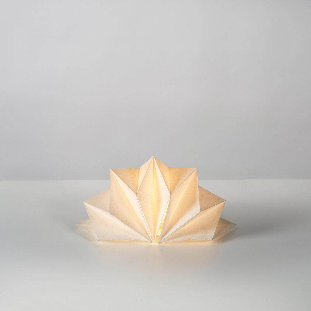
I’d seen Issey Miyake’s 132 5 Project clothes, but not the lamps. Now here is a lamp.
In 2010 Miyake and his Reality Lab groupies developed a collection of one-piece of recycled polyester textile, geometric origami-based garments, paying as much attention to how they looked folded flat as to how they worked on a body. Like his Pleats Please and APOC (A Piece Of Cloth) concepts, 123 5 was an experiment with material, process, and form without too much concern for how it looked on, because it always just looks like: whatever, you’re wearing Miyake.
[Looking now for an image to post, I can also say it didn’t matter to Miyake how it looked on a mannequin, in a photo, in a store, or what a press release said. The charitable explanation is that it privileges the physical experience with the product.]
Anyway, Miyake brought this folding-focused concept into a lighting collection at Artemide called IN-EI. Typically written as In’ei (陰翳), Miyake told Artemide it means “shadow, shadiness, nuance.” But the term is most directly associated with 陰翳礼讃 (In’ei Raisan), “In Praise of Shadows,” Jun’ichiro Tanizaki’s foundational 1933 essay on Japanese aesthetics, which had a huge influence on Japan’s own sense of cultural exceptionalism vis à vis the Modernism of the West.
Another reference that is very unmentioned is Isamu Noguchi’s Akari series, which brought a modernist and modernizing sensibility to Japan’s long tradition of paper lanterns. Many of which also fold flat, obviously. My long-simmering fixation with the Akari arc from lamps to “light sculptures” is probably what made me notice this lamp in the first place. And seeing the stacked rhombus lamps in this Miyake boutique, it’s clear Noguchi was on Artemide’s mind, too.
Artemide and Issey Miyake, making sure “Each lampshade is created using 2 or 3D mathematic principals” since this pic was taken the NYC store in 2012. It was even stenciled on the wall lmao.
However long this cruise ship napkin-shaped table lamp was in production, I don’t know, but the IN-EI Collection currently only has four pieces in it, and this is currently not one of them. Its name, Hoshigame, translates as star tortoise, and yes, its shape does look like the shell of a Burmese Star Tortoise. So maybe in 2015, when the Kemono Friends manga dropped, and an Indian Star Tortoise was among the exotic animals in the magic zoo that turned into kawaii little girls, Artemide decided to quietly excuse itself from the search results.
As long as you know to search for Hoshigame, though, you will not need to rush to buy this one in Paris. Turns out they’re all over the place, at prices ranging from etsy cheap to 1st dibs ridiculous.
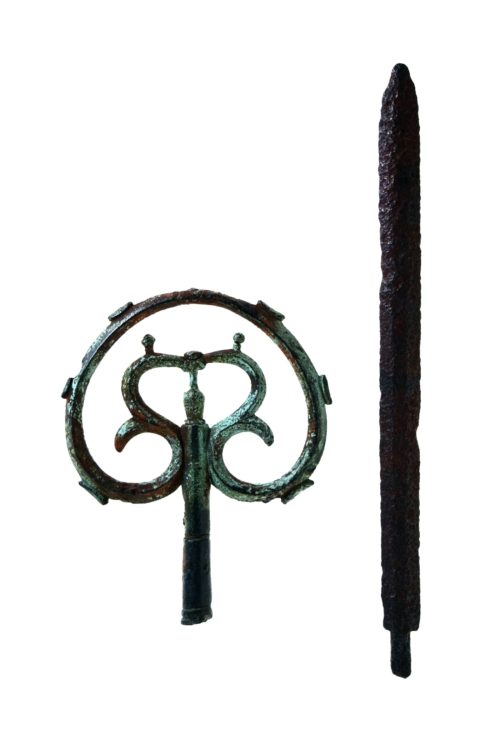
cane head and spear tip, from the late Nara or early Heian period [c. 800 CE], found at the top of Mt Tsurugi in 1907, image: toyama-bunkaisan
In 1907, Yoshitaro Shibasaki and his team successfully climbed Mount Tsurugi, which was regarded as the last unclimbed mountain in Japan. However, they found a metal cane decoration and a sword on the top of the mountain, and it turned out that someone had reached the top before them. A later scientific investigation revealed that the metal cane decoration and sword dated from the late Nara period to the early Heian period and that shugenja had climbed Mount Tsurugi more than 1,000 years ago.
Shugendō is a mountain ascetic religious practice that emerged in the 8th century in Japan, that synthesizes Shintō, Buddhism, and various local spiritual elements. Because of its integrationist nature it was banned in the Meiji era when government land surveyors found that the ascetics [shugenja] beat them to the top of Mount Tsurugi by a thousand years. [via CraigMod‘s newsletter, where he discusses missing a Shugendō retreat because of XOXO and typhoons.
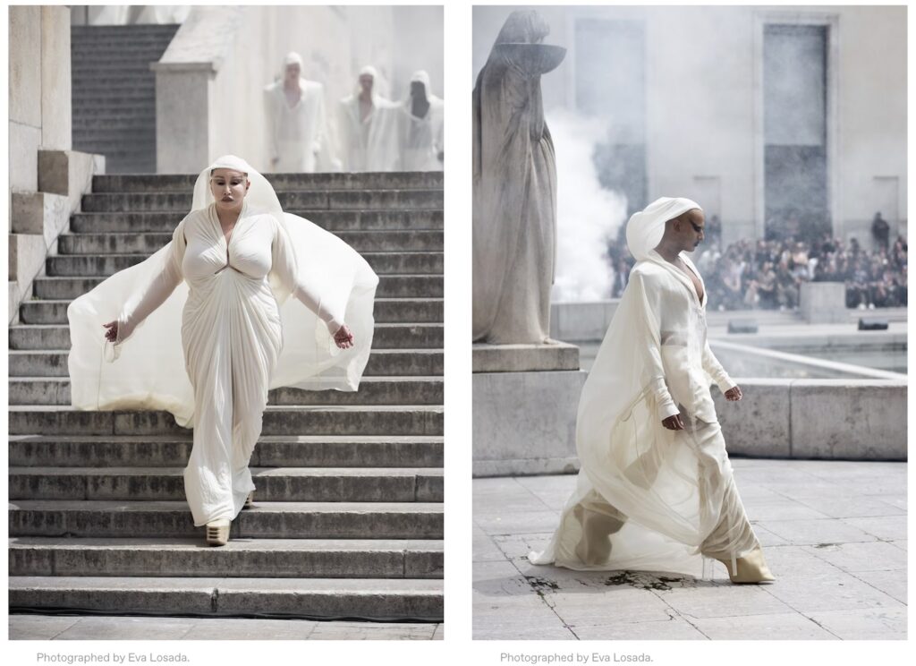
At the apex of the Palais de Tokyo’s staircase, beside the bas-reliefs of the nine muses, there’s Munro choreographing the show, doling out groups of models like the conductor of a heavenly human orchestra. Here they come: Tyrone Dylan Susman in a sheer jumpsuit and bold-shouldered coat. Allanah Starr in a draped and caped prong dress. Charles Star Matadin in a gilded hood and Kat Q in sheer layers with shoulders that arc upward toward the sky. And here parades an assemblage of bodies on a litter supported by ten strongmen.
I tried but this version of the Emblem of Tibet in exile does not help date this holiday card from HH The Dalai Lama. image: juliensauctions
There are literally like a hundred Christmas cards from various configurations of the British royal family in this ex-countess’s estate sale—here’s one of several with skeevy Prince Andrew—but there is only one holiday card from His Holiness The Dalai Lama, and it rocks.
Austrian refugee and concert pianist Maria Donata Nanetta Paulina Gustava Erwina Wilhelmine Stein married to George Lascelles, 7th Earl of Harewood and first cousin to the Queen, in 1949, and after her divorce in 1967, Countess Harewood kept in touch with her friend the Queen. Which accounts for staying on the Windsors’ mailing list, but not the Dalai Lama’s. Her later marriage to a politician Jeremy Thorpe doesn’t help either.
So it probably involves her son David Lascelles, now the 8th Earl, who produced Tibet: A Buddhist Trilogy, a four-hour, meditative, verité documentary on Tibetan monastic life in exile in 1979. Lascelles also commissioned Bhutanese monks to build a stupa at Harewood in 2004 as part of a spiritual reparation, a way to account for his family’s legacy of enslavement and exploitation without necessarily impacting its actual fortune or the 18th century country house it funded.
Which is all well and good, and enslavers need all the karmic help they can get. But the point here is, the coolest Christmas card around was sent by the exiled human incarnation of the Buddha to an Ashkenazi Jewish refugee-turned-ex-countess months away from either of their actual new year’s days. [update: at least TWICE.]
I want a first edition of Moby Dick, but I think the psychic price of actually ever buying one will be too high.
While surfing around to see how the copy for sale at Christie’s rn stacks up, I fall into a briar patch of rarity, condition reports, restoration and repair, inscription and annotation, and cutthroat antiquarian connoisseurship.