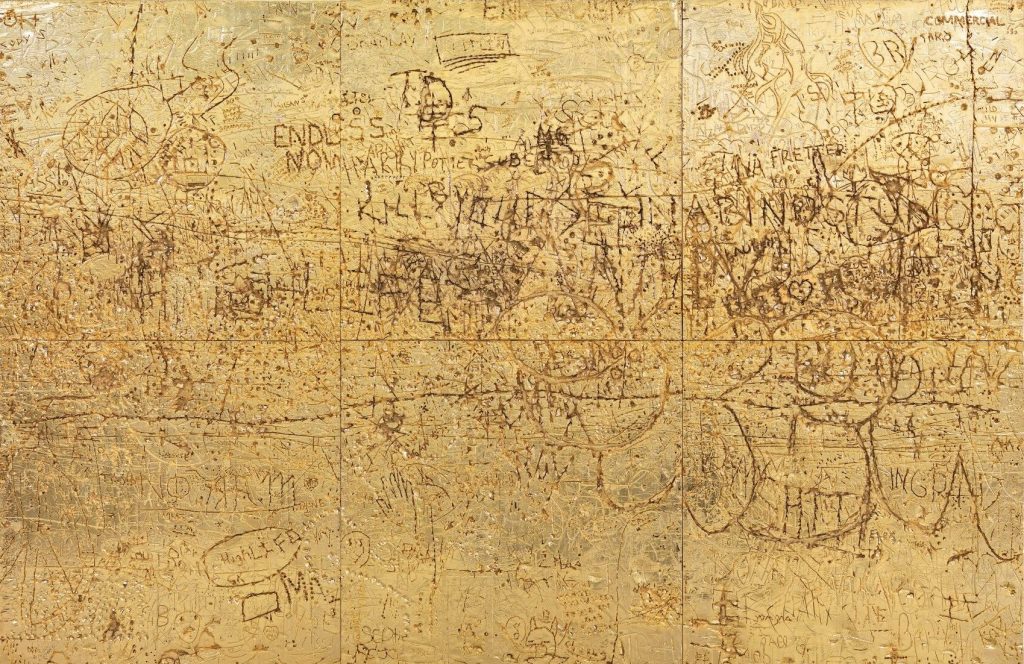
Can’t touch this: Rudolf Stingel, Untitled, 2012, electroformed copper, plated nickel and gold, stainless steel frame, in 6 parts, 120cm sq each, sold at Sotheby’s in 2017
Before the extent of his crimes bubbled to the surface, Philbrick himself related to me the occasion on which he tried to negotiate the sale of a badly damaged Stingel painting from Hiscox insurance company that had been written off owing to catastrophic water damage. An employee of the company confirmed to me that Philbrick indeed had tried unsuccessfully to purchase the damaged painting. Simultaneously, he engaged his assistants to buy the super-rare German paint Stingel uses, which was available only seasonally, so they could replicate over the course of months the precise method of the pricey artist and create an exact replica. Though Philbrick never managed to buy the destroyed work from the insurer — such companies often facilitate or contribute to the restoration of a work that has a claim against it to repatriate it into the marketplace, or they sell it discounted with damage — the fate of Philbrick’s meticulously crafted copy is at present a mystery. Chances are it will be on offer at an auction house near you, if it hasn’t been sold already.
Though I have even more questions about an “exact replica” of a specific painting than I do about a specific paint, or the idea that damaged=destroyed, the “conceptual pose” of Stingel’s challenge to authorship is now a reality, and I am very much here for it. Let a thousand fanmade Stingels bloom–and let them all turn up at Christie’s.
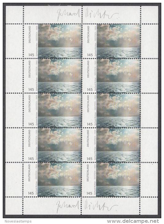
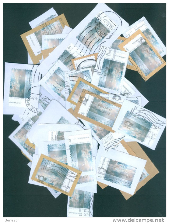
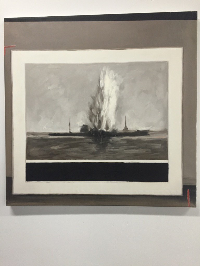
GERHARD RICHTER DEUTSCHLAND 145 SEESTÜCK – 1969, 01.07.2013, offset print on adhesive, signed in plate, edition unknown, image: delcampe.net seller novesiastamps
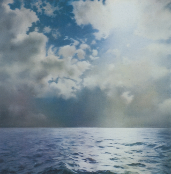
Deutsche Post published Gerhard Richter stamps in 2013. EUR1.43 stamps showing text alongside a rectangular cropped image of the artist’s 1969 square painting Seestück (Gegenlicht)/ Seascape (Contre-Jour) [GR233] were available in collectible sheets of ten. If, as the two facsimiles of the artist’s signature in the sheets’ margins would infer, the stamps constituted the largest edition the artist has ever published, the use of these stamps also amounts to the greatest act of artistic destruction Richter has ever faced. And at the hands of his own countryfolk, no less.
Gerhard Richter, Seestück (Gegenlicht)/ Seascape (Contre-jour), [CR233], 1969, 200x200cm, oil on canvas. image: gerhard-richter.comThousands–tens of thousands, hundreds of thousands?–of pictures just ripped asunder, flung hither and yon, pummeled, shredded, and then dumped. Even in these trying times, the scale and apparent casualness of the obliteration shocks the conscience. The apparent readiness of the German people to trivially use then abandon the work of one who is ostensibly so revered, whose work has–had?–provided a searing beacon of objective light? Staggering.
Did the artist somehow know this was coming? Is that why he chose–presumably it was he–to use the picture depicting contre-jour, backlighting, the photographic technique of directly facing the light source–in this case, the sun–to produce heightened visual contrasts and unsettling shadows?
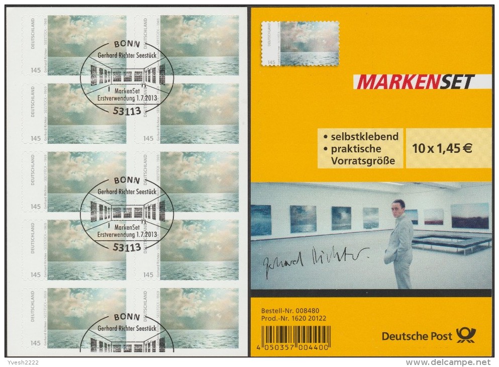
Cancel Culture: Gerhard Richter Seestück edition showing evidence of ceremonial mutilation on 01 July 2013, image: delcampe.net seller Yvesh2222
Fortunately, even in the face of such widespread destruction, there is hope. Faithful stewards in the collecting community are doing what they can, preserving stamps and sheets in whatever form they can: some sheets have the signatures intact; some don’t; some stamps have a signature fragment; a rare few include the commemorative envelope (also with a signature, historians); some [above] are mutilated ceremonially–canceled, they call it, with euphemism that cannot conceal the inherent pictorial sadism; and some, marred and disfigured on the field of postal battle, are rescued from oblivion by angels wielding tiny, little scissors.
Study for Destroyed Richter Stamps 01–50 [sic], 2019, image: delcampe.net seller beneschThese are the pictures that haunt me, the ones pulled from the very brink of doom. Theirs is the story I’ll tell; theirs is the fate we must #neverforget.
Whether it’s 50 original works or ed. 50, we’ll see when the studies arrive from Austria.
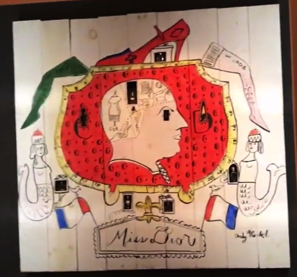
Warhol Museum’s 1997 re-creation of Miss Dior window display for Bonwit Teller, as seen in Adman: Warhol Before Pop, at Art Gallery NSW in 2017
Gene Moore was the creative director for Bonwit Teller, and then from 1955, after Bonwit’s owner Walter Hoving bought it, for Tiffany & Co. next door. Moore hired Andy Warhol, among others, to create window displays along Fifth Avenue. Moore’s book was quoted by warholstars.org:
[Warhol] never pretended a difference between what he did to survive and what he called his art. To his credit, I think it was all the same to him. He was a very busy young man. I used Warhol’s art in several of my perfume windows at Bonwit’s. In July 1955, just before my work began at Tiffany’s, I made some wooden fences, and he covered them with graffiti for a series of windows. They were fun, full of a childish playfulness.”
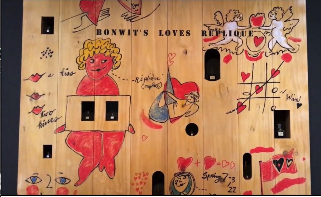
re-fabricated Warhol perfume fence for Bonwit Teller, also from Adman at Art Gallery NSW
I haven’t given two thoughts to those Warhol Fences in 20+ years, since seeing one at a Warhol fashion flotsam show at the Whitney. Which turned out to be a refabrication cooked up by Warhol Museum director Mark Francis? And which turned up again, alongside another one, in Adman, a 2017-18 show of Warhol’s commercial work.
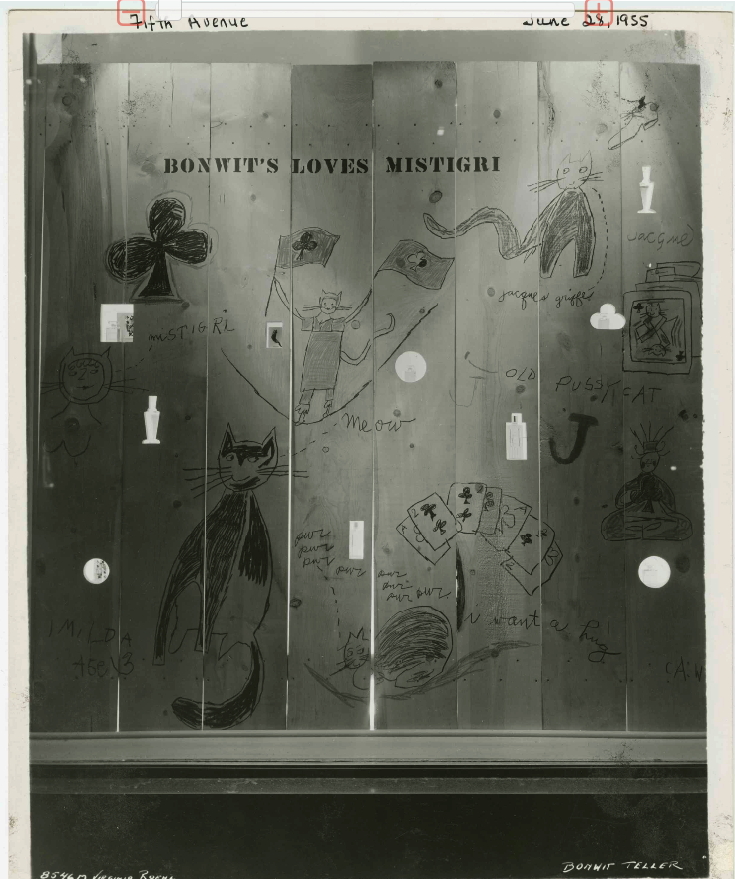
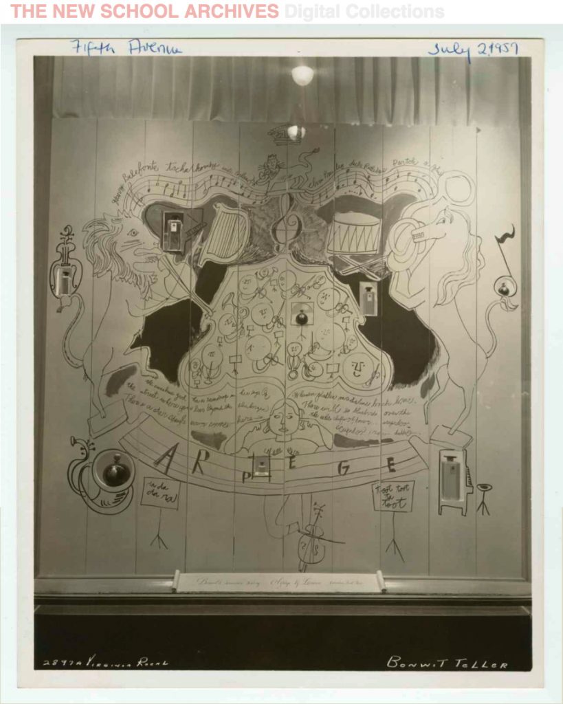
Bonwit’s loves Mistigri, a Warhol window display from Jun 1955, photographed by Virginia Roehl, from the Dan Arje collection at The New School
Which, now I am actually kind of interested in bringing back destroyed artworks. And in Gene Moore and his artist colabos. And in the amazing vintage photos a reader just sent me of several more of Warhol’s window display perfume fences, which are awesome?
I can’t find it now, but someone, either Moore, or Dan Arje, the Bonwit’s assistant art director whose archive is now at the New School, said how easy it was to work on windows with Warhol. He never froze, never panicked, never stalled, but got right to work and cranked out that art. And these fences show it. They feel instant, sprung fully formed from the artist’s head–and pen–like a Keith Haring glowing baby.
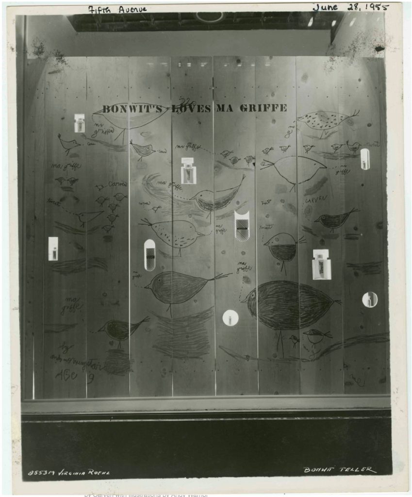
Ma Griffe Birds, 1955 image by Viriginia Roehl for Bonwit Teller’s Dan Arje, via The New School
Which isn’t the same as improvised or conceived on the spot. Installation views of the Adman show include sketches for the Miss Dior fence, so a lot of it was clearly worked out in advance. Credibly repeating one of these wall-sized drawings seems like it would be very hard. But I want to see those birds so bad I can taste it.
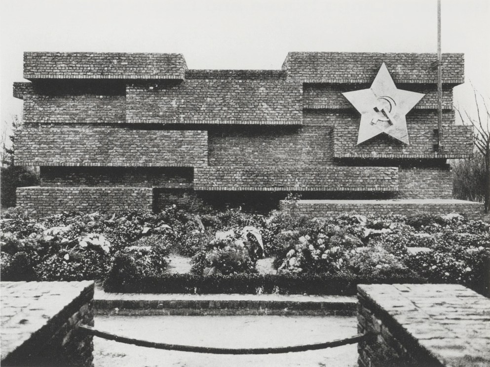
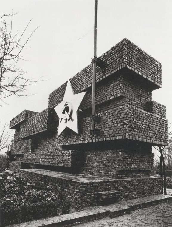
Mies van der Rohe, Revolutionsdenkmal, Berlin, 1926 (destroyed 1935), photo by Arthur Köstler via thecharnelhouse
It is the 100th anniversary of the execution of Rosa Luxemburg and Karl Liebknecht by the fascist Freikorps in Berlin. After several years of unsuccessful attempts, a memorial to these and others killed in the German phalanx of the Bolshevik Revolution was finally built in Berlin’s central cemetery in 1926. It was designed by Mies van der Rohe with the sculptor Herbert Garbe.
According to Edward Fuchs, who was instrumental to the project, Mies said, “As most of these people were shot in front of a brick wall, a brick wall would be what I would build as a monument.”
Mies van der Rohe, Revolutionsdenkmal, Berlin, 1926 (destroyed 1935), photo by Arthur Köstler via thecharnelhouse
At the Charnel House from whence these images come, Ross Wolfe notes that the jagged bricks of the memorial “had been assembled from the bullet-riddled remains of buildings damaged or destroyed during the Spartacist uprising” Luxemburg and Liebknecht triggered. It became an iconic backdrop for speeches, and the site was the focus of annual memorial marches and rallies until the Nazis destroyed the memorial in 1935.
Wolfe also traces some of Mies’ political shifts, from Bolshevik memorial designer to apolitical pragmatist Bauhaus head as the Nazis came to power, to whatever he was in the US. But wait, there’s more! Mies was also the favored architectural visionary and mentor to America’s own greatest Nazi architect Philip Johnson. He got called before McCarthy’s House Un-American Activities Committee in 1951. And he rejected student efforts to rebuild the memorial in 1968, and got protested when his Neu Nationalgalerie opened in Berlin.
I guess I would like to see it rebuilt, bust mostly I’d like to live in it, which is complicated, I know. In the mean time, I will try to find Mies’s HUAC testimony, which seems rather underdocumented onlne.
A couple of months ago while looking at those Danh Vo Japanese plate editions, I came across Blake Byrne, an LA collector who had sent one to auction.
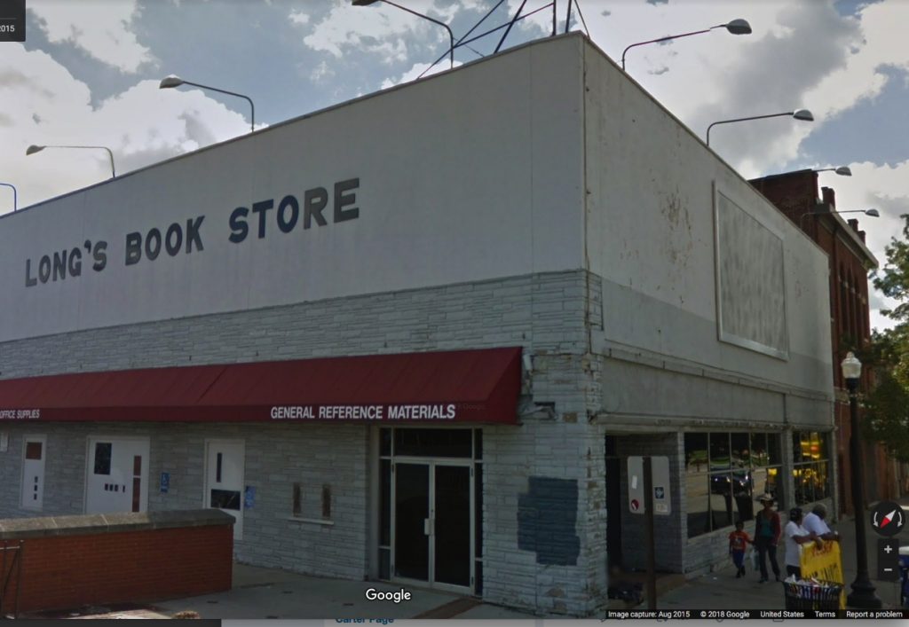
That led me to Open This End, a 2015 traveling exhibition from of works from Byrne’s collection, organized by various college museums and his Skylark Foundation. One stop was Ohio State University, which housed most of the show at the Urban Art Space, except for this: “Just off campus on the façade of the former Long’s Bookstore on the corner of 15th Ave and High St, is a work by Felix Gonzalez-Torres, Untitled(For Parkett) (1994).”
Felix Gonzalez-Torres, “Untitled” (for Parkett), 1994, a billboard edition of 84+15 AP
Which made me wonder how that worked? Actually, I’d wondered for several years how Felix’s Parkett edition billboard worked in real life. It comes rolled up in eight big, silk screened panels, and once it’s installed in a site, that’s it; it’s permanent. So far, my attempt, begun in 2012, to document all 84+15AP editions had gone nowhere. But now I had a new datapoint. Maybe. How does a one-and-done billboard in a traveling show from a private collection work?
“Untitled” (for Parkett), 1994, installed on at Ohio State University in 2015 for Open This End, image: c.2015 GSV
Sure enough, here it is on Google Street View in 2015, facing the OSU campus entrance right by the Wexner Art Center. Let’s scrub forward to see how it has held up?
“Untitled” (for Parkett) 1994 nowhere to be seen at Ohio State University, image: c.2017 GSV
Oh.
I emailed Skylark Foundation executive director Barbara Schwan to find out what happened. She looped in Joseph Wolin, curator of Open This End, to explain. After much consultation with the Felix Gonzalez-Torres Foundation and Parkett, Byrne donated his edition of the billboard to OSU, where it was installed for several months on a building that was slated for demolition.
When the building came down, the billboard came down with it. Wolin wrote:
We were told, I forget if it was by Parkett or the Foundation, that this was one of the very few times, if not the only time, the billboard had been installed as a billboard, so we were pretty excited about that. Blake himself had acquired the work at auction and had it rolled up in storage for many years, so for me it felt rather wonderful, if bittersweet, to be able to realize it as the artist had intended. Apparently, when the work is installed indoors, as in Parkett’s exhibitions, the panels are often just pinned to the wall and rolled up again after.
So many questions answered, so many questions raised. Six years ago I lamented that “Untitled” (for Parkett) is “doomed by its own nature to exist in a state of fungible incompleteness, or worthless realization, or inevitable destruction.”
Which, thanks to a generous donation and successful realization with full knowledge of its destruction, we realize is a feature, not a bug. I hope more owners of “Untitled” (for Parkett) follow Byrne’s lead by realizing their billboards and letting time take its toll in public rather than in storage. It is what Felix would have wanted.
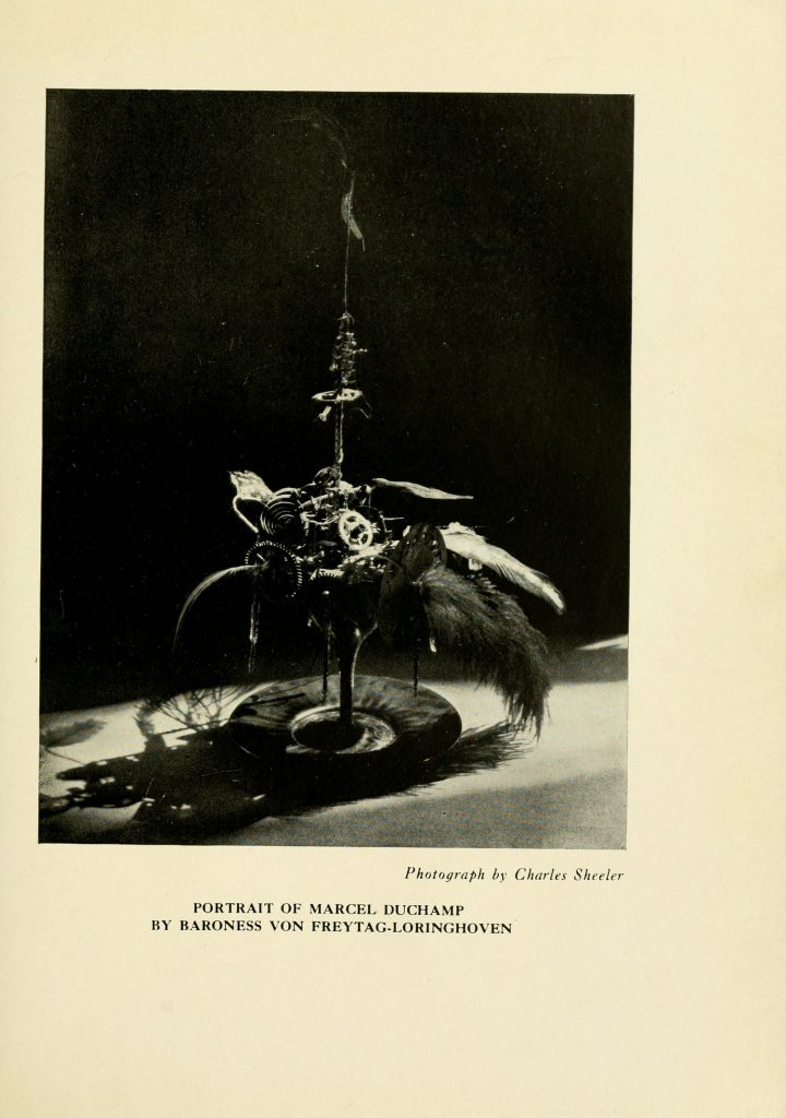
Baroness Elsa von Freytag-Loringhoven, Portrait of Marcel Duchamp, 1920, photo: Charles Sheeler, published in the Little Reiew, 1922. image: brown.edu
After 6 years and 72 issues, I am sure glad Margaret C. Anderson hung in there to publish one more issue of her avant-garde poetry magazine The Little Review in the Winter of 1922. Because it includes a different Charles Sheeler photo of Baroness Elsa’s Portrait of Marcel Duchamp.
The one that’s been floating around, via Duchamp dealer Frances Naumann, mostly, is a more clinical, perhaps Sheeler-esque photo [below].
Charles Sheeler The Baroness’s Portrait of Marcel Duchamp, ca. 1920 Gelatin silver print 9 5/8 x 7 5/8 inches, via francesnaumann
But besides the dramatic lighting, the Little Review version actually reveals more of the cocktail of feathers, gears, and flywheels that filled Baroness Elsa’s glass. Also it’s sitting on a plate.
All of this matters to me because this, my second favorite portrait of Duchamp after Florine Stettheimer’s, is lost, destroyed. And so this kind of documentation will help make a reconstitution of it truer to the original, and less of an inspired-by approximation.
Brown University and the University of Tulsa have digitized The Little Review as part of their Modernist Journals Project [brown.edu]
It’s an accident of timing that I’ve kept thinking of Derek Jarman as a filmmaker with a painting hobby. He was still alive when I saw my first Jarman film, Edward II, and when Blue blew me away. And I felt I knew his story, so I’ve been slow to read his early autobiography, or other books about him; my job was to just catch up and see all his earlier films. It didn’t help that I didn’t really like the paintings shown after his death. His notebooks were more relevant.
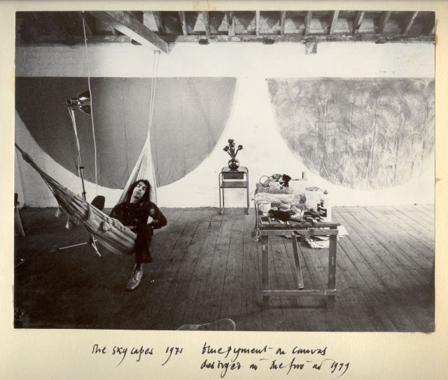
But I just saw this photo which changed all that. I wasn’t 100% wrong, but I was close: Jarman’s painting was more formative and influential-and interesting-than I realized. The photo’s from 1971, and it is captioned in Jarman’s dramatic hand:
“The Skycapes 1971 blue pigment on canvas
destroyed in the fire in 1979”
Skycapes has been a Google dead end, or rather a cul de sac for this caption. But capes, capes is where it’s at. In his 1999 biography of Jarman Tony Peake traced the form and concept of the cape to Jarman’s theatrical work, particularly his ideas for a production of The Tempest:
Capes are both practical and sensual, especially when cloaking nakedness. They are geometric: if hung on the wall, they form a half circle. They have mythic overtones: by donning a cape, the wearer can effect a transformation. These qualities, particularly the latter, had considerable potency for Jarman, who now set about working and reworking this new possibility until the capes he produced-and began to hang on the walls of his studio-no longer resembled design, but approached the condition of painting or sculpture.
Now the timing’s a little confusing, because Jarman made a film version of The Tempest in 1979. But Peake notes the project had interested Jarman for years. And Jarman made a clear, laminated cape scattered with dollar bills [or pound notes, maybe?] for the 1969 production of Peter Tegel’s surrealist play Poet of the Anemones. Peake said the two met at Lisson Gallery.
And the walls of Jarman’s riverside loft were lined with extraordinary capes when filmmaker Ken Russell visited and asked him to design the sets for The Devils, a project that consumed most of Jarman’s waking hours in 1970. Exhausted and dissatisfied by the film project and wary of commercial film industry entanglements, Peake wrote, Jarman “chose to concentrate on his capes, some of which he now began to paint, in two main colours, black and blue, but mainly blue: ‘simple sky pieces to mirror the calm.'”
That quote’s from Jarman’s own 1984 memoir, Queerlife, which was published in the US with the title Dancing Ledge in 1993:
1971. The Oasis
The intervening year was spent painting a series of blue capes, which hung on the walls at Bankside. They were simple sky pieces to mirror the calm that returned after the frenzied year of The Devils. That summer was an idyll, spent sitting lazily on the balcony watching the sun sparkle on the Thames. When I wasn’t painting I worked on the room and slowly transformed it into paradise. I built the greenhouse bedroom, and a flower bed which blossomed with blue Morning Glories and ornamental gourds with big yellow flowers. On Saturdays we gave film shows, where we scrambled Hollywood with the films John du Can brought from the Film Co-op- The Wizard of Oz and A Midsummer Night’s Dream crossed with Structuralism. There were open poetry readings organized by Michael Pinney and his Bettiscombe Press. Peter Logan perfected his mechanical ballet, and MIchael Ginsborg painted large and complicated geometrical abstracts.
An oasis paradise indeed, replete with all the essential elements of Jarman’s subsequent accomplishments. Which is, at least, how he himself saw it when he looked back from 1984.
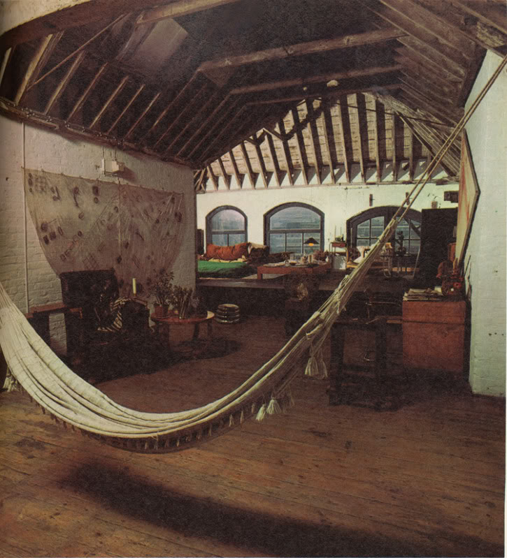
Here is a 1971 photo by Oberto Gili of Jarman’s amazing Bankside loft, the top floor of a 19th century wheat warehouse. Which had the floors, the ceiling, the views, the space, but not the plumbing or the heat (thus the greenhouse bedroom). There’s the hammock from the first photo, and a laminated cape which had tools, weeds, and detritus retrieved from the abandoned waterfront. [How far do the similarities go between Jarman and other gay pioneer artists like Robert Rauschenberg? Jarman would’ve spit at the comparison; in a 1984 interview at the ICA he slammed Jasper Johns for being a tool of the CIA. #freequeerstudiesdissertationtopics]
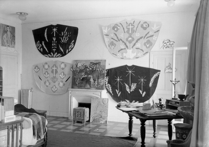
Henri Matisse cutout designs for priests’ chasubles for Vence Chapel, 1951, photographed in his studio surrounding a Picasso painting, by Helene Adant. image: tate.org.uk
In Ken Russell’s telling of their first cape-filled visit, Jarman “was getting ready for an exhibition called “Cardinal’s Capes.” It’s a phrase which turns up nowhere else, but which makes me think of Henri Matisse, who designed amazing chasubles for priests to wear in his chapel at Vence. They began as cut-outs, and were translated into fabric, and changed with the seasons.
In 1970-71 Jarman had two solo shows, including capes, at the then-new Lisson Gallery, but he grew to disdain the gallery system. He also hated Pop and bristled at working in the long shadow David Hockney cast over the London art scene. He opened his studio for his own damn show in 1972, which Peake says was disappointing [though he sold some work and celebrities turned up for the opening, so what greater success could art hope for?]
He included new capes made from black lacquered newsprint [Rauschenberg?] in a 1984 mid-career exhibition at the ICA. [He was 42.] And in that public talk, he described funding his early features by selling paintings and raising money from his painting collectors.
Anyway, are there any Jarman capes left to be seen? I can’t find any. In 2015, the ICA screened Jarman’s super8 documentation of his 1984 show for the first time, but there’s no visual trace online. And as the caption to the original photo mentions, his earlier capes, including what he called his Skycapes, were destroyed along with Jarman’s and others’ studios in 1979.
By retrospectively titling them with the sky, and using the term “blue pigment” instead of paint, Jarman also seems to be linking the capes to one of his clearest references, Yves Klein. Klein the outrager who said his first artwork was signing the sky. Whose International Klein Blue appeared throughout Jarman’s notebooks in the 80s. Jarman filmed an IKB monochrome painting and projected a loop of it for a 1987 live poetry/music performance event he called Bliss, which became his last, greatest film, Blue, in 1991-3.
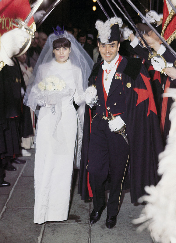
Here is Klein at his wedding on January 21, 1962. Rotraut Uecker is wearing an IKB crown, and he is wearing a cape emblazoned with a Maltese cross. They are processing through the raised swords of the Chevaliers of the Order of St. Sebastian. So at least I know what my dissertation will be about. But first we have to solve the problems that there are almost no Jarman Super-8s online; that Klein’s wedding was filmed, and that’s not around, either. And then, of course, all these destroyed capes. There is a lot of work to do.
Previously, 2013: International Jarman Blue
2004: It’s not just Derek Jarman’s Blue
2002?: As I lay typing
In 1965, before he figured out his Today Series date paintings, On Kawara experimented with several other types of paintings about language, text, and information. They contained a word or phrase, or a graphically encoded text. The National Gallery has a triptych, Title, that weren’t, but most of them were destroyed. [image from the Guggenheim’s exhibition catalogue via ig/mondoblogo]
Pat Lasch cake sculpture for MoMA, 1979, destroyed, image: Pat Lasch via nyt
Feminist sculptor Pat Lasch only discovered that MoMA had thrown out an elaborate cake sculpture it commissioned from her in 1979 when a curator tried to borrow the piece for an upcoming retrospective. Randy Kennedy has the sad, baffling story in the NY Times.
Lasch made the sculpture at the invitation of MoMA’s longtime curator Kynaston McShine, but it was displayed at a gala for The Modern’s 50th anniversary, not in an exhibition. And though it was apparently kept for 20 years, it was never formally accessioned. So when its condition deteriorated, it was tossed out instead of conserved. Another, much smaller work was acquired by Prints and Drawings as a gift in 1979. But at 5’2″, the cake sculpture was not only monumental, it was more important to Lasch’s work at the time and since. Oh well.
Joep van Lieshout, MoMA Bussing Station & Carts, 1995, presumed destroyed, image: Atelier van Lieshout: A Manual [pdf]
The incident reminds me of another blurry situation that began in 1995, when MoMA remade its cafe with all Dutch design in conjunction with a huge Mondrian retrospective. Along with product from folks like Piet Hein Eek [gratingly noisy sheet aluminum chairs] and Tejo Remy [those lights], the cafe included a huge commission from Joep van Lieshout: two fiberglass-wrapped bussing stations, some carts, and some garbage cans. They were basically giant functional sculptures riffing on minimalism and product.
Joep van Lieshout, MoMA Bussing Station & Garbage Cans, 1995, presumed destroyed, image: Atelier van Lieshout: A Manual [pdf]
As with Pat Lasch’s gala, the cafe commission was all overseen by a curator–two, actually, Terry Riley and Paola Antonelli, from Architecture & Design. In 2009 I tried to find out the fate of van Lieshout’s objects, which disappeared from view along with the rest of the cafe in 2004, when the Taniguchi renovation started. Though chairs and lights went into storage, the hulking, 3-meter long turquoise and lime green bussing stations were nowhere to be found.
via Visiting Artist [sic], Part 6/8
[I talked about the bussing stations for the first and only time so far in 2007, at Visiting Artist (sic), a lecture-turned-performance at the University of Utah, which may be one of the first artworks I ever made. Or rather, it was the first time I really contemplated myself acting as an artist. It was a very ambivalent moment, about some ambivalent art world gestures and conundrums, from an era when YouTube encoded things inexplicably green, and wouldn’t let you upload anything longer than like 10 minutes. Maybe gotta work on that.]
Anyway, for these objects by Lasch and van Lieshout, it mattered less that they were commissions, by curators, or that their creators were artists who considered them works. What ultimately determined their fate was that the museum did not process the works into the collection. It turns out accessions matter.
On the bright side, as destroyed works, these pieces have a chance at being re-created. If I had a place to put them. Or show them. Ars Longa, Except When MoMA Throws It Out [nyt]
Previously, related, but disorganized: Visiting Artist [sic] starts with parts 2 & 3.
Start here tho; there is no 1/8: Visiting Artist [sic], Part 2/8, Dan Flavin I [youtube]
Untitled (Gerda Taro Leipzig Monochromes), 2016, Gerda Taro photos, painted wood supports, tar. image: Anne König and Jan Wenzel
On the night of August 3rd, an outdoor installation of 18 photos by Gerda Taro in Leipzig, Germany, was vandalized, painted over with tar? Or aniline black dye? The photos were part of f/stop Leipzig, an annual photography festival, held in early July. Some of the public space components of the festival apparently continued beyond that date.
f/stop curators Anne König and Jan Wenzel included Taro, a pioneering war photographer, because of the confluence of her life, her work, and the city itself. She lived in Leipzig until 1933, when she fled as a Jewish refugee. She met up with another refugee, Robert Capa, in Paris, and they documented the Spanish Civil War together until Taro was killed in 1937. Leipzig is hosting many refugees from the Syrian war right now.
The curators note that effacing the images of refugees by a Jewish photographer with tar is inherently a political act, and they are calling on the city to discuss the implications. The Taro estate, in the form of the International Center for Photography, wants her images back on view in Leipzig.
I agree with all of that, but also wish to recognize the damning bluntness of the blacked out panels. Sometimes redactions and monochromes cannot be let off the hook. Declaring them an artwork of my own is no way of assuring anything, but It feels important that they will be preserved.
The 21 panels include three texts and at least five layouts from LIFE magazine. The bottom eleven were completely blacked out, while the tops of the five tallest appear to have been beyond the easy reach of the unknown redacter. In the event this work does get destroyed, I will try to identify the Taro images under the tar.
update: I’m still thinking this one through a bit.
I thought about it again after seeing Nicole Eisenman’s fantastic, crisp, woke paintings at Anton Kern. But the first time I wanted to remake a destroyed Gerald Murphy painting was in 2011, sometime after seeing the photo of Boatdeck, the epic 18×12-foot canvas he pwned the Salon des Indépendants with in 1924 Boatdeck dominated and outraged the Salon with its scale, style, and subject matter, and led to the resignations of several selection committee members. Murphy made a small number of normal-sized and amazing paintings for several years, but stopped in 1929, when his son got tuberculosis and the stock market crash threatened his family business. Boatdeck is one of eight that were lost or destroyed. Boatdeck, 1924, photo: Gerald & Sara Murphy Collection, Beinecke Library, Yale
In 1921 Gerald Murphy and his wife Sara got their start collecting, then painting scenery for the Ballets Russes. It’s where they met their painting teacher, the exiled Blau Reiter and Futurist Natalia Goncharova. Genial, rich, and happy to work for free, Gerald would touch up backdrops and such by Diaghilev collaborators like Goncharova, Matisse, and Picasso.
The biggest Picasso in the world is a curtain for “Parade,” a 1917 production for which the artist also designed the costumes, and Cocteau and Satie the music. It inspired Apollinaire to coin the term sur-realisme. The 11×14-meter curtain was shown at the Pompidou Metz in 2012.
The biggest Picasso I’ve ever seen, though, wasn’t even painted by him. Le Train Bleu (1924), is a 10×11-meter curtain created by Prince Alexander Schervachidze, another Russian exile, who enlarged a Picasso gouache so skillfully that the artist decided to sign it. Le Train Bleu was a ballet about the flashy, new, beachy Cote d’Azur lifestyle, and had costumes by Coco Chanel. It was not really a hit.
And it was Picasso’s last collaboration with Diaghilev, who nonetheless kept using that curtain all the time. It is pretty beat, especially compared to everyone’s favorite Picasso Ballets Russes curtain, le Tricorne (1919), which used to live in the hallway of the Four Seasons. Train Bleu and Goncharova’s amazing 1926 backdrop for The Firebird were the climaxes of the National Gallery’s 2013 exhibit of the Diaghilev/Ballets Russes collection of the V&A. They absolutely dominated their galleries in the North Tower, which was then closed for gut renovations. The museum’s hilarious no-photo policy for the show left me with nothing but sneaky, wonky pocket shots of the painting’s feet. But it is awesome, and it made me want to remake things with brushes the size of brooms, too.
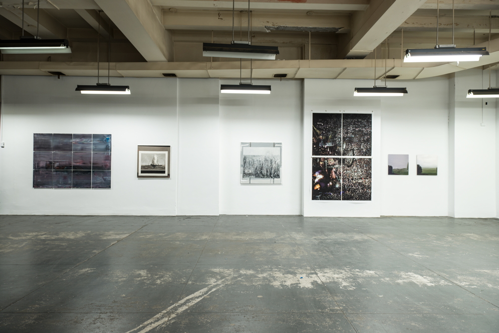
Chop Shop installation shot at SPRING/BREAK 2016, in the vault on the 3rd floor of Moynihan Station, image: Tamas Banovich
I am psyched to announce “Chop Shop”, a show of my work at SPRING/BREAK 2016. SPRING/BREAK’s keyword this year is ⌘COPY⌘PASTE, which is probably what gave Magda Sawon the idea to approach me about a project. “Chop Shop” coalesced around several subjects and series that have appeared recently on greg.org: creative destruction; authenticity; artist’s agency; a critique of collectors, the market, and the networks art traverses; and the interactions between our digital, cognitive, and physical experiences.
In just the last few weeks, the show grew more ambitious and felt like the whole thing might just veer off the rails, but thanks to Magda and her people, the flexible and gracious organizers of SPRING/BREAK, and the expert assistance of some brave painters and printers, it all came together. And it looks absolutely mindbogglingly great, almost exactly the uncanny combination of spectacle, aura, and outrageous WTF? that I’d imagined. And to top it all off, it’s installed inside A GIANT, FREAKING VAULT.
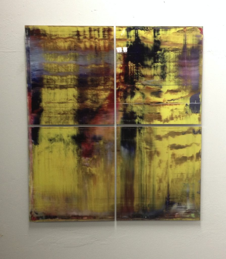
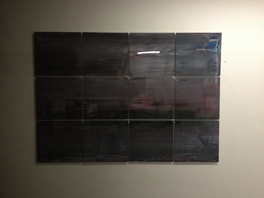
Chop Shop installation shot with Destroyed Richter Grid No. 4, Destroyed Richter Painting No. 8, Shanzhai Gursky Grid No. 1, and Destroyed Richter Paintings Nos. 12 & 11, image: Tamas Banovich
Every work in “Chop Shop” is something I’ve been imagining or visualizing for months, or sometimes even years, but which I had not experienced in person, until now. And this process of conceptualizing something, and then actually realizing it, and then experiencing it, is intensely satisfying to me. I look at tons and tons of art, not only online, but in person, too. And the differences between these experiences and the impressions they leave feel important. So it’s not just a nicety when I say I hope you will be able to see “Chop Shop” in person. [It runs from Tuesday March 1 through March 7.]
“Chop Shop’s” images are appropriated from the old masters, but its processes are lifted from collectors, dealers, and museum shopkeepers. The artwork on view has either already been destroyed, and brought back to life, or it’s about to be chopped up to order, or broken up and parted out.
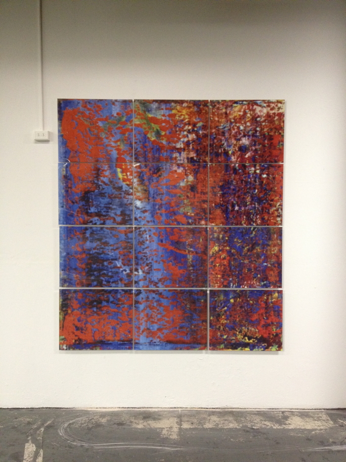
The show includes: new Destroyed Richter Paintings, which are full-scale resurrections of Gerhard Richter paintings that now exist only in archival negatives or jpgs. Some are of paintings the artist destroyed himself (after photographing them, obv), and some are of paintings that have been destroyed in the wild. In a nod to Richter’s own practice of transforming his paintings into photos, prints, or other media, some of the Destroyed Richter Paintings in “Chop Shop” are printed on aluminum panels. They are literally dazzling.
In another nod-or maybe it’s a critique wrapped up in an homage, it’s really too early to say-to Richter’s own destructive predilections, the Destroyed Richter Grid works transform [the jpg of] a lost squeegee painting into a set of prints on aluminum, which will be sold separately and scattered. Unlike Richter’s Facsimile Objects, which are produced in bulk, these grid pieces are each a lone, unique work, part of a whole that will only be visible together during the show. So Richter’s lost works stay lost, unless or until an enterprising curator in the future tracks all these panels down and reassembles them. And even then, what do we have, but a reconstituted jpg? We go to exhibition with the art we have, I guess.
Shanzhai Gursky No. 005, 2016, C-print, 185x303cm, will be destroyed in the production of Shanzhai Gursky Nos. 006 – whatever, 185cm x whatever, at Chop Shop
Shanzhai Gursky Grids are related to the Shanzhai Gursky series, which are produced full-scale from whatever the highest-resolution versions of Andreas Gursky’s images are available at the time. Except in this case, these new works, made for “Chop Shop,” will be themselves chopped and destroyed, with the fragments each constituting a new, unique work. Some are pre-chopped for your convenience, but others will be chopped to order, then properly mounted and framed for posterity. But the sight of these Gursky-looking works hanging, raw and exposed, naked, is just awesome. What a world, they make me think. What. a. world.
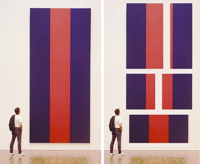
Study for Chop Shop Newman No. 1 and Nos. 2-6, 2015, jpg, but oh it’s real now, baby
Which brings us to the centerpiece of the show, Chop Shop Newman Painting No. 1, a full-scale repetition of Barnett Newman’s Voice of Fire (1967). It is literally awe-inducing, at least for me, and not just because I made it. [With conservation and materials research by the National Gallery of Canada, sage advice from David Diao, and the painterly talents of Tamas Banovich and Kyle Nielsen.] Newman made the 18-ft tall Voice of Fire to order for the 27-story geodesic sphere of the Expo67 US Pavilion. Chop Shop Newman No. 1 will be cut down into Chop Shop Newman Nos. 2 – ?? during the fair, with dimensions and compositions determined by the connoisseur collectors on a first-come, first-served basis. While supplies last.
There are so many variables and unknowns, and it’s crazy/fascinating ceding the fate of so much work to the hands of collectors-or to their indifference, if no one ends up caring, or engaging, or liking the stuff enough to take it home, which I suppose could happen. But it’s also immensely satisfying the way this show has me thinking through the systems of art, our expectations for it, and how we experience and value the world around us. So there’s that.
Destroyed Richter Grid 003 A-D, 2016, UV pigment on aluminum, ed 1/1, also DRG-005, the whole thing, Chop Shop installationDestroyed Richter Grid 004 A-L, 2016, UV pigment on aluminum, ed. 1/1, also DRG-006, the whole thing, installed at Chop Shop, Spring/Break
UPDATE: Reviews
“The outcome is a painterly concatenation of destructive and creative forces, capital’s relentless churn made both gestural and material.” [mostafa heddaya for artinfo]
“They look modest and a little scared. (Rightfully so: “Voice of Fire” (sic) lost its first chunk to an X-Acto knife on opening night.)” [jillian steinhauer for hyperallergic]
“Allen made an absurdist gesture by offering up fragments of copied masterworks of contemporary art for sale by the square foot, like pizza.” [chris green for afc]
At SPRING/BREAK see @gregorg ‘s brilliant install @magdasawon ; also Caroline Wells Chandler knitted figs on the way pic.twitter.com/gMDUKn2gD8
David Diao, Barnett Newman: The Cut Up Painting, 2014, 153x127cm, image: office baroque
I’ve known about David Diao’s productive engagement with the work of Barnett Newman for a while, but I was still pretty blown away to get the announcement in my inbox this morning for his show, Ref: Barnett Newman, at Office Baroque in Brussels.
Because holy smokes, he has The Cut-Up Painting. Sort of.
The story has been around for a while, but rather vague, about how Barney had instructed his wife Annalee to cut up a certain painting. It was finished, but he felt it wasn’t working. She hadn’t cut it up before the artist died suddenly of a heart attack in 1970, but she wrestled with it, and decided to fulfill his wishes. So she chopped it up.
And that night, the story goes, she had a dream, and Barney appeared and told her she was cutting him up. And she woke the next morning, distraught, and gathered all the pieces together, and had them reassembled and lined on a new canvas.
The result was what you’d expect, a Frankennewman, and the painting, or object, whatever it had become, was never shown. [Rumors circulated that someone else altogether, another painter, had destroyed, not an unfinished or rejected work, but an actual Newman. This kind of thing happens when a work is absent, invisible, missing.]
The first time I’d heard of The Cut-Up Painting discussed publicly was in a 2008 symposium at the Getty Conservation Institute. Carol Mancusi-Ungaro described the story as Annalee told it to her. It’s wild and unsettling, with a twist, when Mancusi-Ungaro says Newman had confided in her “because I’m a conservator, and because I’m a woman, and I could identify with this feeling, perhaps.” [The Getty put it on YouTube in 2012.] The Cut-Up Painting was not included in the Menil’s show of late Barnett Newman last year, even though it did include the unfinished paintings Annalee gave the Menil for study & conservation. Sarah Rich did discuss it, though, in an essay in the show’s excellent exhibition catalogue, which also includes texts and research by Michelle White and Brad Eply:
When she first undid this unfinished work, she [Annalee] was following orders, though her dream suggests she also understood the cutting to be a violation. When she had the painting put back together, her act of preservation was also a transgression. Annalee Newman thus uncovered, in her own way, the means by which a painting might host the contours of ethical deliberation (a subject essential to Newman’s own artistic praxis). With those cuts and their stitching, with the deliberations she conducted, deferred, acted upon, and regretted, Annalee Newman performed an experience in which duty becomes consubstantial with defiance.
And now here it is, in some form, at least. David Diao has made a painting of Newman’s Cut Up Painting, and it looks pretty close to the image Mancusi-Ungaro showed briefly at the Getty, so it’s not just an imagining. I am fascinated to see it. Now to figure out how to get to Brussels. Ref: Barnett Newman opens 27 Feb. and runs through 6 Apr 2016 at Office Baroque [officebaroque.com]
Office Baroque is also showing earlier works by Diao at The Independent NYC during Armory Week, so there’s one I won’t miss.
Early work, commercial work, disowned work, and destroyed work are not relevant to an artist’s work, except when they are.
Tiffany & Co. building on the corner of Fifth & 57th, c.1940 via nypl
I did not know that Bonwit Teller was owned by Walter Hoving, who bought it in 1946, and who also bought Tiffany & Co. next door in 1955. From the family. The store was in trouble, and he turned it around, turned it into the Tiffany’s we know today. Hoving was a crack retail guy. His son Thomas became director of the Met. Hoving had Bonwit’s window dresser Gene Moore take over Tiffany’s windows, too. Bonwit’s had 16 windows on Fifth Avenue & 56th St. Tiffany’s had two on Fifth and three on 57th.
Bonwit Teller building, 721 Fifth Avenue, on the corner of 56th Street in 1956. Destroyed by Donald Trump.
Dali did some Bonwit’s windows in 1938. Duchamp did a window display for Brentano’s to promote Breton’s book in 1945; it had to be moved to Gotham Book Mart. Here is a long discussion of shop windows, Benjamin, flaneurs, and capitalist spectacle. [Brentano’s was Scribner’s before, and is a Sephora now.]
Robert Rauschenberg and Susan Weil did windows for Moore at Bonwit’s. And Rauschenberg and Johns did after that. Here is the set of amazing blueprint monotypes Bob and Jap did for Bonwit’s in 1955, which Gene kept. [1955 was also when Warhol started doing Bonwit’s windows.]
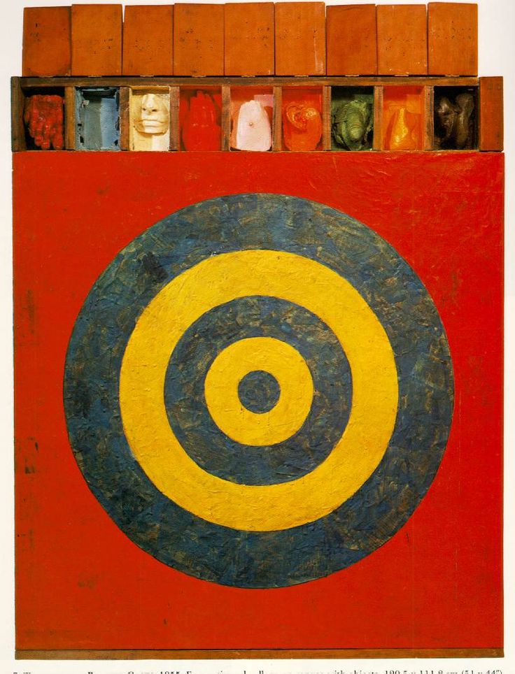
I’m going into this now because I finally got a copy of Gene Moore’s 1990 coffee table memoir, My Time At Tiffany’s, and it talks about the artists he worked with, and how he was the first window dresser [he preferred “window trimmer”] to give artists credit. And how he also showed their “‘serious’ work,” with credit, a rental fee, and no commission if it sold. And he has a chronology of all the windows he did for Tiffany’s. Target with completely unrelated and painted Plaster Casts, why do you even ask?, 1955
So here are all the Tiffany windows Rauschenberg and Johns did under their pseudonym, Matson Jones, and what Moore said about the projects and working with the artists. jan 2017 update: via an interview in the Observer, Tiffany’s current VP of visual merchandising Richard Moore [no relation, apparently] has released four previously unpublished images of Matson Jones windows. They’re added and noted below.