
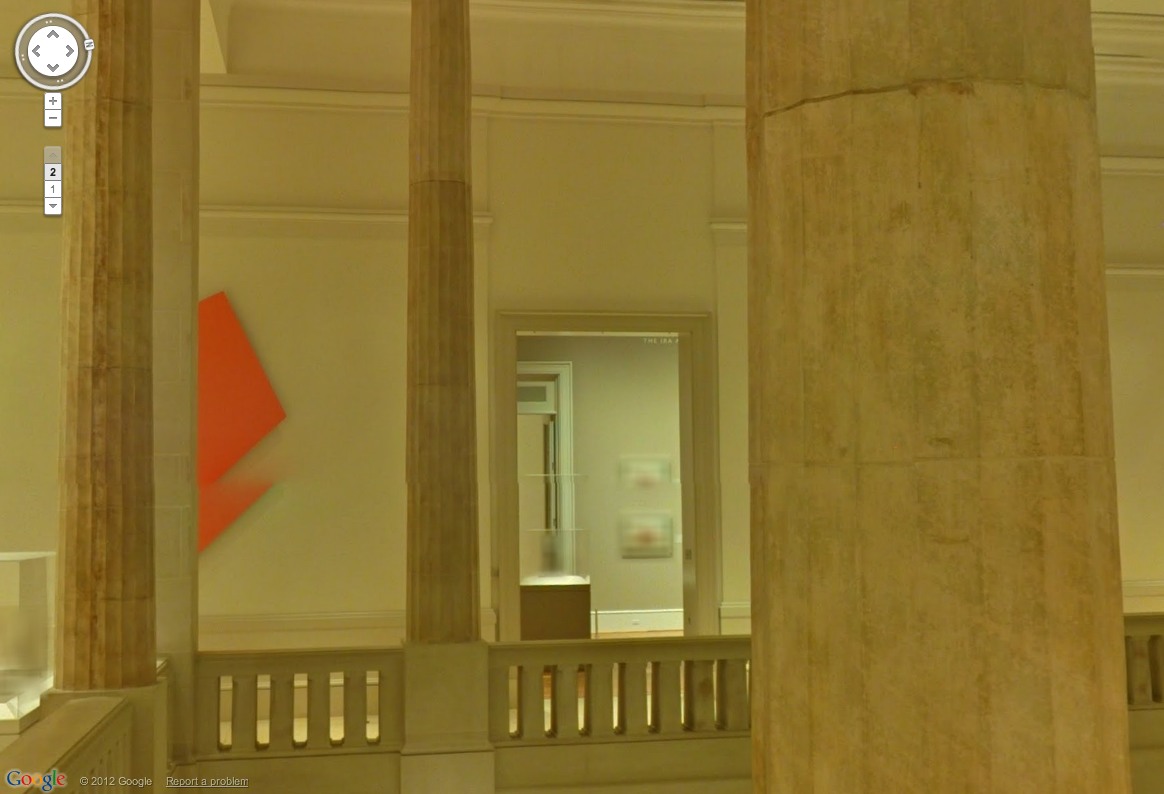
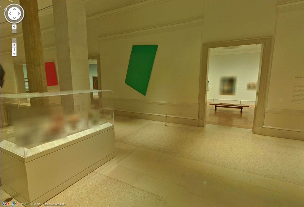
MoMA’s not the only museum on Google Art Project to show works by artists living–or recently dead. The Art Institute of Chicago’s stunning Sculpture Court is right there, too, with nothing less than Ellsworth Kelly’s Chicago Panels, six monumental, shaped aluminum paintings from 1989-99. And they look fantastic.
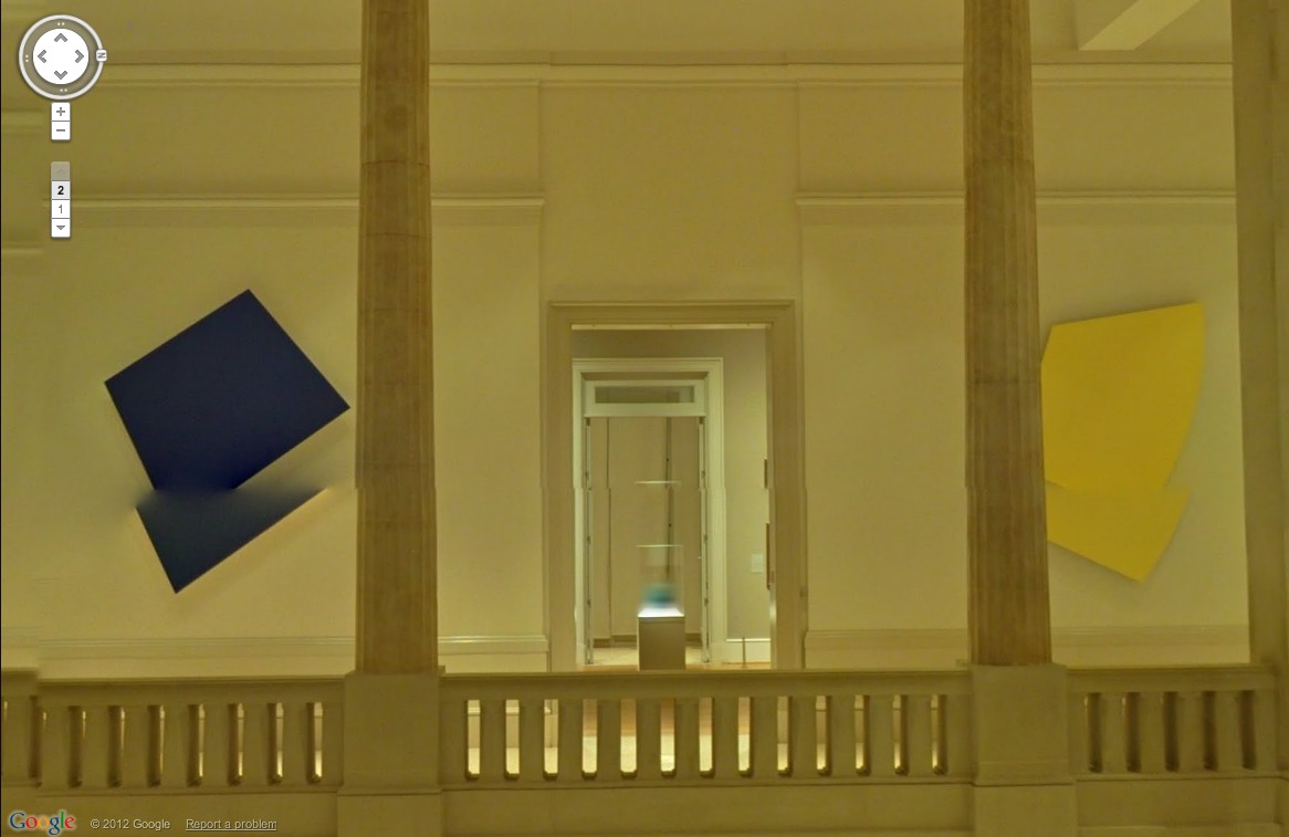
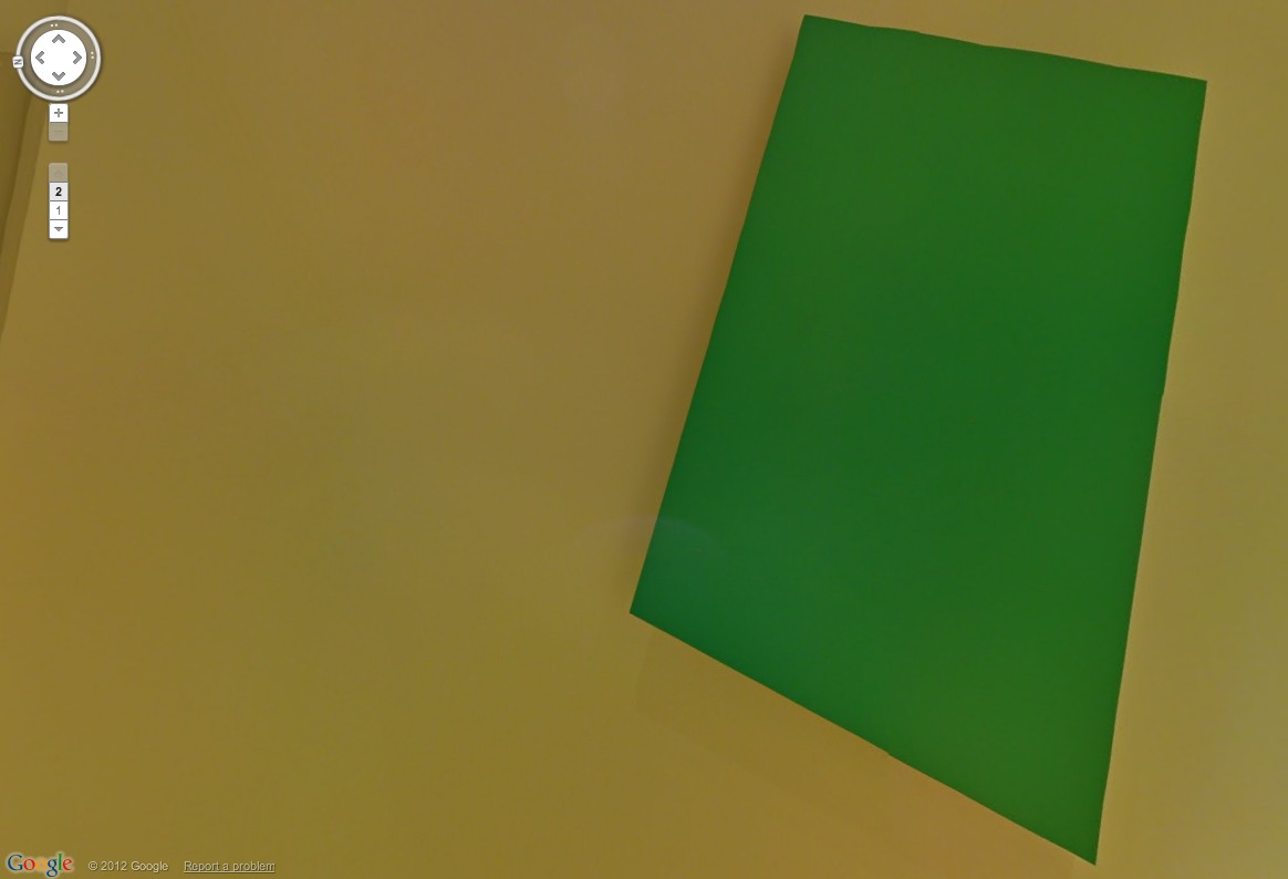
Their geometric precision makes Kellys almost ideally suited for marking Google’s pano distortions. I love this double Kelly. How would that even exist as an object? Maybe we should get Bob Irwin on the horn.
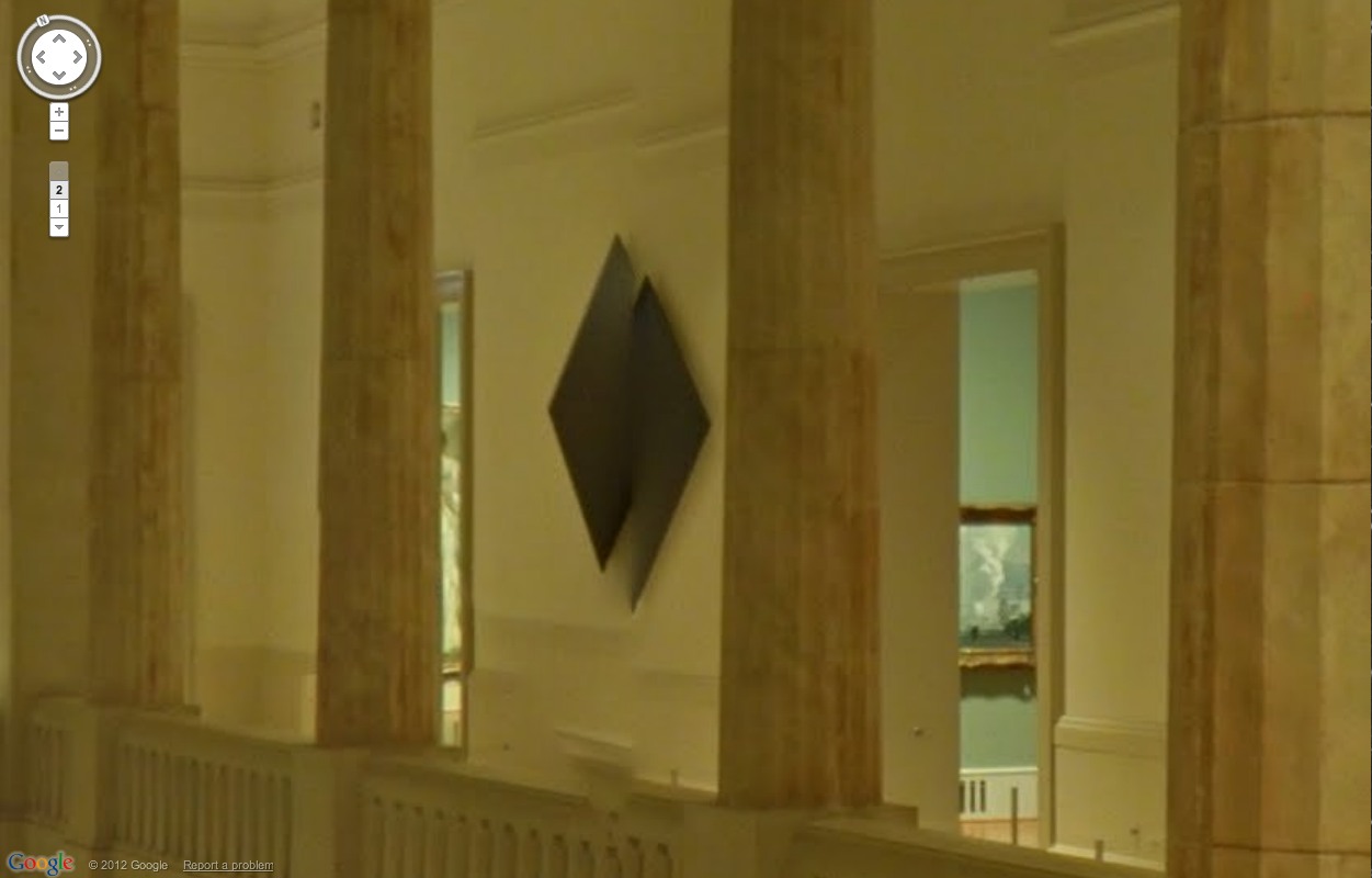
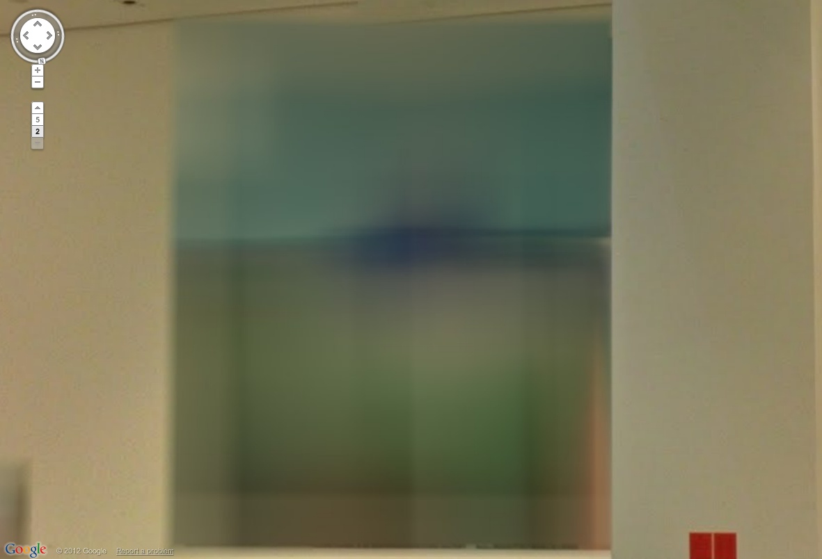
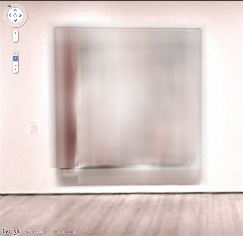
Even when they’re not unevenly stitched, a Kelly in a Google Museum View pano is still distorted. Just tilting around inside a single pano sphere, you can watch the painting’s dimensions pulsate and shift.
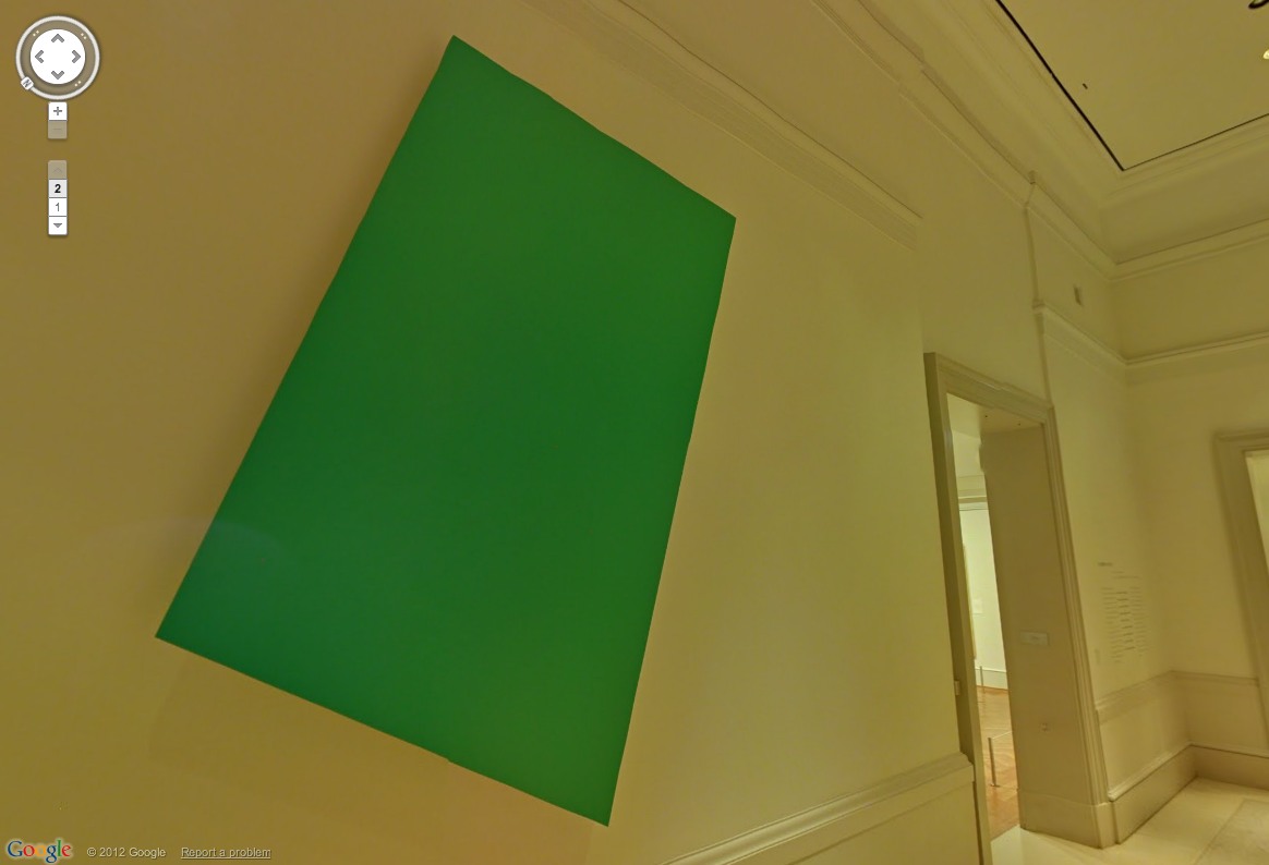
On Google, the kind of perceptual, perspectival changes a shaped Kelly goes through as you move around/along/towards/away from it now happen while you’re standing still [sic], or whatever the term is for not warping to the next spot. This is what our art looks like on Google.
And this is what our culture looks like on maximalist copyright. Any questions?
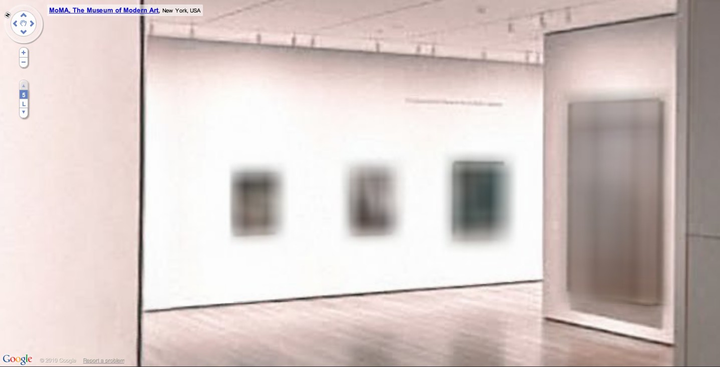
Just in these tchotchke-filled vitrines alone, the Art Institute may actually have more blurred out objects and paintings on Museum View than MoMA. Here’s what we cannot see: products, design, ashtrays and pots.
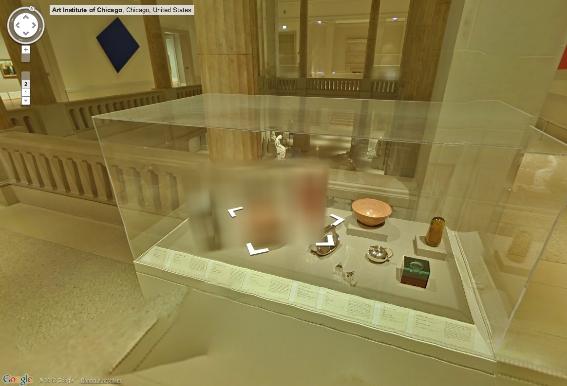
For these vitrines, I have to wonder if they just decided that clearing all these doodads from 20+ designers and their estates/mfrs was too much administrative work.
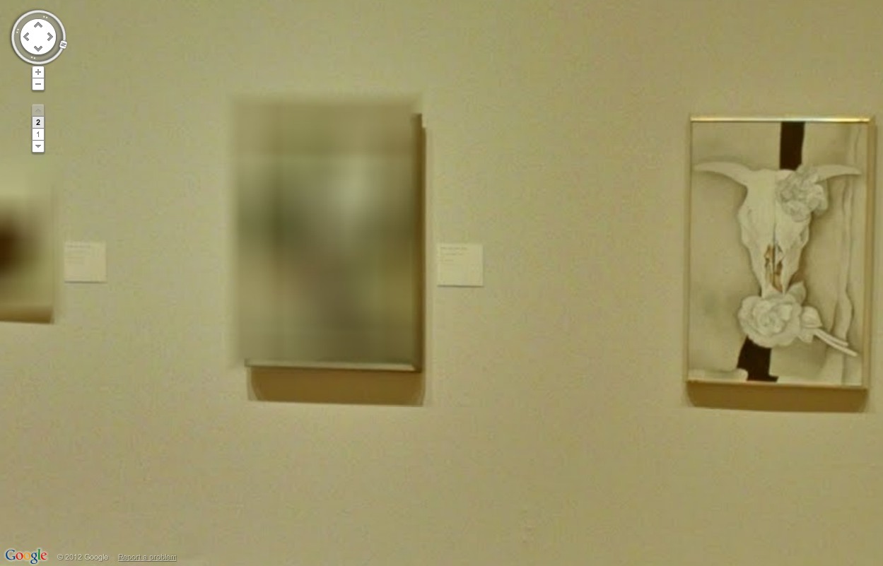
The spotty blurring in the Georgia O’Keeffe exhibit, though, indicates that something else was clearly afoot. It looks like the museum has repro rights for some works, perhaps those in their own collection, but not for others. Or maybe the Estate didn’t give permission for some subset? Loaned works?
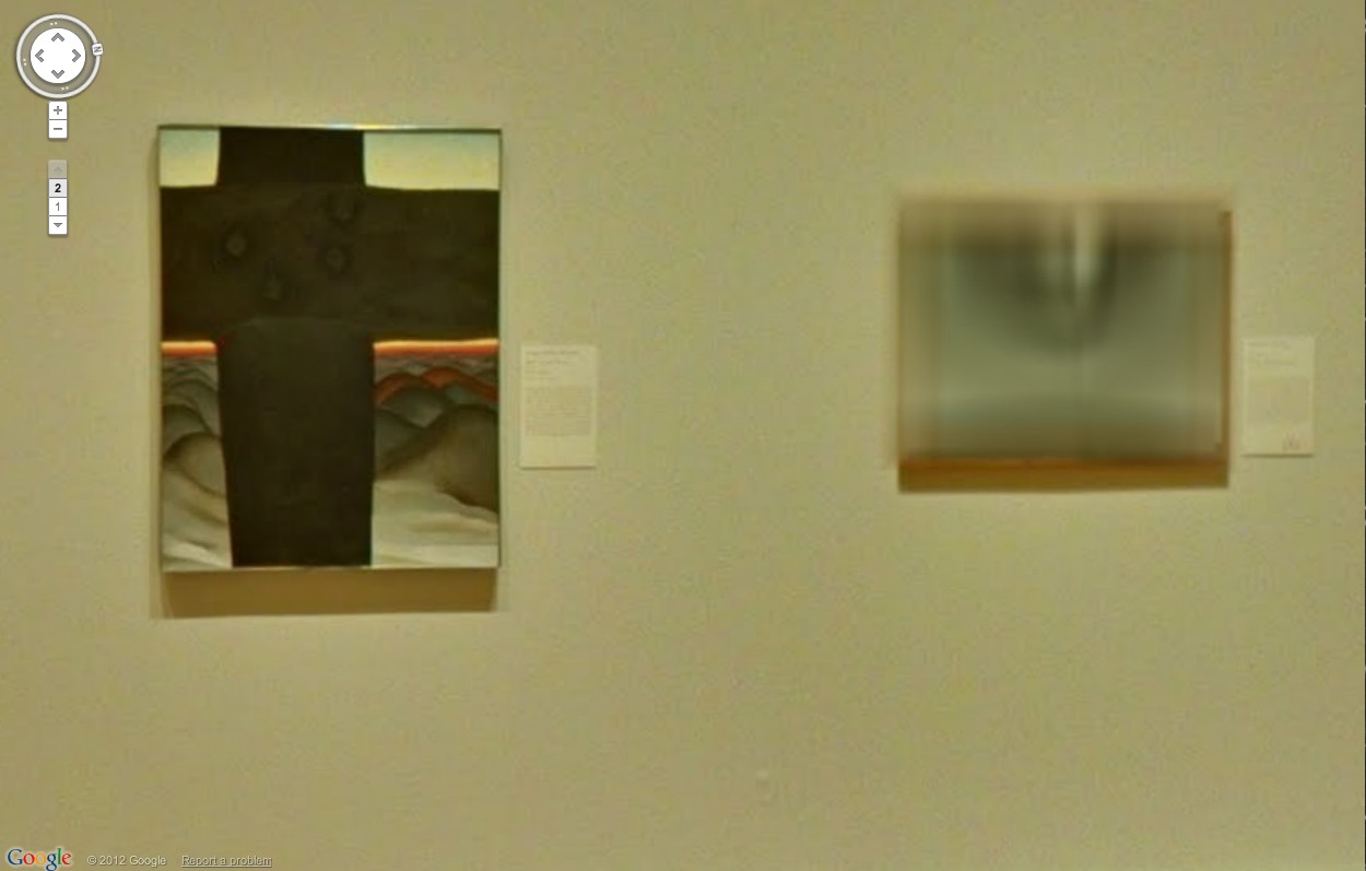
Including this probable landscape, which, hey, goodlookin’, I’ll be back to paint you up later. [update: it’s Abiquiu Sand Hills and Mesa, 1945. Interestingly, it’s from a 2002 gift–many of the AIC’s O’Keeffe’s came from the artist herself or Stieglitz–and it’s one of two listed online as being “© Georgia O’Keeffe Museum.” With no image, even a thumbnail, on the Museum’s website. I think we have our explanation.]
Here is a 94-year-old Paul Manship sculpture [and pedestal], now, thanks to Google and the Manship Estate, remade very much for our time.
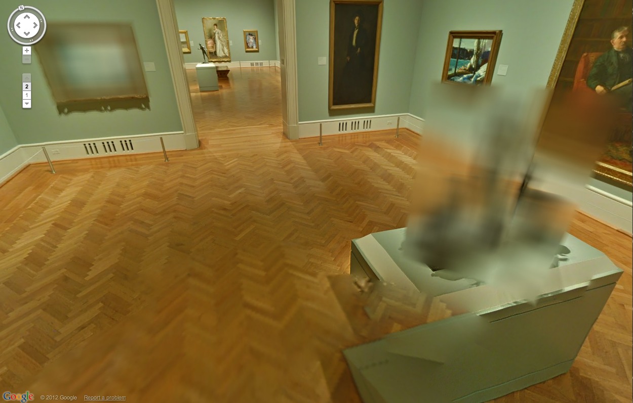
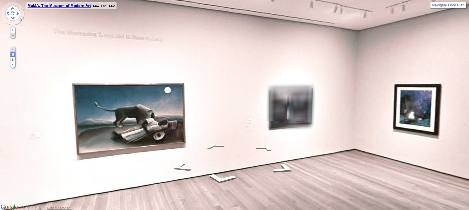
Now you know I love the blur, but even so, this shot actually kind of bummed me out. O’Keeffe hung on until 1986, but every other artist in Gallery 271, the Early 20th Century American gallery, has been dead for more than 40 years. I guess we should be glad Kelly was still alive to give his permission, because it looks like the estates put that kind of thing on lockdown. Or on the meter. [Not you, grandfils de Lachaise!]

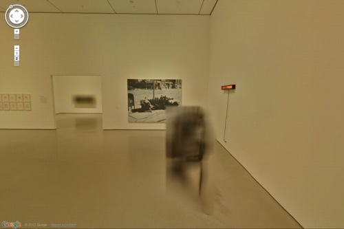
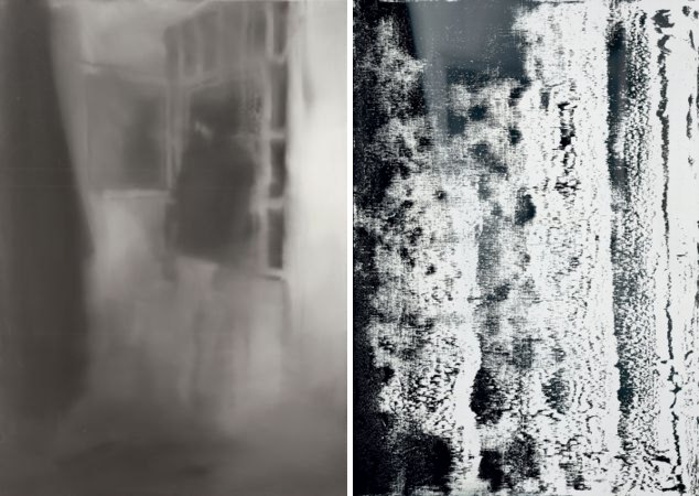
Here’s an awesome but depressing view from Postwar, Gallery 262. I can’t figure out the far left, but there’s Jacob Lawrence, Ilya Bolokowsky, and Beauford Delaney on the wall there.

The unblurred Lawrence is nicely reflected in the plexi on the–seriously–blurred out Herman Miller table by Isamu Noguchi.
Previously: Blurring of Google Art Project comes as no surprise
Google Art Project v1.0: Les Blurmoiselles d’Avignon [Feb 2011]
Blurmany and the Pixelated Sublime [Nov 2010]
Tag: blur
Blurring Of Google Art Project Comes As No Surprise
It looks like Les Blurmoiselles d’Avignon have some company.
The Google Art Project has released a new batch of 134 museum participants, bringing the total to 150, though only 51 institutions are offering Street View Museum View. And a couple of those, like Tate Modern and the Crystal Palace at the Reina Sofia, have basically no art, just space. [Tate Modern Museum View rather brilliantly drops you into the Turbine Hall, facing a blank temporary wall. ]
But if any museums besides MoMA gave to deal with living artists, or works still under copyright, I haven’t been able to find them. And so MoMA wins this round for adding a rotating show–Kathy Halbrecht’s contemporary installation in the 2nd floor Kirk Varnedoe Galleries [I am calling them this forever now, btw]–of contemporary art, thereby demonstrating that living artists are easier to get clearances from than estates.
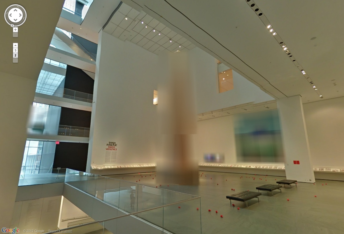
Most of them, anyway. Fortunately, there are some exceptions, and they look awesome cloaked in Google’s Blurmany-style algorithms. Oh the first really is the best, too. Sanja Ivekovic apparently didn’t sign on to have her atrium installation, Rosa of Luxembourg become Rosa of Luxembourg of Google Art Projects.

Lady Rosa of Luxembourg (foreground), with the Gëlle Fra (background). Photograph by Christian Mosar. Courtesy Casino Luxembourg–Forum d’art contemporain , via moma.org
The monumental column is nice, of course, but the colors on that giant photo are utterly fantastic. That’s the first one I’ll paint.
Also, is the Bell & Howell helicopter over the staircase blurred out, too? Is that a fluke? Anyway, stepping back into the Varnedoe Galleries…
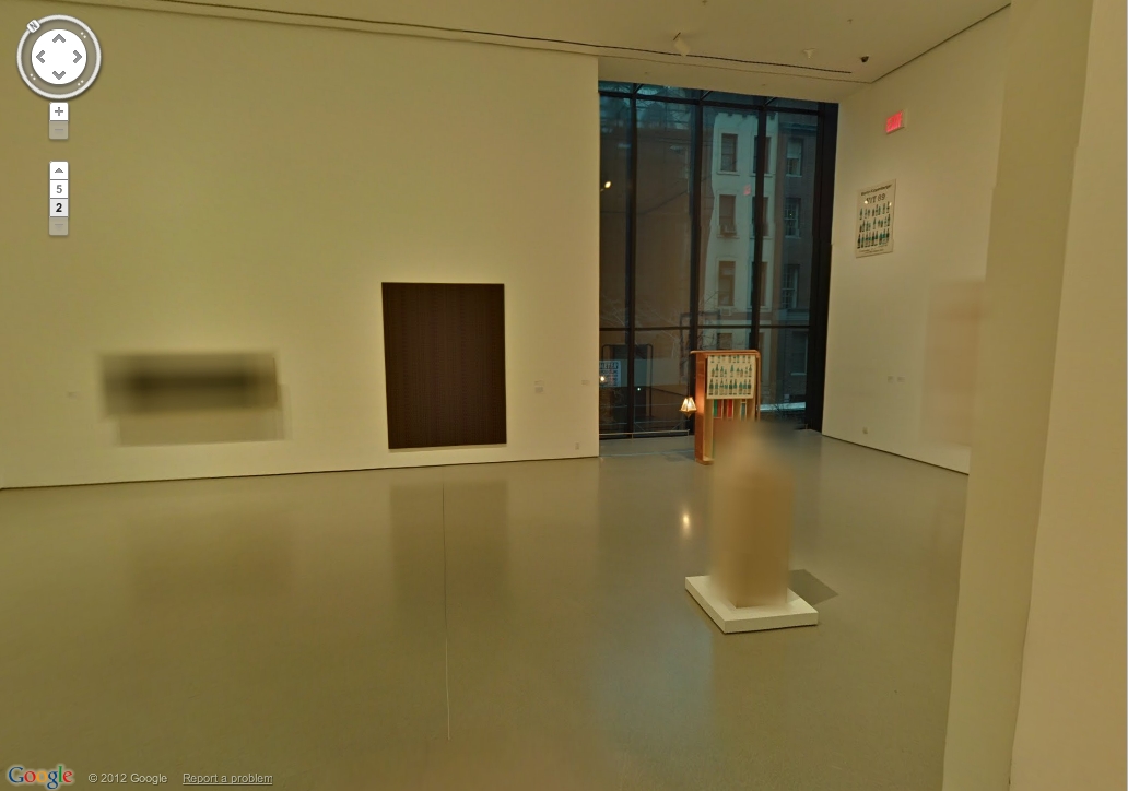
Still waiting to hear back on this one. I can’t remember what it was, though from this angle, it looks like the bastard lovechild of Louise Bourgeois and Gerhard Richter raised by Thomas Houseago. Of course, after a speculative mashup like that, whoever it turns out to be will almost inevitably disappoint. Sorry, artist. That’s a Reinhard Mucha in the back, though.
And when you head back there, both the Georg Herolds are also blurred. For a moment. Because you take another click/step, and they’re not. The blur disappears. It’s an unexpected reveal as Google’s sheets of virtual ribbed polycarbonate clatter to the ground.

Or is it like that stuff on the facade of the Issey Miyake Pleats Please store in SoHo? You’re walking along, blur blur blur, and then you align with the material, and for an instant, you can see in. At least, in this case, for one pano. I suspect this is an oversight, so go try it quickly.
And no offense to Herold, because his underpants dome is quite fetching, but I’d totally get one of those LA acrylic guys to cast me one of these first:
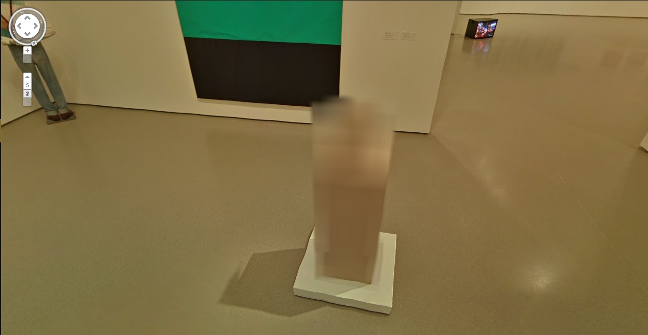
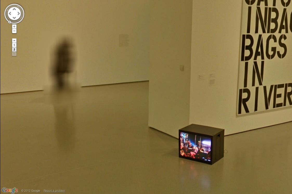
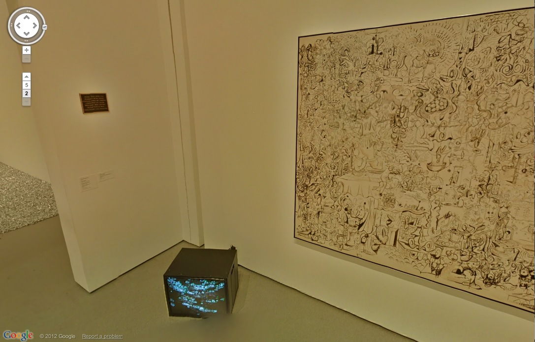
It’s like an ethereal Anne Truitt. Also, don’t you kind of wish that Kippenberger wasn’t turned to the corner, so Museum View could blur its face? Also, it’s interesting that the video monitor on the floor always has the same image in every pano. Was it on pause? Did they ‘shop it in? Does it unsettle you, too, to have the simulation of moving through space without the simulation of moving through time? That is so Street View.
The Keith Haring mural and the Koons look great. [Which, Pace Prints just opened a show of another Haring mural, a unique silk screened scroll of his Blueprint Portfolio.]

Ahh, but we’re here for the blur. Ooh, a very nice double blur from George Condo [right, really?] and Jenny Holzer [left, really? REALLY? Did she maybe insist on the obscuring blur to promote her redacted documents-as-minimalist-paintings show at Skarstedt?]
But take another click forward, and the veil drops again, momentarily, whatever that means on GSV’s frozen timeframe.
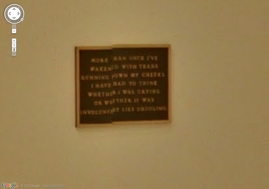
This is awesome, what the algorithm stitching this pano together did to this Holzer bronze plaque. Perfect, really, and such a conveniently discrete, little object. I think I could have that 3D printed before I have it cast.
Such Google Maps-generated anomalies are ususally site-specific by definition. And recreating them is entirely dependent on the alignment of anomaly, real space, and aesthetics. Like the piece I installed in Brian Dupont’s Extra Gallery last fall which translated the [fortunately] misaligned Street View seam running through their window into real space.
As Google Maps gets more hi-res, these noticeable differences between the real world and its corporate map simulacrum will diminish, if not disappear altogether. So it seems important to map them, or at least to note them, and to be able to read them while we can.
MoMA Museum View [googleartproject]
Previously: les Blurmoiselles d’Avignon
Blurmany and the pixellated sublime
LLOLZ On Gerhard Richter’s Annunciation After (A Postcard Of) Titian
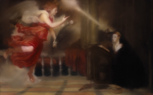
Annunciation after Titian, CR 343-1, 1973, collection Hirshhorn Museum, image: gerhard-richter.com
I confess, I love Gerhard Richter in the 70s. Here are some of the best/funniest excerpts from a interview he did with art historian/curator Gislind Nabakowski that was first published in Heute Kunst in 1974. The subject was Annunciation after Titian, a series Richter painted in 1973, after visiting Venice in 1972 for the Biennale.
The first in the series, above, is in the Hirshhorn’s collection. The series has not been shown together since it was first exhibited in 1973 at the Galleria la Bertesca in Milan.
GN:What made you choose a fifteenth-century painting as a model and create a sequence based on Titian’s Annunciation?
GR: Because there’s something about this painting, or any painting, that grabs me if they’re good–irrespective of the impact they had at the time, why they were made, the story behind them. I don’t know what motivated the artists, which means that the paintings have an intrinsic quality. I think Goethe called it the “essential dimension”, the thing that makes great works of art great.
I beg your pardon?!
Continue reading “LLOLZ On Gerhard Richter’s Annunciation After (A Postcard Of) Titian”
On Man-Made Painting After Google
I haven’t yet decided whether to more proactively engage the growing numbers of people who use Google as medium or subject for their artmaking, or to forge ahead alone, buoyed up by the certainty of my own unequaled, Googly aesthetic and conceptual brilliance.
detail of Reconciliation (after @gregorg after thompson after allen [maybe])…
CanvasPeople® probably non-archival inkjet print on canvas
11″ x 14″
2012
Signed Edition of 1 (+ infinite unsigned APs), POR
But then Man Bartlett comes up with a sharp, funny project that turns out to relate directly to my lingering anxiety over what I think of, what I make, what I try to get out there, and how well [or not] I do it.

study for Untitled (After Google Art Project, les Demoiselled d’Avignon), 2011
So last year–a year ago today, in fact–my immediate reaction to the launch of the Google Art Project was to zoom in on the blurred out paintings that MoMA hadn’t gotten copyright clearance for–including les Demoiselles d’Avignon and several other iconic Picassos–and to suggest they must now be painted as Google had–there’s no other word–overpainted them.
And then last month, I see that an artist named Phil Thompson had sent screengrabs of the blurred paintings to one of those Chinese painting factories, and has now unveiled the work as his Copyrights project. Which is fine, if not at all how it should be done I’d do it.
But which nonetheless made me tweet about the twinges of annoyance caused by my no-doubt outmoded sense of authorship and originality:
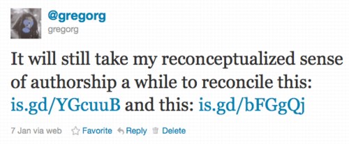
Which prompted Man to take a screenshot of my blog post, pixel-blur everything but the blurred Google Art Project image, and order a print-on-canvas of it. AND a Chinese painting mill cover version. All of which are for sale, and which are hilarious. Though I will let him reveal the Chinese copy in his own good time. It really is awesome.
Reconciliation (after @gregorg after thompson after…) [manbartlett.tumblr.com]
Previously, painfully related, feb 2011: les Blurmoiselles d’Avignon
nov 2010, because it really does come back to Richter, it seems: Blurmany and the pixelated sublime
Overpainted Gerhard Richter Painting
Joerg tweeted last night about a “[DESTROYED]” 1982 Gerhard Richter candle painting, and heeyeahsure, I’ll look at that.
It turns out though, that the artist’s own term is not entirely accurate. Because according to his website, the painting, 2 Candles 1982, (CR 499-3), still exists: “Richter painted over this work in 1996. The painting is now entitled Abstract Painting (CR 837-4).”
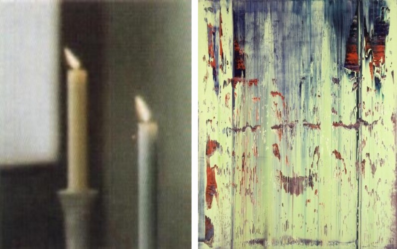
l: 2 Candles, 1982-96 state; r: Abstract Painting 837-4, 1996-, images via gerhard-richter.com
Which would be interesting enough if it were a one-off thing. And no, it appears that Richter has not painted over any of the 73 other paintings listed as “[DESTROYED]”. But by 1996, he had already been painting on photographs for a decade. In 1989, in fact, he produced two editions of candle images overpainted with squeegees.
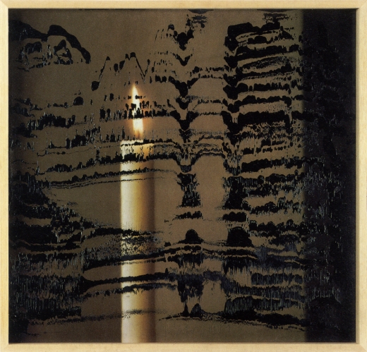
Candle III, 1989, ed. of 30+10, image: gerhard-richter
There are at least a dozen other such editions since then which combine photos or photoreproductions and squeegeed abstract overpainting. They constitute a persistent connection between the two seemingly diametrically opposed bodies of Richters’ work: photo-based representation and so-called aleatoric, or mechanized, gestureless abstraction. It’s a dichotomy that continues to stump even the illustrious Benjamin Buchloh, who laments while writing, at great length, in the latest Artforum: “The question posed over and over again (and which has basically remained unanswered) was how these photographic images could be related to the emerging works of abstraction.”
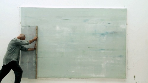
But my bigger point here, which Buchloh also cursorily notes, as does anyone who’s seen Corinna Belz’s film Gerhard Richter Painting, is that overpainting is central to Richter’s abstract practice. In these stills from the scene that appears in Belz’s original trailer, Richter very thoughtfully creates classical gestural abstractions:
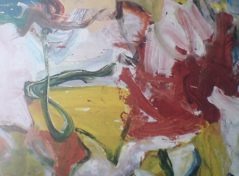
Which remind me of nothing so much as the great, underappreciated-until-just-now, large-scale paintings of Willem de Kooning from the mid-1970s.
It’s one of the main reasons I hustled back to MoMA to see the de Kooning show on the last day, after seeing Belz’s film, and after getting both the Richter and de Kooning catalogues for Christmas. Because these amazing wet-on-wet structures that Richter laid down
felt almost like reincarnations of some of the virtuoso brushstrokes de Kooning made in 1975 paintings like Screams of Children Come from Seagulls [check out this dark blue, sideways L from the upper right quadrant, for example]
or the single, epic loop at the center of the Art Institute of Chicago’s Untitled XI (1975):
And then when they’re just right, Richter takes his squeegee to them. As if getting erased by Rauschenberg wasn’t enough.
But–oh man, I really did just mean to do a quick, “ooh, look, overpainted Richter!” post here–but this is the thing that bugged me so bad about Buchloh’s reading: his extraordinarily limited range of references in discussing Richter’s work. I mean, it’s basically Johns and Stella [Stella!]. And he dismisses Johns on false pretenses. And doesn’t mention de Kooning once.
Here’s what Buchloh got from Belz’s film–WHICH HE WAS IN: some kind of Surrealist theatrical something or other:
Starting the production of each canvas with strange rehearsals of various forms of gestural abstraction, as though moving through recitals of its legacies, in the final phases Richter seems literally to execute the painting with a massive device that rakes paint across an apparently carefully planned and painted surface. Crisscrossing the canvas horizontally and vertically with this rather crude tool the artist accedes to a radical diminishment of tactile control and manual dexterity, suggesting that the erasure of painterly detail is as essential to the work’s production as the inscription of procedural traces. Thus an uncanny and deeply discomforting dialectic between enunciation and erasure occurs at the very core of the pictorial production process itself, opening up the insight that we might be witnessing a chasm of negation and destruction as much as the emergence of enchanting coloristic and structural vistas.
Alright, so maybe it’s not that wrong. No, it is, because after 20 years working on layers and layers of paint with that “crude tool,” Richter has proved, I think, that he has all the control he needs.
Just as Rauschenberg’s erasing were not negation, but creation through another type of mark, I think Richter’s squeegee strokes are generative additions to, not killers of, the rich repertoire of markmaking techniques he inherited. Maybe it took Belz’s film to show how tightly the squeegee marks are linked to Richter’s body and movement. They don’t diminish, but magnify; they’re full-body gestural abstraction.
For a great illumination of the specifics of Richter’s abstract production, I keep going back to Tate Modern conservator Rachel Parker’s discussion with blogger Mark Godfrey during the Panorama show:
If we think about the very large scale of Wald 3, we must consider the logistics of one man making this painting. Although Richter probably dragged the squeegee across the wet surface in two separate applications this process must have demanded enormous physical energy. The two resulting squeegee tracks are obvious: one track extends from the top to about 5/8 of the way down the painting surface and the other starts just below this. It would appear that Richter applies the squeegee first to the left side of the work and then drags it from left to right: with both tracks he appears to stop ¾ of the way across for a rest before completion. You can also tell exactly when the momentum of dragging the squeegee across the very tacky surface began to slow down as the drag marks become more shallow. The upper track is characterised by the squeegee having embedded itself more deeply into the paint resulting in slightly sharper surface disturbances and deeper excavations. The lower track has glided more fluidly across the surface creating lighter disturbances. There is undoubtedly an element of chance in the results of this technique: the first track will bear most influence on the final composition whereas with the second track, Richter tries to replicate the same direction, speed and weight behind the squeegee to re-create the same marks in the paint. The compositional balance between track 1 and track 2 in Wald 3 exposes Richter’s trust in his materials and intuitive craftsmanship.
I’ve got more bone to pick with Buchloh’s analysis, which ultimately fails to convince because it seems so disengaged, so cut off within the hermetic, Richterworld bubble. But maybe later.
Because Parker and Godfrey make a very persuasive case, I think, for some of the implications of Richter’s overpainting,. In this case, they discussed SFMOMA’s 1999 Abstract Painting (CR 858-6) [above] on aludibond panel:
Richter has applied his paint in a similar manner as before, manipulating the paint with a squeegee when the paint is very newly applied, hence its fluid character…Once the paint has dried Richter has taken a sharp wide-head palette knife and gouged and scraped features out of the paint layer, exposing the paint-stained white preparatory layer beneath. The technique creates a hallucinatory effect (are the shapes portals or are they solid elements floating in a multi-dimensional composition?).
These underlying paintings aren’t destroyed; they just become something else.
UPDATE: Alright, I’m righter than I knew. There are at least three more overpainted paintings.
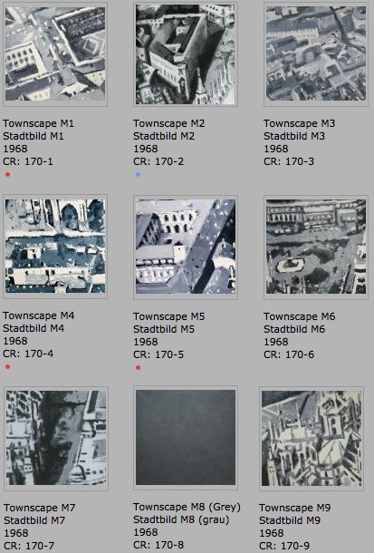
Stadtbild M1-M9, 1968, rearranged into a 3×3 grid, image: gerhard-richter.com
The earliest known example is from the Stadtbild/Townscape series, from 1968. Richter first created a large, 2.7m x 2.7m painting based on an aerial photograph of the center of Milan, which he then cut into nine nearly square paintings, numbered M1-M9. Townscape M8, however, he painted over with grey [above]. Joe Hage, the collector/technologist/uber-groupie behind Richter’s website notes:
Townscape M8 depicted what was presumably a detail taken from the same source photograph and was painted over with grey paint later.
…
The series Townscapes M1 up to M9 illustrates Gerhard Richter’s engagement in the process of abstraction: starting from a concrete depiction, which was enlarged at first and then cropped, the final image can barely be traced back to the source photograph. The numbering of the single parts of the painting, which do not relate in any way to their initial positions in the original large format, also suggests that any kind of identification is less important to Richter than the painterly process of abstraction.
So in this case, at least, there is currently only the presumption of underpainting, based on the series, the title, and the procedure of its making.
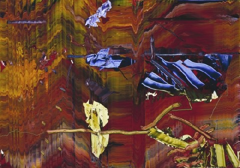
Hanged and Blanket, both 1988, via gerhard-richter.com
The next example, though, is the opposite. While painting his October 18, 1977 series in 1988, Richter made two identically sized versions of Hanged [above, left], only to partially paint over one and retitle it, Blanket, after the blurred photo-based image that remains visible under the squeegee. The CR numbers show that Blanket [680-3] was completed some time after Hanged [668], with at least two dozen squeegee paintings in between [including two “[Destroyed]” works]. After evoking the “function of a curtain in art history: a painted curtain indicates that a glance is allowed at something that should not necessarily be seen,” Hage’s note offers an interpretation of this overpainting: “It appears almost as if Richter wanted to shield the events from view, by painting over the second version of the painting almost completely.” Which would be true enough in isolation, but which seems to mean not considering the existence of the un-squeegeed version. Which is nevertheless blurred, as if there’s a continuum of obscuring and revelation.
The third example comes from the Spiegel story on Richter’s destroyed paintings. Ulrike Knöfel writes of a work
painted in 1990 [which] shows two young people standing in front of Madrid’s Museo del Prado, Spain’s national art museum. However, two years later, he painted over this work, turning “Prado, Madrid” into “Abstract Painting, 1992.”
There’s no Prado related work mentioned on the side, but there are two Atlas pages of photos from Madrid. I’m still looking through the 279 108 abstract paintings from 1992 to see if I can figure out which one it is. update from a few minutes later: no idea.
Powhida Street View
As they say in Blurmany, this is ucking awesome.
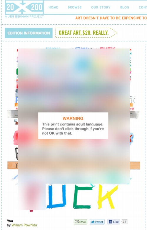
You, a new print by WIlliam Powhida at 20×200.com [20×200.com]
Previously: Google Art Project, or Les Blurmoiselles d’Avignon
Blurmany and the pixelated sublime
Google Art Project: The Making Of
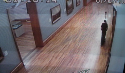
Now we’re getting somewhere. James Davis was Tate Britain’s pointman for the Google Art Project, and he gives an interesting behind-the-scenes account of getting locked in the museum with the Street View Cart overnight:
[It] seemed to me to be a marvellous combination of garden-shed and cutting-edge.
The trolley was not simple. It had lasers and cameras and GPS and all sorts. You could not stand in its view, for fear of being captured. Yet it could see you, left right, up down, back and forth and everywhere in between. So it must be operated by a squirrel (a trained man with a perfectly shaped back) who hides in its visual wake and guides it through the rooms.
Of course, Davis accidentally [sic] found his way into a shot. He’s the one with the blurred head.
Google Art Project: Behind the Scenes
Trolleys in the Gallery [blog.tate.org.uk]
Previously: Street View and “accidental” self-portraiture
Google Ramp View, Or My Google Art Project, Part 2
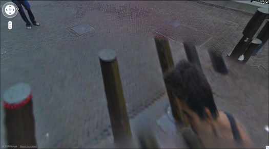
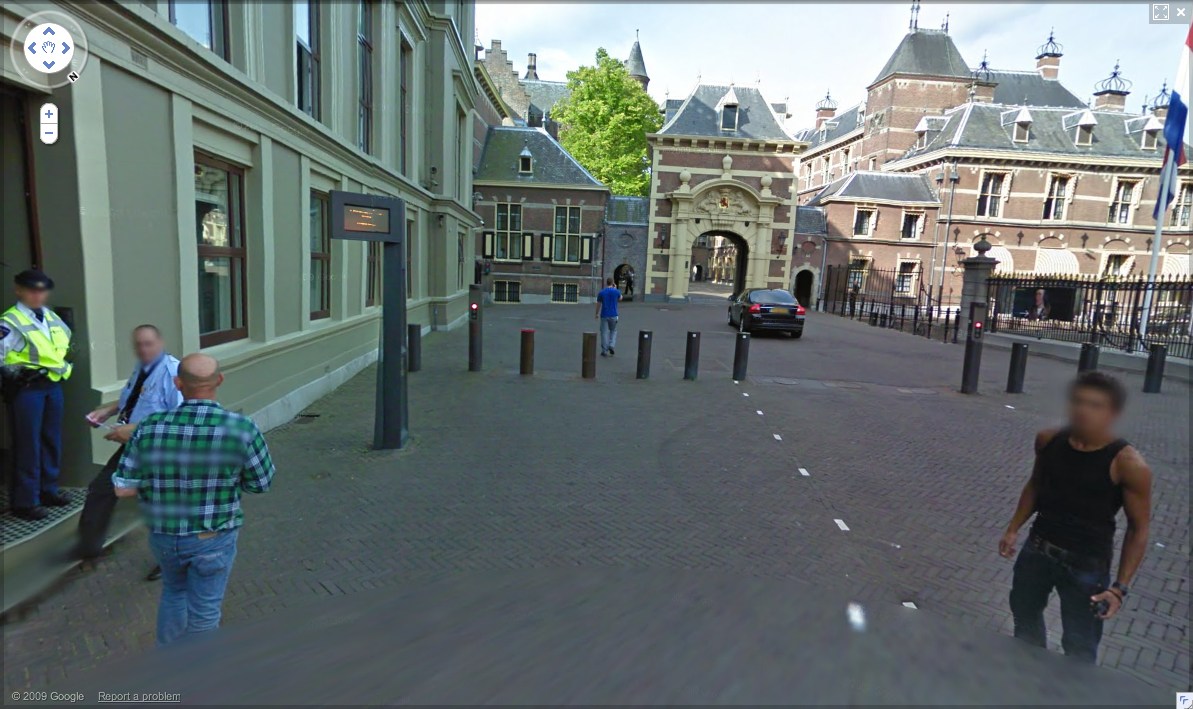
Sometimes I can’t tell when something is obvious, or when it’s just obvious to me.
But whichever this was, the idea came to me as soon as I figured out that the unidentified guy who was photographed at least 62 times in Google Street View’s mapping of the Binnenhof in The Hague was almost certainly a Google employee and not, in fact, a tourist who happened upon the Google Trike, figured out what it was up to, and followed along, quietly but persistently inserting himself into the company’s massively ambitious effort to map, photograph, and simulate the entire world.
Obviously, someone should quietly but persistently insert himself into the company’s massively ambitious effort to map, photograph, and simulate the entire world. And if the algorithms that stitch those panoramas together are going to erase everything but the top of that guy’s head, it might as well be me.
Google Trike and Google Guide at Kasteeltuinen, the Netherlands
Not to say that the Binnenhof Walking Man didn’t plan and execute his awesome portrait series–an inside job–but just to make sure, it’s important to re-create it by following a Google Trike somewhere. But where? Google’s been using the Trike as a non-threatening promotional tool, running contests to gin up excitement about where it should roll next. So anywhere the company would be likely to go on its own is already, by definition, a somewhat compromised artistic context.
And just angling to get your picture on Street View’s no good, either. There are plenty of people who ambush the Street View camera, or who react to or engage it, whether as an act of protest or “Look, ma, I’m on TV!” giddiness.
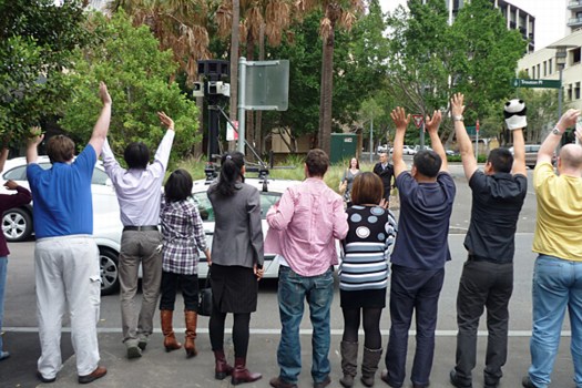
man with panda puppet, others waving at the Street View car in Sydney [via smh]
So it would need to be an art context. That’s a Google Trike no-brainer, or at least Google Trike-compatible. Ideally, it’s interesting in its own right, spatially, architecturally. If it had some spiraling and doubleback elements that could help replicate the atemporal incongruities of Walking Man’s walk around the Binnenhof. Is it obvious yet?
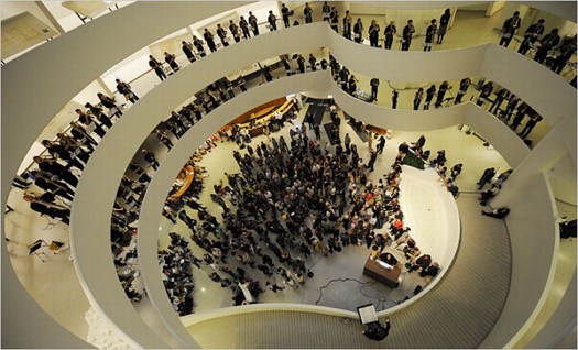
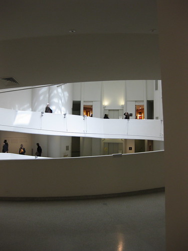
Henry Brant’s “Orbits” performed in the Guggenheim rotunda in 2009 [via nyt]
The real problem I saw for taking the Google Trike into the Guggenheim and up the ramp was neither logistics nor permissions. The Google Trike’s first outing was offroad, on far rougher, steeper terrain than Frank Lloyd Wright’s rotunda would offer. And the Guggenheim has obviously made itself available for artists’ productions, from Matthew Barney to Vanessa Beecroft to Francesco Vezzoli.
via newyorkinfrench.net
Even curatorially, the obstacles did not seem insurmountable. In 2010 Nancy Spector launched Intervals, a site-specific projects series that was inspired by, among other programs, Hans Ulrich Obrist’s Migrateurs projects at the Musee d’Art Moderne in Paris. In a 2009 interview Spector did with Sarah Hromack, she tapped one of my formative memories of the Museum:
SH: It’s a compelling space. Frank Lloyd Wright tucked many interesting details into the museum’s tertiary areas; they are so easily overlooked.
NS: The triangular staircase, for instance, is a beautiful space. It has been rarely used by artists-in fact only twice if I recall correctly: in theanyspacewhatever exhibition Douglas Gordon installed his phrases in the stairwell. And Felix Gonzalez-Torres installed one of his light strings in 1995.
She went on to describe Intervals as interesting artistic responses to “situations that could be perceived as marginal.” Forget marginal; there’s nothing more marginal than not appearing in the museum in the first place. I figured that the best way to execute Walking Man was to not exhibit it at all, but just to let it appear, and be found organically on Street View itself. No announcement, no press release, no opening; one day it’s just there to be discovered.
And that is where I was confounded. The biggest obstacle I saw was persuading Google to ever be interested in adding the interior of any building–even one as awesome and iconic as the Guggenheim–to Street View.
via keithbradley’s flickr
When I went to the YouTube Play event at the Guggenheim last fall, I’d discussed a bit of this with Spector, and later, when talking about the Binnenhof series with a Google PR, I floated the idea of bringing the Trike up the ramp. In retrospect, now that I know the Google Art Project was well under way, and Street View images from 17 museums were already in the can, her bemused and slightly cagey responses make more sense.
via rhino8888’s flickr
So now the idea’s out there, but the context is somewhat changed. Seeing the Guggenheim’s rotunda on Street View would now generate less surprise than it would have a couple of weeks ago. But the modernist, curved abstractions and planes would still make for the most spectacular interior on Street View. Better than Versailles, you ask? Well, let’s put the Gugg on there and find out!
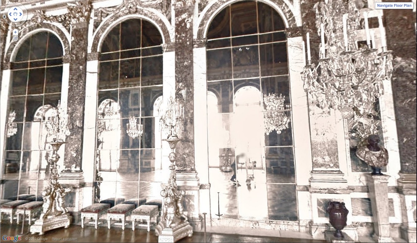
Oh look, there’s the guy pushing the Street View camera through the Hall of Mirrors!
And it really is and should be about the space. The other idea that seemed crucial to me was shooting the rotunda empty, focusing on the architecture [and avoiding the rights clearance issues that blurred half the artworks on MoMA’s Street View foray.] That means mapping while the rotunda is closed for deinstallation of a show. Have it full of crates, or workers–populate the panos with the staff themselves, make it a [blurred out] portrait of the Museum as an organization and a network as much as a space.
Anyway, that’s the idea.
My Google Art Project, Part 1A
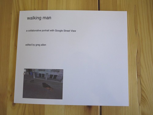
Here’s the introductory text I wrote last Spring for Walking Man – A Collaborative Self-Portrait With Google Street View. I made some proofs, but I’m still figuring out the best size. If I do decide to publish it, I may polish up the title a bit.
And I’ll probably revise it. Street View’s imagery and technique seems to me to turn a lot of critical thinking about photography on its head, but as much as the theoretical implications fascinate me, every time I start writing about them, I feel like a poseur.
As ongoing enhancements and even promotional stunts like Google Art Project affirm, Google executives are working to make Street View the primary tool for us “visual animals,” a browser for the physical world. Robert Smithson wrote about studying massive infrastructures like dams to discover “unexpected aesthetic information.” Google is creating the most massive visual infrastructure project right now, and it is chock full of unexpected visual information.
My Google Art Project, Part 1
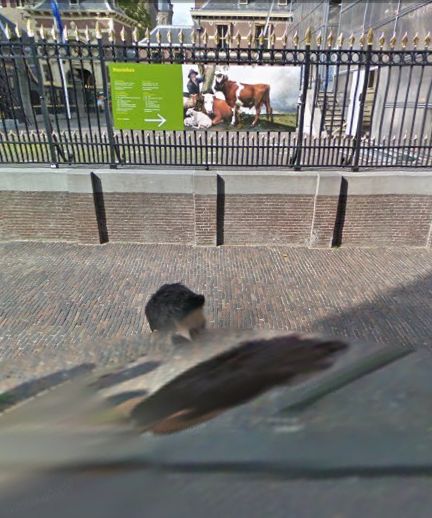
Last February, I realized that the subject of this awesome, distorted Google Street View portrait was not just a random pedestrian. Hundreds of thousands, if not millions, of people around the world have been photographed once by Google’s roving, robotic cameras. This guy appears at least 63 times.
binnenhof 01, all images 2010
‘The Excess of Unimportant Information’
Though to a guy making something called Atlas in his spare time it still probably feels pretty empty and limited, Gerhard Richter’s website is pretty expansive. Via Twitter, we learn that his web elves have just added a quotes section, most of which is taken from Gerhard Richter: Text. Writing, Interviews and Letters 1961-2007 (2009), the UK edition of the artist’s second collection of writings, both of which were edited by Hans Ulrich Obrist.
I was about to bit the bullet and buy the expensive, out-of-print The Daily Practice of Painting: Writings 1962-1993 when the new edition came out, and I’ve hesitated, waiting to see how or if the two volumes overlap. So far, I’ve seen nothing; I guess I’ll have to pigeonhole Hans-Ulrich at the next global 24-hr art lecture marathon.
Meanwhile, I went ahead and bought Gerhard Richter: Writings 1961 – 2007, the US edition, so I’m just a couple of days away from seeing whether this awesome quote about blurring from 1964-5 [!] is, in fact, on page 33:
I blur things to make everything equally important and equally unimportant. I blur things so that they do not look artistic or craftsmanlike but technological, smooth and perfect. I blur things to make all the parts a closer fit. Perhaps I also blur out the excess of unimportant information.
Les Blurmoiselles d’Avignon
Alright, this is kind of killing me right now, not just with its awesomeness, but because I have been planning to do a very similar project, and also because like half my blog these days could be called Google Art Project, and well…
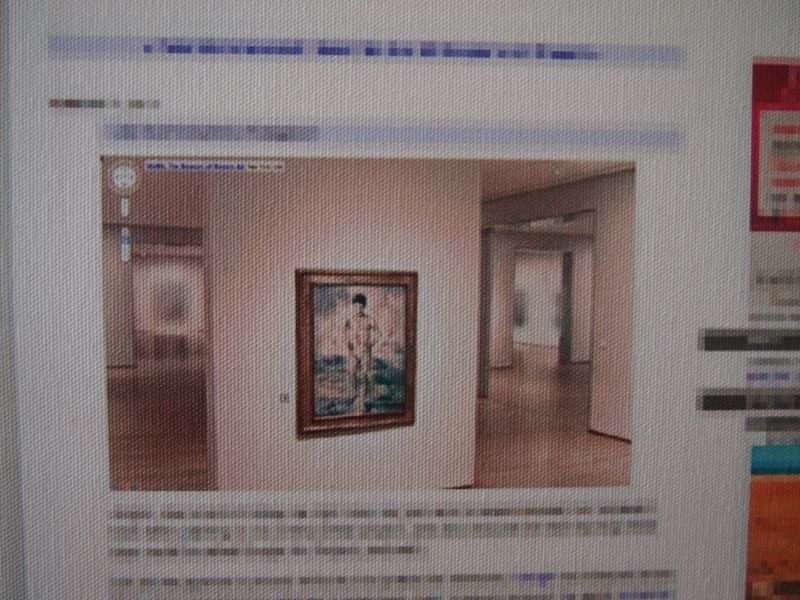
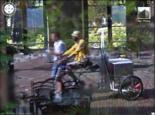
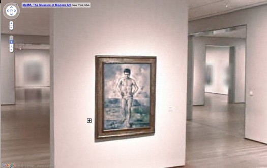
But let me agonize in private while we first praise the awesome. Google has released Street View-style navigation for galleries in seventeen major museums around the world, including the Museum of Modern Art. MoMA’s only got the lobby and one room on there, the first gallery on the fifth floor, which contains Cezanne’s Bather and Starry Night.
The resolution and color look awful, frankly, but who cares? It’s Starry Night as you’ve never seen it before–in an empty gallery. But still. Check out the background, what they had to do to all the artwork in the adjacent galleries, the stuff they didn’t clear the rights for:
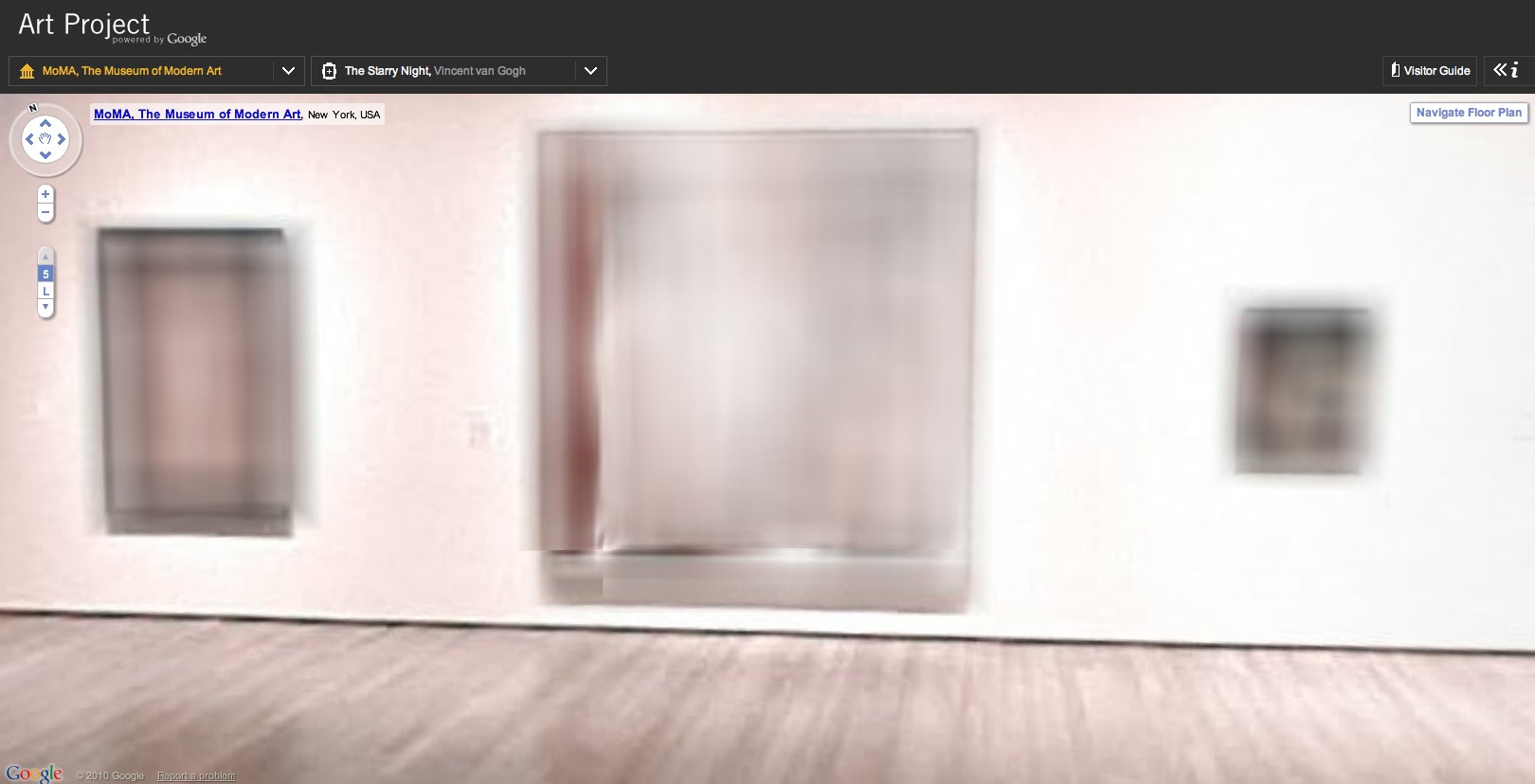
That’s Les Demoiselles d’Avignon there in the middle:
Which makes this, Picasso’s Boy Leading A Horse:
What’s crazy is that whatever’s hanging next to Rousseau’s Sleeping Gypsy is blurred out, too. By definition, it has to be in the public domain, right? 19th century? What is it?
The shoot for The Googlecam Was Present seems to have taken place almost a year ago; in the lobby, Marina’s still listed as “coming soon.” And they’ve rehung Gallery 1, there, so it’ll take a little flickrdiving to figure out what that was.
UPDATE: Thanks to MoMA scout Dan Phiffer, the work is identified as Edward Munch’s 1893 painting, The Storm.. [Munch died in 1944, so depending on which copyright regime applies, it may not enter the public domain until 2014. The image of the painting on MoMA’s website is rather boldly claimed to be copyright 2010 by the Munch Museum.]
But meanwhile, I’m prowling the other 16 museums for more blurred material. Richter must be so pissed right now.
Previously: Blurmany and the pixelated sublime
Sherrie Levine’s Meltdown series
Bondeno Street View
Compared to Germany’s digital scrim effect, the Italian Google Street View opt-out regime is extraordinarily, even romantically, naturalistic.
Haha, no. It’s a photo from Elmar Haardt’s careful and unassuming project documenting Bondeno, a seemingly unremarkable small town in Ferrara. [via the incomparable mrs deane]
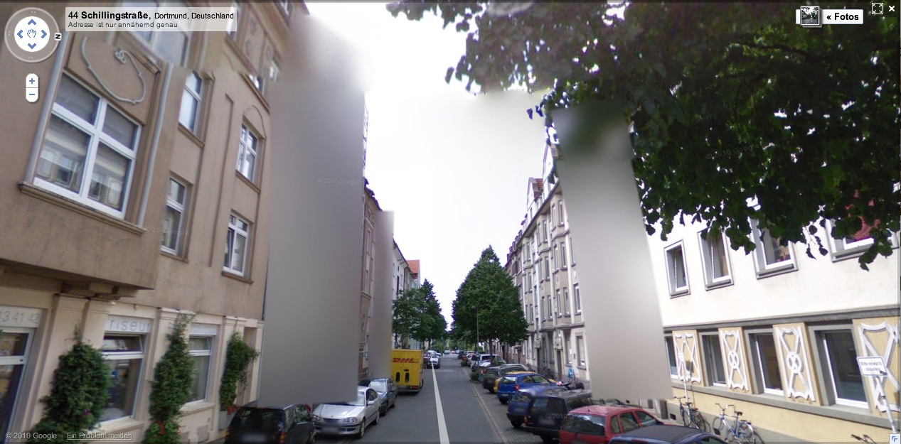
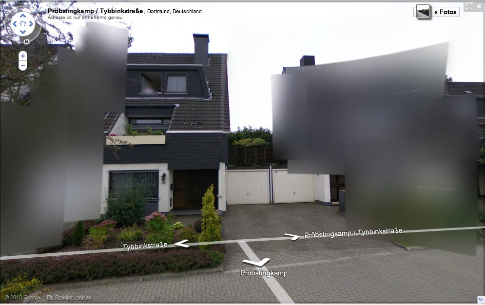
Blurmany: The Dortmund School
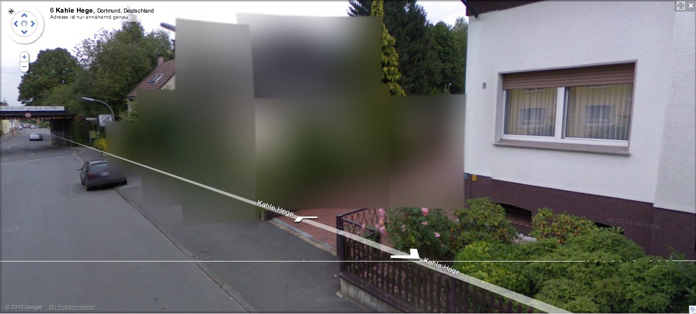
More of Germany is appearing on Google Street View, and we can start to see what 240,000 blurred out residences looks like in a country of 8 million-plus: a lot. Far from being a marginalized fraction, the blurred structures pop right out; they’ll be the prominent, even the defining feature of Google’s virtual German landscape.
[How ridiculously cursory is this opt-out scheme, by the way? Does the blur go with the house, or the owner? Can an owner take his Street View privacy with him when he moves? Will blurred residences have an easier or harder time selling? Who gets to decide to blur a multi-family apartment? The landlord? A majority of the tenants? Whatever else they think of it, Germans should recognize that this blurring is unsustainable as it stands, and that Google is certainly treating it as a transient fix for getting through the immediate political situation.]
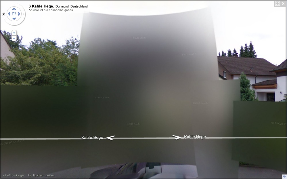
And in just a matter of days, it seems that the algorithm Google is using to blur out the houses has changed. The result, as seen in this completely random collection of houses I just surfed up in Dortmund, is all blur and no pixel.
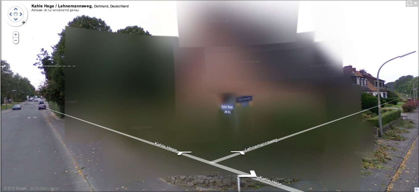
It’s also distinctively planar, with large, overlapping, color-averaging tiles, like looking through scrims or through a construct of semi-opaque glass. If they’re still Richters, they’re the glass paintings,
![]()
as assembled in space by Helio Oiticica.
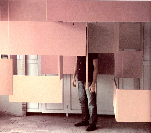
At least that’s what I’d probably use to reconstruct the blur structures in real life. Probably set up a very slight scaffolding of polycarbonate sheets, experiment with the films and filters to get the right optical effect. And then rephotograph the whole site.
Without searching through the German web, I’ll naturally assume that I’m the first to think of this brilliant artistic idea. But I’m just as sure someone on the ground will beat me to the execution. And as Germans acclimate to this Street View, I’m sure that the Blurman landscape will begin to creep into the aesthetic consciousness in a whole host of ways.
Previously: Blurmany and the Pixelated Sublime
Blurmany And The Pixelated Sublime
Ausgezeichnet, this is so awesome.
Amidst a fierce, ongoing, politicized debate, Google has released the first Street View panoramas for Germany. To assuage privacy concerns, the company is allowing homeowners to assert their Verpixelungsrecht, that is, their Right to Pixelation.
Some 240,000 locations are thus set to be blurred out. From what I can understand, though, the rollout is still in its early stages, and so only a handful of blurred buildings have gone live.
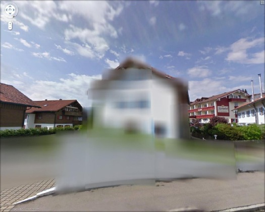
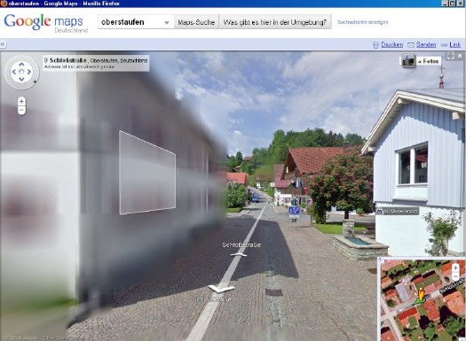
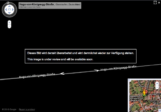
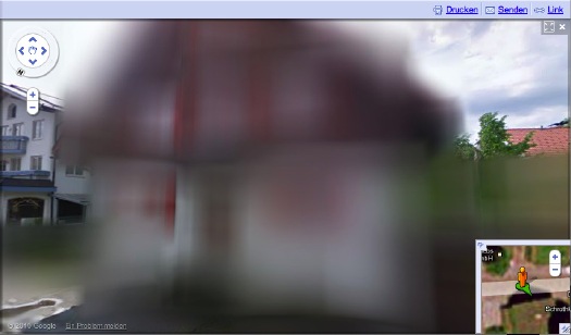
And the hunt is on. The few opt-out houses spotted so far have fed the media firestorm anew, and the examples cited by Der Speigel or FAZ [Google Translate] from Oberstaufen, the tourist village which first invited Street View to town, have been removed by Google “for review.”
At the center of the debate is my old blogging 1.0 buddy Jeff Jarvis, whose rather hyperbolic post on the subject, “Germany, what have you done?” was translated and republished by FAZ. [thanks greg.org reader/cinematographer Sanne Kurz, who tweeted about Jeff’s column.]
Sanne had referenced Germany’s complicated history of a giant state surveillance apparatus that elisted millions of citizens to spy on each other. Jeff’s having none of it:
This is not a matter of privacy. And don’t tell me it has a damned thing to do with the Nazis and Stasi; that’s patently absurd. If anything, the Stasi would have exercised their Verpixelungsrecht to obscure their buildings from public view, taking advantage of the cloak of secrecy the idea provides. That’s the danger of this.
Well, who’s Stasi now, because that is exactly what is happening next door in the Netherlands, where the Intelligence and Defense Ministries actively distort the Google Maps imagery and block Street View access for dozens of sites they have unilaterally deemed sensitive. [Search greg.org for “Dutch Camo” for details, such as they are.]
While obscuring active military bases or the royal palaces may be justified for security reasons, the Dutch government’s Google Maps pixelation program also renders maps of entire villages and town centers unusable as it hides abandoned NATO weather stations–or nothing at all.
The state needs to be held accountable in its efforts at information control and censorship, but I can’t disagree more strongly with Jarvis’s unnecessarily extreme, incendiary language to criticize the individual assertion of some control over his own data. Referencing the Street View pano above:
Ugly, isn’t it? As someone in the audience said when I spoke on the topic at a meeting of the Green party in Berlin a few weeks ago, it is as if they are digitally bombing the German landscape.
Actually, no it isn’t, and–holy crap, wtf?–no it isn’t.
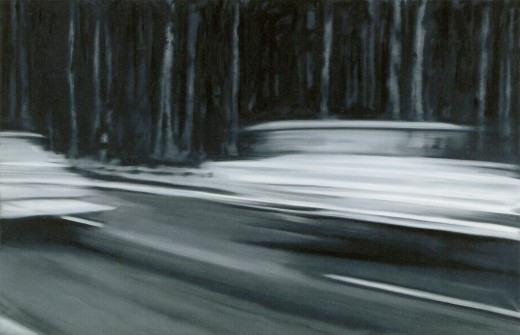
Google’s German Street View blurring looks utterly fantastic. And for that matter, fantastically German. By which I mean, of course, that it looks like a Gerhard Richter painting.
Nurses, 1965, image: gerhard-richter.com
Richter’s signature blurring technique calls into question the status, context, and veracity of the photographs that are his source material. Richter, Rosemary Hawker has argued,
refers not to the visual plenitude and truth that we usually associate with photography, but rather to its moments of representational inadequacy, to photographic blur and lack of focus that results in deliberately obscured imagery.
It’s worth noting that Richter began his blurred photo-painting series soon after fleeing East Germany.
I would think that the persistence of a few deliberately obscured images on Google Street View will serve as a useful corrective to the convenient, info-rich panorama’s seductive call, and will help remind users that they are, in fact, not in “the German Landscape,” but in a corporately controlled, commercial, and contested simulacrum of it.
Two Fiats, 1964, via gerhard-richter.com
Far from “bombing” the supposed digital public sphere, the people who exercise their Verpixelungsrecht are asserting the individual’s right to virtual protest, to engage the digitization of his entire world on his own terms.
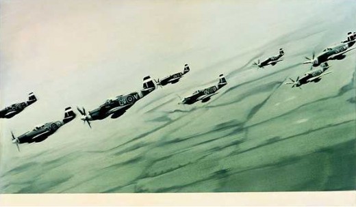
Mustang Squadron, 1964, image: gerhard-richter.com
Google has filed for patents to place advertising, “virtual billboards,” within Street View, reserving for itself the right to control and alter its ostensibly objective representation of the world for its own reasons, including, but not limited to, its own commercial gain. If someone painted their URL on the front of their store, would there be an outcry if Google threatened to blur it out unless they got a piece of the action?
Jeff argues that it’s folly for politicians to restrict innovation like geo-tagged facial recognition that, who knows, might be useful in locating Katrina victims. But who’s to say that, when our reality gets augmented to death with advertising and tracking, opt-out blurring isn’t where the real value will be? It’s the unlisted number of the future.
Or the vanity phone number. As an inadvertent-but-eager connoisseur of Google Map pixelation techniques, I could just as easily envision a premium Street View image management business emerging out of this controversy. In fact, it’s already started.
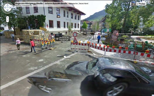
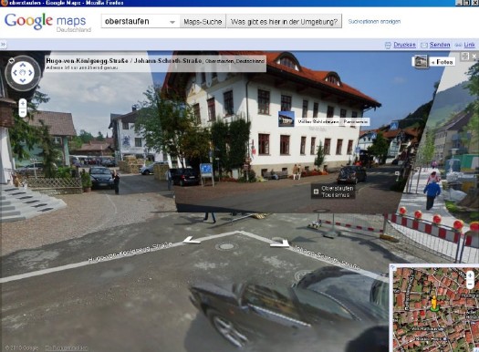
Just look at the unsightly street closure and construction project right in front of the Tourism Office of the otherwise-scenic Oberstaufen. Sheesh, no wonder they baked Street View a cake. Now check out the screenshot Spiegel got, where an embedded photograph from Panoramio helps clean things right up, mostly:
The Street View we see now is a mere shadow of the virtual world–or the virtualized real world–to come, and I’d like to think that when it comes to building and designing that world, digital citizens will be able to vote with more than their wallets.
At the very least, when people start paying Google to decorate their Street View houses with Blingee crap and animated gifs, mark my words: we’ll be grateful for the visual respite these Richterian Street View sites will provide.
Related, actually from over a year ago: Gerhard Street View