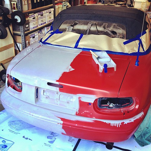
So Todd Lapin at Telstar Logistics is starting to roll out The $50 Paint Job, and it’s really got me thinking.
Basically, it’s Rustoleum household enamel, thinned by 50% or so with mineral spirits, and applied with high density foam rollers, with wet sanding between each two very thin coats. This guy did it on his Corvair, and that moparts.org thread goes on for days, months, years about it.
As I’ve been building up layers of Rijksoverheid enamel on my own panels, using various brushes and rollers, and wet sanding in between, I’ve been working toward an ideal that’s really eluded me so far: a hand-applied painted surface that shows no marks from the application. Like, for example, a Gerhard Richter mirror painting.
Part of the motivation for this is the ease with which you [I] could order these panels from a body shop. It’d be Moholy-Nagy easy–even easier since there’s no design, just color–to just order these monochromes by the official Dutch governmental auto paint code on the phone. I have the list right here. But I wanted to do them myself.
And so far, that perfectly self-leveled, brushless, orange peel-less surface has eluded me. But reading The $50 Paint Job stories, it’s obvious why: the paint straight out of the can is too thick. And for whatever misguided, paint-can-as-unaltered-found-object reason, I have resisted thinning it. Well screw that, because the next six coats are going to be nearly water-thin. I can’t wait.
Previously: rijksoverheid rood in process
The original idea, to paint monochromes and 2-color gradients based on the 21 officially approved colors in the Dutch government’s Rijkshuisstijl, plus the five blues of the country’s new logo, all of which are derived, we’re told, from Golden Age Dutch painting and the Dutch light that inspired Dutch painting.
Tag: rijksoverheid rood
Rijksoverheid Rood 8: A Whole New Kind Of Sanding
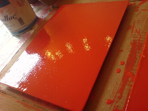
OK, this sanding thing is completely new now.
Before, when I was using the brush, I’d be sanding down drips and bulges around the edges of the panels, and hoping to even out ridges in the brush strokes.
Now that I’ve sanded my first coat of enamel laid down with the roller, though, it feels totally different. The amount of paint that goes on seems like much less–there are certainly no excess drips over the edges. And the slightly eggshell-y, all-over surface levels out a bit, but not completely when it’s dry.
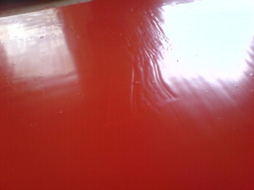
But the big difference are these tiny bubbles, which end up sanding right out, giving the whole surface a pretty smooth touch.
It’d be easier if there were no bubbles, of course. I’d love to paint a coat, have it dry, and see that it’s finally the perfect, featureless, skin-like smoothness I want. But the bubbles showed up again in the new coat [above]. Maybe I’m shaking the paint too much, or not letting it sit long enough, when I open it? But such bubbles couldn’t transfer from the can to the sponge. I suspect they’re coming from the roller, which is probably not saturated enough.
Anyway, it’s working. Which is nice.
Rijksoverheid Rood 8: Better Roller
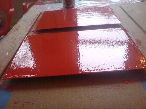
Alright, I think we finally may be onto something. I switched to a high-density foam roller for this next coat, and though it looks kind of eggshelly in the photo, it actually ends up drying to a smoother finish than any brush so far. And it uses less paint, which means no drip/stalactites around the edges, which need to be cut/sanded off.
The rhythm is sort of set now: when I start a new coat, I flip the panel over and wetsand and tack the coat from two sessions prior. That way, the coats go on each side sort of interlaced [I’m painting both sides, and I think it’ll be done when the panel builds up a sufficient edge of paint, not support, and there’s a pretty clean, non-painterly surface with no discernible front/back.] They’re not there yet, but it now seems like they will be.
On the question of posting this kind of log/journal-style info, yeah, it’s still kind of boring to me, mixed with a bit of incredulity that really, why would anyone care? But that’s fine.
Because one of the things I’ve found is that these posts almost always draw out some helpful and interesting emails from people who know paint far better than I do. So it’s really nice to hear from people, to get advice and feedback, to check my assumptions, and to see what other people are doing.
Part of my decision to paint was to learn what it’s really like, to see what paint does, how it behaves. And part of it was definitely to actually see some particular objects in person that I’ve seen in my mind, and which I haven’t really found anywhere else. So it’s all pretty good.
Rijksoverheid Rood 7: Roller
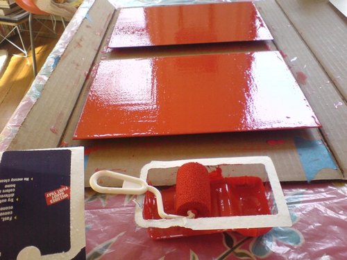
Well, that was a total surface disaster.
The size and disposability of this crappy little foam roller made it irresistible. The bubbly eggshell finish that even contains a few crumbs of foam made it a total failure putting paint down on the monochromes.
The instructions on the back are so specific, I was tempted to call following them a conceptual conceit:
- Pour 1/2 inch of paint into tray
- Roll back and forth on slanted section of paint tray to load roller thoroughly
- When painting, increase pressure on roller as it dispenses paint to pull paint from inside the foam reservoir
- Performance improves as roller becomes fully saturated with paint
- Finish with light strokes
But no.
On the bright side, there aren’t any brushstrokes.
FEW HOURS LATER UPDATE: OK, maybe it’s not so bad. The eggshelling thing is a bit subdued, but there’s far less paint per coat with a roller, no drip, and it’s generally smoother overall. I think I will continue with them a bit and see how it sands and builds up.
Previously: Rijksoverheid Rood paintings: the making of
Rijksoverheid Rood 5: Thinner
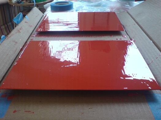
Since I appear to only be able to find the time bandwidth to paint on the weekend, sometime I might have to investigate terms that already haunt me anyway, like “weekend painter.” At least I’m not painting on Sunday, right?
Anyway, another sanding and another layer of Rijksoverheid Rood on the two panels, this time with a little bit of thinner added to the paint. It felt different, for sure. We’ll see how it ends up.
Rijksoverheid Rood 5: Mirror
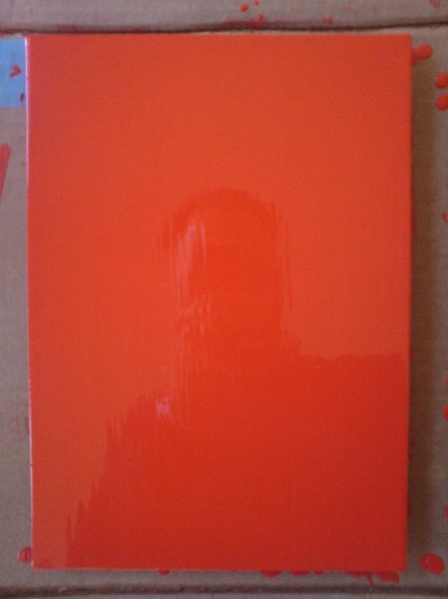
Theoretically, I can get the prep and sanding and tacking and painting of a new coat, and the cleanup, and a bit of documentation, done in a little over an hour now. But I also find it takes a certain kind of hour.
And anyway, I wanted to switch to a roller, and so I went looking at neighborhood hardware stores, to no avail. I explained to one ACE manager what I needed: a roller for laying down smooth oil enamel on steel panel. Yes, it’s primed. No, it’s just a panel. No, can’t spray; it’s custom mixed in a can. Monochr– Just the one color. Not going to paint anything on top of it. He finally said, “It sounds like art.” Well, that remains to be seen. Right now, it’s just a painting.
Well, yes and no. It’s taken me several coats or sessions to realize that I’ve been handling these panels very carefully, like art–but like someone else’s art. Art I’ve bought and need to take care of. I think I’m over that. They need to be made before they need to be conserved.
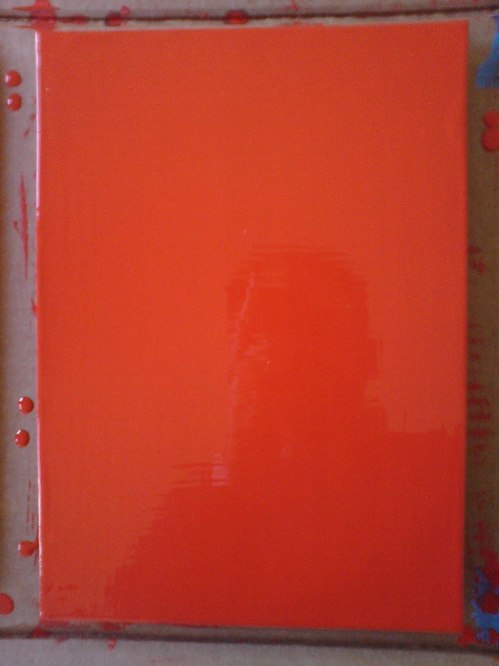
And now that I’m handling them a lot more, and less hesitantly, I’m finding I like the feel of the steel panel [top] better than the aluminum [above]. At least at this gauge, the aluminum is just too light and flimsy. And since I don’t want the metal to have an edge profile of its own, I’m wary of moving up to a thicker gauge.
The sponge brush, well, I’m not sure I’m for it. It does produce a much finer striation than the natural brush I’ve used till now. What I think is that for these layers I know I’m going to sand, it’s not as important. I am interested, though, in how the brush strokes differ, horizontally and vertically, or portrait and landscape [sic or heh, I’m not sure which]. If I can’t get rid of it entirely, I may keep that somehow.
[Note: I missed posting an update #4, but it was sanding, and then cutting the drip/stalactites off, rather than wait any longer for them to dry, which they’d never really do, and then you’d sand across one, and it’d break and shmear like a rood zit.]
Guggenheim Color by Fine Paints of Europe
Karen Meyerhoff, Managing Director of Business Development at the Guggenheim Museum, and my new hero:
People come to an art museum in part to be inspired by the works of art on view there. And we develop an emotional relationship with those works of art and with the artists that created them.
So much of that emotion is evoked from the imagery and the colors that the artist uses to create that imagery. Color can be…an unconscious communicator. And when we use that color in our living space, we share that emotion with anyone who enters the space.
In creating this second collection, we used our permanent collection at the Guggenheim as inspiration. The permanent collection at the Guggenheim spans from the late 19th century all the way to the present, and we decided to focus on the early part of the 20th century for this purpose.
We had an exhibition on view of–called, “Great Upheaval,” of works from Cezanne all the way up to Kandinsky, and we spent hours and hours in the gallery, working with these paintings, drawing colors out of them.
One of the things that became interesting about that process was that certain colors kept repeating. Not just within canvases by a single artist, but from artist to artist. So it became clear that there was a commonality to this early 20th century palette.
We call the collection The Classical Colors from the Classical Modern period in a sense. And when we had the opportunity to lay these colors out, finally, on a table together, it was very clear that there was this very rich, soft, elegant, classic palette that represented the paintings on view at that time.
These are very complex colors. And we relied heavily on Fine Paints of Europe and their unique tinting system to accurately match those colors and recreate that classical modern palette.
I am nerding out on this so hard right now. The Guggenheim Museum, in “an exclusive licensing arrangement with Fine Paints of Europe, Inc. of Woodstock, Vermont, will introduce two paint collections suitable for residential and commercial use in October 2011.” The “second collection” Meyerhoff refers to above, in a video intro which I transcribed from the website for Guggenheim Color by Fine Paints of Europe, is Classical Colors, “a set of 150 wall colors drawn from much-loved paintings in the Guggenheim’s permanent collection.”
Beyond the concept itself, which is obviously golden–no, wait, it’s conceptually golden precisely because of the art that was chosen, why it was chosen, and how it is being packaged and presented.
Cezanne, van Gogh, Delaunay, de Chirico, Kandinsky, Modigiliani, Gaugin, Pissarro, Franz Marc, whose Stables provides the illustrative detail above. I suspect these artists’ primary commonalities–besides their “very rich, soft, elegant, classic palette,” are being in the Guggenheim’s collection and being dead long enough for any copyright and trademark claims to evaporate.
What makes the Guggenheim Color Collections superior to run-of-the-mill museum merchandise is that it’s actually paint, the stuff the art is made of. Or at least that’s what it’s meant to evoke. Great word, evoke. There’s ample scholarship and conservation data, dissertations and grant-funded research projects galore, on what paints artists actually used. Technology exists to analyze the paint’s spectral and chemical properties with great precision and match it to historical manufacturing information.
None of that seems to have been brought to bear here. In addition to Fine Paints of Europe’s “unique tinting system,” the Collection was “refined.” “Refined in consultation with exhibition designers to ensure the colors are appropriate for a variety of architectural settings.” and “further refined” and “fine-tuned” for a variety of “lighting situations, to precisely match each hue.” These are not recreations, but evocations, and each color “relates to the painting from which it was derived and the artist who created it.”
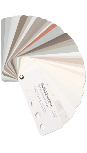
This is distinct from other collection, Gallery Colors, which is–students of The White Cube, rejoice!–actually based on the Guggenheim’s archives of wall paints used in the galleries “by generations of Guggenheim Museum curators, artists, and designers-including Wright himself.” And Jean Nouvel. Up in the middle of the fan there is the charcoal-black he used in the Rotunda for the Brazil exhibit. “These fifty hues,” FPE’s website says, “are intended to guide homeowners and designers in the presentation of art.”
Guide on, Fine Paints of Europe, and art will follow.
Previous Fine Paints of Europe coverage on greg.org, because hello, it’s an officially licensed manufacturer of Pantone Matching System paints: Rijksoverheid Rood
Rijksoverheid Rood 3: Missed A Spot
I now know that the bubbles sand right out. But what I learned this time is the importance of checking to see if you missed any spots in your smooth, monochrome surfaces before you clean up your brush and your workspace.
I ended up touching this up not too well with some scavenged drips and a leftover sponge brush. Obviously, it will not survive the next sanding.
Rijksoverheid Rood 2
Here’s a look I’m calling Red Steel.
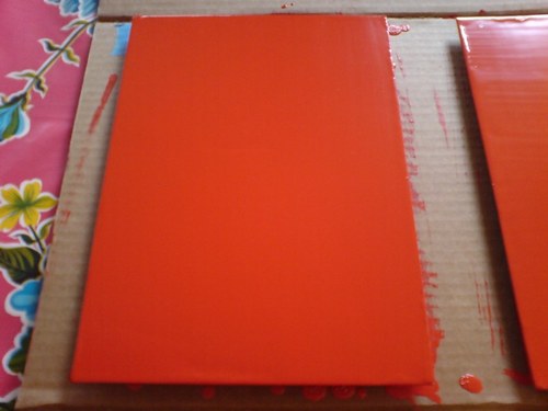
The other side. These stalactites form after the panels are put away to dry, I guess by the paint settling across the surface. Then I have to sand them down before doing the next coat.
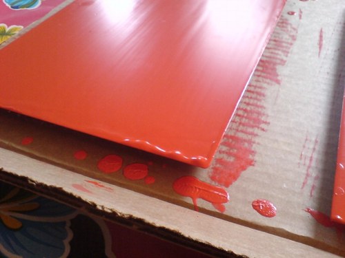
last coat, I switched up the direction of the brushstrokes, which has created a bit of a cross-weave and stalactite thing to sand down. Plus all these bubbles, not sure how those got there.
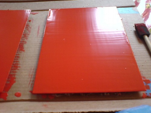
Seriously, this is like the most boringest thing in the world to be typing right now.
What I Looked At Today: NGA Monochromes
Well, let’s just get this out of the way: if you can only see one Warhol exhibition in Washington this year, see Shadows. The Warhol Headlines show is very slight. It’s hard to call it a highlight, but a series of three 1982 or ’83 silkscreen paintings of successive pages in the NY Post did remind me a bit of the newspaper On Kawara used to line the boxes of his date paintings. Also, the show includes the three Screen Tests where the subjects appear to be reading and unaware they were being filmed: Alan Solomon, Grace Glueck, and Arman. That really is all.

But let’s back up because, hey-ho, did you know the National Gallery’s East Wing was built with red brick infill walls?? It’s like Long Island City up in there behind IM Pei’s Indiana granite.

I also love that a construction worker in 1975 declared his allegiance to the Pittsburgh Steelers, practically in the Baltimore Colts’ own backyard. That was the year the Terrible Towel was invented, and when the Steelers did, in fact, win their second Super Bowl in a row. Also, I thoroughly approve of this epic-scale scaffolding. Glaze it and set it up at the beach for me, please.
Anyway, after the Warhol bust, I went downstairs for a close look at one of the NGA’s current strengths: contemporary monochromes. I’m working on some little monochrome panels right now, and I wanted to see surfaces and techniques–and to see if I’m inadvertently copying anyone I don’t want to.
I think I want a really immaculate, glassy, brushstroke-free surface, and I definitely know I want a continuity around the edge of the thin steel and aluminum panels I’m trying. So I figure setting out to study the cleanest, smoothest paintings I can find will be yield some hints.
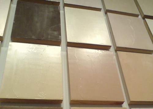
So first up: Byron Kim’s Synecdoche (1991-), the multipanel grid of monochromes based on various art world folks’ skin tones.
Rijksoverheid Rood
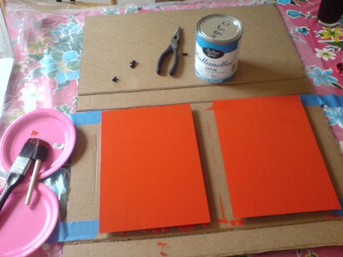
So.
Found the local Pantone shop and brought home a liter of Hollandlac oil-based enamel in Rijksoverheid Rood, aka PMS 485c.
Ordered some small galvannealed steel and white aluminum panels, both paint-ready, and cut as close to A4 as North Carolina metal shops not called Metal By The Millimeter are able to get. They arrived very neatly packed.
And so I used some of the packing to make a little nest, so they can be covered, with circulation, while the paint dries in between coats.
Diet Coke. Leatherman left in the car, whoops. Tape everything down. Float the panels on little bubblewrap sheets so I can get to/around the edge.
MIneral spirits to clean the surfaces. Oh, right, there’s a protective film on the aluminum. More Diet Coke.
Do people really still listen to NPR all day? I can’t imagine. I want listen to youarelistening.to, but New York is down, so I head to Montreal. Police scanner with that awesome Quebecois twang.
Nabisco Ginger Snaps, the dog biscuits of the gods. Seriously, how did I fall into this box of tough yet improbably delicious cookies? More Diet Coke.
Unwrap the brush. Open the can. Wow, it seems much oranger than the web version, or the offset ink version. Is it–no, it has to be right. The Netherlands has ceded sovereignty over their Central Government palette to Pantone, Inc., a wholly owned subsidiary of X-Rite, LLC of Grand Rapids, Michigan. One PMS code to rule them all.
Stare at the foam brush again, try to remember what she–no, I’m pretty sure she said she was using foam for acrylic enamel, not oil. Go with the brush, even though foam seems somehow less painterish, and thus less daunting,
Load is not quite the word for what I do to the brush. Introduce. Poke. Alight the brush with paint. Whatever it is, it’s not enough paint. A fair amount of pull, this oil.
The steel panel is first. I really am not going to do a stroke-by-stroke account here. The steel feels better. The aluminum plate is so light, it moves with the brush; I have to hold it down. Paint’s not as self-leveling as I was originally hoping.
I knew there will be extra coats; I’d hoped there wouldn’t be much sanding. But there are definitely still brushstrokes in there. Texting with my brother-in-law, a highly skilled painter of entirely different types of monochromes, he diagnoses it immediately: ‘the brush needs to be loaded and moved with confidence.’
I would probably say those are problems #2 and #1, respectively, but loading the brush will be much easier to address. I will leave my paranoia about little paint stalactites on the edges in the kitchen the next time I get a Diet Coke.
But of course, the next coat will only go on 24 hours or so from now. I guess I never quite understood how much of painting is waiting for the paint to dry.
De Rijkshuisstijl & The 1 Logo Project
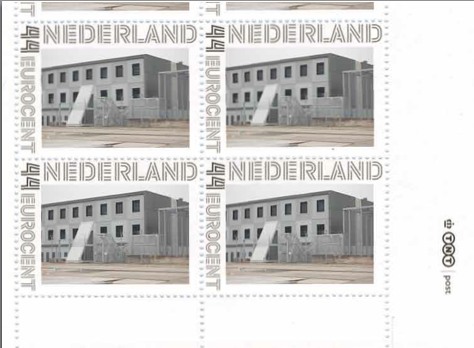
As part of their project Caché-Exposé, investigating the Netherlands’ largely invisible detention and deportation system, the Amsterdam art & design collaborative Foundland documented obscure, anonymous detention sites around the country. Then they used a highly official, public system to distribute their images: design-it-yourself postage stamps.
What with the domes, the minimalist/industrial architecture, these stamps, and–hello, this awesome flag they shot in 2008–I can’t help noticing how beautifully designed the Dutch immigrant prison system is. So thoughtful.
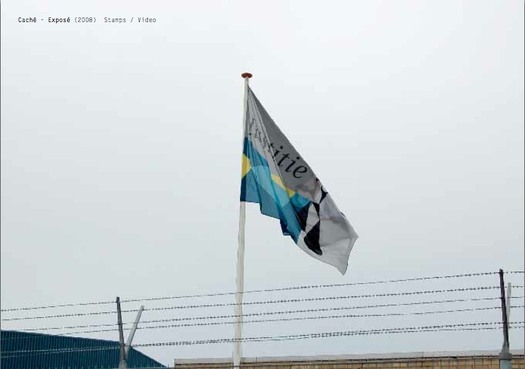
That is the Ministry of Security & Justice flag there, flying over the Zaandam waterfront dome prison. The biomorphic shape is a perspectival view of the scales of Justice, a fragment of the Ministry logo, which is an abstracted, blindfolded Justice.

Is, or was. Because on Google Streetview, the flag is different. Much simpler.
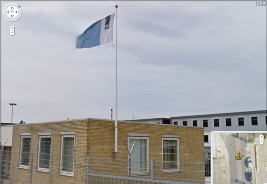
That is the new Rijkshuisstijl, which is officially called the Central Government Visual Identity, but which I gladly transliterate as the State House Style, a four-year effort begun in 2007 to centralize and redesign the Dutch government’s corporate identity. Part of that initiative was the 1 Logo Project, a replacement of 125+ separate ministry and agency logos with a single logo, the national coat of arms on a vertical blue bar.
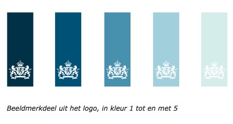
Ah, I’m told it’s a ribbon. Here’s the English version of the style guide.
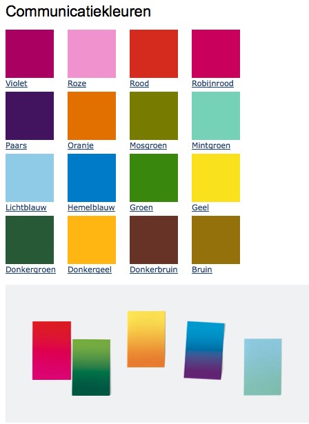
Oh, man, the color palette, 16 colors “inspired by the colorful Dutch landscape painting,” plus five gradients. Get me Colby Poster on the horn.
I am kind of geeking out over this. On the one hand, it’s a normal redesign gig, tastefully done, but typical to the point of banality. On the other, because it’s the state, I can’t help but read every platitude in the mission statement and objectives, every justification of every design decision and element, through a politicized filter. Without knowing really anything about the details or shifts in Dutch poltiics beyond recent surges of right-wing populism, I can’t help but interpret the identification of problems the Rijkshuisstijl was intended to fix as criticism of the parties and governments then in power.
Partly, it’s the Rijkshuisstijl’s incredibly bold assertions of design’s importance and function. And the grand assertions of meaning:
“The symbol exists of a blue ribbon with the coat of arms. Subtle and unpretentious, an authority without being authoritarian.”
The color of the logo is Rijksoverheid Blue. Inspired by the Dutch skies and Dutch light. Blue for calm and reliability. Blue for tradition and enduring values. Blue for harmony and balance.”
“The wide variety of logos previously used by various government organisations made them less recognisable, causing confusion among the public and business community. People were no longer able to see the wood for the trees. Central government organisations seemed to be competing rather than cooperating with each other. This approach compounded the widely held view that central government was fragmented.”
“The mission statement and the motto both underline what central government stands for. They give the central government logo (Rijkslogo) real meaning.”
And then there’s the irony of context, the subjective happenstance of discovering the Rijkshuisstijl while looking at an exposé criticizing the Netherlands’ unjust treatment of immigrants, a project which I’d discovered in turn while reading about the current populist government’s massive cuts to the country’s arts infrastructure. Is this what modernism and Good Design signed on for? Because it’s what they got.
Oh, and there was a symposium, and a book, De stijl van het Rijk/ Style and the State, produced last fall by the Stichting Design den Haag.
Foundland [foundland.org]
Rijkshuisstijl guide in English [rijkshuisstijl.nl]
UPDATE: So the work was actually done by Studio Dumbar in Rotterdam, announced on their site in 2007 [studiodumbar.com]
If You See Something, Say Something
Do you find yourself wanting to talk about Group Zero, but the only names you can pronounce are Fontana and Klein [and Westwater]? Do you ever call galleries you’re about to walk into, just to hear them say the artist’s name? [I just asked at the desk, it’s von HILE.]
You may be suffering from Gigli Syndrome, a condition where you avoid saying an artist or designer’s name because you’re not sure of the pronunciation. Bennifer can’t cure all possible outbreaks of Gigli Syndrome, any more than Nomi Malone could inoculate us against the dangers of unknowing mispronunciation, Versace Syndrome.
After typing [well, cut-n-pasting] 0100101110101101.org yesterday morning, I realized a universal cure to either condition is impossible. Americans will never switch to Van Gohchhhh, and Thaddeus Ropatch may never give you more than 10% off, but that doesn’t mean we shouldn’t do all we can to treat and prevent.
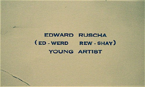
So inspired by my friend Sam, who once helped me avert disaster at Lever House [it’s A-B Rosen, not Abby], and as a tribute to the young artist who once printed up business cards reading, “Ed-werd Rew-shay”, here is a quick roundup of high-risk artworld names and their correct pronunciations by curators, interviewers, and even the artists themselves:
- 0100101110101101.org: zero-one-dot-org [thx their dealer @magdasawon, pronounced sah-vawn, btw]
- Eija-Liisa Ahtila: AY-ya-lisa AHH-tilah [youtube]
- Richard Anuszkiewicz: AN-ehs-KAY-vitch [mike wallace via youtube]
- Giuseppe Arcimboldo: Arch-im-BOLD-oh [washpost]
- Kutlug Ataman: KOOT-loo ATTA-mun [tate channel]
- Huma Bhabha: HOO-mah BAH-bah [public art fund via youtube]
- Alighiero e Boetti: Ali-GYAIR-oh BO-etty [he was just one guy, btw. Stuck the “e” in there himself. moma]
- Carol Bove: Bo-VAY [I called Maccarone to confirm, because I’ve heard people calling her Bove (rhymes with clove) to her face, and introducing her as Bove, for literally YEARS. She is too polite and well-known to deserve this any longer.]
- Eli Broad: rhymes with road [thx @manbartlett]
- Marcel Broodthaers: ooh, a Britdown between BROAT-haus and BROOT-ers, with a bit of long O thrown in. I vote for the latter. [mk-g.org]
- Vija Celmins: VEE-ya Sell-muns [youtube thx @lucretiab]
- Chinati: Chih-NAUGHT-y, not Shih-Naughty or Kih-Naughty. [member since 1994, plus I just called and listened to their answering machine.]
- Wayne Clough: rhymes with rough and censoring stuff. [nyt]
- Dan Colen: CO-lin [via nyt]
- Bice Curiger: short for Beatrice, [Just imagine Che Guevara taking an interpretive dance class: “Be a tree, Che.” and then leave out the “a tree,” cuz you guys are tight.] Koo-REE-gare, rhymes with Care Bear [via youtube]
- Dada: Da-DAH [Marcel Duchamp and Richard Huelsenbeck, both founders of Dada, pronounced it Da-DAH at The Modern in 1961. clocktower.org]
- Walter De Maria: de Ma-REE-uh [youtube w/English accent, thanks judy]
- De Stijl: de STALE, maybe Dutch it up a bit with a little h: ShTALE [youtube]
- Marlene Dumas: Mar-LANE du-MAH [moma]
- Rineke Dijkstra: RIN-uh-kuh DIKE-stra [moma]
- Ekow Eshun, ex-ICA, current (2014) Fourth Plinth guy: Echo Ession rhymes with session [lisson gallery youtube]
- Omer Fast: Homer without the H, not Omar [via @magdasawon]
- Os Gémeos: Ose like dose, ZHEH-meh-ose [coolhunting, alt. pron.: Barry McGee]
- Joseph Grigely: Grig-lee [via hans ulrich (han-ZOOL-rick) at moma]
- Cai Guo-Qiang: Cy, like Twombly, Gwoh, long O, Tsee-ahng, somewhere between a Ch and a Ts [moma]
- Francesca von Habsburg-Lothringen: Hops-burg Lote-ring-en, though I’ve never heard the Lothringen used/said. [youtube]
- Thomas Houseago: House-ago, like it was two words. [public art fund via youtube]
- Pierre Huyghe: I say Hweeg to his face, but I almost hear Peter Eleey say Whee. [thx @analogc]
- Dakis Joannou: DOCK-iss ZHO-new [numu youtu]
- Emilia and Ilya Kabakov: KA-buh-Koff, Ka like Kat [youtube, bonus: Andre Putman: PUT like in Putin, man, rhymes with yawn]
- On Kawara: Own, as in rent-to-. Kawara is his family name, so it’s Kawara On (河原温) in Japanese. [dude, I speak Japanese. 25 years.]
- Paul Klee: Clay [thx paddy]
- Guillermo Kuitca: GYAIR-mo hard G, KWEET-kuh in Minneapolis and Buffalo, anyway. In London, they say KWIT-kah [youtube; publicbroadcasting.net]
- Yayoi Kusama: Yah-yoy Koo-saw-mah. Again, Kusama is her family name, so Kusama Yayoi (草間彌生). [me]
- Wifredo Lam: THERE IS NO L, PEOPLE, NO L!! LOOK CLOSELY. Anyway, it’s pronounced like Wilfredo WITHOUT THE L. [Italian on vimeo, thanks @aljavieera]
- Laocoön: Lay-UH-kuh-wahn, rhymes with go on. [britishmuseum.org]
- Aristide Maillol: My-yole [moma]
- Iñigo Manglano-Ovalle: In-EE-go Mawn-glawn-o O-VA-yay [though the guy at SAIC also says peda-GO-gee, so…]
- Julie Mehretu: MARE-Eh-too [metmuseum]
- Modigliani: Mo-DEE-lee-Ah-nee [metmuseum via youtube]
- Laszlo Moholy-Nagy: LAZ-low rhymes with Hasbro, Moley as in holy, Nazh, like gnaws, with a zh on the end [german youtube, but you get the idea. update: But the artist and his family also accept the Americanized “nadgie” new idiom]
- Vik Muniz: Moo-NEES [5min]
- Edvard Munch: Moonk [thx paddy]
- Albert Oehlen: Uhrlen, classic umlaut O [moma]
- Maja Oeri, of the Schaulager: Ury, like Early without the “L”; Show- like shower and lager like beer. moma]
- Meret Oppenheim: Merit [moma]
- Francis Picabia: Pih-CAW-bee-uh [moma]
- Otto Piene: PEEN-uh [german youtube]
- Fondazione Sandretto Re Rebaudengo: Ray-Ray-bo-DANG-go, a little like Bojangles [italian youtube]
- Gerhard Richter: For Americans, it’s like the scale. For the Teutonically inclined, go ahead and let’er rip, GAIR-haht REESH-tah [gerhard-richter.com]
- Gerrit Rietveld: two R’s, one T, people. REET like street, feld, like fell down the stairs. [dutch youtube, thanks craig]
- Dieter Roth: Rote [german youtube]
- Edward Ruscha: “(Ed-werd Rew-shay)” [walkerart.org and colette.fr thx @valeriemargolis]
- Anri Sala: ON-ree SAHL-LAH [google video]
- Yinka Shonibare: YEEN-kuh SHOW-nih-Bar-eh [tate channel]
- Alec Soth: rhymes with both [youtube, thx @jenbee]
- Sperone: Spare-ownee [just call, you’ll see]
- Thomas Struth: [SHTRoot, he has never corrected me, but that’s how he says it at the Met]
- Alina Szapocznikow: Ah-LEE-nuh Shah-POTCH-nick-off [UPDATE: this moma audio has it as POTS, but thanks to Rachel Wetzler, we learn that the ‘cz’ combo in Polish is pronounced “CH”, like chalk. cf. a Polish curator’s youtube video. To practice hearing the difference, please listen to this 4-hour symposium at MoMA. Thanks Rachel and thanks Andrew for the suggestion]
- Thyssen-Bornemisza: Tissen BORN-uh-Meesa [youtube]
- Rirkrit Tiravanija: Hans Ulrich says Tier-uh-vah-NEE-juh, and Rikrit says TEER-uh-van-EET. So maybe there’s a reason people just say Rick-rit. hans ulrich at moma; studiobanana.tv]
- Günther Uecker: GOON-ter OO-ker, like a clipped booker [german youtube]
- Ulay: OO-Lie, as in, “Ooh, lie down naked with this skeleton on top of you for eight hours.” [that’s how Marina prounces it, anyway]
- Joep van Lieshout: Yoop fawn LEASE-howt, [dutch tv, whoops, I’ve said van lees-hote to his face, too]
- Danh Vo: Yahn, it’s a “Vietnamese soft ‘d’. [ex. Talking at Walker Art Ctr, via youtube]
- Apichatpong Weerasethakul: A like apple pih-CHAT like room pong WEIR like weird -uh-suh-THA like Thatcher cull like a herd [cannes 2010 press conf]
- Susan Weil: Vay, “like Simone Weil” [Rauschenberg Fndn oral history, page 1] UPDATE: When I met her and mentioned this, she was like, “No, it’s Vile, “like Simone Weil,” and I was like, “Sounds good to me!” So I think it is Vile like Susan Weil.
- Ai Weiwei (艾未未): Eye way way, family name is Ai [paleycenter.org]
- Rachel Whiteread: reed, not red [moma]
- Witte de With: VITT-uh de VIT [dutch youtube]
- David Wojnarowicz “(pronounced voy-nah-ROH-vitch)” [PPOW, his dealer since 1988]
- Lisa Yuskavage: Yuh-SKA-vedge, sounds like savage [youtube, thanks john]
Some build on each other; once you know Bas Jan Ader [Boss Yan Adder], you can do Jan Dibbetts, Jan Schoonhoven [Skoon-ho-ven], Christian Jankowski [Yan-KOFF-ski], and so on. If your favorites aren’t on the list, please feel free to send them along.
