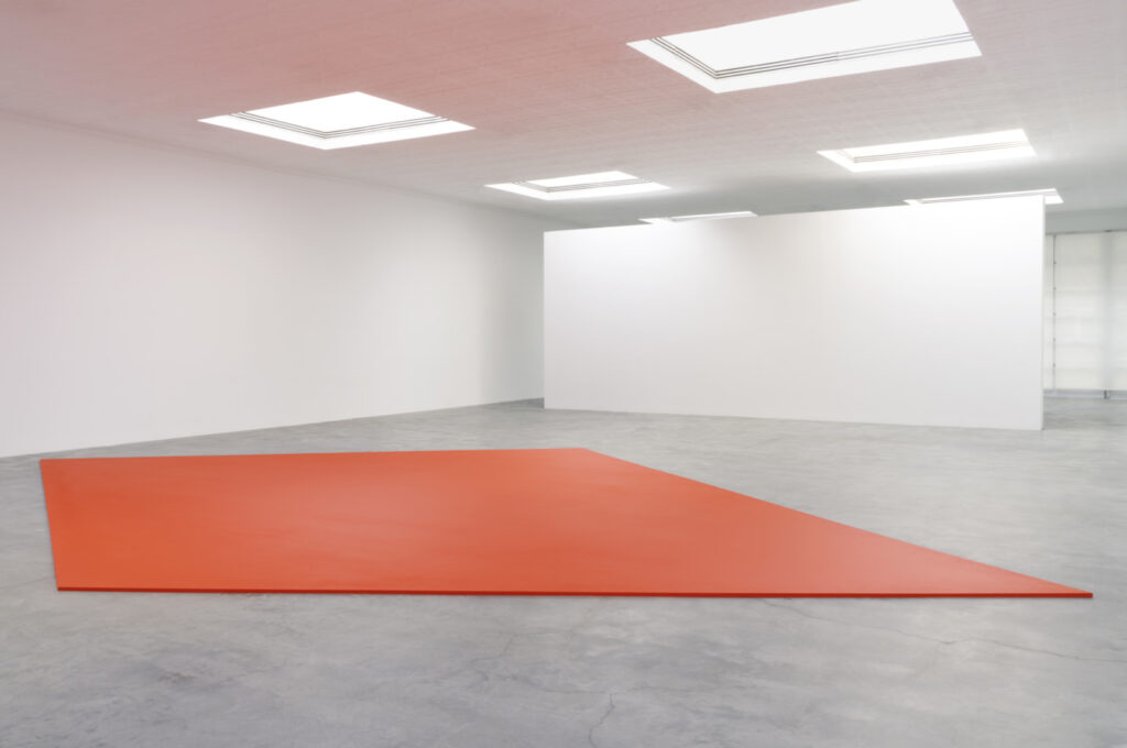
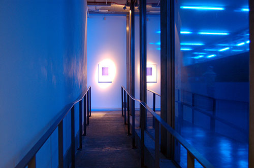
Ellsworth Kelly, Red Floor Panel, 1992, acrylic on canvas on wood panel, installed at Matthew Marks
I remember the experience of walking into Matthew Marks and seeing one stunning work: the 1957 Sculpture for a Large Wall, which Marks had basically rescued from the Philadelphia Transit Building for which it had been commissioned. (The Lauders bought it for MoMA in 1998.) Anyway, now there will be another, though it seems like this time, seeing won’t be enough.
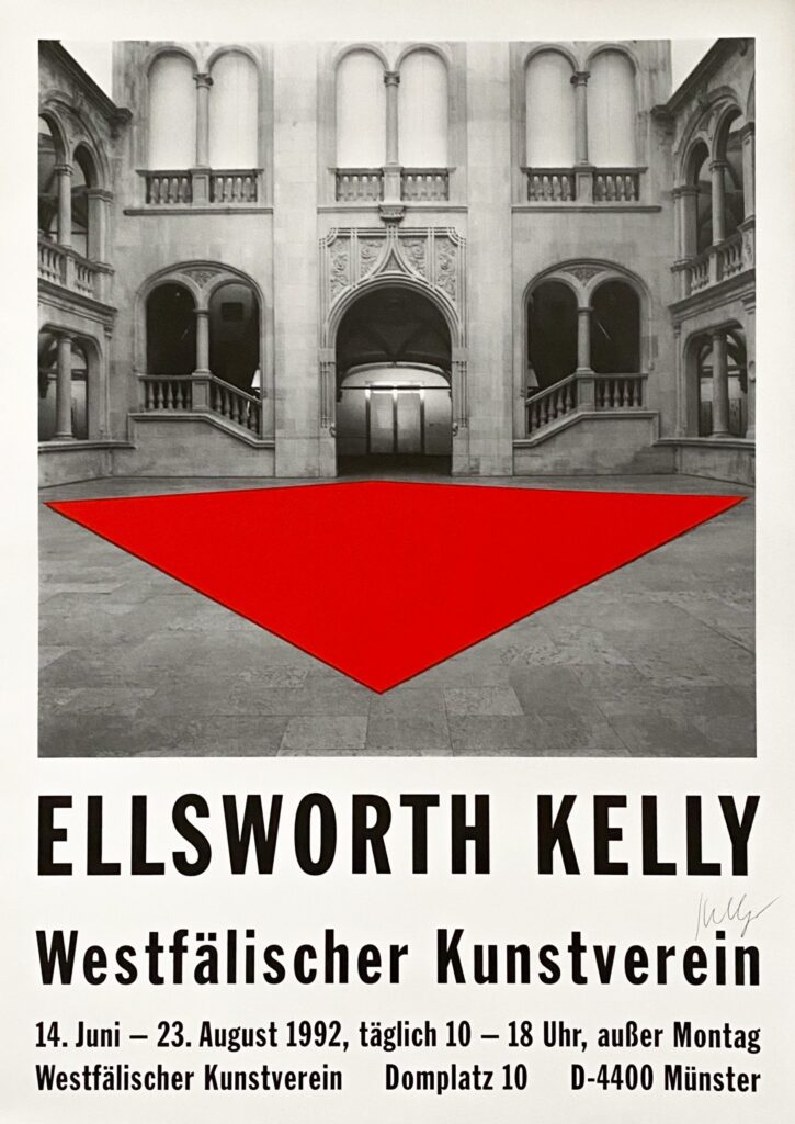
Ellsworth Kelly Westfälischer Kunstverein exhibition poster, A1 offset print, signed, via Susan Sheehan Gallery
Red Floor Panel (1992) is one of five floor paintings Kelly made, beginning in 1990. [Glenstone got the first, but how can this not be the best?] It is being shown for the first time since its original appearance at the Westfälischer Kunstverein in Münster.
How does this object exist? And how is it possible that each of these pictures is of the same object? I mean, it’s at once the most obvious and confounding thing. [update: I’ve learned the answer to the first question, and it will astound you. It did me.]
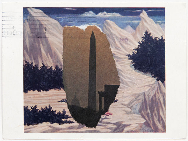
Domenico Veneziano/Washington Monument, 1984, newspaper on NGA postcard, via Peter Freeman back in the day
Though a couple we included in his Guggenheim retrospective in 1996, most of Kelly’s 400 or so postcards made between 1949 and 2005 have never been shown or published. Each venue will show a distinct selection of 150 of the works, and the catalogue reproduces 216 postcards at full scale. It is a veritable facsimile object blockbuster–but I still want to see the real things in person.
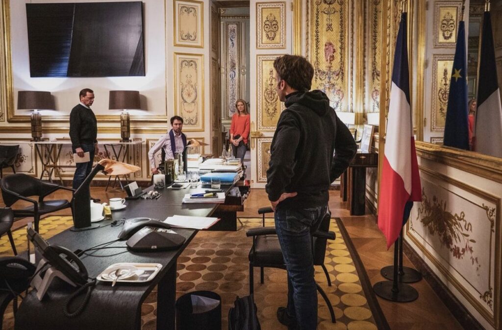
Ceci n’est pas un miroir noir, image via like ten hot takers on twiter
Some might say this warrior president Golden Roommise-en-scène feels like a very special Continental episode of Black Mirror come to life. Me, I say, that’s no black mirror: it’s a Proposte Monocrome Macron! Srsly, though, the Struth fan who took this photo deserves a Légion d’Honneur.
UPDATE WTF: I just zoomed in to make myself an Ellsworth Kelly-style rhomboid crop, and it appears that is not a flatscsreen TV with a reflective image on it at all, but an image? Non, but it is a picture. It is a Soulages.
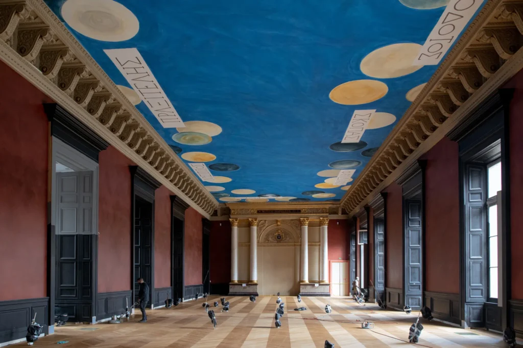
The Wall (2021), dimensions and The Ceiling (2010), installed in the Salle des Bronzes in the Louvre, photographed in Feb. 2021 for the NYT by Dmitry Kostyukov
As 2021 is finally shown the door, I am pleased to announce The Wall, which was next to The Ceiling. The Wall is a Marron Côte d’Azur and Noir painting executed directly on a wall or a discrete section thereof. Even more than the 19th century neo-classicist aesthetic of Napoleon III, who first executed it in his Salle des Bronzes Antiquites, it evokes the historic moment during the pandemic when leaks about the work’s installation drew the litigious ire of The Cy Twombly Foundation.
study for The Wall, 2021, dimensions variable, an altered 150 x 100px svg ganked from a hexcolor website for Marron Côte d’Azur (#A75949)
For a few months this year, the first realization of The Wall was installed alongside–or underneath, really–The Ceiling, Cy Twombly’s ceiling mural at the Louvre. In Napoleon III’s day, the Noir was the display cases. In the 2021 installation, the boundary between the two colors was demarcated by a dado. The composition of future installations may take cues from the space, and condition of the wall and its elements.
While it is available for individual purchase or commission, The Wall will also be free with the purchase of nine other works, as a treat.
There are other works associated with both The Ceiling and The Wall, the details of which are at present insufficient.
While making The Ceiling, Twombly friend Barbara Crawford and French painters Laurent Blaise and Jean de Seynes joked “that the unique, precise blue for this particular sky, which they’ve spent weeks fine-tuning, should be trademarked and given the name Twomblu.”
According to Grant Rosenberg’s account of this process in The American Scholar, in late 2008, the Louvre produced “several” “big” panels of monochrome blue for color testing during a Twombly site visit. It is not clear what blues these were, but we know what they were not: Pas Twomblu.
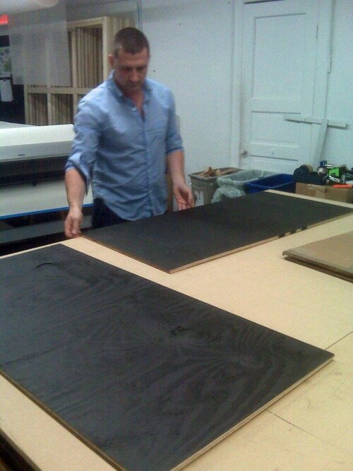
Installation shot, Untitled (Heist), 2021, 96 x 121 in., enamel on plywood panel, documented in Union Square in November 2021 by Hunter MacNair, image via brokeassstuart, thanks @xintra
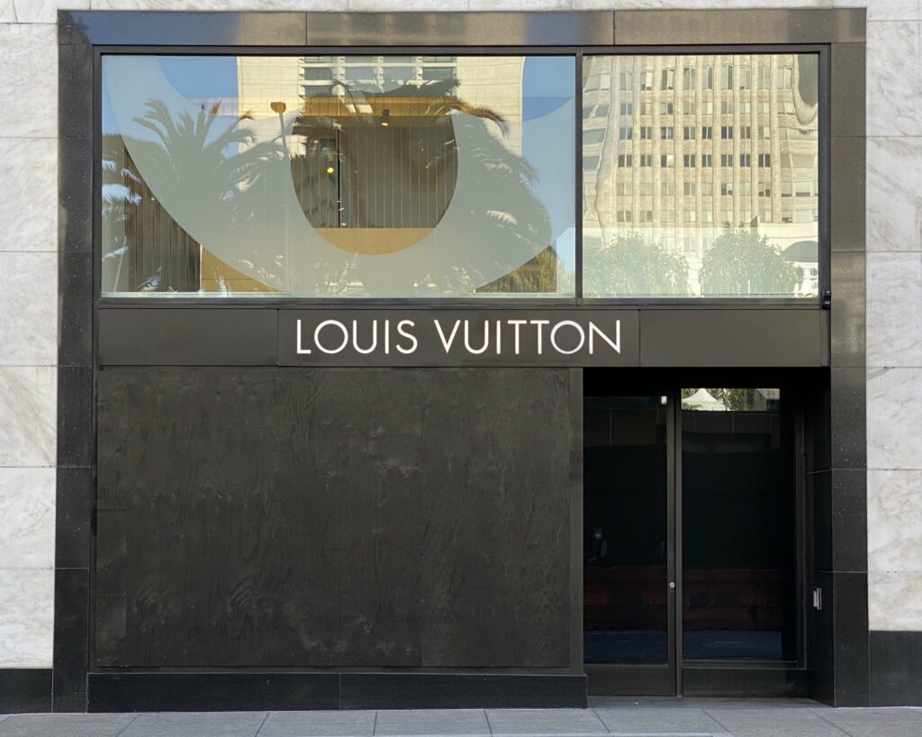
It has been a while since realizing works like this. Partly, it’s just the world. As Martin Creed says, The Whole World + The Work = The Whole World.
But when it exists, it also feels wrong to ignore it. Untitled (Heist) was recently installed in San Francisco’s Union Square, following a flashmob robbery of several hundred thousand dollars (retail) of merchandise from the Louis Vuitton store.
When Broke Ass Stuart ran this installation shot by Hunter MacNair on their post, “Let’s Talk About The Louis Vuitton Heist,” I first thought it would be a deep dive on the street value of the various items that got jacked.
But BAS instead went deep on luxury-fueled capitalism’s complicity in gaping inequality. And that, along with LVMH’s recent appearances in the art news, seemed like a collab-worthy context in which to encounter this work. Which I imagine will remain on view through much of the Christmas shopping season, at least. Maybe minting it as an NFT would make it last even longer.
UPDATE: As San Francisco Mayor London Breed’s office put it in their review, “I think that’s the visual for where the rule of law needs to make its stand.” [FOIA’d and published by @journo_anon] Thanks for supporting the arts, Your Honor!
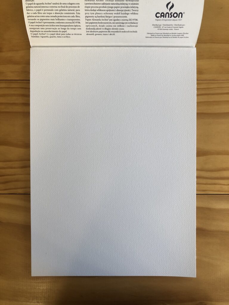
Love the concept, but this pad of Arches watercolor paper is about an inch too small in each direction. [UPDATE: IT IS NOT, IT IS JUST FINE. The catalogue just dropped with new, slightly smaller dimensions for the Manet: 32.8 x 24.8 cm. The difference is probably the frame, but it’s good to pin these things down!]
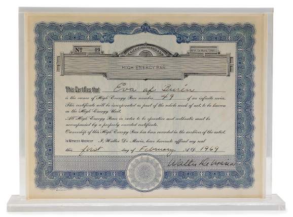
Orders are coming in, facsimile objects are being needed, and so certificates of authenticity must also be realized. So I’ve been thinking about them.
The 1:1:1 scale of the certificate to the facsimile object to the work felt right immediately for many logical, conceptual, historical, and aesthetic reasons.
Walter de Maria, one half of his High Energy Unit (1966/69)
The coexistence of the certificate and the object remind me of Walter de Maria’s High Energy Bar, an infinite series he insisted was not a multiple, but which he also considered to unite with its certificate of authenticity to become a distinct work, a High Energy Unit. De Maria bought his fancy certificates from the old-timey stock certificate printer, and kept the registry of owners’ names secure, he promised, in a Swiss vault.
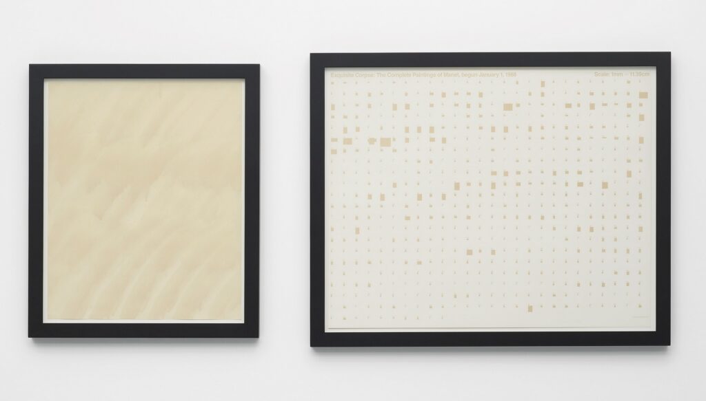
Stephen Prina, Exquisite Corpse: The Complete Paintings of Manet, 232 of 556, Berthe Morisot à l’Eventail, (Berthe Morisot with a Fan), 1874, (March 4, 2012), ink wash on rag (L) and offset print (R), image via maureen paley via ocula
Obviously, when it comes to embodying Manets, Stephen Prina’s Exquisite Corpse: The Complete Paintings of Manet (1988– ) comes to mind. I do not envision making a career of making 556 Manet facsimile objects. The circumstances that compel this one are highly specific and, if civilization (sic) can get its socio-political act together and end this pandemic, very limited. Please do not let the world of Manets exist beyond our experiential reach for much longer.
Anyway, though I have a deep spot in my heart for the monochrome, I feel like making a monochrome ink wash Minnay would end up more a Prina Facsimile Object than a certificate of authenticity for this Manet Facsimile Object. So I’m still thinking, staring, and experimenting, but soon I will also be getting paper of the appropriate size.
Also, I guess I wrote this in 2009:
Interestingly, though there are hundreds of mentions of High Energy Bar, there were only two mentions of the “complete” piece, High Energy Unit. [It makes me start to wonder about the underappreciated existence our poor certificates must lead, even as they’ve become so important to the authenticity and integrity of the work. Is anyone else making sexy artist certificates–or art about certificates, even–that remain ignored or unknown by everyone but the work’s purchaser? Will an artist make a work whose aesthetic or artistic payoff is actually the [secret] certificate itself? If you have or know of any awesome certificates languishing in any file cabinets out there, by all means, let me know.]
Gallerist Stephanie Theodore was there for the unveiling of Wade Guyton’s new election aftermath-themed windows at Bergdorf Goodman. Though it clearly feels like a scaled up version of his #monochrome-on-plywood 2008 edition for Parkett, it also references the matte-black-OSB sculptures he made in 1999, which have since been #destroyed [cf. Guyton OS, 13.]
Sunrise from a small window, Apr 27, 2020 via @shoshibuya/IG
“I realized that from the small windows of my studio, I could not hear the sounds of honking cars or people shouting. I could hear the birds chirping energetically and sound of wind in the trees, and I looked up and saw the bright sky, beautiful as ever despite the changed world beneath it.” –Sho Shibuya, via Spoon & Tamago
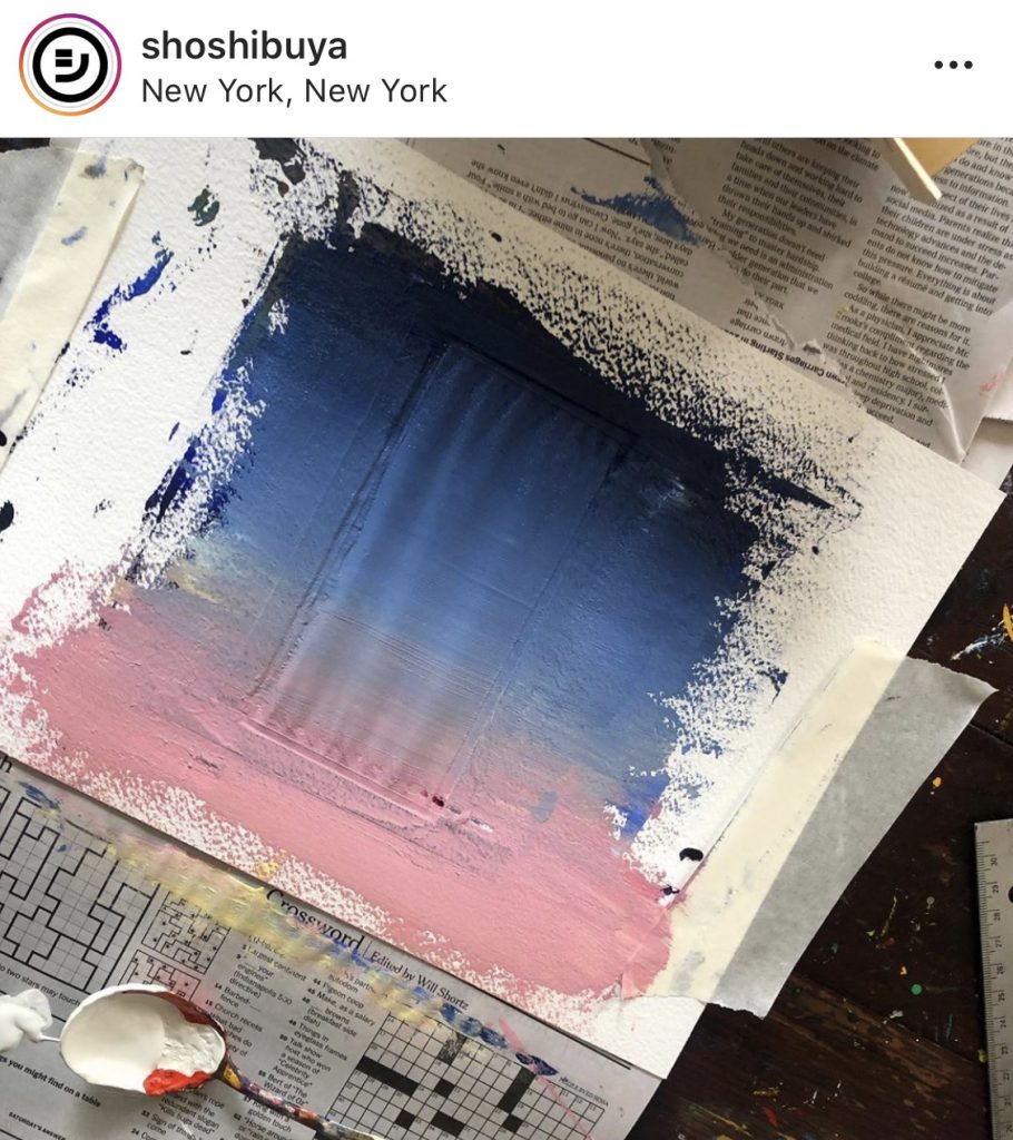
April 27 sunrise process shot, via @shoshibuya/IG
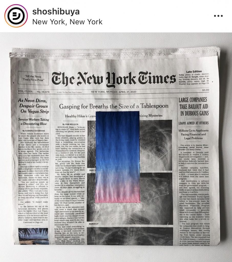
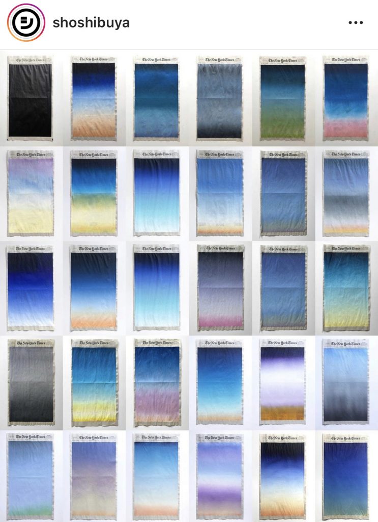
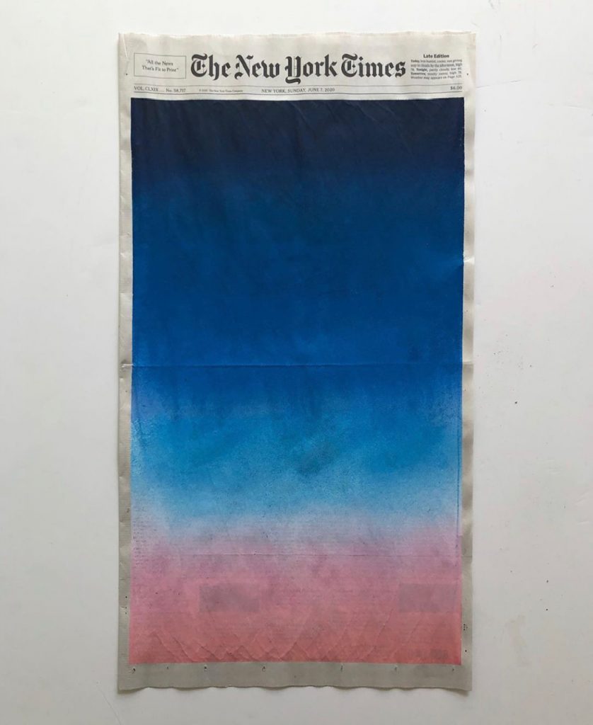
Sho Shibuya began photographing the sunrise during the pandemic lockdown in New York City. By late April he was translating these photographs into gradient paintings. He cut portrait-shaped rectangles and applied them to examples of his print and graphic design work. On April 27, he taped off and painted the sunrise directly onto the front page of the print edition of that day’s New York Times.
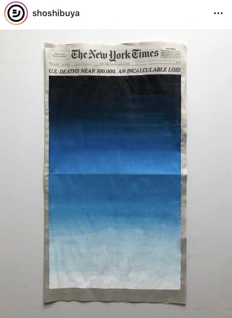
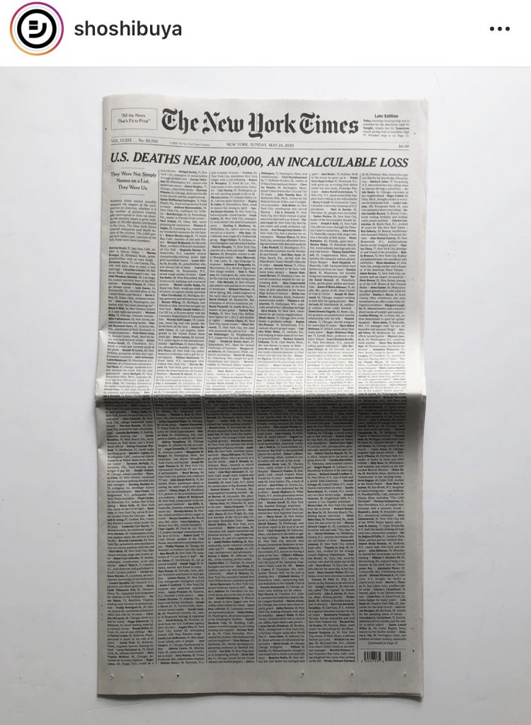
Sunrise from a small window, May 24, 2020, and the front page of the NY Times from that day, as COVID-19 deaths approached the first 100,000. images: @shoshibuya/IG
By May 24, Shibuya’s sunrise filled the entire front page of the Times, just like the names of 100,000 people who’d died from COVID-19.
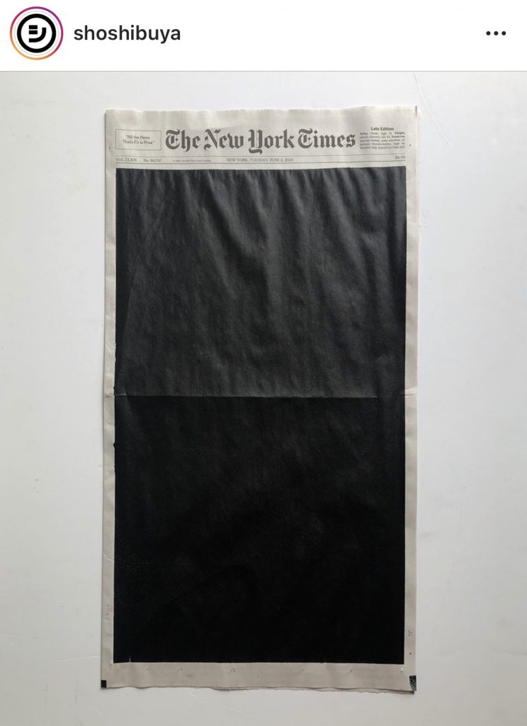
Sunrise from a small window, June 2, 2020, replaced by a black monochrome field to show support for Black Lives Matter protests, image: @shoshibuya/IG
On June 2 he replaced the sunrise with a black monochrome field in support of the Black Lives Matter movement.
Sunrise from a small room,
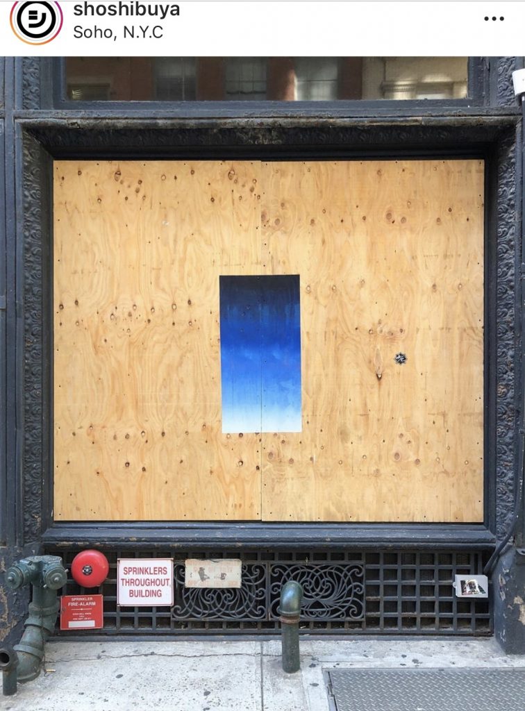
On June 7 he painted the sunrise on plywood barriers that had been erected in SoHo after police brutality-related violence and looting. On June 28 he painted six rainbow flag-colored monochromes on inside pages of the Times for Gay Pride.
On July 1 he released a video and gallery of the 30 NYT sunrises he painted in June. On July 2 he showed two days’ Sunrise/Sunset from a small window, paintings on square acrylic sheets in which two inverted gradients are superimposed on each other. On the July 4 Times he painted a David Hammons-style African American Flag.
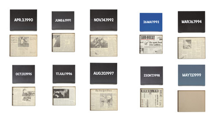
But clippings: ten On Kawara Date Paintings sold as one lot from one collection in 2007, with an absolutely horrible jpg and an absolutely uninhibited essay. image: christies.com
On Kawara often included a clipping from a local newspaper in the cardboard boxes he built for his Date Paintings; most often, he was in New York, so it was the Times.
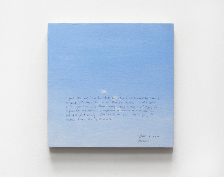
Byron Kim, Sunday Painting 10/4/15, 2015, 14×14 in., acrylic and pencil on canvas mounted on panel, image via jamescohan.com
Byron Kim began making his Sunday Paintings, square sections of the Brooklyn sky, in 2001 as part of a practice goal of completing (at least) one painting a week. He transcribes information from his diary onto their surfaces in pencil. Kim showed over 100 Sunday Paintings in 2018, including new ones painted during the exhibition.
Sho Shibuya, Sunrise from a small window, June 7, 2020, acrylic on newsprint, image via spoon & tamago
We see painting projects like Kawara’s and Kim’s as related to the passage of time, of course, but not necessarily as strategies for just getting through the day. In an article that is due to drop any day now, I wrote about a particular practice of art for daily survival: “The kind of singular accomplishment that can fortify a troubled mind, but can also accumulate to greater effect.” Shibuya’s NYT Sunrises convey a highly focused, abstracted experience during an exceptional and terrifying time, and now that he’s through it, that view of the world is expanding.
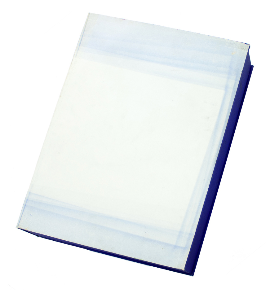
I mean, this is a jpg of it, or a composite, or a rendering, or I just don’t even know what it is. Imagine making a 10-foot tall object in 1986 that becomes an image like this 34 years later. Amazing.
If that’s confusing, here’s a detail? I think I know what this is, but it would not surprise me to learn it is actually a vector graphic.
Just as Kelly created his works by abstracting the shapes and colors and lines he saw in the world around him, I feel like I could spend the rest of my life making work of the jpgs of Ellsworth Kellys.
Kasimir Malevich, Black Square, 1915 version 79.5×79.5cm, collection: State Tretyakov Gallery, Moskow
Speaking of black squares and racism, I was surprised to not see anyone try to sneak Malevich’s Black Square into their #BlackoutTuesday posts. But then, I was offline and only did catch up to it all after the fact. Which is good, because it probably would’ve been me; I’m a sucker for a monochrome.
It did make me wonder whether Malevich has been canceled since 2015, when the State Tretyakov Museum announced they found a caption-like text on the face of the painting that reads, “Battle of the Negroes…” The gist of their announcement, and reporting at the time, was that Malevich had at some point–it was written in pencil on dry paint–titled his most important work after a French poet’s 18-year-old monochrome April Fools’ Day joke. Thus the foundational work of abstraction, Suprematism, and Modernism was actually racist satire, joke’s on the century of art snobs who fell for it.
Alphonse Allais, from Album primo-avrilesque, 1897, image: wikipedia
Maybe we were all a little bit too trusting of the Russians in 2015, argued Aleksandra Shatskikh in e-flux journal 2017. Shatskikh, a leading expert on Suprematism, dismissed the Tretyakov’s definitive attribution of the text to Malevich, who would never tell such a lame joke:
[Tretyakov Malevich expert Irina] Vakar drew her information about the creation and existence of the work A Battle of Negroes in a Cave at Night from the internet, most probably from Wikipedia…When they declared the inscription on The Black Square to be “authorial,” neither Vakar nor the collective as a whole felt even a shadow of doubt that Malevich could have thought of his BlackSquare as a banal illustration and written a title explaining its subject in the white margin below the black “illustration.” This was precisely the approach taken by Paul Bilhaud [in 1882] and then Alphonse Allais: an “illustration” and its humorous title. Allais replicated Paul Bilhaud’s discovery, and the jokers at the Moscow Academy of Painting, Sculpture, and Architecture replicated the replication—permit me to note in passing that witticisms are only authentic when fresh; afterwards they become plagiarism and cliché.
Ouch. Shatskikh also criticized the museum’s analysis. Based on the amount of time needed for the paint substrate to dry, and the multiple (ignored) instances of Malevich’s controversial Suprematist works being vandalized, Shatskikh is sure the painting was scribbled on by an unoriginal realist with a terrible sense of humor.
[DG:] The fundamental issue, to me, is that someone like Allais could get away with making what he thought of as a little joke, about Negroes in a cave being black, because his audience consisted essentially of white Europeans like himself. But our expectations of more ‘serious’ modernists are higher, and their own imagined audience was larger. We demand them to be emancipators, to work on progress in thinking. After all, it is only another decade or so until the demands of Du Bois for a ‘Negro art’, when he called for culture to help humanity to transcend what he called the ‘color line’, but also, to gain ‘the right of black folk to love and enjoy’ art, if necessary, through propaganda.[13] Like Du Bois, we expect Malevich to be both serious and on the right side of history.
This is why the discovery threatens to undermine the supposed sanctity of modernism itself. And yet, it is perhaps also an opportunity to develop a more critical understanding of many modernists’ own posturing in history.
Allais (or Bilhaud, or Malevich) is not less racist because he also made other monochrome jokes about pale girls in the snow or whatever. As Gusejnova points out, his world was basically European, white, and male. And it doesn’t really matter who wrote the text on Black Square; it successfully punctures the Suprematist myth that abstraction could exist apart from the real world of objects, people, ideologies, and racial conflict. 2015 was as good as year as any for everyone to get that message.
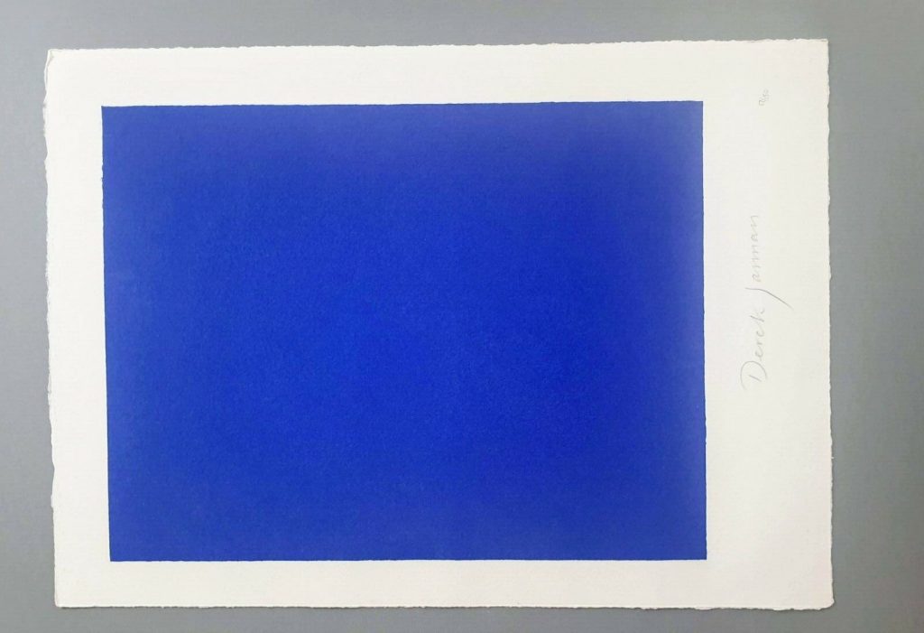
Derek Jarman, Blue, 1994,17×12 1/2 in., screen print originally made for the deluxe letterpress edition of the script by The Blue Press, now floating loose on ebay
This is a silk screen print by Derek Jarman. It was originally intended to accompany a letterpress edition of the text for Blue, his final film. That project was either produced in an edition of 150, plus some proofs, or was not realized before Jarman’s death. The numbers on the two I’ve seen hint at a bunch–this one is labeled 17/150, and the print shown at Chelsea Space in 2014 as part of the book was 37/150.
you may approach: Blue print installed at Chelsea Space, 2014, image: chelseaspace
But the only other copies I’ve ever seen of the whole book were described as printer’s proofs. Jarman was supposed to have painted IKB on the clamshell boxes of 25 of the 150 editions. One proof on ebay back in the day said only four proofs were made before Jarman died, and its lid was painted, but didn’t have a print, and said the prints were never realized either. Another, proof listed for sale privately, had a print (#43/150), but its lid looked more like the paper under the paintings than a painting itself.
Derek Jarman, Blue special edition, proof, The Blue Press, via paperbooks.ca
But that seller [pdf] said the whole letterpress edition “was centered on a loose Klein Blue screenprint signed by Jarman,” which makes it sound like the prints made it across the finish line after all. Why a signed print in a painted box doesn’t essentially become a certificate for a painting, I don’t know, but if the paintings never happened, it’s moot.
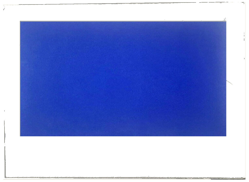
Study for Derek Jarman Blue Screen Print, 2020, gahhh, the aspect ratio…
I absolutely love this print, and may try to buy it, but I cannot for the life of me figure out why it’s portrait and not landscape. Maybe I’ll just make some and fix it myself.
LMAO This always happens to me. I think, oh, just flip it, DONE. But as I am typing in the dimensions of my new cinematic masterpiece, I am frozen. Because what should it be? Jarman made Blue on 35mm film. So 16:9 (1.77 in the US, where I first saw it, except if I look it up, some definitive-seeming sources have a widescreen aspect ratio of 1.85:1.) But Jarman’s own print is basically 4:3, so television. (Which is OK because Blue was aired on Channel4? Or nah?) But when it was still a live performance called Bliss, Jarman projected an image of an actual Yves Klein painting, and then switched to a blue gel, so no image at all, just a frame or aperture mask on the light? I think 16:9 is the clear choice here, but still.
so something like this, at 16:9, using the sheet size and smaller margins as the parameters yields a 8.125 x 14.5 inch print on a 12.5 x 17 inch sheet. study-derek-jarman-blue-screen-print-2020.jpg
Next day update: after spending part of a day determining the size and placement of the blue printed field in relation to the (unconfirmed) paper size and type of the original, I repeatedly caught myself trying not to think about how the film, then the print, then the book, then the box, then the– were all approached as the last project Jarman might complete. Make just one more thing, he and those around him might have thought? Woke up again, so there is still some time.
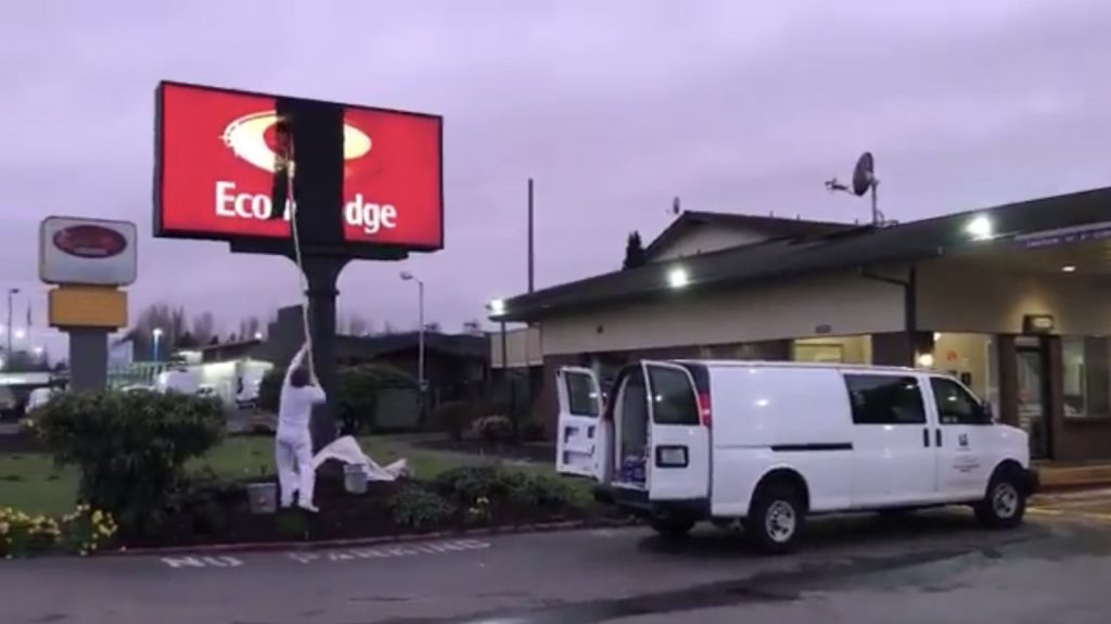
Untitled (Ecodge), 2020, latex on acrylic, lightbox, 7 x 14 ft, image: komo via @colemillertv
Untitled (edge), 2020, latex on acrylic, lightbox, 7 x 14 ft, image: kuow/megan farmer
The Washington town of Kent does not want King County Public Health Department to buy the EconoLodge and use it for coronavirus quarantine housing, but it is the only property on the market at the moment with separate entrances and separate HVAC for each room. Yay capitalism.
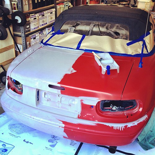
So Todd Lapin at Telstar Logistics is starting to roll out The $50 Paint Job, and it’s really got me thinking.
Basically, it’s Rustoleum household enamel, thinned by 50% or so with mineral spirits, and applied with high density foam rollers, with wet sanding between each two very thin coats. This guy did it on his Corvair, and that moparts.org thread goes on for days, months, years about it.
As I’ve been building up layers of Rijksoverheid enamel on my own panels, using various brushes and rollers, and wet sanding in between, I’ve been working toward an ideal that’s really eluded me so far: a hand-applied painted surface that shows no marks from the application. Like, for example, a Gerhard Richter mirror painting.
Part of the motivation for this is the ease with which you [I] could order these panels from a body shop. It’d be Moholy-Nagy easy–even easier since there’s no design, just color–to just order these monochromes by the official Dutch governmental auto paint code on the phone. I have the list right here. But I wanted to do them myself.
And so far, that perfectly self-leveled, brushless, orange peel-less surface has eluded me. But reading The $50 Paint Job stories, it’s obvious why: the paint straight out of the can is too thick. And for whatever misguided, paint-can-as-unaltered-found-object reason, I have resisted thinning it. Well screw that, because the next six coats are going to be nearly water-thin. I can’t wait.
Previously: rijksoverheid rood in process
The original idea, to paint monochromes and 2-color gradients based on the 21 officially approved colors in the Dutch government’s Rijkshuisstijl, plus the five blues of the country’s new logo, all of which are derived, we’re told, from Golden Age Dutch painting and the Dutch light that inspired Dutch painting.