In late 2020 A24 Films dropped this aspect ratio blanket. It is part of the film studio’s unusually extensive swag collection, and was designed by Actual Work, of Provo, Utah. It is great, and not only to the extent it makes me think of Liz Deschenes’ photos and Derek Jarman prints.
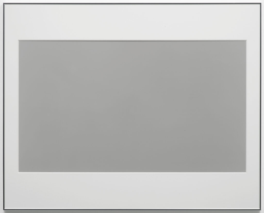
In 2003 Deschenes made a series of monochrome photographs in the dimensions of various screens, analog and (emergent) digital, which helped to forefront the usually unseen technological systems used to produce the images we consume. They don’t get as much attention as the saturated awesomeness of her green screen photos of the same era. I saw them first at Andrew Kreps, and she showed them again in London at Campoli Presti.
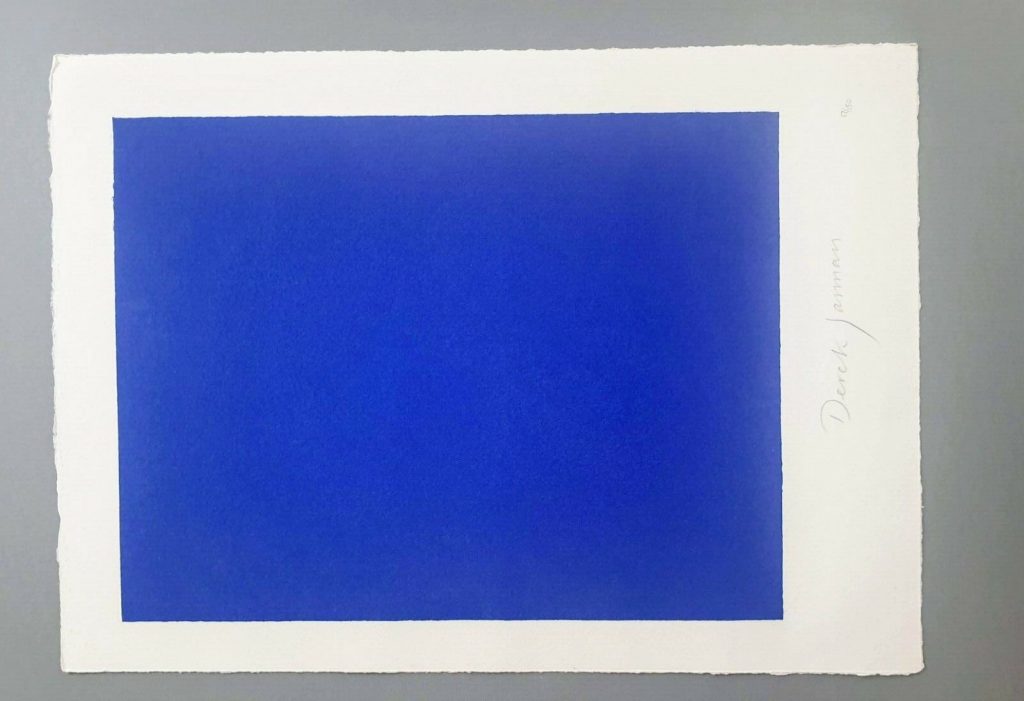
Derek Jarman is my own damn fault, a rabbit hole I jumped into and kept on digging as I tried to figure out the correct [sic] aspect ratio of a monochrome silkscreen of Jarman’s Blue, rather than just buy an example from the unfinished deluxe letterpress edition of the screenplay when it appeared on eBay.
But maybe it’s exactly those too-close encounters with aspect ratios that made me wonder what’s going on in A24’s blanket? Why does it have the seven aspect ratios it does? 1.33:1 and 2.39:1 are pretty standard (standard TV and anamorphic/widescreen theater, respectively), but 1.66:1? That’s a European theatrical format. 2:1 was originally launched in the ’50s as SuperScope, but it’s more likely that its promotion by Red, the digital camera company, as an optimal format for phone & flatscreen display is a more likely explanation. 2.76:1 is Panavision, and an auteur-y choice only a Tarantino would make (or, apparently Gareth Edwards, who used it for Rogue One. Neither film was an A24 joint.) 1:1 is…Instagram? Josef Albers? I have no idea.
1.19:1, though, is an ancient ratio that does have a direct A24 connection. Originally used in the 1920s during the transition to sound, Robert Eggers used it on his 2019 film, The Lighthouse, which was an A24 joint. The ratio was a deliberately, constricted, archaic choice that evoked imagery of the 19th century of Edgar Allan Poe’s unfinished story that inspired the film. So in a way, it makes the most sense of all.
But I think the blanket is not meant for overthinking, and these ratios were chosen to look good when stacked. Which, I guess it’s good that they do look good. If they also connected to something about the self-consciously quirky studio that made them, that’d be even better.