Before there was bluescreen or greenscreen, there was yellowscreen, and it was better.
beam splitter prism graphic, screenshot from Collision Crew
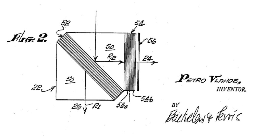
In the 1950s Petro Vlahos created an in-camera, sodium vapor process which filmed actors lit frontally with white light, against a monochrome backdrop, backlit by yellow sodium vapor lamps, using a beam splitting prism that recorded the color image and its monochromatic mask simultaneously on two reels of film. It is basically a dichroic version of Technicolor, invented by Wadsworth E. Pohl, which used prisms to split an image into three color-separated frames.
The three pieces they discuss and play, by Steve Reich, Julius Eastman, and Jason Moran, are all bangers of their kind. No spoilers, but Ligon’s made work related to a Reich text piece [above]; Moran scored a Ligon film, and it turns out Ligon and Eastman will be in a two-person show at 52 Walker in January.
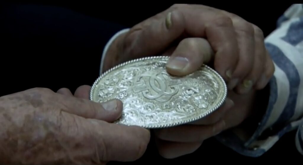
When it came out in 1996, everyone who didn’t get an actual laserdisc edition wanted a bootleg copy of Cremaster 2. I wanted a belt buckle even more.
My queries at Gladstone amounted to nothing except the offer to buy an unrecognizable photo edition. So I plotted how to get a bootleg buckle made.
Would Mortenson Silver & Saddles of Santa Fe, who were credited with the extensive silver engraving in the film, make an extra one on the side? I ultimately decided not to ask.
But watching Cremaster 2 again last night—someone has uploaded the entire Cremaster Cycle to the Internet Archive, along with Fundament (2014) and Redoubt (2018)—I was struck again by the film’s particular beauty. And I wanted a buckle all over again.
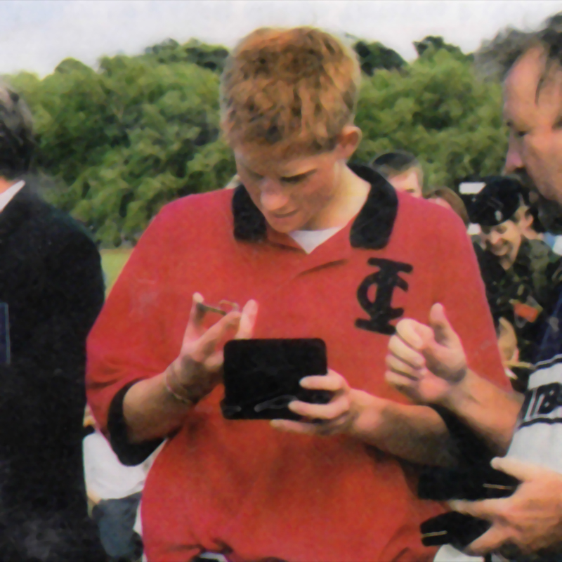
“So a cremaster is a muscle?” Prince Harry probably did not say. image: Mortenson’s Silver & Saddles
Maybe it is too far back, but Mortenson’s doesn’t mention Barney or Cremaster props on their custom commissions page. But they do note the custom buckles the CEO of Outback Steakhouse commissioned as gifts for Princes Charles, William and Harry at a charity polo tournament he organized, probably in 2002 or 2003.
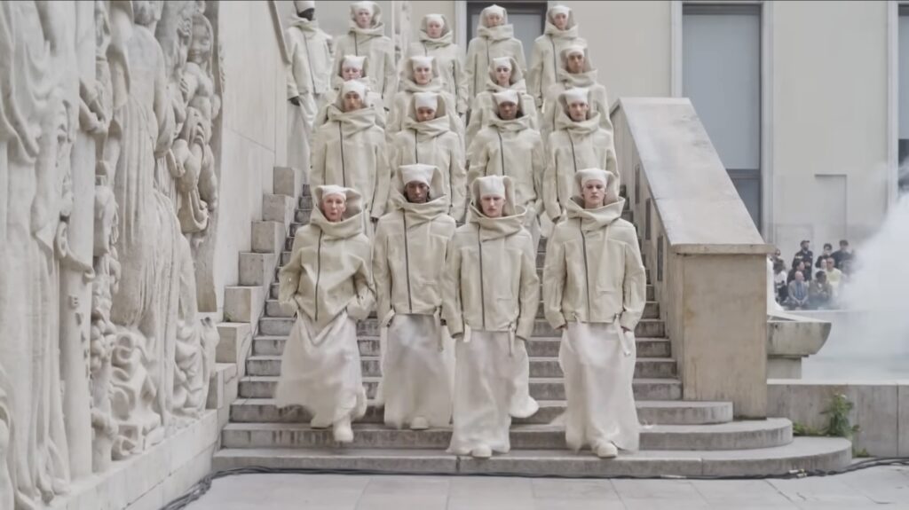
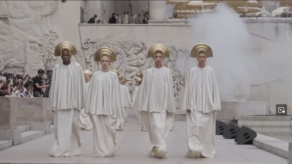
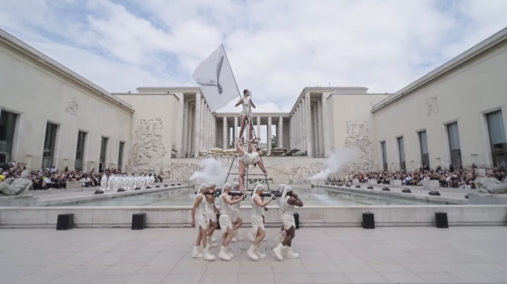
The streets were scouted. The fashion schools were emptied. The gazar was unfurled. The skaters were evicted. And Rick Owens’ Spring/Summer ’25 men’s collection processed momentously around the courtyard of the 1937 Palais de Tokyo— twice—to a very extended remix of the second movement of Beethoven’s 7th.
In the description on his YouTube channel, Owens cites as inspiration his own youthful flight to Hollywood Boulevard, Jack Smith & Kenneth Anger, and “THE LOST HOLLYWOOD OF PRE-CODE BLACK AND WHITE BIBLICAL EPICS, MIXING ART DECO, LURID SIN AND REDEEMING MORALITY.”
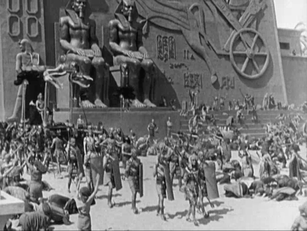
Which sounds and looks like Cecil B. DeMille’s original 1923 version of The Ten Commandments, with better costumes.
screenshot from The Ten Commandments (1923), dir. Cecil B. DeMille, via internet archive
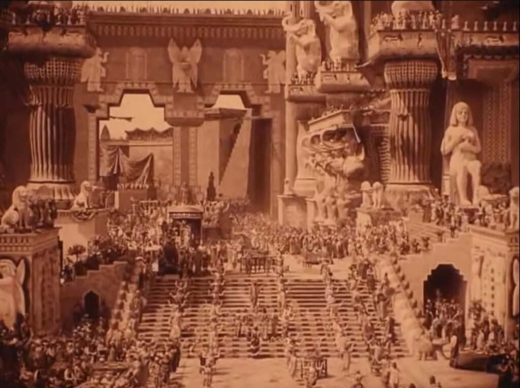
And, ngl, it also sounds and looks a lot like Intolerance (1916), D.W. Griffith’s unwieldy and obsequious sequel to his breakout klanfic hit, The Birth of A Nation (1915), with much better costumes.
screenshot of Intolerance (1916), dir. D.W. Griffith, showing the lost Babylonian set [which has been recreated in tiny part as a mall at Hollywood & Highland], via youtube
The creation of Griffith’s spectacle, from the cast of thousands to the mammoth set built on Hollywood & Sunset, was a centerpiece of Anger’s book, Hollywood Babylon.
“EXPRESSING OUR INDIVIDUALITY IS GREAT BUT SOMETIMES EXPRESSING OUR UNITY AND RELIANCE ON EACH OTHER IS A GOOD THING TO REMEMBER TOO… ESPECIALLY IN THE FACE OF THE PEAK INTOLERANCE WE ARE EXPERIENCING IN THE WORLD RIGHT NOW…” also wrote Owens.
I am not really sure how the master’s spectacularly propagandistic tools are going to dismantle his ideological house. But maybe it’s the show’s second lap, where each model walks again solo. I do want one of those jackets, though.
The image for the edition being a screenshot-timestamped.png makes it feel like we’re right there in the studio, dubbing via gladstonegallery
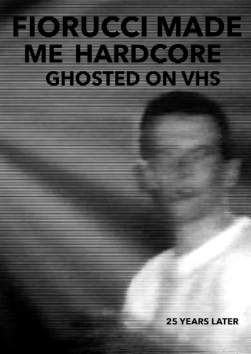
This is the 25th anniversary of Mark Leckey’s epic video work, Fiorucci Made Me Hardcore (1999), and to celebrate, he released a throwback “final version” as a VHS edition of 100. I am always too slow to get his limited edition album drops, and I figured I’d already missed this, too. But I just saw an edition in the White Columns Benefit Auction, and I wondered…
Sure enough, Gladstone still has some, and practically at 1999 prices. Now I just have to pull a VCR out of storage, and figure out how to connect it to my digital TV, to relive the hollowed out cultural promise of that haunted ghost-space.
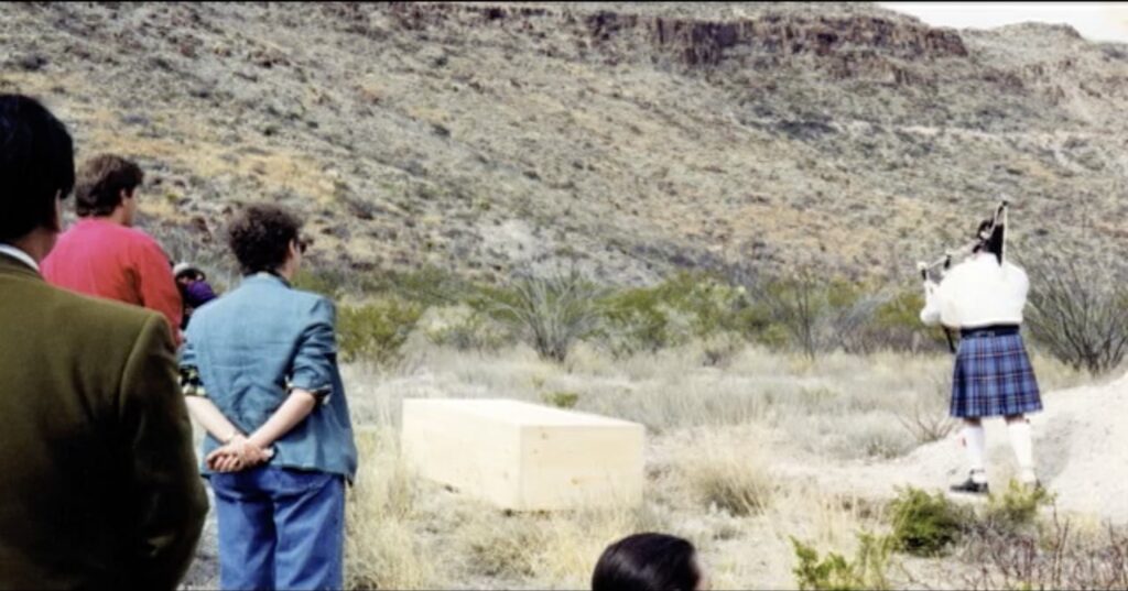
If I had a nickel for every artist documentary made from well within the circle of subjectivity that caught me off guard with the nuances of the artist’s funerary arrangements, I’d have two nickels. Which isn’t a lot, but it’s wild that it’s happened twice.
In 2007 Rainer Judd and Karen Bernstein co-directed Marfa Voices, a documentary about Donald Judd’s life and work in west Texas that emerged from the Judd Foundation’s Oral History Project. Among those who shared their stories were friends and colleagues who attended Judd’s funeral up Pinto Canyon in 1994, including the bagpiper, Joe Brady, Jr.
It probably could go without saying that Judd was buried in the most pristine of pine boxes, but it is remarkable to actually see it nonetheless.
Josh Slater-Williams has an interview for Mubi with a very thoughtful Kevin Macdonald about the implications of making High & Low — John Galliano, a documentary that about the designer’s career, his conviction for his vile anti-semitic outburst in Paris, and his not-uncontroversial return to fashion afterward.
Coming from outside of the fashion industry and its norms is probably Macdonald’s greatest superpower here; he’s able to recognize the self-delusions that haunt the field and its most intense and talented figures, and to put them on view. What I didn’t expect was to hear how Galliano handled his own role in a situation where he ceded all editorial and creative control:
He wanted to achieve various conscious things, but I think also this is part of his therapy, I suppose. It’s part of his trying to figure things out for himself. That was really apparent to me when I went to the Margiela show that we filmed, that begins and ends the film. I realized as we were watching it: my God, this show is about having a documentary made about your life. It’s about his life filtered through film, because he made a fashion show that is a film at the same time.
I don’t think Matt Zoller Seitz even knows how to do a bad interview, but his discussion with Ken Loach on the occasion of the release of The Old Oak, which Loach, 87, has decided will be his last film, is really excellent. Part of that is their discussion of the experience of filmmaking, Loach’s process, and style, something the famously naturalistic, un-stylish [sic] filmmaker apparently never gets to talk about:
If you were to distill “How to make films the Ken Loach way,” what would be the most important rules? Camera at eye level. Natural light. Lens like a human eye. No great wide-angle lens and no extreme telephoto effects. Don’t intervene in an actor’s space, you know? Respect their space. Within those parameters, light is critical because it can tell viewers whether you’re gonna treat somebody like a suspect in a hostile interview or whether you’re gonna engage with someone sympathetically. I’ve learned a lot just looking at old paintings. First thing when you look for a location is “Where’s the light?” It isn’t about the place. If the light doesn’t work, we needn’t see any more of the scene. It’s not only useful for lighting performers, it’s just immensely beautiful for shots. And then you consider the balance of people in the frame, the balance of architecture, the rhythm of cutting. Bad cutting can destroy a sense of reality.
What is bad cutting?
I wish him a long and healthy life, but can we get more interviews on process with him quick, please?
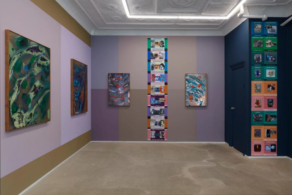
I am so fascinated and pumped for this show. Jonah Freeman just opened Décor Slip at 56 Henry—actually at their annex across the street, 105 Henry—and it looks incredible. The multi-process abstract paintings and storyboard/timeline images remind me a bit of Jeremy Blake’s last show, in concept, but not at all in the realization. I don’t know what the moving image piece is.
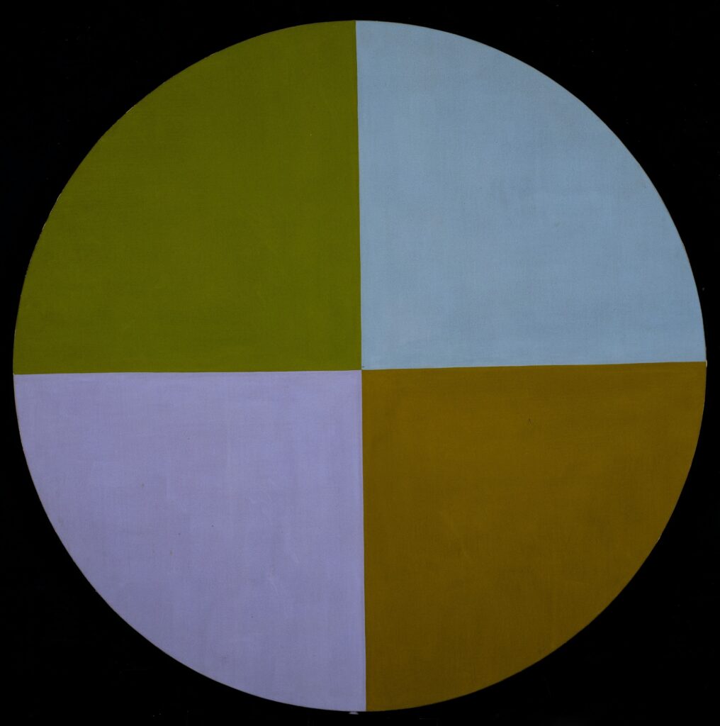
But the colors on the walls behind the works are just perfectly off, a reminder that Freeman has spent years since his last gallery show in NYC producing meticulously realized spatial experiences. There’s a mention of Albers in the show’s announcement, but these feel like the colors of that one Mary Pinchot Meyer painting we have visuals on.
Mary Pinchot Meyer, Half Light, 1964, 60 in. dia. (it’s round, btw, not black in the corners), collection: The Smithsonian American Art Museum
Between this and the Christopher Wool show, the white cube may be ready for a theoretical renovation.
At Little White Lies, Lillian Crawford has a Q&A with Hirokazu Kore-eda about working with Ryuichi Sakamoto on what would be the composer’s final film project, Monster [Kaibutsu]. Sakamoto ended up composing a couple of pieces for the soundtrack, and Kore-eda used some existing compositions, which are all so integral to the film, perhaps because he edited to them. The sonic experience of Monster is subtle and compelling, a mix of piano, diagetic musical instruments, and ambient/natural sounds. It really works as part of the whole.
I’ve been trying to figure out what to say about Monster, which is an exquisite, precise, and wrenching film. When early reviews compared its multiple narrative views to Rashomon, I went back to rewatch, and it absolutely is not that.
As Kore-eda explains to Crawford, “One thing that’s consistent throughout this film is how hard it is to understand other people.” And that is in there. But I think Monster lays out the roots of that problem, by showing how trapped everyone is by their own subjective circumstances. Rashomon reveals the contradictions and lies people weave to suit their own selfish interest.
Monster shows how even a slightly different perspective, slightly different timing, can totally change the story. Some people have compared Monster to Kore-eda’s 2018 film, Shoplifters, for its emotional tenor—and overlaps in casting. It has made me think back to After Life (1998), in that both are enacted metaphors of filmmaking. Monster‘s events unfold unchanged each time, except for the position of the camera, or the timing of the cut, which changes the emotional impact and insight.
And the sonic texture of the film ends up being both an anchor and an amplifier as we—and the characters— try to piece things together.
I haven’t even scrolled down to read the article, but this caption alone is already my favorite thing of the week. I hope Barbara Visser does a documentary on Richard Prince’s Instagram portraits next.
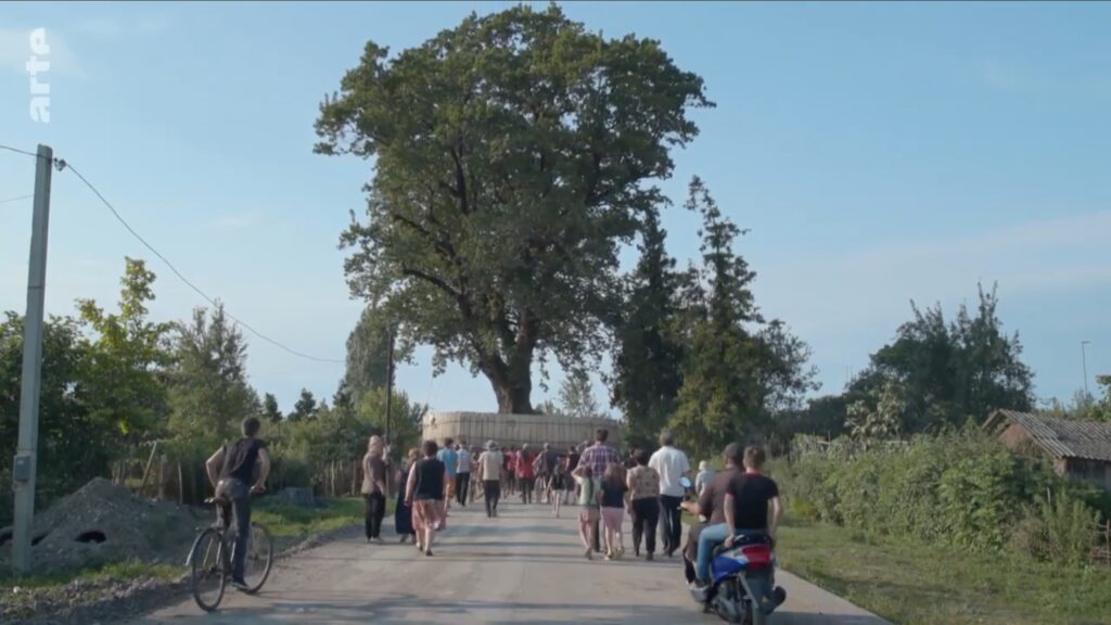
Still from Salomé Jashi’s Taming The Garden, 2021, showing a giant tree on the Black Sea en route to Ivanishvili’s private tree zoo. images via a German-titled arte broadcast uploaded to YouTube
In 2021 Georgian filmmaker Salomé Jashi released Taming The Garden, a documentary about the creation of the Shekvetili Dendrological Park. Bidzina Ivanishvili, a Georgian oligarch-turned-politician who minted his $6 billion fortune in Russia, spent five years collecting over 200 old-growth trees from around the country, which he had transplanted in a park of his own design next to his estate on the Black Sea. The park opened to the public in 2020.
Residents of a Georgian village follow their tree as it drives out of town in Taming The Garden, along a route with probably 90% fewer infrastructure hassles or regulatory hoops to jump through than that rock had to face on its way to LACMA
In her film, Jashi follows several trees as they are removed from the village s, farms, and forests where they’ve been for centuries. She records the resignation and loss of the locals, as well as the surreal transport of the uprooted trees along rural roads, and on barges. The filmmaking is quietly powerful, with dramatic images that only reveal the project’s traumas and absurdities and slowly.
NO SPOILERS but Jashi’s quiet revelations of the sheer artificiality of this ostensibly idyllic natural landscape are amazing
A 2022 dispatch from Ivan Nechepurenko in the New York Times, with striking photos by Daro Sulaukari, reports that around half the trees arrived by sea, and half by truck. The entire project cost Ivanishvili “tens of millions” of dollars, which seems like a pittance for what he did and what he got.
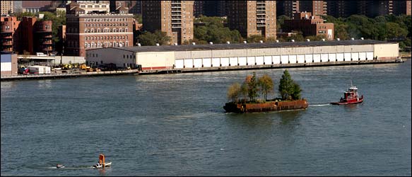
Robert Smithson’s Floating Island, 2005, image via NYT
Why, in 2005, when Nancy Holt authorized Floating Island, a previously unrealized project of her late husband, Robert Smithson, it cost $250,000 to drive a single barge around lower Manhattan for a week.
A miniature version of The Gates chasing a miniature version of Central Park, by, as it turned out, Bruce High Quality Foundation and Robert Smithson, respectively, as captured by Ian Adelman in 2005 in the NYT
I guess I should be more shocked, surprised, dismayed, whatever that Land Art, created in opposition to the collector-pandering commodification of the gallery system, has been so thoroughly subsumed by the billionaire class. But then again, Double Negative was produced and owned by a 3M heiress who donated the first version of Lightning Field, realized on her New Mexico ranch, to the foundation started by the oil heiress which built the permanent version. And which now manages Spiral Jetty. And of course, it was New York’s own oligarch-turned-politician Michael Bloomberg who made Christo & Jeanne Claude’s Gates happen. And the industrialist with the private museum has taken on the care and funding of City. Is Land Art actually about real estate and power? Always was.
“For me, a floating tree was a symbol of power, of desire, of wanting something at any cost,” Ms. Jashi told the NYT. If Land Art can accommodate the Department of Defense’s creations at Dugway Proving Grounds, the cost-be-damned symbolic gestures of a tree-obsessed oligarch should fit right in.
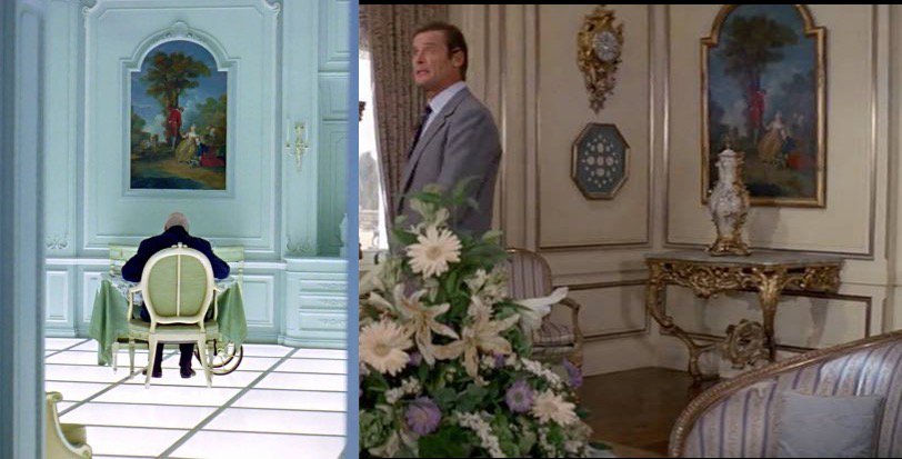
Dan Hopewell turned up a 2017 thread on social media by Simone Odino about film writer Joe R. Frinzi, who noticed that the aliens in 2001: A Space Odyssey decorated the astronaut’s hotel room with a painting from Roger Moore’s room at Max Zorin’s château in the 1985 Bond movie, A View To A Kill. The idea of A View To A Kill existing in the 2001 universe is a lot to process. But given Clarke’s premise that they gleaned details of Earth from TV broadcasts, I guess we should have at least been aware of the possibility.
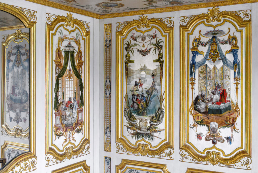
Detail of Christophe Huet’s 18th century monkey business paintings in the Petite Singerie at Château de Chantilly, image: Marc Walter via CdeC
A View To A Kill was filmed at the Château de Chantilly, whose most famous decorative paintings, in the Grande and Petite Singeries, are Christophe Huet’s 18th century wall paintings of monkeys dressed and carrying on as French aristocrats. Perhaps someone paint a version of the opening scene of 2001 in the style of Huet.
If Frinzi mentions the painting in his new book, Kubrick’s Monolith: The Art and Mystery of 2001: A Space Odyssey, I couldn’t find it in his just-dropped interview on the Kubrick Universe Podcast. They were operating on a different level of fandom entirely, tbqh.
A few hours later update: following up to a comment on tumblr by @brocatus about whether this was an intentional quote, I looked on IMDb. The Art Director for A View To A Kill was John Fenner, who also worked with Stanley Kubrick. He worked as a draftsman on The Shining (1980) and 2001 (1968, uncredited), and would go on to work as art director on Eyes Wide Shut.
Somewhere on social media in response to the Frinzi mention, someone Odino wrote that when he asked about the identity of the painting in the Hotel Room, Christiane Kubrick said she recalled MGM making it themselves “[MGM] might as well have made it themselves,” and she had no idea.* If Fenner didn’t make it, he surely would have recognized it, and would have been in a position to place it. Someone else pointed out that the studios for the two productions were different. Perhaps Fenner not only made the painting, but has it?
*Corrected the quote and credited Odino after he chimed in and clarified on social media.
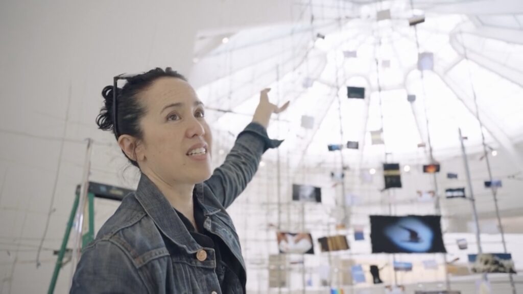
Sarah Sze explaining Slice (2023), a site-specific work in the her Timelapse exhibition at the Guggenheim, in an Art21 documentary. image: art21.org
I still have to see Sarah Sze’s exhibition at the Guggenheim, Timelapse. Watching Ian Forster’s Art21 interview/documentary of Sze explaining her work as she makes it does not make it easy to wait.
A couple of weeks ago, Sze talked to Ben Luke for The Art Newspaper’s podcast about her Artangel commission, Metronome, which is installed in a South London railway station waiting room. Because of the pandemic, the timing for these two major shows slid on top of each other.
For both exhibitions Sze has created streams of video or audio content that slip and loop in a seemingly non-repeating way, creating seemingly random confluences and juxtapositions. In Forster’s footage, we see Sze’s images, but don’t hear about them. In Luke’s we hear her talking about her sources, but don’t see them.