There. Are. FOUR. LIGHTS.

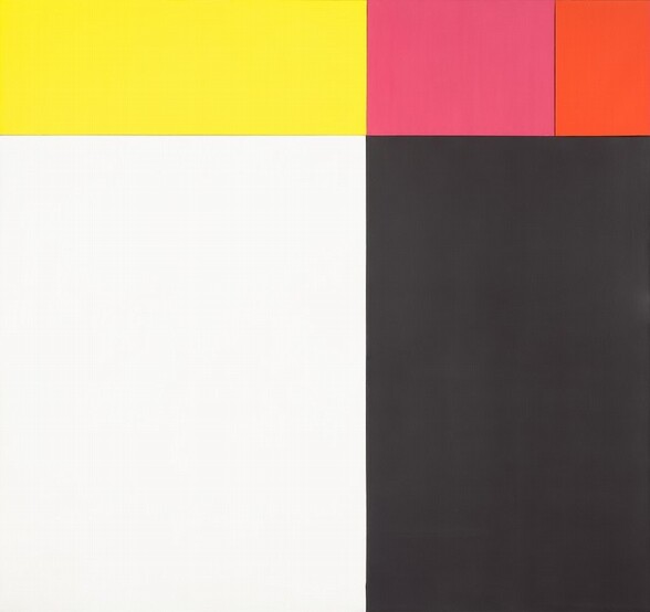
an ellsworth kelly painting of five asymmetrical monochrome canvases in yellow, pink, black, and white, form a square. through the door behind it two figures are backlit by a hot white dan flavin fluorescent sculpture that turns the room around it green. at the national gallery of art in washington dc

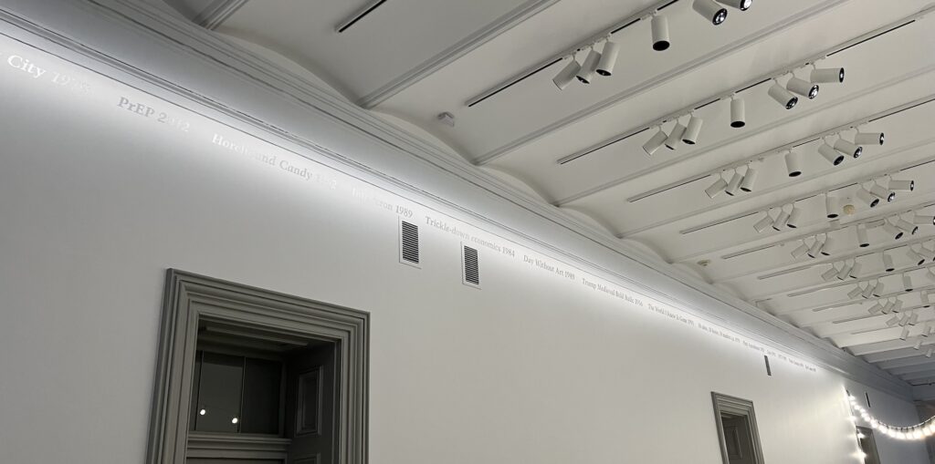
I went back to the National Gallery of Art today just to photograph the two major lighting WTF going on right now, but also to celebrate the return of Ellsworth Kelly’s Tiger, an early multi-canvas masterpiece from 1953. The work had suddenly disappeared from the 2023 Ellsworth Kelly show at Glenstone, without a word of explanation.

In completely unrelated news, I remember a few weeks ago talking with one of the conservators at the NGA who said how much Ellsworth loved the Gallery, and had even left a bunch of money to research the conservation of contemporary paintings. Which is good, because [counting Tiger as one,] they have 24 Kelly canvases.

Back to the photo, which also shows Lighting Situation #1, or 1-3: a gallery of three white hot Dan Flavin Tatlin Monuments throwing my ccd out of whack.

a giant white barnett newman painting on the left wall is in a pink tinted gallery of all white paintings, as the bright white light of a dan flavin sculpture that turned its gallery green bleeds through the doorway, silhouetting a couple of visitors along the way. the national gallery of art

Which is fine. But there is a white walled gallery next to it, filled with white paintings. That is a Barnett Newman on the left, The Name II, 1950, very rarely seen. There’s also a Mary Corse, Robert Ryman, Freddy Rodriguez, and an Anne Truitt.

the shadow of a grumpy middle aged white guy is cast across a brightly lit all white painting by anne truitt, which has a patch of whiter paint, and a faint graphite line on that, though you wouldn't know it from the lighting. the national gallery

Truitt’s white acrylic and pencil on gesso Arundel XI painting suffers the worst. My phone camera is doing a lot of work here, and the painting is still almost unseeable.

a gallery of all yellow artworks with a yellow geometric olafur eliasson chandelier sphere in the center, includes a yellow shop storefront with canvas on it by christo; a yellow and orange painted square column by anne truitt; an angled mirrored doorway, actually a freestanding, deeply framed doorway-shaped sculpture, by olafur; and a figure on a bright yellow background by usco, at the national gallery

You know, to see these photos of Lighting Situation #2, Yellow Gallery, I feel like I’m being a noodge; they really do seem to color correct a lot, even presenting the range of yellows Christo, Truitt, USCO, Kusama, and Mangold used.

olafur eliasson's yellow sphere chandelier casts its light across all the other yellow objects in the gallery, canceling some of their tone. this includes the giant kusama infinity net, yellow on black, that looks like the one frank stella had for decades; a bunch of small works idek; and a multipart geometric canvas by robert mangold. at the national gallery of art.

Even Olafur’s got two different yellows, in the door and the orb. But it truly is the orb yellow that becomes a collaborator with every other work in the room; it’s really palpable. There is a similar circular pedestal being set up on the mezzanine right now; I wonder what they’ll hang above that one?

I really feel like I can see how these installations came together; the way the curators thought through the challenging situations these light-based objects present; and the factors that brought them to this spot in the first place. And it’s good to remember we really are all going through some stuff right now, as a city, a capital, a nation, and a world.

Vase Value

in a grey floored white cube gallery filled with a ring of jumbly contemporary sculptures, all narrow, tall pedestal-shaped, wrapped and decorated, with various agglomerations of objects on top of each one, the central artwork in the foreground is dominated by a large spider decoration atop a red plastic vase, balanced upside down on another silver vase, and surrounded by a bundle of sticks and a stick broom, and a silver painted baby doll, on a pedestal wrapped with babies from a copy of a lost leonardo, some mirror tile, and some orange plastic. this precarious work by isa genzken was made in 2004 and is titled dreaming baby. it was first shown at david zwirner gallery.
installation view of Isa Genzken, New Works, Spring 2005 at David Zwirner Gallery, NYC

Träumendes Kind (Dreaming Baby), 2004, stood at the center of Isa Genzken’s first show with David Zwirner in New York, in the spring of 2005. Topped with a twig broom, a mighty bundle of sticks, some precariously shoved-together vases, a spraypainted baby, and a giant Halloween spider, it was the shaggiest of the nine messy, totemic sculptures that dominated the show. It’s probably where Hirshhorn curator Anne Ellegood saw it, but it’s not clear when she decided to include it and five other similar Genzkens in her 2006 survey exhibition of contemporary sculpture, The Uncertainty of Objects and Ideas.

Traumendes Kind [minus the umlaut] was discussed at length in the show’s catalogue, where Ellegood celebrated “artists’ willingness to allow their work to suggest both a coming together and a falling apart.” And works whose “visible awkwardness or indeterminateness may take on structural manifestations in terms of delicacy, precariousness, and the periodic use of inherently unstable materials.” Yes, about that, actually,

In mid-October, a couple of weeks before the show, the Hirshhorn folks opened a large crate shipped from New York, and they found half the Genzken was missing. It turns out the mirror- and cherub-wrapped pedestal was in its own crate that didn’t make the trip. More importantly for this post, the half that did arrive was in pieces, rolling around on the bottom of the crate.

While looking for something else in the Hirshhorn archives I stumbled across the documentation of the resolution of Träumendes Kind‘s trauma: a thick folder of unredacted back & forth with the lender—gallerist Tim Nye, actually almost all of it was with his assistant—and Hirshhorn conservators, registrars, and curators, with occasional reply all’d interjections from the David Zwirner team and the Christian Scheidemann, contemporary art’s go-to conservator. It’s the kind of thing that happens all the time, but even for a show about sculptural uncertainty, it almost never gets mentioned or discussed in public. In this case, though, it’s all preserved for the nation by the Smithsonian.

tl;dr the sculpture’s fine ($35,000) and Nye’s fine ($30,000), but here’s what happened:

Continue reading “Vase Value”

BOGO Tillmans Concorde Grid

wolfgang tillmans' grid of 56 photos of the concorde landing or taking off at heathrow airport are all in different formats and vantage points, wherever he was able to capture the image, but all printed at the same size that, to 21st century audience, now echoes a cellphone screen, but in 1997, did not. this edition was acquired by the hirshhorn museum in 2006
Wolfgang Tillmans, Concorde Grid, 1997, 56 c-prints, ed. 10+1AP, this one acquired by the Hirshhorn in 2006

I still remember standing in front of Wolfgang Tillmans’ Concorde Grid as Andrea Rosen sold the last complete set to some art adviser from Paris who’d started talking to her before I did, and I was offered a few loosies, at unbundled prices. I got the book instead. But now I wonder if I should just YOLO it and make some.

While researching something else in the Hirshhorn’s archives recently, I stumbled across the museum staff’s correspondence with Tillmans and his gallerists about their acquisition of a Concorde Grid edition in 2006.

Actually, it was about designing the lighting for the Hirshhorn’s 2007 Wolfgang Tillmans exhibition, because conservators stipulated a lower light level than the artist wanted, in order to protect the museum’s new acquisition. But no worries, it turns out Tillmans had also provided an exhibition copy in addition to the “original,” 10-year-old C-prints, so just go ahead and turn up the lights, blast those suckers!

“[Tillmans] feels that implicit in the terms of the acquisition was the idea that the exhibition copy could be shown at light levels that he prefers to show his work,” wrote a curator to a conservator.

Which reminds me of something I’d heard Tillmans say before, that collectors of his unframed prints get the media file and a certificate of authenticity, and are able to reprint it as needed. He was talking about his large-scale prints, but I wonder if that applies for his smaller unframed works, too? Or maybe just to Concorde Grid, because it’s at once both large and small? Actually, re-reading this now, reprinting requires the destruction and return of the original print, so this is actually handled differently from an exhibition print. Also, MoMA stipulates two identical color prints whenever a work enters their collection, so maybe it’s nbd after all. nvm

Wolfgang Tillmans interview, 2021: ‘I don’t really believe in the possibility of absolute protection or in the inferiority of a slightly altered print.’ [lightingthearchive.org via @bbhilley.bsky.social]

‘All that is needed to caricature an oppressor is to portray him exactly as he is.’

The other day Cabinet Magazine sent out a fresh link to their June 2024 essay by James G. Harper and Philip W. Scher, “Looking Back At The White Man: The Story of Julius Lips.”

The title is a reference to the working title of Lips’ own multiyear research project, begun while he was a promising, young anthropologist in Cologne who was made director of the Rautenstrauch-Joest Museum in 1928: “How The Black Man Looks At The White Man.” Lips had collected depictions of European colonizers by indigenous people across Africa, North America, and Oceania, the source material for a counter-narrative of the civilizing myths of white supremacy.

In 1933 Lips was forced out by nazis who worked for months with complicit colleagues of his to seize control of his research. He smuggled it and his wife out of Germany, through France, and to the US, where his book was published in 1938 with the title, The Savage Hits Back. Though happy to dunk on nazis, the US anthropology world didn’t seem to receptive to his anti-racist take, and ignored or took issue with discrepancies in his interpretations. Still, Harper & Scher make a case for Lips as an important progenitor of anti-colonialist theory.

The Savage Hits Back is on the Internet Archive in a nearly illegible scan. His former museum in Cologne did an exhibition revisiting Lips work in 2018, which might be the same show that turned up at the Haus der Kulturen der Welt in Berlin in 2019 as Spectral-White. Wait, no, this is not right. Harper & Scher’s first footnote is a big vague/wrong about this sequence of events.Anna Brus staged a symposium, “The Savage Hits Back Revisited,” in Cologne, at the Rautenstrauch-Joest Museum, in February 2016. Brus also co-curated the show, Spektral-Weiss, at HKW in 2019. The publication Brus edited, which accompanied the show, was The Savage Hits Back Revisited: Art and Alterity in the Colonial Encounter, and I assume it was the proceedings of the 2016 symposium.

The Julius Lips pullquote for the HKW exhibition, “All that is needed to caricature an oppressor is to portray him exactly as he is.” sounds like the kind of thing that could drive nazis berserk all over again, even today.

The Blood Counters Next Time

Bookforum recently emailed some links to read up on in advance of its Fall 2025 issue. On the list: Gene Seymour’s Summer 2017 review of James Baldwin: The FBI File, William J. Maxwell’s deep dive into the declassified records of the FBI’s most extensive surveillance of a Black writer. Maxwell would know, after publishing a survey of the US government’s investigations of Black literary figures in 2015, F.B. Eyes: How J. Edgar Hoover’s Ghostreaders Framed African American Literature.

What stuck out from Maxwell’s second book is Baldwin’s response to discovering in 1963 that he and the Civil Rights Movement leaders in Selma, Alabama were all being monitored by the FBI, surveilled by agents of their own country’s government, but not protected when other agents of the state attacked them. Baldwin announced, publicly and repeatedly, that his bestselling novel, Another Country (1962), his next book was going to be about Hoover and the FBI, and their central role in America’s “race problem.”

There’s evidence throughout the book that Baldwin gave back to the FBI as good as he got, baiting the easily baitable Hoover by declaring in a 1963 television interview that the director “was part of the problem in the civil rights movement.”

The book obviously didn’t happen, but it’s not clear whether Baldwin ever meant for it to, either. Was he actually was working on the book, titled The Blood Counters, or did he use the looming possibility of such an exposé as a taunt and a feint for his FBI adversaries? Maxwell traces the documentation of the FBI’s frantic efforts to find out, and to, if possible, prevent its publication.

Maxwell seems to make as much effort to present The Blood Counters as a conceptual vaporware meant to bait Hoover personally as he does on the idea that this far-reaching surveillance, involving dozens of agents and even more informants reporting from wherever Baldwin traveled or spoke, was actually a personal contest of wills between these two men. It might, in retrospect, be more useful to look at how many eager collaborators the FBI found in New York’s publishing industry, and what actual books they successfully spiked, or writers they successfully silenced.

Maxwell notes a diminished output for Baldwin in 1964, which may have represented lost work on The Blood Counters. Or maybe it was just the stress of living under government surveillance. The Blood Counters was the story Baldwin had to tell in order to live, but it’s not clear if he was telling it to himself, or just to his official menacers.

And now this all feels remarkably quaint and humane in the face of an unresrained digital dragnet that logs your DMs and knows exactly how far you haven’t gotten in your Google Docs draft.

Refugee Boat, 1992

a handmade boat the size of a freestanding bathtub made of styrofoam blocks and covered in places with tar pitch has two short oars on its sides, and a tarp in the center. it sits in a glass case behind a glass wall, surrounded on three sides by large glass panels with photos of the blue open sea, context that is important to make clear that the boat contained two refugees from cuba who were picked up in it in 1992 by us coast guard. the boat was on display at the smithsonian until july 2025. the smithsonian acquired it when they first showed it, in 1994.

From an early draft of the report on Washington, DC museums I recently did for ARTnews:

While the National Museum of the American Latino is in development, a dense exhibition tracing the Latino history of America is being presented in the Molina Family Latino Gallery on the ground floor of the National Museum of American History. The largest object in the show is a tiny boat the size of a cold plunge, made of pitch-covered styrofoam scraps. In July 1992 the US Coast Guard rescued two Cuban men in this boat on the open sea. In Summer 1994 tens of thousands of Cubans fled for the U.S. on homemade balsa wood rafts, and “Felix Gonzalez-Torres: Traveling” opened at the Hirshhorn Museum. In September, as politicians debated the fate of 20,000 Cuban balseros intercepted at sea and detained at Guantanamo, this boat went on view at the Anacostia Community Museum in a show titled, “Black Mosaic: Community, Race and Ethnicity among Black Immigrants in Washington, DC.” It then entered the Smithsonian’s collection. The current administration is also demanding the cancellation of the National Museum of the American Latino.

a stack of deep black posters of a photograph of the open sea with no horizon sit on the floor of a gallery. this is an untitled work by felix gonzalez-torres in the collection of the walker art center in minneapolis
Felix Gonzalez-Torres, “Untitled”, 1991, offset print on paper, endless copies, collection: Walker Art Center

[I checked, and Gonzalez-Torres’s paper stack, “Untitled” (1991) with an image of the open sea that looked uncannily similar to the installation of this raft at the Smithsonian, was not included in the Hirshhorn’s 1994 exhibition. It was on view in 1994 at the Walker, though, and in Felix’s 1995 Guggenheim retrospective. It has never been exhibited in Washington, D.C.]

Now Hyperallergic reports that on July 20th, a couple of weeks after I filed my piece, and barely a week after the Regents meeting where Chancellor Lonnie Bunch acceded to JD Vance’s demands for an improper ideology review of the Smithsonian’s shows, and four months before it was scheduled for reinstallation, the Molina gallery was closed.

Hispanic conservatives in 2023 had already used fundraising threats to force the Latino Museum to change the 2025 exhibit from a history of Latino civil rights to a celebration of salsa music. With nine months to install it, I expect it’ll be one helluva show.

Man on Fire in Country on Fire

a life-size fiberglass statue of a cocoa brown man, nude, with left arm raised, legs wide astride a knee-high barrel, is engulfed in orange red and yellow airbrushed flames that encircle his head and arm like a fiery wing. the figure stands on a grey painted mdf pedestal, over nine feet tall. luis jimenez's 1969 sculpture man on fire is installed against a chocolate painted wall and black painted 19th century industrial column at the smithsonian american art museum in dc, and trump hates it so much he condemned the show which he's never seen, in an executive order.
Luis Jiménez, Man on Fire, 1969, fiberglass in acrylic urethane resin, like 9 ft tall, installed in “The Shape of Power: Stories of Race and American Sculpture at the Smithsonian American Art Museum”

In June I did a whirlwind survey of almost all the museums, art and otherwise, in Washington, D.C., and wrote about it for ARTnews. It’s in their latest print issue, and it just dropped online.

For a series of museums I’ve been visiting for years, it was a repeatedly revelatory experience. Luis Jiménez’s Man on Fire is a case in point, a stunning sculpture that stands between the columns of the Smithsonian’s Old Patent Building at the flaming center of “The Shape of Power,” the first exhibition singled out for criticism in a presidential executive order.

And I felt the urgency of the decades and centuries of work, both in art and history, and in the museums’ presentation, study, and care of these objects. We’ll get a more perfect union yet, but let’s not destroy the imperfect one we have on the way.

D.C.’s Museum, Under Attack by Trump, Have Never Been More United In Their Purpose [artnet]

Jasper Johns Little Guys For Obama

a jasper johns etching has two horizontal rows of squarish images, like a comic strip, in gradations of grey. most of the panels have an element that looks like an eye or a sun, in space or in a larger circle. the upper right panel has the three stick figures johns began using as an occasional motif in the 1980s, but especially after 2000.
Jasper Johns, Untitled (from the Artists for Obama portfolio), 2008, etching and aquatint, 8 x 20 cm image, 21 x 30 cm sheet, ed. 13/150, selling as a loosie on 3 Sept 2025 at LA Modern [kinda wild that such a low edition number was broken up for parts]

Whoops, missed another one. I might have to check all the benefit print portfolios Johns contributed to in the last 30 years, to see if there are any more little guys out there.

Meanwhile, these little guys are in a little print—just 8 x 20 cm, smaller, even than the Ellsworth Kelly print in the same Artists for Obama portfolio.

a detail of jasper johns's 2008 print for obama comprises the upper right panel where three barely drawn stick figures are in motion against a gradient sky sprinkled with stars. the stars and guys are drawn in line,and the sky is brushed in around them all. feels kind of quick, looks kind of provisional
Jasper Johns, detail, Untitled (from the Artists for Obama portfolio), this little scene is like 5 x 5 cm

And they’re pretty lyrically drawn, too. No stamps here. I assume those are pens in their hands, encouraging people to register to vote.

3 Sept 2025, Lot 310, Jasper Johns, Untitled, est. $2-3,000 [lamodern]
Gemini GEL got 14 Artists for Obama in 2008, tho technically they were Artists for the DNC [moma]
Previously, related: Jasper Johns Little Guys for Leo

Louise Bourgeois, I do (2010)

What a document, what a moment.

a louise bourgeois print on fabric of two red watery flowers emerging from a single forked stem, with LB embroidered in the lower right corner, and the title, I do, and edition number, 199/300 in the lower left. via phillips I think
Louise Bourgeois, I do, 2010, digital print and embroidery on textile, 16 x 12 in.,ed. 199/300+35 AP, unframed, sold at Phillips in 2022 [h/t to @thelegendaryhitchhiker]

On May 11, 2010, Freedom To Marry announced the release of I do, an edition by Louise Bourgeois, which the artist donated to raise $300,000 for the campaign to recognize gay marriage in the United States.

Continue reading “Louise Bourgeois, I do (2010)”

The Smithsonian Said F*** Palestine

a white teenage girl stands on a very flimsy looking white plastic folding chair as she paints a scene of protestors holding signs into a group mural. one sign references climate change, another says free palestine. via npr
The kid of MOCAT painting Free Palestine on her mural at the Smithsonian Folklife Festival, image: Bruce Guthrie via NPR

The Museum of the Contemporary American Teenager (MOCAT) is an art and culture program initiated by a teacher in Montgomery County, MD, which operates at American University, the Kennedy Center, and the Smithsonian.

For this year’s Smithsonian Folklife Festival on the National Mall, MOCAT artists painted a mural of teen life and teen issues. It included protest signs that mentioned the climate crisis, the immigrant crisis, the gun crisis, and Free Palestine. One of these was anti-Semitic hate speech, a Smithsonian official told the teen artist, who is Jewish, and who disagreed.

a wall of a temporary structure on a shady park lawn (actually the national mall) is covered by several green tarps. three large concrete cubes hold down the structure at the two corners and the center. underneath the tarp is a mural painted by area teens, who included a sign that said free palestine in the mural, which sent some smithsonian folks into a hate speech panic in ways that starvation and genocide apparently don't. via npr
MOCAT Mural with Smithsonian Tarp, Folklife Festival 2025, image: Léda Pelton via NPR

The next day, the MOCAT crew arrived on the Mall and found their entire mural covered with tarps by the Smithsonian. The Smithsonian said they were doing it to protect the kids from angry mobs, which the kids said,  “maybe we are not the problem in that situation.” The Smithsonian said the mural violated the no politics policy MOCAT had agreed to, though the document they cited was only distributed two days after the festival began. The MOCAT folks want the mural for educational purposes, but the Smithsonian claims ownership of it, so I guess it was a work-for-hire situation. Or work-for-exposure.

This all happened at the beginning of July, but only hit NPR the other day. So I feel like we should have a lot more clarity over what happened and why. What we do know is that in the three weeks since, Israel has continued starving and killing Palestinians in Gaza while governments in the West throw a tarp over it and walk away.

The Smithsonian Said Trans Erasure

Look, I understand how reporting works, and why it’s being covered the way it is, because that is how the story got out, and that is who has gone on the record.

But as shocking and admirable as it seems that Amy Sherald canceled her retrospective’s appearance at the National Portrait Gallery, that is not the really important part.

The important and frankly dire thing is that the NPG, and the Smithsonian’s chancellor Lonnie Bunch, attempted to join Trump’s extremist movement to erase trans representation. They sought to censor one of Sherald’s paintings, of a trans woman posing as the Statue of Liberty, remove it from the exhibition American Sublime—organized by SFMOMA and moving in a couple of weeks from the Whitney to, well, not the NPG now, so who knows?—and replace it, somehow, with a video of people debating or reacting to the painting? The painting they would refuse to show? And letting people decide for themselves whether trans people should exist?

The quote being attributed to Bunch, via Sherald, is that they didn’t want to “provoke” Trump by showing a work. So instead they join him by censoring it. This comes just weeks after Bunch and the board of regents also acceded to Trump’s calls to review Smithsonian exhibitions for unapproved ideologies. Like, I guess, the applicability of “with liberty and justice for all” to trans people.

Project 2025 calls for a takeover of the Smithsonian and the removal of Bunch, saying he’s not the right man for the job. Maybe he’s trying to prove to them that he is their guy after all. This immediately calls the resignation of NPG director Kim Sajet into question, too. When did all this censorship conversation go down? Why was Lonnie Bunch even weighing in on single artwork decisionmaking?

Sherald did the right thing when she needed to, exercising the power she has in the context where she has it. Every one of us should do the same. But what matters on a larger scale is that faced with the same situation, the people at the Smithsonian Institution betrayed their mission, their principles, trans people, and all of us.

The Communications of Bureau

two portrait photos of us navy sailors are centered in medallions with white borders on two posters: the left, on a background of blue and white stripes, and the right, on a field of red. around the top of the sailor on the left, it says, to die for. underneath his portrait it says, raidoman allen r. schindler, 1971-1992. around the right sailor's portrait is a quote from the ny times: helvey stalked schindler into a public toilet and beat him to death because he was a homosexual. underneath it reads, airman terry m helvy, born 1972. at the top edge of the right poster in very small type it reads, the ban on gays in the military is profound discrimination and perpetuates violence. bureau deplores all violence against gays and lesbians. this pair of posters designed by bureau in 1993 are being sold in august 2025 at la modern auction
this unnumbered, unsigned pair of posters by Bureau are being sold at LA Modern August 1, 2025 [update: for $635]

The murderer of US Navy Petty Officer 3rd Class Allen R. Schindler had just pleaded guilty in a military court in Japan when Creative Time wheatpasted In Honor of Allen F. Schindler, Bureau’s poster diptych of the two sailors, all around New York City in the Summer of 1993. [J.N. Herlin has an archived press release.]

I realize though I’d seen the posters, and the basics of the situation, I’d never known the brutal details of Schindler’s killing. Or of the violent harassment Schindler experienced and tried to report, repeatedly, from the moment in late 1991 when he’d transferred to to the USS Belleau Wood until his murder October 27, 1992, days before Bill Clinton defeated George Bush in the US presidential election.

Clinton had campaigned to end the military’s ban on gay soldiers. Bush and his Defense Secretary, the draft dodger and parent of a gay child Dick Cheney, and many other Republican politicians, supported the ban, and fostered the atmosphere of homophobic violence and discrimination under the guise of military unity. Actually, gays were the real threat to this culture, they argued, what with the blackmail, and the AIDS.

I also did not realize the vast extent to which the US Navy abandoned and gaslit Schindler’s mother and family, and to which they covered up the culture of abusive bigotry encouraged by the officers on Schindler’s ship, and to which they obstructed investigations and attempts to seek accountability, much less reform. This all unfolded after the posters had gone up and worn down, after Clinton agreed to a compromise with the powerful and bigoted senator from Georgia, Sam Nunn, the policy known as Don’t Ask, Don’t Tell.

two pairs of posters by bureau are hung in a grid on a white museum wall. the two with blue and white striped background show a portrait of allen schindler, a us navy sailor murdered by the sailor depicted in the other poster, the one with a red background. schindler was murdered because he was gay. on the wall to the right is a black and white photo, large format, of a middle aged white guy and a lady in front of a clapboard building, a portrait by alix lambert and bob nickas. the installation is from a 2013 exhibition at the new museum title, nyc 1993.
2013 installation view of Bureau’s posters and Alix Lambert & Bob Nickas’ portrait at the New Museum’s 1993 show, via Big Red & Shiny

Bureau was the design studio of artists Marlene McCarty and Donald Moffett, a continuation of sorts of Moffett’s involvement with the activist collective Gran Fury. At some point, or eventually, it all just became too much, too intense, too traumatic, and Moffett sought refuge in the studio, and in art, making abstract paintings. He seemed to address it in his 2019 Brooklyn Rail conversation with Dan Cameron, but rereading it now, it’s actually Cameron who does the talking, both questions and answers.

The way I’d remembered the posters installed was the way I’d remembered all Bureau’s posters, in an alternating grid, which was also how they were shown in 2013 at the New Museum’s NYC 1993 time capsule survey. I mention them now because a pair of posters just turned up in LA Modern’s post-Pride queer swag auction. But also because we live with one of Moffett’s earliest abstract paintings at the center of our home; we pass it hundreds of times each day. And its beauty now reminds me of the psychic cost Moffett paid to get to the place where he made it. Also, we’re entering an era where government-led bigotry and violence against its own people are expanding, and we need to remember how it went down before, and how to counter it.

The Arc of William H. Johnson

a self portrait of william h johnson in his mid-20s reveals a very light skinned man with thin features, brown hair, and a red and black patterned robe or shirt, lit by a single strong source amidst a very shadowy black background. collection saam
William H. Johnson, Self-Portrait, 1923-26, oil on canvas, 29 3/4 x 23 3/4 in., collection SAAM

William H. Johnson left South Carolina for New York when he was 17, and began studying painting at the National Academy of Design. He painted this self-portrait in his early 20s, giving himself lighter skin than in later portraits.

a range of spiky purple mountains poke up into a vivid yellow sky with a clearly drawn sun circle at the top center. some green in the lower valleys in the foreground and trenches of white merging into all white glaciers or snow along the left side all feel representative of lofoten norway, where william h johnson depicted the midnight sun in 1937. collection saam
William H. Johnson, Midnight Sun, Lofoten, 1937, oil on burlap, 41 5/8 x 59 1/8 in., collection SAAM

He went to Europe in 1926 to study modernism, married Danish artist Holcha Krake, and spent a decade working, showing, and traveling in Scandinavia. He painted several extraordinary, expressionistic views of Lofoten, Norway. These landscapes and his European-era figure paintings feel like they could have evolved from Soutine, or Hartley.

a radically simplified linear style with a modern, limited palette of chartreuse, purple, yellow, orange, and brown skin tone all come together in a scene of a black family fixing a flat tire on their older car. the father is working the jack while the mother holds a baby and a kid stands next to them. the vernacular style feels as much like african mask-inspired features as picasso, which would be apt. collection saam
William H. Johnson, Breakdown with Flat Tire, 1940-41, oil on plywood, 34 1/8 x 37 1/2 in., collection SAAM

Johnson returned to NYC with Krake in 1938, and began painting in an African American vernacular mode that feels as close to Horace Pippin as to Picasso. After Krake’s death from cancer in 1944, Johnson moved back to Denmark, making American and African American history paintings for a while, but a mental health crisis led to his return to the States, the end of painting, and hospitalization until his death in 1970.

The Smithsonian American Art Museum holds over 1,000 works by Johnson, and has two dozen on view at the moment. The SAAM bio makes it sound like they rescued these works after Johnson’s death, but I think most, if not all, were donated upon the dissolution of the Harmon Foundation in 1967.

The Harmon Foundation was established by a white real estate developer named William Harmon to collect, promote, and exhibit art by Black artists. There are some problematics in the Harmon Foundation’s story—they removed portraits of W.E.B. Dubois and Paul Robeson from exhibitions because of their communist sympathies, for example—and it’s not clear if Johnson’s reputation suffered from his association. It does feel like he’s been sort of stuck at one museum, though.

There’s a lot that doesn’t immediately make sense. But the most important thing—besides donating its large collection of art to HBCUs and the Smithsonian, and besides Johnson’s own work, of course—is that William Harmon created his foundation after years of pseudonymous philanthropy and non-predatory student loaning—under the name of an ancestor, Jedediah Tingle.

The Making Of An Artist

There are many poor choices involved here, but one straightup mistake I made was not skipping the first fifteen minutes of this video, which was so insipid it left me unable to keep watching the actual event for more than nine months. Nine months of this thing sitting in my tabs, paralyzing me like a wireless fence whenever I’d get too close or it started autoplaying.

Well, the world is in a state where listening to the experiences of George W. Bush’s three art teachers is officially a less-worse option than [gestures around] all this. And that’s what the questions, the anecdotes, the uncomfortable pauses, were all about: what was it like meeting and interacting with Bush?

Continue reading “The Making Of An Artist”