

So.
Found the local Pantone shop and brought home a liter of Hollandlac oil-based enamel in Rijksoverheid Rood, aka PMS 485c.
Ordered some small galvannealed steel and white aluminum panels, both paint-ready, and cut as close to A4 as North Carolina metal shops not called Metal By The Millimeter are able to get. They arrived very neatly packed.
And so I used some of the packing to make a little nest, so they can be covered, with circulation, while the paint dries in between coats.
Diet Coke. Leatherman left in the car, whoops. Tape everything down. Float the panels on little bubblewrap sheets so I can get to/around the edge.
MIneral spirits to clean the surfaces. Oh, right, there’s a protective film on the aluminum. More Diet Coke.
Do people really still listen to NPR all day? I can’t imagine. I want listen to youarelistening.to, but New York is down, so I head to Montreal. Police scanner with that awesome Quebecois twang.
Nabisco Ginger Snaps, the dog biscuits of the gods. Seriously, how did I fall into this box of tough yet improbably delicious cookies? More Diet Coke.
Unwrap the brush. Open the can. Wow, it seems much oranger than the web version, or the offset ink version. Is it–no, it has to be right. The Netherlands has ceded sovereignty over their Central Government palette to Pantone, Inc., a wholly owned subsidiary of X-Rite, LLC of Grand Rapids, Michigan. One PMS code to rule them all.
Stare at the foam brush again, try to remember what she–no, I’m pretty sure she said she was using foam for acrylic enamel, not oil. Go with the brush, even though foam seems somehow less painterish, and thus less daunting,
Load is not quite the word for what I do to the brush. Introduce. Poke. Alight the brush with paint. Whatever it is, it’s not enough paint. A fair amount of pull, this oil.
The steel panel is first. I really am not going to do a stroke-by-stroke account here. The steel feels better. The aluminum plate is so light, it moves with the brush; I have to hold it down. Paint’s not as self-leveling as I was originally hoping.
I knew there will be extra coats; I’d hoped there wouldn’t be much sanding. But there are definitely still brushstrokes in there. Texting with my brother-in-law, a highly skilled painter of entirely different types of monochromes, he diagnoses it immediately: ‘the brush needs to be loaded and moved with confidence.’
I would probably say those are problems #2 and #1, respectively, but loading the brush will be much easier to address. I will leave my paranoia about little paint stalactites on the edges in the kitchen the next time I get a Diet Coke.
But of course, the next coat will only go on 24 hours or so from now. I guess I never quite understood how much of painting is waiting for the paint to dry.
Tag: works
Ghetto Busted Street View
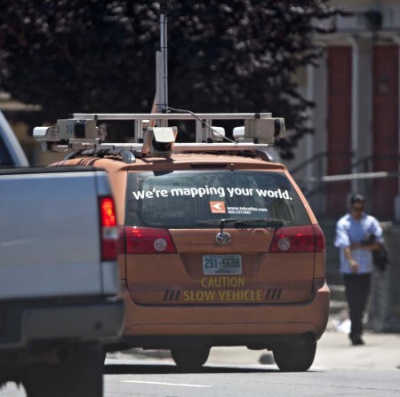
Just when I start to worry that maybe it’s wrong to care how sculpturally sweet the Google Street View’s camera ball is, I see this [scroll way down], a photo of the ramshackle, zip-tied, off-the-shelf mess that is the Tele Atlas street mapping van.
Seriously, people, if you’re not gonna suit up, why even come to the game? [image: sfcitizen.com]
Richard Prints At 20×200’s Booth At The Affordable Art Fair

Sure, you can get it for free right here, in all its original jpeg glory, but if you want to see the velvety printed goodness of Untitled (300×404) in person, you should head to 20×200’s booth at the Affordable Art Fair, which opens in Manhattan tonight through the weekend.
Jen Bekman’s got a couple of print and collecting discussions scheduled, and there’s a framing primer–and a few spots left to reserve in the 20×200.com pop-up framing shop. Check the 20×200 blog for all the details.
Visit 20×200 THIS Weekend at the Affordable Art Fair in NYC! [20×200.com]
Previously: Untitled (300×404) the making of
300×404 @ 20×200!
Untitled (300 x 404) @ 20 x 200
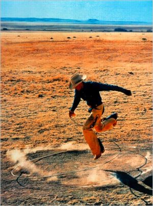
When I offhandedly declared a jpg of Richard Prince’s 2003 rephoto, Untitled, (Cowboy) to be my own work a year ago, I had no idea it would ever leave my blog post.
As an idea, appropriating an appropriation might be funny/interesting for about 30 seconds. Or it might be a useful provocation for a discussion about fair use, and the unacknowledged constraints it places on our cultural dialogue and production.
Untitled (300 x 404) may look like a jpeg of Richard Prince’s Untitled (Cowboy), but it turns out to look nothing like Prince’s actual, 30×40 inch work. [Which, itself is actually an enlarged photo of Sam Abell’s Marlboro Man ad from a magazine.]
And that’s something I only began to realize when I started looking around for the best way to print this jpg file in real life. Obviously, it can be reproduced infinitely online–here, have one! But printing it without dramatically altering the original data turned out to be a challenge.
So when Jen Bekman and I started talking about publishing an edition with 20×200, my first question was for their printer. Since they knew their printer was awesome and could pull it off, their first question was for their lawyer.
But as soon as we saw the proofs come in in various sizes, with the pixels rendered in velvety, matte inkjet pigments on that heavy paper, it was obvious that this piece really needed to be published, and it needed to be done by 20×200.
I have no claim on the image, or the idea, or the technical skill of making them, and yet I feel incredibly proud of these prints, which are these beautiful, physical things.
As I figure out how best to photograph them, I’ll post some image of the prints themselves over the next little while. But it might be tough. They’re really the kind of thing you want to see in real life.
Check out prints and details about Untitled (300 x 404) at 20×200 [20×200.com]
Read Jen’s email announcement of the edition [20×200.com]
Previous greg.org posts:
May 18: West Trademark F(*#$Up
May 20: 300 x 404 [sic]: The Making Of
June 10!: Richard Prints: Untitled (300 x 404)
Enzo Mari X IKEA Mashup, Ch. Last
home stretch, from Thanksgiving 2007 to Thanksgiving 2009.
And it is done. [more pictures here]

A quick recap:
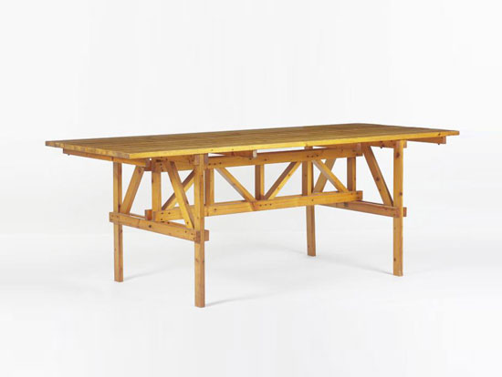
An EFFE table based on a 1974 design by Enzo Mari, but made entirely from unfinished pine components of Ikea’s Ivar shelving system. The vertical and diagonal elements are the square corner posts. [Some revisions were made mid-construction.] Horizontal elements are the pre-assembled shelving side trusses. [The center truss uses two trusses intact, while the end trusses use disassembled pieces.] The top is glued up from four Ivar shelves, which are braced underneath. [compare to Mari’s original design below.]
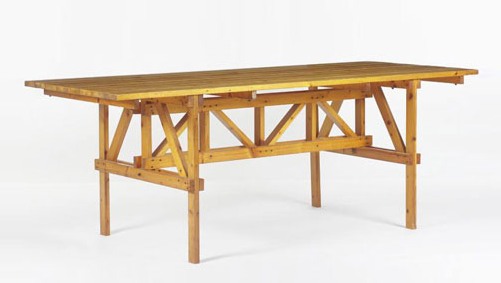
Though Enzo Mari’s original design calls for the low-grade pine to remain untreated, I decided to finish the entire thing with Sutherland Welles tung oil varnish. Components received five coats of wiping varnish, with sanding in between, before the trusses were constructed [finishing nails and #10 stainless screws]. The trusses and top then received six more coats of medium lustre varnish. The top will get two more, then a final sanding with steel wool.
Not only did the varnish cost more than the wood, all this hand-finishing turns out to be an insane amount of time and effort. Even so, the incredibly uneven quality of the Ikea pine resists a fine finish. This top may be conceptually ideal, but a more practical solution may be required if we decide to use the table daily.
Previously:
Autoprogetazzione: The Making of an Enzo Mari dining room table
Ch. 1: Enzo Mari x Ikea Mashup
Ch. 2: Parts
Ch. 3: Decisions, Decisions, adapting Mari’s design for Ikea lumber
Ch. 4: Finish Fetish
Ch. 5: In Process (Rev.)
Ch. 6: Ikeaness
Richard Prints: Untitled (300 x 404)
I just got my first edition of Untitled (300 x 404, after Untitled (Cowboy), 2003 by Richard Prince) from the printer. It’s a 1px = 1mm version, which came out to be 12 x 16 inches, inkjet printed on aluminum.
Though it’s crazy to feel any sense of accomplishment for an image I appropriated whose fabrication I outsourced, I’m actually kind of stoked. The print looks fantastic, with a graininess that doesn’t map to the supposed pixel dimensions.
When you zoom in on a screen, a pixel is so nice and tidy and square. But unless you’re a mosaicist or a North Korean cardflipping stadium extravaganza director, physical pixels are probably not going to be square. Who knew?
Anyway, since it cost the same to make one as a dozen, there’s an edition of ten, with a couple of proofs. If I had a dealer, a gallery, an artist career, or an idea to have any of the above, I’d probably sell them. I’m sure they’d be cheaper than the Richard Prince.
Previously: West Trademark @)#(*$ed Up
Untitled (300 x 404): the making of
update: Just found out via Joerg’s post that the original photographer was not Jim Krantz, but Sam Abell, the great National Geographic photographer. He shot it in 1996 for Leo Burnett, Marlboro/Philip Morris’s agency. PDN had an interview with Abell about it last year, on the occasion of Untitled (Cowboy)‘s prominence in Prince’s Guggenheim retrospective.
300×404: The Making Of
So the other day, I was still trying to wrap my head around the fact that Slate’s editors were, “ironically, unable to get permission” to reproduce Richard Prince’s Untitled (Cowboy), 2003 for Sarah Boxer’s slideshow review of “Into The Sunset,” MoMA’s exhibition of photography’s role in creating the concept of the American West. [The irony, of course, is that Prince’s work is actually a rephotograph of a Marlboro Man ad, which was probably photographed originally by Jim Krantz.] [Update: actually, last year, PDN identified the original photographer as Sam Abell. thanks Joerg.]
And so I blithely grabbed an image of Untitled (Cowboy) online, resized and retitled it, and republished it as my own work, 300 x 404, After Untitled (Cowboy) 2003 by Richard Prince, and offered to let Slate show it instead. Though I’ve written for Slate before, they have not, as yet, taken me up on my offer.
Not that I expect them to. The point that Slate felt copyright-constrained while Prince so clearly didn’t was so obvious, it’s barely interesting. And even their complete abrogation of fair use principles, which specifically allow reproduction of copyrighted work for purposes including “criticism, comment, [and] news reporting,” is kind of equivocal.
Boxer’s piece was decidedly not a review, and it could arguably not be news, but I can’t see how Slate could decide it wasn’t comment. I have to assume they just accepted some publicist’s refusal–whether MoMA’s or Prince’s dealer Barbara Gladstone [at the time the work was made, anyway. Now it’s Gagosian.] they don’t say–to provide a suitably hi-res file. If they’d wanted to run the image, they could have grabbed a slightly smallish version online, or they could have scanned Prince’s work from the catalogue, but they acquiesced to the wishes of someone somewhere who, ironically, did not actually control the copyright anyway. Fine, now we know.
After posting my one-liner, though, I started thinking more about this work I’d just created, what claim I really had to it, and what relationship it really had vis a vis Prince’s–and Krantz’s Abell’s–work. The pixel count in the title seemed to hold a key. A relatively new articulation of fair use exemptions has emerged specifically to deal with the no-permission-necessary reproduction of images online. Though it didn’t offer any technical guidelines, a 2002 lawsuit, Kelly v Arriba Soft Corporation, helped establish a fair use exemption for thumbnail images.
And that’s what interests me most about my re-reproduction. What’s a thumbnail? What size and quality does an image have to be to qualify for online fair use? What does its thumbnail-ness relate to? The size of the screen? Of the page? Of the original? Does it relate to the resolution, or just the display size? It’s an issue I think about every time I grab someone else’s image and post about it here. Beyond just giving credit and a link, I try not to create a perfect substitute for someone’s original, or for the context they put it in. [Ironically-again, that word–when I started greg.org way back in 2001, I was still a little hippie dippie Xanadu-ey about it all, and would hotlink to too many images. Too many of those impolite, dead links are still lurking in my archives, waiting for my ghost army of interns to fix.]
And what happens when you start reproducing a work that begins online and is defined first and foremost, not by its resolution, but by its pixel count?

When I started looking for a place to print 300 x 404 on canvas, I found that it wasn’t so easy. The original web resolution, 72 dpi, would only produce a tiny, 4×5-in painting. I wanted to see something, you know, more Princeian, a 30 x 40-in. painting [10 ppi] or maybe even a Gurky-esque 60 x 80-in. [5 ppi], 60 inches being the maximum width of canvas today’s printers can handle.
As any Photoshop user can tell, increasing the pixel size is like zooming in on a digital image. Except in this case, it’s not the size of the magnifying glass, but the size of the pixel itself that increases. And since it’s the pixel count, not the size that’s important, I figured I’d go with a round number, 1 px = 1 mm, or 25.4 ppi, which would produce a nice, manageable little 12 x 16.2 painting.
Or at least it should. According to all the print studios I’ve spoken to, you can’t adjust the print resolution on their state-of-the-art inkjet printers; you can only get “the best” resolution. And if your image isn’t hi-res enough, no problem; they’ll fix it for you:
We understand that almost no one has a digital camera capable of producing native resolution for a 30X40 giclee at 150ppi. We can use image interpolation to compensate.
For example, if ordering a 30X40″ print, we would generally require to have a file that measures 30X40″ at 200 ppi.
Digital cameras compete on megapixel counts, and generations of printers claim they can [finally!] be “true” to an original work of art. And when an original doesn’t hold up, “image interpolation” comes to the rescue. The assumptions of accuracy, authenticity, and fidelity are embedded deep in our image-saturated world. And just as HD television forced the development of new makeup techniques to save large-pored actresses’ careers, our own perception of veracity is constantly changing in ways we don’t acknowledge.
Now consider Sarah Boxer’s assessment of Prince on Slate which is, at every level, incorrect:
Although the photo looks authentic, it is, at every level, inauthentic…Prince didn’t really take the picture of the cowboy himself. And even the original photographer wasn’t catching a real moment in a cowboy’s life; he was just shooting an ad.
That “just shooting an ad” kills me. Has there ever been an ad campaign more relentless in its pursuit of visual and content authenticity than Marlboro’s? Is the photo “inauthentic” because it’s an ad? Because it’s not a “documentary”? Is the cowboy inauthentic only if he is auditioned, dressed, placed or directed? Isn’t Prince’s photograph of the photograph a near-perfect 1:1 representation? Prince’s work provokes these kinds of questions and challenges these kinds of assumptions, the very ones Boxer seems completely oblivious to.
But I can’t laugh too hard; as my little offhand attempt to accurately reproduce my 121,200 pixels is proving, I’m just as likely to be oblivious to the limits of my own assumptions, too.
Untitled (Composition with Taxi, Tree & Halston)
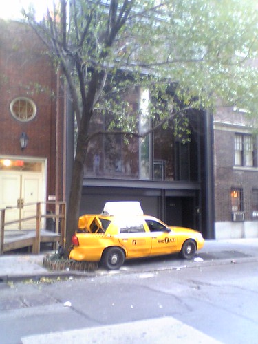
We were driving back from the storage unit Sunday morning, when we saw this spectacular and impossible-seeming scene on E 63rd St & Park:
A taxi, slammed full force, backwards and against traffic, into a tree in front of the townhouse Paul Rudolph created for Halston.
Apparently, a carjacker came flying off the bridge, hit the taxi, sent it spinning, and then backed back up 63rd to flee down Lexingon. And all before 8 in the morning. According to the super of a nearby building, the whole incident was captured on security cameras, so I should be checking the local evening news.
You Have A Stingel? No Way! I Have A Stingel!
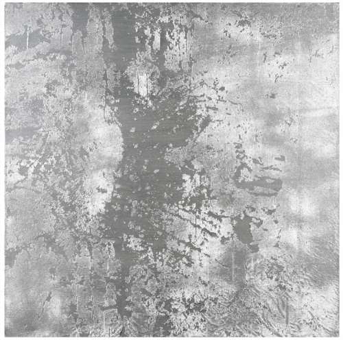
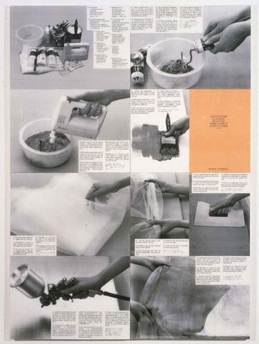
In 1989, artist Rudolf Stingel published Instructions, an illustrated booklet showing how to make one of his silver paintings. “He challenges the process of creating a painting and questions the concept of the canvas and that of authorship,” says Christie’s in a paraphrase of the curator Francesco Bonami. Christie’s is selling a 1998 silver Stingel painting [whatever that means, we’ll get to in a second] in London in a couple of weeks. Christie’s explains how they’re made:
The works begin with the application of a thick layer of paint in a particular colour, in the case of the present example silver enamel, to the canvas. Pieces of gauze are then placed over the surface of the canvas and silver paint is added using a spray gun. Finally, the gauze is removed, resulting in a richly textured surface. When seen in conjunction with the DIY manual, the Warholian nature of Stingel’s work is difficult to refute: technical methods of factory-like production, which are openly communicated and question authorship, contrast the provoked coincidences that result in individual monotypes. Particularly, a parallel to Warhol’s so-called Piss Paintings comes to mind: both artists test the methods of what can be considered painting, while simultaneously emphasising the carnality of the practice by combining coincidence and will in a process solely focused on the canvas’s skin. With Stingel’s works, the aggravation of the derma creates the rapture.
I love it, except that the challenge to authorship is merely a conceptual pose, one refuted most immediately by Stingel’s signature on this painting and its £120,000 – £160,000 sale estimate.
Bonami reads the Instructions as “tricking you into learning how to do a painting for someone else.” Which, though, is the neater trick: following the artist’s instructions and making a Stingel for myself, or getting someone to spend £200,000 on an identical painting from the artist’s factory because it has Stingel’s autograph on the back?
The invocation of Warhol and the Piss Paintings is illuminating, and not just for the works’ focus on a painting’s surface or skin–or derma. Such process-oriented practice, which embraces a degree of randomness, conveniently results in serial works of unfakeable uniqueness. They don’t need stamps of authenticity; the object is its own fingerprint. With minimal documentation at the time of creation in his studio, Stingel’s collectors will never face scandals of authorship like those engulfing the Warhol Estate’s authentication board. According to the board’s self-contradictory interpretations of Warhol’s Factory processes, mass-produced silkscreens that Warhol never saw can be accepted as works, while a documented self-portrait can be rejected repeatedly.
On the flip side, though, if Stingel really wanted to challenge authorship and treat each painting as a “cell” that only gains meaning from its connection to countless others, he’d get more traction by treating the world’s DIY Stingels as intrinsic parts of his own work. Locate, document, and show them in galleries and museum retrospectives. Let them be bought and sold in the secondary [primary?] market. Then when one of those works shows up at Christie’s, we’ll talk again about questioning the concept of authorship.
Lot 319: Rudolf Stingel (b. 1956),
Untitled
signed and dated ‘Stingel 98’ (on the reverse)
oil and enamel on canvas
32 x 32in. (81.3 x 81.3cm.)
Executed in 1998
Estimate: £120,000 – £160,000 [christies.com]
Rudolf Stingel – Selected works [paulacoopergallery.com]
On The Sky Atlas And The NGS-Palomar Observatory Sky Survey
The Palomar Observatory Sky Survey was sponsored by the National Geographic Society. Over ten years, between 1948 and 1958, astronomers at Cal Tech’s Palomar Observatory used a 48-inch Schmidt Telescope to create the most advanced sky survey ever, a comprehensive portrait of most of the visible universe as seen from the Northern Hemisphere. [Actually, the survey detected objects of a magnitude of +22, one million times fainter than the limits of human vision.]
When completed, the 935 pairs of glass plates, one filtered red, and one blue, were compiled into the Sky Atlas, which was published over the years on paper, glass, and film.
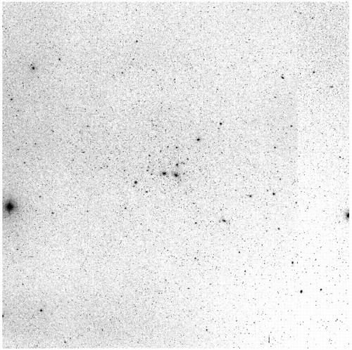
I first found out about the NGS-POSS about ten years ago I was visiting a physicist friend at her university office. There was a reception in the department library, and we wandered off to explore, and ended up in a rear stairwell, where she showed me a large, grey, metal flatfile on a landing. Inside each drawer was a stack of large, slightly curled photographs. They were printed in the negative; instead of glowing stars on a black sky, each page was light silver, flecked with linty black specks. There was a string of numbers–right ascension and declination, it turned out–on the top of each print.
Two print versions of the POSS were published, one 14×17″ format in the 1950’s and 1960’s, and another, 14×14″, in the 1970’s. The version I saw was the former. Paper turned out to be the least useful format for astronomical analysis; glass and film were much better, and since the POSS plates were scanned into the Digitized Sky Survey in the 1990’s, the print version of the Sky Atlas is obsolete by several generations.
So besides finding an extant copy gathering dust and taking up space in a university physics department somewhere, the logical [sic] thing to do is to print an entirely new set from the original plates.
Two sets of original plates were created, one to work from, and the other to be “stored, unused, in the dome of the 200-inch telescope on Palomar Mountain, where it will be available in the even that the plates in Pasadena should be damaged or destroyed by some catastrophe.”
At least that’s where they were in 1963 when R.L. Minkowski and G.O. Abell wrote about the NGS-POSS for K. Aa. Strand’s Basic Astronomical Data, Vol. III of Stars and Stellar Systems. They described in some detail the characteristics of the Survey, as well as the making of the prints. [Strand’s compendium also includes descriptions of earlier sky surveys, which I might get to later.] After the jump, some excerpts from Minkowski & Abell’s paper, pp.481-6, on the production of the Sky Atlas
Continue reading “On The Sky Atlas And The NGS-Palomar Observatory Sky Survey”
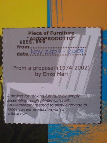
Autoprogettazione: The Making Of An Enzo Mari Dining Room Table
The economic and ecological and aesthetic far-sightedness of Enzo Mari’s 1974 Autoprogettazione still blows my mind. Translated variously as “self-projects,” and “self-design, self-made,” Mari’s collection of designs for furniture you could build yourself with just a hammer using cheap, off-the-shelf lumber anticipated several key design principles that resonate right now: DIY; sustainability; small-scale, local production and consumption; simplicity; handmade; hacking commercial products; and the open-source/creative commons movements [the furniture could be built by anyone except a factory or a dealer.]
Mari intended his Autoprogettazione to be made of #2 medium-grade, knotty pine, some of the humblest material on the market. He arranged for a company to pre-cut the lumber and sell it in packs as Metamobile. Naturally, one of these vintage 1974 kit tables sold for $14,400 at auction last fall.
Naturally, a gallery in Chelsea, Demisch Danant, just closed an exhibition of Metamobile furniture which they had made, and which they arranged for Mari himself to sign. Which seems to defeat several purposes of the entire Autoprogettazione concept, but that’s life.
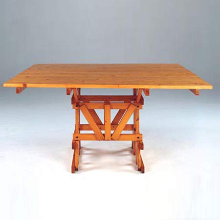
I’m looking for photos of the first Metamobile furniture I saw, which is still my favorite: In 2004, Rirkrit Tiravanija produced Mari’s square dining table [above] and some chairs in chrome-plated stainless steel. The pieces weighed a ton, but they were truly spectacular, like Koons picnic furniture.
Anyway, we’re just in the middle of moving our place in DC, which gives me the occasion to need a bigger, nicer dining room table. Mid-century modernism is too relentlessly tasteful; recent prices of “good” furniture make me laugh out loud. Though I’m an unrepentant Ikea fan, it only goes so far [i.e., no serious furniture]. Mari’s furniture feels like the perfect counterpoint to the homogeneous mega-catalogue stores: C&B, Pottery Barn, CB2, West Elm, etc. etc. etc.
So I’m thinking of getting the Truss Table [top] known as the EFFE Table. As a city dweller, I’d have to have it made, or at least have the lumber cut and finished and delivered for my own assembly.
An ex-pat design firm in Japan used sugi, Japanese cedar, to make their EFFE table. For me, I think it’s key to use Mari’s intended pine. So far, I’ve sourced two wildly disparate, but potentially interesting woods:
update: Those Demisch Danant pieces appear related to a series of 18 pieces put up at auction last June in Paris. Artcurial has a making of video, though they don’t actually show what they made. An EFFE Table went for EUR2,231.
The Satelloons Of Project Echo: Must. Find. Satelloons.
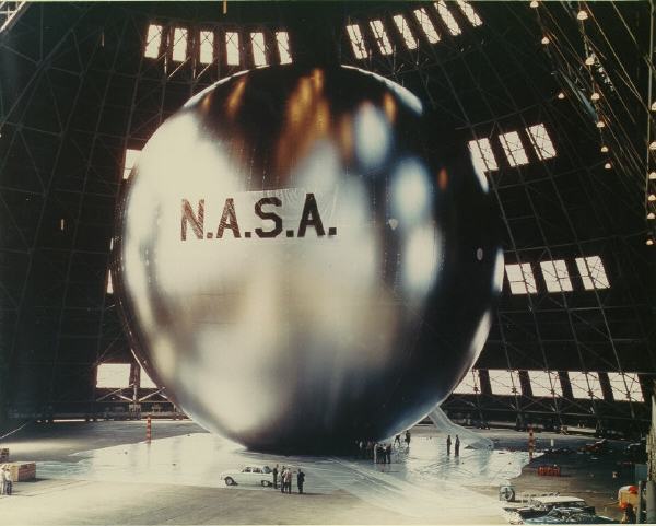
From about 1956 until 1964, US aeronautics engineers and rocket scientists at the Langley Research Center developed a series of spherical satellite balloons called, awesomely enough, satelloons. Dubbed Project Echo, the 100-foot diameter aluminumized balloons were one of the inaugural projects for NASA, which was established in 1958.
In his 1995 history of NASA Langley, Space Revolution, Dr. James Hansen wrote:
The Echo balloon was perhaps the most beautiful object ever to be put into space. The big and brilliant sphere had a 31,416-square foot surface of Mylar plastic covered smoothly with a mere 4 pounds of vapor-deposited aluminum. All told, counting 30 pounds of inflating chemicals and two 11-ounce, 3/8-inch-thick radio tracking beacons (packed with 70 solar cells and 5 storage batteries), the sphere weighed only 132 pounds.
For those enamored with its aesthetics, folding the beautiful balloon into its small container for packing into the nose cone of a Thor-Delta rocket was somewhat like folding a large Rembrandt canvas into a tiny square and taking it home from an art sale in one’s wallet.
The satelloons were made from a then-new duPont plastic film called Mylar, which was micro-coated with aluminum using a then-new vacuum vaporizing technique developed by Reynolds Aluminum Co. Originally conceived as research tools to collect data on the density of the upper atmosphere, the reflective satelloons also served as proofs of concept for space-based commmunications systems.
The original research proposal put forward by a Langley engineer named William J. O’Sullivan called for a 20-inch balloon, which was increased to 30 inches. These “Sub Satellites” were followed by a 12-foot diameter Beacon satelloon, the size of which was determined, not by any scientific requirements, but by the ceiling height in the Langley model fabrication room.
In the post-Sputnik euphoria of a 1958 congressional hearing at which a Beacon was inflated in the Capitol Building, O’Sullivan assured politicians that a communications satelloon “10 stories high” could be readied and launched very quickly which could be used “for worldwide radio communications and, eventually, for television, thus creating vast new fields into which the communications and electronics industries could expand to the economic and sociological benefit of mankind.” Such a large, American satellite would also be visible to the naked eyes of everyone in the free world and in the rest of the world. Just like Sputnik, only much, much bigger. It was these 100-foot satellites which were called Echo; the rocket system that would launch these giant balls into space was called Shotput.
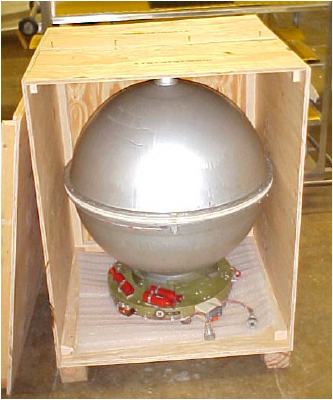
l: nasa. r: flight spare at nasm
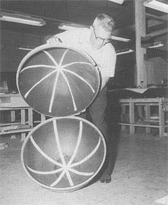
With this exponential increase in scale, NASA’s Project Echo team faced major engineering challenges in packing and deploying the satelloon. They eventually devised a two-piece spherical payload container laced together with fishing line and ringed by a small explosive charge, which would deploy the balloon.
Then there was the issue of seams. At a 1959 inflation test in a disused blimp hangar in Weeksville, North Carolina, the original General Mills Echo split apart. A photo in Hansen’s book shows O’Sullivan and his colleagues sticking their heads through a gash of the collapsing balloon. The top photo is from a later 1959 test, also at Weeksville.
Folding was another major challenge. G.T. Schjeldahl, the Minnesota packaging manufacturer contracted to build the Echo satelloons after General Mills, had the adhesive question solved, but they couldn’t figure out how to fold the thing. [Founder Gilmore Schjeldahl is credited with creating the first air sickness bag in 1949. In the 1950’s, his company also made inflatable buildings known as Schjeldomes.]
After watching his wife unfold a tiny plastic rain bonnet, however, Ed Kilgore had a “Eureka moment,” which set Langley’s technicians in motion:
At Langley, Kilgore gave the hat to Austin McHatton, a talented technician in the East Model Shop, who had full-size models of its fold patterns constructed. Kilgore remembers that a “remarkable improvement in folding resulted.” The Project Echo Task Group got workmen to construct a makeshift “clean” room from two by-four wood frames covered with plastic sheeting. In this room, which was 150 feet long and located in the large airplane hangar in the West Area, a small group of Langley technicians practiced folding the balloons for hundreds of hours until they discovered just the right sequence of steps by which to neatly fold and pack the balloon. For the big Echo balloons, this method was proof-tested in the Langley 60-foot vacuum tank as well as in the Shotput flights.
The first Shotput flight occurred almost exactly 48 years ago, in the late afternoon of October 28, 1959. The launch and deployment were successful, but the Beacon exploded, most likely due to residual air left in the balloon to aid its inflation in the vacuum of space. The result was a spectacular, 10-minute light show all along the east coast of the US as “the thousands of fragments of the aluminum-covered balloon…reflected the light of the setting sun.”
To uncover the cause of any future failures, the engineers coated the inside of each satelloon with red fluorescent powder. Then they set up a 500-inch focal length camera on the beach near the launch site to document the unfurling in space. They also publicized the launches well in advance, so they could get mitigate any negative publicity of an explosion–and possibly get some credit for another light show.
Echo 1 was destroyed when its rocket failed. Echo 1A, which was commonly known as Echo 1, was successfully launched August 12, 1960. Bell Labs in Holmdel, New Jersey beamed a radio message from President Eisenhower to it on its first orbit, which was reflected back to the world:
This is President Eisenhower speaking. This is one more significant step in the United States’ program of space research and exploration being carried forward for peaceful purposes. The satellite balloon, which has reflected these words, may be used freely by any nation for similar experiments in its own interest.
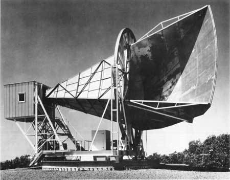
To communicate with the Echo satelloons, Bell Labs built a 50-foot long horn-shaped antenna in Holmdel, which could rotate and pivot on several axes. Later, in 1964, while calibrating the antenna, Drs. Arno Penzias and Robert Wilson detected microwave background radiation, the first concrete evidence of the Big Bang theory. They were awarded the Nobel Prize in 1978.
Echo II was launched in 1964. Both Echo satelloons stayed aloft for years [until 1968 and 1969, respectively] Though not very efficient, their passive communications technology spurred on the development of active signal-transmitting communications satellites like Telstar. An Echo II was exhibited at the 1964 New York World’s Fair, and a folded backup is on display at the National Air & Space Museum.
I’ve highlighted some of the aesthetic or non-scientific elements from Hansen’s long, somewhat rambling but detailed chapter on Program Echo to make a point. Or more accurately, to pose a challenge. In the art world, thanks in no small part to Duchamp, we privilege intentionality above all; anything–even the most mundane or found object, situation, and action–is art if the artist declares it to be so. But nothing else.
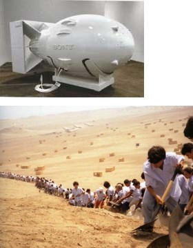
Rirkrit Tiravanija cooking curry; Anish Kapoor employing an engineering firm to build a giant tension-fabric cone or a polished steel parabolic mirror; Michael Heizer etching patterns on the desert with his motorcycle tires; Cai Guo-Qiang exploding an arc of rainbow-colored fireworks across the East River; Tom Sachs replicating Fat Man for Sony; Francis Alys contracting hundreds of laborers to move a mountain of dirt one foot to the left.
How does the remarkable historic, political, cultural, aesthetic, performative, and conceptual achievement of NASA’s Project Echo fit into the cash-and-carry art world? Or, because I’m sure NASA, et al could not care less, and it’s really the art world’s problem, how does the collectively accepted framework of the art world deal with the fantastic, innovative, creative, and life-changing realities of the world around it?
The continent-spanning light show? The largest minimalist sculpture to ever orbit the earth? The hundreds of hours spent folding balloons in a bricoleur’s clean room? The meticulously choreographed performance of folding it? The stop-action artifacts of exploding powder bombs? The emotional and political manipulations of narratives of success and failure, and the rush of collective ego-boosting as a country watches from their porches for Echo to pass overhead?
In practice, product, experience, and impact, Project Echo is every Tate Turbine Hall project, plus half the Turrells [OK, maybe not Roden Crater], plus Happenings, Minimalism, Post-Minimalism, the Wilsons, Sachs, Murakami, Rhoades, Mir, Hayakawa, deMaria, Kapoor, Semmes, Hirshhorn, Hamilton, and more rolled–or should I say folded–into one.
And yet has anyone outside the space stamp collecting community even heard of Echo 1 before Cabinet Magazine published a tiny photo of it in their current issue? I’m an art collector married to a satellite-building NASA astrophysicist, and the whole store party atmosphere of the art fair/biennial circuit’s never felt more like a giant, hermetic NetJets conspiracy than it does right now.
Frankly, I’d rather track down the remaining test models and photos of the Beacon and the Echo. By the time I need a place to install it, hopefully the art world will have caught up/on. Which is a long way of saying I won’t be at Frieze this week.
online: , Ch. 6: The Odyssey of Project Echo, SPACEFLIGHT REVOLUTION by James R. Hansen [history.nasa.gov]
not online: A Minor History of Giant Spheres, by Joshua Foer [cabinetmagazine #27]
The Inflatable Satellite [americanheritage.com]
Previously: Dugway Proving Grounds, the world’s awesomest earth art?