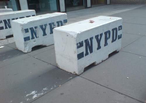
It’s UN Season in New York, and the streets are filled with people enjoying the sun, and squeezing through these flat-out gorgeous NYPD barriers. Seriously, I mean, Tony Smith, Donald Judd, Richard Serra, Beverly Pepper, Anselm Kiefer, Janine Antoni, Scott Burton, Robert Gober–you see where I’m going with this? I mean, Rachel Harrison–I’d love to make a Rachel Harrison-style version of these. That would be awesome. and so much more manageable, too.
Oh, look, I was right:
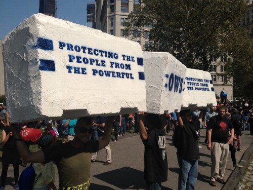
Occupy protestors on Sept. 17th in Battery Park, as covered by Bucky Turco at Animal New York
So the next thing would be a Cow Parade-style celebration across the whole city. These barriers could become a vibrant platform for artists the world over, and highly collectible, too. Munny dolls-meets-street security furniture.
I. Am. On it.
Tag: works
‘Domestic Objects’ Opens Tonight, Sept 5 @ Bridge Gallery
And speaking of art and politics….
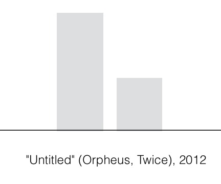
I am stoked to announce my participation in “Domestic Objects,” at Bridge Gallery on the Lower East Side. The show opens tonight, Wednesday, September 5th, and runs through October 18.
In addition to my piece, the show includes work by John Powers, Susanna Starr, and Jer Thorp & Diane Thorp. “Domestic Objects explores concepts of our constructed private spaces, belonging, family, domesticity, and material possessions.”
Which seemed to me like an excellent context and time for “Untitled” (Orpheus, Twice), 2012. It’s a piece I’ve actually been thinking about for a couple of years, but this is the first time it will be installed.
I’ve been thinking about art that doesn’t exist, and why not. “Untitled” (Orpheus, Twice), 2012, is a speculation, or a wistful reimagining, of Felix Gonzalez-Torres’ 1991 work of the same title. I’ll probably write more about it later, and how it came to be, but now I’m going to hit the road.
If you’re able to make the opening tonight, it’d be great. Otherwise, I hope you’ll get to see the show while it’s up.
Domestic Objects, 5 Sept – 18 Oct, Bridge Gallery, 98 Orchard St (Del/Ess) [bridgegalleryny.com]
‘Concept By Mercedes’

image via 0823n’s flickr
I swear, I’ve tried to keep it all on Twitter, but in the wake of Schimmelgate, I can’t help feeling that the debate over Jeffrey Deitch’s increasingly depressing tenure at MOCA overlooks one of the most damning incidents: Transmission LA: AV Club, the Mercedes-Benz exhibition curated by Mike D that suddenly displaced and delayed the opening of Philipp Kaiser and Miwon Kwon’s Land Art show, Ends Of The Earth.
Maybe it’s been underexamined, misunderstood, or just quickly condemned as a “marketing spectacle.” But I think Transmission LA is actually a show, an unusually pure embodiment of the programming vision Deitch and his patron Eli Broad hold for MOCA, and for art itself. But that means Transmission LA also expands–and complicates–the comfortable moral outrage against Deitch and MOCA; because the forces and assumptions that gave rise to it–art as leisure, entertainment, consumption experience, luxury good and corporate branding project–are already operating across vast swaths of the contemporary art and museum world.
MOCA’s own PR weirdness about its [non-]announcement and the ostensible obviousness of the show’s marketing objectives contribute to an inaccurate perception that Transmission LA was an impulsive, hastily organized, poorly handled, maybe slightly desperate corporate rental deal: that Mercedes and its ongoing lifestyle branding initiative, The Avant/Garde Diaries, swooped in unexpectedly to save the big, hard-to-fund scholarly show set to open in a few weeks by offering a six-figure proposal for a pop-up show “curated” by their aging rapper, if only the cash-strapped museum had a space available for a few weeks.
In fact, as the LA Times’ Mike Boehm reported a couple of weeks after the Mercedes show appeared on MOCA’s calendar, such a mix of “celebrity, fashion and youth culture” were “a key reason [Deitch] was hired in 2010.” Boehm wrote,
Deitch said he helped plan the festival for its sponsor, Mercedes-Benz, including recruiting Mike D as the curator who will oversee its offerings of art, music and food. Admission is free. With Mercedes covering the cost and making a contribution to the museum, Deitch expects it to generate several hundred thousand dollars for MOCA’s more conventional activities, while continuing his populist push.
“We need to build the museum as a social space,” Deitch said in an interview Tuesday at MOCA.
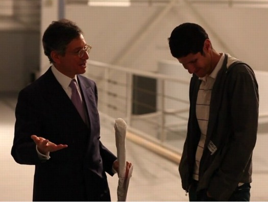
image via Breaking Through – In Preparation for TRANSMISSION LA – AV CLUB
Deitch met Mike D [whose given name is Mike Diamond] in 2010, while participating in a documentary about Jean-Michel Basquiat by the musician’s filmmaker wife Tamra Davis. The Daily Beast, writing about the April opening, said “According to Diamond, Deitch called him a year ago to propose that he curate Transmission: LA and has been very hands-on since.” So Deitch was working on Mercedes’ show at MOCA in April 2011, and no one [sic] knew about it until six weeks before it opened.
But that is not Deitch’s only involvement in Mercedes’ branding activities. In December 2011, two months before Transmission LA was announced on Mercedes’ site, and 3.5 months before MOCA’s involvement was revealed publicly, Deitch made a an Avant/Garde Diaries video at Art Basel Miami Beach, along with Theaster Gates.
Ironically, considering the criticisms leveled against him now, Deitch’s role in the video is to provide gravitas and historical context. Specifically, it was to anoint The Avant/Garde as the rightful heirs to the “the avant-garde,” aka the world Deitch had come up in, the “small community” that was “the art world” in “the early 70s.” In other words, exactly the kind of intergenerational baton-passing that 90’s veteran, Deitch collaborator, and Avant/Garde-ist Aaron Rose called for in his recent defense of Deitch’s MOCA mission. [It’s not really relevant, but the video includes Deitch fluff-flubbing Gates’ affiliation with the Art Institute, instead of the University of Chicago.]
In his curator’s statement in the “official Audio-Visual Club zine“ [pdf], explaining how the whole thing came together, Mike D reflects some of Deitch’s curatorial light:
When Jeffrey Deitch first approached me about doing this show, the assignment was more simple. It was to pick 10 or 11 artists that I found inspiring, or was inspired by. I quickly, however, spiraled out of control.
I decided to be a bit more ambitious and go for a complete sensory experience inclusive of food, coffee, books, film, and many multi-media installations.
…
…I realized the theme had emerged: this notion of how visual art is informed by and inspired by music, and how that then turns back to music. after that, I knew that we also had to have a musical component to the exhibition with DJ nights, performances, etc. to complete the circle.
the food and coffee elements were conceptualized with Jeffrey originally because I thought of the project as two-fold. One is that LA is all about car culture. the tricky thing is to get people out of their homes, so you need to check multiple boxes off in one day and destination. the other is that we’re trying to create this all- encompassing sensory-rich environment.
“Pick 10 or 11” “inspiring” artists, add coffee and a DJ, crank “everything up to 11,” and you have “the new MOCA,” as Mike D put it on a MOCA blog, “a 21st Century institution that redefines how contemporary art is presented in a cultural context.” Which is modulated a bit from the way he described the show in April, before the Schimmel hit the fan: a “grown-up theme park, a Six Flags for adults.”
In The Avant/Garde’s preview for the show, “TRANSMISSION LA: AV CLUB Concept by Mercedes Benz [! -ed.] Curated by Mike D”, Diamond’s fragmented, aphoristic narration has been edited together to sound like nothing so much as International Art English, spoken with a recovering rocker patois:
Installations cranking everything up to 11…musicians…visual artists…trying to break it up…so that’s not a typical white wall, concrete floor kind of gallery experience.
An experienced curator would have said, ‘There’s no way this is going to be possible.’ But I didn’t know! [muffled laugh of whoever he’s talking to] So I just kind of like…’Do it!'”
Experiential, mind-altering fun? Like, my dream of what my house might be like. Like a fantasy of what it would be if you came over. Why don’t I meet you, we’ll have a cup of coffee, I have the big, old Tom Sachs sound system, and we’ll play some music on that.
The museum is transformed, the literalization of a dreamscape, where your fantasy of hanging out at your favorite musician’s house comes true.

Image via 0823n’s flickr
And right in the middle of the show, waiting to upend your “gallery experience”? The 2013 Mercedes CSC, or Concept Style Coupe. Bet you didn’t expect that!
Deitch’s show, conceived by The Avant/Garde Diaries, which he has been consulting for, and organized by the inexperienced guest curator he picked, and with his intimate involvement, turns out to be more than a crankin’ exploration of “how visual art is informed by and inspired by music”; it’s also one step–sandwiched between “leaked” PR photos and an official unveiling at the Beijing Motor Show–in the highly orchestrated marketing campaign for the launch of the new, mid-sized version of the CLS 4-door coupe.
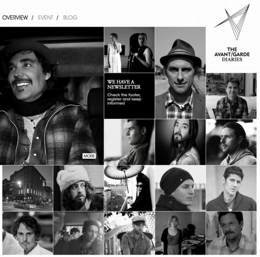
Which is not to imply that The Avant/Garde Diaries was created by Mercedes just to launch one new mid-market sedan; it’s really a platform for shifting the cultural perception of the Mercedes brand itself. Taken as a whole, The Avant/Garde’s Diarists appear to be rebellious, creative, successful, in their late 30s and early 40s, prone to wearing large plaid, white with a token Asian–and almost exclusively male. It’s an aspirational lifestyle profile from which you can neatly reverse engineer the Mercedes driver profiles the company’s trying to counterbalance: suburban yoga moms, Orange County realtors, Hamptons d-bags, and unsettlingly blingy black folk.
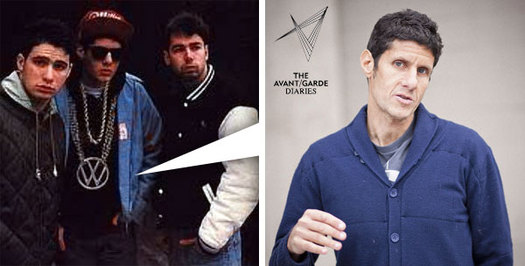
diptych via notcot
It’s also an attempt–and in Transmission LA’s case, a literal one–to make peace with a generation and culture which once considered Mercedes Benz as the contemptuous Other, the target of their scornful, youthful mischief, and to bring them–and their upscale families–into the corporate fold. And so a rapper who once encouraged his fans to turn stolen hood ornaments into necklaces is hired to make official versions for the Brand Communications team and party VIPs. And is provided with giant, authentic Mercedes logos to scatter about the galleries, and to dangle from gold chains on the front of the museum.

image via shapthings’ flickr
[No doubt too late disclosure: I just sold one of our Mercedes; I trust the one that’s left is so boring as to be aspirational to no one.]
And this is all of a piece, not just with Deitch’s strategy for MOCA, “guest curators” and all, but with his conception of art and its role in the culture. Speaking to Mike Boehm in March, Deitch cited the fundraising difficulties faced by academically focused shows like Ends of the Earth:
It’s much easier, he said, to raise money for shows by popular figures, “where collectors are excited about the artists and brands want to be connected to the artists’ image. Fundraising for historical shows with great artists who don’t include today’s art-world stars is a great challenge.”
It’s a sentiment that comes up in The Avant/Garde Diaries’ latest video featuring 90s magazine photographer David LaChapelle and Berlin dealer Reiner Opoku, aptly titled, “Reinventing Yourself”:
[Opuku]: I’d say recently, we see a lot of need for certain brands–or the desire for brands to work with creative people. First of all, you have to find a language between these two: between the creator and the brand. Therefore you need people in between, who, let’s say, orchestra [sic] the whole enterprise, the whole idea.
LaChapelle’s reboot as a fine artist began, as you might guess, with a 2005 sideshow/”retrospective” at Deitch Projects. It’s all enough to make me wonder how deep and ongoing Deitch’s involvement with Mercedes’ marketing is.
More importantly/depressingly, it makes me wonder if there really is anything to be done about it. Transmission LA includes several artists I actually like, respect, or at least take seriously. Even Hans Ulrich Obrist has done a video for the Avant/Garde Diaries [which rather succinctly demolishes Aaron Rose’s defense of MOCA in the name of forgetting the irrelevant past. Count me as Team HUO on this one, obviously.]
Here’s Peter Saville shooting down the fantasy of a contemporary avant-garde in–what else?–his video for The Avant/Garde Diaries, titled awesomely, “Disco Ball of Everything”:
This last decade, we’ve had a broadly pluralist culture. Basically, we have a kind of, entirely multi-track system. The system has evolved to encompass all forms of provocation. We’ve entirely commercialized–and commoditized–life culture. It’s perfectly understood now that you will dress any way you like. You can have dance music with rock music with classical music. All of these genres in a multi-faceted, contemporary kind of reality. Like a kind of disco ball of everything.
If only Saville would curate MOCA’s show.
Meanwhile, museums seemingly not in peril have negotiated far-ranging sponsorships with car companies, from VW’s multi-year deal with MoMA and PS1 to BMWGuggenheim’s globehopping program on urban design. But MOCA’s Mercedes tie-up doesn’t remind me of these more traditional underwriting agreements. The closest analogue I can think of is YouTube’s complicated content/sponsorship/museum rental relationship with the Guggenheim for the YouTube Play Biennial in 2010. [For Mercedes’ part, nothing beats Arne Quinze’s Uchronian campaign at Burning Man for the 2007 Lexus LS460 for inspiration in developing a long-term, stealth co-optation of a non-commercial art context for a car launch.]
Is MOCA really only guilty of indelicate execution? Are the differences between Deitch’s boundary blurring antics and the rest of the art/museum world’s stimulation-seeking, crowd-pleasing, and corporate sponsor-pleasing differences of kind, or merely of degree? These are questions I’ve been grappling with as MOCA’s credibility has been disintegrating in front of me.
On the one [personal] bright side, it makes me feel slightly better, more aware and critical, and slightly less implicated, to have made this giant, blingy sculpture, which is now hanging in my living room:
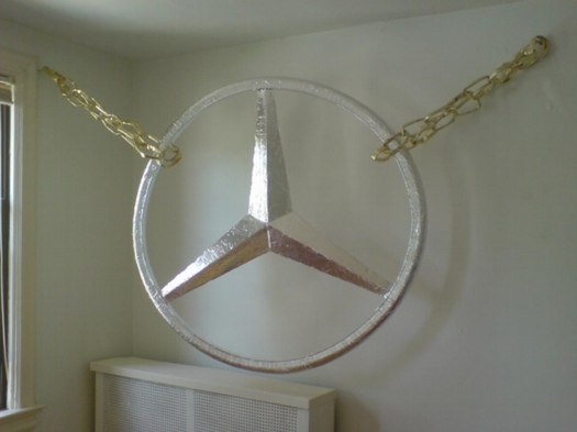
Untitled (MOCA Mercedes, after Mike D), 2012, ed. 10
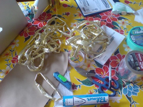
Like the Thomas Hirschhorn chain sculptures which were its inspiration, this is made from cardboard, aluminum tape, gold foil, and packing tape. As such, it’s designed to last just long enough to serve its purpose, to be considered, favored, consumed/shown, and flipped a few times at auction. Anything longer than that will be a problem for the conservators, assuming such a position exists in the museum of the 21st century.
This one, I think I’ll keep for my self, but I suppose I’ll make a few more. The price’ll go up after Deitch leaves, with the increase going to MoCA.
Rijksoverheid Rood 9: The $50 Paint Job
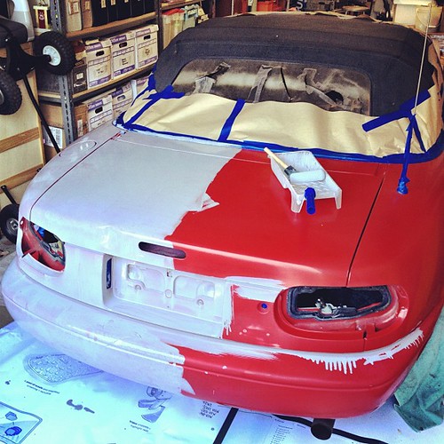
So Todd Lapin at Telstar Logistics is starting to roll out The $50 Paint Job, and it’s really got me thinking.
Basically, it’s Rustoleum household enamel, thinned by 50% or so with mineral spirits, and applied with high density foam rollers, with wet sanding between each two very thin coats. This guy did it on his Corvair, and that moparts.org thread goes on for days, months, years about it.
As I’ve been building up layers of Rijksoverheid enamel on my own panels, using various brushes and rollers, and wet sanding in between, I’ve been working toward an ideal that’s really eluded me so far: a hand-applied painted surface that shows no marks from the application. Like, for example, a Gerhard Richter mirror painting.
Part of the motivation for this is the ease with which you [I] could order these panels from a body shop. It’d be Moholy-Nagy easy–even easier since there’s no design, just color–to just order these monochromes by the official Dutch governmental auto paint code on the phone. I have the list right here. But I wanted to do them myself.
And so far, that perfectly self-leveled, brushless, orange peel-less surface has eluded me. But reading The $50 Paint Job stories, it’s obvious why: the paint straight out of the can is too thick. And for whatever misguided, paint-can-as-unaltered-found-object reason, I have resisted thinning it. Well screw that, because the next six coats are going to be nearly water-thin. I can’t wait.
Previously: rijksoverheid rood in process
The original idea, to paint monochromes and 2-color gradients based on the 21 officially approved colors in the Dutch government’s Rijkshuisstijl, plus the five blues of the country’s new logo, all of which are derived, we’re told, from Golden Age Dutch painting and the Dutch light that inspired Dutch painting.
Still Life With Untitled (MOCA Mercedes, After Mike D) Chains
Study For Untitled (MOCA Mercedes, After Mike D), 2012

OK, people, who has not been telling me about this? In Transmission LA, the very important exhibition Mike D just curated at MOCA, sponsored by Mercedes Benz?
Fortunately, Tyler Green used flickr user Eli Carrico’s image, above, for a MOCAWTF roundup, or I might have missed it for even longer.]
Here are a couple of other views, from sadjeans, who reports that “this Mercedes emblem was six feet wide,” which, really?

And these from Nicolas Arias:


Oops, sorry, that one’s from inside the show.
Besides its own self-evident awesomeness, it reminds me of one of my favorite artworks from Documenta 11, by Thomas Hirschhorn. Hirschhorn installed his Bataille Monument in a Turkish housing complex out of Kassel’s city center.
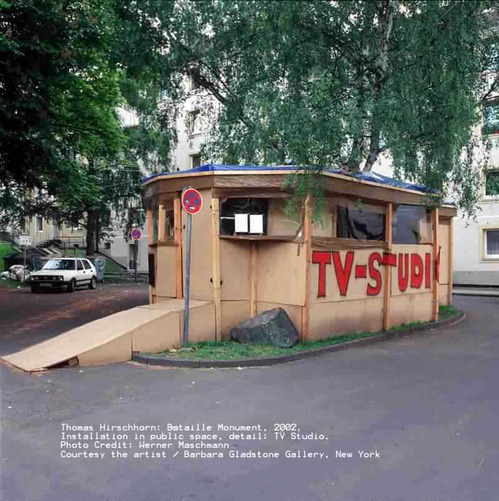
To get to it, he’d come pick you up in a worked-over, old Mercedes, which I can’t believe I can’t find a photo of? Really, Internet? But that’s not important now.

Because the work I’m talking about his contribution to the Documenta Collection by Edition Schellmann, sold exclusively at the show. CNN is a 2.5meter-wide piece of gold chain bling with the once-relevant news network logo dangling from it. An edition of 50, the original price was just EUR1200. And when it’s come up for sale it’s been just $5,000. So it’s an awesome–and inexpensive–way to fill a wall.
Obviously, if I can’t track down this original–do we know who the artist is? Mike D? Or the edition size? Did it enter MOCA’s collection?–I will be making my own edition in the Hirschhorn-ian style to celebrate MOCA’s and Mercedes Benz’s unwavering support and incisive relevance to contemporary art.
FIVE MINUTES LATER UPDATE:
OK, then, it’s a go. Notcot has these hardhitting photos from the opening. The artist is indeed Mike D. His subversive appropriation of the Mercedes logo and his deployment of it as a readymade were not limited to the patio. He had at least two more, one leaning against a fence, and one inside, tucked into a corner.
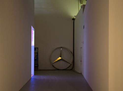
I assume they’re from dealerships. No idea how he got a hold of them. But that does not look like six feet across; more like four. Okay, that one may be six feet. And the chains are gold[en].
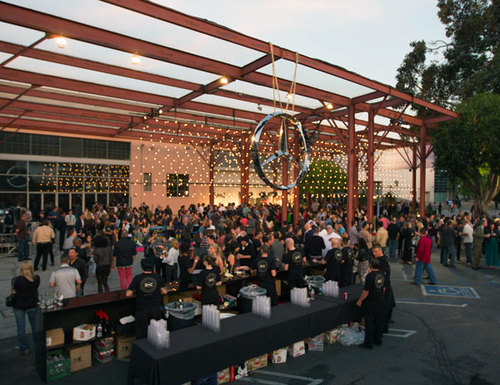
Also from Notcot: this gripping firsthand report:
So it’s only natural that when curating this art festival (which they gave him carte blanche on!) he created a HUGE Mercedes emblem hanging on a large chain in the central pavillion of the exhibition… as well as a few huge emblems tucked around the space… and then around 25 special chain necklaces with authentic Mercedes-Benz emblems for the artists and key brand folks…
Which was enthusiastic enough [“Here’s Anders-Sundt Jensen, Head Of Brand Communications, modeling one of the necklaces!”] for Anders-Sundt Jensen, Head of Brand Communications, to give said necklace to said blogger at the end of the night.

Hmm, do we have a photo of Deitch wearing a Mercedes chain necklace?
Richteriana In The German News
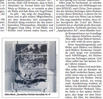
There is a review of Richteriana in this week’s DER SPIEGEL [22/2012]. Google doesn’t do tone, so who really knows, but it sounds alright. There’s not a link or an English version of the Spiegel review yet, but I”ll add them as they appear.
It’s written by Ulrike Knoefel, the art critic whose article about “the separate and secret museum” of destroyed Gerhard Richter paintings provided the impetus [and imagery] for my paintings.
I like that she noted,
Der Hinweis darauf, dass die nicht mehr vorhandenen Richter-Gemälde heute viele Millionen wert wären, brachte Allen dazu aus seinem Werk über Richter auch ein Werk über den Kunstmarkt zu machen.
And of course, then there’s the part about how, “Letzlich hat er ebenfalls große Konzeptkunst geschaffen.”
Mhmm.
If I want my Konzeptkunst to be really große, I may have to go all in, and decide to destroy whichever of the Destroyed Richter Paintings the market doesn’t take. While supplies last.
Richteriana In The News
I find the maxim of not reading reviews of one’s work to be much easier to live by when there are no reviews.
Because at least two takes on Richteriana have already been published, and I like the concept. It’s reassuring but also a but unsettling. And then a little invigorating, to encounter other peoples’ takes on your ideas.
In the Village Voice, James Hannaham called the Destroyed Richter Paintings “outlandish,” which I took to be a good sign, even though I wouldn’t–you know what, no, let’s just let it hang out there:
While partially homage, this work invades the great man’s privacy on at least two levels: first, by showing us images he apparently didn’t want anyone to see, and second, by co-opting and outsourcing his technique.
While I don’t think that’s literally true, the invasion of privacy part, I do think Hannaham is right to find an uneasiness in the images, not just whether they should exist, but whether they do or don’t, and if so, how?
And also Jane Hu did a lot of context work on Richter, his art, his history, his control issues, and the larger Richter and Art Industrial Complexes themselves:
[T]he artist has destroyed or painted over many past works, in order, presumably, to maintain a narrative about his artistic trajectory that satisfies his present sense as a painter. Richter knows as well as anyone that art history traffics in selling a story, as much as it does in telling an image. While the first half of his career produced paintings that tried to approximate photographic realism, he later increasingly turned to abstraction. And in doing so, no matter what other aesthetic reasons he may have had, Richter not only has revised his own biography, but those of his paintings as well.
Her discussion of David Diao’s work Synecdoche, is particularly sharp. On its own, David’s painting is amazing, but his wresting control of a vintage Benjamin Buchloh Artforum exhibition catalogue [whoops, 2nd time I’ve made that mistake. -ed] essay is a blunt and powerful and unsettling gesture.
The more I look at Synecdoche, the more it feels like the most important argument in the show.
An Intentionally Incomplete Inventory of Pictures: Richter’s Bilderverzeichnis
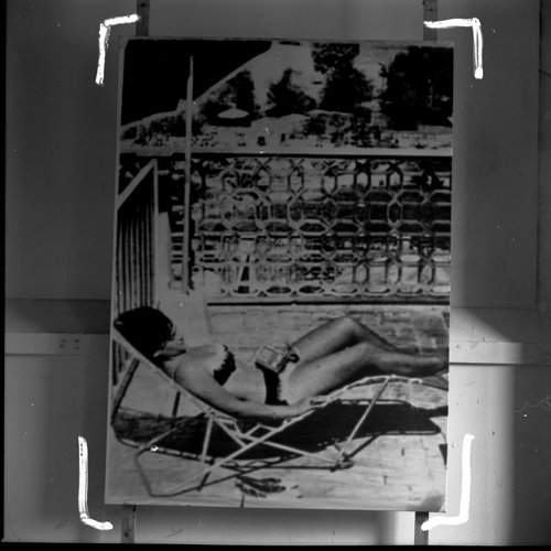
Photograph of a painting destroyed by Gerhard Richter, Gerhard Richter Archiv via Spiegel
Since I first started looking into them, I’ve wanted to know why Gerhard Richter destroyed some of his paintings. Because, of course, some of them weren’t “destroyed” destroyed, but just painted over, with their previous state being technically defined as a momentary completion, not a work in process. There are only a few like that in the Catalogue Raisonné, though; most of the works listed as “Destroyed” are presumably actually destroyed.
But at least they all got Catalogue Raisonné numbers. Ulrike Knöfel wrote about a different category of destroyed Richters, largely undiscussed and unseen, which were destroyed before the artist began his catalogue raisonné, and which thus, with maybe one exception, don’t have a CR number, and are thus excluded from Richter’s declared oeuvre. Even if they were authentically created by Richter, and shown in exhibitions, and offered for sale.
As Dietmar Elger points out in his biography of Richter, A Life In Painting, Richter actually conceives of the Catalogue Raisonné as a work of art in itself, one which, like Atlas, is still in process.
I recently met with Dr. Elger during a trip to New York, and we spoke about these dynamics of creation, destruction, recognition, and archiving as they play out in Richter’s practice. Elger runs the Gerhard Richter Archiv at the Staatlichen Kunstsammlungen Dresden, and maintains the Catalogue Raisonné, so he has a seat at the table for much of this history. After a brief fanboy prelude, in which he signed my book [and my copy of the Felix Gonzalez-Torres catalogue raisonne which he was also involved in], we got to talking. [We met for information, not as an actual interview, so I didn’t take notes or record our conversation, and I won’t directly attribute quotes, but just try to capture my recollections.]
Continue reading “An Intentionally Incomplete Inventory of Pictures: Richter’s Bilderverzeichnis”
Will Work Off Jpegs: Destroyed Richter Paintings
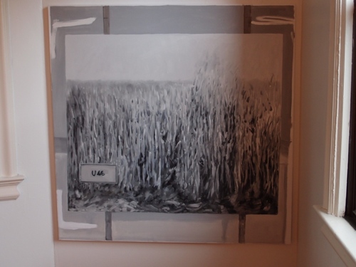
Destroyed Richter Painting #03
First off, a huge thanks to everyone who came to the opening of Richteriana Saturday, and a high five to Magda, Postmasters and the artists in the show. It really does look great, and interesting, and provocative. If you can, you should definitely see it in person.
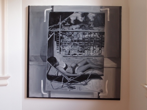
Destroyed Richter Painting #04
Which is actually one reason I debated not posting images of the Destroyed Richter Paintings paintings I put into the show. One of the real drivers of making the paintings was to approximate the experience of standing in front of paintings that could now only be seen through photos. Or transparencies. Or JPGs. And to measure what the difference is between these different modes of mediated perception.
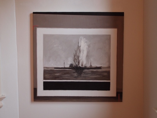
Destroyed Richter Painting #02
I did not have access to the actual dimensions of Richter’s original works, but I worked hard to deduce the size as well as to approximate the image, so as to make the feeling of seeing a picture in person as authentic [sic] as possible, even while acknowledging that Richter made such an experience impossible.
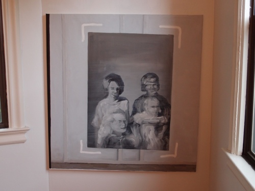
Destroyed Richter Painting #05
But looking at jpgs of paintings [of jpgs of paintings of photos] obviously falls short of this idealized encounter. As so much of our art encounter/consumption does. It’s a distinction that most people miss or gloss over, but which is not lost on Tyler Green, who recently addressed the subject of critics reviewing shows they haven’t seen by tweeting, “I never ‘work’ off JPEG.”
Richter actually showed most or all of the paintings depicted here between 1964-67, so in a way, there’s an aspect of going back in time, to encounter Richter and his work at the beginning of his Western career. A time when the context of the work wasn’t hype and adulation and skyrocketing prices, but bafflement, resistance, and indignation. There are early photo paintings that survive only because someone bought them or kept them; so these works, which were once good enough to be exhibited or put on sale, were rejected by the market before they were ultimately rejected by the artist himself.

Destroyed Richter Painting #01
The one exception/mystery is Grau. This is one of the 70+ paintings that did make it into the catalogue raisonne, but which are now listed as destroyed. And if there’s a surviving image of the three destroyed grey monochromes [CR395-1-3], I couldn’t find it. So all that’s known publicly is the dimensions, and the unusual support [wood panel]. But that’s part of the beauty of the grey paintings, I thought, that you could think you could credibly extrapolate an actual painting from such minimal information. And seeing it in person really makes me miss Richter’s version–and to wonder what happened to it.
Richteriana, Postmasters Gallery, 12 May 2012
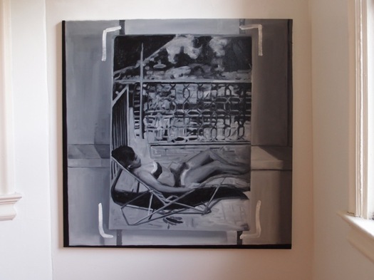
Destroyed Richter Painting No. 04, 2012, oil on canvas, 110x110cm
Postmasters is pleased to announce:
RICHTERIANA
GREG ALLEN, DAVID DIAO, RORY DONALDSON,
HASAN ELAHI, FABIAN MARCACCIO, RAFAËL ROZENDAAL
May 12 – June 16, 2012
opening reception, saturday, may 12, 6-8
Postmasters‘ new exhibition Richteriana attempts to examine the current canonization of Gerhard Richter, presenting six artists whose works pre-date, update, expand, and subvert “the greatest living artist’s” own.
…[snip much amazing thinking and description of great artists and their work]…
Greg Allen’s Destroyed Richter Paintings channel the elder artist’s own private documentary images back into the photo- based painting feedback loop he once deemed “photography by other means.” They reproduce the experience of encountering Richter’s lost originals, while becoming new objects themselves. By engaging the sprawling Chinese photo-painting industry that has grown up in Richter’s wake, Allen forefronts the market’s incredulous perception of the artist’s autonomy–and his right to declare or destroy his own work.
More to come, obviously.
Previously, related:
a destroyed Richter/Palermo collaboration
“I am practising photography by other means.”
On repainting Gerhard Richter
Overpainted vs Destroyed Gerhard Richter
On Repainting Gerhard Richter
First, Happy Birthday, Mr. Richter.
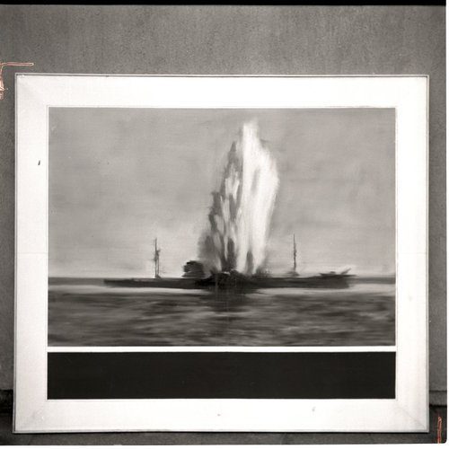
Destroyed 1964 Richter painting, image from Gerhard Richter Archkiv via Spiegel
I don’t know if Joerg knew at the time he first tweeted about it–he is plugged in and German, so who knows?–but I certainly had no idea when I picked up on the topic of Gerhard Richter “destroying” paintings by painting over them. But it turns out that the 74 paintings listed as “[DESTROYED]” on Richter’s website are only a fraction, barely half, of the paintings he’s actually destroyed so far.
In an interview with Ulrike Knöfel for Spiegel, Richter talks about the 60 or so photo-based paintings he destroyed in the 1960s during a very self-critical period of his career. Not to worry, though, because, being Gerhard Richter, he photographed them first
These photos, most of which were never published, are now either in the Gerhard Richter Archive in the eastern German city of Dresden, where the painter was born, or in a box in his studio in the western city of Cologne. They are testaments to his refusal to compromise.
Mhmm. Though the ambivalence/regret/equivocation Richter expresses in the interview reveal that a refusal to compromise is not automatically a win. Couldn’t he have just put them away and not looked at them for a while instead?
None were apparently included in Richter’s first catalogue raisonne, the source for his website’s “[DESTROYED]” list. And many appear to date from the earliest phase of his recognized work, 1962-4. Oh but wait, his much-discussed 1962 Hitler IS online, described as “believed to have been destroyed.”
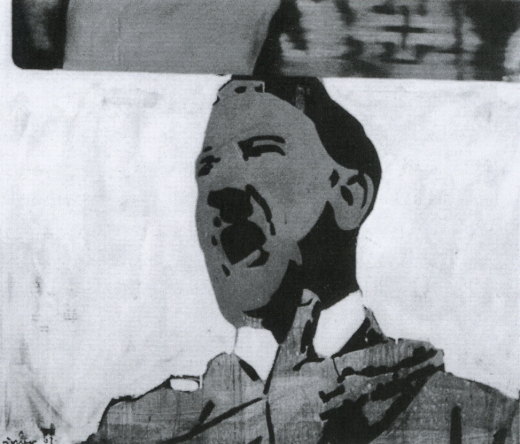
Hitler, 1962, image via gerhard-richter.com
That seems like a new category, loaded with ambiguity. I like it much better than “[DESTROYED]” or even “Richter painted over this work in ___. The painting is now entitled ____.” Which, it turns out, has another example:
Today, Richter says he’s surprised at how many works he continued to destroy after the 1960s. Perhaps he will return to one motif or another, he adds, noting that “otherwise it would be a shame.” One painting, in particular, comes to mind. It was painted in 1990 and shows two young people standing in front of Madrid’s Museo del Prado, Spain’s national art museum. However, two years later, he painted over this work, turning “Prado, Madrid” into “Abstract Painting, 1992.”
Which, yeah, there is no Prado, Madrid in the CR, and there are at least 279 Abstraktes Bild done in 1992, so, this’ll take a bit of digging. I’ll update the post when/if I find it. [I’ll have to do an update post anyway, because I’ve already found at least two other overpainted paintings.]
This painting over thing is one thing. The other, which I’m kind of fascinated by now, is the relationship between painting and photography as it plays out in these destroyed paintings. Which, of course, still exist as the artist’s photographs. It’s like Barthes’ Camera Lucida; they’re gone, but not. I can’t tell if this is Spiegel’s interpretation or reportage:
Still, since his urge to destroy some of his paintings also made him feel uneasy, he photographed them before doing so.
But someone has to have already looked at this backup, insurance, documentary, archival, post-mortem, forensic, ghost aspect of the way these two mediums intertwine. Right?

Photo of destroyed Gerhard Richter painting, 1960s, by Gerhard Richter, image: Gerhard Richter Archiv Dresden via Spiegel
Meanwhile, the obvious thing–and isn’t that what I’m here to point out?–is to recreate these destroyed Richters. Whether you paint the archival photo, crop marks and background and all, in a meta-Richterian gesture, or just try your darnedest to bring their destroyed, painted subjects back to life, I’ll have to figure out. But paintings based on a painter’s photographs of paintings based on photographs? What’s not to love?
It’d be trivial to the point of meaninglessness to just print the Spiegel jpgs on canvas, or to order them up from Chinese paint mills. But I’d be interested to see just how much more meaning could be gleaned by painstakingly copying them by hand. Even if the answer is very little, that’s still an important datapoint.
His Own Harshest Critic | A New Look at Works Destroyed by Gerhard Richter [spiegel.de via bigthink]
Rijksoverheid Rood 7: Roller
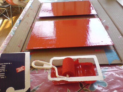
Well, that was a total surface disaster.
The size and disposability of this crappy little foam roller made it irresistible. The bubbly eggshell finish that even contains a few crumbs of foam made it a total failure putting paint down on the monochromes.
The instructions on the back are so specific, I was tempted to call following them a conceptual conceit:
- Pour 1/2 inch of paint into tray
- Roll back and forth on slanted section of paint tray to load roller thoroughly
- When painting, increase pressure on roller as it dispenses paint to pull paint from inside the foam reservoir
- Performance improves as roller becomes fully saturated with paint
- Finish with light strokes
But no.
On the bright side, there aren’t any brushstrokes.
FEW HOURS LATER UPDATE: OK, maybe it’s not so bad. The eggshelling thing is a bit subdued, but there’s far less paint per coat with a roller, no drip, and it’s generally smoother overall. I think I will continue with them a bit and see how it sands and builds up.
Previously: Rijksoverheid Rood paintings: the making of
Rijksoverheid Rood 3: Missed A Spot
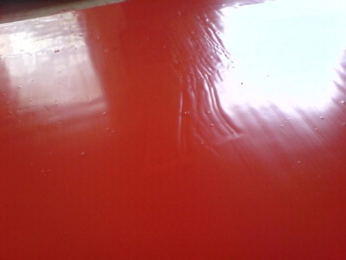
I now know that the bubbles sand right out. But what I learned this time is the importance of checking to see if you missed any spots in your smooth, monochrome surfaces before you clean up your brush and your workspace.
I ended up touching this up not too well with some scavenged drips and a leftover sponge brush. Obviously, it will not survive the next sanding.
Untitled [Extra Street View]
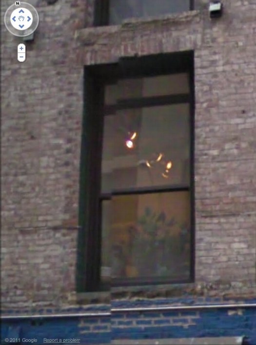
I’m bummed to miss it but “While You Wait,” a group show organized by Brian Dupont in Extra Gallery, his Chelsea art firm’s expropriated lobby is opening right now. [Spoiler alert on the venue’s lobbyness? I can’t quite tell, but I figure it’s clear from the show’s press release.]
Anyway, after Brian invited me, I was trying to figure out what I might do, and saw this image of the building–and the space’s window–on Google Street View. And then it was obvious.
I’ll write some more about the piece later; right now I’ve got to pick up the kid from riding lessons. I mean, proletariat lessons.
OK, comrades, I’m back. Basically, Google Street View is increasingly the first impression, the reference point, even the authority of sorts, for the new places we go in the physical world. In Extra’s case, the distinguishing feature of its unassuming architecture is the mismatched seam Street View gave it. Untitled [Extra Street View] is an attempt to approximate that digital reality in the physical experience of the building, to sort of sketch it into the space. Or maybe to capture it in one spot–the window–or one perspective, from inside the place you’ve just traveled to, looking back toward the pano-mapped street. It’s like a shot reverse shot between the viewer and the Google cam.

