
If I ever get a PhD it will be in the US Pavilion at Expo67 as a gesamtkunstwerk. So much going on there, and in my years of fascination and study of it, it just keeps on giving.
And I am stoked for the Queens Museum’s show, opening to day, on Thirteen Most Wanted Men, Andy Warhol’s short-lived commission for the New York State Pavilion at the 1964 World’s Fair. It sounds amazing, with an impressive amount of archival research and new understanding.
I haven’t seen it yet, but I have been bothered by a line that’s cropped up in several reviews of the show, which makes me think it’s not accidental, calling the 13 Most Wanted Men panels “Warhol’s only public artwork.”
This characterization only holds up if you define public art so narrowly as to make it irrelevant [which is something that happens to public art a lot, actually, but that’s not the point here.] Warhol exhibited work in at least three World’s Fairs in a row–1964 in New York, 1967 in Montreal, and 1970 in Osaka. And the first two were commissions. In fact, I’d suggest that the New York and Montreal projects are so similar, that they really should be considered together. Warhol’s Expo 67 works suddenly feel like a direct response to the controversy in 1964. When faced with the prospect of wading into another political conflict over his subjects, Warhol chose to depict himself.
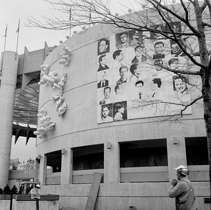
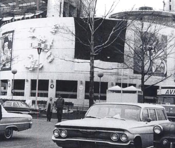
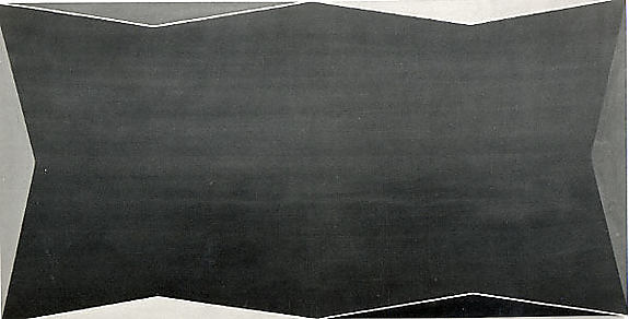
In 1964, Warhol painted 25 panels–22 with mug shots, 3 blank/monochromes–on 4-foot square masonite panels. The images came from an internal NYPD pamphlet that gave the piece its title: 13 Most Wanted Men. These were painted over in aluminum house paint within two days.
Thirteen Most Wanted Men overpainted and covered by tarp, 1964. Photo: Peter Warner, via Richard Meyer’s Outlaw Representation
Later they were covered with a large tarp. They have since been lost or destroyed. In his incisive 2002 history, Outlaw Representation: Censorship and Homosexuality in Twentieth-Century American Art, Richard Meyer quotes John Giorno’s story about the origins of Thirteen Most Wanted Men, and that the mug shots came from the gay cop boyfriend of another painter, Wynn Chamberlain. 1 [No one’s mentioned it, but I assume this is all in the Queens Museum show. Right? And the show will surely explain why Philip Johnson told Warhol in 1963 not to talk about the sources of the paintings? Johnson, who surely knew as much about power, rough trade, and a man in uniform?]
Warhol painted 25 panels with Robert Moses’ headshot, taken from Life magazine, as replacements. Philip Johnson rejected them, and they are also now considered lost or destroyed. [This photo is by Mark Lancaster, who helped Warhol make the Moses panels and much else. There’s a great interview with Lancaster at warholstars.org.]
During the Summer of 1964 Warhol reused the screens to create paintings on canvas of the 13 Most Wanted Men, which Lancaster cropped and stretched. Nine of these are currently in the Queens Museum show.
In 1964 he began making the Screen Tests, which were inspired both by the Thirteen Most Wanted mug shots and the photobooth pictures Warhol began using in 1963. He created Most Wanted series of women and boys as well.
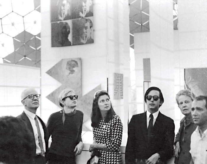
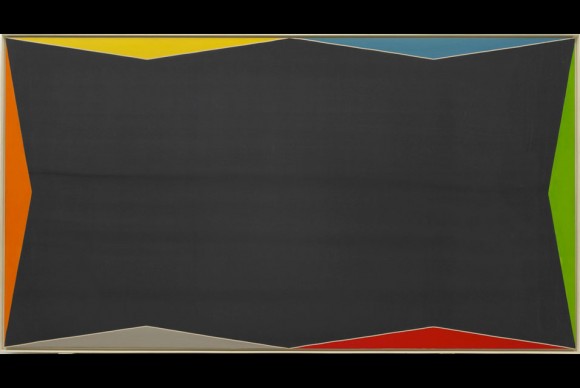
Warhol visiting Expo 67 with the de Menils, that’s John de Menil at left, not Buckminster Fuller, as some online sources would have it. image via menil.org
In 1967 curator Alan Solomon commissioned Warhol to make large paintings for the US Pavilion at Expo 67. Warhol created eight giant Self-Portraits. They are 6-feet across and based on a photo by Rudy Burckhardt. Six of them were installed in Buckminster Fuller’s geodesic dome, above Jasper Johns’ Dymaxion Map. Four of them are visible above, in a photo taken during Warhol’s visit to the Expo with John & Dominique de Menil. The one on the lower right is now in the Tate Modern.
If the Thirteen Most Wanted Men censorship was really as concerned with vice, power, and the homosexual gaze as Meyer argues, then Warhol’s uncensorable Self-Portraits read like an act of defiance. For his 2nd World’s Fair, Warhol didn’t shrink from political conflict; he met it straight on and came out on top.
1 Update: I just came across a story by Lucy Sante about Thirteen Most Wanted, which he published in 2009. It is, I assume, a fictional encounter with a retired NYC policeman who had the idea for a Ten Most Wanted list stolen from him by a fellow cop, who became lovers with a young Warhol, and then years later, while guarding the World’s Fair, saw his Most Wanted Men idea stolen again by his ex. Hmm. I think someone had better talk to John Giorno.
Tag: works
Ex Collectio: The Bernard Madoff Provenance Project
UPDATE: There is now a Google Doc, your one-stop source for Madoff Provenance information. Have a detail? Send it in!
Last month I proposed that the specific artworks which had once belonged to Bernard Madoff be forever associated with him, that he and his various corporate entities become an inextricable element of their history, discourse, and meaning.
For the most part, Madoff collected prints and multiples from large editions. There are usually dozens of identical examples of each artwork he collected; they’re true investment-grade commodities. However, Bernard Madoff’s ownership of these examples differentiates them and renders them unique among their editions. How does the historical fact that these specific artworks were owned by the perpetrator of one of the financial industry’s biggest frauds affect their engagement with the art market, the art audience, and the critical structures of the art world? We shall find out.
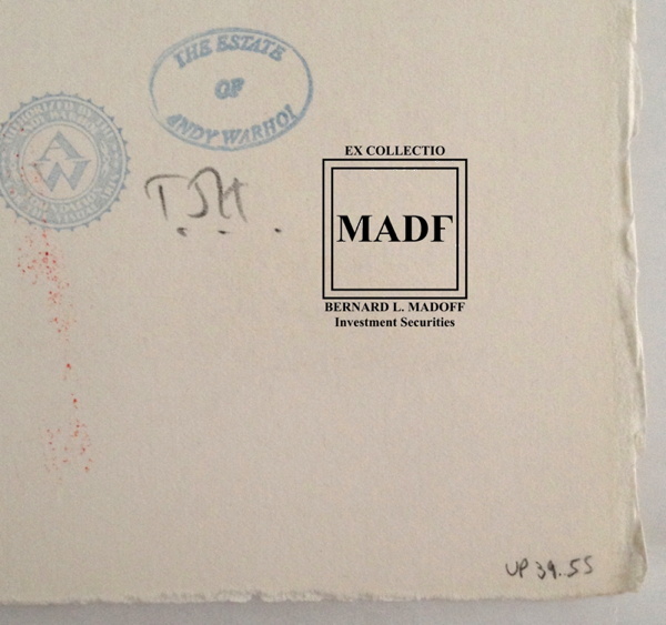
Study for Ex-Collectio MADF Stamp, 2014, digitally manipulated photocollage
Seven of the 53 artworks listed in the US attorney’s inventory of Bernard L. Madoff Investment Services, plus one additional work, are being sold by the bankruptcy trustee at Sotheby’s on May 1st.
Their lot and edition numbers are documented below, along with edition and title information for previously sold Madoff artworks whose court inventory entries were incomplete.
In accordance with art market, conservation, and art historical practice, I have created a stamp to indicate these works once belonged to Bernard Madoff and/or his corporate entities. I hereby issue an open invitation to all owners, buyers, dealers, agents and conservators handling these artworks, to accurately reflect their history, significance, and provenance by having them stamped. I am happy to provide this service, upon review, authentication, and mutual agreement, for no charge within New York City or the Hamptons or, upon prior arrangement, at art fairs in Basel, London, or Miami Beach. For other locales or times, please contact me directly. I’m sure we can work it out. This offer applies only to artworks which can be documented through court and/or auction records as having been in the collection of Bernard Madoff. No frauds or phonies.
Not in Inv.
Lot 41 Henri Matisse, FORMES, PL. IX (FROM JAZZ), 1947, pochoir print of “plate IX of XX from the edition of 100 (total edition includes the book edition of 250 with a central fold), on Arches wove paper, published by Tériade, Paris.”
Continue reading “Ex Collectio: The Bernard Madoff Provenance Project”
Images And Ideas I’ve Been Thinking Of
So many projects, so many browser tabs, open for so many months, I’ve gotta clear some of these things out:
I’ve wanted to remake the lost/overpainted panels from Andy Warhol’s Thirteen Most-Wanted Men mural for the NY World’s Fair since the Destroyed Richter Paintings days, but now with the comprehensive-sounding show at the Queens Museum opening, I’ve probably got a week to do it. And process it. And put it behind me. Ah well. The show does sound good, though.
Not sure why it didn’t occur to me sooner, but the news this week that MoMA’s started the dismantling of the Folk Art Museum gave me a flash of inspiration: The Williams+Tsien Folk Table Collection. Turn each bronze alloy panel into a unique memento/tabletop. Maybe there’s enough material inside to use for legs, &c., too. I see a couple dozen dining tables, as many coffee/side tables, and a handful of console/sofa tables. An edition of up to 63. They’d be a stunning addition to the finest home, and quite the conversation piece.
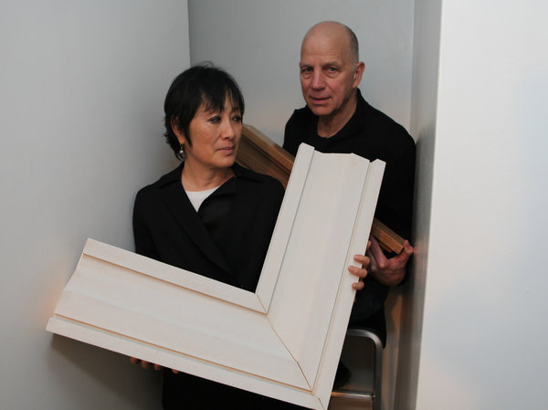
Actually, the inspiration came from Chester Higgins Jr’s photo of Billie & Tod holding architectural fragments. The domestication of architecture.
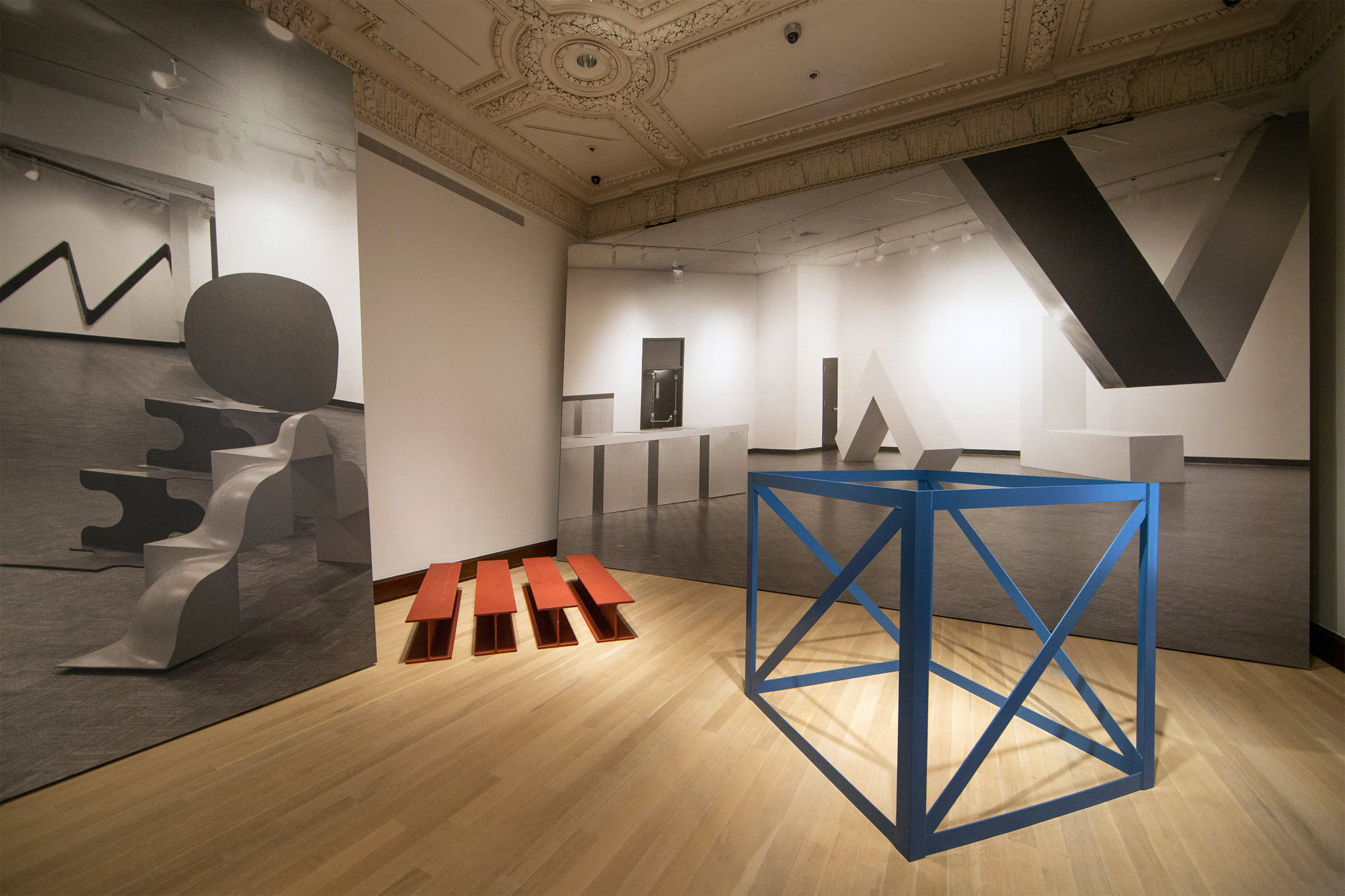
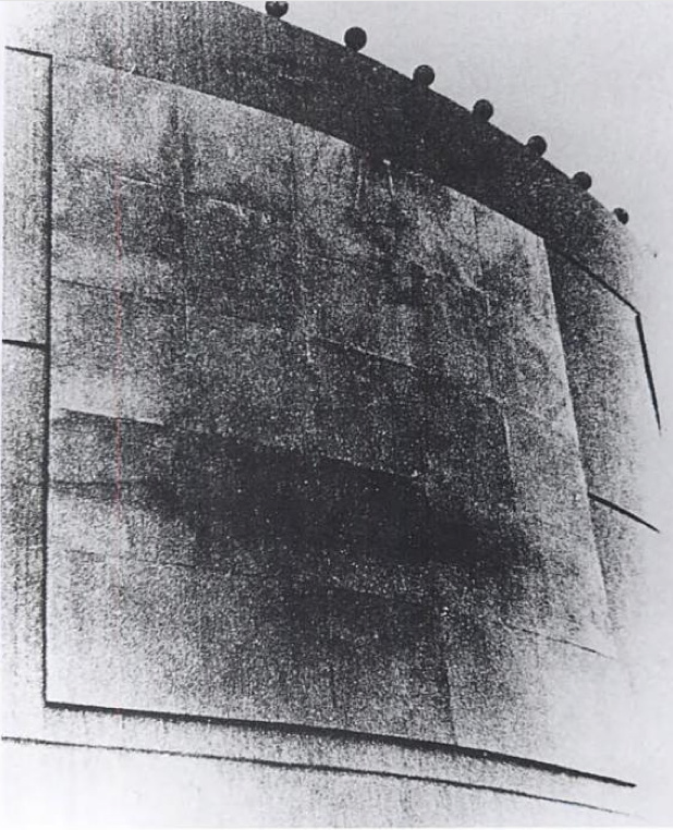
Also from the Times: Fred Conrad’s great photo showing the use of photomurals to evoke/approximate historical spatial experience at the Jewish Museum’s “Other Primary Structures” show. It’s interesting that they’re angled and mounted on wall-sized panels, not stuck to the moulding-encumbered wall. Makes them a bit more exhibition design and a bit less exhibition, I suppose.
Richter tweeted this the other day, and it’s been nagging at me ever since:
Reproductions of ‘Aunt Marianne’ and ‘Mr Heyde’ are shown in the exhibition ‘Registered, Persecuted, Annihilated’. gerhard-richter.com/exhibitions/…
— Gerhard Richter (@gerhardrichter) April 1, 2014
the exhibition of reproductions of paintings, that is, not just paintings based on photographs. Also, of course, the show is at the world’s most intensely named museum, the Topography of Terror.
I’ve reached out to the Topographers, hoping to find out more about how paintings function in an exhibit like this, and how the decision was made to include them as reproductions. But so far I have received absolutely no response. But I did get some screencaps from a YouTube video of the opening, which I can’t find right now:
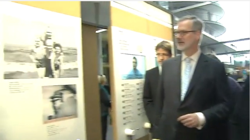
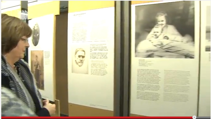
Hmm, actually the panels look like reproductions of pages of books, not of paintings. Simultaneously more and less interesting.
While rummaging around the Met’s collection database, looking for Arthur Vincent Tack info, I Google Imaged up this hard edge painting. Which apparently hadn’t been documented in the color photo era, but I couldn’t find it on the Met’s site.
As I was posting this I realized the filename is the accession number, 1978.565, Larry Zox. 1978’s obviously too old for Hard Edge; the painting’s from 1966, an at once unusual and logical size of 50×100 inches. Untitled (from the Double Gemini Series).
Turns out the Guggenheim has a very similar painting, Alto Velto, from 1969. Color really matters in these jpgs.
Martin Bromirski posted images from a 2008 Larry Zox show at Stephen Haller.
Untitled (UKR-RUS Flag Carpet)

I don’t know what’s going on here. This image was the intro for a Yahoo News slideshow yesterday on Russia’s annexation of Crimea, and so it doesn’t have any caption or credit line.
At first I thought it was just a graphic of the Ukrainian and Russian flags, but looking a bit longer, I started to wonder why it had these irregular, dingy, textured spots on it. Which would be odd for a CG graphic, but normal for a photograph.
But then what’s it a picture of? A wall? A carpet? Is this a detail from a giant flag mural somewhere? Did someone make a flag-themed rug for some international event? Which people have been walking all over like some geopolitically conflicted Rudolf Stingel installation?
Anyway, the obvious solution now is to make such an installation. I can see a whole series of flag carpets, coming soon to a regionally appropriate biennial near you.
Untitled (290 x 404, After Graduation, 2008, by Richard Prince)
Who Owns This Image?
We got this.
Suddenly the New Yorker headline got me thinking, and I clicked on their little jpg of Graduation, and it’s 290 x 404 pixels–and its original title says it’s a screenshot– almost exactly the same dimensions as Untitled (300 x 404), and I’m like, DONE. Frankly I’m kind of embarrassed it took this long.
No need for Chinese Paint Mill; I’m ordering test prints tonight. It’ll be interesting to see what that little jpg looks like at Graduation-size. Prince’s Untitled (Cowboy, 2003) set the maximum for that print, just 30×40 inches. But Graduation is six feet tall, (72 3/4 by 52 1/2 inches, 1.85 x 1.33m). Could be a real mess, but that’s fair use for the rest of us.
Who Owns This Image? [newyorker]
Previously, related:
May 2009
the instigation: West Trademark F@*#(up
the concept: 300×404, the making of
June 2009:
proofs: Richard Prints, Untitled (300 x 404)
June 2010
published: Untitled (300 x 404) @ 20 x 200
the review/thinkpiece: the great debate: the value of greg allen’s untitled (300 x 404) [artfcity]
Para-Real Conversation Really Happening, Wed. Feb 5, 7PM At 601Artspace
Vic Muniz After Gerhard Richter (from pictures of color) (2001) and Greg Allen Destroyed Richter Painting No.2 (2012, left) and Destroyed Richter Painting No.4 (2012)
I’m really stoked to have the Destroyed Richter Paintings project included in “Para-Real,” an exhibition at 601Artspace, that has been extended until this weekend [closes Feb. 8, cf. Ken Johnson’s review in the NYTimes].
Magda Sawon curated the show with works from the 601 collection and others, and she paired Vik Muniz’s big paint chip Portrait of Betty with one of the Destroyed Richters. I’ve been a big fan of Muniz’s work for years and was particularly taken by his Pictures of Color series when we first saw them in Venice in August 2001. We barely knew how great we had it back then.
But anyway, that’s just one of many interesting pairings of works that examine notions of the real. If you haven’t seen the show already, I hope you’ll put it on your itinerary.
Maybe you should put it on your calendar tomorrow, in fact, say, 7pm, when our rescheduled conversation takes place with Robert Blake, Director of Special Projects at 601 Artspace, Jennifer & Kevin McCoy, John Powers and I. I’ve been looking forward to it for weeks. Months, even.
A round table conversation on Para-Real moderated by Robert Blake and led by Magdalena Sawon with Greg Allen, Jennifer and Kevin McCoy and John Powers
Wednesday, February 5, 2014, 7-8:30p [601artspace.org]
On Untitled (Beauty Love)
There is beauty in this painting. But the beauty is not what makes you love it.
It’s the emotion of what it says, in very simple means about life. And where we all go.
I don’t know why I get chills from Tobias Meyer’s little promo video for Silver Car Crash (Double Disaster), but here we are.
I matched the audio to Michelle V. Agin’s photo from the Times this morning.
And then after reading Ian Bogost’s McRib essay again, I realized it was the most persuasive explanation I’ve seen of Auction Week. So
untitled (where we all go)
Collection Daniel Loeb
Collection Daniel Loeb, 2013
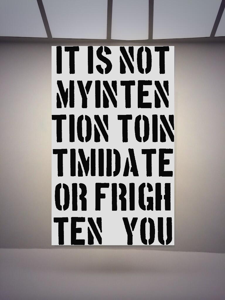
I’m inordinately pleased with this, especially the TION TOIN. So I’m now going to search around for some other stellar quotes from Christopher Wool collectors which can become paintings. Dan’s a genius for this kind of stuff, though, he’ll be hard to beat.
UPDATE: A few more after the jump. It feels like they’re just scratching the surface. It’s like how there are some people who totally should have a Warhol portrait, there are quotes that should really be a Wool painting. It really just should happen.
Previously, related:Now a painting? Who do I think I am?
base image via #ChristopherWool/@Alipechman
Mari X IKEA: autoprogettazione by greg.org (2010)
Three years ago, I was thinking about what to do with the posts I’d written about the project I’d begun six years ago. Which I guess means it’s time to release the results.
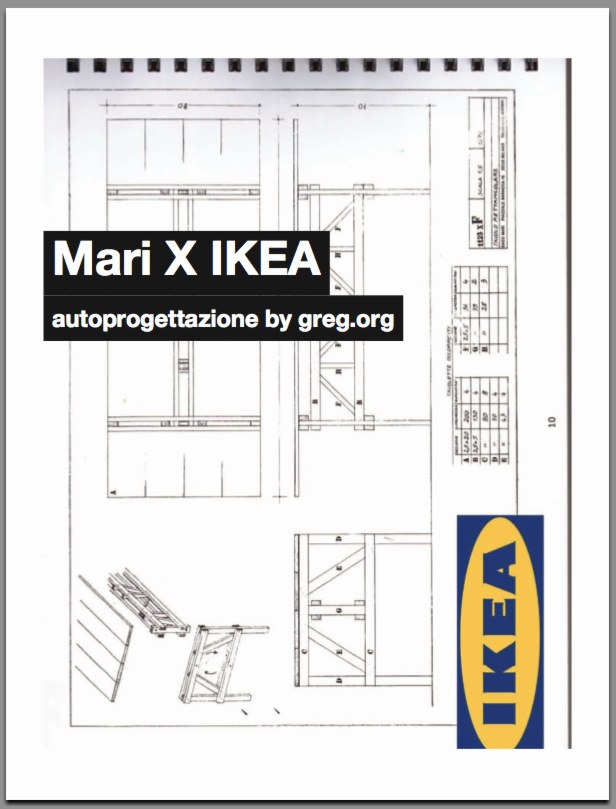
So here’s Mari X IKEA, a PDF compilation I made in 2010 aboutfmy 2007-09 project to construct an Enzo Mari autoprogettazione table out of Ikea furniture components.
I was not entirely pleased with the way it read all together, and so I didn’t publish it back in the day. But I realize now that my inner archivist and inner editor will never agree on things, and I/we are becoming OK with it. So the tabloid-style publication contains all the original blog posts and images documenting the project, and that includes a fair amount of recapping and repetition. Meanwhile, my inner publicist wants to emphasize that this is not a bug, but a feature, like the catchy chorus of a song.
I’m still quite stoked about the project–and the table, for that matter, which I am using at this very moment–and it continues to influence and inform my thinking about stuff: art, design, originality, authorship, authority, appropriation, systems, craft, utility. So I’m very happy to get information on the project out there in a more easily consumable format.
I should also give a shoutout to The Newspaper Club, the amazing publishing company, then just starting out, where I had originally contemplated printing Mari X IKEA in 2010. This PDF was made using their easy publishing/layout tool. And though I ended up not pulling the trigger on this particular project, they regularly make me want to turn this blog, and many other things, into a newspaper.
Mari X IKEA: autoprogettazione by greg.org, 2010 [PDF, 2.8mb]
Ghetto Erased De Kooning Drawing
[See the note about Ghetto vs Shanzhai at the bottom of this post.]
I’ve explored and written quite a bit about Erased de Kooning Drawing by Robert Rauschenberg & Jasper Johns. And I started to wonder if anyone else had ever erased one, too. If so, who and when, and if not, why?
Was it really a gesture that only needed to–or only could be–done once? Yes, there’s an audacity to Rauschenberg’s gesture, but the work is also, rather definitively, not a destructive act. Rauschenberg correctly saw erasing as an affirmative markmaking technique, one that de Kooning himself used quite skillfully.
So why not do it again?
I think the obvious explanation is that one more erased de Kooning drawing in the world would mean one less de Kooning drawing in the world, and that’s a seen as a problem. De Kooning’s pre-eminent stature as an artist, combined with his being dead, the finite number of works by his hand, the urge to preserve them, the conservation imperative of not making any irreversible alterations to an artwork–and of course, the economic folly of it, it just don’t add up.
On the other hand, it would offer an invaluable insight into Rauschenberg’s own experience and process in erasing de Kooning. Remember how he said it took him a month and a whole bag of erasers or whatever? Now we could find out.
Because Christie’s just posted an online-only auction of de Kooning works on paper collected over two decades by his longtime physician and friend Dr Henry Vogel. There are 33 works in the online Vogel sale, and some of them are nice, and even interesting. Let’s also say that there are several works available whose artistic character, historic importance, and sales estimates completely upend the calculations that have prevented a restaging of Rauschenberg’s act. They are highly erasable de Kooning drawings.
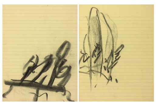
Lot 10, a diptych, is the first of nine drawings in what me might call de Kooning’s Notepad Series, which juxtapose his expressive markmaking with the rigorous geometry of lined paper:
He drew on everything from bags to grocery receipts, but it was paper–smooth, permanent and hard–that he favored most. Any kind of paper could suffice, even the torn out pages of a notebook, like with these two pieces.
The current bid is $2,600, with an estimate of $4-6,000. [update: sold for $3,250]
Christies’ specialist hints at the mysteries locked into Lot 11, above:
De Kooning often used the female figure as a starting point to explore abstraction, obsessively and tentatively probing the boundaries between the two forms. In drawings like this, only the faintist hint of the female form emerges–and even that is open to interpretation.
The starting bid will be $1,000 against an estimate of $2-3,000. [update: sold for $2,750]
But the most promising candidate for erasure may be Lot 12 (starting bid, $1,500, est. $3-5,000, [update: sold for $1,875], which not only features images that de Kooning himself crossed out–a double negation!–but which has not only been seen, but commented upon by John Elderfield himself:
“There’s one of these yellow pad sheets where he seems to have drawn a lot of forms and crossed them out,” said John Elderfield, a [sic] former curator at MoMA, describing this piece. “And it’s hard to quite know what he’s up to. […] But with de Kooning, there always is something.”
Just like a palimpsest, there always is something.
Which highlights another major difference between Rauschenberg’s Erased de Kooning Drawing and this, for lack of a better term, Ghetto Erased de Kooning Drawing: you could buy it. Rauschenberg held onto his for decades, until he sold it with a group of foundational, early work, to SFMOMA. But if having an authentic, erased de Kooning drawing of your very own is something you’ve always drramed of, well, the auction ends June 19th. Drop me a line. We’ll make it happen.
Willem de Kooning Works on Paper from the Estate of Dr. Henry Vogel, online auction ends June 19 [christies.com]
[NOTE: Though the use was more common at the time, I grew uncomfortable with the racist origins and implications of the colloquial use of “ghetto” for these works. I changed it to “shanzhai,” a Cantonese term which originally described unabashed counterfeit consumer goods; this usage has since shifted toward a hackier, scrappy innovation, but for these works, the original meaning pertains. I have kept the original uses of ghetto rather than delete them to acknowledge the blinkered social context I was also complicit in.]
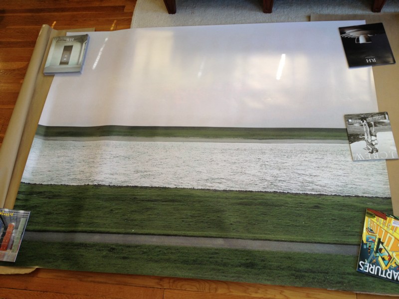
Unrolling: Ghetto Gursky Rhein
[See the note about Ghetto vs Shanzhai at the bottom of the post.]
When I undertook this Ghetto Gursky experiment last week, immediacy felt important: to use just the best image I could find online rather than scanning a catalogue, for example. And printing with the quickest, point&clickiest online service I could find. The constraints would then be the focus: the “accuracy” and veracity of the image that circulates freely [approximated here by resolution]; and the ability to instantly print large-format photos in the dimensions that were once so startling and rare, they were only available to, well, Gurskys.
Literally, though, no sooner did I place my order than I realized this generated complications. Printing at 5×6 feet, the rough dimensions of Gursky’s Rhein (1996), is actually beyond the capacity of most instant printers, at least those of the vanilla consumer variety. [It’s trivial to print a vinyl banner at that size, though, but this wasn’ what I wanted.]
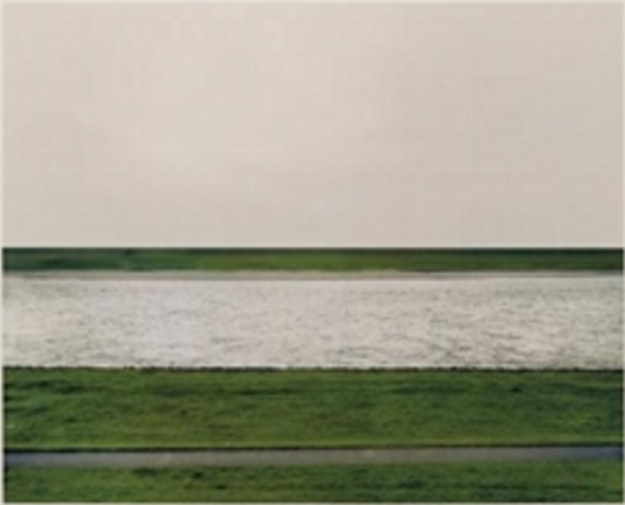
Which is all a long way of saying that the Ghetto Gursky test print just arrived today. It turns out that my immediate vendor choice meant it was printed in California and groundshipped. But it came rolled nicely in a large tube, and it made it perfectly intact. So that’s all good.
First impression: ghetto fabulous. Turns out high-production photography has an uncanny valley effect, too. It’s on thick photo paper, with a nice finish. The colors are true [to the JPG I used, anyway]. Standing in front of/over it, the similarity to a Gursky is surprising.
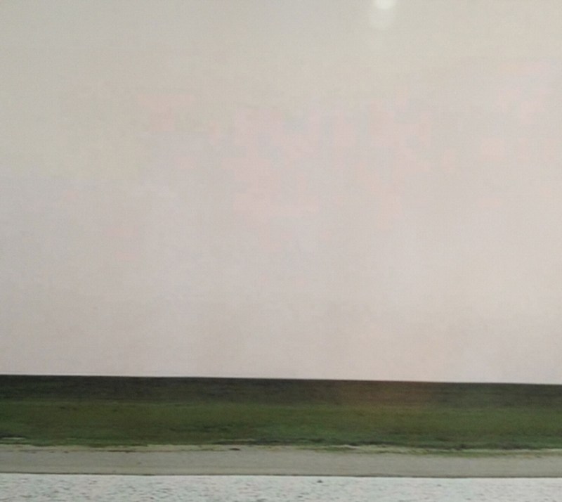
Looking closely, though, yields its expected rewards, just the way Hito Steyerl likes it: “resolutely compromised: blurred, amateurish, and full of artifacts.” Without algorithmic smoothing or some kind of image-massaging resolution upgrade, there are pink, pixellated passages in the sky [above].
And there are a couple of greyish digital artifacts floating in the grass as well. I was going to say that the Ghetto Rhein does not have any of the crisp focus of Gursky’s original, but I don’t actually know that to be true. I haven’t stood up close with Rhein lately, but I’m not so sure that mid-90s C-prints actually have the grainless clarity I see/imagine in my memory. As with Prince’s Untitled (Cowboy) and the life-sized Untitled (300×404) print, I’d really like to see them side by side.
But the other issue, which popped up immediately, by which point it was too late, is mounting. There was no obvious, immediate, self-serve online place for facemounting a print that size on plexi. So now it’s up to me to track someplace down, and get it done. At which point, I’ll be schlepping a 5×6 print around. And soon enough, it’ll be basically 6×7 framed. And then it gets a crate, and then it’ll need a Sprinter van, and then it’s practically a Gursky, alike in every way except its street value.
[NOTE: Though the use was more common at the time, I grew uncomfortable with the racist origins and implications of the colloquial use of “ghetto” for these works. I changed it to “shanzhai,” a Cantonese term which originally described unabashed counterfeit consumer goods; this usage has since shifted toward a hackier, scrappy innovation, but for these works, the original meaning pertains. I have kept the original uses of ghetto rather than delete them to acknowledge the blinkered social context I was also complicit in.]
Gursky, Ohne Titel XI
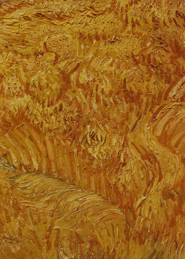
The artist blew up the passages by a factor of at least twenty; the paintings’ materiality comes into focus as the surface images lose resolution, further abstracting already cropped and isolated images. That is to say, we can hardly tell what these paintings are “of.”
This diffusion into abstraction seems to operate as a metaphor for the materiality of the photograph, the way that photographic images reveal either grain, in straight photography, or pixels, in digital photography, when sufficiently enlarged.
Katy Siegel, Artforum, 2001, on Gursky’s Untitled XI, 1999, a photo of a detail of a Van Gogh painting, printed at 2.7 x 2m.
Ghetto Gursky
[NOTE: Though the use was more common at the time, I grew uncomfortable with the racist origins and implications of the colloquial use of “ghetto” for these works. I changed it to “shanzhai,” a Cantonese term which originally described unabashed counterfeit consumer goods; this usage has since shifted toward a hackier, scrappy innovation, but for these works, the original meaning pertains. I have kept the original uses of ghetto rather than delete them to acknowledge the blinkered social context I was also complicit in.]
Seeing Brent’s tweet of a Taylor Swift photo yesterday made me finally move on an idea that’s been percolating for several years: the Ghetto Gursky.
The new Gursky. RT @taylorswift13: Dallas. Thank you for a memory I’ll replay in my mind on rainy days. https://twitter.com/taylorswift13/status/338877935069036544
— Brent Burket (@HeartAsArena) May 27, 2013
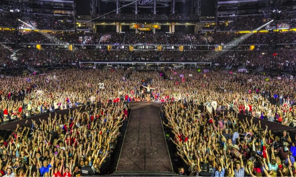
The Swift-as-Gursky image is key, in a way. I had kind of a falling out with Gursky’s work in November 2001, when he was shooting Madonna’s concert tour (in LA, on Sept. 13) instead of what I felt he should be shooting: the wreckage of the World Trade Center.
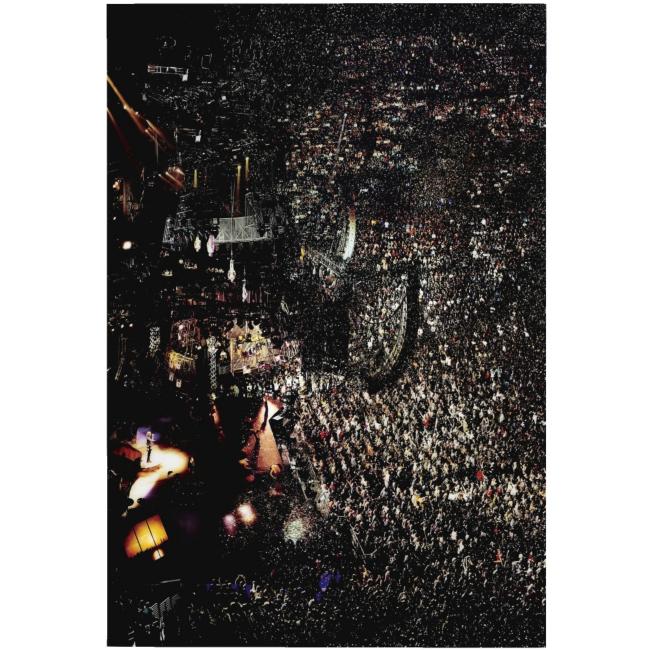
Madonna I, 2001, ed. of 2
I’d been morally invested in Gursky’s work [I was not alone at the time] and its presentation as a critique of the globalizing forces and systems in the world, and I’d wanted to see his take on what seemed like the most pressing reality of the moment:
From the first week after the bombings, when I was in full CNN burnout, I wanted writers’ and artists’ perspectives, not Paula Zahn’s. The scale of the debris, the nature of the target, even in wire service photographs, it called for Gursky’s perspective to make some sense of it, perhaps.
Because I realized even then it was an idealistic and presumptuous view of art, and it was based on no actual knowledge of Gursky’s practice of artmaking. But it distanced me from the work, and germinated the seeds of skepticism that had been planted at the end of Peter Galassi’s 2001 MoMA retrospective.
The last gallery of that exhibition featured ever more massive prints, with ever less subtle Photoshop manipulations, culminating in a collage of disembodied CEOs and boards of directors floating against an abstract background. I remember thinking at the time how awful it was, and wondering where Gursky was heading–and whether Galassi had any qualms about showing the stuff.
Gursky has certainly made much better work since, but it stuck with me then how closely linked the impact of his work is to the state of the technological art and the means of production at any given moment. He was a Becher alum interested in exploring the latest developments in large-format photo printing and digital manipulation. The effect and experience of this can be stunning, but it can also be a trap. When you’re selling spectacle and production and wall presence, you have to keep up with the Struths, as well as the dozens of other artists who figure out where the 5-foot wide printers are. And the 8-foot. So there’s that.
99 Cent “Like Warhol, Gursky has succeeded in seducing his viewers with his product.” –Phillips de Pury, Nov. 2006
And then a few years later, while working on a story for the Times, a collector offhandedly mentioned a market for Gursky exhibition prints. Which kind of surprised me. Because now there was a tension between the arbitrariness and fiction of the photographic work’s edition size, and the physical reality of these giant, expensively produced, museum-grade [obviously] objects. And the tension played itself out in, or was really only a problem for, the market, where at that moment, Gurskys at auction were the most expensive photos in the world.
Which is right when I was chatting with another collector in Miami, as we toured the family’s house during an ancillary Art Basel event. Introduced to her as a fellow collector with an interest in photography, she asked, “Do you collect Gursky?” And suddenly Gursky was stripped bare, transformed into [or revealed as, depending on your cynicism] a pure commodity, the apparently socially acceptable way of straight up asking someone their net worth. And of demonstrating your own.
Untitled (300×404), 2009, published in 2010 by 20×200
In 2009, when I printed up copies of Untitled (300×404) using a small JPG of a Richard Prince Cowboy photo, I was interested to see what the difference was between his real, appropriated artwork and the digital image we were “allowed” to access by copyright [and gallery/institutional exercise of control].
The 20×200 editions of Untitled (300×404) got me thinking about how art discourse and the market handle [or don’t] issues of authenticity and copying, where the value lies, and where the attention is directed. And the extent to which money, class, rarity, and luxury color our experience of art, even when we claim self-awareness and critical resistance, and even if the artist seeks to thwart such influences in the reception of her work.
And I thought on the existence of quasi-illicit, out-of-edition Gurskys infiltrating the market in a don’t ask, don’t tell way, ably performing their functions as markers of capital and luxury objects. And how it was acceptable to ask if you collected Gurskys, and even when you started, but not to ask how much you paid, or how big a discount you got, or what number this here Gursky was in the edition.
And I wondered how close you could get to the experience of standing in front of a Gursky, the encounter with the artwork, the image and scale and finish and physicality of the object itself. What would happen to the rest of the experience? Could a Gursky ever generate a genuinely critical encounter of the system that has spawned it, from within that system?
And that’s where the idea of the Ghetto Gursky came from: a full-scale recreation of the Gursky Experience, made with publicly available imagery and publicly available production technology. Which, by the way, has become widespread, if not commonplace, in the decades since Gursky began using it.
What would such a commonly produced object do to the socioeconomic aura of the originals? If a Gursky were a sign of significant wealth and sanctioned taste, what would a Ghetto Gursky be a sign of? Clueless and failed aspiration–the contemporary art equivalent of putting an elaborate copy of Michelangelo’s David by the pool? We can call this the outcome the Carlos Slim. Or would it be a way to show off the modesty of one’s means? The Art Basel cheer of absolutely no one, “Hey, I have five thousand dollars!”
The polarization of the art market is such that a Ghetto Gursky has less justification for existing, and less likelihood of being sold, than a real Gursky. Which seems ridiculous. So I decided to go ahead and make one and see what it’s like.
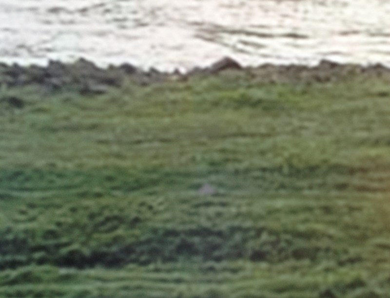
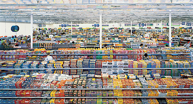
Rhein, 1996, blown up 4x from a thumbnail for effect
I’ve ordered a full-size print of Gursky’s 1996 photo Rhein, which is being made using the largest jpg version of the image I was able to find online. Then I’ll have it mounted on Perspex and framed, just like his original. This is not Rhein II (1999), which is like 2×3.5m long, and is currently the most expensive photo sold at auction. [An edition of Rhein did just sell at Phillips a couple of weeks ago for $1.9 million, which is not nothing, but still.]
Rhein is only around 5×6 feet, big when it was made, but now, not really, which is kind of the point. It’s also a more manageable size to experiment with. It will fit on my wall and in my car and in my storage. Katy Siegel wrote in 2001 that “Gursky’s motivation is the masterwork, the valorization of the fetishized object of high art.” A Ghetto Gursky will invariably be as heavy and large and unwieldy and difficult to transport, store, and hang as a real one, which only contributes to its implausibility. Which is kind of the point.
Untitled (Embroidery Trouble Shooting Guide)
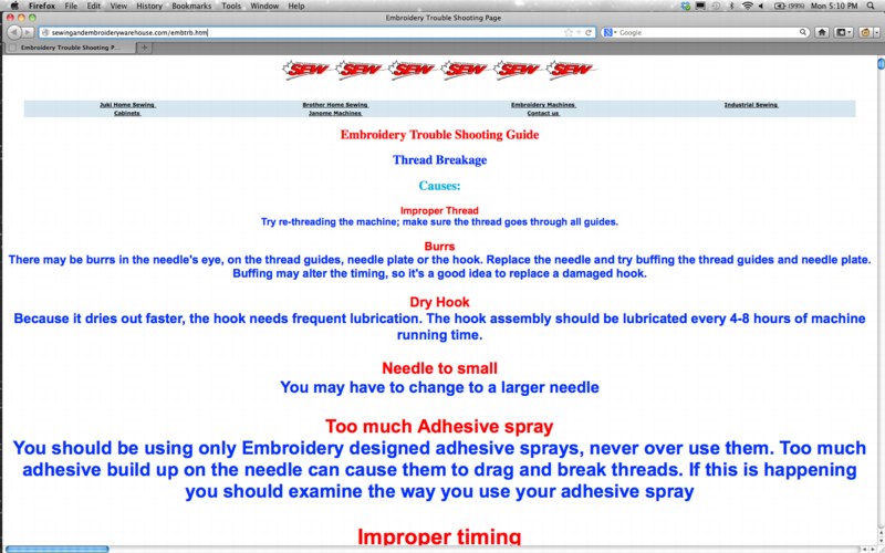
When I first met Richard Serra in 1994 or so, we talked a lot about the Internet. Soon after, I began trying to imagine what a Richard Serra web project would look like. Given the way his sculptures rather definitively reconfigured the space they inhabited, I envisioned a Serra site as a single, massive, interlaced GIF, that rendered in your browser with excruciating, megalithic slowness, controlling time and processing power as well as screenspace.
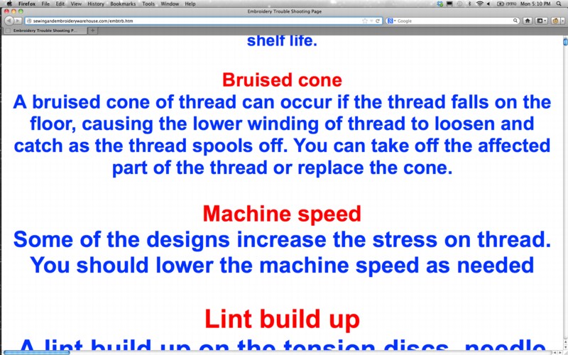
I mention this now because I think that, after my nearly 20 years online, the Embroidery Trouble Shooting Guide page at sewingandembroiderywarehouse.com comes closest to Serra’s work in terms of its spare, dauntless power.
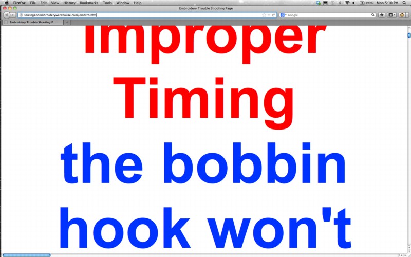
ETSG is created in Microsoft FrontPage. None of the HTML headings tags are closed, so the text, as Rob at boingboing puts it, grows “inexorably in size until the greatest website in the world is achieved.”
This kind of webby, self-referential recursiveness is similar to, though the inverse of, Moonwalk, Martin Kohout’s standout YouTube video which was a conceptual standout at the Guggenheim’s YouTube Play competition/exhibition a couple of years ago.
ETSG‘s scrolling text is also reminiscent of Serra and Carlotta Fay Schoolman’s 1973 video piece, Television Delivers People.
But of course, it’s all unintentional, even unnoticed. Apparently, the SEW folks say the page renders just fine in Internet Explorer.
Crazy 20×200.com Sale Starts at 4AM EST

20×200.com is starting their WTF Cyber Monday sale early, at 4AM Eastern, with an eye-popping 40% off on prints and frames, as detailed above. The discount ticks down a bit throughout the day, until it reaches a still-totally-respectable 25% off by 4PM.
The discounts apply to orders over $100, so for example a framed 14×11 edition of Untitled (300 x 404), below, would be $111 instead of $185. And one of the five remaining 30×24″ prints, would be $720 vs $1,200.
There are, of course, many other excellent prints available, too.
You can’t even get discounts like that at Basel Miami Beach, people. It is serious Crazy Eddie days over there.