
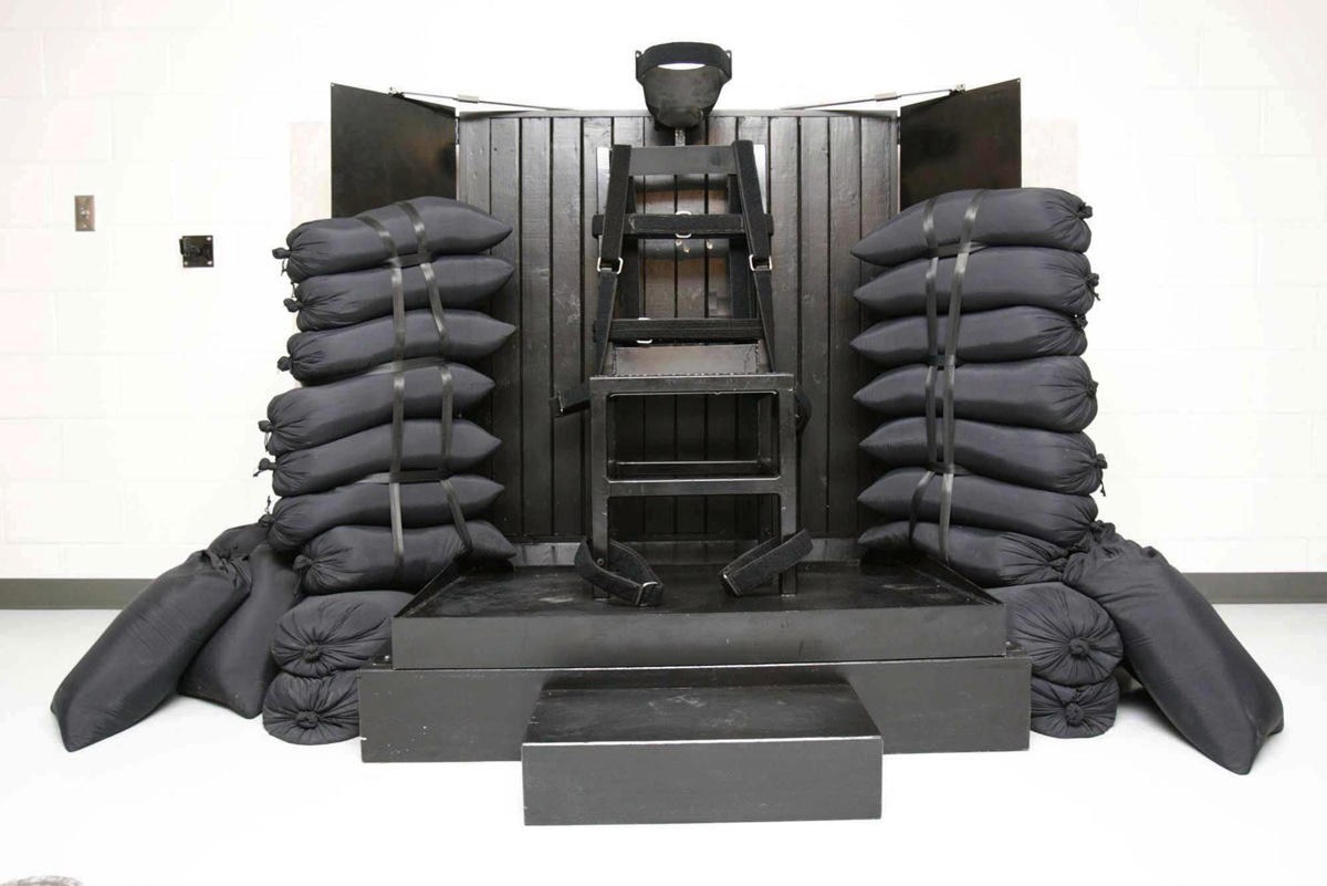
I think this is the official photo of the firing squad execution chamber for the State of Utah. It was executed in 2010 for the killing of Ronnie Lee Gardner, who had requested death by firing squad. Though the firing squad was banned as a method of state execution in 2004, four other Utah death row inmates who had requested death by firing squad have been permitted to keep their choice. Today one house of the Utah legislature voted to reinstate the firing squad as a method of execution.
The structure consists of a chair made of welded steel square tube and a perforated seat; nylon and Velcro restraining straps for the executed person’s feet, chest, and arms; and a height-adjustable steel neck and head brace, which has a piece of black impact foam where it hits the base of the skull, and a strap.
The chair is welded to a two-tiered pedestal; a steel plate box is bolted to a larger, painted wood box below. The top of the steel pedestal is not level, but is angled slightly toward the back. It is inset on the sides, and appears to have a small lip at the rear edge. A black painted wooden step is aligned with the chair, and is slightly shorter than the wooden pedestal.
A screen sits behind the executed’s chair. Perhaps it is affixed to the wall. It comprises fourteen pieces of 2×4, painted black , and arranged vertically and set into an angle iron frame; and two half-width panels of steel, hinged, and kept open at an obtuse angle with locking brackets on top.
The spaces on either side between the platform and the rear screen panels are filled with sandbags. The sandbags are black nylon, cinched at the top with the tops all facing out. Nine sandbags are stacked vertically on each side and held in place with a single vertical nylon belt, and with horizontal nylon belts tight between every two sandbags. The 9th sandbag on top is lashed separately. At least three sandbags are propped diagonally against this stack to act as buttresses, bringing the total to 24.
Tag: works
Untitled (Post-It), 2015
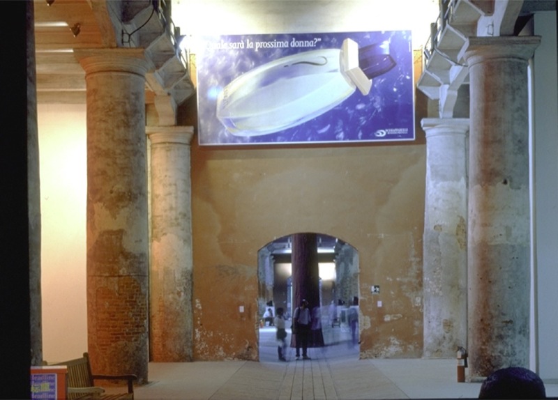
Lavorare e un Brutto Mestiere, (Working is a Bad Job), 1993, installed in Aperto ’93 Emergency/Emergenza, 45th Venice Biennale. image: from all over, but this time via contemporaryartnow
Maurizio Cattelan was invited to contribute work to Aperto ’93 at the Venice Biennale. Aperto’s shows-within-a-show format, conceived by FlashArt editors Helena Kontova and Giancarlo Politi and curated by Kontova and twelve others, focused on emerging artists and would prove highly influential.
Cattelan offered his space to Gruppo Armando Testa in Torino, the head office of Italy’s largest advertising agency, which had just been taken over by the deceased founder’s son Marco. Cattelan said he “assigned” it, but he is often described as having leased his space; he also signed a contract with Testa to promote whatever they decided to display.
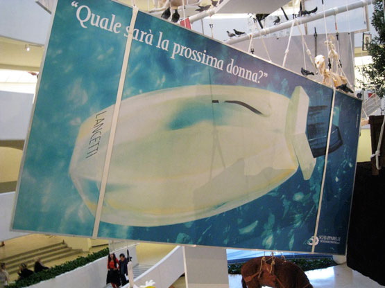
According to an article at the time titled “L’Arte Cerca Publicitta [Art Seeks Advertising]” Testa decided to use the Biennale opportunity as a teaser for the launch of a new perfume by Roman fashion designer Pino Lancetti. Though the licensing company Schiapparelli’s logo is in the corner, Lancetti’s name is only visible obliquely on the bottle. The perfume turned out to be called Suspense.
Untitled, 2002, photo: perrotin
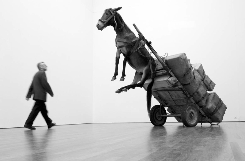
Cattelan told FlashArt the project was meant to “encourage people to reflect on the internal working of the Aperto.” In 2005 a nameless Sotheby’s cataloguer wrote, “By allowing an exterior, non-artistic, body to infiltrate this sanctified world he was exploring the hierarchies and politics of choice which selects the participants.” What’s not quite clear is the degree to which the art informed the advertising. It’s hard to tell the cart from the horse, much less tell who’s in front.
The world of the Biennale was not so edenic as the auctioneer imagined, nor was Cattelan’s gesture its Original Sin; biblically speaking, art and advertising already knew each other’s bodies very well. Armando Testa had been prominent in the Italian art world, and aspired to “pure art’s” ability “to play with ambiguity.” Lancetti, the client, trained and identified as a painter, and he was known for creating several collections using imagery from artists like Kandinsky and Picasso. Elsewhere in the Arsenale, another Aperto curator installed crotch shots by Oliviero Toscani, the famously iconoclastic ad man for Benetton. All that was left, directionally, was for an artist to reciprocate the ad love.
Lavorare e un Brutto Mestiere, 1993, installed in the Guggenheim, 2011, photo: jill krementz/nysd
Cattelan eventually sold the 3x6m billboard as an artwork titled Lavorare e un Brutto Mestiere, (Working is a Bad Job). Surprisingly, maybe a little ironically, it later took two attempts, in 2005 and 2006, for Sotheby’s to sell Lavorare for just 10,200GBP. On a square inch basis, that’s probably the cheapest Cattelan of the century. Like everything else, it hung in the Guggenheim rotunda in 2011. [above] [UPDATE: The Rubells got it, well done, as usual.]
I thought of all this this morning [except the auctions, which I hadn’t known, but now regret missing] when I saw the latest addition handwritten Post-It note in Hans Ulrich Obrist’s Instagram feed, which was from Paul Chan. Technically, I saw the autotweet first: “Letter from Paul Chan EROTIC ROMANCE IS THE FUTURE!!”
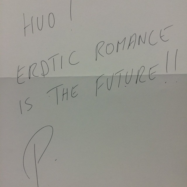
Paul Chan’s @badlandsunlmtd note in @hansulrichobrist’s IG today
Unlike the series’ typical self-conscious banalities or Deep Thoughtz, Paul’s note sounded unexpectedly promotional. Because I’d recently received an invite to the launch of Badlands Unlimited’s New Lovers erotic fiction collection. Then I clicked through to HUO’s pic of Chan’s note, and it’s not a Post-It at all! That’s what he means by “letter.” And “#LilithWes.” Paul sent Hans Ulrich a note with the books. Which, you go, Paul! I’m an admirer of both their work, and have only ever had engaging, genial interactions with either of them. But this felt like a shift, a disruption in the making.
I’m thinking HUO’s leaving a lot of mindshare on the table. Most of HUO’s notes respond to his request for a thought, and most all those thoughts at that moment are non-promotional. [An inevitable exception: Alex Israel, who can never not promote himself.] But HUO’s got like 90,000 followers. Once you move beyond the initial “it’s a personal brand boost to be asked for a Post-It note,” why wouldn’t you artfully pitch your book? Or obliquely reference the work in your upcoming show? There’s a lot of promotional room to travel between HUO’s status quo and Alex Israel.
Which is how and why I came up this project:
Hey #brands and #creatives, I’m preselling a shoutout to you whenever HUO asks me to write that Post-It note hmu
— gregorg (@gregorg) February 5, 2015
Like a director who always has his thank you speech in his pocket if he needs it, I will make sure that whenever Hans Ulrich gets around to asking me, I’ll have something on point and monetizable to scribble down. And that’s the witty brand message or hashtag that I’ve been supplied with, exclusively, by a thinkfluential social media professional. Email for rates and terms.
Your message can’t be too terribly time sensitive, of course, since there’s no telling when HUO’s tap is gonna come. With kids and shows and all, we don’t hang out as much as we used to. But with an/your important message in place, I would definitely make it a subtle priority to make it happen. If it doesn’t, of course, well, that’s HUO. I’ll gladly write your content on a Post-It note and help get the word out in my own channels as a make-good. The important thing is the concept, and that we tried.
Untitled (Andiron Attributed To Paul Revere Jr.), 2014
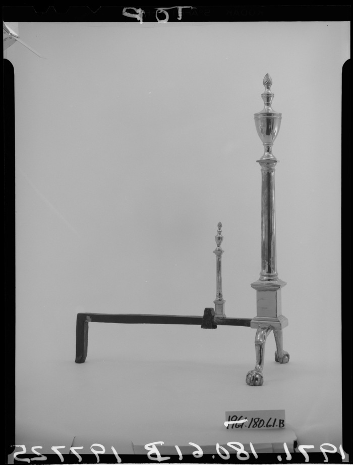
Untitled (Andiron Attributed To Paul Revere Jr.), 2014, whoops, 2015, obv
[UPDATED, see below; UPDATED AGAIN, see below that]
I am stoked (pun recognized and allowed to stand) to have a new work in the Metropolitan Museum. Despite its minty freshness, Untitled (Andiron Attributed To Paul Revere Jr.), 2014, is currently on view in The American Wing, Gallery 774, the Luce Visible Storage Gallery, officially known as the Henry R. Luce Center for the Study of American Art.
I have not seen it installed yet–I just made it a few minutes ago, cut me some slack–if you’re at the Met, maybe swing by and send me a pic? Ideally, the piece should be installed just as it’s depicted in this beautiful photo.
Continue reading “Untitled (Andiron Attributed To Paul Revere Jr.), 2014”
Untitled (YOUR NAME HERE), Study for Dasha
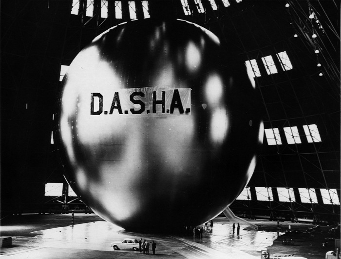
Satellite Communication: Untitled (YOUR NAME HERE), Study for Dasha
Previously: If I Were A Sculptor, But Then Again
Protestors’ Folding Item, 2014
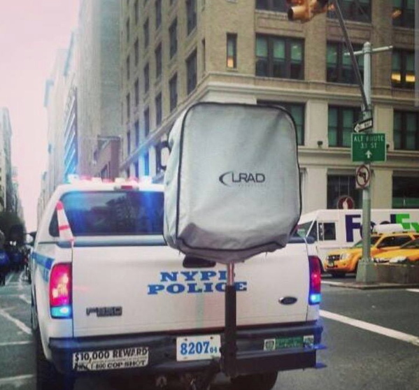
Installation view: Protestors’ Folding Item (LRAD 500X/500X-RE), ink on Cordura, nylon webbing, LRAD, 2014, Collection: NYPD Order Control Unit
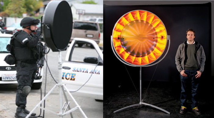
NYPD used an “LRAD” sound cannon today on high school students who staged a Ferguson walkout (via @SeismoMedia) pic.twitter.com/soUovemuUj
— Michael Tracey (@mtracey) December 2, 2014
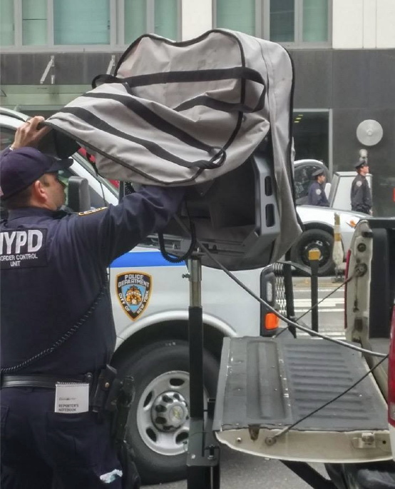
Installation view: Protestors’ Folding Item (LRAD 500X/500X-RE), 2014, Collection: NYPD Order Control Unit
This is related to this: Traveler’s Folding Item or, in French, Pliant de Voyage, an Underwood typewriter cover as Readymade by Marcel Duchamp.
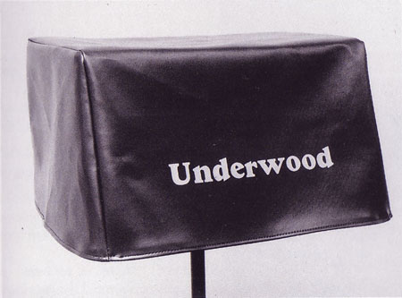
Traveler’s Folding Item/Pliant de Voyage, 1964 Schwartz replica of the lost 1916 original
From Tout Fait,
On the most basic level, Traveler’s Folding Item stands as a typical Readymade. It demonstrates the clear displacement of an everyday object from its original context and function. A cover with no typewriter for it to protect is utterly useless. It tempts the viewer to look underneath its skirt, and suddenly it takes on some very sexual meanings. Museums often strategically display the typewriter cover in a manner so as to tempt the viewer in this manner as if it were a woman’s skirt. Joselit explains, “This item, which Duchamp identifies with a feminine skirt, should be exhibited on a stand high enough to induce the onlooker to bend and see what is hidden by the cover” (90). In this way, this Readymade acts as an invitation to voyeurism.
You know what else is utterly useless and tempting? An LRAD with a cover on it. Which is why I am stoked to announce my latest work, Protestors’ Folding Item, a series of LRAD covers, installed on LRADs.
What does it mean to declare LRAD covers a Readymade? Such a designation definitely does not hinge on my making them, or my cashing the checks for their sale. Sorry, flippers, they’re only available to institutions. [Carlyle & Co. folks and the Zabludowiczes, call me, we can probably work something out.] If anything, it’s a relief not having to worry about fabrication or sales. I can really just focus on the work. True, it takes some effort to gather documentation on venues and edition size, but it’s not something a diligent registrar can’t handle.
Given the interest my institutional collectors have in control, it also might be difficult to arrange loans to show them in galleries or museums. Which doesn’t mean they won’t be seen publicly. In fact, at the apparently increasing rate LRADs are being deployed, I’d say my CV is about to explode.
What would the legal implications be for my declaration of these Readymades? Could copyright or VARA or droit moral be used to assert control over the public display of these, my works?
In Alberta, Canada, an artist has fended off gas drilling and pipelines on his farm for eight years by copyrighting his land as an artwork [and by charging oil & gas companies $500/hr to discuss it]. Yves Klein once signed the sky.
According to my fabricator’s website, “The LRAD 500X / 500X-RE systems [underneath Protestors’ Folding Item] produces a sound pattern that provides clear communication over long distances. The deterrent tone can reach a maximum of 149 dB (at one meter) to influence behavior or determine intent.” My work, too, is designed to provide clear communication, influence behavior, and determine intent. That’s why they go so well together, like a glove on a hand. Really, they’re inseparable. You can’t have one without the other.
L: You Hear Me, 2007, R: Eye See You, 2006
“The art world underestimates its own relevance when it insists on always staying inside the art world. Maybe one can take some of the tools, methodologies, and see if one can apply them to something outside the art world,” said Olafur Eliasson. In T Magazine. “If we don’t believe that creativity as a language can be as powerful as the language of the politicians, we would be very sad — and I would have failed. I am convinced that creativity is a fierce weapon.”
I hope LRAD cover readymades, are too, and that collectors of my work will preserve its integrity by exhibiting it only as originally intended, with the covers on the LRADs.
17 U.S. Code § 106A – Rights of certain authors to attribution and integrity [law.cornell.edu]
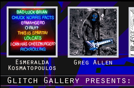
Glitch Gallery Installation Shots
Installation shots from one of two shows currently on, this one titled “Challenging the law without Infringing the law,” curated by Primavera di Filippi, is at Glitch Gallery in Charlestown, MA for another couple of weeks. Those are Brian Dupont’s text paintings front and center there, with some Untitled (300×404) print versions to the right. They’re slightly different from the 20×200 edition, both in dimensions and medium, but like those editions, they look best when shown in multiple sizes.
There are more images atGlitch’s FB page.
Previously: 9/20: Opening in Charlestown
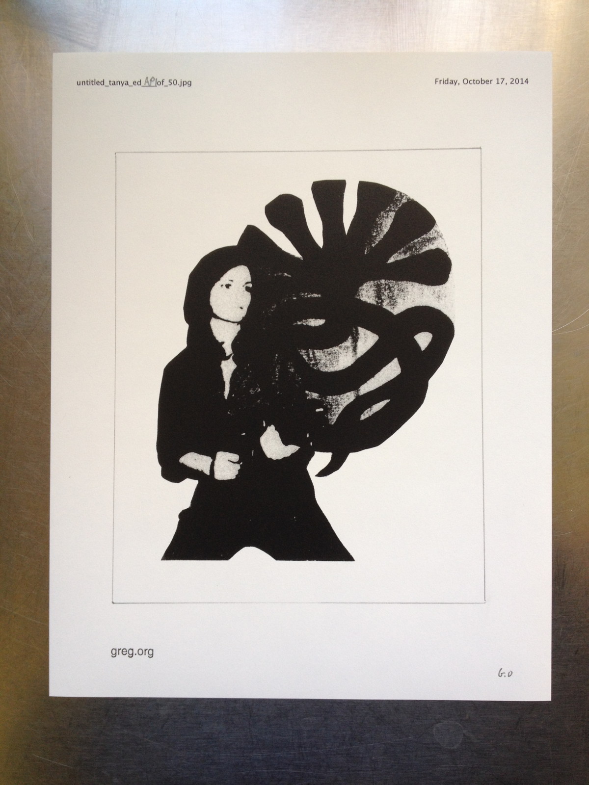
Untitled (Tanya), 2014
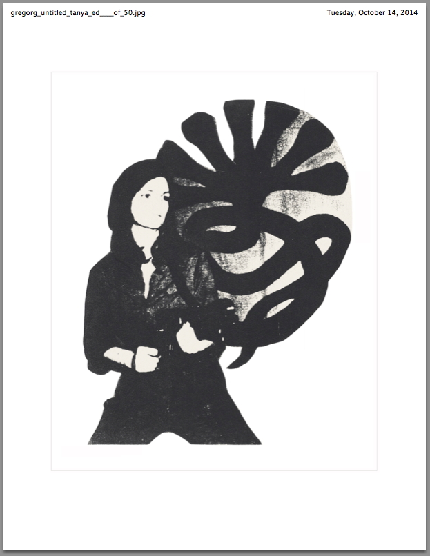
Study for Untitled (Tanya), 2014, lasercopy and graphite on white paper, 11×8.5 in., ed. 50
In honor of Frieze London, and all the awesome sales going down this week, I have created a special edition.
Untitled (Tanya) is a drawing on black & white lasercopy printed on 11 x 8.5 in. paper. It is titled, dated, stamped, and numbered in an edition of 50. Untitled (Tanya) depicts at actual size Tanya, the photocopy work of Cady Noland, which is being sold at Christie’s contemporary day sale Thursday Friday morning. The graphite marks of this work reference the dimensions of that work (7 5/8 x 6 1/8 in.).
Untitled (Tanya) will be available only during Frieze London week for $US10 each, shipped. [Update: Wow, nice, thanks. Definitely get a couple if you like, but please leave some prints for others, too.]
[UPDATE UPDATE: Unless it sells out beforehand, Untitled (Tanya) will only be available up until Cady Noland’s Tanya sells at Christie’s in London, around 2:30 UTC. So don’t underbid on Cady’s and then come slinking around here looking for photocopied consolation when you lose. Cuz you won’t get any.]
10/17 update: the edition is no longer available for purchase. thanks though.
Thanks again, all the prints are on the way. Unless they are cut down, this is what they look like:
Untitled (Truitt EBAY)

Anne Truitt’s been an inspiration to me for a very long time, but I’d never wanted to make one of her works. Until now.
Previously: Truitt AMAZON, I guess
Untitled (Muji Tote), 2014
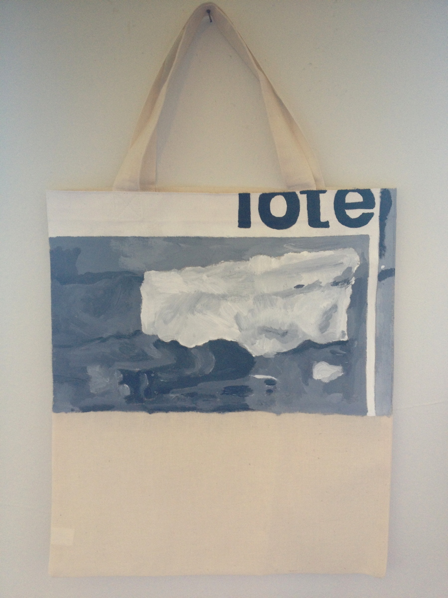
Untitled (Muji Tote), 2014, 19.5 x 12 x 1, acrylic on muslin
It’s been brewing for a long time, basically every time I see that painting it sticks to me like the smell of a campfire.
It really should be a product, a utility, an it bag for real men, no matter what part of Brooklyn they’re traversing.
But it never comes out right. No one will print right to the edge, and it really must be printed right to the edge. It could be screenprinted, but my queue’s pretty stacked right now. Printable heat-transfer paper frankly doesn’t do it justice.

image from The Internet
Wouldn’t you know, Kanye and Condo had the answer: just paint the damn thing. Which is a hard thing to accept sometimes. For some people. Who don’t, as a rule, paint. Anyway, here we are.
My favorite part of the whole thing now is that Muji Tote could translate into Anonymous Death. So even though there’s only one, and Kimye get first dibs on it [the 24hr clock starts ticking when I hit publish, get your 2nd holds ready], this really is for everyone.
Opening In Charlestown: Glitch Gallery
hello, new headshot
I wish I could be there right now, for the opening, but I’m stoked to announce the inclusion of some work in a group exhibition at Glitch Gallery in Charlestown, Massachusetts titled, “Challenging the law without infringing the law.” The show is curated by Primavera Di Filippi, and includes Brian Dupont, Sara Hendren, Esmerelda Kosmatopoulos, Kofhschlag, and Sara Newman & Matthew Battles.
The show is the first time that Untitled (300×404), a project I began in 2009, is being exhibited IRL. The work’s original is a 300x404px jpg image of a Richard Prince Cowboy photo, but the most widely known manifestation is the print edition published by 20×200.com. [Which is once again available, btw, in limited numbers.]
If you’re in or near Charlestown, I hope you’ll check out the show.
Glitch Gallery Exhibit 005 — Challenging the law without infringing the law, opens Sept 20, 2014 [glitchmonster.com]
“Untitled” (ArtEverywhereUS)
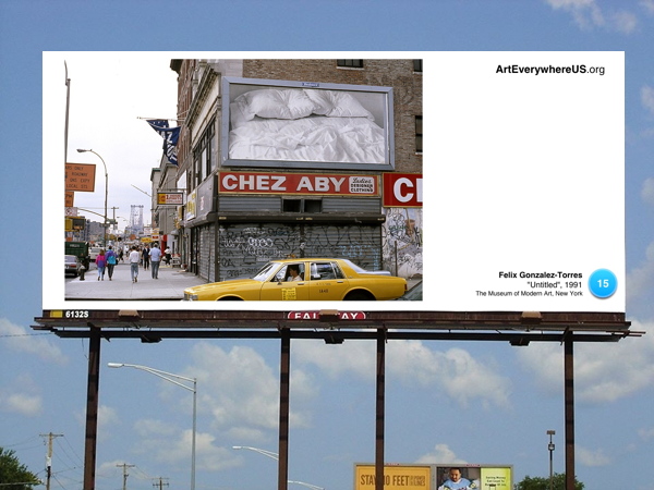
Untitled (happy place), 2014
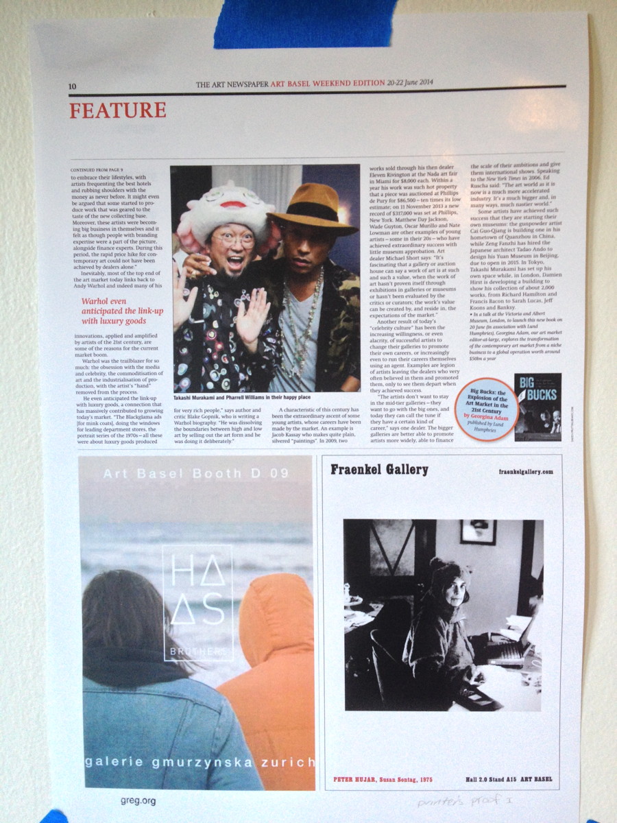
Untitled (happy place), 2014, 15.5×11 in., digital print on glossy stock, ed. 25+5AP, $100, shipped.
From Robert Smtihson & Mel Bochner’s “The Domain of The Great Bear” to Gerhard Richter and Ellsworth Kelly’s special editions of Die Welt, I’ve been interested print as art. A couple of years ago Printed Matter turned up a big stack of Inserts, a tabloid-sized portfolio of full-page artworks by the members of Group Material. The Public Art Fund helped the collective produce 90,000 copies, which were inserted in the Sunday New York Times on May 22, 1988, and distributed downtown and in Greenpoint/Bushwick. [even then.] A few turned up at Printed Matter a couple of years ago.
Group Material member Julie Ault recalled that they’d negotiated for nearly a year with the NY Daily News, but that when they submitted the artworks, they were rejected “on the basis that ‘it wasn’t art it was editorial.'” That tension or ambiguity is one of the things I like most; it upsets a seemingly small but persistent expectation.
I also love The Art Newspaper’s art fair editions, reported and published on the spot every day. And when I saw this page from this summer’s Art Basel paper, it seemed like an almost perfect object. It includes an excerpt from TAN editor-at-large Georgina Adams’ book, Big Bucks: The Explosion in the Art Market in the 21st Century which, like so much of the page, provides a salient, vital picture of the moment.
It’s taken me a little while to get it just right, but I am pleased to present Untitled (happy place) as a print in an edition of 25, with 5 artist proofs. It is digitally printed on gloss stock, handstamped and numbered, and measures 15.5 x 11 inches. It will ship flat for USD100.
Opening In Stamford: It Narratives At Franklin Street Works
Shanzhai Gursky 002, 2014, not included in the show
Brian Droitcour and Zanna Gilbert have curated “It Narratives: The Movement of Objects as Information,” which just opened at Franklin Street Works in Stamford, Connecticut. The show examines shifting networks, and how artists use the postal system and the web in the production and distribution of artworks.
I am quite pleased to have some pieces included in the show, which runs through November 9.
In addition to some Destroyed Richter Paintings, the show includes a photo from the Shanzhai Gursky project, previously known in less ethnosocioeconomically critical times as Ghetto Gurskys. [Though the pejorative aspects of “ghetto” still apply to the project itself, in a self-critical way, I think the racialist connotations ultimately kill it for me. “Shanzhai” seems a little pluckier and resourceful than I’d originally pictured the series to be, but I really like it.]
The series are somewhat related, in that they both originate in images circulating online. The Destroyed Richter Paintings are made by Chinese Paint Mill and based on jpgs of photos Richter took in his studio before destroying certain paintings. The Shanzhai Gursky photos are produced to the specifications of the original using the highest resolution jpgs I could find in the wild.
In both cases, the web is the source of the image and the site of production for objects which are intended to be experienced in person. For this reason, and also because the show sounds very interesting, and is put together by sharp folks, I would encourage everyone to go see it.
It Narratives: The Movement of Objects as Information, runs from Sept. 5-Nov. 9, 2014, at Franklin Street Works [franklinstreetworks.org]
Previously, related: Ghetto [sic] Gursky
Unrolling Ghetto [sic] Gursky (Rhein) [which, archivists take note, is now titled Shanzhai Gursky 001.]
@TheRealHennessy Tweet Paintings
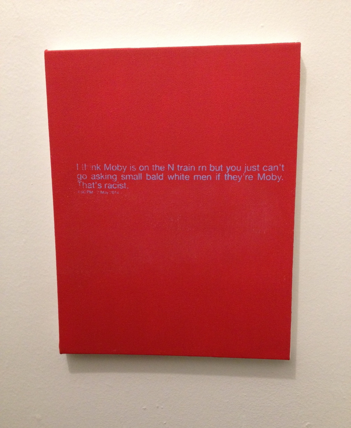
@TheRealHennessy Tweet Painting, Moby, 2014, 14×11 in., acrylic and screenprint on canvas SOLD
If anything I think they’re tragic.
greg.org is pleased to introduce @TheRealHennessy Tweet Paintings, inspired by Donelle Woolford’s Dick Joke series, which were buzzworthy standouts at the most recent Whitney Biennial. update: more here.
Instead of the expressive, gestural application of paint that was so fashionable, @TheRealHennessy tweets are silkscreened onto a flat, monochrome canvas. Similar to his re-photography of existing images, this approach removed the artist’s hand from the work. Despite this conceptual strategy, @TheRealHennessy Tweet works are nonetheless considered first and foremost as paintings. As he jokingly remarked, “the ‘Tweet’ paintings are abstract. Especially in Europe, if you can’t speak English.”
The series of monochrome tweet paintings, of which @TheRealHennessy Tweets, Moby is an outstanding example, presents the viewer with a strangely puzzling juxtaposition of a minimalist canvas and painted words. Although this can be interpreted as a reference to postmodern linguistic theory, the work also points to two quintessentially American features: hard-edge abstraction and popular humor. Cleverly subverting the clean and serious language of abstract painting, the tweets’ amalgamation of low and high culture characterizes @TheRealHennessy Tweet’s most iconic work. This intelligent fusion of conceptual strategies with popular cultural references, which has been the driving force throughout @TheRealHennessy Tweet’s influential practice, is perfectly merged in @TheRealHennessy Tweets, Moby. Wittingly parodying the uncomplicated jokes from vernacular literature, the artist has found a way of incorporating a difficult subject-matter – humor – into a deeply serious artistic practice.
More @TheRealHennessy Tweet paintings are below.
Wade Guyton And Anxiety In The Age Of Mechanical Reproduction
Personally, the thing I remembered about Carol Vogel’s puff piece a couple of weeks ago for Loic Gouzer, organizer of “If I Live I’ll See You Tuesday,” Christie’s Edgy Sale, was that she’d used the word “seminal” twice in one sentence. But if I were an artist whose painting was being used as Exhibit No. 1 to illustrate it, I could see how the headline might catch my eye, too: “For Those Who Can Afford It, Christie’s Is Selling Anxiety”.
The sale was supposed to be a “mould-breaking auction,” a “risky operation” meant to “shake things up” with artworks that “capture the raw angst” that the current “generation of rich embryonic collectors” are all hot for.
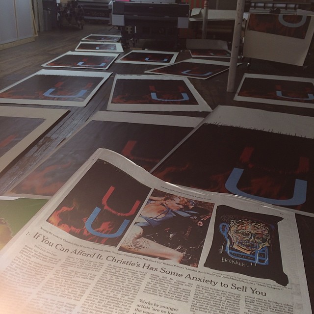
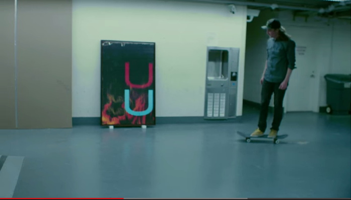
image: burningbridges38/s IG
Christie’s own idea of raw shakeup: a promotional video skateboarding video, showing skate pro Chris Martin tooling through the galleries and the back of the house, passing works and staff along the way. It was the most brilliantly ridiculous thing ever. For a day. Then someone pointed out embryonic auction star Parker Ito’s own YT videos of his skateboarding around his studio. And someone else ran the numbers and realized that many lots were presold via third-party guarantees/irrevocable bids, so the actual angst of the evening’s outcome depended entirely on one’s own market ignorance.
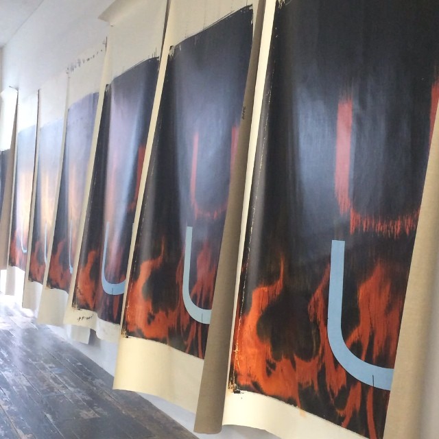
image: @burningbridges38’s IG
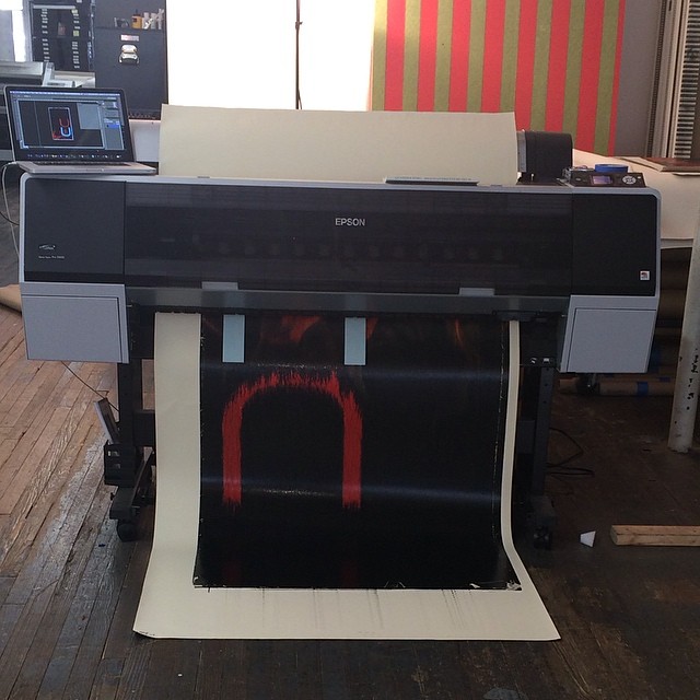
Until Wade Guyton entered the game. Wade’s 2005 painting Untitled (Fire, Red/Black U) had a starring role in the sale, the video, and the Anxiety article. And last week, as the video racked up views and scorn online, Wade introduced some real anxiety–by making more than a dozen new paintings, identical to the one at Christie’s, using the same digital file. He then posted the images to Instagram. They stream out of his trusty Epson inkjet printer, are strewn across the studio floor, and flutter in the breeze like a fiery curtain on the wall.
When she declared a slightly bent & restored aluminum painting destroyed last year Cady Noland reprogrammed all her remaining work, instilling collectors with the fear that the tiniest nick or bump might render their precious object unsaleable. Similarly, by revealing even the hypothetical existence of infinite digital replication–so far, all he’s done is post pictures of canvases to Intagram–Guyton has stripped away the presumption of uniqueness, and has seized his work back from the outsized speculative frenzies that swirl around it. And the greatest part is that he did all this just days before the big sale [where he doesn’t have anything to win, and much, potentially, to lose].
As Jerry Saltz wrote, “Whatever happens tonight, I admire an artist willing to tank his own market by flooding it with confusing real-fake product.” And except that there doesn’t need to be anything fake at all about the resulting works, I completely agree. This is awesome. [Even though it didn’t slow down the sale one bit: Untitled sold for $3.5 million, a record. So win-win, depending on what actually qualifies as a win here.]