

Untitled (141831674795), formerly known as: Beer statue TEST – DO NOT BUY
I haven’t written much about the eBay Test Listings project here since eBay shut it down and forced it into a different configuration. I’m happy to have it exist primarily on eBay, where it conspires against itself, making success and failure interchangeable.

ceci n’est pas 600px: just noticed it’s actually 500px
They don’t search well. The titles are opaque. The pricing across the series makes people wonder. And after surfing through the 800 even less expensive items in the “photographs > directly from artist” category, it turns out these aren’t always even the most eye-popping.
So it really does come back to their unique situation, unlike literally every other thing on eBay: they were specifically made and chosen to not be sold. To not be found, and to not be found attractive. At least to a bidder or buyer. Yet they are still made and chosen in some way, for some surpassing reason beyond their function. [An image is required for every eBay listing, even a test listing with nothing to sell.] And so I’m intrigued by the otherwise invisible images made by otherwise invisible people, which are intended to be seen by no one but themselves and maybe their colleagues, and their bots.
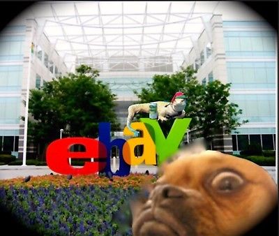
Really I just wanted an excuse to post that [bear+deer=] beer statue picture.
eBay Test Listing prints for sale, only through Art Basel Miami, though [ebay]
Previously, all eBay Test Prints-related posts, in chronological order:
7 March 15: Untitled (DO NOT BID OR BUY)
18 March 15: Proposte monocrome, ebay, rose
16 April 15: DO NOT BID OR BUY Meets DO NOT LIST OR SELL [includes CR]
7 May 15: eBay Test Listings, Reviewed
30 July 16: New eBay Test Listings Prints
10 September 15: Prince & Prints at Internet Yami-Ichi 9/12
Tag: works
“Untitled” (Crystal Bridges), 2015
“Untitled” (L.A.), FKA “Untitled” (Rossmore) image via christies
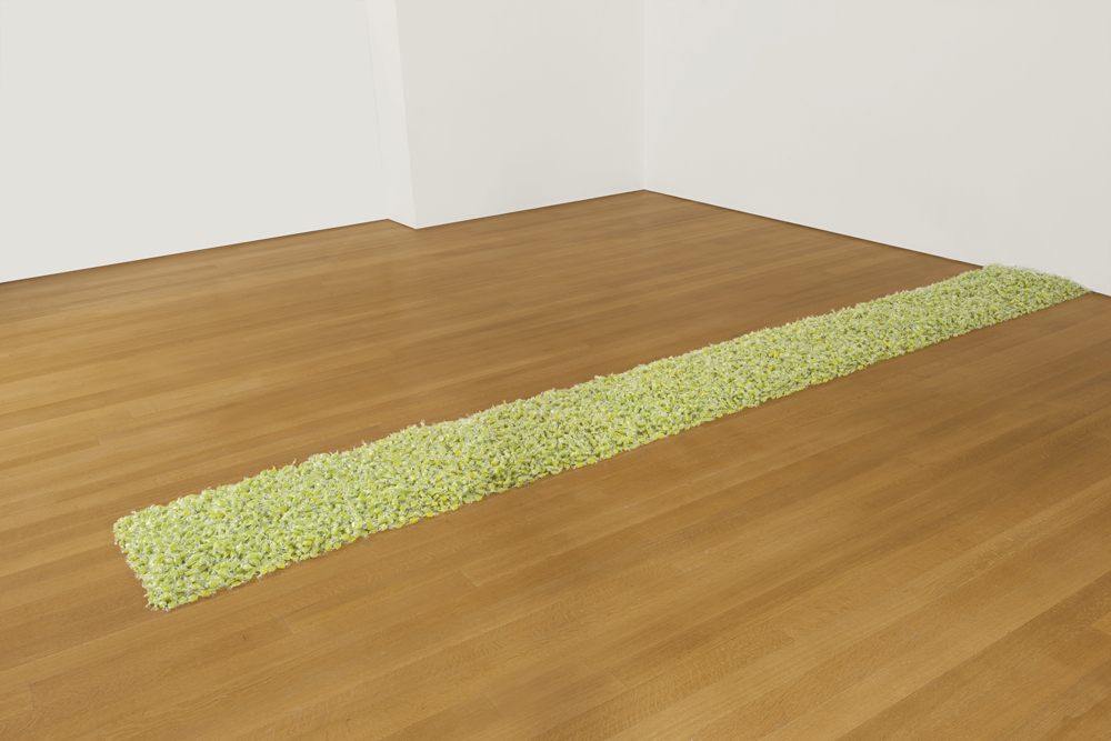
Howard Rachofsky bought Felix Gonzalez-Torres’ 1991 candy pour, “Untitled” (Rossmore)” in 1998. It consists of green wrapped candies spread on the floor with an ideal weight of 50 lbs. That was presumably the title when Ranbir Singh purchased it in 1991, and when he sold it in 1998, even though the 1997 catalogue raisonne lists it as “Untitled” (L.A.). [Another candy pour from 1991, also with green candies, but an ideal weight of 75 lbs., bears the orphan title “Untitled” (Rossmore II).] Rachofsky loaned his pour to the Modern Art Museum in Fort Worth, and exhibited in a bathtub of his Richard Meier-designed house.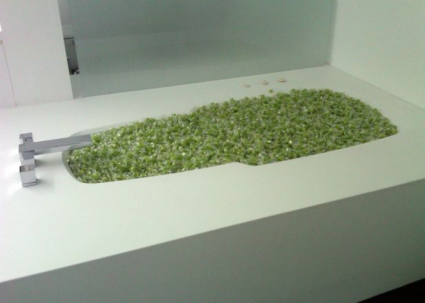
Felix Gonzalez-Torres, “Untitled” (L.A.), 1991, as installed in Howard Rachofsky’s tub, image by Andrea Duffie via forthworthanewperspective
Rachofsky and his wife donated or pledged the house and much of his collection to the Dallas Museum in 2005-Cindy Rachofsky specifically mentions the Felix piece in this interview-so it’s frankly baffling that he sold “Untitled” (L.A.) last week at Christie’s, even if it did bring $7.7 million. But DFW’s loss is Bentonville’s gain. [2024: updated dead url on that Cindy Rachofsky interview]
ArtNEWS reports the buyer of “Untitled” (L.A.) is Alice Walton’s Crystal Bridges Museum of American Art. I would imagine that the politics of the Wal-Mart heir would have pissed off and/or inspired Felix to no end. But after re-reading his 1995 interview with Rob Storr about politics and culture and audience, and how he wanted to operate like a spy, I think he’d see the acquisition of his work by Crystal Bridges as a triumph. He has successfully infiltrated the beating red state heart of America’s conservative plutocracy.
Of course, in the 20 years after the artist’s death, the cultural terrain has shifted, and if it doesn’t exactly end up being the wrong one, the mountain Felix scaled offers views of still higher, more difficult peaks.
“Untitled” (Crystal Bridges) Wal-Mart money (endless supply) dimensions variable ideal weight: 50lbs [artnews tweet]
— gregorg (@gregorg) November 16, 2015
And so it occurred to me almost instantly to make another piece, inspired by Walton’s “Untitled” (L.A.) acquisition: “Untitled” (Crystal Bridges) consists of Wal-Mart money, free for the taking and endlessly replenished, with an ideal installation weight of 50 lbs. It could be a pour, but it probably works best in Felix’s other trademark form, as a stack piece. It looks a bit like “Untitled” (Passport #II), but with cash instead of little booklets.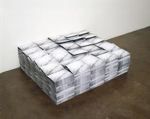
“Untitled” (Passport #II), 1993
A US banknote weighs just under a gram, so 50 lbs is around 25,000 bills. They should all be of the same denomination, whether it’s singles ($25,000) or $100s ($2.5 million), as long as there is an endless supply.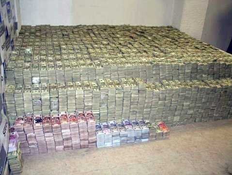
$207 million of Sinaloa drug cartel cash weighed 4,500 lbs, not an ideal weight for the sculpture, but I’ll leave that to the owner’s discretion.
Since the Walton family only has $147 billion right now, they’ll have to manage the installation with an eye on both ROI and replenishment rates. I’m sure they can do it.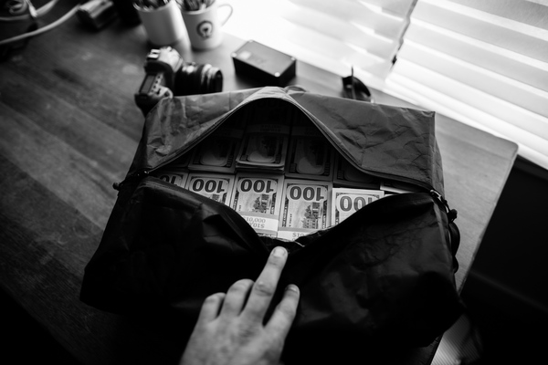
image of 1M Hauly from SDR Traveller
I’ve rebooted Felix works before, but I think the idea for this piece crystallized so immediately because I’d been primed to consider the spatial implications of a million dollars in cash. Just a few days ago, Michael Sippey tweeted about the 1M Hauly, a high-performance duffel bag by SDR Traveller optimized for the secure, discreet transport of $1 million, in 10,000 $100s.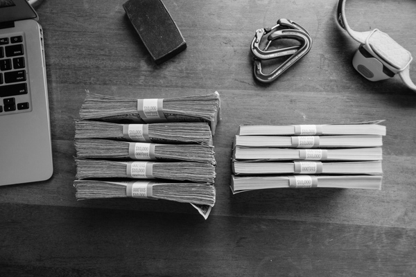
fat v. flat, via SDR Traveller
Turns out used, street, dirty money takes up as much as 40% more space than crisp, fresh bank product, but the 1M Hauly can handle it all. When strapped, 10,000 bills fits into a 20.4 lb cube 18x12x6 inches. So if it were stacked, “Untitled” (Crystal Bridges) could be an 18×18-in square about 10 inches high. It’s an adorable scale, domestic, almost intimate, which will provide endless [sic] enjoyment and engagement for museum visitors. As long as they don’t get too grabby. And as long as the Waltons don’t go broke.
[I haven’t exactly asked, but I bet SDR Traveller would be willing to discuss the commission of a custom-sized travel bag for “Untitled” (Crystal Bridges). Interested collectors should get in touch with me for details.]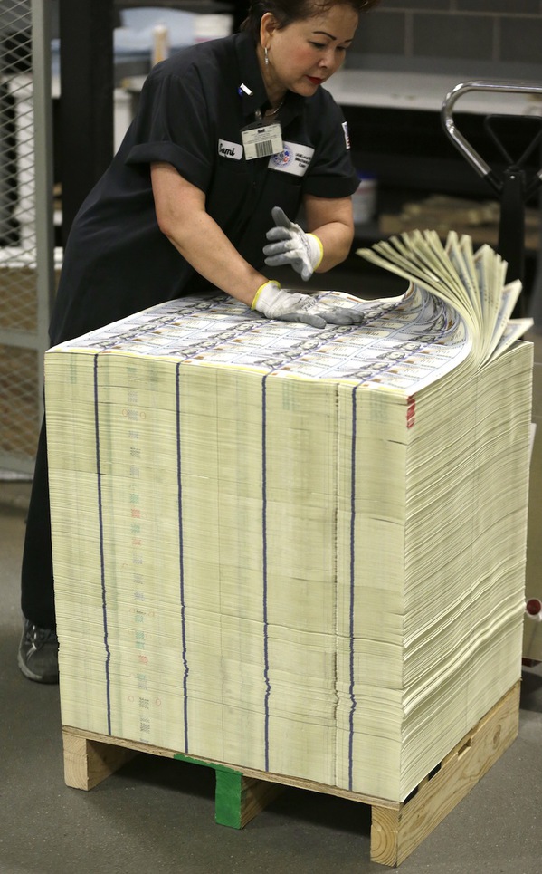
uncut sheets of new $100 bills at BEP in 2013, image: AP/LM Otero
UPDATE: OR, maybe there is another way. Uncut currency sheets sell for a premium from the Bureau of Printing & Engraving, but they’d really give the piece a Felixian feel. The ideal height for a stack of 32-note sheets like the ones above would be about 775 sheets, about 6 inches. The BEP online store only has 16-note sheets, though, for $1,800 each. See if you can get a volume discount, or a subscription.
Previously: On Politics and Art
suddenly related: “Untitled” (Orpheus, Twice), 2012
Untitled (On A Clear Day), 2015 –
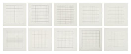
They are not the kind of thing to get excited over, necessarily, but every time I think about Agnes Martin’s 1973 screenprint portfolio On A Clear Day, I like them a lot. [I did not like seeing a complete set baking in the sun in someone’s freshly renovated loft kitchen one time, though. Respect, people.]
Martin had given up painting for seven years, and the invitation from Luitpold Domberger to create a print portfolio was instrumental in Martin’s decision to start making work again. [That she was also preparing for her first mid-career retrospective at the ICA in Philadelphia at the time might have helped. I guess we should read the new biography and find out.]

Anyway, On A Clear Day is 30 images Martin selected from over 300 drawings she’d done in 1971. So a subset, perhaps, more than a series. And a mechanical interpretation of her hand marking process.
The 8×8 prints on 12×12 sheets are printed in an edition of 50, plus 14 APs. It is not clear how many portfolios were kept together, but a bunch were broken up, and loosies show up at auction all the time. One’s coming up at Doyle in a couple of weeks, in fact: plate 8 from ed. 49/50. The estimate seems a bit low, but it says there’s a soft crease in the image.
I hate broken up sets, and have long wondered if you could put one back together. And by you, obviously, I mean me. How long would it take? Could you track them down, or do you just have to wait and watch? Which number should you work on? Should you keep a stash of loosies available anyway, to trade with reluctant sellers?
What have these prints been through since they’ve been apart? Have they been cared for, kept out of the sun? Framed nicely? Framed crappily? Lone silkscreens are not very precious. And there are nearly 2,000 of these things out there. Some might be shoved in drawers, or stuck inside a book. Isn’t it likely that some might not have survived at all? If there are already a couple dozen complete sets around, what’s the value to Martin’s legacy of one more?
But I guess it’s not really for or about Martin at all. She just provided the raw material for the project. If a reassembled Agnes Martin portfolio is a new work, Untitled (On A Clear Day), would an assemblage of mismatched Martin prints be a study?
I remember very well the set of ten On A Clear Day prints up top, which were at Phillips in 2008. They are a ragtag bunch of misfits, actually: three “a.p.s,” six “p.p.s”, and only one actual numbered print: plate 4 from, oh hey, 49/50. This project may start right now.
Oct. 27, 2015: Lot 125 Agnes Martin (1912-2004), ON A CLEAR DAY, est. $1,000-1,500 [doylenewyork]
Untitled (Merce At The Minskoff), 2015 – 2018
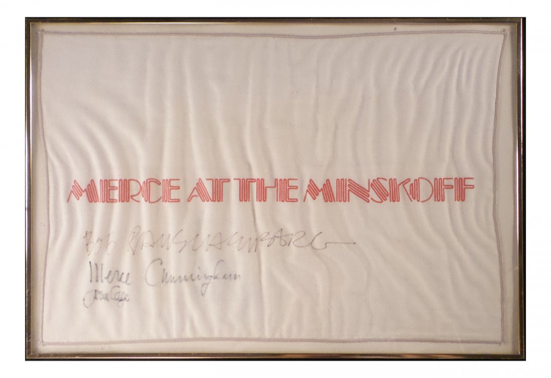 Untitled (Merce at the Minskoff), 2015 – 2018 , ink on towel with four signatures (interim state)
Sometimes an object has its own logic.
A few days ago I saw an unusual auction listing. It was described as a “textile” with the title, “Merce at the Minskoff,” and it was signed by “Bob Rauschenberg, Merce Cunningham, and John Cage.” But the description was cursory, and there was no image. When I called, the small downtown auctioneer couldn’t describe it, but they assured me they’d post the image soon.
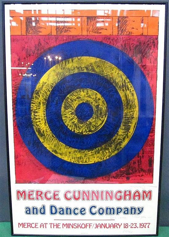
This textile was clearly related to Merce and the company’s week-long performance at the Minskoff Theater in January 1977, the only time they performed on Broadway. But what would be signed by these three?
Then I got wrapped up in other stuff, and confused the sale date, and long story short, I missed the auction this morning, and I lost a chance to buy what appears to have been an autographed commemorative hand towel.
So for now getting the designer of the Merce at the Minskoff poster to sign this towel requires not just the acquiescence of Mr. Johns, but the co-operation of the as-yet-unidentified owner/custodian of the towel.
But it will happen. Or at least it must. Because when an object has its own logic, your only viable option is to endeavor to realize it as quickly as possible.
FROM THE ESTATE OF LOUISE NEVELSON HELLO: “Signed Jasper Johns lower right and inscribed, ‘Dear Louise, I love you, Merce”
Lot 194: Textile, “Merce and the Minskoff”, sold for a measly $125 to someone now carrying the weight of future Art History on his or her shoulders [roland/liveauctioneers]
Apr 26, 2010, Norwalk, CT, Lot 357: AFTER JASPER JOHNS (AMERICAN, b.1930): Signed colored poster. [braswell/invaluable]
UPDATE: This post was edited soon after publication to accept responsibility for an object’s realization, even though it is not presently within my control to do so. I must and will do what I can.
APRIL 2016 UPDATE: I was discussing this work with my wife recently; she takes issue with this entire project of asserting art status upon an object beyond my control or ownership. She questioned my claim thus: “Why didn’t he sign it? If he designed the poster, it can’t be for lack of opportunity. That’s the logic of this object: that he didn’t sign it.”
Reader, I married her.
UPDATE UPDATE: Several months ago I received updated information about the towel and its situation. Upon renewed contemplation of the logic of this object, I determined an appropriate course of action, and followed it. As Jasper Johns wrote, “Take an object/ Do something to it/ Do something else to it [Repeat]” And now here we are. All of those involved have my sincere gratitude and respect. I am psyched to report that as of May 4, 2018, this work has been completed.
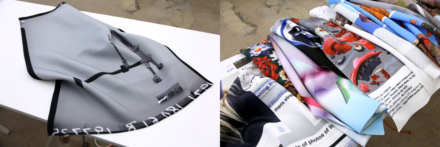
Prince & Prints At Internet Yami-Ichi New York 9/12
I am bewildered and psyched in equal parts to announce the presence of some greg.org objects at Internet Yami-Ichi New York, this coming Saturday (9/12) at Knockdown Center in Maspeth.
Michael Sarff from MTAA invited me to show some black-marketable items in Over The Opening (OTO) a space (blanket) he is curating, so I sent along the following:
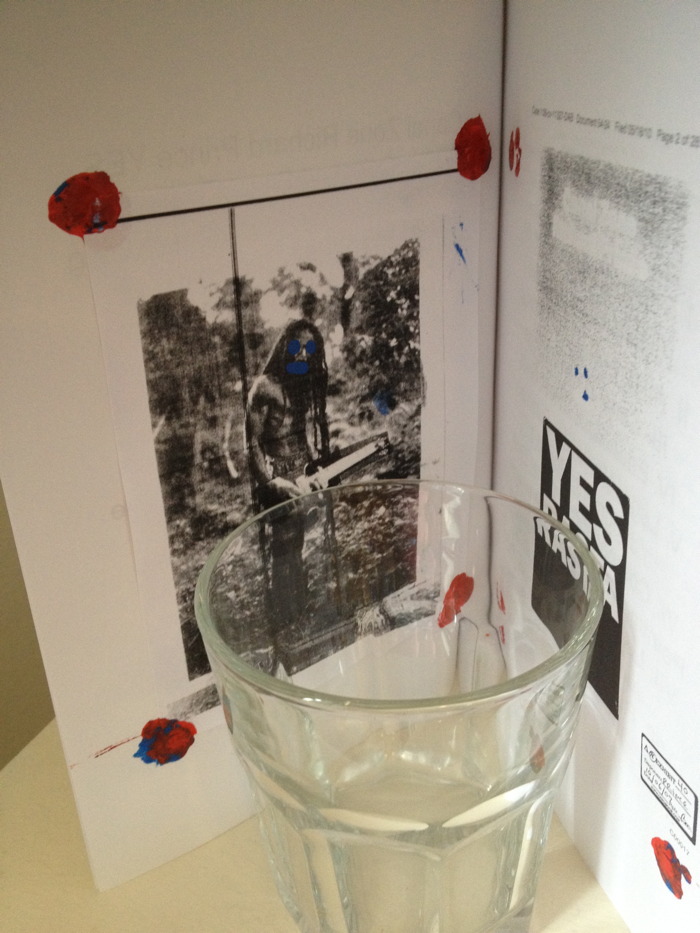
Hand-colored editions of Canal Zone Richard Prince Yes Rasta and CZRPYR 2. The original book with Richard Prince’s full Cariou v. Prince deposition transcript includes a hand-painted bookplate tipped in with paint, in homage to Prince’s technical innovations on the Canal Zone series. CZRPYR 2 includes the complete set of altered illustrations created by the Appeals Court, hand-tinted in the manner of publishers of yore. Supplies will be pretty damn limited.
A rare and exclusive selection of Local Pick-up Only #eBayTestListing prints. Because price and shipping parameters are intrinsic aspects of the eBay Test Listing series, it was not conceptually reasonable to just stick a bunch of prints in a portfolio and sell them like crack on the street. So the only prints available at Yami-Ichi are those few whose eBay listings have local pick-up or store pickup options. Buy them right then and there on eBay, and take them home. Is how it will work.
OTO will also feature pieces from Yael Kanarek’s World of Awe; Waterbear flatware by Raphaele Shirley; canonical Before Facebook-era artifacts from MTAA; and the premiere of Sarff’s new audio project, Music 4 Music 4 Airports. Like I said, psyched and bewildered. Should be awesome.
Over The Opening (OTO) @ the Internet Yami-ichi (Internet Black Market) [mtaa.net]
New eBay Test Listings Prints


I have added some prints found during the earliest days of the eBay Test Listings project, but only made available now for sale and entertainment which, after all, are the same thing.
See all available eBay Test Listings prints on eBay [ebay]
Untitled (Screenshot), 2015
“I came because of Prince.” Untitled (Screenshot), 2015, png
cf. @gregorg. ibid.
Andiron Of The Library Of The Printed Web
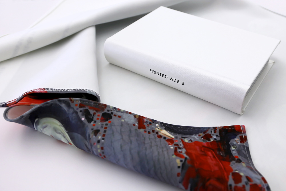
The third edition of Paul Soulellis’s Library of the Printed Web is out, and it looks fantastic in many forms. What started as a tabloid zine is now, with Printed Web 3, a sprawling, multi-platform, medium-jamming festival of publishing. 147 people responded to Paul’s invitation by submitting 329 files, which are now being released in a variety of print and digital formats, at prices ranging from free to entirely justified. Each one looks as interesting as the next.
I’ve already scraped rhizome.org, which is presenting all the files in one giant Apache directory, in the order they came in. And I’ve ordered the full set of sorted print-on-demand zines. And I’m thinking of pulling the trigger on the limited edition, full-color hardcover Chinatown Edition, a handbound/POD hybrid which comes wrapped in a digitally printed neoprene book blanket.
A what?
Yes, and in fact, there are digitally printed neoprene book blankets available separately, too, which feature a small selection of the images. I’m stoked to find that my submission, Untitled (Andiron Attributed To Paul Revere, Jr.) is one of the ten neoprene options. And the only reason I might not get that one is because doing so might deprive the lonely andiron of the company of a(nother) sympathetic steward. Won’t you help?
There’s even a 5.5mb, 147-frame GIF. Printed Web 3 is dropping IRL this weekend at Offprint London. Everything else is below. Congratulations and thanks!
Check out all the instances of Printed Web 3, by Paul Soulellis [newhive.com]
Previously, related: Untitled (Andiron Attributed To Paul Revere, Jr.), 2015
eBay Test Listings, Reviewed
When I asked a recent buyer of some eBay Test Listings prints how he’d found them, he explained he had been searching for some items to boost his feedback ratings. I marveled how, within their own context, these dollar photos functioned just like more expensive transferring social capital to their collectors.
[It also made me wonder about monetizing this mediated reputational currency; maybe each cash-flow-negative transaction should be viewed through a customer acquisition cost lens, and the whole project reconceptualized as a startup. Old habits die hard.]
This unanticipated parallel to IRL art practice was fresh in my mind when I read Mike Pepi’s review of the situation of Surround Audience, the New Museum’s current triennial exhibition. Pepi argues that the solipsistic, theory- and commodity-driven artmaking context, and the exhibition form itself, are as poorly suited to presenting ideas and discourse as the single-voiced descriptive magazine review is at interpreting them.
Something like the Triennial deserves to be interpreted using methods that at first might contradict the delivery vessel of the exhibition.
What future are we creating when we double down on the hollow notion of singular judgment spreading forth, unidirectional and divorced from the connections now forged by a pervasive exchange of information? Our critical tools are just as responsible for art’s caboosed condition.
Then I read David Salle talking to Michael H. Miller about the current art world’s numbers games:
And now we’re in a situation of measuring the success of something by the audience size. Which is for me, personally, the beginning of the end, because that was always the thing that set art apart from other areas of culture, there was no equation between quality and audience size.
And quantification and the interpretive value of data and its manipulation, and, as I think about the takeaways from these eBay Test Listings–and the point, frankly–it suddenly occurs to me that I’ve overlooked one crucial aspect of the project: the feedback. Which constitutes a very medium-specific form of review for the images, the objects, the project, the experience.
So I’ve collected it here:
For The Archive: Untitled (#rank Gift Bag), 2010
![]()
This post is for the archivists out there, and is inspired by putting away sweaters and Paul Soulellis’s Rhizome post about zip files.
In September 2010 I wrote about what I called the Gala-as-Art Movement.
installation image of Untitled (#rank Gift Bag) via hyperallergic
In December I presented an expanded history of Relational Aesthetics For The Rich at #rank, Jen Dalton and William Powhida’s Art Basel Miami Beach follow-up to #class. Both #rank and #class were done for Ed Winkleman Gallery. #rank was actually part of Seven, the independent satellite exhibition. I later put a poorly edited audio/slideshow version of the Gala As Art on Vimeo. I expect I will edit the transcript and images into book form as well.
![]()
I decided at the last minute to create an edition for the #rank event, and that the most appropriate form was a gift bag. I was reminded of how, staying true to its gift bag nature, I had not explained the edition, and had not identified it as an edition per se, even though, if you looked, there were clues. Up until now, this Hyperallergic photo of Veken and Jesse Lambert was the only public documentation of this edition.
Then I was putting some sweaters away this weekend, and I found a bag of leftover parts from editions that had gone uncollected after the event. I will now describe the edition, its elements, and its development.
The impetus for an edition was the gold-leaf chocolate lips dessert edition created by Kreemart for Marina Abramovic’s The Artist Is Present after-gala. I put edible silver leaf on red wax lips, and repackaged them. I also bought edible gold leaf, which, having never bought it before, I found unexpectedly expensive. I tested with the silver and found it satisfying, but I did not return the gold.
![]()
The lips alone were insufficient, however, and thus the gift bag idea was reached. The color theme came from the silvered lips, which, as the colors of a Diet Coke can, also evoked the autobiographical. I wanted to add a tchotchke, like a LIVESTRONG bracelet, but the lead time was killing me.
![]()
I decided to publish the supporting media for the project the way Doug Aitken had made an artist book for his MOCA Happening. I thought of burning a bunch of DVDs, but I didn’t want to get all designy. I thought of a customized USB stick, but again, I had too little lead time. These two objects merged into one, though, when I found a silicone bracelet with USB memory embedded. I signed and numbered the band, and named each drive with its edition number. I remember after the event, hearing people not realizing it was a USB stick, and thinking oh well, no one gets it, and no one will ever see it.
In the few minutes between finding these USB bracelets and opening one again, I imagined publishing the whole thing as an e-book, or a PDF. I’d remembered more texts and fewer videos. Which is why Soulellis’s zip file art publishing stuck in my mind. But that’s the beauty of zip-based publishing: it can take anything. And so they’re here, as Gala-as-Art_Gift_Bag.zip. The contents are as seen in the screenshot above.
The bag also contained a card, in the format of a gala invitation, in which all the artists mentioned were listed as benefit committee members. I have not found the leftover stack of these cards, which were hastily and unsatisfyingly produced on the ground at some Kinko’s in Miami Beach. But when I do, I will document it here.
The bags are similarly suboptimal, looking nothing like their pictures in the Oriental Trading Co. catalog. The silver mylar, however, is just right, and should be properly considered by future historians of the exhibition history of satelloons.
Untitled (#rank Gift Bag) is the second time I’ve introduced an artwork in the context of a presentation. Instead of site-specific, they’re situation-specific. In each case, I took Cary Leibowitz’s practice to heart, and signed something “so you won’t throw it away.” And yet even considering fluxus and James Lee Byars and the stuff I’ve got socked away in storage, I expect that few if any examples of either piece have survived in the wild. I also expect that it doesn’t matter.
So while this doesn’t reconstitute the works, and I’m not inclined to do anything with the leftovers, when it comes to ever discussing the works and their experience, I have changed my position on whether you really had to be there.
Gala-as-Art_Gift_Bag.zip [dropbox greg.org, 254mb]
Previously: An Incomplete History of The Gala-as-Art Movement [greg.org]
The Gala As Art As Slideshow [ibid.]
The Gala As Art, greg.org, at #rank 2010 [vimeo]
Why Ed Winkleman did #rank at the Seven Miami Art Fair [hyperallergic]
DO NOT BID OR BUY Meets DO NOT LIST OR SELL
UPDATE: OK, I decided the images are the priority, and getting them out there, so they’re all relisted and ready to go, including exciting groups of ducks, frogs, fruit, monochromes, and office cube minimalism.
Looks like I picked the wrong week to get high-handed about arbitrary-seeming market-related rule-driven art practices. After almost six weeks and nearly 100 prints shipped, eBay suddenly dropped the hammer on my Test Listings series. 35 listings were canceled without warning tonight, and I spent an hour bouncing around eBay’s call center to find someone who could explain what happened, and how to fix it.
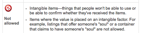
Apparently the main problem boils down to having actual items to sell in the test listings category, which is for testing only. But the content from test listings (image and title and description texts) apparently triggers an automatic rejection if you try to list in a mainstream category like art > photographs. Calling something a “test,” or using the word “test” in your title is enough to keep a listing off the site. But that’s eBay’s tautological problem. They also actually ban listings “where the value is placed on an intangible factor,” like, no joke, “someone’s ‘soul'”.
I had a couple of confounding discussions with CSRs about appropriation, context, and an awareness of the process of selling. I was asked how I could possibly claim I was actually selling an object, and that I wanted someone to buy it, when my descriptions clearly said “NO ITEM” and “DO NOT BID OR BUY.” And how could I think it’s not confusing that I put, “Actually, there is an item, and you can buy it.” right underneath it?

And who would even try to sell an image that had DO NOT BID OR BUY printed right across the middle of it?
“Is this your image?”
“It is now.”
“Then you can change it so it doesn’t say that, right?”
“Does eBay have any other instructions for how I should change these artworks?”
Was a real conversation I had with one Resolution Manager, after he’d already told me to change the title of the works, too.
It was a challenge to explain the project in this situation, to someone who had no interest or expertise in the art context, and whose job was to maintain the integrity of eBay’s transactional experience. Even though I had been instructed by an eBay CSR to list my items in the testing category, I was clearly selling, not testing. And the way I was selling would disrupt the expectations of someone shopping in a normal part of the site. Which, of course, was my entire point. Which he accepted and rejected at the same time.
Maybe I’m the one who needs to pay attention to the context. eBay is full of art ridiculousness, more or less interesting, and apparently, I’m just wanting to add one more.
Matt Latourette reminded me of the 2014 4chan stunt listings to sell posts, then screenshots of posts, then making-of screenshots of posts, &c. which culminated/dissipated into Hyperallergic selling a blog post about the whole thing.
And @yunginstitution linked to this kind of thing, where an Italian creator of unabashed fakes hopes that kerning and an amazing incantation of a copyright disclaimer will keep the reaperbots at bay:
The work is not supplied with certificate of authenticity and warranties (as has never been evaluated, estimating expertise) and then, having regard to the recognition and similarity to the style of the author, is proposed as a copy of copyright, false copyright, in the manner of the author, under Article 8 of the law of 20 November 1971, n.1062 (Official Gazette No 318 of December 17) (according to law “dl 41 22/01/2004 art 179)
“a copy of copyright, false copyright, in the manner of, full of grace…”

I guess my interest is primarily not in becoming an eBay crank, nor in reverse engineering the site’s unwritten policies and assumptions about selling. But I am still fascinated by the images and language of not-selling, and the aesthetic decisions being made in these unimaginably rare situations where marketing, promotion, strategy and enticement aren’t just absent, but avoided. And the implications of this for art are still worth considering even after Armory Week.
I’ll revise this tomorrow, but, in the mean time, I have published a list of all the items eBay terminated, with their titles and (now defunct) item numbers. This will serve as a Googleable registry/reference for these works as I try to figure out whether and how to relist them. And then I’ll think about what to do with the prints for the two dozen new test listings arriving this weekend.
UPDATE You know what, enough nonsense, the images are what interest me, so I’m stripping out all the text and title stuff and just relisting all available prints. They’ll all be properly titled when they’re shipped out, according to the registry below. Bid and buy with confidence.
Continue reading “DO NOT BID OR BUY Meets DO NOT LIST OR SELL”
Untitled (richardprince4), 2014
Soon after her arrival at MoMA in the late 1990s, Laura Hoptman and I had [what I remember as] a heated discussion about the nature of art. She said that as part of the culture, all art was for the public. I tried to argue that there could be exceptions; she was unconvinced. Of course, to put it more bluntly than she ever did, part of her job was to instill in an eager young collector the instinct to steward his art and money toward the museum. Which, sure. But what I was unable to explain at the time was that I imagined an artist being able to make an artwork not for “the public,” but for a person, that a work could be intended to be experienced solely by a particular person, and that would be enough.
[I didn’t know about Ian Wilson’s conversational works at the time, but that, along with James Lee Byars’ fantastical ephemera, have given me plenty of reasons to recall our invigorating conversation. Also, the irony that it took place on the deck at the Rubell’s hotel in Miami, after a visit to their still-raw DEA warehouse, means I get flashbacks every time I go to ABMB. But that’s not the point right now.]
Anyway, last Fall, I wrote about Richard Prince’s Instagram portraits show, and what I saw as the subtle mix of alteration and aspiration that went into them. Our social media personas are one fiction, and his comments and interactions are another, and the construction of the digital interface/frame is yet a third.
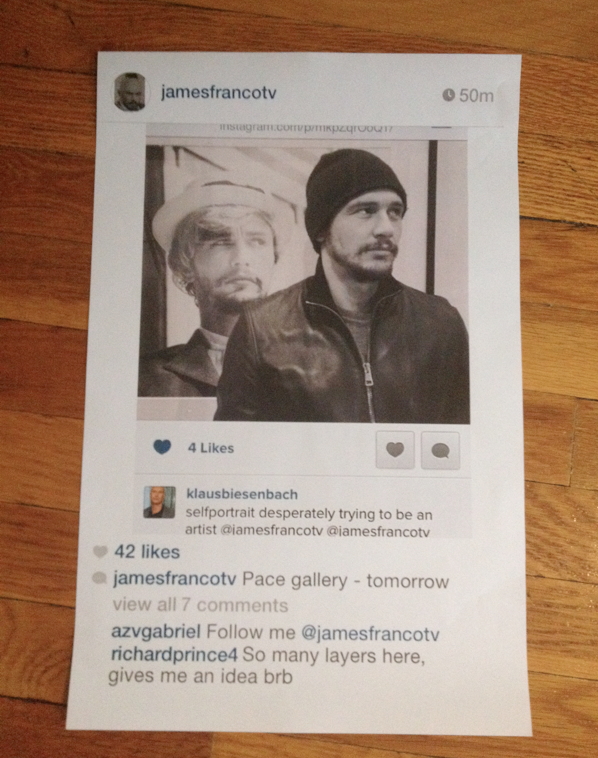
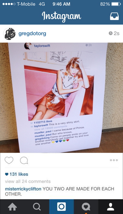
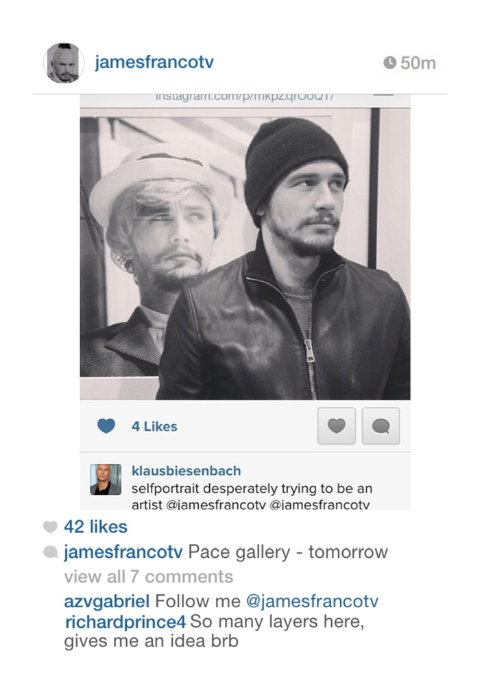
I framed Richard Prince: Study for Untitled (richardprince4), 2014
To illustrate the point, and to underscore what I saw as some of the more abject, exposed emotional elements of Prince’s works, I created my own Instagram portrait “by” Prince, using a convoluted, regrammed image of James Franco as Cindy Sherman by Klaus Biesenbach.
I added a flatfooted quote from Prince at the bottom, rolled back the timestamp, and then made a Prince-like print of the screenshot. Which I used as an illustration in the blog post, fictionalized evidence that Prince’s controversial Instagram works had been inspired by Franco’s embarrassing Sherman reboots. I thought my conditionals and qualifiers would be obvious…
Did Prince recognize something of himself through Franco’s[!] layers of mediated desperation [Klaus’s (?) term], not just an artist, but a Shermanesque shapeshifting master? Did he see Franco’s and these other kids’ Instagram personas and want to get in on it? Did he want to be a Nightcore? Or worse, did he want to be a Franco? Is this the lifestyle envy that fuels the whole thing? Or is this just one more image, one more comment, one more layer of media we’re supposed to question but probably won’t?
…but even the satirical suggestion was still too much for Prince, who unfollowed me on Twitter soon afterward. Prince prefers to be in control of the fictions around his works, and I can dig that. But also he was the one who’d declared the unilateral appropriation and manipulation of someone else’s social media presence as a tactic. And as Warhol said about Coca-cola, now everyone has an iPhone, from the president to the bum in the street.

Dawoud Bey be like, “Jerry…”
I bring this up now because just days after posting the Prince/Franco/Klaus pileup, I saw an announcement for the National Portrait Gallery’s Outwin Boochever Portrait Competition. I’ve seen previous NPG Portrait Competition exhibitions, and they were numbing, like a state fair for art. And then I saw that this time, one of the jurors was Jerry Saltz. And I decided that it would be hilarious to plant this toxic matryoshka doll of a portrait in the competition, for an audience of one: Jerry.
Untitled (richardprince4), 2014, 72×48 in., inkjet on canvas, unrealized
So I entered it. The first round is judging by jpg and a brief explanatory text [below]. The work would be an inkjet, 4-ft wide, the same dimensions as Prince’s, but I would print and stretch it only after it got selected for the in-person judging of the semi-finals. I called it Untitled (richardprince4). It was a portrait of Prince. And not a terribly good one. I didn’t get his comment right; it turns out it takes a lot of effort to appear as awkward as Prince does on Instagram. My portrait of him feels about as successful as that dead-eyed painting of the Duchess of Cambridge a while back.
But that was secondary to its presence in the staid context of the National Portrait Gallery competition, where I imagined it sitting, waiting, like an IED of WTF, to blow up the ideas of portraiture and reality. I kept totally silent about the entry for seven months, because I liked the idea of Jerry stumbling across it in a weary jury slideshow and being momentarily entertained by it way more than I liked the idea of kiss-ass campaigning.
Which wouldn’t help anyway. The nested art world personalities are too insidery, and the references are so contorted, and the text so clumsy, that I didn’t think anyone besides Jerry would ever care about it, and even he was iffy. If he grabbed onto it, great, but I never imagined it would get past that first shock or bemusement in the competition. Maybe a whoopie cushion is a better analogy than an IED.
And sure enough, my rejection notice came today. Whatever reaction he had, I don’t know–there were 2,500+ entries, so maybe he didn’t even see it after all–but I found the months of secret possibility to be quite satisfying. This image has done its job. And the world is a better place without a 4×6 foot canvas version of it in it.
Or maybe…if I print it up and light it on fire, Richard Prince will start following me on Twitter again…
View Source: Richard Prince’s Instagram Portraits
Outwin Boochever Portrait Competition 2016 [portraitcompetition.si.edu]
Proposte monocrome, eBay, rose

Yves Klein had two shows in 1957 titled Proposte monocrome (Monochrome Proposition): the first was in January at Galerie Apollinaire in Milan [above], the second in October at Galerie Iris Clert in Paris.
In each case, Klein presented a group of eleven blue monochrome paintings of identical size, production, and appearance, but with different prices. Klein argued that despite initial appearances, each painting was in fact quite different:
Each painting’s blue world, although all of the same color blue and treated in the same way, revealed itself to be of an entirely different essence and atmosphere; none resembled the other, not anymore than pictorial moments and poetic moments can resemble one another.
And the prices proved it.
The most sensational observation was that of the buyers. Each selected the one that pleased them the most among the displayed paintings, and paid its price. The prices were all different, of course.
These quotes are from a 1959 lecture Klein gave at the Sorbonne, which was released as a limited edition LP. Klein delivers the last sentence like a punchline, “Et les prix sont tous differents, bien sur,” is followed by applause, gasps, and laughter. [It’s in the first 2:00 on this ubu mp3 excerpt.]
Klein’s Monochrome Propositions were intended as a spiritually enlightening alternative to the polychrome world, a gateway to the mystical energies of the universe. And the pricing, Sotheby’s argued, was “an audacious ploy that demonstrates Klein’s ingenious handling and overcoming of the disjuncture between art and commerce.”
I have never been able to reconcile these two aspects of Klein’s early monochrome shows. Until now.

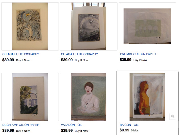
While searching through thousands of eBay test listings, I found an eBay test store that followed Klein’s strategy. The same monochrome image was used for two dozen separate items–which all had different prices. The only problem was that there could be no buyers with no items for sale. I have solved this by making prints of nine images available at eight different prices.
And now I understand the Monochrome’s Retail Proposition. The visual cacophony of a typical eBay search result is replaced by soothing uniformity. In this Kleinian spiritual paradise, I am left free to focus on the differences, both those I imagine, like shading variations in the jpgs, and those of price. My decisions fall away, all I need to think about is the essence of the transaction: to decide how much I want to spend.
Untitled (Test Test Test Item 16 –DO NOT BUY, NO ITEM FOR SALE), 2015
5×7 in. digital inkjet print
signed and numbered from an edition of 15 plus 2 aps
with price and shipping terms set in the original test listing:
$30+20 freight
Sound familiar? You can try it at home: Why spend $50 when there’s an identical one for $25? But the “freight shipping” is more than the photo itself. Oh, I might buy a photo, if they weren’t so cheap. It really is whichever one pleases you most.
See all nine Test Test Test prints, plus others [ebay/nycgreg]
Previously: Untitled (Do Not Bid Or Buy)
Untitled (Do Not Bid Or Buy)

Untitled (ANDR Test Auction – DO NOT BID OR BUY – Ship DSCT 2),
2015, 5×7 in. digital inkjet print, ed. 15+2AP, of which
10 are available, $3+6 s/h
3/16 UPDATE: New images are listed at the bottom of the post, check them out.
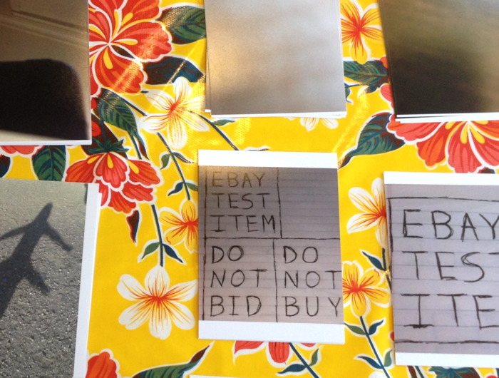
Yesterday @yunginstitution turned me on to the Test Auction section of eBay, which is amazing. Test listings are for eBay developers to debug different features and settings, or for Power Users to preview and QA their regular listings. These auction listings have esoteric acronyms and abbreviations for titles, and images that range from stock to baffling to perfect. And they are full of warnings like TEST ITEM DO NOT BUY OR BID, and NO ITEM EXISTS NO FEEDBACK GIVEN
Well, these items exist now. And you can bid, and you can buy, and feedback will be given.
I have taken a selection of eBay test listings and recreated them to sell digital inkjet prints. The availability and pricing is determined entirely by the original listing. These 5 x 7 inch prints will be signed, stamped and numbered, and would obviously look best in groups.
Because they have “test” in the lot title, eBay won’t allow the prints to be listed in the regular, searchable categories. But the customer service person I spoke with said they’ll function just fine in the Testing category. They only look unbuyable.

Untitled (Andr test auction do not bid do not buy carrier 2)
2015, 5×7 in digital inkjet print, ed. 15+2ap, of which
one is available in this listing, $1 + 5.32 s/h, $15.32 intl [note: updated link to current relisted item
After I created the first several print listings, which are all quite cheap for what they aspire to be, I realized I could sort the thousands of test listings by price. And oh hey, it turns out some were quite expensive for what they are. So I added a few of those to the mix, too. To hit all the price points.
Untitled (ANDR TEST – JERBEAR – DO NOT BID OR BUY – MBIN COMMIT),
2015, 5×7 in. digital inkjet print, ed. 50+6 aps,
34 of which are available in this listing, $3+5s/h, $15 intl
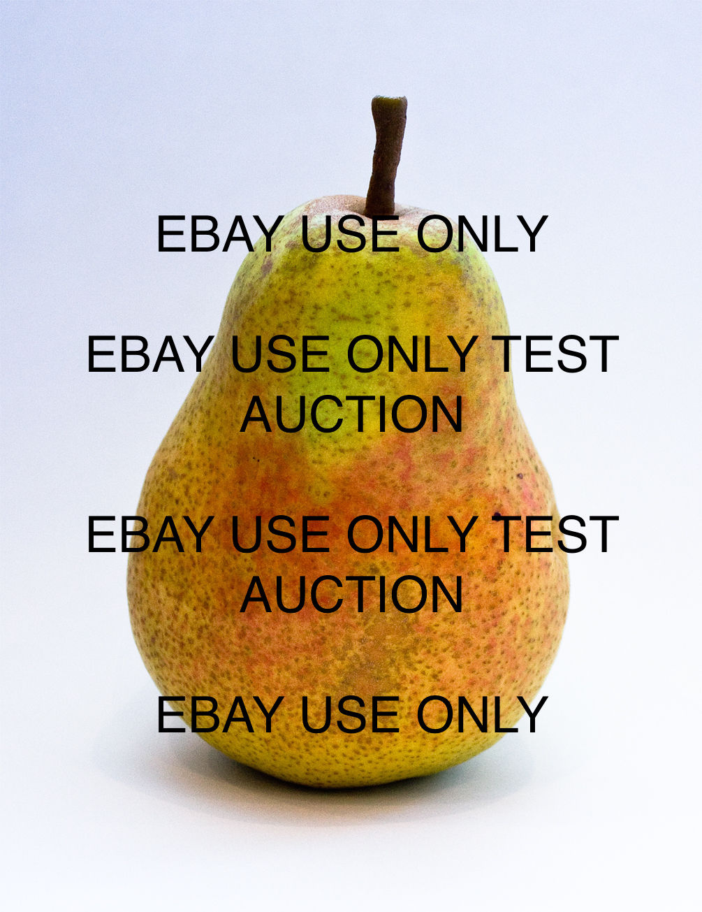
Right now there are 18 19 images in the series, including a monochrome, one suite of eight prints, one pair, and two that could really work as a pair. Plus a picture of an actual pear.
Shop the entire series on my eBay seller page, or after the jump.
On @TheRealHennessy Tweet Painting, DILF
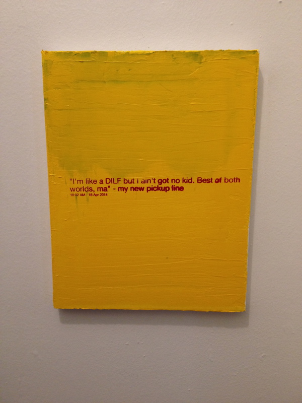
@TheRealHennessy Tweet Painting, DILF, 2014, 14×11 in., acrylic and screenprint on canvas
Monochromatic with a sharply contrasting silk-screened text, @TheRealHennessy Tweet Painting, DILF belongs to one of greg.org’s most iconic series–the @TheRealHennessy Tweet Paintings.
Distilling his canvases in a humorous simplicity, he has disassembled the process of artistic representation and its interpretive demands. Placing his control over the viewer, we read the tweet, laughing or groaning in response. Echoing the uncluttered monochromes of an esteemed range of artists form Kazimir Malevich to Yves Klein and Ad Reinhardt to Brice Marden, @TheRealHennessy Tweet Painting, DILF has the emphatic simplicity of Minimalism. And yet, deliberately puncturing the seriousness of art history’s great monochromes, he has printed a classic pick up line at its center. Recalling the zips of Barnett Newman’s paintings, greg.org’s selection of a deliberately unobtrusive font places the canvases serious and authoritative appearance in strange tension with the flippant content. “The subject comes first. Then the medium I guess,” he has explained. “Like the tweets. They needed a traditional medium. Stretchers, canvas, paint. The most traditional. Nothing fancy or clever or loud. The subject was already that. So the medium had to cut into the craziness. Make it more normal. Normalize the subject. Normality as the next special effect” (greg.org, quoted in R. Rian, ‘Interview’, pp. 6-24, in R. Brooks, J. Rian & L. Sante, London, greg.org, 2003, p. 20)
Minimal in composition and lacking the painterly presence of the artist’s hand, greg.org’s @TheRealHennessy Tweet Paintings parallel the “rephotography” that he became so well known for in his photographic works. Surreptitiously borrowing, appropriating, or as he refers to it, “stealing” is a trademark of his work. Even the location from which he draws his content has become a staple to his oeuvre. “Tweets are part of any mainstream magazine,” he explains. “Especially magazines like the New Yorker or Playboy. They’re right up there with the editorial and advertisements and table of contents and letters to the editors. They’re part of the layout, part of the ‘sights’ and ‘gags.’ Sometimes they’re political, sometimes they just make fun of everyday life. Once in a while they drive people to protest and storm foreign embassies and kill people.” (greg.org quoted in B. Ruf (ed.) Tweets, n.p.)
Previously: @TheRealHennessy Tweet Paintings
@TheRealHennessy Tweet Paintings, Cont’d.