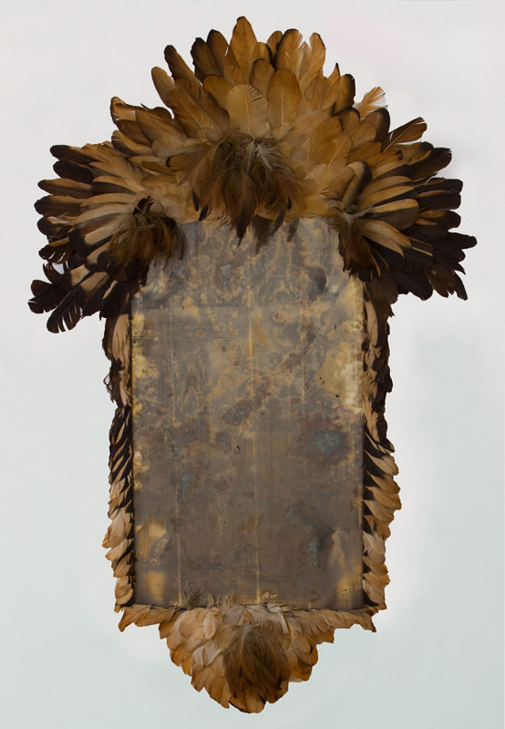
Untitled (I’ll Be Your Mirror), 2016, 70 x 46 in., feathered mirror by Bill Cunningham
The end credits for Richard Press’s documentary Bill Cunningham New York run over Nico and the Velvet Underground’s langorous, “I’ll Be Your Mirror.”
In the 1950s, before he took up a camera and changed the world, Cunningham designed hats for his own label, William J. He also created some unknown number of objets d’art and furniture. Well, at least one piece is known. The fashion illustrator Kenneth Paul Block considered this feather-covered mirror by Cunningham to be one of his most prized possessions.
It is large, 70 x 46 inches, and has an extraordinary patina. It holds the wall like a 50s Bruce Connor or Rauschenberg. I put #painting in there, but maybe it’s #combine instead. Oh wow, I just found this photo of Merce Cunningham dancing Aeon (1961) in a pair of feathered chaps Rauschenberg designed.
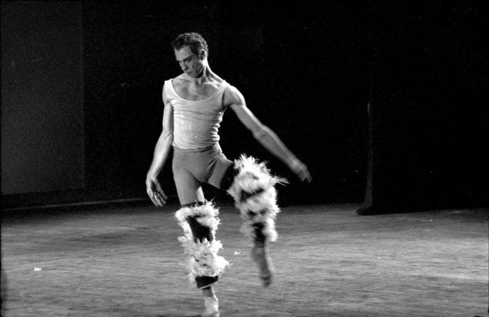
Merce performing Aeon (1961) in Tokyo in 1964, photo: Yasuhiro Yoshioka/Sogestu Foundation, via walkerart
Block passed away in 2009 and his partner of over 50 years, artist and textile designer Morton Ribyat, died in March. If you’re interested in buying this work, email or call me whenever you’re ready. If you’d like to take physical custody of it, though, you’d better move fast. UPDATE: And have more than $13,000. Wow.
INFLATION UPDATE As of 2017 we know where the mirror is. For sale here for $60,000.
Sept 23, 2016, Lot 377: AN IMPORTANT FEATHER-MOUNTED MIRROR, DESIGNED AND CREATED BY BILL CUNNINGHAM [stairgalleries]
Previously, related: Untitled (Joan Collins Toile de Jouy), 2015
Tag: works
Untitled (redbox), 2016
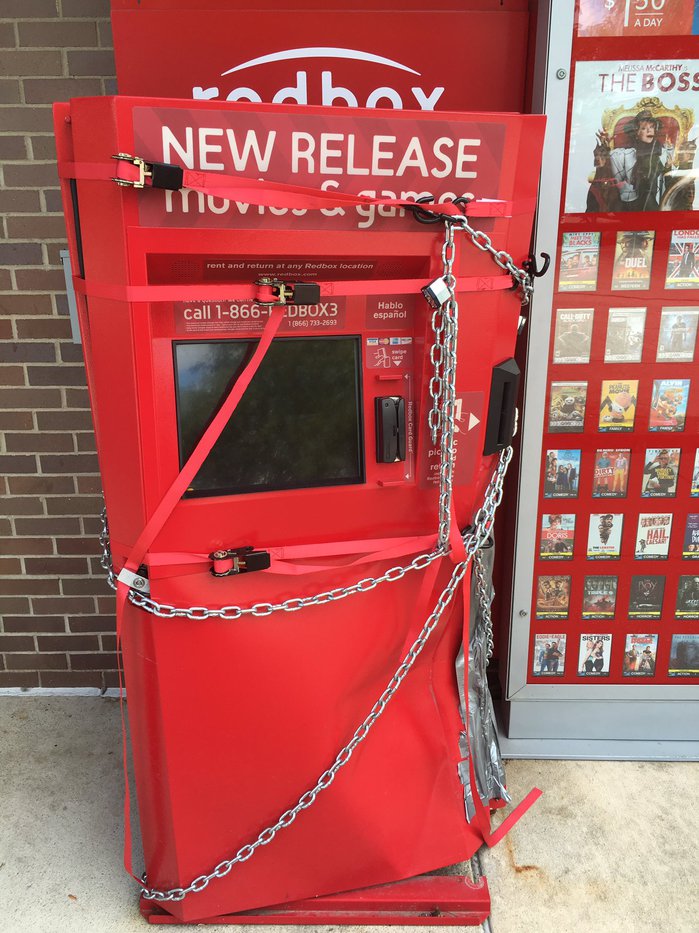
Untitled (redbox), 2016, altered redbox dvd rental kiosk, ratchet nylon web straps, chain, padlock, aluminum tape. installation view via @rgay
Someone wanted a movie collection really badly. pic.twitter.com/gDnhpbmCuo
— roxane gay (@rgay) August 25, 2016
Can you claim a work if you have no idea where it is? Writer Roxane Gay snapped this great piece and posted it to Twitter this morning. The web straps immediately made me think of the straps on the previous, Untitled (Shenanigans) piece. There’s menace and violence, but it’s less political here. More Hollywood. The chains are what really make it for me.
Gay is a professor at Purdue, and that brown brick looks familiar, so maybe this was outside a McDonald’s in West Lafayette somewhere. I don’t think it’ll be up for long, but it’s enough for the CV, at least.
Untitled (Shenanigans), 2016, Installation View
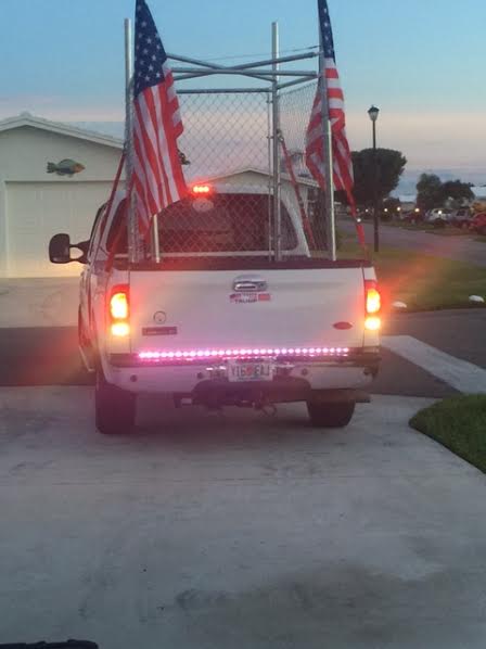
It seemed so much funnier when Cady Noland did it.
Maybe not funny, but at least it didn’t freak you out. Noland’s artworks drew from the raw aesthetic landscape of late 20th century built America to shed light on uncomfortable truths about patriotism, violence, commercialism, waste, the American psyche.
But it did it in an art context. Whatever it was, or however dark or unsettling, it was still [just] art. You could walk away from it.
Or wake up from it, like a bad dream.
Now there’s a white nationalist bigot in Florida trolling Muslims, and protesting Hillary Clinton and her treasonous supporter citizens by building a lock-em-up protest cage in the back of his pickup truck. No voter shenanigans, he says on Twitter: Trump landslide or in the cage ya go.
My instant impulse, or maybe it was a coping mechanism, was to make a Noland reference. Then as I got ready to post this thing here, and declare it a work [as one does around here], I got cold feet. The reality of this person and his anger and hatred and poisonous rhetoric and not-idle threats piled up, and I reconsidered. This is literally not-helping, I feared, it is making-worse.

But after a couple of days of looking, and thinking, and seeing this guy’s gesture/threat circulate, I came to see this as important. Or at least real. Relevant. This bigot’s sculptural move was atypical, even perhaps unique, but it is a datapoint in a network, a churning system of political hate. These images are of a physical object manifesting the digital flow of right-wing ideas and imagery across Twitter and Facebook. It’s a post-Internet avatar of Trumpist America.
Looking at it, now I wonder: is this how Noland saw, how she read, how she felt, when she made her works? Did she dream of making toxic, dystopian, American flag-draped cages, only to wake up and find the dream was still there? And wasn’t even a dream?
Untitled (Gerda Taro Leipzig Monochromes), 2016
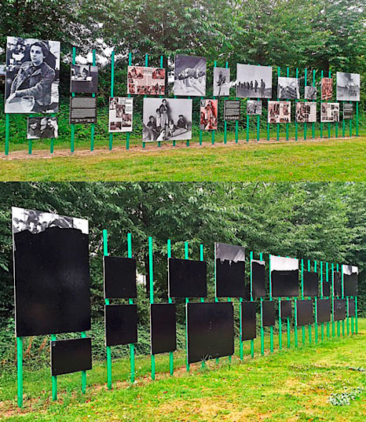
Untitled (Gerda Taro Leipzig Monochromes), 2016, Gerda Taro photos, painted wood supports, tar. image: Anne König and Jan Wenzel
On the night of August 3rd, an outdoor installation of 18 photos by Gerda Taro in Leipzig, Germany, was vandalized, painted over with tar? Or aniline black dye? The photos were part of f/stop Leipzig, an annual photography festival, held in early July. Some of the public space components of the festival apparently continued beyond that date.
f/stop curators Anne König and Jan Wenzel included Taro, a pioneering war photographer, because of the confluence of her life, her work, and the city itself. She lived in Leipzig until 1933, when she fled as a Jewish refugee. She met up with another refugee, Robert Capa, in Paris, and they documented the Spanish Civil War together until Taro was killed in 1937. Leipzig is hosting many refugees from the Syrian war right now.
The curators note that effacing the images of refugees by a Jewish photographer with tar is inherently a political act, and they are calling on the city to discuss the implications. The Taro estate, in the form of the International Center for Photography, wants her images back on view in Leipzig.
I agree with all of that, but also wish to recognize the damning bluntness of the blacked out panels. Sometimes redactions and monochromes cannot be let off the hook. Declaring them an artwork of my own is no way of assuring anything, but It feels important that they will be preserved.
The 21 panels include three texts and at least five layouts from LIFE magazine. The bottom eleven were completely blacked out, while the tops of the five tallest appear to have been beyond the easy reach of the unknown redacter. In the event this work does get destroyed, I will try to identify the Taro images under the tar.
update: I’m still thinking this one through a bit.
Pioneering war photographer Gerda Taro’s images vandalised in Leipzig [theartnewspaper]
09. August 2016 Auch Gewalt gegen Fotografien ist Gewalt [f-stop-leipzig.de]
Untitled (The Four Seasons), 2016
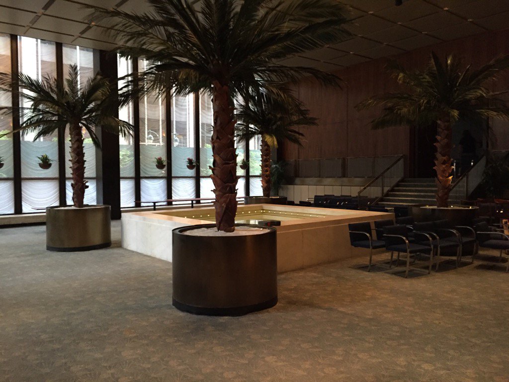
Untitled (The Four Seasons), 2016, four bronze Philip Johnson planters and 16 trees, in seasonal rotation. image: Paul Goldberger
Paul Goldberger tweeted this photo of an emptied out Four Seasons, and now I want those potted palm trees more than anything in the 14-hour auction I sat through the other day&night [online, obv, but I stayed until the checks arrived].
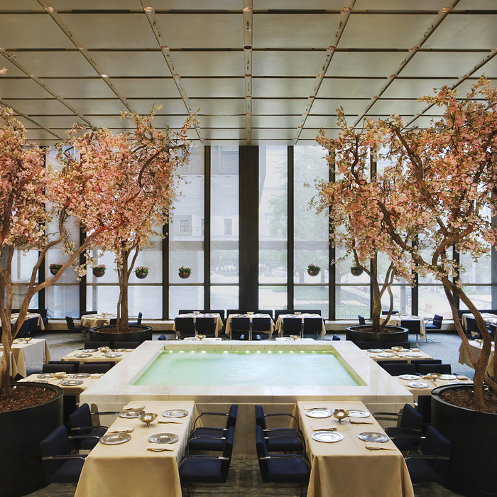
The Pool Room in spring, via wright20
Those planters canNOT be landmarked, can they? The trees certainly can’t be; they change(d) with the seasons. OTOH, given the merch they unloaded, the only way they wouldn’t have sold the planters is if they were landmarked. So Selldorf, Rosen & those food guys will keep them. Will they rotate their trees too, keeping a signature of the restaurant they booted planted squarely in the center of their new joint? We shall see.
Sforzian Boardwalk
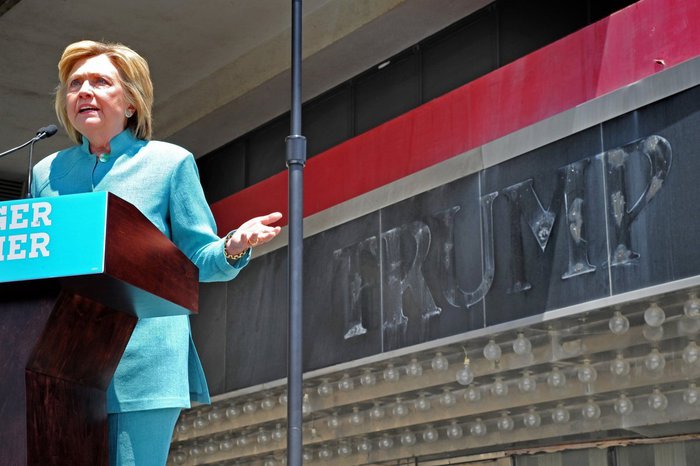
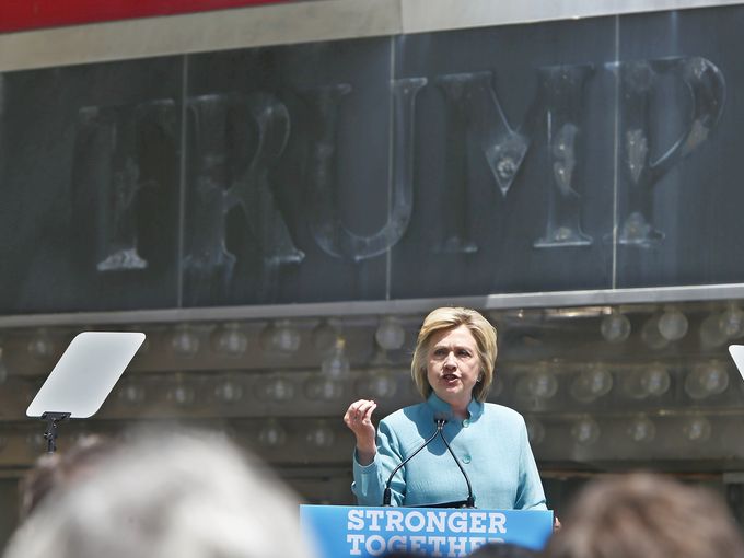
Hillary Clinton speaking at the closed Trump Plaza in Atlantic City July 6, 2016, image: philly.com/Tom Gralsh
I missed this while I was out of town, but Hillary Clinton hit a Sforzian jackpot when she gave a campaign speech on the boardwalk in Atlantic City, in front of the closed and failed Trump Plaza Casino.
Carl Icahn owns the building now, and the vestiges of Trump’s failure are literally written on the wall, providing a readymade Sforzian backdrop.
Or two. According to Amy Rosenberg’s report at philly.com, the Clinton campaign had originally wanted to stage their event a block inland, with the casino’s de-Trumped tower in the background, but it would have blocked traffic to Caesar’s. So they wedged in to a less optimal but still effective corner of the boardwalk, the ghosts of T-R-U-M-P lingered on the classy, glassy marquee.
same, this time via Asbury Park Press/USAT/Tom Costello
If you don’t count his kneejerk tweets blaming anyone else for his business’s failures while crowing about skating out of bankruptcy with a wad of investors’ dough, Trump’s reaction came Thursday. The Press of Atlantic City reports that the traces of Trump’s name were removed “for good” from the boardwalk facade. “Black paint has been applied to cover up any mention to Donald Trump.”
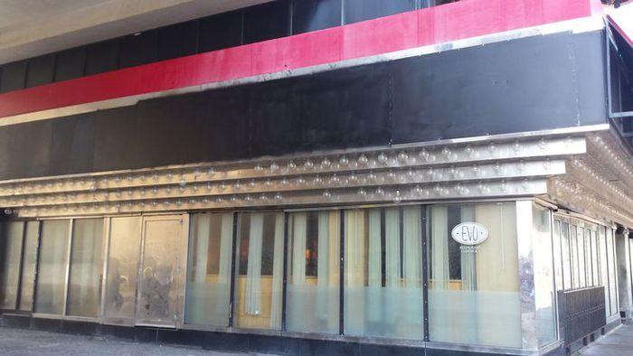
Untitled (Trump Plaza Black) Nos. 1-3, 2016, paint on panel, collection: Trump Entertainment Resorts/Carl Icahn, installation photo via Press of Atlantic City
Actually, from Jack Tomczuk’s (or Michael Ein’s, I can’t tell) photos, the traces of Trump’s name were not painted over, but were covered by painted panels. Five black monochromes were affixed to Hillary’s Sforzian corner, and to the fenced off boardwalk entrance, where the ghost of Trump’s made up crest remains visible but illegible.
The exhibition will remain on view at least through November. I would be stoked if you visit it and post photos.
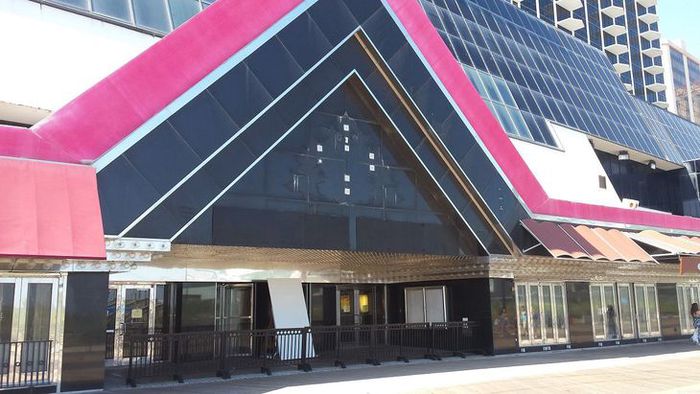
Untitled (Trump Plaza Black) Nos. 4 & 5, 2016, paint on panel, each in two parts, collection: Trump Entertainment Resorts/Carl Icahn, installation photo via Press of Atlantic City
Hillary Clinton takes on Trump in A.C. [philly.com]
Faded ‘Trump Plaza’ removed after Clinton appearance [pressofatlanticcity.com]
Better Read #008: Death By Gun
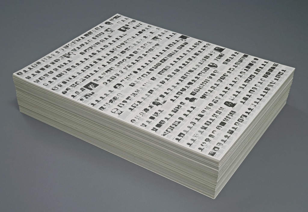
“Untitled” (Death By Gun), 1990, endless. collection: moma.org
We’ve come to reading the names of the dead, to intone them, as a form of memorial.
I’ve never felt Felix Gonzalez-Torres’ “Untitled” (Death By Gun) was a memorial per se, more a statement. Remembering for different ends. But following the massacre of Latinx gay people at Orlando’s Pulse night club, and the subsequent readings of their names, it occurred to me that I’d never read and did not remember the names of the people who appeared on Felix’s 1990 stack piece.
I looked for the original Time magazine article that was the artist’s source, and I couldn’t find it online. I couldn’t find it in libraries. I ended up buying an old print edition of the magazine itself on eBay. July 17, 1989.

And I transcribed the names of the 460 people who were killed in the US the first week of May 1989, the week Time chose to document, in the order Felix chose to lay them out, and had them read aloud by a computer.
Download Better_Read_008_Death_By_Gun_20160620.mp3 from dropbox greg.org [dropbox greg.org, 16.7mb mp3, 11:37]
Previously:
Better Read #007: Spinoza’s Ethica from Sturtevant’s Vertical Monad
Better Read #006: The Jetty Foundation Presents, Send Me Your Money
Better Read #005: Frank Lloyd Wright Speaks Up
Better Read #004: Why We Should Talk About Cady Noland, a Zine by Brian Sholis
Better Read #003: Sincerely Yours, An Epic Scholarly Smackdown By Rosalind Krauss
Better Read #002: A Lively Interview With Ray Johnson, c.1968
the Ur-Better Read: W.H. Auden’s The Shield Of Achilles, Read By A Machine
Podcast: Play in new window | Download
Subscribe: RSS
⌘S
About five years ago I began collecting dead websites. It started in 2010 with Thomas Hirschhorn, after his first website, made for the Bijlmer Spinoza-Festival in Amsterdam, disappeared from the net. The Spinoza project was the third in a series of temporary projects dedicated to philosophers.
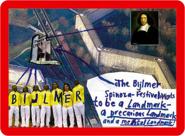
Hirschhorn calls these “presence and production” works. Here is a 2009 interview with Ross Birrell:
“Presence” and “Production” are terms I use for specific projects which require my presence and my production. It means to make a physical statement here and now.
I believe that only with presence – my presence – and only with production – my production – can I provoke through my work, an impact on the field.
When the project is over, the programs end, the materials are dispersed, the artist moves on, and a couple of months later, the website where the entire thing had been documented disappears. Then the links go dead, the URL expires, and gets scooped up by some zombie ad network. All that remains are some jpgs illustrating Marcus Steinweg’s Bijlmer lectures.
I’d been to the first at Documenta, the Bataille Monument, in 2002, but not the Spinoza Festival, and so the website was it for me. I’d wanted to read and see more, longer. And then I discovered I couldn’t. It was gone.
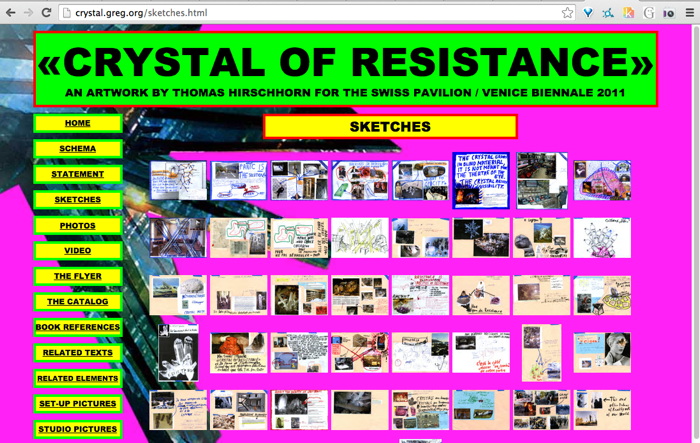
So when Hirschhorn launched his second website the next year, for CRYSTAL OF RESISTANCE, the Swiss Pavilion at the 2011 Venice Biennale, I was ready. Almost. I grabbed the whole site several times, but l missed some galleries. And then it was gone.
The GRAMSCI MONUMENT site in 2013, I definitely got that one. And Hirschhorn’s project at the Palais de Tokyo in 2014, FLAMME ETERNELLE, I got that one too.
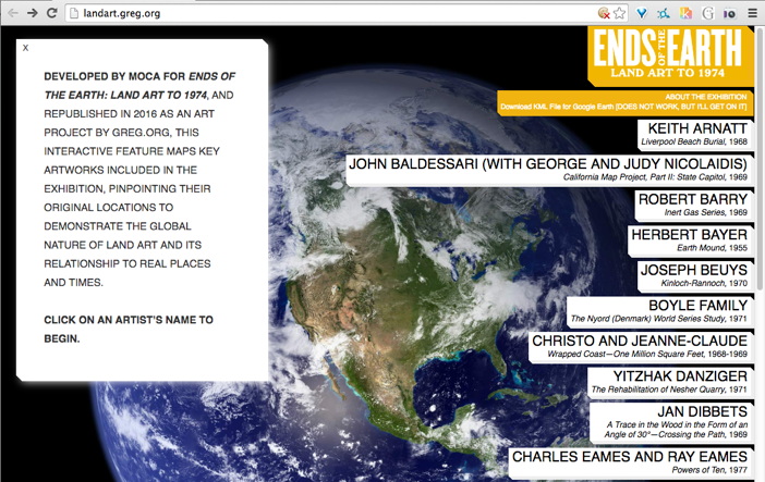
When the greatest website in the world got edited into oblivion, I grabbed it from the Internet Archive and made a piece out of it last year: Untitled (Embroidery Trouble Shooting Guide).
Then a few months ago I heard MOCA had deleted the informative and interactive mini-site for Philipp Kaiser and Miwon Kwon’s Land Art show, so I rebuilt that one. Or I’m in process. I still have to reconnect the Google Earth links. [Google’s deprecated KML API may have led to the page’s demise.]
This is how I started posting them as subdomains, similar to found texts or found web objects. In the case of Hirschhorn, I was very aware since Venice that these were different, and very much not his work: “This website is neither an artwork, nor part of the artwork <>”, it said on the front of the site.
But wasn’t, but now it was, but of a different work. Hirschhorn’s projects required his presence and his production, and my sites had neither. They appeared the same but were the opposite.

They weren’t just for me anymore. At least I didn’t have to think so.
I do edit them, leave my mark, track changes, in the text somewhere, or the source, in ways that are invisible or imperceptible, where I imagine literally no one will ever know or care. At one point, in a more cynical mood, I rewrote the entire Gramsci Monument to be entirely about me. But the more I consider Hirschhorn’s practice, the less sure I am that the gesture works as critique. [Of him, anyway. Of me, OTOH… At least I kept a clean version too.]
For example, here is something I wrote in the source of Ends of the Earth:
Though it is still available on the Internet Archive, this is the kind of thing that should, I feel, exist within an art context. It is too off-the-cuff to imagine these two mirrors as a site and non-site, but that is an apt reference, I won’t throw it out. What ultimately motivates this repetition of the site is a bafflement at why MOCA removed it in the first place. Huge shoutout to Kimberly Drew (@museummammy) for calling this to my attention.
I just feel like I have to grab these things, even the ones that get scraped into the Internet Archive. It’s an urge that I can’t dismiss, even when I can recognize the futility of it. I have to save them.
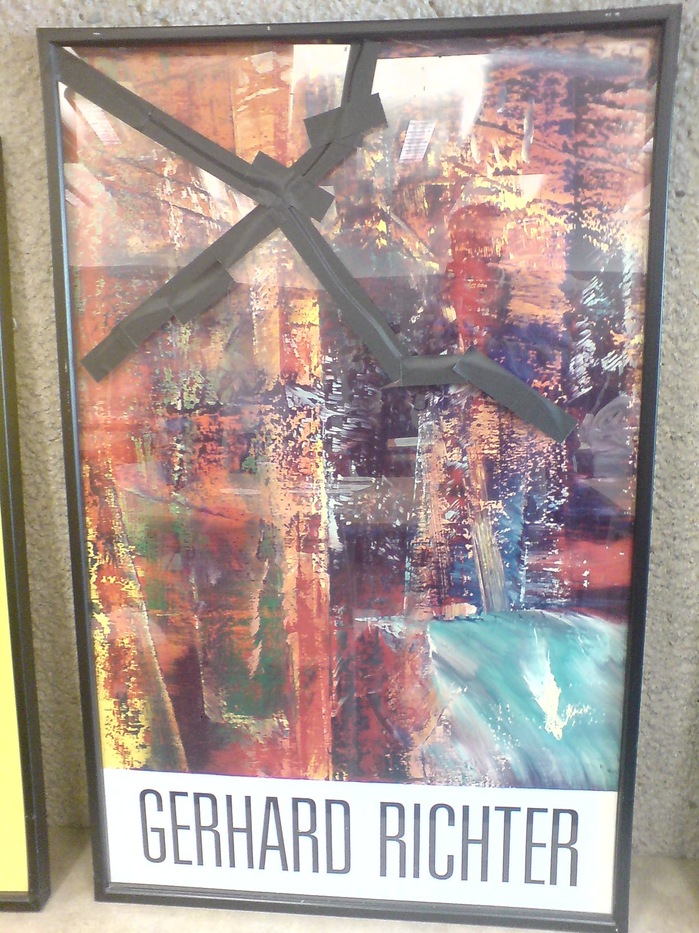
Untitled (Damaged Richter Poster), 2010-2016
In 2010 the kid took a weekly studio class at the Hirshhorn with Dan Steinhilber. It was fantastic, but unfortunately, it was the last one the museum offered for non-teens. It was held in the education space in the sculpture garden, a space which could connect under the road to the museum, but for various logistical reasons, does not.
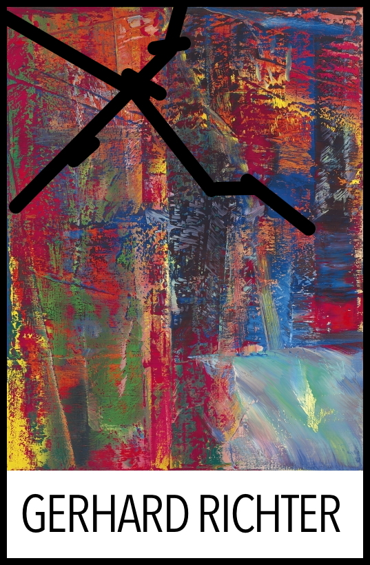
This incredible framed poster from Gerhard Richter’s 1987-8 exhibition was there. The painting in it, A B Dunkel, or Abstraktes Bild Dunkel (Dark), (CR: 613-2), 1986, is from what is considered Richter’s breakthrough year for squeegee painting. For me, though, it’s the gaffer’s tape that makes it special.
Now that I have declared it a work, I called the Hirshhorn. It is still there. There are no plans for it at this time. I called the museum shop, which has an endlessly interesting selection of books and exhibition catalogues for sale from the museum’s own library, but which does not, it turns out, have any 28-year-old Richter exhibition posters lying around.
It’s possible that it’s not even a product, but marketing material or signage; I couldn’t find another example of this poster mentioned online. So for now, it is ed. 1/1. Plus a study.
Chop Shop At SPRING/BREAK 2016, Curated By Magda Sawon
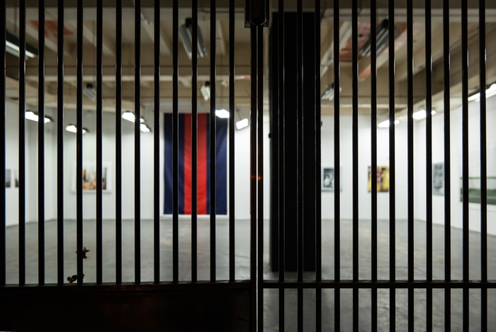
Chop Shop installation shot at SPRING/BREAK 2016, in the vault on the 3rd floor of Moynihan Station, image: Tamas Banovich
I am psyched to announce “Chop Shop”, a show of my work at SPRING/BREAK 2016. SPRING/BREAK’s keyword this year is ⌘COPY⌘PASTE, which is probably what gave Magda Sawon the idea to approach me about a project. “Chop Shop” coalesced around several subjects and series that have appeared recently on greg.org: creative destruction; authenticity; artist’s agency; a critique of collectors, the market, and the networks art traverses; and the interactions between our digital, cognitive, and physical experiences.
In just the last few weeks, the show grew more ambitious and felt like the whole thing might just veer off the rails, but thanks to Magda and her people, the flexible and gracious organizers of SPRING/BREAK, and the expert assistance of some brave painters and printers, it all came together. And it looks absolutely mindbogglingly great, almost exactly the uncanny combination of spectacle, aura, and outrageous WTF? that I’d imagined. And to top it all off, it’s installed inside A GIANT, FREAKING VAULT.
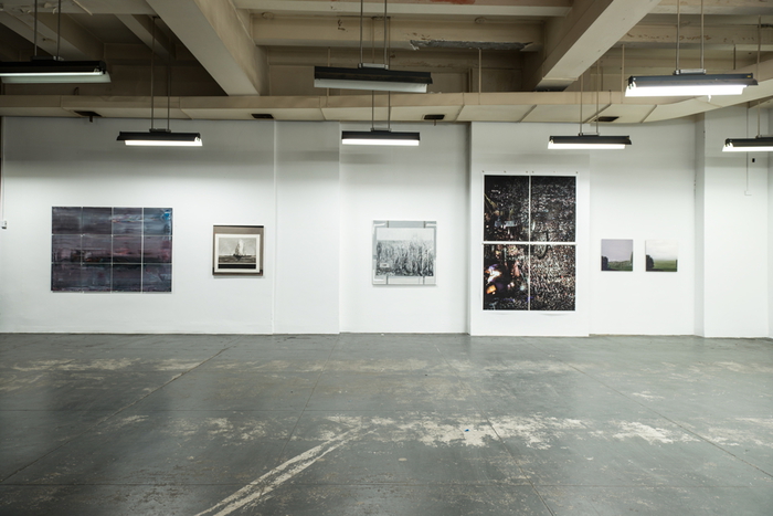
Chop Shop installation shot with Destroyed Richter Grid No. 4, Destroyed Richter Painting No. 8, Shanzhai Gursky Grid No. 1, and Destroyed Richter Paintings Nos. 12 & 11, image: Tamas Banovich
Every work in “Chop Shop” is something I’ve been imagining or visualizing for months, or sometimes even years, but which I had not experienced in person, until now. And this process of conceptualizing something, and then actually realizing it, and then experiencing it, is intensely satisfying to me. I look at tons and tons of art, not only online, but in person, too. And the differences between these experiences and the impressions they leave feel important. So it’s not just a nicety when I say I hope you will be able to see “Chop Shop” in person. [It runs from Tuesday March 1 through March 7.]
“Chop Shop’s” images are appropriated from the old masters, but its processes are lifted from collectors, dealers, and museum shopkeepers. The artwork on view has either already been destroyed, and brought back to life, or it’s about to be chopped up to order, or broken up and parted out.
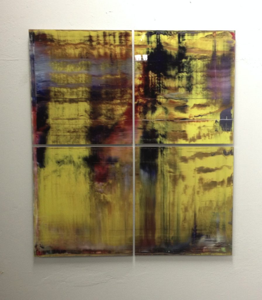
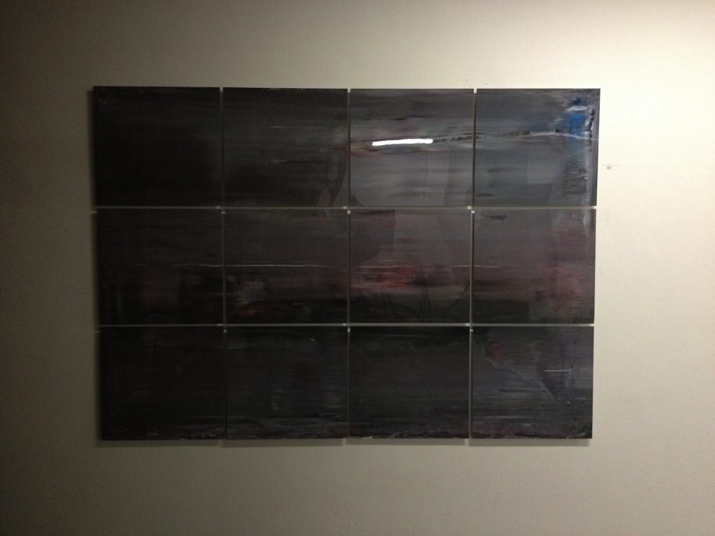
The show includes: new Destroyed Richter Paintings, which are full-scale resurrections of Gerhard Richter paintings that now exist only in archival negatives or jpgs. Some are of paintings the artist destroyed himself (after photographing them, obv), and some are of paintings that have been destroyed in the wild. In a nod to Richter’s own practice of transforming his paintings into photos, prints, or other media, some of the Destroyed Richter Paintings in “Chop Shop” are printed on aluminum panels. They are literally dazzling.
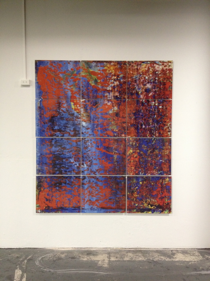
Destroyed Richter Grid No. 1 A-L, 2016, UV pigment on aluminum, 50x60cm each, unique, image: Tamas Banovich
In another nod-or maybe it’s a critique wrapped up in an homage, it’s really too early to say-to Richter’s own destructive predilections, the Destroyed Richter Grid works transform [the jpg of] a lost squeegee painting into a set of prints on aluminum, which will be sold separately and scattered. Unlike Richter’s Facsimile Objects, which are produced in bulk, these grid pieces are each a lone, unique work, part of a whole that will only be visible together during the show. So Richter’s lost works stay lost, unless or until an enterprising curator in the future tracks all these panels down and reassembles them. And even then, what do we have, but a reconstituted jpg? We go to exhibition with the art we have, I guess.
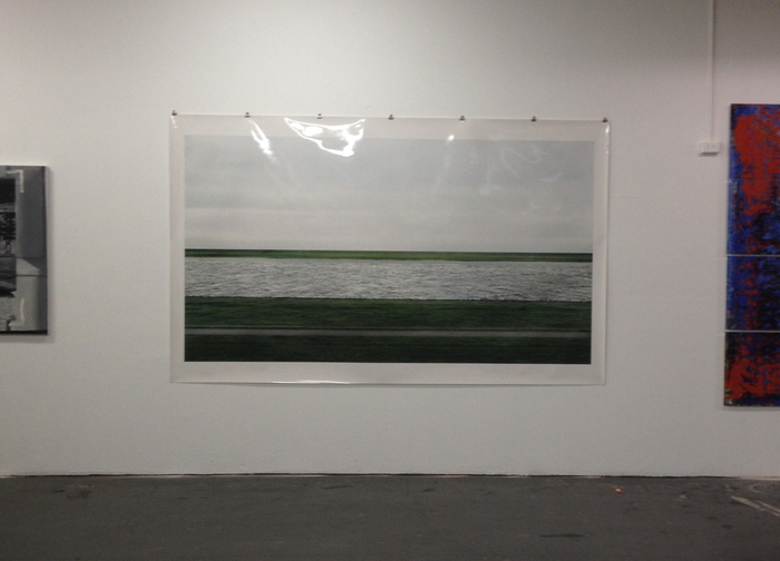
Shanzhai Gursky No. 005, 2016, C-print, 185x303cm, will be destroyed in the production of Shanzhai Gursky Nos. 006 – whatever, 185cm x whatever, at Chop Shop
Shanzhai Gursky Grids are related to the Shanzhai Gursky series, which are produced full-scale from whatever the highest-resolution versions of Andreas Gursky’s images are available at the time. Except in this case, these new works, made for “Chop Shop,” will be themselves chopped and destroyed, with the fragments each constituting a new, unique work. Some are pre-chopped for your convenience, but others will be chopped to order, then properly mounted and framed for posterity. But the sight of these Gursky-looking works hanging, raw and exposed, naked, is just awesome. What a world, they make me think. What. a. world.
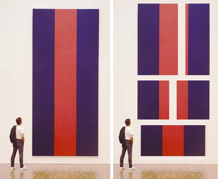
Study for Chop Shop Newman No. 1 and Nos. 2-6, 2015, jpg, but oh it’s real now, baby
Which brings us to the centerpiece of the show, Chop Shop Newman Painting No. 1, a full-scale repetition of Barnett Newman’s Voice of Fire (1967). It is literally awe-inducing, at least for me, and not just because I made it. [With conservation and materials research by the National Gallery of Canada, sage advice from David Diao, and the painterly talents of Tamas Banovich and Kyle Nielsen.] Newman made the 18-ft tall Voice of Fire to order for the 27-story geodesic sphere of the Expo67 US Pavilion. Chop Shop Newman No. 1 will be cut down into Chop Shop Newman Nos. 2 – ?? during the fair, with dimensions and compositions determined by the connoisseur collectors on a first-come, first-served basis. While supplies last.
There are so many variables and unknowns, and it’s crazy/fascinating ceding the fate of so much work to the hands of collectors-or to their indifference, if no one ends up caring, or engaging, or liking the stuff enough to take it home, which I suppose could happen. But it’s also immensely satisfying the way this show has me thinking through the systems of art, our expectations for it, and how we experience and value the world around us. So there’s that.
Press release: Magdalena Sawon presents Chop Shop by GREG ALLEN at SPRING/BREAK Art Show, March 1 – 7, 2016 [postmastersart]
SPRING/BREAK Art Show 2016, ⌘COPY⌘PASTE [springbreakartshow]
So slick, you can buy “Chop Shop” works directly online until April 30th! [springbreakartfair]
Who’s Afraid of Red & Blue? About Chop Shop Newman Painting No. 1 et al.
the original blog post, At Home with Voice of Fire
Previously, related: on Reassembling chopped up masterpieces after 500 years
on the still-hypothetical proposition that there is a non-traumatic way to chop up a Barnett Newman
On museums showing reproductions and being like, oh nbd
It was. the. jutes. Stefan Simchowitz just cold chopping up Ibrahim Mahama’s jute sack installations
UPDATE: Reviews
“The outcome is a painterly concatenation of destructive and creative forces, capital’s relentless churn made both gestural and material.” [mostafa heddaya for artinfo]
“They look modest and a little scared. (Rightfully so: “Voice of Fire” (sic) lost its first chunk to an X-Acto knife on opening night.)” [jillian steinhauer for hyperallergic]
“Allen made an absurdist gesture by offering up fragments of copied masterworks of contemporary art for sale by the square foot, like pizza.” [chris green for afc]
At SPRING/BREAK see @gregorg ‘s brilliant install @magdasawon ; also Caroline Wells Chandler knitted figs on the way pic.twitter.com/gMDUKn2gD8
— Roberta Smith (@robertasmithnyt) March 6, 2016
[!!]
Untitled (Border), 2016

Untitled (Border), 2016, two 4×6-in. blocks of Azul Platino granite from Home Depot, as installed in some apartment in Washington DC
I am stoked to announce a new work which, depending on how the real estate market operates, should be available for viewing during CAA.
Obviously, Untitled (Border) owes a debt to Richard Serra, but the confluence of form, site, and source material-Azul Platino granite is from Spain-put me in the mind of Serra’s works at the Reina Sofia.
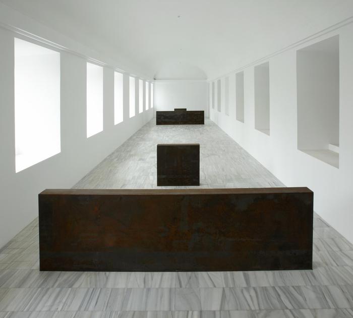
There’s Equal – Parallel: Guernica – Bengasi (1986), of course, which the museum somehow lost, and had to have refabricated in 2006.
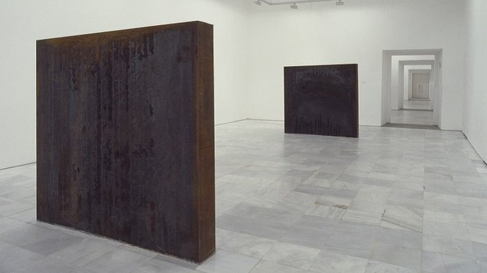
There’s also his show at Reina Sofia in 1992 which included this pair of square steel slabs just owning the space in between and around them.
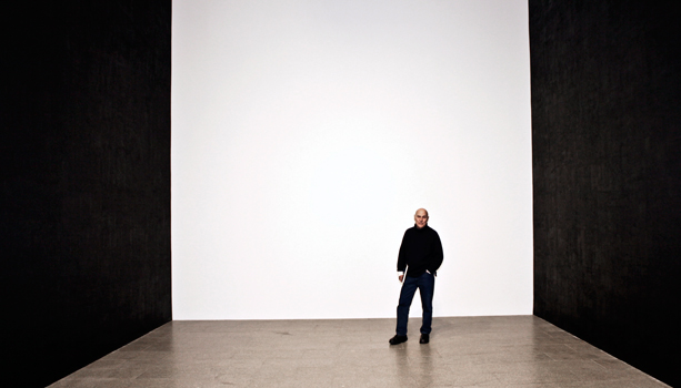
image: linneawest
I just found this uncanny photo from the Met’s Richard Serra Drawings show, which kind of gives me chills, it’s so similar. Assuming Serra is swapped out for a bowl of lemons and bodega oranges. [Which are not to be considered part of the work, btw.]
What I like most about Untitled (Border) is the way it attempts to define an abject liminal space, in this case a kitchen passthru right by a door. Indeed, except for obvious, the word that came to mind the most when I was making this piece a few minutes ago is abject. It practically jumped out of the picture in the real estate listing, fully formed and perfect. Like the work itself.
Anyway, Untitled (Border) will be on view this Sunday, Jan. 31, from 1-4pm, or by appointment.
Dust Breeding (Bull), 2016 –
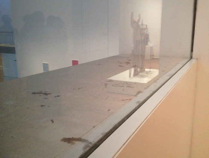
Dust Breeding (Bull), 2016, dust, museum, reflection of Picasso sculpture.
Last week I went to see the Picasso Sculpture show at the Modern again. That’s when I noticed the extraordinary amount of dust on the window ledge in the last gallery. I took a picture of it with Picasso’s Bull in the reflection because it was amazing, and because it obviously reminded me of Dust Breeding, Man Ray’s photo of six months worth of studio dust and street grime settled on the surface of Duchamp’s Large Glass.
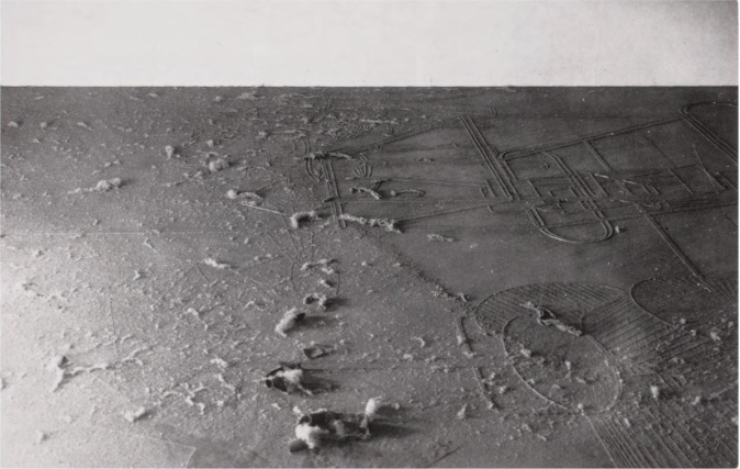
Man Ray, Dust Breeding, 1920, contact print, from Roxana Marcoci’s Photography of Sculpture catalogue.
I’ve loved Dust Breeding for a long time. Colby Chamberlain wrote a nice piece on it and Anthony McCall’s work in a 2009 issue of Cabinet on dust that has stayed with me for its conclusion: the antipathy between august art institutions and dust. I think MoMA has complicated Colby’s thesis.
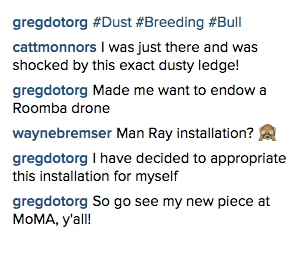 My first comment on Instagram about wanting to donate a vacuum cleaner, but I kept thinking about Matt Connors’ noticing the same ledge situation I had, and having it trigger a similar reaction. After a couple of days, I decided to make the situation a work.
And since then, I’ve been wondering what the existence of such an artwork might mean for someone, or more precisely, what knowing it exists might do for the experience of seeing that ledge.
On the one hand, it might be amazing to have people think of me and my work when they glance out the window into the atrium. Isn’t that associative frisson better even than wanting to have an endowed Roomba drone named after me? Just think of the dialogues!
Right now the gallery is filled with jaw-dropping sculptures Picasso put together out of junk and scraps of wood, in a show that includes artworks made from cigarette-burned napkins. Dust blends right in. But in a few weeks, the Museum’s permanent collection will return in some form. What interaction might happen then? Duchamp put a little sign next to Large Glass: “Dust Breeding. To be respected.” Is it possible for that dust on MoMA’s ledge to engender respect?
Though I’m willing to find out, I’m skeptical. A few years ago, I pointed out to a guard on the 2nd floor that someone had written on the wall. She smiled benignly and informed me it was a Yoko Ono instruction piece. Which, of course it was. How cute. I was annoyed, partly for not recognizing it, but mostly that my good intentions had flipped back on me. Instead of being thanked for my civic responsibility, I was being schooled on Ono’s whimsy. I somehow doubt I was experiencing what the artist intended.
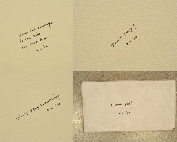
Whisper Pieces installed at MoMA in 2010, image: moma
Claiming MoMA dust bunnies as art might be seen as even lamer than Banksy, who surreptitiously stuck his own work on a museum wall and gloated about how long it took the museum to take it down. It’s just a stick in the eye of people who live to look.
Does declaring it an artwork just seem like so much ledge-half-full spin, a passive aggressive way to shame the Museum needs to break out the cherry picker and the Swiffer? Until I decided it was an artwork, I would have thought so. But now I feel actual dread knowing it’ll be gone. Some unknown day soon, maybe as soon as Walid Raad’s installation gets cleared out of the atrium, a Museum staffer is going to unceremoniously obliterate my piece. I’ll walk into the 4th floor to see some Naumans or Hesses or Broodthaers or whatever, and it’ll be gone.
But it will also be back; that’s not ten years of dust we’re looking at. And while Dust Breeding‘s parenthetical collabo right now is Picasso’s Bull, that will change too. And as it comes and goes, I’ll document its condition, and its neighbors. And if you see it, please take a picture and let me know. #dustbreeding
UPDATE WOW: From MTAA‘s Michael Sarff comes this bombshell of a project: the MoMA’s Dust Windows Community on Facebook, established OVER TWO YEARS AGO to document and appreciate the dust that gives “voice to time, memory and entropy set against the ideals of what a museum is often thought to reflex.”
@gregorg Jan 1, 2014. You are a bit late to stake out a claim but I’m willing to share the responsibility and stewardship 🙂
— michael sarff (@mriver) January 16, 2016
I am the prodigal dust son, make me as one of thy dust-loving servants!
[LOL. As I write this, Ann Temkin is actually live on Periscope, offering invited guests to honor Duchamp and the 100th anniversary of the Readymade, a term which first appeared in a letter the artist wrote to his sister on 15 January, 1916. Perfect.]
Previously, related: Untitled (Andiron Attributed To Paul Revere, Jr.)
Untitled (Re: Graham), 2016
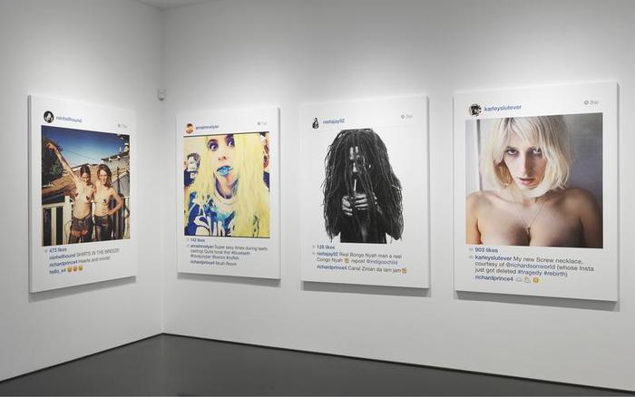
Richard Prince, “New Portraits,” installation shot, Sept. 2014, Gagosian 976, image:richardprince.com
According to his copyright infringement lawsuit against Richard Prince, Rasta-fetishizing fashion photographer Donald Graham sells limited edition prints of his 1997 photo, Rastafarian Smoking a Joint in two sizes: 20×24 inches (ed. 25) and 48×60 inches (ed. 5).
A rasta/model/whatever named @indigoochild ‘grammed Graham’s image in February 2014. It was regrammed in May by another r/m/w, @rastajay92, three months later. In May Prince commented on it, then took a screenshot, which he eventually printed at 4×5′ and showed in his “New Portraits” show at Gagosian Madison in September 2014.
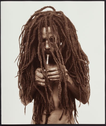
Donald Graham, Rasta Smoking A Joint, 1997-, Lambda print, 20×24, ed. 5/25, sold at Heritage Auction in Nov. 2015
In his complaint, Graham’s attorneys detail the alterations Prince made to Graham’s image, including making a screenshot, cropping, adding text and emoji, adding all the UI and empty space, and printing at low resolution and large size on canvas. Prince’s depiction is clearly of a photo on/in Instagram, with all that entails. It is clearly different in appearance, color, finish, and context, unless you’re seeking a significant amount of money, in which case these differences become invisible or irrelevant.
Unfortunately for Mr. Graham, he only registered his copyright for the image after Prince’s show, so even if he were able to prove infringement, he would only be able to recover actual damages. Since Prince sold his New Portrait to his dealer Larry Gagosian, those actual damages probably range between the profit from one 4×5 photo print and $18,500, Prince’s half of the $37,000 retail price for the IG works at that time.
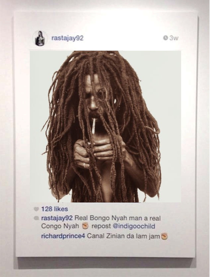
greg.org, Study for Untitled (Re: Graham), 2016, Donald Graham Lambda print cut down and collaged on inkjet on canvas, 30×24 in., ed. up to 25, I guess
It strikes me that the quickest and easiest solution is to buy one of Graham’s prints, cut it up, and collage it on top of the infringing Prince. They’re already roughly the same size. For proof of concept, I’m glad to make a study using one of Graham’s smaller, 20×24-inch prints. As it happens, the only two ever to come to auction surfaced after Prince’s show: in November 2014 in Paris (EUR2600), and in Nov. 2015 in Dallas ($2,475). Delivery date’s a little uncertain, but at these prices, I’m sure we can make it work. Win-win-win.
Untitled (Glafira Warhol), 2015
Dan Duray has an excellent scoop on an unheralded auction last spring to liquidate the art collection of Glafira Rosales, the only person convicted so far in the Knoedler Gallery forgery scandal.
About 236 lots were sold by the US Marshals via their auction contractor. Only one, a portrait of Rosales herself, betrays any connection to the caper, but that doesn’t mean they’re unrelated. Most of the works were bought at auctions since 2010, which means they were presumably bought with proceeds from Rosales & co’s fake postwar masterpieces.
The obscurity of the sale and the omission of the works’ criminal connection practically demand a Glafira Rosales Provenance Project. Maybe in the new year.
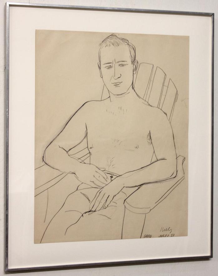
Right now, though, I’ll just call out two fascinating works:
This 1957 drawing by Ellsworth Kelly is of David Herbert, a dealer and gallery employee who worked with key NY figures like Betty Parsons, Sidney Janis, and Richard Feigen. Herbert was also dragged into the center of the Knoedler scam; Rosales claimed that Herbert, who died in 1995, was the source for the paintings, which she said belonged to an anonymous, but totally fictitious, European collector. As Patricia Cohen described it when the Knoedler forgeries began to surface:
Herbert planned to use the works to stock a new gallery that was to be financed by the original collector. But the two men had a falling out, and the art ended up in the collector’s basement until his death.
Ms. Rosales does own a 1957 line drawing of Herbert by Ellsworth Kelly that was recently part of an exhibition at the Brooklyn Museum. What she does not seem to have, however, are any records that track the ownership of the two dozen or so Modernist paintings she brought to market.
Rosales had been introduced to Ann Freedman, Knoedler’s president, Cohen reported, by a gallery employee Jaime Andrade. Andrade was Herbert’s partner. He was, presumably, the one who sold or gave Kelly’s portrait of Herbert to Rosales. This is how provenance is made: it is inferred along a chain of relationships.
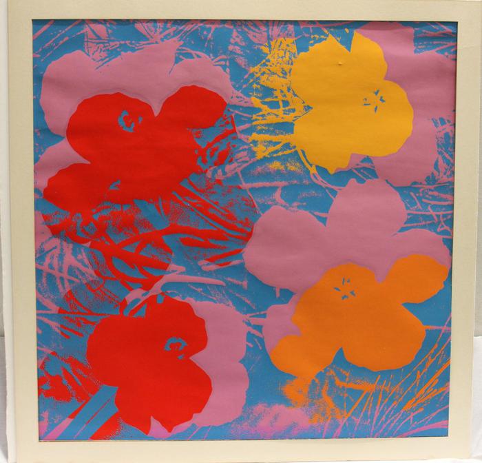
The other work is now my favorite. It is so perfect I have made it my own. Untitled (Glafira Warhol), 2015, is a poster for “Look at Warhol,” a 1970 exhibition at Galerie Thomas in Dusseldorf. It’s hard to top the Marshal’s lot description
Sheet folded at text in top margin and hinged to mat, full sheet = 35.75” x 26.75”. No frame, non-archival mat only.
That’s right. The master forger and con artist who sold dozens of modern masters to the most venerable gallery in the country without detection also folded a Warhol poster into a mat from Michael’s and tried to pass it off as a Warhol print.
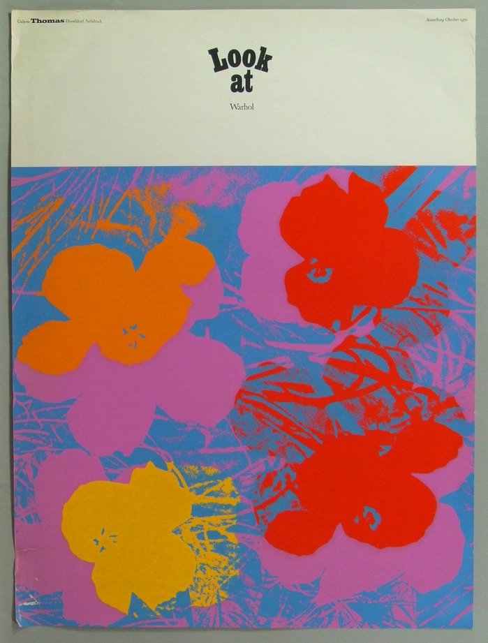
In Glafira’s defense, she is not alone. The web is littered with these posters, which art grifters pretend is worth $1,500 or more, even as they sell from vintage poster shops for less than fifty bucks. The Marshal appraised Glafira’s handiwork at $85. It sold for $905. I can only assume it is because an astute connoisseur recognized the brazen shittiness of the hack as the ultimate souvenir of the whole Knoedler affair.
And while the original now resides in an unknown private collection, I will make Untitled (Glafira Warhol) as an authentic replica edition object as soon as the posters arrive.
Secret fire sale held of 250 works confiscated from dealer in Knoedler gallery scandal [theartnewspaper]
LOT: 104 (1) DRAWING: Ellsworth Kelly (1923 – ) Portrait of David Herbert 1957, sold for $15,200 [txauction, note: dead txauction links updated to archive.org]
LOT: 142 (1) SERIGRAPH POSTER: Andy Warhol [txauction]
Glafira Rosales’ collection runs from Item number 18381 to number 18616 [txauction]
Previously, 2013: What You See Is What You Believe: Barnett Newmans From The Knoedler/Rosales Collection
2012: Here’s that Knoedler Gallery Rothko
Untitled (Joan Collins Toile de Jouy), 2015
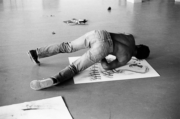
David Hammons Slauson Street Studio, Bruce Talamon, 1974, image: roberts and tilton
Like Jasper Johns a decade before him, David Hammons made prints of his oiled body. Hammons’ were more narrative, rich with content beyond just the impression of the artist’s own body.
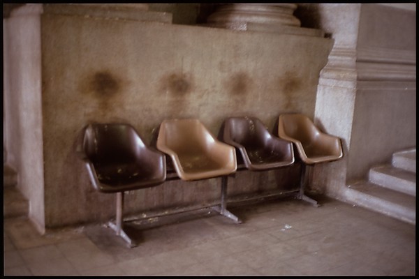
Waiting Chairs, Gabriel Orozco, 1998, image: metmuseum.org
As is his wont, Gabriel Orozco found his narrative, this time in India, in the stone wall darkened by contact with the hair of people who rested against it as they sat in these seats. We don’t know who they were.
I am pleased to introduce a work that combines these two threads of presence and absence, specificity and universality, anonymity and celebrity, found object and markmaking.
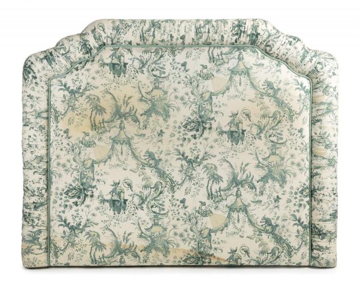
Untitled (Joan Collins Toile de Jouy), 2015, 59 x 72 inches, patinated toile de jouy fabric, stuffing, wood
Untitled (Joan Collins Toile de Jouy) is a shaped work, a painting, really, comprising an upholstered headboard from Ms. Collins’ New York apartment, altered in collaboration over the years by her and, apparently, occasionally, (an)other(s).
Interested parties, or at least those interested in having physical custody of the work, should contact me quickly, before the 14th. That’ll give us enough time to get the headboard from the auction in LA. Me, I’m happy with it right where it is. And wherever it ends up.
Lot 43: JOAN COLLINS TOILE DE JOUY HEADBOARD [julienslive.com]
Previously, related: Untitled (Merce At The Minskoff)
