
I’m not saying we should commission GWB to paint this, but I’m not saying we shouldn’t [deleted twitter url to a pic of angela merkel giving side-eye to ivanka trump at a white house mtg]
— gregorg (@gregorg) March 17, 2017
I swear, I tried not to do it, but the image was too strong. In the days since I started drafting this Kickstarter campaign, I quit several times. And then history kept catching up to this image. In fact, history started lapping it.
So yes, we need to mark this moment, this look on Chancellor Merkel’s face, on all our faces, when it was still possible to not believe what was happening before our eyes. And there’s only one painter who can do this moment justice. Unfortunately, he and justice are not really in a great spot right now, so we’re gonna use #chinesepaintmill and the Thomas Kinkade Editions Pyramid.
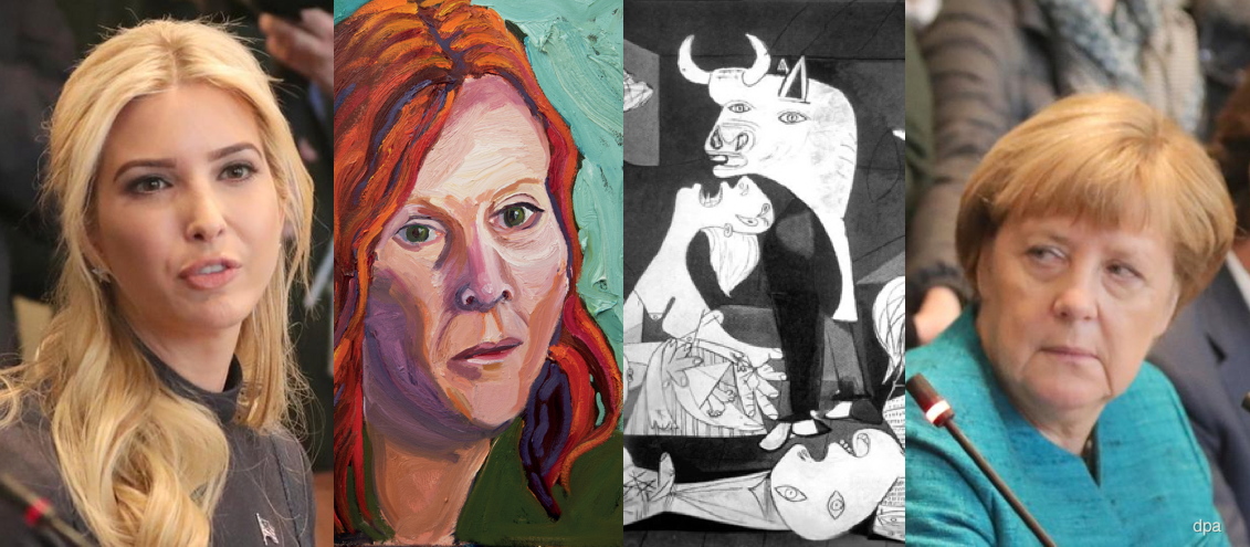
Our Guernica, After Our Picasso: collaged details from Michael Kappe/dpa photo, George W. Bush painting, and Picasso’s Guernica
In my darker moods, I imagine a series of paintings of such moments will come- Angelus Novus looking back and piling JPG upon JPG at his feet as the storm irresistibly propels us into the future. Can our brush-wielding Chinese allies capture the essence of Trumpian corruption with authentic Bushian flourish? Can we spread the resulting image(s) to the four corners of the warming, flooding earth to bear adequate witness? Let’s start with one and see.
Back “Our Guernica, After Our Picasso on Kickstarter now
UPDATE #1 After just a couple of days the project has gotten over halfway to its funding goal, thanks!
It has also been the subject of reportage by Will Fenstermaker at Artspace [who is also a backer, write what you know!] and AFC [“that’s a lot of layers to unpack for what’s essentially a meme” I do not disagree!]
On the more depressing news front, today, Day 3, might pass without a single new backer. Perhaps everyone’s too stunned at the floating of #Ivanka2024 by The Daily Caller [not linkin’, look it up], and worrying how a painting can somehow head off this meta-disaster. It probably can’t, but there’s a lot to be done in the mean time.
I’ve also noticed that backers are a savvy bunch. Folks seem to prefer the lower-priced, smaller prints at this stage. Possibly, I thought, because you’re reluctant to put up larger amounts of money for an artwork that you’ve 1) not seen because 2) it doesn’t exist yet.
It might be useful to reframe the entire project as a single conceptual piece, in which case, the physical manifestations are secondary to its core expression. But it’s still natural to wonder how it’ll look, especially if you’re contemplating getting a big one. I’m trying to think up a solution for this. Any advice or thoughts are welcome. And thanks again for spreading the word!
UPDATE #2 WHOA IT IS HAPPENING, THANKS! THE BALL IS ROLLING, THE CAMPAIGN IS CONTINUING. LET’S BUILD THAT PYRAMID AND LAUNCH A WHOLE BUSHMASTER CYCLE OF PAINTINGS TO DOCUMENT THIS THING!
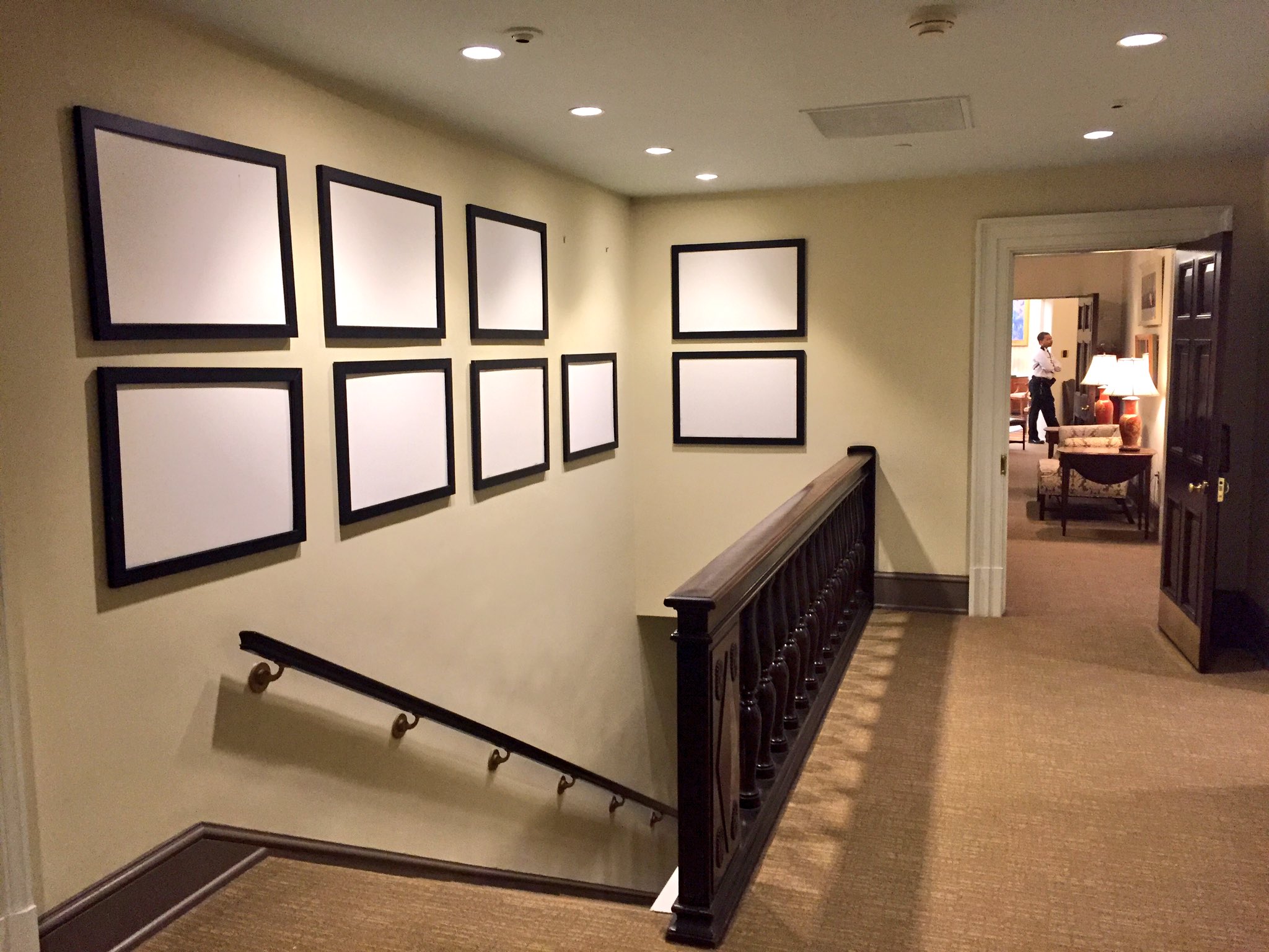
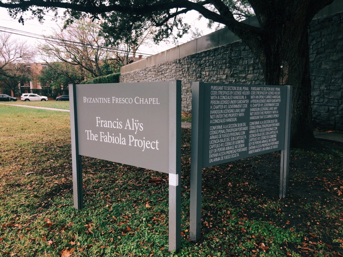
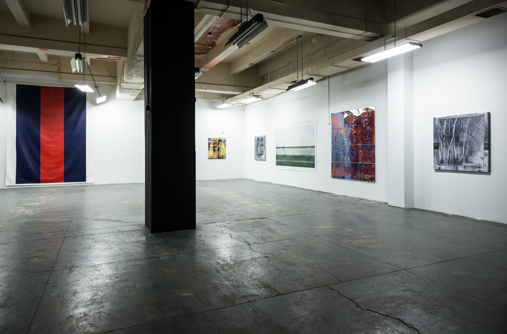
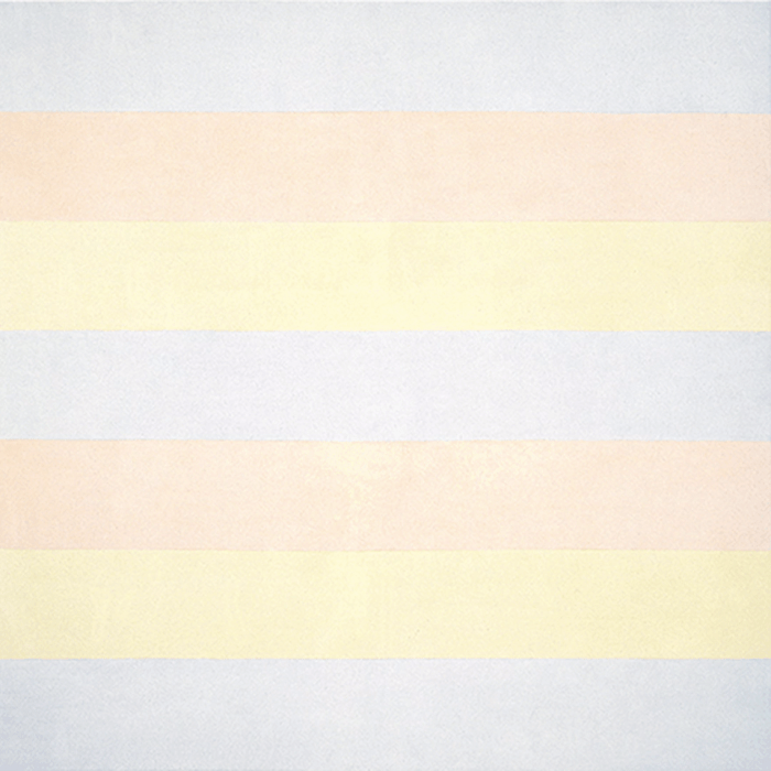
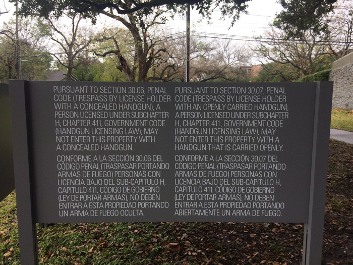 Untitled (30.06 & 30.07), 2017, screen printed text on enamel on wood, est. 48 x 36 in., installation image via

