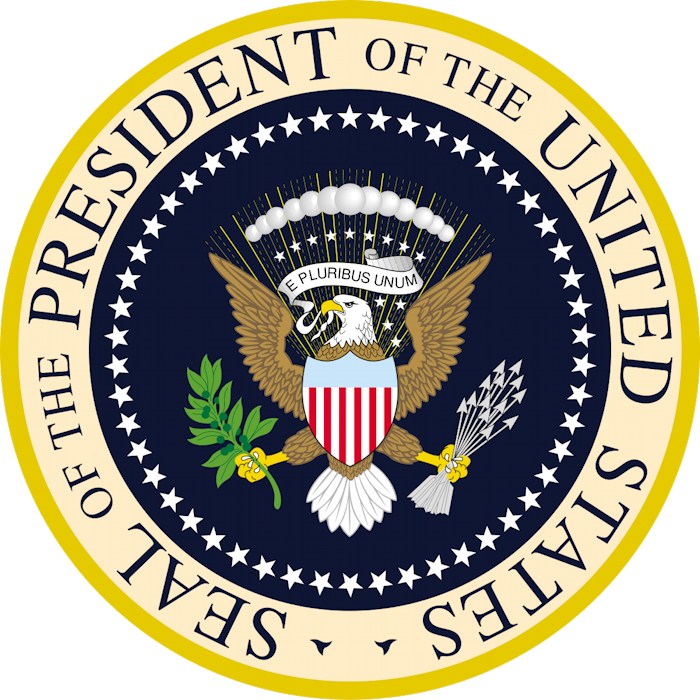
The Seal of the President of The United States is the official coat of arms of the U.S. Presidency, and is based on the Great Seal of the United States [below], which is used by the federal government to verify the authenticity of certain official documents. The basics of the current design go back to 1877. After a formal redesign was initiated by Franklin Roosevelt, it was taken up and finalized by Harry Truman in 1945.
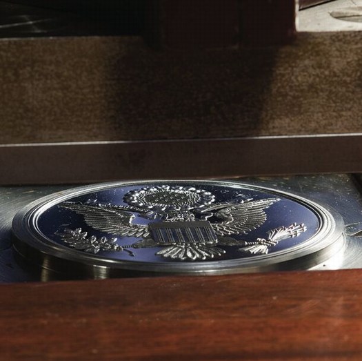
Counter-die for the Great Seal of the United States
In that redesign, based on a painting provided by US Naval Commodore Byron McCandless, the eagle was switched from facing to the left-in the forward direction when used on a mounted flag-to facing right, dexter, the standard direction in heraldry. A press release of October 25, 1945 says the eagle faces “right-the direction of honor-but also toward the olive branches of peace” it holds in its right talon.
The Seal design has been unchanged since 1960, when the 50th star was added to its border recognizing the inclusion of Hawai’i in the United States.
The Seal is used on the lectern for presidential press conferences. It appears on the side of Air Force One, Marine One, and presidential limousines. It is affixed to the balcony of the White House for state arrival ceremonies. The Secret Service is authorized to use the Seal of the President on merchandise it sells for charitable fundraising in its White House Online Gift Shop.
The law governing the use of the Presidential Seal is contained in Title 18 U.S. Code § 713. It is primarily concerned with using the Seal to falsely imply endorsement or support for commercial activities by the Government or the President, and with the wrongful exploitation of the Seal for commercial gain:
(a) Whoever knowingly displays any printed or other likeness of the great seal of the United States, or of the seals of the President or the Vice President of the United States, or the seal of the United States Senate, or the seal of the United States House of Representatives, or the seal of the United States Congress, or any facsimile thereof, in, or in connection with, any advertisement, poster, circular, book, pamphlet, or other publication, public meeting, play, motion picture, telecast, or other production, or on any building, monument, or stationery, for the purpose of conveying, or in a manner reasonably calculated to convey, a false impression of sponsorship or approval by the Government of the United States or by any department, agency, or instrumentality thereof, shall be fined under this title or imprisoned not more than six months, or both.
(b) Whoever, except as authorized under regulations promulgated by the President and published in the Federal Register, knowingly manufactures, reproduces, sells, or purchases for resale, either separately or appended to any article manufactured or sold, any likeness of the seals of the President or Vice President, or any substantial part thereof, except for manufacture or sale of the article for the official use of the Government of the United States, shall be fined under this title or imprisoned not more than six months, or both.
In 1972 Richard Nixon promulgated regulations about authorized uses of the Presidential Seal by issuing Executive Order 11649. The Seal, it states, may be used by the President. It may be reproduced for “Use by way of photographic or electronic visual reproduction in pictures, moving pictures, or telecasts of bona fide news content.” It is permitted “in libraries, museums, or educational facilities incident to descriptions or exhibits relating to seals, coats of arms, heraldry, or the Presidency.”
In 1976 Gerald Ford amended EO 11649 by issuing EO 11916, further authorizing “Use in encyclopedias, dictionaries, books, journals, pamphlets, periodicals or magazines incident to a description or history of seals, coats of arms, heraldry, or the Presidency.”
Section 2 of EO 11649 goes on to echo 18 U.S. Code § 713 (b) in constraining commercial exploitation of the Seal:
The manufacture, reproduction, sale, or purchase for resale, either separately or appended to any article manufactured or sold, of the Seals of the President or Vice President, or any likeness or substantial part thereof, except as provided in this Order or as otherwise provided by law, is prohibited.
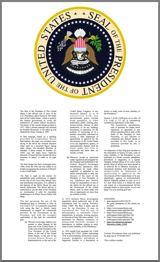
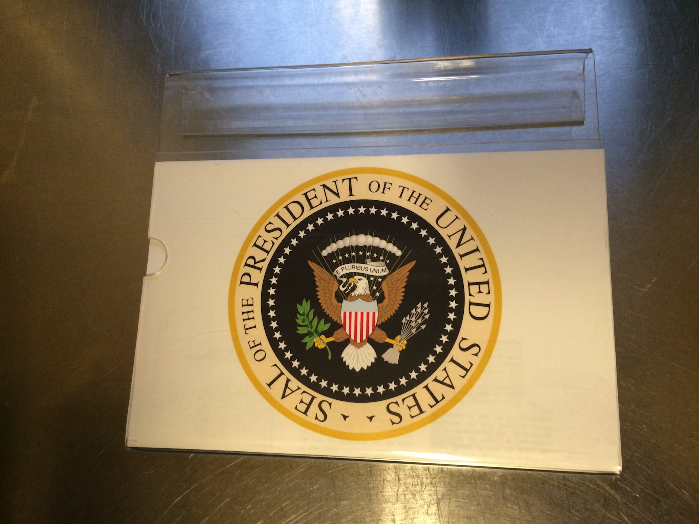
greg.org, Untitled (Presidential Seal), 2017, digital print on bond in acrylic message holder.
Sheet: 14 x 8.5 in. Folded: 6 x 8.5 in., ed. 25 + 5 AP
An adaptation of this blog post incident to the description or history of seals, coats of arms, heraldry, or the Presidency is now published as a books, journals, pamphlets, periodicals or magazines, in a signed, stamped, limited edition of 25, with 5 artist proofs, three of which have been placed in or reserved for in libraries, museums, or educational facilities, with absolutely and unequivocally no impression of sponsorship or approval by the Government of the United States or by any department, agency, or instrumentality thereof.
Digitally printed in color on 14 x 8.5 inch white bond, it is folded by hand and stored in a decommissioned EZ-GO message holder in clear acrylic, so you can hang it on your fucking golf cart.
Untitled (Presidential Seal) is $20, shipped. [via paypal]
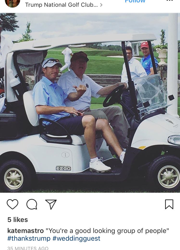
ARTIST PROOF UPDATE: It works.


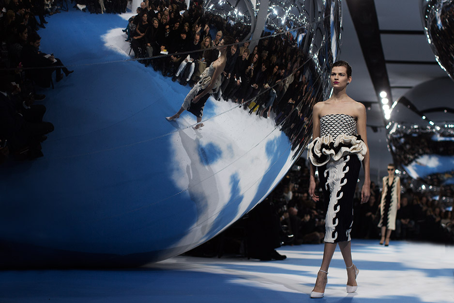
 Dior F/W2013-4, image: not thesartorialist


