
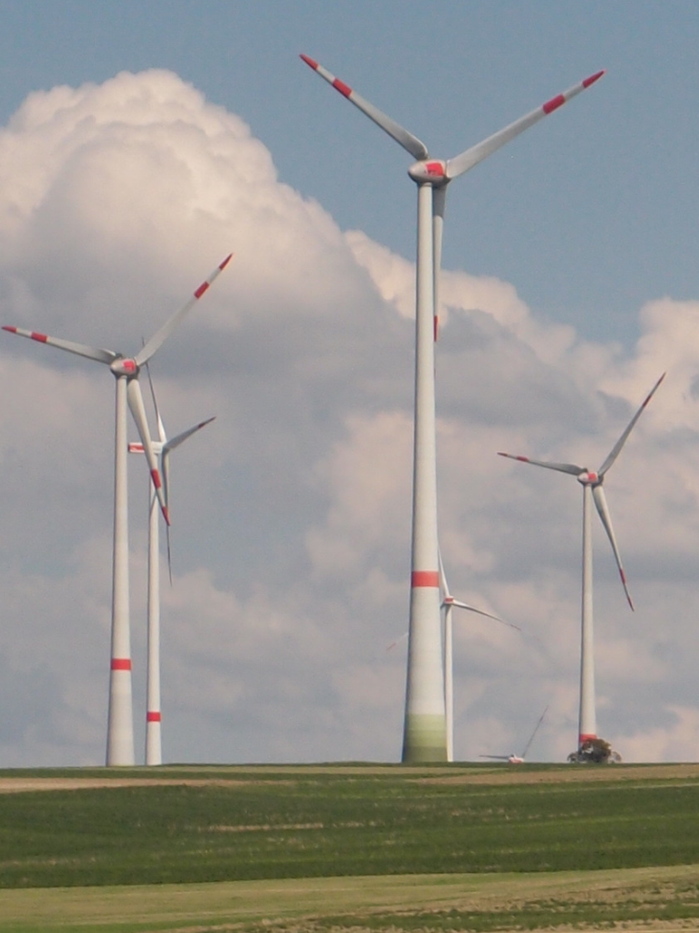
While driving along the autobahn yesterday near Stuttgart, we passed many wind turbines. Some of them have been painted at the base with a gradient of various greens or browns. This is an attempt to minimize their visual intrusiveness on the landscape.
It was only by the time we passed the second installation that a clear enough photo could be taken. Then I realized that not all turbines were painted, and each painted turbine was painted differently.
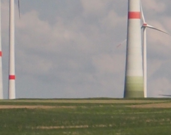
By the third cluster of turbines it was clear that each painted turbine was painted in an approximation of its own site, as viewed, fleetingly, from the vantage point of the freeway itself. The gradient is a representation of the landscape, in the landscape.
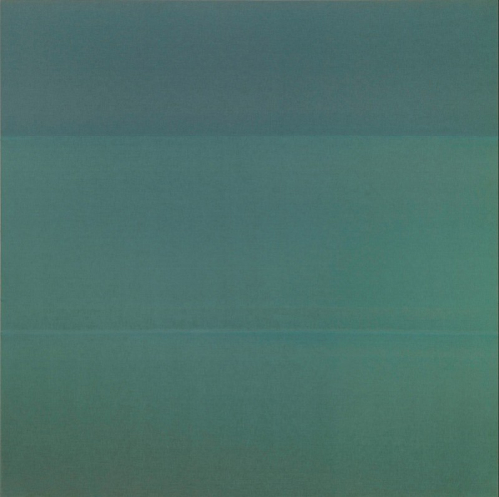
Grand Duc Jean loaned his Palermo, Untitled (1968), to MoMA’s Color Chart show in 2008. image: jens ziehe via x-traonline
They recalled to me at the time the textile works of Blinky Palermo, but as I see the photos now, their similarity to Gursky’s Rhein seems more direct. In any case, so far I have found little discussion of these word, or the principles of their production. When I get back to a computer, though, I will update this post with some coordinates so you can hurtle past them, too.
UPDATE: they’re a corporate trademark. See below.
When I got back to a laptop to find more images, I realized there is no Street View in Germany beyond what Google launched with in 2010. Also, the gradient paint is not a locally produced, or site-specific feature after all, but the trademarked design of Enercon GmbH, the wind turbine manufacturer.
The clues came quickly. The “Wind Power In Germany” wikipedia article includes the above image of an Enercon E70-4 being installed in 2005.
Turm Komponenten, image via: enercon.de
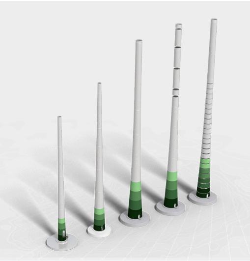
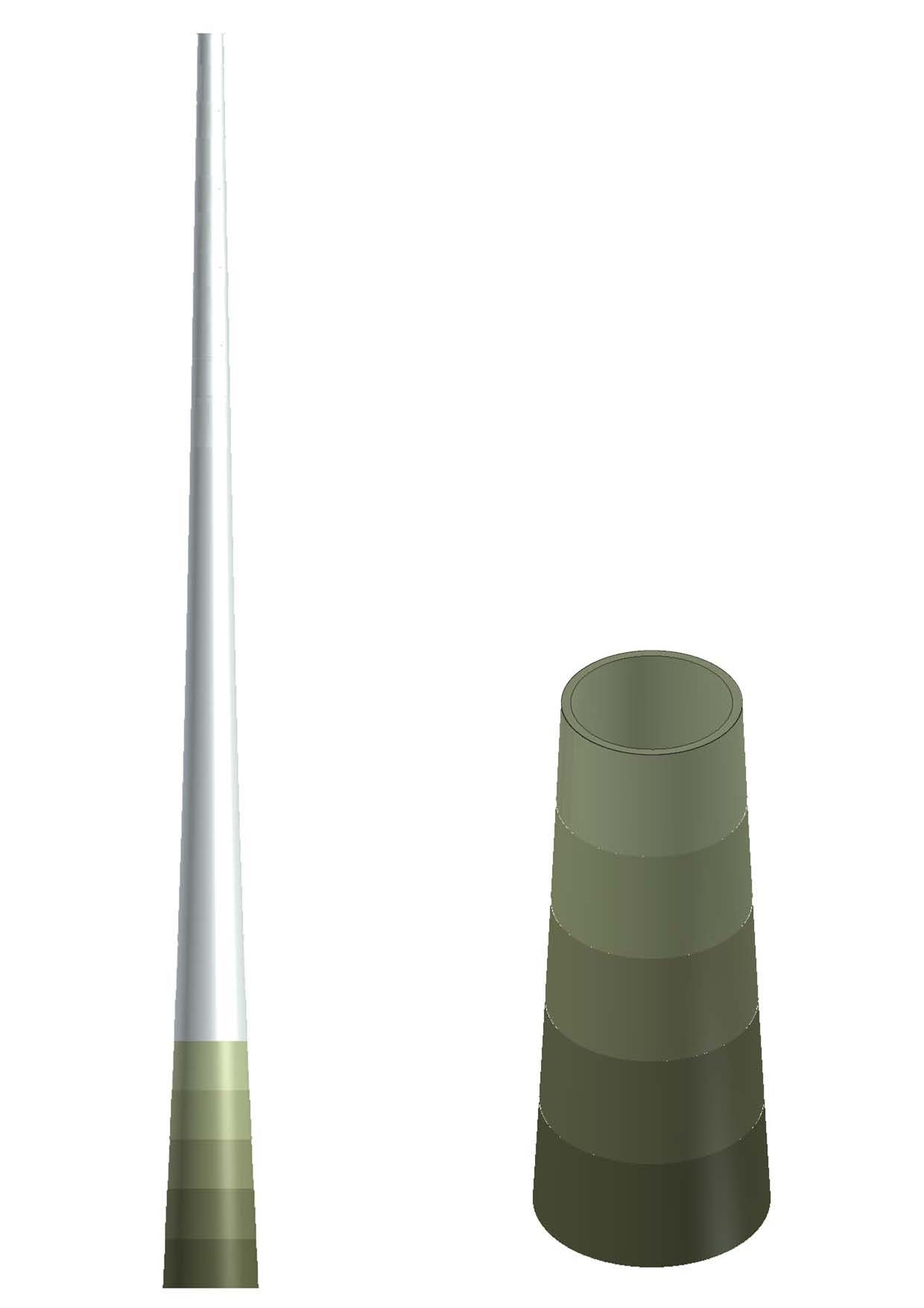
Enercon towers are available in both steel and precast concrete, depending on the height. Brochures [pdf] note the “green tower shades”, or “die grüne Farbabstufung”, are a registered trademark. It was apparently once called the “Enercon Natural Color Scheme,” but now that phrase only lingers in scraped copies of the company’s older wikipedia page. Norman Foster’s credit as the tower & turbine designer persists.
Six trademark or design applications cover various forms of Enercon’s gradient scheme as a three-dimensional mark, a color mark, and “another type of mark.”
[l, r:] Enercon GmbH reg. 002346443 and 002346542. Maybe one was for offshore wind farms? idk. images via dpma.de
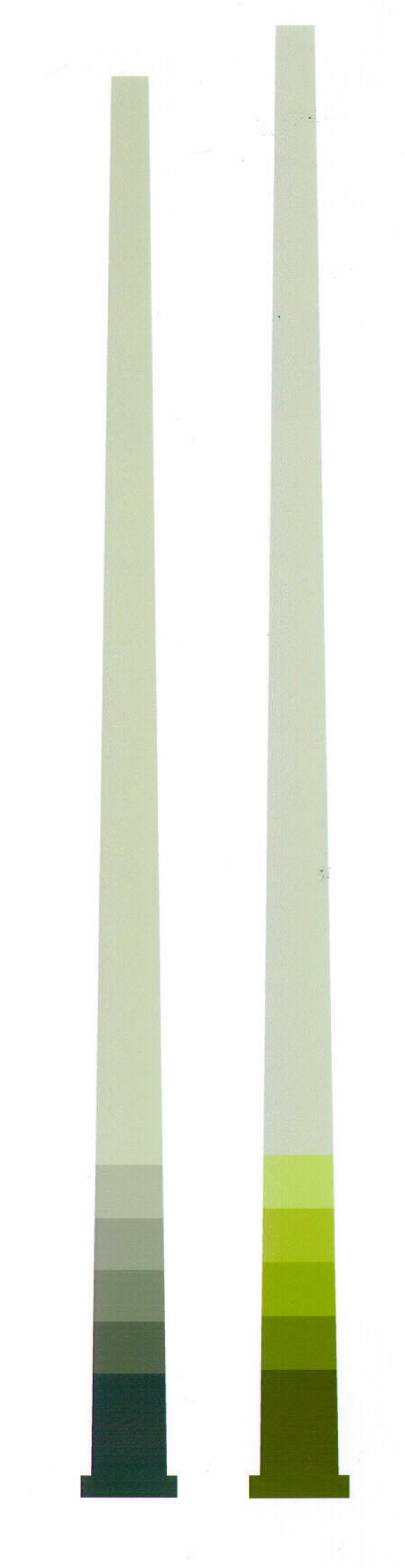
The colors are variously specified by code and various mix ratios. The two shown above are different; the greener one on the right, which seems to be most like the ones I’ve seen, is listed as “cancelation pending,” though as a non-lawyer largely unfamiliar with German or EU trademark practice, I don’t know what it means.

One application simply lists five equal bands of green ranging from “very dark” to “very light.” [It was rejected.]
This application [010989028, from 2012] describes the gradient as reaching “about 2%” of the overall height of the tower. Presumably, this is missing a zero, and should be 20%. In any case, given these formulas for the ersatz Enercon Natural Color Scheme, my previous assumption of site- and vantage point-specificity appears to be incorrect; these factors influence the works’ composition only inasmuch as the site and purchase date determine the model of turbine installed.
It also appears that Enercon’s trademarks only apply to wind energy converters and models and toys of the same. So works of art are still fair game. Even, perhaps, if they are life-sized and windmill-shaped.