I’ve been slowly picking my way through Anne Rorimer’s 1978 article on Blinky Palermo, which I think laid down the path for most Palermo understanding that followed, at least in English. And maybe there’s a metaphor for a discourse that goes to such clunky effort to not say 200cm or 80cm, much less know what it means physically:
The Stoffbilder are often square in format, though not exclusively, generally measuring 78 3/4 inches square. The standard width of fabric, which in Europe is usually 31 1/2 inches, determines the maximum possible width of each area of color.
Lot 44, Blinky Palermo, Untitled, n.d., graphite on paper, 8 1/2 x 11 in., sold from the collection of Donald Baechler at Stair in Feb. 2024 for $4,750
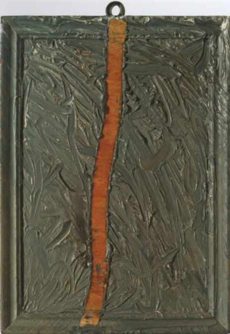
Gerhard Richter, Abstraktes Bild, CR-36-b, 1964, 14 x 10 in., oil and tape (?) on panel, image via gerhard-richter.com
David Rimanelli just posted this little Gerhard Richter painting on instagram, and I swear, I cannot figure out how I’ve never noticed it before.
It is just 14 x 10 inches, 35.7 x 25.5 cm, an oil on panel—the description on Richter’s website, and the Sotheby’s lot description from 2007 both say it is oil and tape on panel, but I really do think the absence of the tape is the point here.
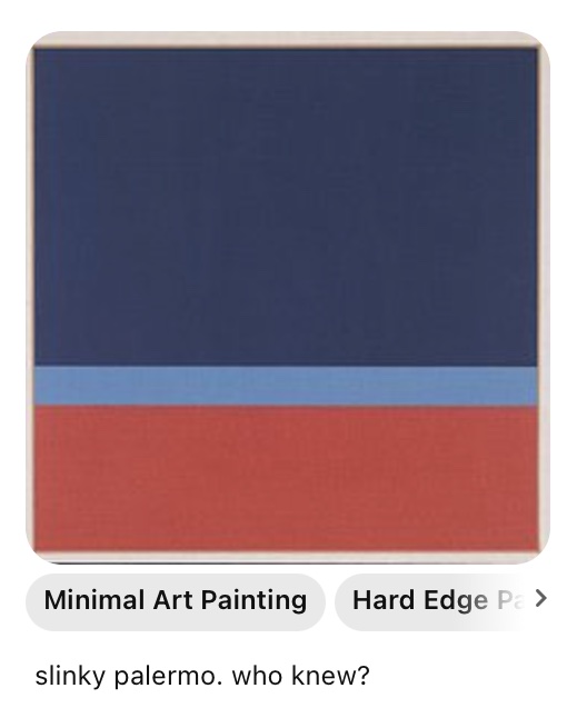
I scanned over my neighbors. Slinky Palermo, Slinky Palermo Now I’m in all the papers.
Who knew, indeed?: A “minimal art painting”, n.d., by Slinky Palermo on Thai Pinterest.
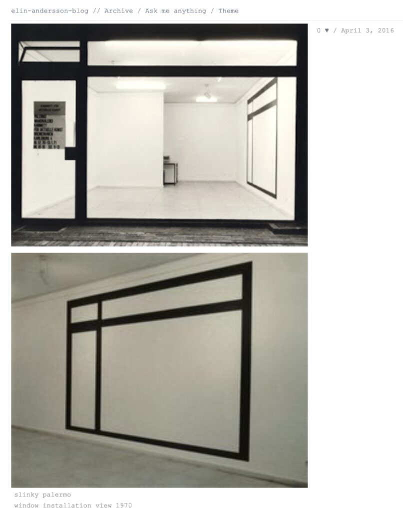
So far we have only two images of artworks attributed to Slinky Palermo, from Pinterest [above] and tumblr [below]. I guess technically, it’s slinky palermo.
Slinky Palermo cited in a Mutual Art syndication of a c. 2006 Jerry Saltz Village Voice review of Michael Krebber originally digitized by Proquest; a tumblr; and an Italian rare book dealer’s listing for a 1968 group show exhibition catalogue, image: google
the most significant critical information we have on the artistic practice of Slinky Palermo comes from just two sources.
The first is the Dia Art Foundation, which exhibited Slinky Palermo works from 1964-1997 in 2011, as seen in the results for two slightly differently worded Google searches:
“‘Slinky Palermo’ was in fact the assumed name adopted by the young German art[ist?]… [unknown]”“Slinky Palermo’s commitment to painting was steadfast during the late 1960s, a period in which the medium was widely felt as untenable for… [unknown]”
It may be possible that additional Google searching will yield more detail from these truncated excerpts, in the way that you can, in desperation, search phrase by incremental phrase in a Google book snippet view.
“Slinky Palermo — A retrospective of editioned graphic works by this German artist (1943-1977) who saw abstraction as an inquiry into the philosophy of phenomenology” image: google books
Whatever it may have been in the past, from this point forward, Slinky Palermo is an artist who sees abstraction as a Google search into the philosophy of epistemology.
Given the absence of actual books in the Google Books results, it seems likely that most Slinky Palermo mentions can be attributed to OCR software that predates Google’s own scanning initiative. Whether it’s a steadfast commitment painting in the face of untenable something, or glitching industrial-scale digitization, Slinky Palermo is a tenacious artifact—a bookmark, if not a flagbearer—of a specific historic moment and context, and for those that inhabit and revisit it. Which, looking prospectively, is all of us.
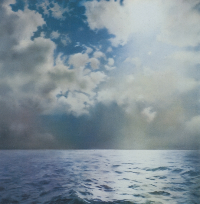
Gerhard Richter, Seestück (Gegenlicht)/ Seascape (Contre-jour), [CR233], 1969, 200x200cm, oil on canvas. image: gerhard-richter.comWhen he first showed his seascape paintings in 1971 Gerhard Richter was criticized for being kitschy and romantic, and for aping Caspar David Friedrich. In the catalogue for Richter’s 2011 Tate retrospective, Panorama, Mark Godfrey maps out an important nuance about Richter’s relationship to Friedrich and suggests a different, closer, and more conceptually skeptical source.
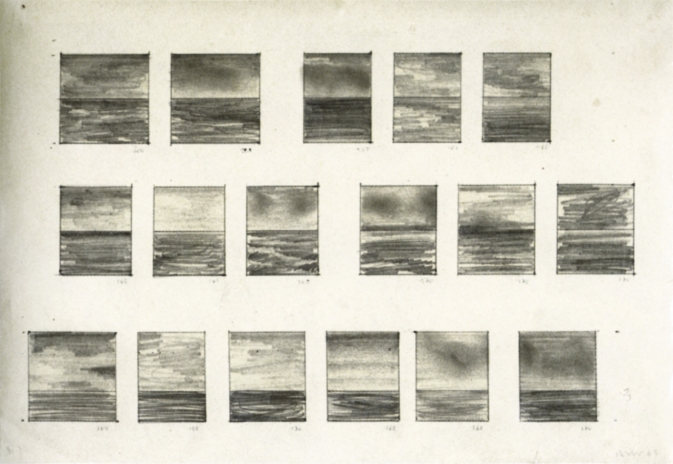
Though he described them in 1991 as appearing “endlessly repeatable and without end,” Richter only made ten large, square Seascape paintings in 1969, and three in 1970:
Just about all the seascapes (many of which were included in the Atlas) depict collaged motifs. The sea and cloud sections came from different photographs then collaged together in a single image. The successful paintings were dependent on finding exactly the right mood between the combined images. There were also a couple of paintings, for example, where I used two halves of the same image of the sea [CR: 244, CR: 245]. Although I had a rather bad feeling about them, I was visited by George Maciunas, who thought they were absolutely wonderful and for that reason I allowed them to survive, despite feeling they were very decorative.
[Sidebar, but this phrase “I allowed them to survive” jumped out at me. Richter’s quote comes from “Comments on some works, 1991” which was prepared for the artist’s (earlier) Tate retrospective. It is not too much to say that a throughline in Richter’s comments is destruction, both as a subject and as a process. So for Richter a retrospective is an occasion to review a bunch of art you haven’t seen in a while, and try to remember why you didn’t destroy it when you had the chance.]
A 1969 drawing, 17 Seascapes, shows Richter experimenting to find the best size, proportion, and composition for seascape paintings, which 2009 Tate retrospective curator Mark Godrey notes, were conceived as serial works. [It was the 60s, after all.]
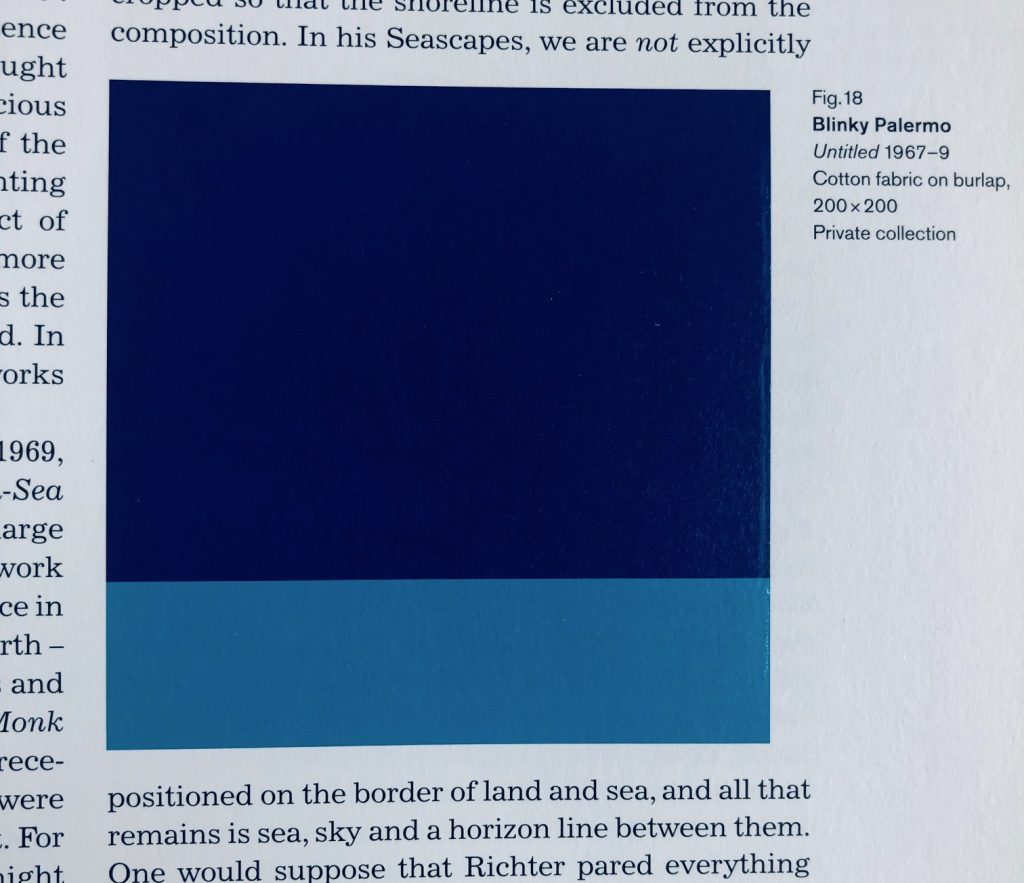
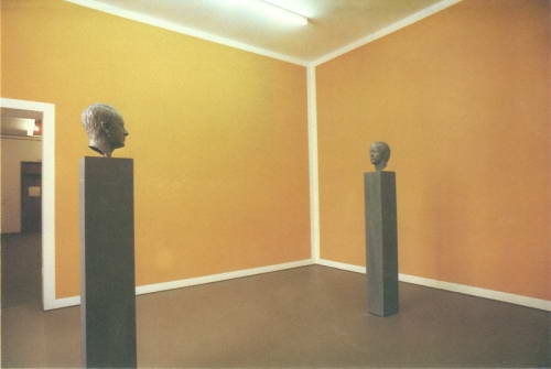
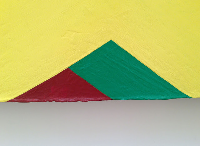
Fig. 18 Blinky Palermo, Untitled 1967–9, Cotton Fabric on burlap, 200 x 200, Private collection, image of Panorama, p. 81, credited somehow as “image courtesy Sotheby’s Picture Library,” who swears it is a photograph, not a digital concoction.
Godfrey also notes that the size, shape, and horizon line Richter settled on for Seascape (Contre-Jour) [yes, from the stamp, where the cropping now feels like a crime] were identical to a work by his closest friend and collaborator at the time, Blinky Palermo. Palermo’s Untitled (1967-69) is a 200 x 200 cm Stoffbild (Cloth Picture), a painting of bands of monochromatic commercial fabric–which was sewn together by Richter’s first wife Ema.
“Richter was crossing Friedrich with Palermo to make the Seascapes,” Godfrey wrote. Palermo and Richter were actually working in the “chasm” that the 20th century wars had opened between their 1960s Germany(s) and Friedrich’s.
Writing about their collaborations in the Dia catalogue for To The People of the City of New York, Christine Mehring associates Palermo’s Pop-related, readymade cloth pictures with Richter’s color chart paintings. The Seascapes, meanwhile, call out the landscapey cloth paintings’ claims for abstraction.
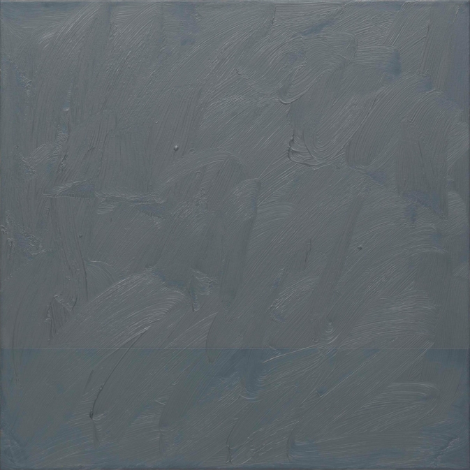
Gerhard Richter, Seascape (Grey), 1969, 70 x 70 cm, image: gerhard-richter.com
Meanwhile no one mentions this 1969 painting, titled Seascape (Grey) [CR 224-16]. At 70 x 70 cm it feels bigger than a study. A geometric seascape of Palermo-ish composition is overpainted with grey, to near illegibility. Knowing how Richter gets about overpainting, the nearness of illegibility is just. right.
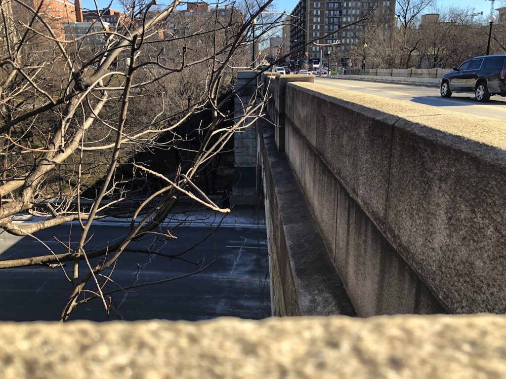
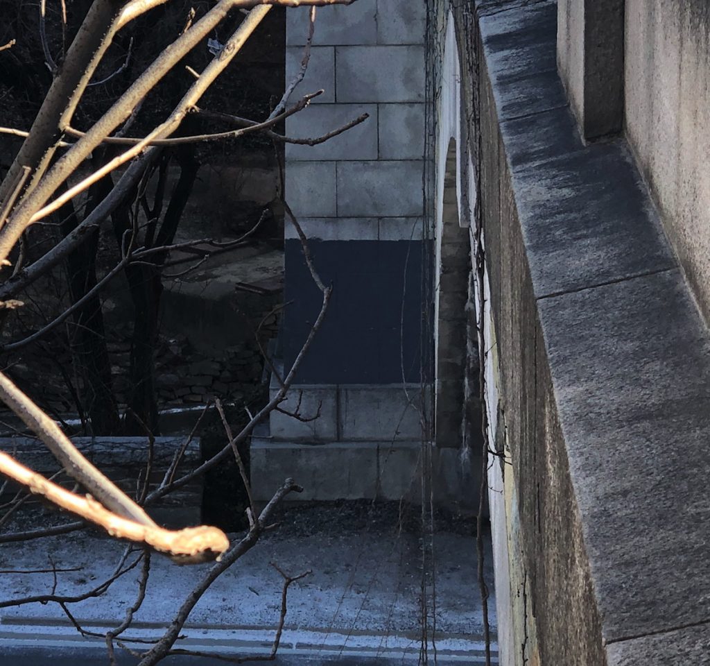
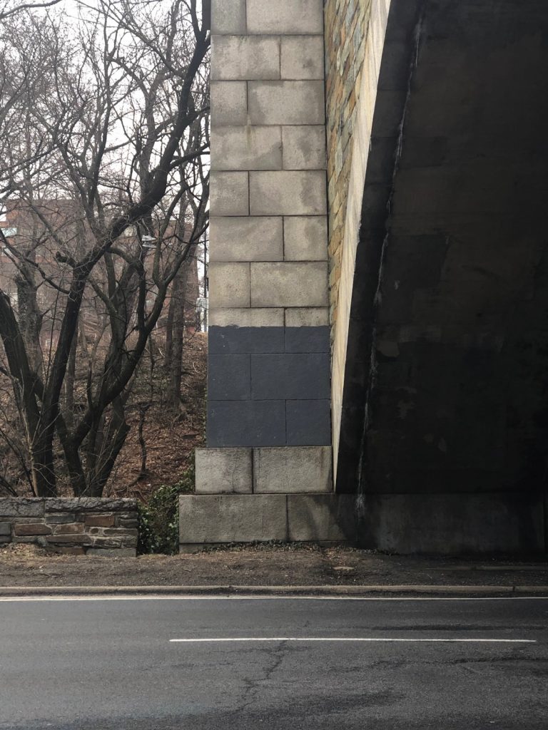
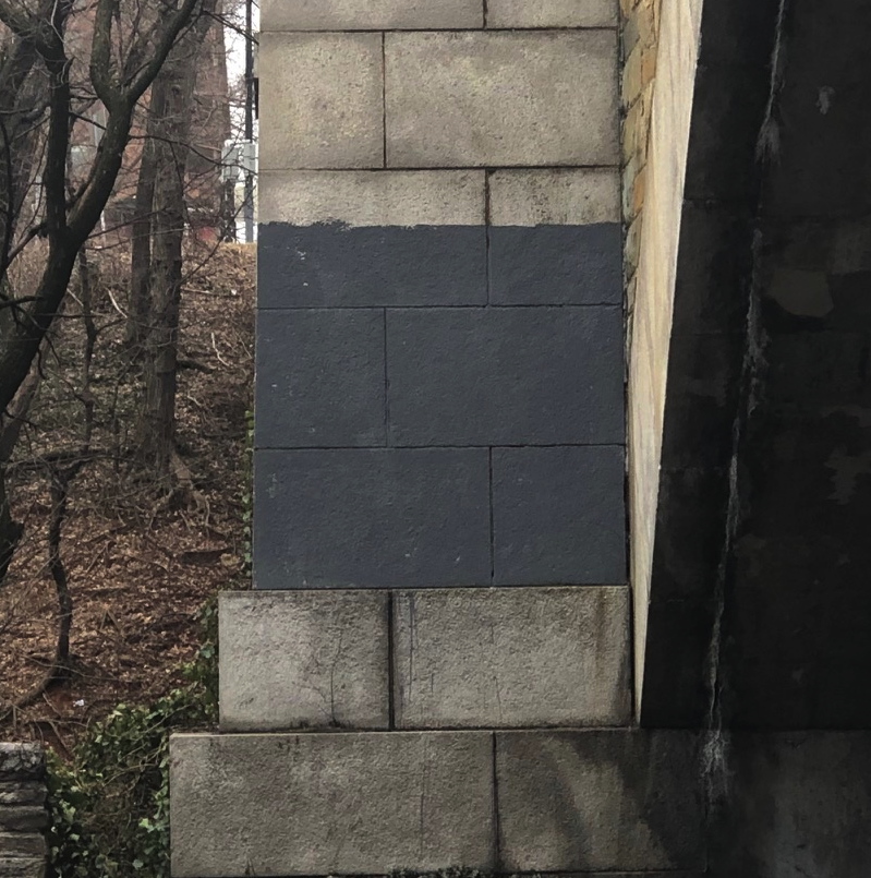
Untitled (monocrome du pont), 2019, enamel on stone, est. 150 x 150 cm, installation view from Lauzun’s Legion Bridge, Washington, DC
Again with the buffing, I am not a fan. But I’m also not going to pretend it doesn’t exist.
The 2e Légion des Volontaires Étrangers de Lauzun, comprised of foreign mercenaries led by the duc du Lauzun, was part of the Compte du Rochambeau’s expeditionary force to aid the colonists in the American Revolution. They marched from New England to Yorktown, Virginia, where they played a pivotal role in the American victory.
On their way, the Légion du Lauzun crossed the Potomac just east of Georgetown. Washington, DC did not, obviously, exist yet. In 2004, following its renovation, the P Street Bridge connecting Georgetown to Dupont Circle was renamed Lauzun’s Legion Bridge.
Untitled (monocrome du pont), 2019, installation view
This nearly perfect square monochrome painting is installed on the east pier of the bridge, at traffic level for the Rock Creek Parkway. Except for fleeting views from passing cars, where its deep grey surface and uncommonly crisp geometric form positively pop off the stone support, it is best seen from the bike and jogging path on the west side.
I’m guessing. It was butt cold on top of this bridge today, and that is as far as I was gonna go.
SPRING-LIKE RESPITE UPDATE:
installation shot, parkway level
imagine you’re standing in the middle of the road…
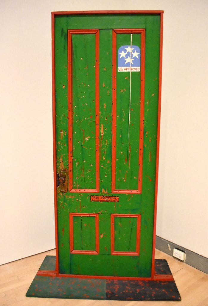
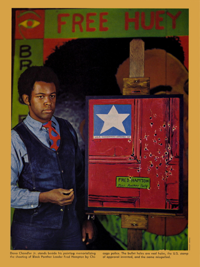
Fred Hampton’s Door 2 (1975), installed in Soul of A Nation at The Brooklyn Museum, image:gregcookland
Getting the colors of that Melvin Edwards X Blinky Palermo joint in my head was like learning a new word: you start hearing it everywhere. Like in Dana Chandler’s 1975 painting, Fred Hampton’s Door 2, which is in Soul of the Nation at the Brooklyn Museum. Greg Cook has a great post on Wonderland about Chandler, a prominent Black Power activist and artist from Boston, who painted at least two versions of Fred Hampton’s Door, complete with [bullet] holes, to memorialize the young Black Panther leader and to protest his murder at the hands of Chicago police.
Chandler’s painting in Soul of a Nation was made in 1975, after his original 1970 painting was stolen from Expo ’74 in Spokane, Washington. The original was a framed painting of a section of Hampton’s door; the second version was actually a door. Both had holes that are meant to be read as bullet holes. The original had one big white star that read (to me, anyway) as an armed forces service star; the second one has a cluster of four stars, arranged like an admiral’s insignia. But the dominant colors are Pan-African red and green.
Dana C. Chandler, Jr. posing for Time Magazine (6 Apr 1970) with a 1970 painting then titled, Freddie Hampton’s Door.
This is the only photo I’ve seen of the original painting; it ran as a full page in Time Magazine in April 1970, illustrating an article on Angry Black Artists [sic].
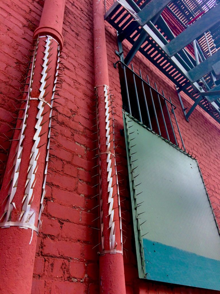
Untitled Palermo (South Park), 2019, enamel and latex on wood and steel, enamel and steel on cast iron and brick, installation image by Bryan Finoki, aka @subtopes
When he first tweeted this photo from San Francisco, Bryan Finoki saw #fortressurbanism. I saw metal af Blinky with a Melvin Edwards twist.
Untitled, Palermo, 1970 image ganked from wherever (it is not so easy to tell in this jpg, there are actually three bands of green. hashtag metadata, but I can’t tell if this is a different work from the Untitled, 1968, belonging to Grand Duc Jean)
My principled stand against buffing is not softening, and I don’t condone it, but I can’t not appreciate the occasional aesthetic results. Until I’m able to source the exact anti-climbing spike strips in this installation, to see this work you’ll have to go–or google your way–to 2nd & Brannan streets.
Which is fine. Palermo was very into site specifics, which I can appreciate. The painted wall and pipes here feel especially significant.
I’ve recently been taking a long look at the work of Sam Gilliam. There was one drape installation he made in the 1970s at a gallery, and when he reinstalled the piece in a museum, he added a vertical beam to stand in for the gallery’s steam riser. I think this painting, though standalone, would benefit from a similar treatment [chef’s finger kiss emoji].
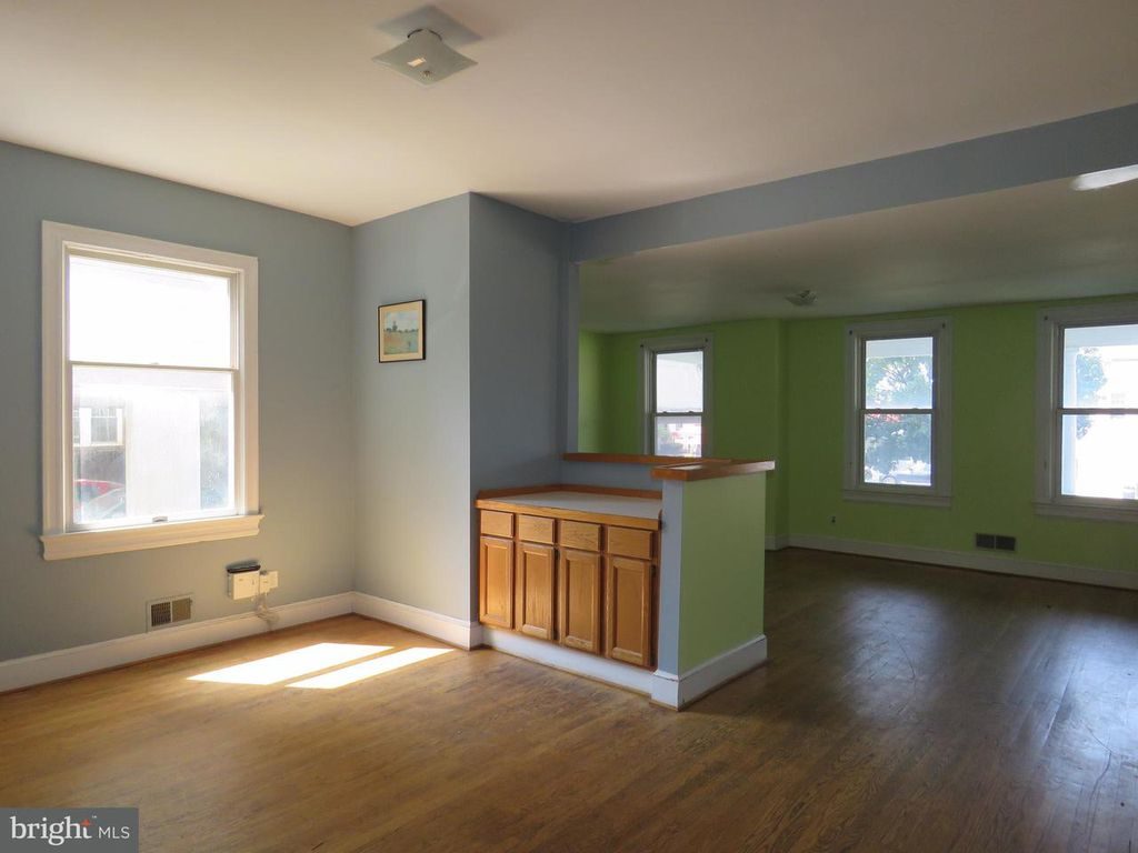
Untitled (One Painting For Two Rooms By Cactus Cantina), 2017, cornflower blue and green wall paint, landscape painting (framed), charcoal, dimensions variable, installation view
I am pleased to announce that a work I thought was gone has perhaps come back on view in Washington, D.C. The title, obviously, is derived from Gerhard Richter’s 1971 work, Two Sculptures for a Room by Palermo (below). But its creation, including all the vagaries involved, are inspired directly by Palermo’s work and practice.
Gerhard Richter, Two Sculptures for a Room by Palermo, 1971, plaster & wood, painted, in ochre room, image:gerhard-richter.com
Talking about his late student in a 1984 interview with Laszlo Glozer, Joseph Beuys said:
I believe that one of the most important things for art–and he knew it too–is the behavior of people in general. The way people live, the way they live in their space. The way people live was very important for him. The way they inhabit, the way they live, what chairs they sit on, or what they have around them, what they stuff into themselves.
Untitled (One Painting For Two Rooms By Cactus Cantina), 2017, cornflower blue and green wall paint, landscape painting (framed), charcoal, dimensions variable, installation view
I’d seen the painting first (what they have around them), but it was that charcoal (the way they live) and the horizontal blue passage on the upper left that made the work come into being (the way they inhabit). But that was last year.
Beuys again:
Well, if I could, I would say one should perceive his works like a breath. They have something of a breath about them, a breath that vanishes…One ought to see his paintings more like breath that comes and goes, it has something porous, and it can easily vanish again. It is also highly vulnerable. Vulnerable, say, like a cornflower: when you out it into light, it fades very quickly. So one has to perceive that breathlike being as an aesthetic concept and not as a solid structure…
I still don’t know whether to post these matters, or whether it differs from filing it away, or from seeing it, or thinking it. I mean, it’s posted now because the house where this was installed last year came back on the market, with the same listing photos, and I saw them again. But what changes? Is the work still there? Would it matter if it is or isn’t? Does it matter what that crappy little painting even is?
Which seems as good a time as any to mention another work from last year, which I intentionally didn’t post, to see what it was like. Does it change now? Now that situation has been moved out and gut renovated for sure? Now that I can search for it in a different dialogue box? Now that someone else can, too?
For me the value lies in the wonder, the fleeting marvel, the tiny layers of history, of how some people lived overlaid with how other people staged. So I’m good.
While driving along the autobahn yesterday near Stuttgart, we passed many wind turbines. Some of them have been painted at the base with a gradient of various greens or browns. This is an attempt to minimize their visual intrusiveness on the landscape.
It was only by the time we passed the second installation that a clear enough photo could be taken. Then I realized that not all turbines were painted, and each painted turbine was painted differently.
By the third cluster of turbines it was clear that each painted turbine was painted in an approximation of its own site, as viewed, fleetingly, from the vantage point of the freeway itself. The gradient is a representation of the landscape, in the landscape.
Grand Duc Jean loaned his Palermo, Untitled (1968), to MoMA’s Color Chart show in 2008. image: jens ziehe via x-traonline
They recalled to me at the time the textile works of Blinky Palermo, but as I see the photos now, their similarity to Gursky’s Rhein seems more direct. In any case, so far I have found little discussion of these word, or the principles of their production. When I get back to a computer, though, I will update this post with some coordinates so you can hurtle past them, too. UPDATE: they’re a corporate trademark. See below.
As always, Abelow has the goods. In this case, it’s nice detail shots of the “interesting” parts of Al Held’s Alphabet Paintings at Cheim & Read, which are very nice.
The more time goes by, the paint goes down, the more paintings like this and the brushy little Blinky Palermos up at MoMA right now that I look at, the more I start to wonder if finish fetish is just not where it’s at for me after all.
Will the wonders of WWI-era camo never cease? The Wary Meyerses have an awesome post about early German & Austrian Lozenge Camo, which was used primarily for airplanes. An asymmetrical polygon pattern was printed onto aeronautic linen, which comprised the body skin of early bi-planes. Colors were keyed to the viewing perspective: lighter lozenges were used on underside of the plane, to blend with the sky, while darker colors were meant to blend with the ground when viewed from above. There was also a night-time colorway.
First let’s get the adorable synchronicity between German fighter plane camo and Dutch Google Map camo out of the way right now. Noted and appreciated.
Now let’s ask the obvious question: fabric? Where can I get some? Because obviously, it should be made into Blinky Palermo-style Stoffbilder, Fabric Paintings [as seen below at the Kunstverein Düsseldorf in 2008]:
And the not-as-immediately-obvious answer: Vintage Aero Fabrics of Bardstown, Kentucky, where Ross Walton produces historically accurate–and FAA-certificated–lozenge camo fabric for the vintage plane restoration community using authentic Belgian linen and original production techniques. Flight of the Lozenges [warymeyers]
Fingerspuren/Finger Marks, with Palermo, 1970, image via gerhard-richter.com
Despite an 11-year difference in their age, Gerhard Richter and Blinky Palermo became fast friends in the early 1960s. Richter’s first wife Ema sewed Palermo’s groundbreaking Stoffbilder/Cloth Pictures starting in 1966, and Palermo influenced Richter’s move towards readymade abstraction with the Color Chart paintings.
In 1970, while Palermo was studiosurfing among his Dusseldorf friends, he painted the first stencil/multiple version of his blue triangle over Richter’s door. And then the two artists collaborated for the first time, on a painting.
Or rather, two paintings: Fingerspuren (Fingermarks) was a grey monochrome diptych, painted by hand, one side by each artist, that formed a 2-meter square whole. Palermo’s canvas is the much busier one on the left.
In Dia’s 2009 book on Palermo’s masterpiece, To the People of New York City, Christine Mehring wrote about Fingerspuren:
It is tempting to see this as a manifestation of what many believe are differences in the artists’ temperaments: Richter’s more calculated, meticulous manner of painting versus Palermo’s more process-oriented practice…It seems more likely that Palermo’s disarrayed, isolated marks are gestures of self-assertion. After all, the gray monochrome was the domain of Palermo’s friend, who furthermore relayed that the diptych originated from his own working on a gray monochrome and asking Palermo to “join in, and make one too.” Fingerspuren remained a merely semi-collaborative beginning to Palermo and Richter’s collaborative period.
This collaborative period was at its peak in 1971, when the duo’s painted wall and sculpture installation was shown at Heiner Friedrich’s gallery in Cologne, and when Fingerspuren was included in Richter’s first major retrospective at the Kunstverein in Dusseldorf.
I haven’t been able to find any info on the when or the how of Fingerspuren‘s subsequent destruction, but maybe its merely “semi-collaborative” nature accounts for some of the why.