
At least the Space Force guy is on the job.
the making of, by greg allen

At least the Space Force guy is on the job.

Robert Smithson, Underground Projection Room (Utah Museum Plan), 1971, graphite on paper, 9×11.75 inches, lot 145 @ LA Modern, 21 June 2023
According to the friend of my mom’s whose family used to own the ranch land on and around Rozel Point, the basalt-strewn hill above the Spiral Jetty is full of rattlesnake dens. I don’t know if Robert Smithson knew this when he picked the site, but I doubt it. He was more focused on the scenic qualities: the pink salt water of the Great Salt Lake, and the collapsed oil derrick a little further along the shore.
I’ve thought about it a lot, though, especially when I think about Smithson’s original plan to show the Spiral Jetty film on a continuous loop in an underground screening room on the site. A sketch for that idea (above) will be sold next week at LA Modern auction house.
Which is as good an occasion as any to propose that Smithson’s idea be realized. For the snakes.
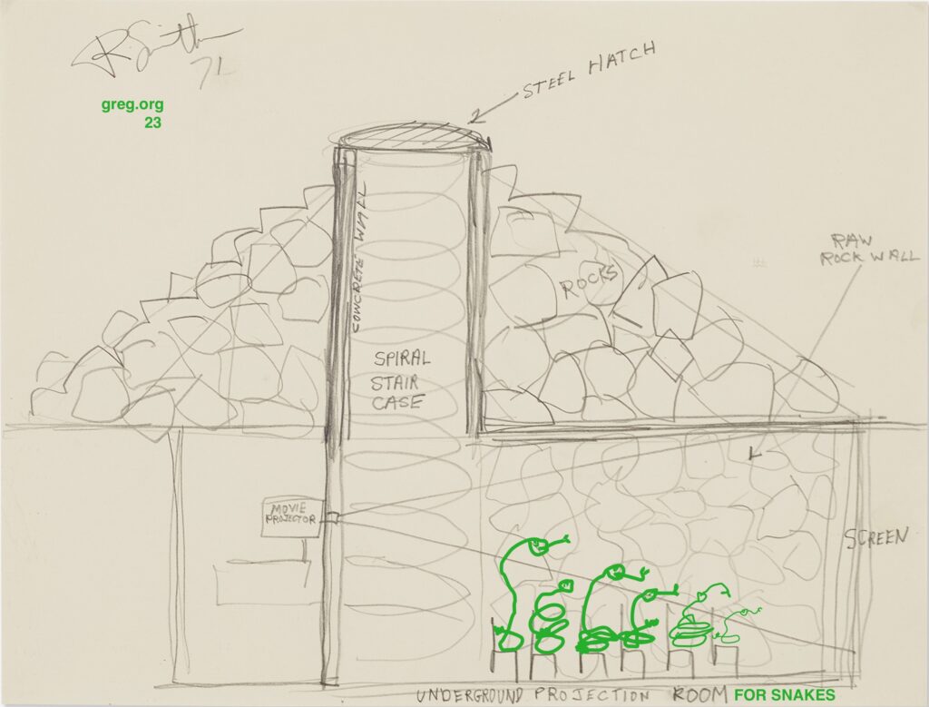
As half the human population on earth knows, tiny flatscreens are a thing. And so is solar power. Smithson’s film, Spiral Jetty, is 36 minutes long and can easily fit on a micro SD card that plugs into an Arduino-compatible 60×94 pixel TinyScreen+, which can be lowered into the snake den.

A small solar panel on the surface, connected to a battery connected to the Tinyscreen down below will keep the movie streaming endlessly, or until the heat death of the planet, whichever comes first. Before installing them for the snakes, I think I need to make a small edition of prototypes first. And to start by extracting out my copy of the film from the not-solid-state external drive. Fingers crossed that this project isn’t over before it starts
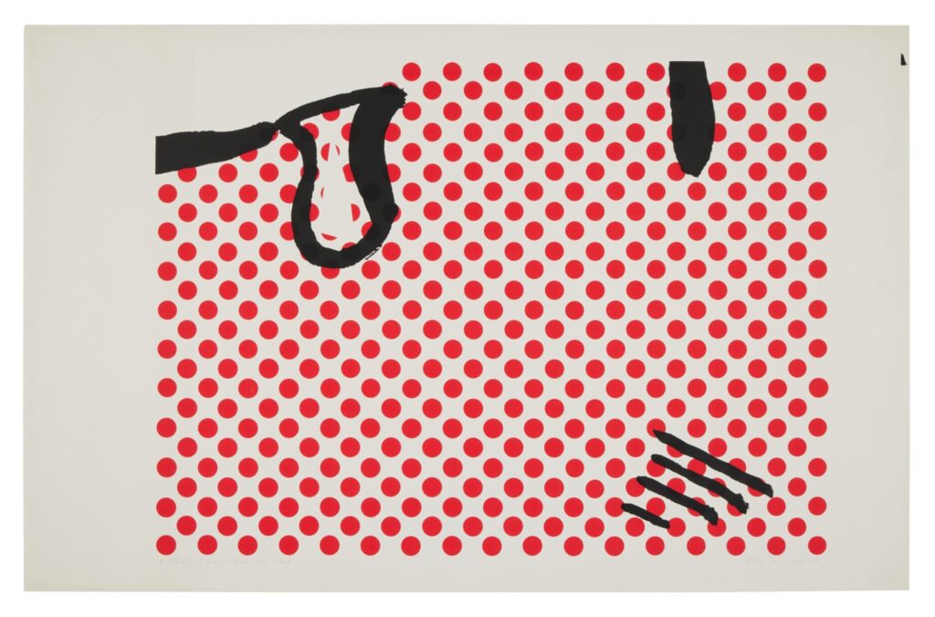
During his 1963 visit to the US to see Duchamp’s Pasadena retrospective, Richard Hamilton also picked up a Roy Lichtenstein poster/lithograph from Castelli. When he got back to the UK, he enlarged a tiny section to make his own two-color print edition, A Little Bit of Roy Lichtenstein for…, which he liked to give away to friends.
Today A Little Bit of Roy Lichtenstein for Mark sold at Sotheby’s, part of the collection of the artist Mark Lancaster, who studied with Hamilton, and who shot the photos for Hamilton’s translation of The Green Box. [His copy of it sold today, too.] Lancaster worked in Warhol’s Factory in 1964 while working on his dissertation on Stieglitz, and from 1972 until 1985, worked as Jasper Johns’ assistant and business manager [a lot of nice Johns prints in the sale, btw.] and as artistic director for the Merce Cunningham Dance Company. He somehow survived all that and only died in 2021. Gary Comenas did an amazing interview with Mark Lancaster for warholstars.org in 2004.
Continue reading “A Little Bit of Roy Lichtenstein for Mark”
Beginning the Spring of 2016 and running through the Fall, I put out Untitled (Free As In America), a series of Cady Noland sculptures replicated with the America beer cans that Anheuser-Busch InBev replaced Budweiser with in the run-up to the US presidential election. The concept was to remake any sculpture for only the cost of the raw materials it required.
Exactly none of these sculptures were realized in the window in which Budweiser’s America cans were available.

Now the window has reopened. As the right wing is consumed by its own flames of hate and violence, it seeks to transform that hate into consumption. Recognizing the futility of icing out the giant, international beer conglomerate for paying a trans woman to promote one of their products on her own social media channel, some grifter created an alternative: right-wing beer.

As long as this beer is actually for sale, then, I will make Untitled (Free As In America) sculptures available again. I will replicate any Cady Noland sculpture, replacing the Budweiser cans with perfect replicas of—when I started this post, it was going to be replicas of the grift beer. But no, it will be replicas of the 2016 America cans, made by the finest trans metallurgists and artists in the world. All proceeds beyond the production costs will be used to fund trans legal defense, health care, and emergency support services. Prices run from $100 million for a basket to $1 billion for a room-sized installation.
ONE DAY LATER UNBELIEVABLE UPDATE: In a statement literally titled, Our Responsibility To America, Anheuser-Busch InBev caves to trolls attacking their product and threatening humans with baseball bats. To update Cady Noland, “Violence has always been around. The seeming [systematization] of it now actually indicates the [work] of political organization representing different interests. ‘Inalienable rights’ become something so inane that they break down into men believing that they have the right to be superior to women (there’s someone lower on the ladder than they) so if a woman won’t date them any more they have a right to murder them.”
A FEW DAYS LATER UPDATE: I joked about it, but now other people investigating the grifter’s sourcing are saying it is actually likely the case that the rightwing grifterbeer is made in an Anheuser-Busch plant. It’s America all the way down.
Previously, related: Free As In America
On Tuesday, September 9, 2014, The Metropolitan Museum of Art enacted what historian Daniel J. Boorstin called a pseudo-event. It was intended to draw public attention to David Koch, a right-wing extremist whose inherited fossil fuel fortune funds a vast network of politicians, judges, lobbyists, and ideologues that has pursued power in its own service for decades.
A small fraction of his wealth, $65 million, was used to redo the plaza in front of the Met, where Koch was a trustee. The main feature is a pair of large, square, fountains of black granite, with circles of choreographed water jets. The fountains are ringed by a rough cut black granite seating ledge that bears the inscription, David H. Koch Plaza, in gilt letters.
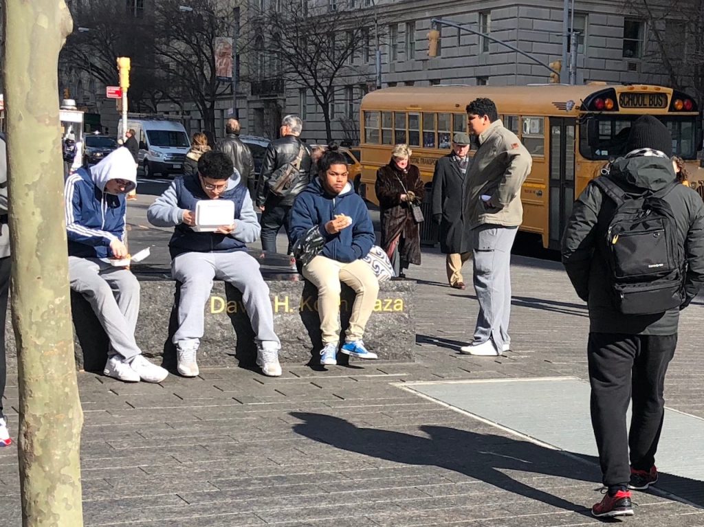
In 2017 I made a work of an endless, collaborative performance of negation, where the Met’s millions of visitors and passersby, New Yorkers and outsiders alike, continuously sit in a way that blocks this aggrandizing, carved text from view. That piece is called Untitled (Koch Block), and it is still in process. Please join it whenever you’re nearby.
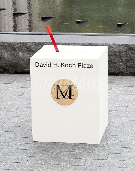
But there is another work, a predecessor, unearthed only recently, through a search for something else, I already forget what. On the 9th of September, the Metropolitan Museum invited the Kochs—David and his wife, Julia, whose first socialite outing in New York was co-chairing the Met Gala in 1997, a year after their marriage—to flip the switch on the fountain for the media assembled, and in the presence of local politicians and functionaries, museum leaders, neighborhood schoolchildren, and a youth chorus dressed in white and wearing red gloves, who sang a dissonant arrangement of “New York, New York.”
Here is the switch.
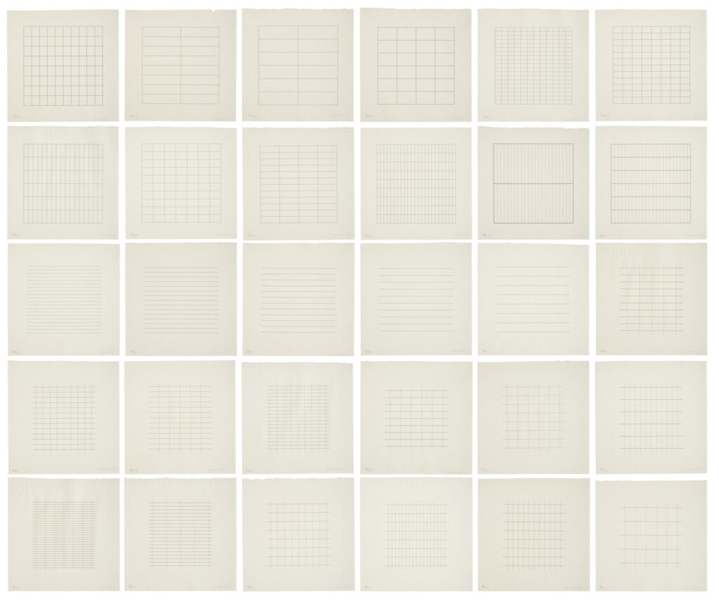
A complete edition of Agnes Martin’s silkscreen portfolio, On A Clear Day, is coming up for auction at Christie’s, from “an important corporate collection” I expect is the merged remnant of the Chase Manhattan Bank.
It’s as good an occasion as any to reflect on two aspects of this important work: As print curator Riva Castleman explained when The Museum of Modern Art announced the exhibition and gift of the prints [pdf], Martin did not make them. She selected “30 drawings from more than 300 that she executed in 1972…[and] had the Domberger silkscreen workshop in Stuttgart cut the stencils to their exact measurements without attempting to duplicate her autographic line.” This was in order “to replace, by means of mechanical application, the illusionary and irregular drawing that detracted from the perfection she sought in her compositions.”
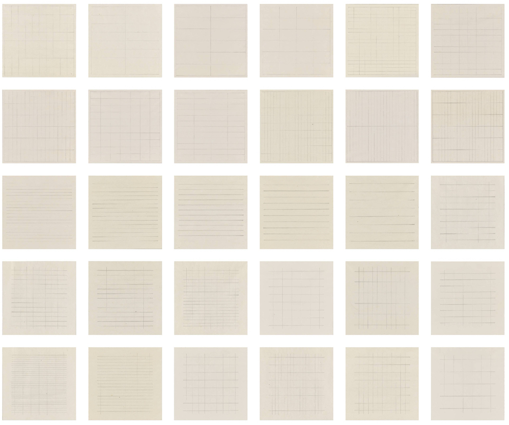
The Fishers bought what seem to be the 30 drawings—which are shockingly loose for Martin—and they are now at SFMOMA as a Untitled (Study for On A Clear Day), which is not quite how it went down? But close.
The other thing is, though the artist conceived On A Clear Day as mechanically supplanting the imperfections of her autographic line, it is credited with pulling her out of self-imposed isolation and re-starting Martin’s art production. Yet she also made 300 drawings for it in 1972. And her correspondence with curator Sam Wagstaff from the time she supposedly wasn’t painting—1971-72—includes references to making paintings. And to loaning, selling, and planning to show work. So she was not isolated, and had not stopped working, but was managing her work’s reception while still seeking its perfection.
Anyway, it’s a good time to have an extra couple of hundred thousand dollars and some taste. For my part, I am trying to figure out the best way back from the silkscreens to the drawings. Which seems like a more easily realizable project than my other Untitled (On A Clear Day), to reuinite one of the broken-up editions as a work.
Lot 25: Agnes Martin, On A Clear Day, 1973, est. $150-200k [christies]
[morning after update: sold for $264,600. nice work.]
Previously, related: Untitled (On A Clear Day), 2015
Agnes Martin Mini-Storage
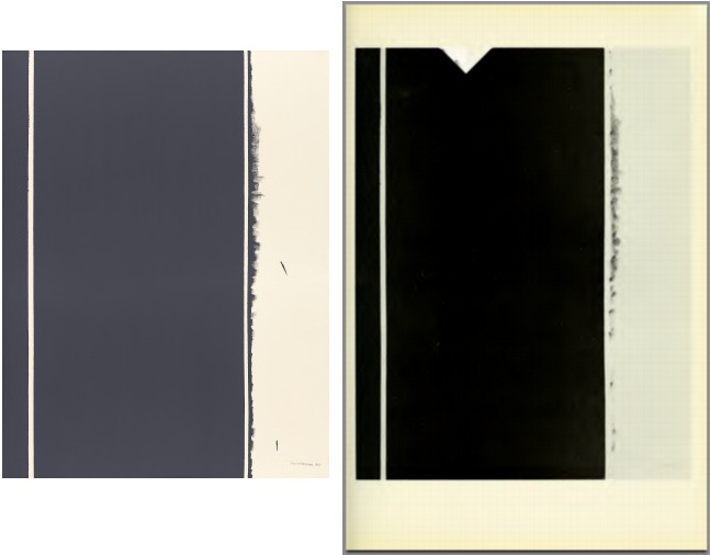
It’s been almost ten years since I found the Internet Archive scan of the Guggenheim’s 1966 catalogue for the debut exhibition of Barnett Newman’s Stations of The Cross had not one, but two alternating glitches in it.
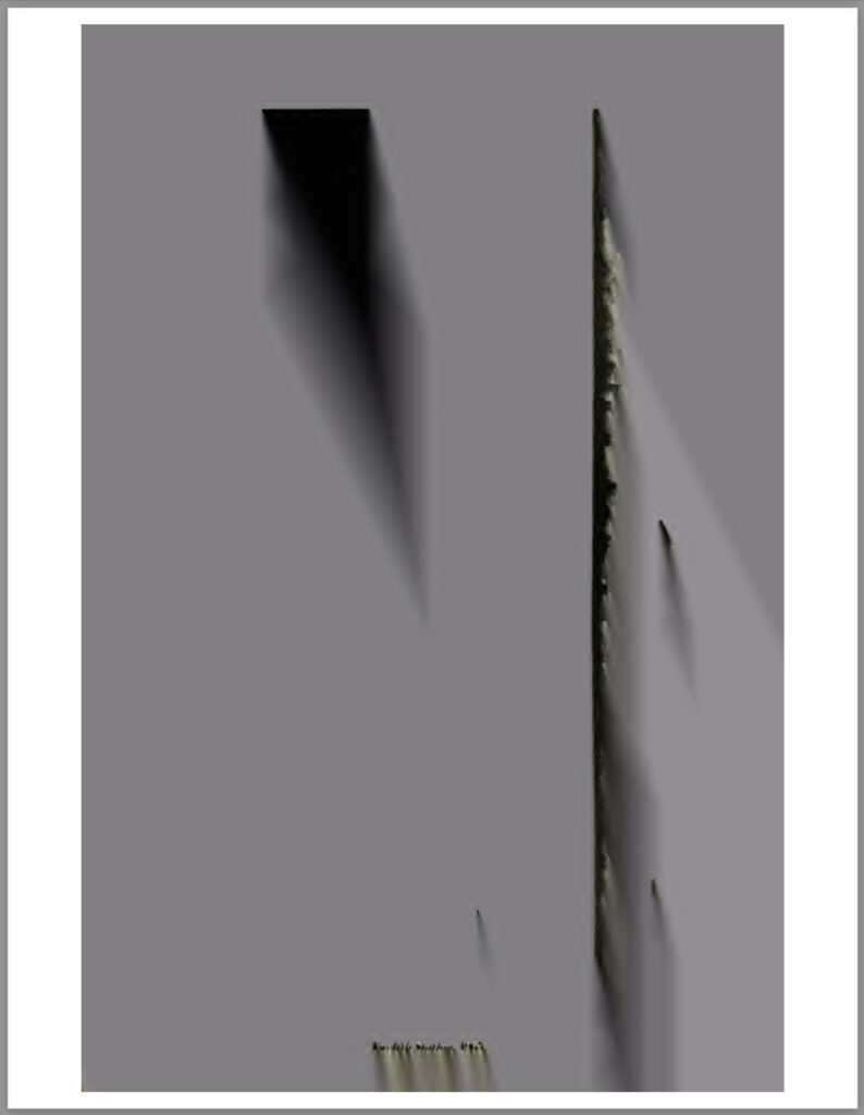
And ten years and five minutes since I decided they should be made into paintings.
And ten years, five minutes and a day since I last thought about me actually painting them myself. I guess these things just take time. I was about to buy an old catalogue of Barnett Newman prints when I realized I already had two. And that memory of Newman’s interest in the borders around prints, intrinsic to the medium, and his treating lithograph stones as an instrument to be played, reminded me of these pages. And though my previous comparison this instrument metaphor to Richard Prince’s description of playing a camera didn’t help me make the connection at the time, I now see that a scanner can be an instrument as well, with what Newman called its repertoire of “instrumental licks.” [Which, now that I type it, reminds me of Sigmar Polke’s hyperexpressive use of a Xerox machine to make his artist’s book, Daphne. But if the artist introduces them himself, are they even glitches?]
Still not sure what form(s) these should take—whether books, or prints, or paintings, or paintings of paintings—but I am glad to be thinking about it again.
Glitch II is still there, btw. [1.8mb pdf]
Previously, related:
Glitches of The Stations of The Cross
Creation is Joined with the Playing
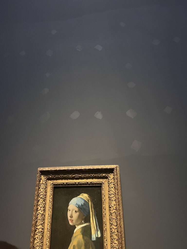
I’m not sure I could think of a greater honor than to have work in a two-artist exhibition with Vermeer. I certainly didn’t think of anything before today.
But now I am beyond thrilled to announce my site-specific installation, Mural With Girl With A Pearl is on view at the Rijksmuseum in Amsterdam. It comprises a painting on the wall holding Girl With A Pearl, and the painting Girl With A Pearl itself. It’s hard to say how long it will be there; certainly this incarnation won’t go past March 30th, when Girl With A Pearl goes back to The Hague. Tickets to see it are definitively not available. [But if you do go, SEND PICS!]
Like Vermeer’s work, which it incorporates, it is an exploration of the subtle effects of light captured in built up layers of paint. And like those light effects, it may be fleeting, perceived only in the periphery of vision, occupying the liminal spaces around the older work that is the predictable draw of our attention.
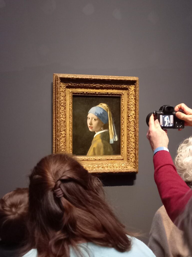
But for now, if you look up, and the gallery lights hit at the right angle, you will feel your field of view, and with the close looking you’ve exercised, you’ll recognize the changing world beyond the frame.
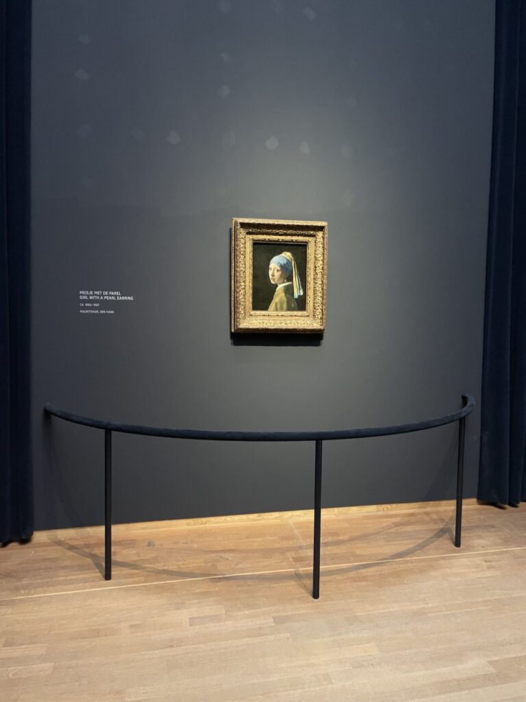
You’ll see the new horizon coalesce just above Girl with a Pearl Earring‘s head. The loose grid of brusquely brushed forms —pearls? lights? ships? celestial figures? yet too big to be stars?—shimmering in formation in the graying sky.
While the current installation involves Girl with a Pearl, I am happy to discuss how to make the piece work for your Vermeer, too. Or, if you’re at the Mauritshuis, we can recreate the Amsterdam magic. Just because the Vermeer show is once-in-a-lifetime doesn’t mean this collab has to be, too.
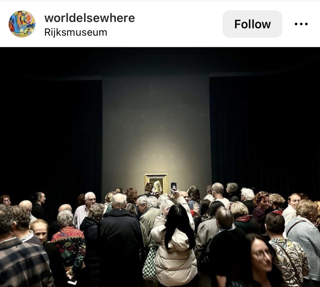
April Update: Thanks to @worldelsewhere, I am able to say that the installation stayed up until Girl With A Pearl left for the Mauritshuis. Thank you all for your engagement.
Previous, related museum works:
The Wall, 2021, Musée du Louvre
Proposte Monocrome, gris, 2017, The Metropolitan Museum
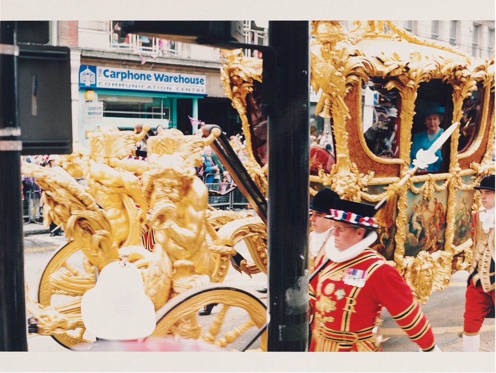
The last time the Queen of England rode around London in the Gold State Coach was for her 50th anniversary, and Wolfgang Tillmans was there.

If he was there today to see the Queen’s subjects waving at a hologram of her riding in the GSC, it might look a little something like this. Protip: the way you can tell my Tillmans from Tillmans’ Tillmans is the aspect ratio.

And while mine will ship with a separate
SCREEN COVERAGE WILL CONTINUE
AFTER THE HORSES HAVE SAFELY PASSED BY
monochrome, I feel like Wolfgang would have been able to get both screens in one shot.
Previously: Yas, Regina
It’s been a minute since I’ve gone deep into Dan Flavin’s work, but a tweet exchange with Joshua Caleb Weibley the other day really got me thinking. Joshua mentioned seeing crates of Flavin replacement bulbs during a museum install, and how visitors to the Guggenheim would accidentally break the fluorescent light bulbs with shocking regularity.
I’ve never seen that–and without inciting it, would low-key kind of like to, to be quite honest. The issue of constant replacement was acutely felt, because, as Joshua had pointed out, Flavin’s signature medium, fluorescent lights in various colors in union-made, commercial grade fixtures, had become obsolete, and the studio/estate had decided it needed to be propped up with their own hand-formulated replacements.
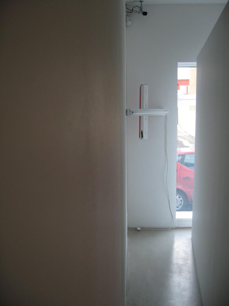
Which made me think of a Flavin that had been turned off. Or actually, a Flavin that had burned out. That’s it, that’s the piece. The history, the legacy, the ephemerality, the [absence of] light.
In another timeline, it’s happened: Flavin insisted that when the lights went out of production, that was it. People turned the pink ones off first, to make them last the longest. They’d crowd galleries on the special day when they got turned on. Flavin Day. Over the years they went out and were mourned as lost icons of their time, like demolished Paul Rudolph houses. People began to appreciate them as relics, not environments. Everyone contemplating them became Buddhists. Or Quakers. They became sites of meditation, where people manifested the light. Can you see it?
After a few decades, instead of half a dozen virtual Van Gogh shows, tourists flocked to Flavin Experiences, where simulations of his work alight were projection mapped onto the walls and floor. Critics complained, of course, about the physical difference between projected light and emanating light, and maybe a joker made some facsimile objects to simulate the lost fluorescent effect through tubes stuffed with LEDs.
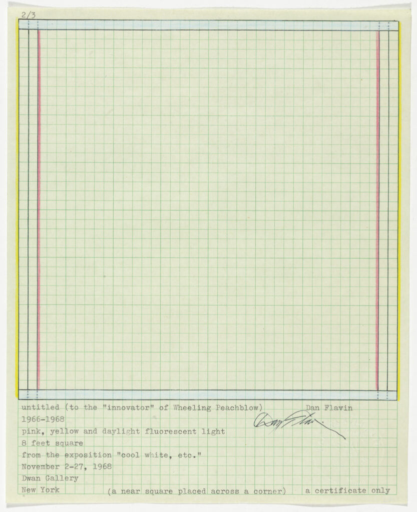
And then there’s the rarity. It occurred to me how hard it might be to make a Flavin out of burned out lights. Properly burned out lights, not just turned off or disabled. How long might it take? When the qualities of desirability and dismissal are inverted, it really does change a lot. [Flavin’s work already has similar dichotomies built into it, though: in our timeline, there’s an existential link between the glowing, manufactured fixture/object and the mundane hand-drawn certificate. Both are required to comprise the work.]
But it did remind me of a visit to MoMA once where I saw, not only a crate of Flavin replacement bulbs, but another crate–of Flavin replaced bulbs. They kept the burned out bulbs. MoMA has five Flavin sculptures [and twelve diagram/drawings of sculptures, including one straight-up certificate that’s registered as a separate object, but that’s another blog post.] They’ve had Flavins since at least 1969. Just think of all the burned out bulbs they’ve accumulated. If other institutions do the same, then maybe rarity is not really a factor, so much as access, rarity by another name.
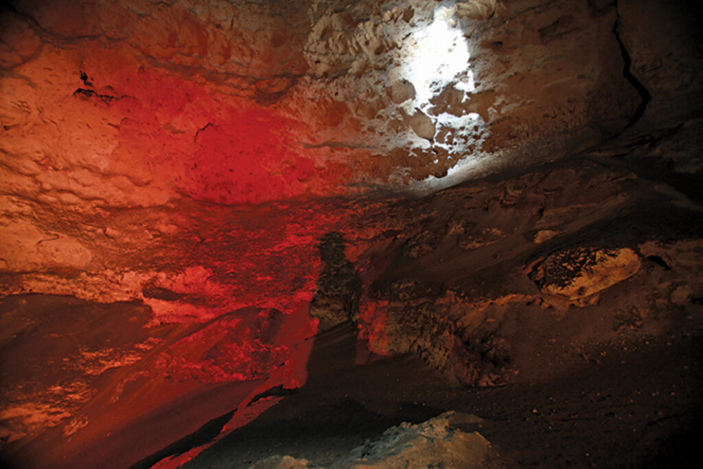
Well, there’s also the issue of the Flavin Estate, which might not be amenable to burned out works. Then again, that lack of consent didn’t stop Dia from commissioning Allora & Calzadilla to make a work installing one of their dozens of Flavins in a Puerto Rican cave. And anyway, Flavin is the work’s title, not its author.
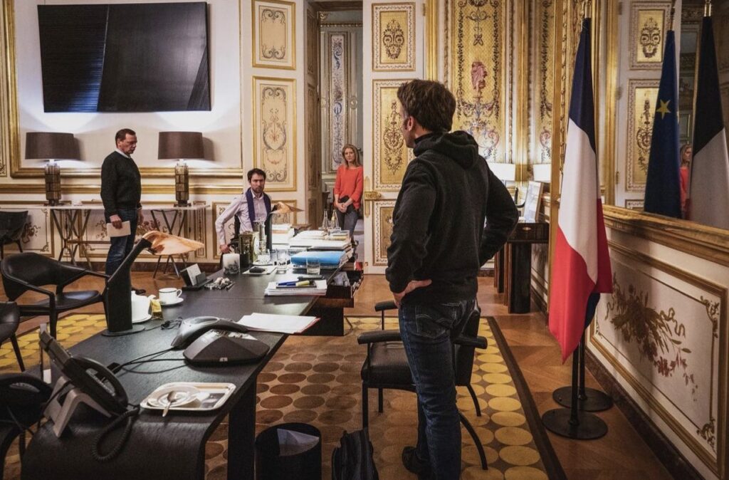
Some might say this warrior president Golden Room mise-en-scène feels like a very special Continental episode of Black Mirror come to life. Me, I say, that’s no black mirror: it’s a Proposte Monocrome Macron! Srsly, though, the Struth fan who took this photo deserves a Légion d’Honneur.
UPDATE WTF: I just zoomed in to make myself an Ellsworth Kelly-style rhomboid crop, and it appears that is not a flatscsreen TV with a reflective image on it at all, but an image? Non, but it is a picture. It is a Soulages.

![gwyneth's montecityo living room is pale gold and pink and grey in its vibe. a drapey lighting fiture of multiple light elements across the ceiling are connected with catenary swags of black cable. it echoes slightly the fake ruth asawa [turns out it's fake, lol, that's one result of this post] hanging wire sculpture in front of a double glass door, one of two on either side of the fireplace, the garden beyond that. the main architectural feature of the room is not the curvaceous mod wood or italian chairs, or the large squared off grey sectional sofa, which just sticks in from the right. it is the bonkers scale black and white marble bar, freestanding, with a matching marble console and thick slab wall behind it, which feels like it was extracted from some other setting. the lightnig makes it look pink. over the flat black fireplace is a john baldessari diptych: a square gold monochrome on the left, and a white square painting with the words avant garde in the center, on the right. it is legible only in the photo still from architectural digest, and blurred in the video with goop herself. a licensing thing. an ridiculous.](https://greg.org/wp-content/uploads/2022/02/baldessari-paltrow-archdig-1024x688.jpeg)
Alexandra Lange brought Gwyneth Paltrow’s troublesome installation of her Ruth Asawa sculpture in front of her patio door to Twitter’s attention this morning. And I confess, seeing the Architectural Digest photos, that included Lindsey Adelman’s drapey light installation, and a Ralph Pucci hammock also hanging from the ceiling of Paltrow’s new Montecito living room, I, too, was troubled. For a minute.
But after watching the video tour, and hearing the care and attention to detail, feel, design, and material that Paltrow and her people put into this project, I became fine with it. How else *should* an Asawa sculpture live, but in an actress-turned-influencer’s slightly louche, ultra-deluxe living room full of stuff hanging from the ceiling? Not everything should be a white cube. As long as the door, or the dog, or the kid, doesn’t hit the fragile sculpture, go wild, Gwyneth. [LATER THAT DAY UPDATE: NOT an Asawa! Problem solved! Or, rather, replaced with new problem!]

That’s not important now. Not when the Baldessari diptych over the fireplace is blurred out in the video. I’m guessing A/D did not want to splurge for the video license from ARS? I also love that all they felt they needed to blur out is the text on one half of the work; the monochrome painting is undefaced.
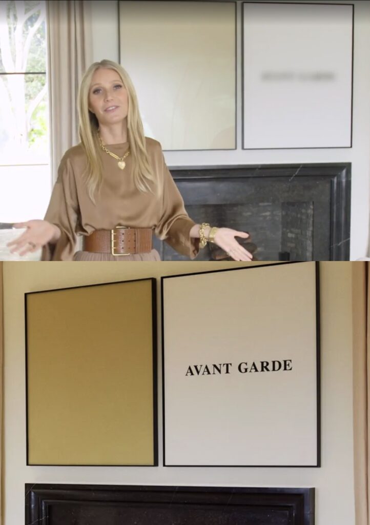
Speaking of face, there’s a new one in town. Untitled (Prima Facie), 2022, is a lenticular print mounted on aluminum and enamel on canvas diptych where the avant garde grows increasingly sharper with a move to the right.
It is inspired by Baldessari’s Prima Facie (Fifth State): Avant Garde, a 2007 diptych which is itself based on a spread found in Baldessari’s 2006 artist book, Prima Facie: Marilyn’s Dress: 2006/2007 – a poem in four parts, which was available in both book and deluxe book with a print editions. Earlier states of the Prima Facie series had photographs of actors and actresses where the monochrome is here, with words chosen to be the instant, descriptive equivalent–and equal in visual impact-to the image. Baldessari showed works from the Prima Facie (Fifth State) at Sprüth Magers in London in mid-2006, where Paltrow might have seen them, but this 2007 work came from Marian Goodman. These works are depicted in David Platzker et al’s Baldessari Catalogue Raisonée, of course, and the Museum Dhondt-Daehnans in Belgium put out a comprehensive-at-the-time catalogue of Prima Facie works for a show in 2005-06. Untitled (Prima Facie) is a greg.org exclusive.
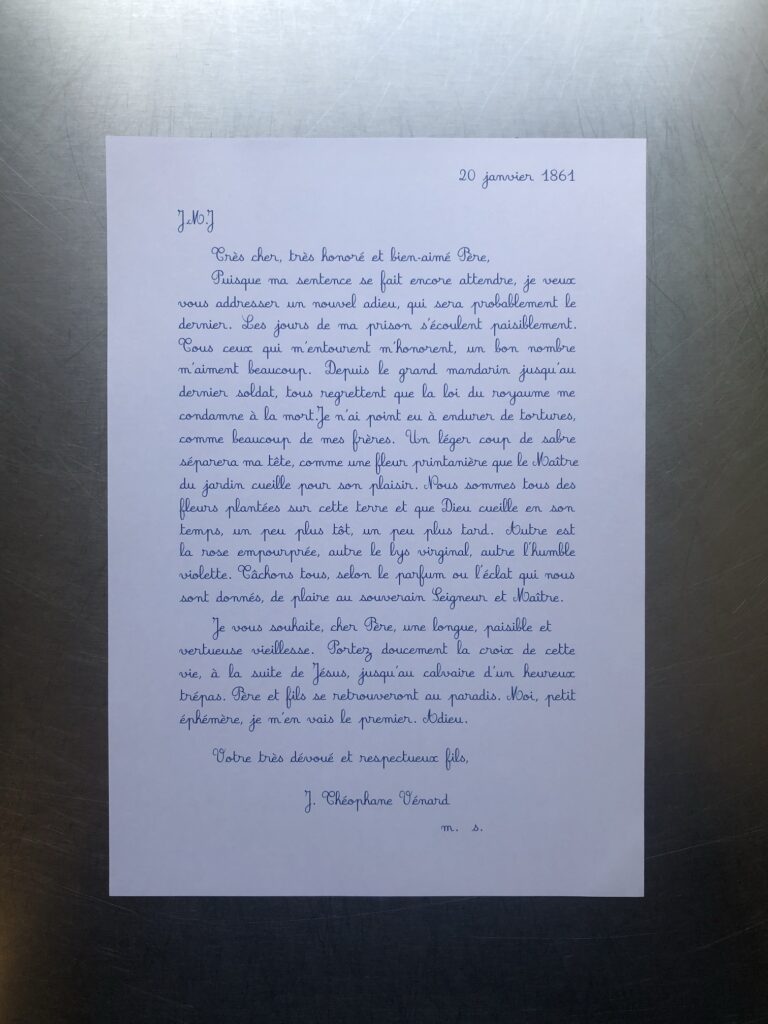
I’ve written before about the long reach of Danh Vo’s 2.2.1861 (2009 – ) on my thinking, but also specifically on the Facsimile Objects project, before I made a one-off Facsimile Object of it. Having a visual of Phung Vo’s beautifully transcribed letter from soon-to-be-beheaded J. Théophane Vénard to his father in front of me, instead of tucked safely away, has leveled up that influence.
It makes me try to improve my handwriting. It intensified my preference for A4 paper, which turns out to be difficult to find and work with in a world that defaults to 8.5 x 11. It prompted me to seek out the original source for Vénard’s letter. It got me to learn LaTeX. It, along with spending time with aging parents and a global pandemic, made me think about mortality, the moment that awaits us all.
And it made me think about what a Facsimile Object does, or what it could do.
Phung Vo Facsimile Object (PV1) is one result. It is the transcription of a slightly different published version of Vénard’s letter than the one Vo uses. It is set in LaTex using the French Cursive font package created by Emmanual Beffara, and printed on Vietnamese A4 paper. A certificate of authenticity matches it, and both are contained in an A4 document sleeve.
The layout is inspired by Vo’s 2.2.1861, but between the machine font and the slight textual differences, the line breaks diverge after just four lines. It’s a bit like how the clocks in Felix Gonzalez-Torres’ “Untitled” (Perfect Lovers) slip out of sync, except for the perfect lovers part, and the baked-in indexing of facsimulatory failure.
I am not decided about what to do with these. Part of me wants to make them available on demand. Part of me thinks they shouldn’t go out until the…end of Vo’s project. [Here at the beginning of a new lunar year, I once again wish Phung Vo a long, healthy, happy, and prosperous life.]
As I contemplate this, I remember back to a project I started in the Summer of 2014, to continue On Kawara’s Today Series after the artist’s death as a communal practice. It was called fromnowon.us, and it would have made it possible for people to order a date painting from Chinese Paint Mill, depicting the date on which it was painted. I’d arranged the production, even getting the painters to include a sheet of the local Shenzhen newspaper with each completed painting. When the test painting arrived, it turned out to be from Sept. 11th. Which gave me pause.
But anyway, I’m still working through this.
Prev, related:
2021: Danh Vo Facsimile Object (V1)
2014: On Kawara Today
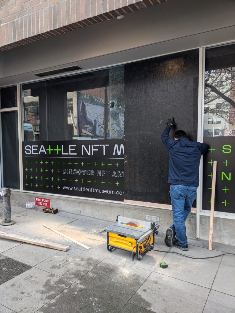
This time, the heist was coming from inside the house.

Previously, Untitled (Heist), 2021
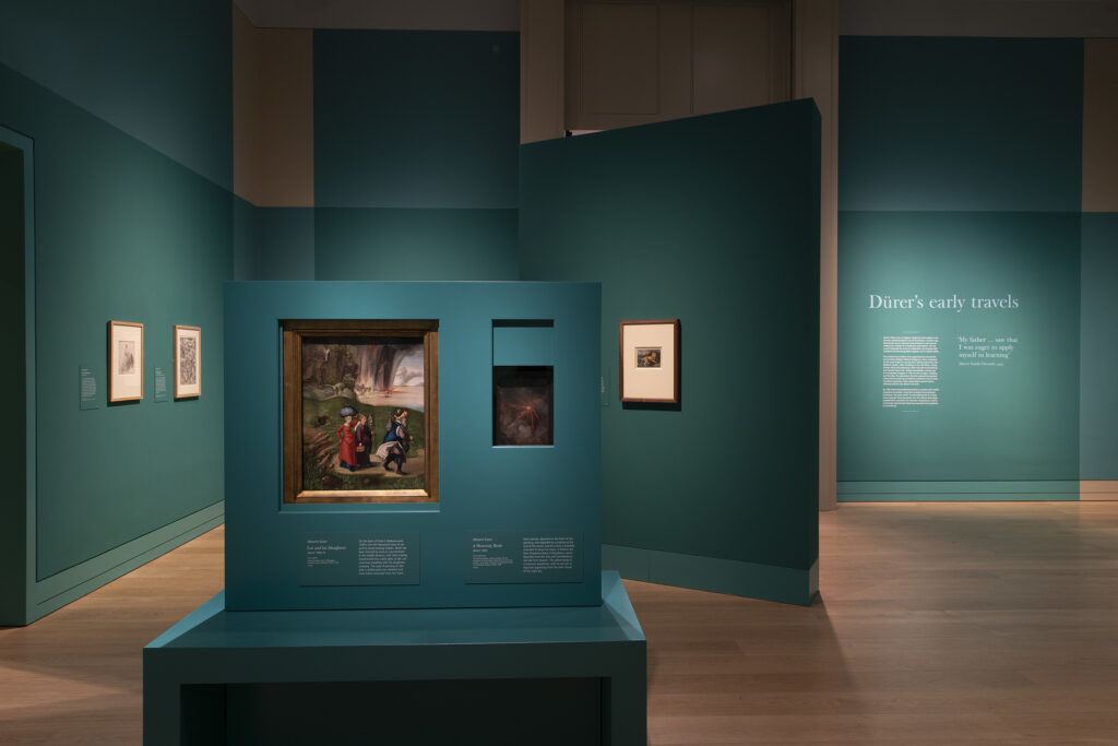
I cannot emphasize enough how much I did not imagine being at this point in the Facsimile Object universe. An Albrecht Dürer exhibition opened in London at the National Gallery, just as an Omicron tsunami crashes around the world.
I mean, by the museums in Germany and the UK reopened last May, and the Dürer Facsimile Objects in that first diptych were discontinued, I did bleakly anticipate their related Dürers might become unvisitable in person again. I was also naively relieved to not be in the business of selling Tastily Painted Destruction of Sodom and Gomorrah pictures. And here we are.
What I did not anticipate, however, was that at a moment when travel restrictions were returning, the National Gallery would title its new Dürer show, “The Credit Suisse Exhibition: Dürer’s Journeys.” And I definitely did not imagine that they’d promote the show using a literal diptych of verso paintings. Why, just look at A Heavenly Body[? A Heavenly Vision?], on the back of the National Gallery (London)’s own St. Jerome; and the Lot and His Daughters painted on the back of National Gallery (DC)’s Haller Madonna, together at the very center of the awkward and weirdly empty exhibition photo up top. We’ve come a long way, and yet we have not.
The thing I’m most appalled by, though, is that despite a 60% jump in COVID case levels since I started *writing* this post, to the highest levels of the entire pandemic, and 10x even New York’s current spike, it appears that the Her Majesty’s Government is dragging their feet on issuing any restrictions, for fear of what impact a negative public reaction might have on Boris Johnson’s hold on power.
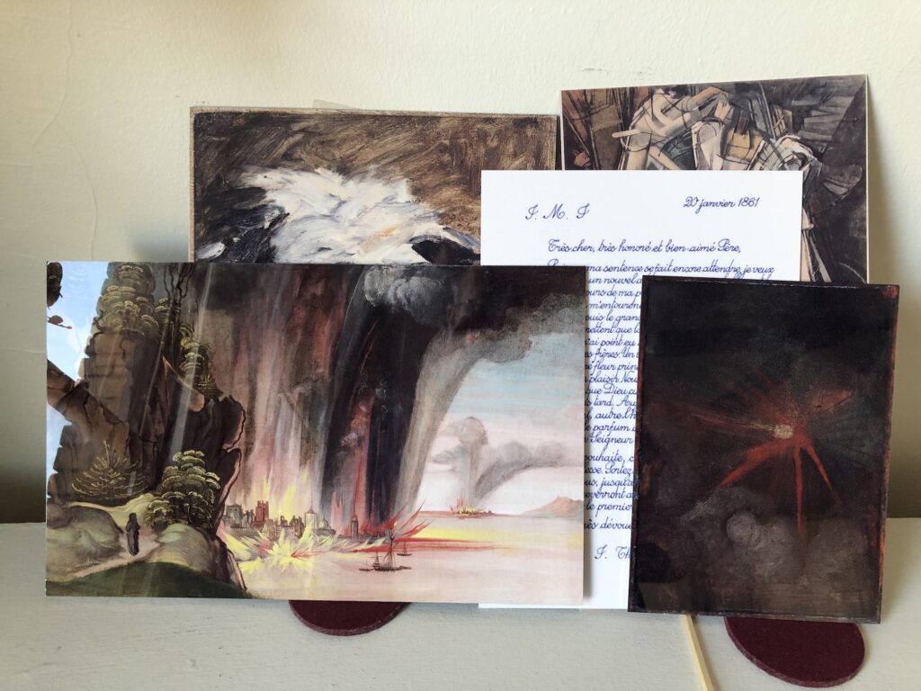
So while previous Facsimile Objects mitigated art encounters you couldn’t have, this new Dürer Diptych based on the National Gallery’s exhibit is meant as a hedge for an experience you shouldn’t have, at least right now. And so, The Credit Suisse Dürer Diptych: Dürer Facsimile Object (D1) A Heavenly Vision is available along with Dürer Facsimile Object (D3.38), The Destruction of Sodom and Gomorrah, a full-size detail of 38% of the original painting, conceptualized last spring when the NGA reopened, that focuses on the painterly joys of fire, brimstone, vegetation, and that brushy, little black pillar of salt that used to be Lot’s wife.
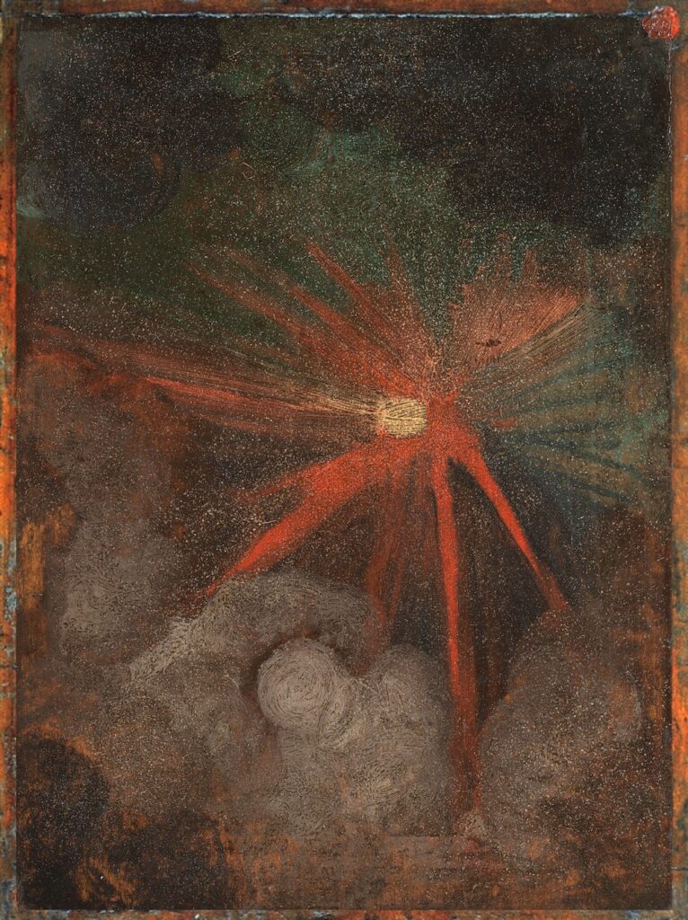
If you think about it, a fiery meteorite crashing to earth and sulfur and fire raining down from heaven go together quite nicely; the apocalyptic symmetry was surely not lost on a young Dürer who, with the year 1500 fast approaching, was already thinking about the end of the world.

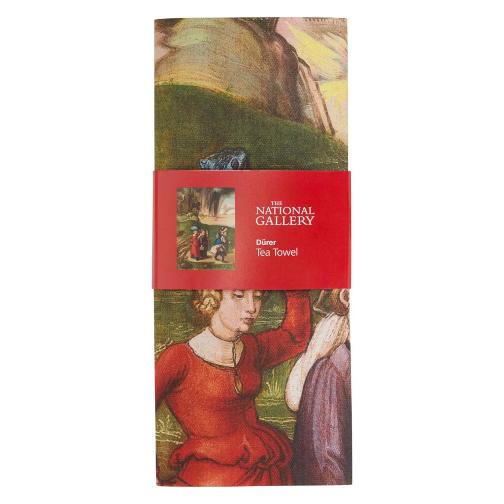
[For those who really, really need the full image to stand in front of, try one of the Lot and Daughters Flee The Destruction of Sodom and Gommorah tea towels in the National Gallery shoppe. They’re not to scale and out of stock, but I’m sure they’ll be back soon.]
In consideration of those who might have acquired an AD FO (D1) already, AF DO (D3.38) will be available separately. Each Facsimile Object is accompanied by a full-scale, certificate of authenticity handmade in India ink on Arches. ADFO(D1) certificates will be distinct from those produced last spring, as a treat.
If the National Gallery actually does close to slow the spread of COVID, these Facsimile Objects will be available only until it reopens, or until, like with the Vermeers, it becomes official that the show will not reopen. If the National Gallery and its partner Credit Suisse don’t do anything, and just take their couple of days off during Christmas break, I will probably end this futile folly when that becomes clear, either on January 27th, or January 2nd. What a world.
2 January UPDATE: Turns out making shiny facsimiles of paintings or parts of paintings available is not enough to defeat the omicron surge. If only I’d sent them to every house in the UK instead. Or even to every Credit Suisse client.