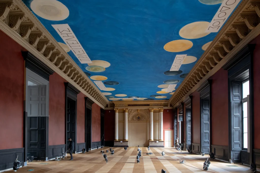
The Wall (2021), dimensions and The Ceiling (2010), installed in the Salle des Bronzes in the Louvre, photographed in Feb. 2021 for the NYT by Dmitry Kostyukov
As 2021 is finally shown the door, I am pleased to announce The Wall, which was next to The Ceiling. The Wall is a Marron Côte d’Azur and Noir painting executed directly on a wall or a discrete section thereof. Even more than the 19th century neo-classicist aesthetic of Napoleon III, who first executed it in his Salle des Bronzes Antiquites, it evokes the historic moment during the pandemic when leaks about the work’s installation drew the litigious ire of The Cy Twombly Foundation.
study for The Wall, 2021, dimensions variable, an altered 150 x 100px svg ganked from a hexcolor website for Marron Côte d’Azur (#A75949)
For a few months this year, the first realization of The Wall was installed alongside–or underneath, really–The Ceiling, Cy Twombly’s ceiling mural at the Louvre. In Napoleon III’s day, the Noir was the display cases. In the 2021 installation, the boundary between the two colors was demarcated by a dado. The composition of future installations may take cues from the space, and condition of the wall and its elements.
While it is available for individual purchase or commission, The Wall will also be free with the purchase of nine other works, as a treat.
There are other works associated with both The Ceiling and The Wall, the details of which are at present insufficient.
While making The Ceiling, Twombly friend Barbara Crawford and French painters Laurent Blaise and Jean de Seynes joked “that the unique, precise blue for this particular sky, which they’ve spent weeks fine-tuning, should be trademarked and given the name Twomblu.”
According to Grant Rosenberg’s account of this process in The American Scholar, in late 2008, the Louvre produced “several” “big” panels of monochrome blue for color testing during a Twombly site visit. It is not clear what blues these were, but we know what they were not: Pas Twomblu.
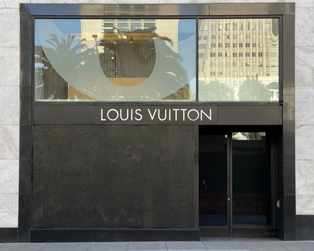
Installation shot, Untitled (Heist), 2021, 96 x 121 in., enamel on plywood panel, documented in Union Square in November 2021 by Hunter MacNair, image via brokeassstuart, thanks @xintra
It has been a while since realizing works like this. Partly, it’s just the world. As Martin Creed says, The Whole World + The Work = The Whole World.
But when it exists, it also feels wrong to ignore it. Untitled (Heist) was recently installed in San Francisco’s Union Square, following a flashmob robbery of several hundred thousand dollars (retail) of merchandise from the Louis Vuitton store.
When Broke Ass Stuart ran this installation shot by Hunter MacNair on their post, “Let’s Talk About The Louis Vuitton Heist,” I first thought it would be a deep dive on the street value of the various items that got jacked.
But BAS instead went deep on luxury-fueled capitalism’s complicity in gaping inequality. And that, along with LVMH’s recent appearances in the art news, seemed like a collab-worthy context in which to encounter this work. Which I imagine will remain on view through much of the Christmas shopping season, at least. Maybe minting it as an NFT would make it last even longer.
UPDATE: As San Francisco Mayor London Breed’s office put it in their review, “I think that’s the visual for where the rule of law needs to make its stand.” [FOIA’d and published by @journo_anon] Thanks for supporting the arts, Your Honor!
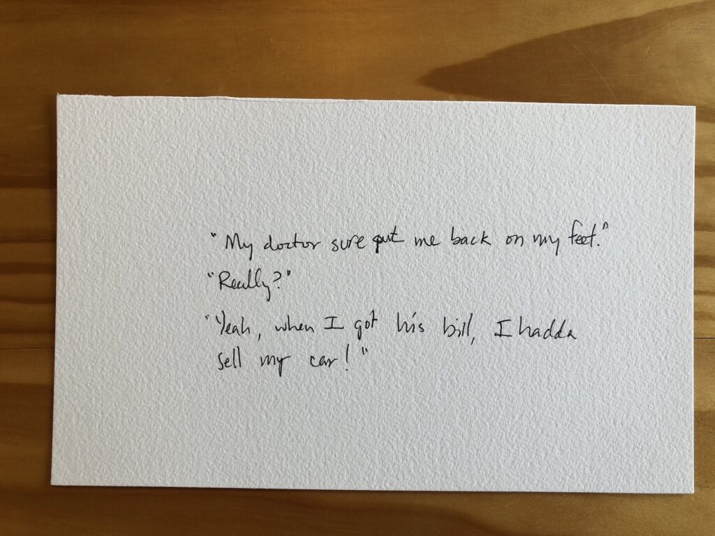
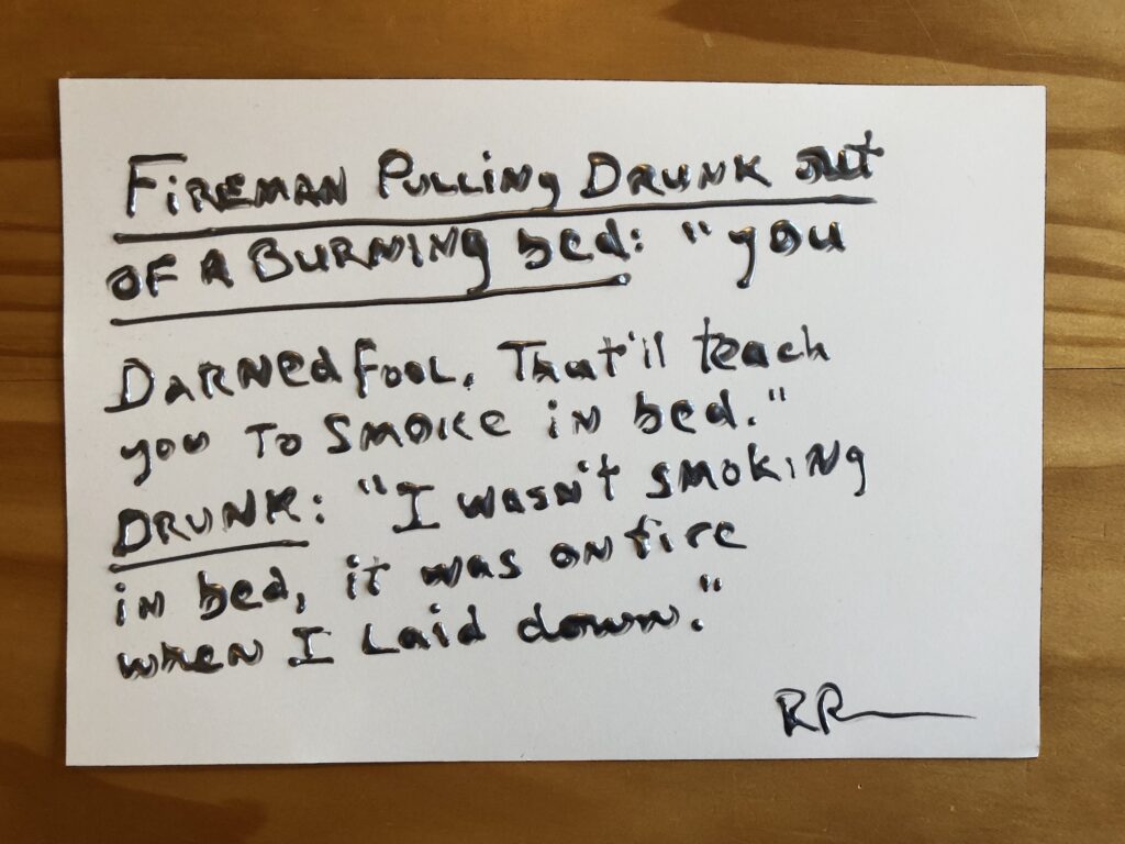
The stakes could not be lower: Untitled (Richard Prince Handwritten Joke), 2021, gel pen ink, which is not the same as puffy ink, it’s just smoothly flowy ink, on Arches, 5.5 x 9 in.
A few days ago a friend with amazing superpowers for finding things sent an eBay listing from a European autograph dealer for a Richard Prince joke drawing. It was a hilarious forgery, but it was also only €1, and, I argued, it was well worth it. As we texted about it, I was like, dang, now I want to sell Richard Prince drawings on scraps of paper on eBay for €1! You should make them in puffy pen ink, my heroic friend said.
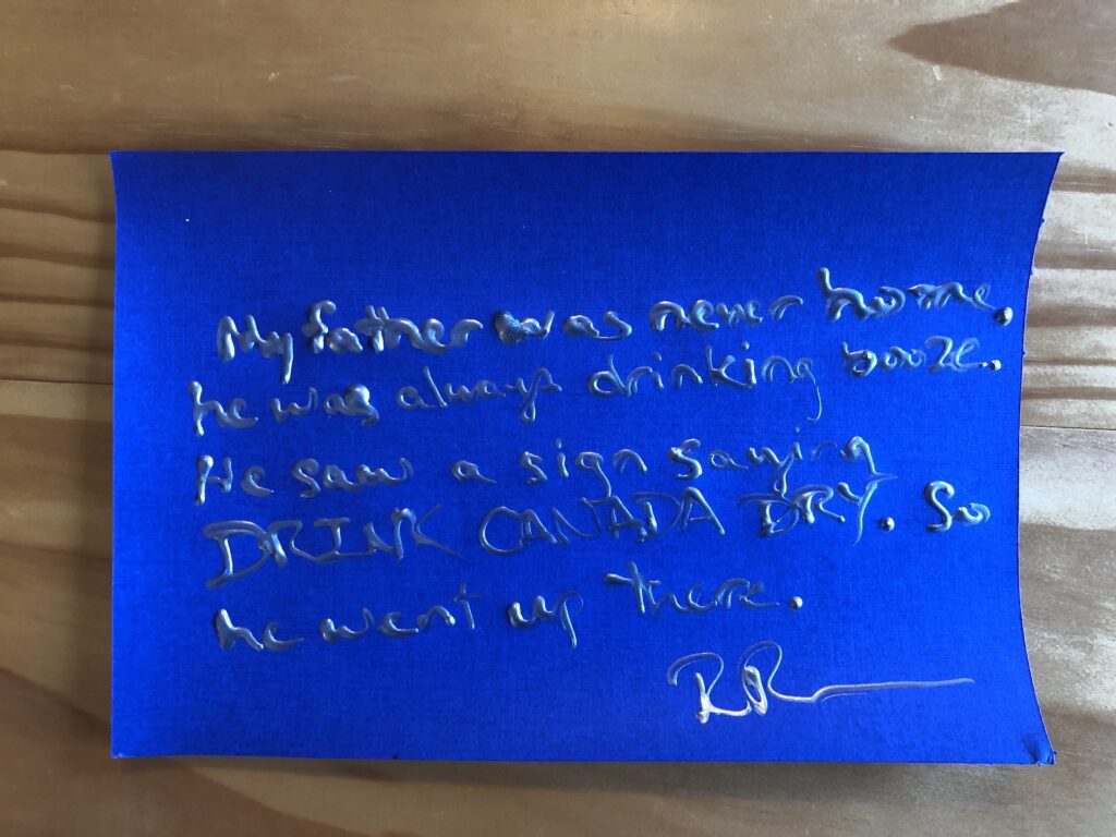
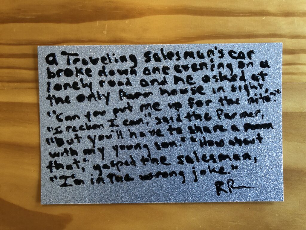
Untitled (Richard Prince Handwritten Joke), 2021, metallic silver puffy ink on fancy cardstock, 6 x 9 in.
As it turns out, puffy ink is more of a bottle-based medium than a pen-based one. And it is intended for use on fabric, not Arches or fancy metallic scrapbooking cardstock.
Untitled (Richard Prince Handwritten Joke), 2021, silver metallic puffy ink on Arches, 7 x 10 inches
The dimensionality of the text, along with the curling of the paper as the puffy ink dries, most assuredly transforms what I’d imagined were drawings into objects. Objects which might get crushed if shipped via a simple, stamped envelope. Objects which contain vital title, stamp and initialing elements on the verso, complicating simple framing and mounting.
Untitled (Richard Prince Handwritten Joke), 2021, puffy ink on silver glitter cardstock, 5.5 x 9 inches
And to top it all off, eBay insists I list my US-based items in dollars. But out of such difficult decisions is great art sometimes born. In the case of this little series, at least, I am certain they’re worth a dollar if they’re worth anything at all. Because every single one is guaranteed to contain an authentic Richard Prince joke. I could not make these up.
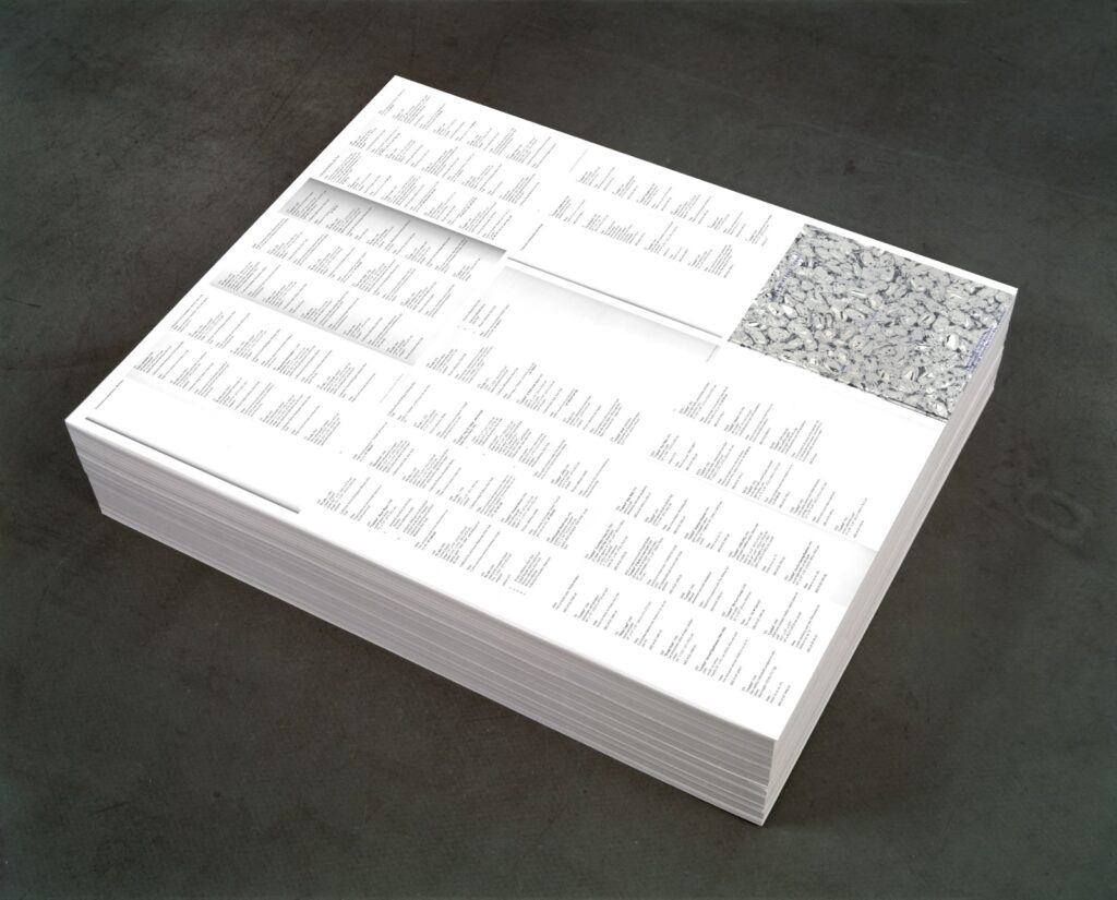
Untitled (Additional Material), 2021, study, 0ffset print on paper (endless copies) 20″ (ideal height) x 23″ x 29″, base image: FG-T Fndn
I’m as surprised as anyone that it was only when I finished posting about the orphaned appendices in the Felix Gonzalez-Torres catalogue raisonée that I figured out what to do with them.
I do still think that the Foundation should republish the information about the dozens of works Gonzalez-Torres made, and showed, and sent out into the world, which were later declared to be non-works.
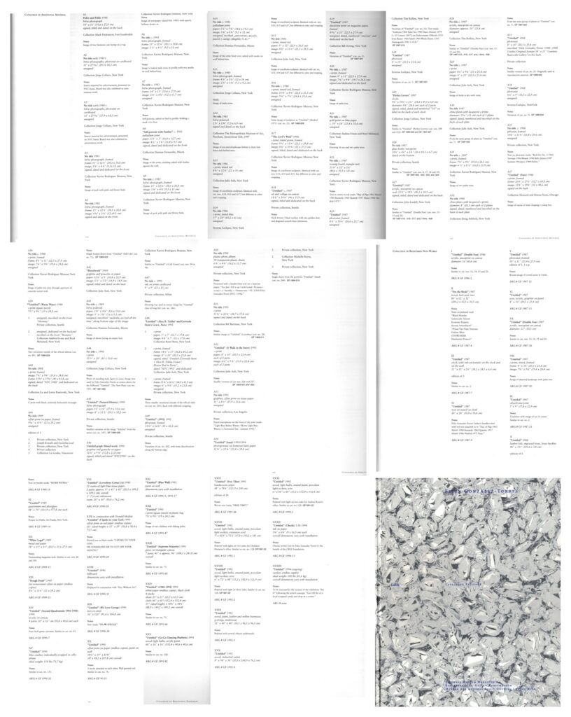
Untitled (Additional Material), 2021, (detail) 0ffset print on paper (endless copies) 20″ (ideal height) x 23″ x 29″
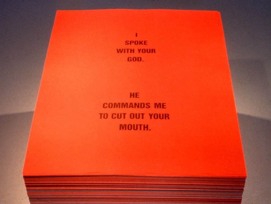
By laying out the eight pages of the CR’s two appendices, Untitled (Additional Material) appropriates the strategy of the iconic stack, “Untitled” (Death by Gun), which reproduces entire pages from a special issue of Time magazine showing the people killed in the US by guns during one week.
The dimensions, meanwhile are a nod to one of two pieces that ended up classified as Non-Works: a 1990 collaboration with Donald Moffett called, “Untitled” (I Spoke With Your God). The stack of printed text by Moffett on red paper (“I SPOKE WITH YOUR GOD/ HE COMMANDED ME TO CUT OUT YOUR MOUTH”) appeared just once, in a two-person show at the University of British Columbia Arts Center in Vancouver. [The print size, 29×23 inches, is one Gonzalez-Torres used in other stacks, too, including “Untitled” (Veterans Day Sale), 1989, the image of which was used above for a rendering of the piece. I did not print 20 inches worth of giant bootleg posters today.]
The stack by Felix Gonzalez-Torres and Donald Moffett formerly known as “Untitled” (I Spoke To Your God) [sic], 1990, image: Scott Watson via Felix Gonzalez-Torres Foundation
As it turns out, this Non-Work does have a Foundation webpage, complete with installation shots. It does not appear to be linked from anywhere, and the URL now ends in “-hidden.” I am in awe all over again.
[2025 update: In subsequent correspondence with the Foundation that is mentioned in the previous post, this absence of the non-works and additional material information was temporary, part of a reconfiguration and expansion of the Foundation’s presentation of works (et al). There is indeed an entry for this work/non-work, and the untitled title is now a designation, “Untitled” (I spoke with your God). Like the distinction between work and non-work, I feels important to note that the nuance of title vs. designation reflects subsequent reconsideration and refinement. From what I can tell of the historical record, in 1990 Felix’s works were shown with “Untitled parenthesis- something- parenthesis” [quotes mine] titles, and this stack was shown as a “collaborative poster” or a creation of Gonzalez-Torres. I feel this is not the last thing I’ll post about this work or show.]
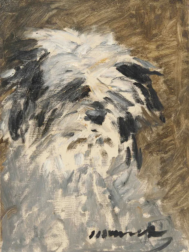
Édouard Manet, Minnay, 1879, 38 x 28 cm, [update: I legit have no idea where these dimensions came from, perhaps my photoshop settings? Anyway, the Manet is 34.8 x 24.8 cm] oil on canvas, to be publicly exhibited for the first time beginning 24 Feb., in advance of being sold at Drouot
I want to go to Paris. I want to see this little Édouard Manet painting of a dog that has never been shown publicly, not once in 142 years. I want to go to Paris to see this Manet painting of a dog which, in just a couple of weeks, will be on view at Drouot for two days and an hour. I want to own this Manet painting. I want to stand in front of it whenever I want, and to watch the features of this dog, and the dashed off brushstrokes that conjure them, dissolve into the vibrations of the atmosphere.
As the world stands right now, the probability of my achieving any of this is low. But it will be at least theoretically possible until Friday the 26th of February, when the two-day exhibition closes, and the painting, Minnay, is sold in an auction starting at 2pm.
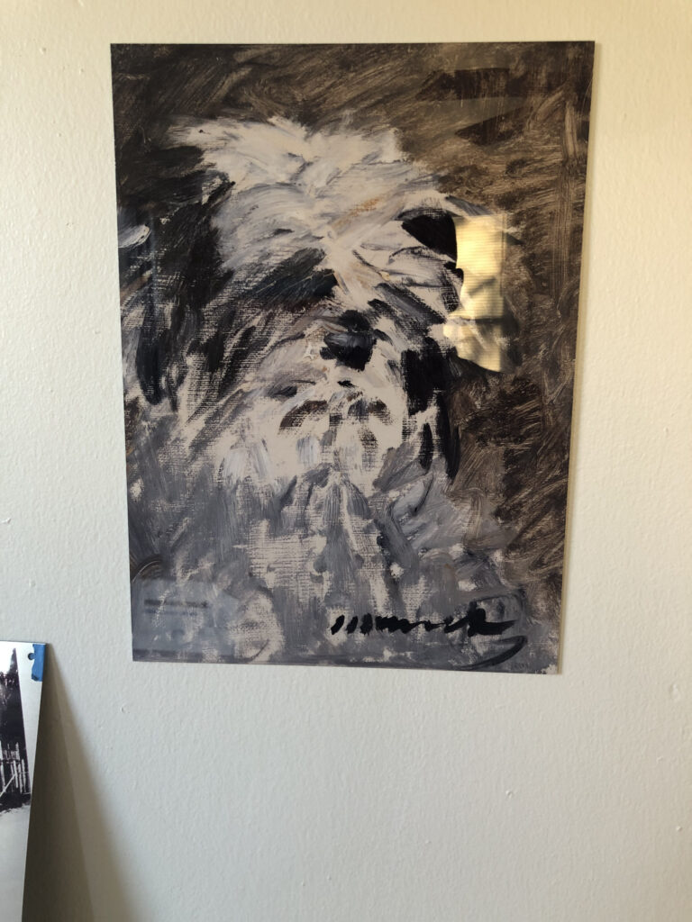
selfie with Édouard Manet Facsimile Object (M1) “Minnay” proof, 2021, 38 x 28 cm, dye sublimation print on aluminum panel, installation view that could probably use a white-balance tbh [update: also, these dimensions are off, I realize now, and the actual facsimile object will match the Manet at 34.8 x 24.8 cm.]
It is in this window of possibility that I propose the Édouard Manet Facsimile Object (M1) “Minnay” as a contingency, an experiential hedge. It is a full-scale image of Minnay, printed on a sheet of aluminum. It is high-resolution and high-gloss. I taped the proof to the wall, and it looks extremely authentic. How does it compare to seeing or owning the painting? LITERALLY ALMOST NO ONE CAN SAY, CERTAINLY NOT ME, NOT YET.
P12 “Annunciation after Titian”, 2015, 135 x 200 cm, they say it’s a facsimile object, but how can we tell?
When first asked by an interviewer if he painted five versions of a postcard of Titian’s Annunciation “to counteract the all-encompassing terror of reification,” Gerhard Richter was like, llol, “Maybe [it was] because I wanted to own such a beautiful Titian.” By making 53 full-scale facsimile objects of his Annunciation After Titian after it ended up in a museum, though, he managed to do both. These are the goals here, too. We will get or get through this.
In the event I do not get to Paris, and/or do not buy Minnay, but you do, I will offer this facsimile object to you in exchange for the painting. Then let us discourse on the differences, if indeed there are any.
In the mean time, everyone with a not-yet-zero-but-diminishing-daily probability of seeing or buying Minnay is invited to acquire their own facsimile object, to hedge their potential experiential loss. They will available from today until the moment the painting sells in Paris [tbc, but some point after 1400 CET on Feb. 26].
Each facsimile object will be accompanied by a hand-made certificate of authenticity, executed in watercolor on Arches at a scale identical to the facsimile object itself.
The COA will also bear the number of each facsimile object, based on the order orders are received. Without knowing the scale of our exposure, it feels important that the facsimile object be available to as many people who need it during These Trying Times, whether that number is 5 or 500 or 6,000 or zero. When the hammer drops in Paris, the facsimile object will become unavailable, and the number ordered, representing the full extent of our collective deprivations, will be known and executed.
The facsimile object is made using a dye sublimation process. Unless it is destroyed, it will last forever. But it will not look the same forever. Some dyes change when exposed to sunlight over a prolonged period of time. Let’s all just strive, though, to live lives and create a world where the status, condition, or ownership of this facsimile object is not a source of stress or inter-generational conflict. It is meant to mitigate loss, not foment it.
Anyway, the facsimile object is available for order below. The price is set at 0.1% of the painting’s probable reserve price. If you need a method other than paypal, let me know. If, after ordering one, you end up either seeing the painting IRL or buying it, also let me know. If you act in a timely manner, you can unwind your hedge, or keep the facsimile object as an historical document. Or, of course, we can exchange it for the painting and some discourse.
[2/26 update: the Manet was sold for EUR420,000, or EUR520,800 with premium, or USD$632,058, and so this offer is ended. For everyone except whoever bought it, of course. HMU]
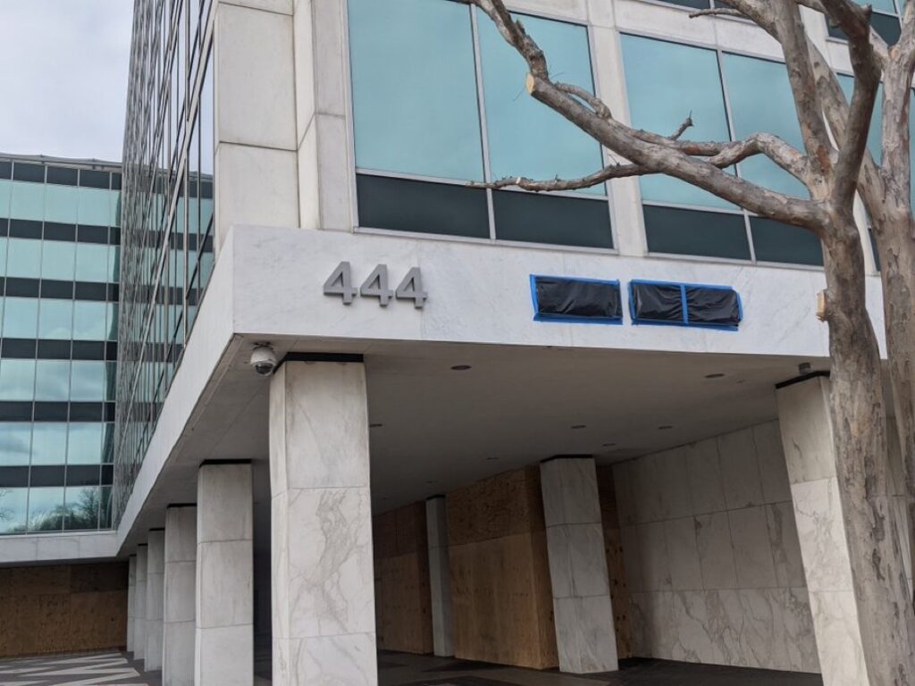
Untitled (News Coverage), 2021, Fox News marquee signage, garbage bags, tape, dimensions variable, installation view Jan 18, 2021 at 444 North Capitol Street NW, Washington, DC, image: @jimswiftdc
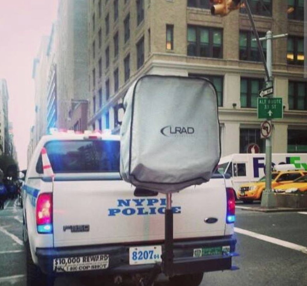
Seeing this work installed for the first time, I am reminded of earlier works, like Untitled (Protestors’ Folding Item) of 2014, an LRAD cover installed on an LRAD;
Installation view: Protestors’ Folding Item (LRAD 500X/500X-RE), ink on Cordura, nylon webbing, LRAD, 2014, Collection: NYPD Order Control Unit
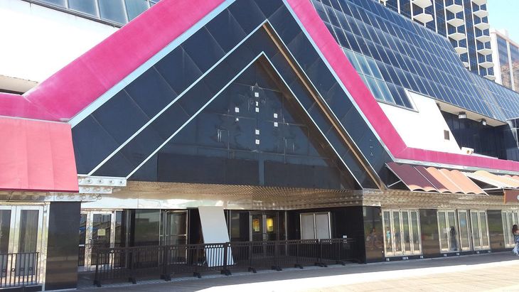
Untitled (Trump Plaza Black) Nos. 4 & 5, 2016, paint on panel, each in two parts, collection: Trump Entertainment Resorts/Carl Icahn, installation photo via Press of Atlantic City
which were hastily installed during the 2016 campaign over the dingy palimpsest of Trump’s name on the facade of the abandoned and bankrupt casino in Atlantic City.
And it reminded me that it very much mattered to the works that they were in the collections of the NYPD Order Control Unit and Trump Entertainment Resorts & Carl Icahn, respectively.
So when this piece went up on the facade of the Fox News studio facing the US Capitol building, in between the white supremacist insurrectionists’ attack on vote certification slash barely thwarted massacre of politicians, and the hastily militarized inauguration, where troops are literally–I hope–protecting the elected president and vice president from the paramilitary mobs of the current/outgoing president, it feels very important to point out that Fox News absolutely owns this.
For no other reason than I can, here is F. Scott Fitzgerald’s The Great Gatsby with every mention of Gatsby replaced by Greg. I should read this again; it has been a while.
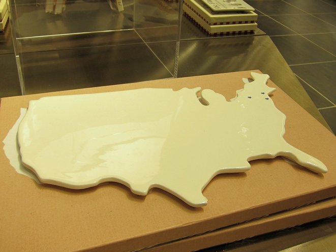
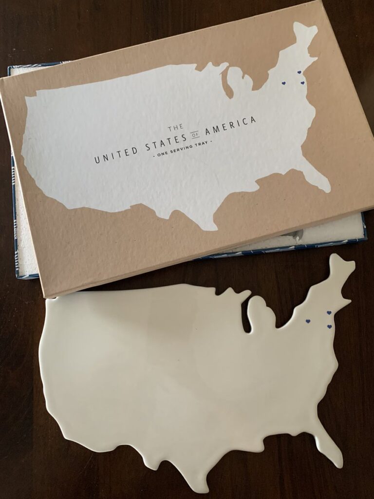
porcelain serving tray at the 9/11 Museum Gift Shop, as photographed in May 2014 by Scott Lynch for Gothamist
It is New Year’s Day, and way past time to recognize the significance of the 9/11 Museum Cheese Board in the development of my practice.
Installation view: Protestors’ Folding Item (LRAD 500X/500X-RE), ink on Cordura, nylon webbing, LRAD, 2014, Collection: NYPD Order Control Unit, image: @SeismoMedia
It is true that in late 2014, recognizing the aesthetic resonance of an LRAD and its cover with the work of Olafur Eliasson and Marcel Duchamp, respectively, combined with Olafur’s call to take the tools and methodologies of art beyond the confines of the art world led directly to my idea to create Protestors’ Folding Item, an artwork in the collection of the NYPD, with the intention of using VARA in court to enforce the piece’s exhibition integrity and require LRAD remain covered in public. From there I stepped up a practice of declaring works that involve objects I do not own or situations I don’t control-including some already in museums, which is convenient, conservationally.
But after spending more than six years now looking for them in the wild, and exploring various techniques and approaches for replicating them, it’s clear to me that the complicated condition of these cheese boards helped map the territory where Protestors’ Folding Item would soon be found: the implications of the art/not-art inflection point, the context of those states, and the related issues of authorship, the object, and the exercise of control.
Almost as soon as Jen Chung reported the existence of the porcelain serving trays in Gothamist, I began researching their creation, and identifying their creators. That the trays were significant was immediately obvious. That their significance came entirely from their terribleness was, too, but the immediate media focus on their terribleness made their significance an awkward subject. I never heard back from the designer or the company after sending what I thought was a very diplomatic and persuasive email request for the middle of a sudden PR maelstrom:
Dear Ms. S––,
Thank you in advance for your consideration, and for your assistance in a story on the porcelain platter Rosanna designed for the 9/11 Museum. I am a writer in Washington DC and New York City, and have published my independent art- and architecture-related research at my blog, greg.org: the making of, since 2001. The site was recently recognized by the Creative Capital | Warhol Foundation Arts Writers Program.
One of the subjects I covered rather extensively and authoritatively was the design competition for the World Trade Center Memorial. I was impressed by the Cartography platter in the recently opened 9/11 Museum Gift Shop, and the debates it has engendered about the museum, the memorialization process, and different experiences and modes of remembrance.
I would hope that as a company and a designer, Rosanna and Ms. Bowles might be able to share insights on the design and the process of creating it, and to site the platter in a constructive and empathetic context.
If it’s germane to this particular commission, it would also be helpful to hear about other museum or philanthropic projects, or perhaps to expand the context to include the history of commemorative plates, figures, and other objects.
Thank you again, and I look forward to your response, and to answering any questions that can facilitate my research.
Sincerely,
As is clear, though, I was still in research mode. It felt like a delicate balance, a fine line, to acknowledge that attention came from controversy, which is not something a manufacturer of porcelain serving pieces and collectibles is anticipating. But it’s also the case that though I was obviously not going to declare their trays works of art in my interview request, I was not yet ready to do it myself, even in my own mind. So for several months in 2014, these trays existed for me as objects in a state of tension.
The 9/11 Serving Trays are evidence of the historical and cultural reality of our world right then, when an expensive museum at the site of a terrorist attack slash commercial real estate development contracted with a housewares company to design an exclusive product for sale in their gift shop. The object that resulted was not a commemorative plate, which had already been produced in great volume by 2014; it was a ceramic tray in the shape of the continental United States, in cream glaze finish, and blank except for three navy blue hearts to mark the sites of four crashed planes. The box called it not a cheese board, but a serving tray. What could be more honorable than serving, they might have thought when they approved the copy. And when faced by overwhelming criticism, even from The 9/11 Families, a group used regularly until that point as human shields for all manner of capital- and politics-driven decisions at the WTC site, the museum defended its offering of “keepsakes” to a bigger market, “the 9/11 Community,” which could include not just the 9/11 Industry, but anyone who has the “historic experience” of visiting the museum itself.
I’m rambling, obviously, but after the internal debate over whether to post works like the blurred Frida, I am deciding to err on the side of slightly more info. And also, for the first time, my periodic internet sweep turned up this photo on a 3-month-old reddit post, the first evidence of the 9/11 Cheese Board existing outside the 9/11 Museum.
9/11 Cheese Board (2014), aka One Serving Tray, produced by Rosanna, Inc. exclusively for the gift shop of the 9/11 Museum at the World Trade Center, and available for a few days, at most, image via reddit user 13nobody
So there is something that in many other circumstances would be called hope. And that feels very fitting for today, and for this moment in time.
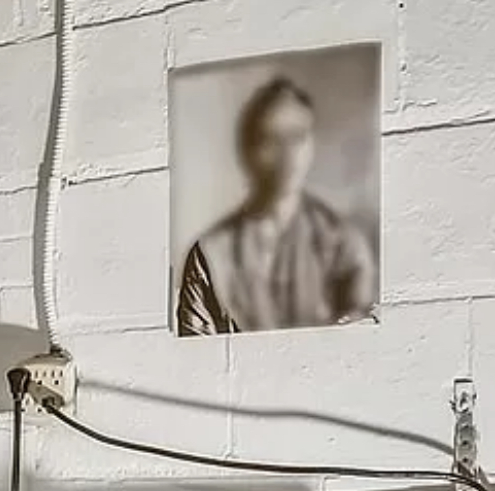
Untitled (Blurred Frida), 2020, 10×8 in., digital inkjet print, ed. 1/3+1 AP, Washington, DC installation view via zillow
Sometimes it feels like I find these works, and sometimes it feels like they find me. Now [gesturing around at the world] is definitely one of those times where I’ve been actively not, and yet I see a work like this, installed like this, and srsly, what am I supposed to do?
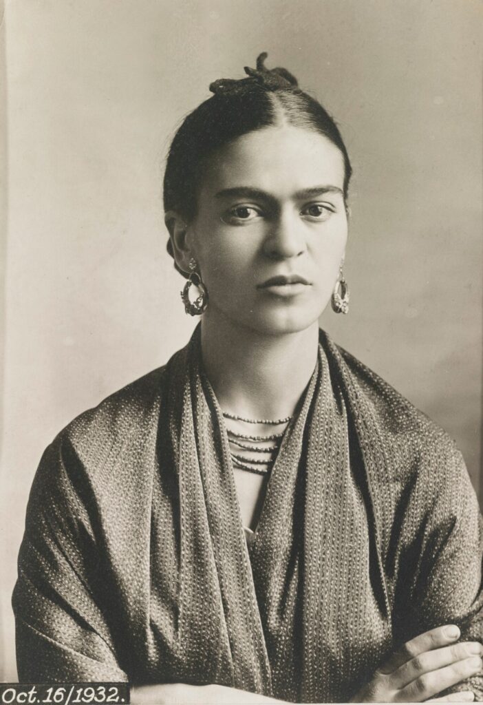
It first seemed like this 1932 portrait of Frida Kahlo by her father Guillermo Kahlo was blurred algorithmically a la Google Street View. But the absence of peripheral blurring, plus the unblurred shoulder at left, indicates it is blurred in the print.
[update: when asked for theories, the kid pointed out that the photo has a border along the bottom and right sides, but not along the left. Also, there is a shadow along the left corner, cast by the naked lamp below, but the shadow is blurred above. Thus the portrait was blurred in the listing photo. I feel like I’m raisin’em right.]
Frida Kahlo by Guillermo Kahlo, 1932, 6 x 4.5 in., silver gelatin print, via sothebys
It will be hard for the second print from the edition, or the AP, to ever match the grandeur of this original installation, though, the world is welcome to try.
Previously, related: Monochrome House and Untitled (Border), both early 2016 UPDATE: though the property is still for sale, the images have been removed lmao
Untitled (Lucien Smith), 2020, 8×10 in. digital print in 3-hole, acid-free sleeve, ed. 1/2+2AP, installation shot via sothebys.com
There so many things to catch the eye and tempt the paddle in Kenny Schachter’s second storage-clearing sale at Sotheby’s. One of the most interesting things to me is the veteran collector/dealer/connoisseur’s confidence in attaching shadow box-style frames and tape right over the overflap signatures of his two small (24×18 in.) Lucien Smith Rain paintings.
The next most exciting thing was seeing my newest work, Untitled (Lucien Smith), installed on the back. Believe me, the only person more surprised than me is probably Kenny.
Anyway, the photo, a detail of Smith’s signature on Reality Bites 10, 2012, is inserted in an acetate sleeve, and is an edition of two, with two APs. No. 1/2 is installed on the verso of Lot 35, Lucien Smith’s Reality Bites 10, above, and no. 2/2 is currently installed on the verso of Lot 37, Lucien Smith’s Reality Bites 9, below.
Untitled (Lucien Smith), 2020, 8×10 in. digital print in 3-hole, acid-free sleeve, ed. 2/2, + 2AP, installation image via sothebys.com
Both sales end tomorrow, December 17. The winning bidder of each of these lots is welcome to contact me for a certificate documenting their bonus acquisition, upon verification, of course. Artist proofs reside in copies of Smith’s 2012 exhibition catalogue, Small Rain Paintings. In case you miss out on the 17th.
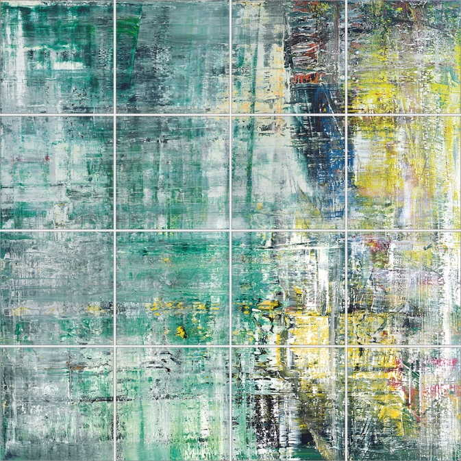
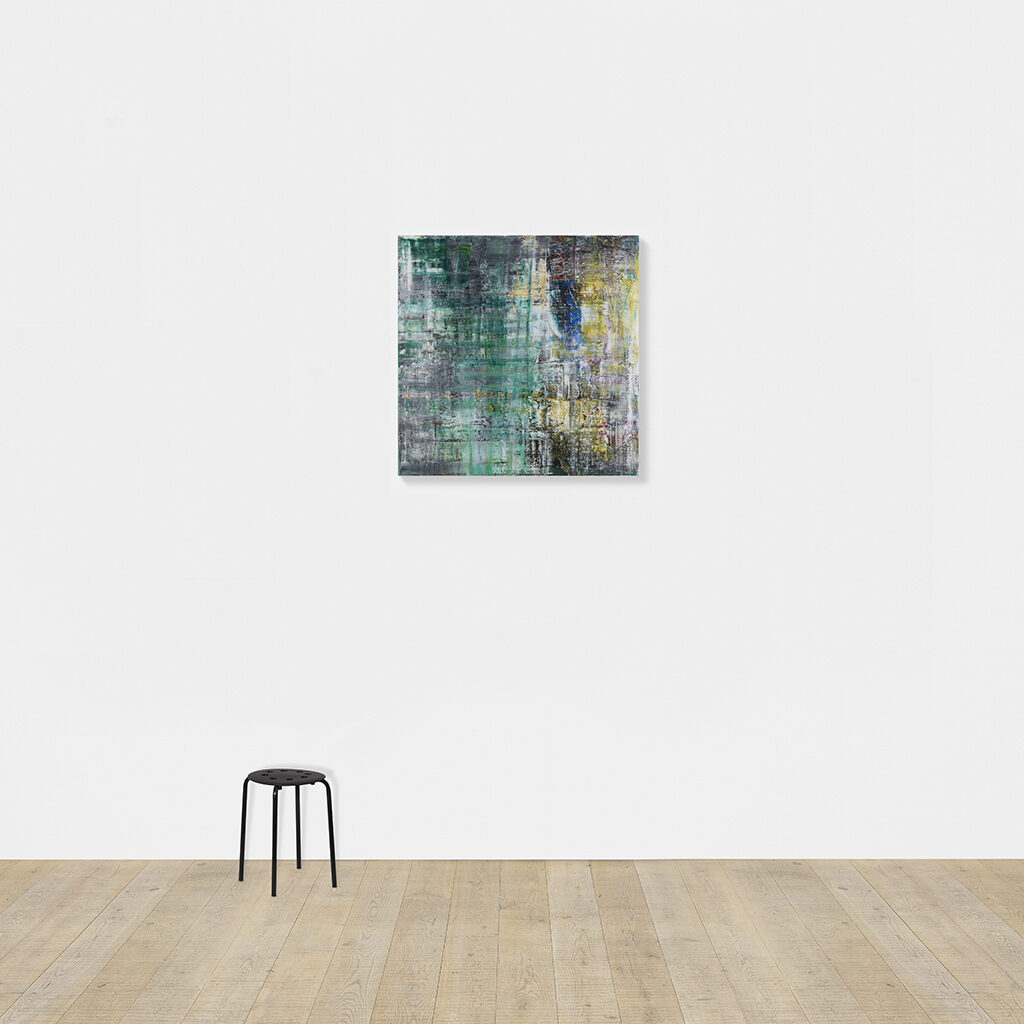
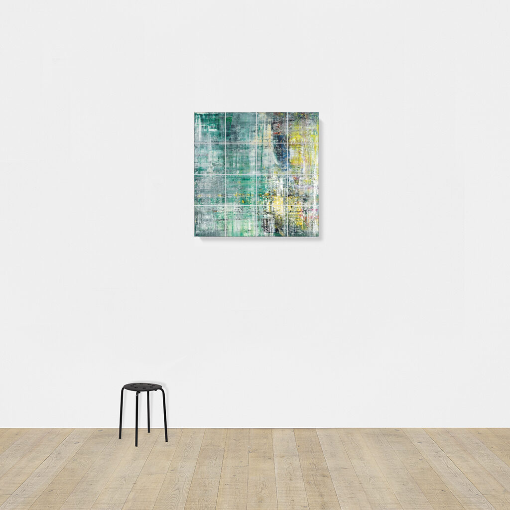
Gerhard Richter, Cage Grid I, 2011, 303 x 303 cm installed, 16 giclée prints mounted on aluminum panel, ed. 16+4AP
My old qualms about the capitalist reality of Gerhard Richter making photo copies of his greatest paintings were rendered quainter than the Geneva Convention by the introduction of an entirely new category, “facsimile objects.” These mass- and masterfully produced giclée prints, numbered and unsigned, and mounted on aluminum composite panels, are the creation of a print foundry founded by Joe Hage, Richter’s lawyer/collector/OG webmaster, Heni Productions.
Now known as Heni Editions, the firm makes stunning prints for other artists as well. [My favorite non-Richter Heni has to be their full-scale print of Hans Holbein’s the Younger’s The Ambassadors, published to benefit the National Gallery, which is still on my Christmas list.]
P12, “Annunciation After Titian,” 2015, facsimile object, 125x200cm, ed. 50+3AP
Heni got its start in 2011, when it made Cage Grid I, a giclée edition of Richter’s monumental squeegee painting Cage 6, divided into a 16-part grid. The panels were sold in the gift shop of the artist’s retrospective at Tate Modern, both as a set, and individually (as Cage Grid II).
Though facsimile objects initially seemed like they were designed to exist outside Richter’s art, they now appear alongside it. Gagosian included at least two facsimile objects–(P1) and (P12), above–in a Richter prints show earlier this year.
They’ve been installed in my head even longer. In 2016 for Chop Shop, a show where large-scale works were sliced up or parted out to order, I used this grid mode to create Destroyed Richter Grids, full-scale recreations of lost squeegee paintings.
Cage Print (P19-6), 2020, 100x100cm, Diasec-mounted giclée print on aluminum composite panel, ed. 200, image via Heni Leviathan.
Time being a flat circle, Heni has now announced the drop of Cage Prints (P19), facsimile objects in editions of 200 (each) of all six of Richter’s Cage paintings, but at 1/9th-scale, or 100×100 cm. Applications for purchase are currently being accepted (decisions are made on Dec. 6), though with no guarantee of Christmas delivery.
Untitled (Heni Cage Grid), 2020, 103 x 103 cm, Diasec-mounted giclée print on aluminum composite panel, in 16 25 x 25 cm parts, ed. 16+4AP
And so I, too, must, compelled by fate, announce a new work, Untitled (Heni Cage Grid), in which a Heni facsimile object of Cage 6 is cut into 16 pieces, each 25×25 cm. Like Richter’s Cage Grid I, it will be available in an edition of 16, plus 4AP. Each piece will be labeled and numbered, and a couple will include fragments of the original label. Some may be sold separately.
Unlike Heni, I can guarantee it will not be available before Christmas.
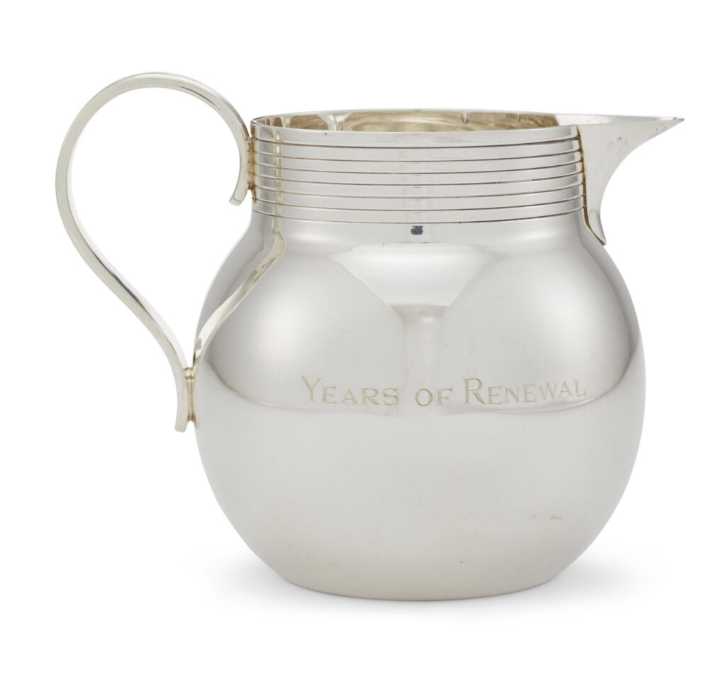
ed. 1/?, ex-collectio Peggy & David Rockefeller, sold at Christie’s in 2018
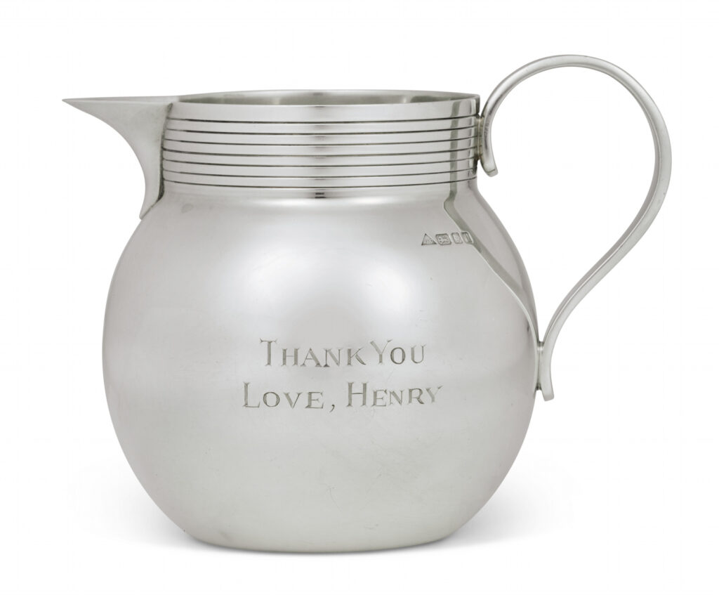
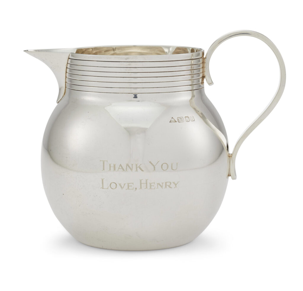
In conjunction with the third volume of his memoirs, Years of Renewal, covering his post-Watergate tenure as both Secretary of State and National Security Adviser in the Nixon and Ford administrations, which was published in 1999, Henry Kissinger created little thank you gifts for his influential friends.
Sterling silver milk pitchers 4.5 inches high, with a machine turned collar and reeded handle were engraved with the book’s title on one side and
THANK YOU LOVE, HENRY
on the other. Their stamp identifies them as the c. 1995 work of smith J.A. Campbell, whose assortment of sterling silver gifts, including engravable silver lids for marmite or Heinz Ketchup, but not these little milk pitchers, are (at present) sold online at The Silver Company.
Another example from what is now an edition has appeared in public, in the sale, ending tomorrow, of the personal collection of Mrs. Jayne Wrightsman, the socialite and French furniture and bookbinding connoisseur who was an extremely influential trustee of the Metropolitan Museum, as well as being in Nancy Reagan’s cabinet.
With less than 18 hours to go, Mrs. Wrightsman’s jug is currently at $1,100. [update: it sold for $4,000.]
This edition will trace the strategic social relationships Kissinger cultivated in the New-York-socialite-meets-consultant-elder-statesman-who-eschews-travel-to-certain-Geneva-Convention-signatory-countries phase of his career. Or it might just map to the acknowledgements in his book, which could be the same thing. Either way, just as with the reflections of the lightboxes in the photos of the respective jugs, the circumstances of this work’s making will gradually come into clearer focus.
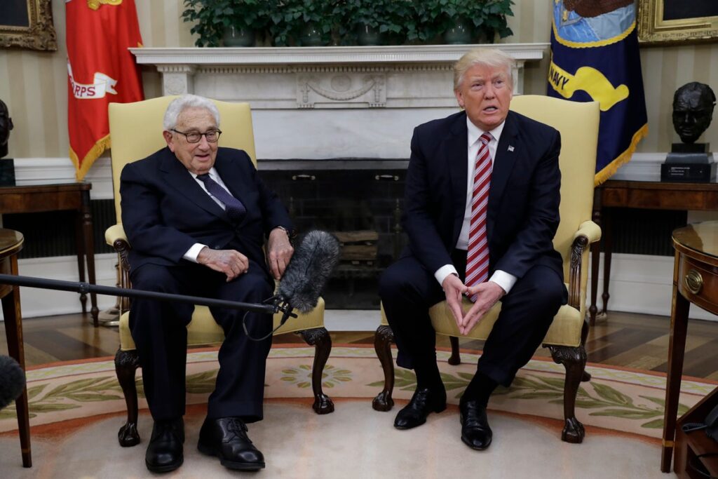
May 10, 2017 AP photo of Kissinger, who reportedly became friends with Putin in the 1990s, while Putin’s other friends went out the back door, I guess. image: patch
I have three deadlines at the moment, so of course I needed to take a couple of hours to tackle a project that has been on my to-do list for seven+ years: figuring out how to print the world’s greatest webpage at full-scale.
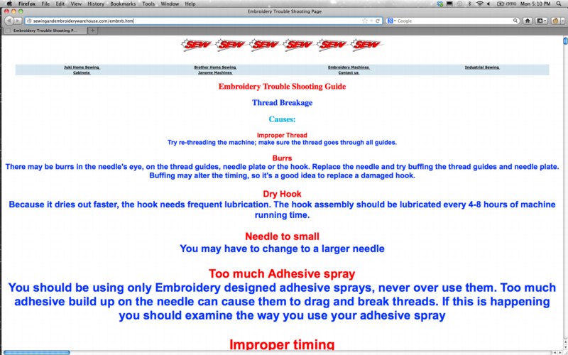
I hadn’t figured out how to print the Embroidery Trouble Shooting Guide in the time between it first going viral and when its wonky html code finally got fixed a few years later. I bought myself some more time by publishing the original page on my site as a work, Untitled (embroidery trouble shooting guide), one of my collection of zombie art websites.
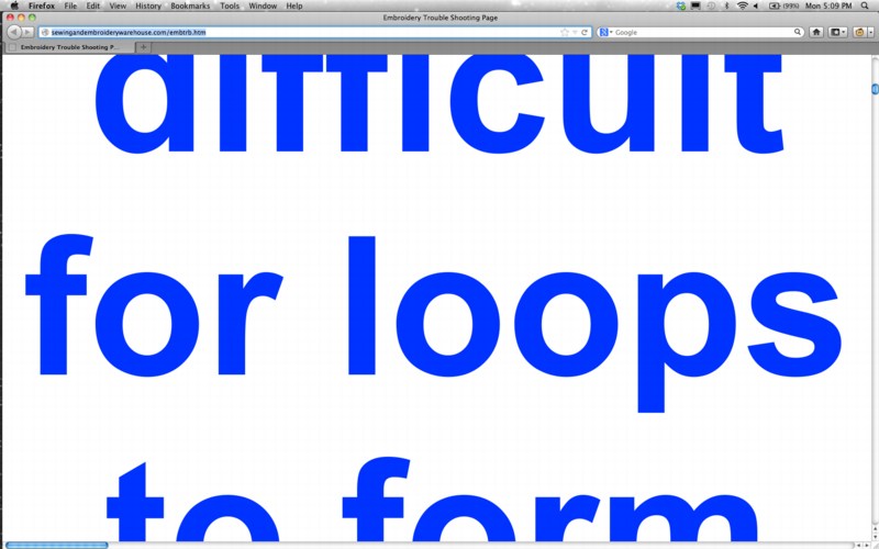
But I have always wanted to see it printed out. A book never turned out right, and the exponentially growing font size made a joke of any remotely normal printing process, even to look at it.
Today though, I decided to just print the webpage as a pdf, and see how big one sheet needed to be to hold it all. And it worked. From that, I figured out how big the font on the last line of text actually is. [I mentioned this triumph at dinner, and my wife just said, “Can’t you just calculate it from the code?” Reader, I married her.]
Study for Untitled (etsg), 2020, inkjet on paper? uv on vinyl? 175 x 330 feet, though, that I know [pdf]
Anyway, the answer is a single page 175 feet tall and 330 feet wide, slightly larger than a football field. Rendered in 6,093 point font, the last, largest line of text is almost 85 inches tall.
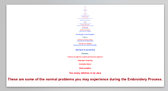
Study for Untitled (These are some of the normal problems you may experience during the Embroidery Process.), 2020, inkjet on paper, 85×3927 in.
Surely, there is a 96-inch wide, 500-foot long roll of paper waiting to take this work. I do know a guy with an Epson printer; maybe I should just print it on primed Belgian linen folded in half instead.
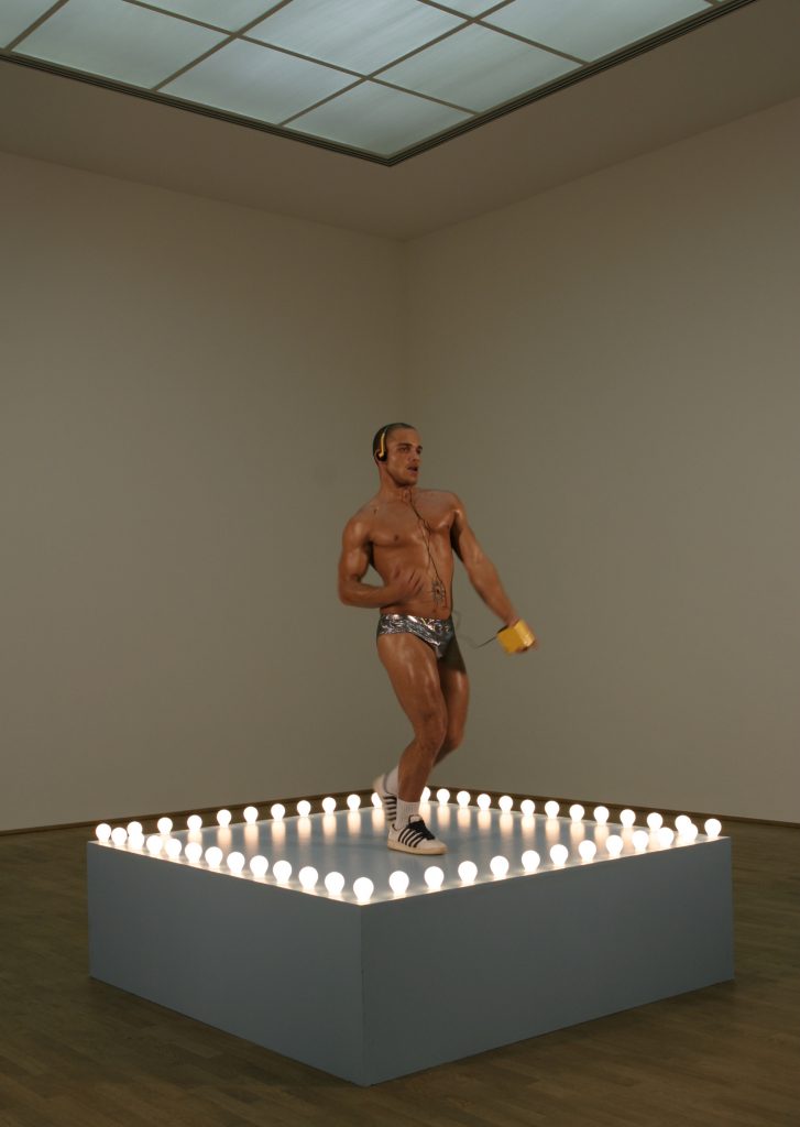
Tyrus with Mack Untitled (Gaga Dancing Platform), enamel on MDF, actor from Andi Mack, installation shot, 2019
Last year this time, I surprised myself by making a work related to* Sturtevant’s repetition of Felix Gonzalez Torres’ “Untitled” (Go-Go Dancing Platform) that appropriated props (and would enlist actors) from the series finale of the Disney Channel middle school soap opera Andi Mack, and was deep-looking and cross-referencing Leo Steinberg, Bruce Hainley, and tumblr superfans. This year we’re protesting outside the condo of the postmaster general to prevent the throwing of the election via the dismantling of the post office. What a world.
Sturtevant, Gonzalez-Torres Untitled (Go-GO Dancing Platform), 2004, MMK Museum für Moderne Kunst Frankfurt am Main, Photo: Axel Schneider, Frankfurt am Main via larb
* One thread of thought I ended up on was about a Leo Steinberg reference to what kind of act is involved in the creation of one artwork that is connected to another artwork. Tbh, I had to re-read these posts twice and can barely follow what was apparently so epiphanically clear then.