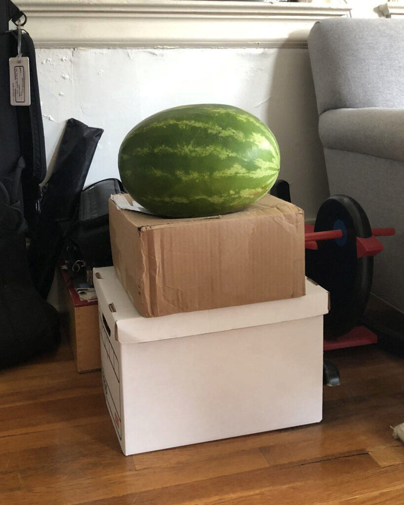
I was updating my documentation, and when I realized it would be my 200th work, I said why yes, I absolutely am making this in painted bronze. 200. what a world.
the making of, by greg allen


I was updating my documentation, and when I realized it would be my 200th work, I said why yes, I absolutely am making this in painted bronze. 200. what a world.
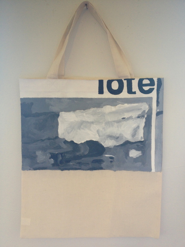
idk why, but I just remembered that when this was in a show, one of Gerhard Richter’s art dealers wanted to buy it, but was like, “$1200? I can make my own,” and I felt both annoyed and understood.
And now that I’m writing this, I’m also relieved I didn’t sell it to Ye.
Previously: Untitled (Muji Tote), 2014
Related: Tote, 1963 [gerhard-richter.com]
“Maybe because I wanted to own such a beautiful Titian”

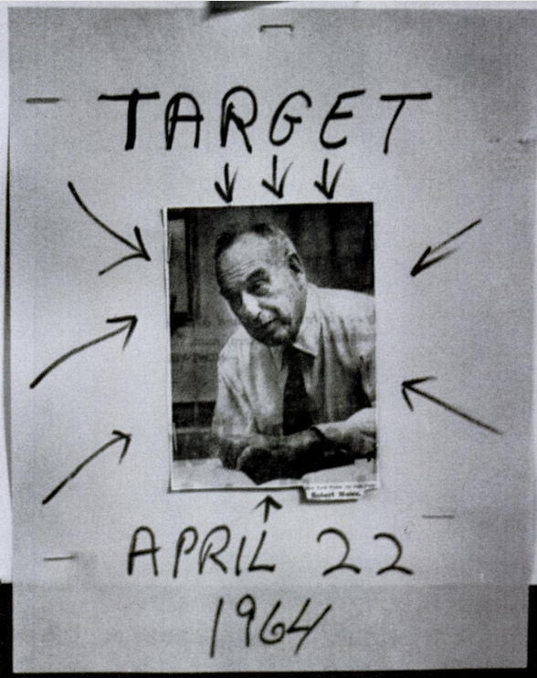
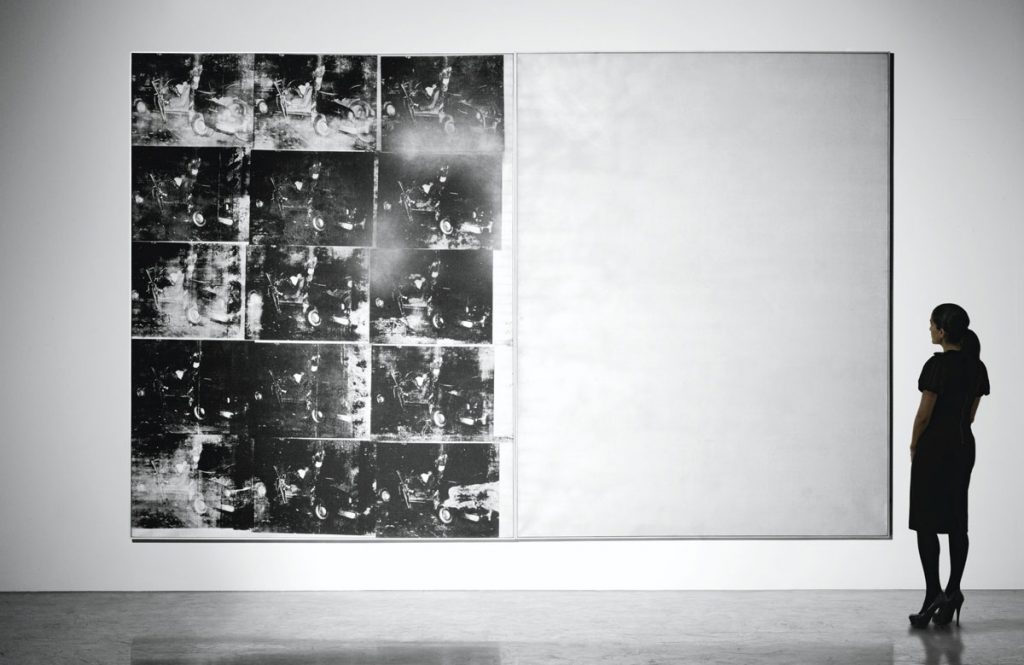
I was looking for the Life Magazine photo Andy Warhol used in the summer of 1964 to make his World’s Fair replacement mural, Robert Moses 25 Times, and this was not it.
It’s from “Throttle The Fair–the Public Be Damned,” an article that ran the week the Fair opened, in the April 24th issue. The photo is captioned, “The Victim”:
Only because he is the head of a huge extravaganza–the New York World’s Fair–is Robert Moses the target of militant Negroes. They are led by a 22-year-old zealot named Isiah Brunson, who, spelling out his threat last week, said, “We’re going to block every street that can get you anywhere near the World’s Fair–and give New York the biggest traffic jam it’s ever had. If people are made uncomfortable by it, good! Maybe they’ll get some idea how uncomfortable it is to be a Negro in this city.”
“Throttle The Fair–the Public Be Damned, LIFE, Apr. 24, 1964
Life is just being coy; there were many reasons for Blacks to protest against Moses. The Brooklyn Chapter of CORE, which Brunson chaired, had been protesting against discriminatory trade union hiring practices during construction of the Fair for more than a year. In addition to access to union jobs, Brooklyn CORE was calling for a citywide rent strike, and the investigation of police brutality.
Brunson proposed a stall-in, where thousands of Black drivers would run out of gas and block all the access roads to the World’s Fair on opening day. The city was worried enough about it, Life reported, that they hastily passed a law making it illegal to run out of gas. In the end, the stall-in did not shut down, or even slow down the Fair. But by deploying broader inconvenience, instead of targeted shame, the stall-in was a model for expanding awareness and the impact of a protest action beyond, say, an unaccountable and inveterate racist politico–or a biased white media outlet.
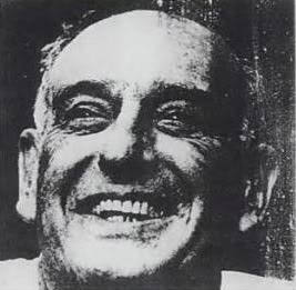
Anyway, the smiley Moses photo Warhol used came from a 1962 Life puff piece which, how did he land on that? did he have a clipping service? Did he go to the library topical guide? Holy smokes, October 22, 1962? Just weeks before Warhol getting the commission paperwork? What if a giant portrait of Moses was the *first* idea for the World’s Fair mural?
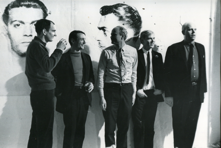
Here is Fred McDarrah’s photo of Andy Warhol partying at the Factory on April 21, 1964, the night of the opening of his Brillo &c. boxes show at the Stable Gallery. The Sculls threw the party, even though it was at the Factory. That’s, from left, Tom Wesselman, Roy Lichtenstein, James Rosenquist, Warhol, and Claes Oldenburg. Behind them is a diptych of mugshots from Warhol’s New York Pavilion mural, Thirteen Most Wanted Men, which had been destroyed just days before this photo was taken, and before the World’s Fair even opened.
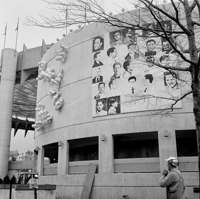
I’ve never been satisfied with explanations of why the mural was painted over with silver. But I blame pavilion architect, art curator, and unremorseful nazi Philip Johnson, who knew the subject–mugshots from an NYPD brochure–told Warhol to keep quiet about it, and then apparently caved within a day of the publication of a Fair preview by a Hearst-owned tabloid that criticized the mural as “Thugs at the Fair,” in which an NYPD spokesman questioned how Warhol had obtained these internal police documents.
On Friday, April 17, after two days of who knows what, Warhol sent an unsigned, one-sentence letter to the New York State Department of Public Works, Division of Architecture:
Gentlemen:
This serves to confirm that you are hereby authorized to paint over my mural in the New York State Pavilion in a color suitable to the architect.
Very truly yours,
Andrew Warhol
via “Letters to Andy Warhol,” a 2016 Cadillac as in car exhibit [?], cited by warholstars
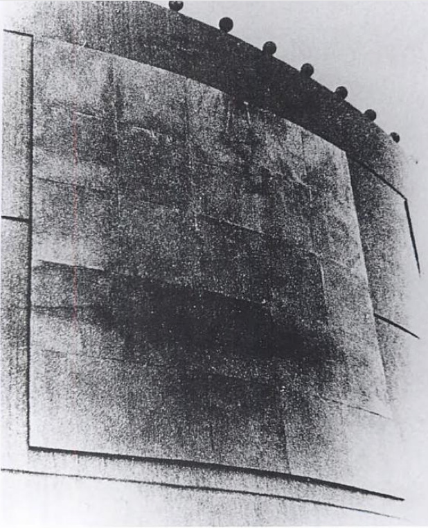
The architect apparently decided silver was suitable. I think the Times ran this image on the 17th, so the letter was just ex-post-facto CYA. In the aftermath of the mural’s destruction, Warhol decorated his party with images from the project he’d worked on for almost a year and a half. The dates are otherwise unclear, and I haven’t read The Biography*, but Warhol had moved into the Factory in November 1963, and maybe it was painted silver by April, too.
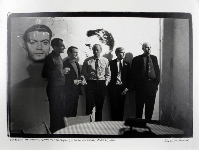
But the images are reversed. [This perp is center right on the mural.] And it looks like a double register. This other McDarrah photo from a second earlier, a print of which is in the collection of the Nasher Museum, shows light reflecting off the mugshots. These are not double-printed outtakes, but the full-scale transparencies used to make the screens, casting shadows on the wall behind them. These ghosts of the mural destroyed just a couple of days before were now decoration for Warhol’s party.
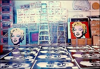
Almost three months later, the Times is still on it, and Warhol feels the need to say the mural was painted over because one guy was pardoned, and so it’s not valid anymore, and he’s working on inspiration for a replacement. That was in July, when he went to the trouble of making 25 panel portraits of World’s Fair commissioner Robert Moses, which were rejected in some paper trail-less way. And which cannot be random; did Philip Johnson pin the blame on Moses? Another, much later conversation used to explain the destruction had Henry Geldzahler and Johnson citing Nelson Rockefeller’s fears of offending Italian American voters in an election year. If that was his choice, between Rockefeller and Warhol, is there any question which way Johnson would go? When the chips were down, Johnson loved power more than art, and he threw Warhol and his rough trade artwork under the bus of New York politics.
Anyway, I now think more about how this must have sucked for Warhol, who spent so much time before–and after–having to destroy his biggest project to date. Not sure what to do with my sympathy for him, except to recommit to bringing his destroyed mural panels back into existence.
Gary Comenas pieced together a lot of this timeline from the Warhol Archives and CR [warholstars.org]
previously, very much related: On Warhol and the World’s Fairs
13 Most Wanted Men exhibition at the Queens Museum in 2014 [queensmuseum.org]
Buy Blake Gopnik’s Andy Warhol biography via bookshop [bookshop]

Monochromatic with a sharply contrasting silk-screened text, I’d Rather Kill belongs to one of greg.org’s most iconic series—the joke paintings. Master miner of mass media imagery, greg.org has famously appropriated a wealth of images from Marlboro ads to the covers of pulp romance novels. In 1987, he began appropriating jokes and cartoons in his work. Noting, “No, I’m not so funny. I like it when other people are funny. It’s hard being funny. Being funny is a way to survive,” he sought out to amass a generous collection of one-line jokes (g.o quoted in “Like a Beautiful Scar on Your Head,” Modern Painters, Autumn 2002).
Distilling his canvases in a humorous simplicity, greg.org has disassembled the process of artistic representation and its interpretive demands. Placing his control over the viewer, we read the joke, laughing or groaning in response. Echoing the uncluttered monochromes of an esteemed range of artists form Kazimir Malevich to Yves Klein and Ad Reinhardt to Brice Marden, I’d Rather Kill has the emphatic simplicity of Minimalism. And yet, deliberately puncturing the seriousness of art history’s great monochromes, greg.org has printed a classic one-line joke at its center. Recalling the zips of Barnett Newman’s paintings, greg.org’s selection of a deliberately unobtrusive font places the canvases serious and authoritative appearance in strange tension with the flippant content. “The subject comes first. Then the medium I guess,” greg.org has explained. “Like the jokes. They needed a traditional medium. Stretchers, canvas, paint. The most traditional. Nothing fancy or clever or loud. The subject was already that. So the medium had to cut into the craziness. Make it more normal. Normalize the subject. Normality as the next special effect” (greg.org, quoted in R. Rian, ‘Interview’, pp. 6-24, in R. Brooks, J. Rian & L. Sante, greg.org, London, 2003, p. 20)
Minimal in composition and lacking the painterly presence of the artist’s hand, greg.org’s joke paintings parallel the “rephotography” that greg.org became so well known for in his photographic works. Surreptitiously borrowing, appropriating, or as he refers to it, “stealing” is a trademark of his work. Even the location from which he draws his content has become a staple to his oeuvre. “Jokes and cartoons are part of any mainstream magazine,” greg.org explains. “Especially magazines like the New Yorker or Playboy. They’re right up there with the editorial and advertisements and table of contents and letters to the editors. They’re part of the layout, part of the ‘sights’ and ‘gags.’ Sometimes they’re political, sometimes they just make fun of everyday life. Once in a while they drive people to protest and storm foreign embassies and kill people.” (greg.org quoted in B. Ruf (ed.) Jokes and Cartoons, n.p.)
“These jokes are edgier and more topical than usual,” observes greg.org. “If read literally, the jokes are tragic. It’s a way to cope, to deal with certain realities, absurdities, what I find unbelievable in this world. I don’t really have a sense of humor. With my jokes, you are not sure if you should laugh at them or agree with them. Either way, it’s a powerful reaction.”
“There is a certain charge when I find something (i.e. a photograph or a cartoon) as if I would have done it myself,” greg.org says. “As if it were made for me. That is a sexual feeling. It’s like being given something and there is an excitement in taking it. Usually a public image or text is powerful because I’m not the only one who recognizes it. It’s a briefer way to communicate than if it all came from me at first.”
“Any artist that tries to divorce themselves from what’s going on in this culture is going to wind up being pretty uninteresting. Even Mondrian listened to jazz, and it influenced his work. Categories are fine for academics and historians. For me, there is only the category of ‘good artists.’ ”
Previously, related: “If anything I think they’re tragic.”
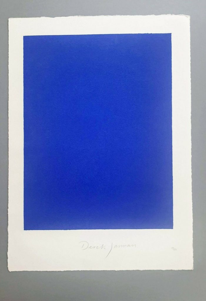
This is a silk screen print by Derek Jarman. It was originally intended to accompany a letterpress edition of the text for Blue, his final film. That project was either produced in an edition of 150, plus some proofs, or was not realized before Jarman’s death. The numbers on the two I’ve seen hint at a bunch–this one is labeled 17/150, and the print shown at Chelsea Space in 2014 as part of the book was 37/150.
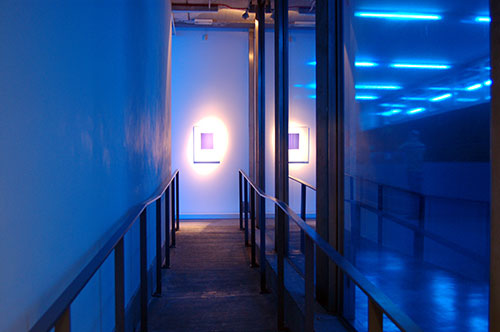
But the only other copies I’ve ever seen of the whole book were described as printer’s proofs. Jarman was supposed to have painted IKB on the clamshell boxes of 25 of the 150 editions. One proof on ebay back in the day said only four proofs were made before Jarman died, and its lid was painted, but didn’t have a print, and said the prints were never realized either. Another, proof listed for sale privately, had a print (#43/150), but its lid looked more like the paper under the paintings than a painting itself.
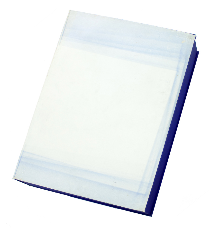
But that seller [pdf] said the whole letterpress edition “was centered on a loose Klein Blue screenprint signed by Jarman,” which makes it sound like the prints made it across the finish line after all. Why a signed print in a painted box doesn’t essentially become a certificate for a painting, I don’t know, but if the paintings never happened, it’s moot.
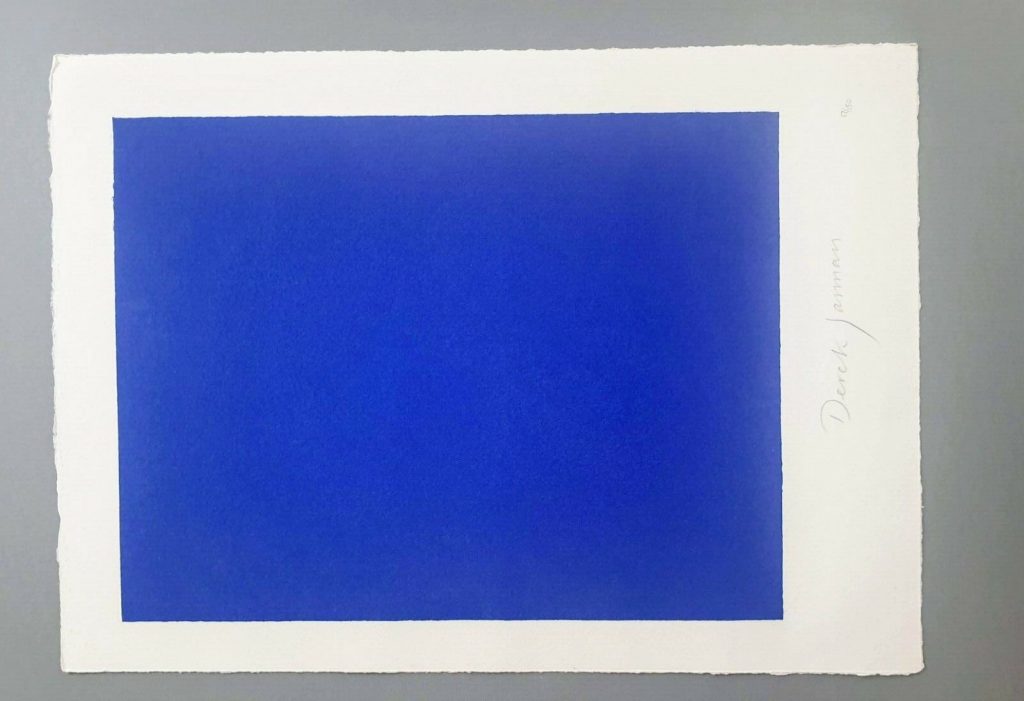
I absolutely love this print, and may try to buy it, but I cannot for the life of me figure out why it’s portrait and not landscape. Maybe I’ll just make some and fix it myself.
LMAO This always happens to me. I think, oh, just flip it, DONE. But as I am typing in the dimensions of my new cinematic masterpiece, I am frozen. Because what should it be? Jarman made Blue on 35mm film. So 16:9 (1.77 in the US, where I first saw it, except if I look it up, some definitive-seeming sources have a widescreen aspect ratio of 1.85:1.) But Jarman’s own print is basically 4:3, so television. (Which is OK because Blue was aired on Channel4? Or nah?) But when it was still a live performance called Bliss, Jarman projected an image of an actual Yves Klein painting, and then switched to a blue gel, so no image at all, just a frame or aperture mask on the light? I think 16:9 is the clear choice here, but still.
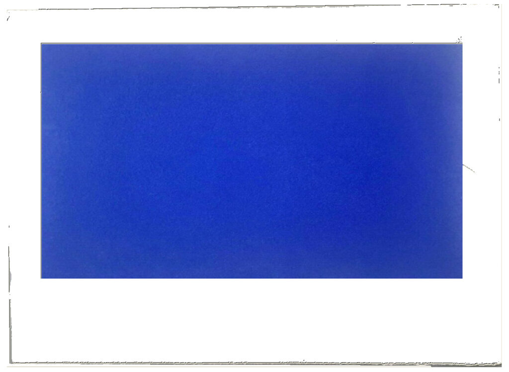
Next day update: after spending part of a day determining the size and placement of the blue printed field in relation to the (unconfirmed) paper size and type of the original, I repeatedly caught myself trying not to think about how the film, then the print, then the book, then the box, then the– were all approached as the last project Jarman might complete. Make just one more thing, he and those around him might have thought? Woke up again, so there is still some time.
DEREK JARMAN, SIGNED, BLUE LIMITED EDITION SCREEN PRINT, ends 5/28/2020, OK, it went for GBP 620, not bad [ebay]
One, then another, then a whole bunch more. Realizing a group of unfinished textiles happens like that bankruptcy quote: slowly, then suddenly.
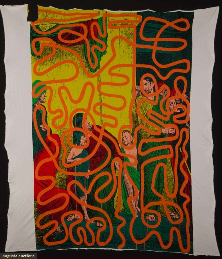
Lot 260 Keith Haring for Stephen Sprouse Textile, est. $1,500-2,000 update: this object sold for $12,000. [augusta-auction]
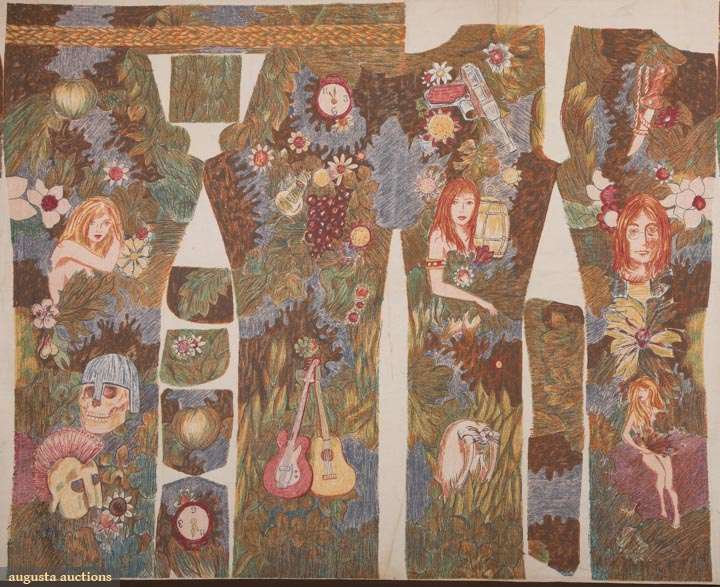
Lot 379 John Lennon Uncut Wrangler Jeans, 1967-8, est. $500-800
update: this object did not sell in this auction
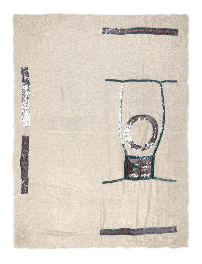
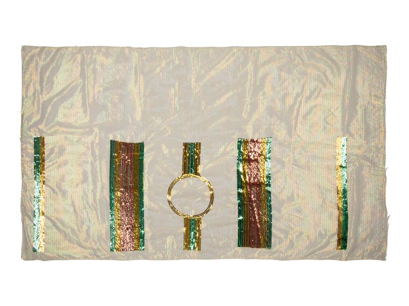
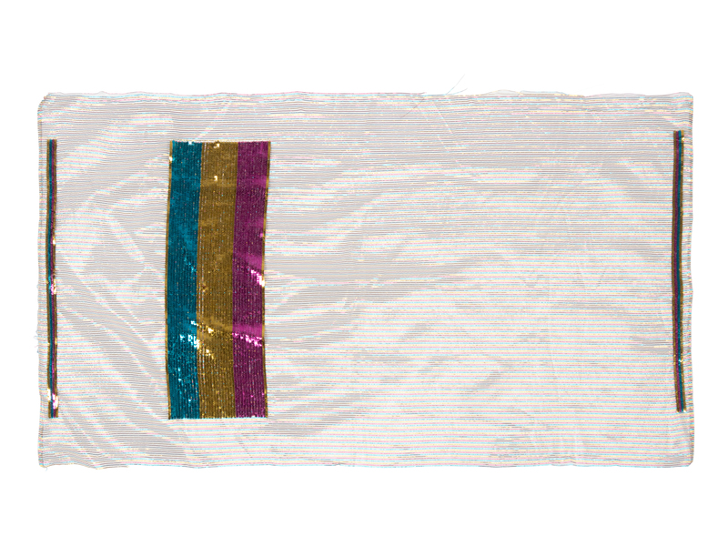
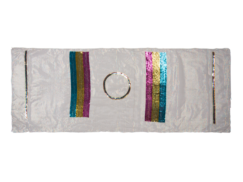
Deadstock is one thing, but these uncut tops from the Geoffrey Beene Archive are something else. And they feel like something else again (something that gets stretched and hung on a wall).
It all reminds me of that time Marc Jacobs said Elizabeth Peyton was all, “Don’t be intimidated; fashion is art, too,” and he was like, “so I got a little bit of confidence from that conversation.” And I guess it’s contagious, because here we are!
Lot 38 Unfinished Geoffrey Beene Sequin Tops, c. 1975, est. $1,000-2,000 [hindman via invaluable]
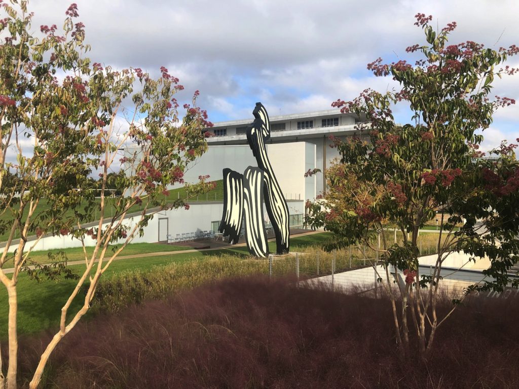
My initial impression of the Kennedy Center’s The Reach is obliqueness. It is in a triangle of land carved by a parkway and on-ramps and a bridge, from which it is hard to see. I finally made a visit this morning after multiple failed, drive-by attempts to photograph this new installation of Untitled (Trudeau Trump Brushstroke). This perfectly framed and backdropped view is the only one, and it is in the intersection of a The Reach sidewalk and a commuter bike path.
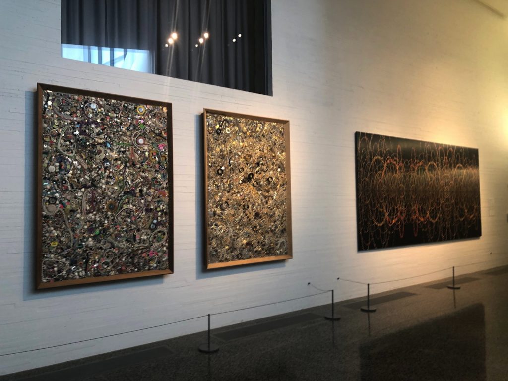
The art at The Reach is on loan. I did not check where the big, blue Joel Shapiro came from, but except for the large, 1969 Sam Gilliam painting, which is from the artist himself, most of the work inside comes from Glenstone. In lieu, it looks like, of a lot of money. David M. Rubinstein, meanwhile, has given more money than even Boeing, and loaned James Madison’s copy of W. J. Stone’s 1823 facsimile etching of the Declaration of Independence (ed. 201, of which around 50 survive, apparently.)
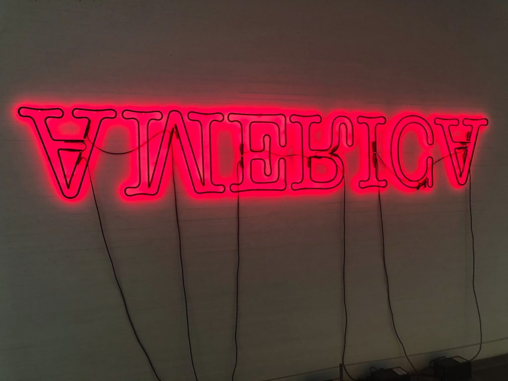
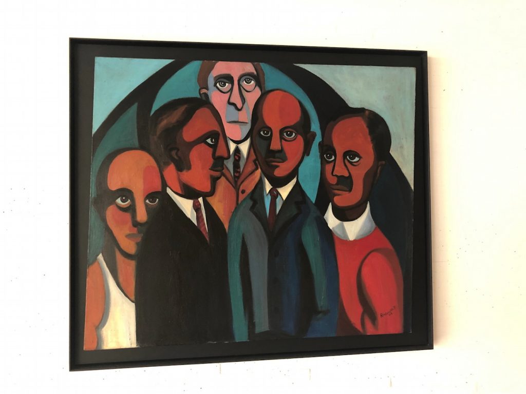
Boeing also sponsored the exhibition of George W. Bush’s paintings of Iraq War veterans, the billboard for which is not easily visible from the nearby roads. Maybe if you’re stuck in traffic. I did see the show, and will write about it separately.
Other thoughts of The Reach: I felt some spatial echoes with Holl’s ICA at VCU, especially in some peekaboo vistas and the dramatic staircase.
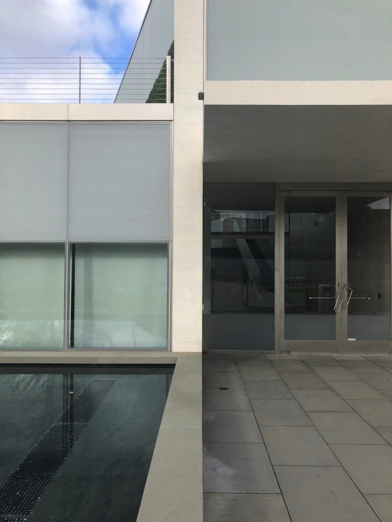
Perhaps this awning rainspout is designed to arc perfectly into the pond and not splash onto the ledge instead?
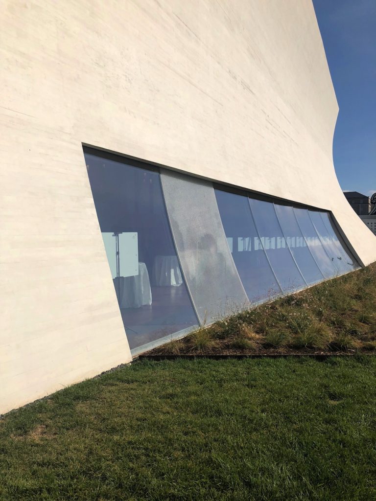
Perhaps this curved glass shattered on its own?
Frieze Week is over. Fashion Weeks are over. The Fall Auctions are coming. And it is McRib Season.
It is also six years since Tobias Meyer and Ian Bogost led me to make this video. Views, shows, likes, money. And the thing we use to mark time.
untitled (where we all go) [youtube]
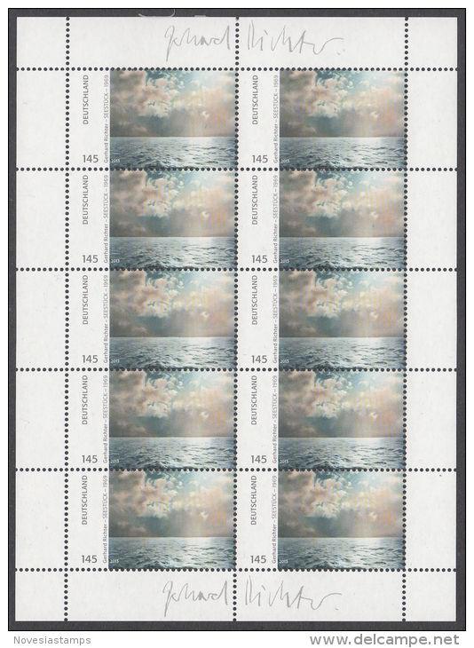
Deutsche Post published Gerhard Richter stamps in 2013. EUR1.43 stamps showing text alongside a rectangular cropped image of the artist’s 1969 square painting Seestück (Gegenlicht)/ Seascape (Contre-Jour) [GR233] were available in collectible sheets of ten. If, as the two facsimiles of the artist’s signature in the sheets’ margins would infer, the stamps constituted the largest edition the artist has ever published, the use of these stamps also amounts to the greatest act of artistic destruction Richter has ever faced. And at the hands of his own countryfolk, no less.
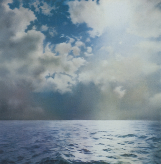
Did the artist somehow know this was coming? Is that why he chose–presumably it was he–to use the picture depicting contre-jour, backlighting, the photographic technique of directly facing the light source–in this case, the sun–to produce heightened visual contrasts and unsettling shadows?
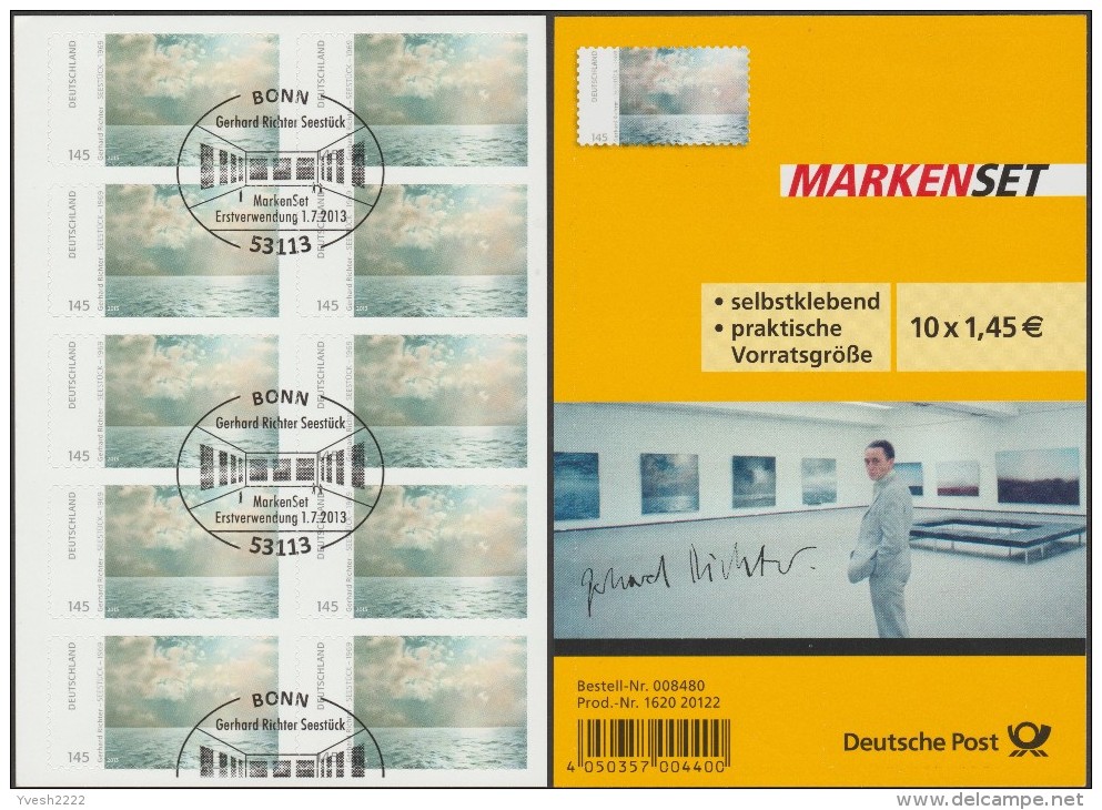
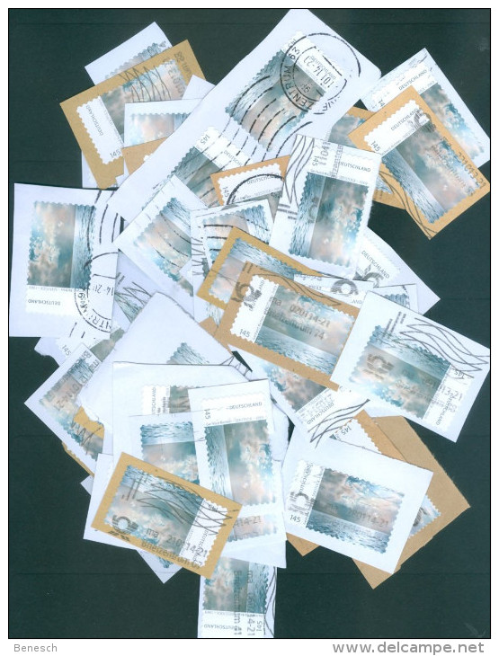
Fortunately, even in the face of such widespread destruction, there is hope. Faithful stewards in the collecting community are doing what they can, preserving stamps and sheets in whatever form they can: some sheets have the signatures intact; some don’t; some stamps have a signature fragment; a rare few include the commemorative envelope (also with a signature, historians); some [above] are mutilated ceremonially–canceled, they call it, with euphemism that cannot conceal the inherent pictorial sadism; and some, marred and disfigured on the field of postal battle, are rescued from oblivion by angels wielding tiny, little scissors.
Whether it’s 50 original works or ed. 50, we’ll see when the studies arrive from Austria.
Previously, related: Robert Rauschenberg, Piece for Tropic, 1979, ed. 650,000
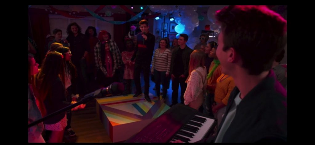
I was going to add this as an update, but it really needs its own post. When I stumbled backwards from appropriating Andi Mack art prop art into Bruce Hainley’s text discussing Sturtevant as talkshow discussing Felix Gonzalez-Torres within a play discussing Sturtevant, I did not remember that Leo Steinberg had special guest appearances in both. But now that I’m back within arm’s reach of Hainley’s s Under the Sign of [sic]: Sturtevant’s Volte-Face, I realize I am trapped in a carnival ride where I can’t tell screen from mirror from object. So here is an abridged, Mack-optimized, recap of Hainley and Steinberg, with a special cameo from editor Michael Fried. (He was not my idea.)
Continue reading “Notes on Untitled (Gaga Dancing Platform)”
It was while digging into an unusual credit line in a 1964 exhibition checklist and trying to find research into why fandoms turn toxic that I ended up bouncing last week between a 220-page interview transcript with the late art historian Leo Steinberg and a postgame for #TyrusWeek, a recent fandom-wide effort to get the Disney Channel middle school soap opera Andi Mack trending on Tumblr during its final episode.
Continue reading “Untitled (Gaga Dancing Platform)”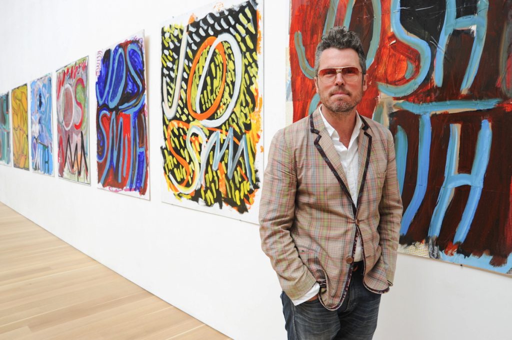
A friend and colleague recently said I had a very soothing voice, I should do a podcast, and I couldn’t tell if that meant I was talking too much, or being too dadsplainy, or perhaps he was right? I generally trust his judgment, but the reason I created a podcast read by a robot is because I could not get past the annoyance all audio performers apparently deal with, of hearing a recording of one’s own voice.
Anyway, I joked that I’d make an ASMR art video, ASMRt, and the name was so damn catchy, I knew at that moment I had to do it. But what to say? What to read? Yesterday the perfect text fell from heaven [actually, Contemporary Art Daily]: the press release for Josh Smith’s first New York show since leaving Luhring Augustine for David Zwirner.
One thing led to another, and now here is a recording of me laconically reading press releases for fifteen Josh Smith solo shows between 2007 an 2019. It was recorded on June 11, 2019 an iPhone in two conference rooms at the Cleveland Park branch of the DC Public Library. Text sources are linked below. My first regret will probably be hosting this mp3 myself. My second will probably be not releasing this as an album.
Download ASMRt-Josh-Smith.mp3 [mp3, 29mb, 1:01:12]
UPDATE:
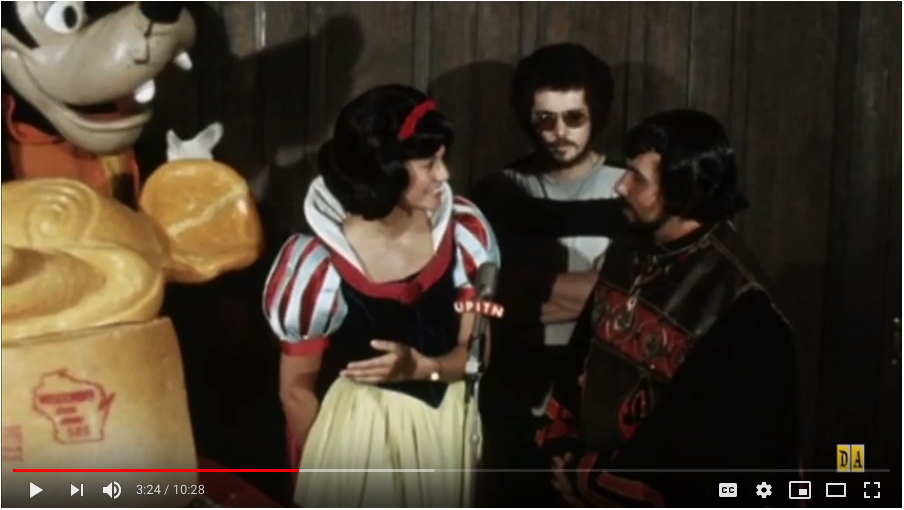
Machu Picchu, do you, like Constantin Brancusi, consider the base an integral part of your sculptures? Or did you place your work, the world’s first portrait bust of Mickey Mouse sculpted from cheese, on an intact wheel of Wisconsin State Brand cheddar cheese so that it would, as the publicist claimed, weigh 1,000 lbs?
Is a question Snow White did not ask the sculptor at Sardi’s that morning in July 1971. Some extended footage of this press event to promote Disney On Parade, a touring theatrical production not involving ice skating, which I may or may not have seen as a child, was surfaced by the enthusiast/historians at DisneyAvenue. It baffles me in unexpected ways.
Sure, there are Paul McCarthy ways, but the film’s rough, unstaged, even amateurish vibe reminds me of early 90’s chocolate and finger-chopping videos more than the sprawling deluxe porntasmagoria of Park Avenue Armory-era Snow White.
Maybe it’s realizing the parallel professionalizing paths McCarthy and Disney have traveled that capture my attention. Having recently experienced a Disney cruise, I can honestly say almost every detail of this footage makes me cringe and fear for these people’s jobs. After I’ve been outraged at the apparent lack of attention to detail, or even of preparation.
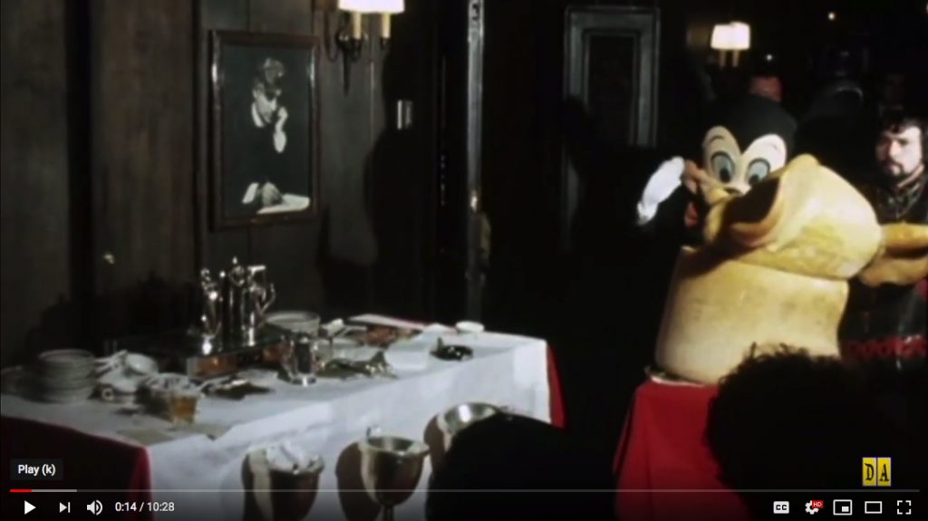
Who was running this event? Did no one know where or how the cheese sculpture would move? Does no one have a mark? Did Snow White not have an inkling about what to say or do? When she improvises(?) a conversation with Mickey and Goofy, does she not know these performers are supposed to not talk? The action is driven almost entirely by instructions from the assembled press, who just want to get their shots, print first, maybe, then TV? Is that alright?
Let’s spend a tiny moment on Snow White here. She is wearing a watch. She has an office. She talks about phone conversations to publicists. Though there is a translator between them, she knows enough Spanish to translate the sculptor’s answers for the press, similar to how she interprets Mickey’s mute, mime answers to the questions she maybe should not have asked in the first place. Whenever discussing the subject at hand, a sculpture made of cheese, she only mentions its materiality, its cheeseness: that it melted, that people–and anthropomorphized dogs–want to eat it.
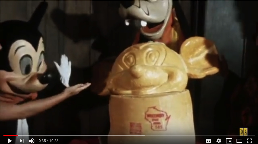
The first thing Snow White says is to Mickey: “There you go, Mickey. A self-portrait of yourself! Can you imagine that?” Well, if he made it, yes? But no. She immediately crosses awkwardly in front of Mickey and the sculpture, to shake the sculptor’s hand: “Thank you very much!” She’s soon told to move because lighting, and then she’s told to interview the sculptor.
The sculptor who is himself in an elaborate costume. He works, he says, in stone, wood, bronze, and now cheese. It took him three 8-hour days to complete. The cheese got soft in the heat, which made things difficult. The sculptor’s name is Machu Picchu. Reader, I think it was not. But in the end, this is the performance, character, and narrative which most fascinates me.
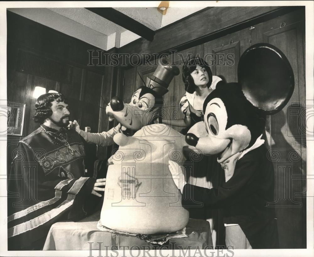
How did Disney come to the place where a pseudonymous Spanish-speaking sculptor has his first work in the medium of cheese, a 1,000-lb. head of Mickey Mouse, wheeled into a Broadway restaurant by three unrehearsed performers is the best way to promote a traveling character revue? What is his experience, this ungoogleable artist whose authorship Snow White attacked repeatedly?
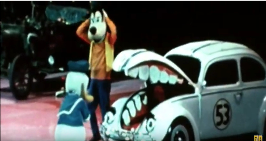
Other segments of this PR footage show characters entertaining a group of boys in Boys Club t-shirts on the empty floor of Madison Square Garden. A range of costumed characters meet an audience assembled, as their posters tell us, by the New York Metropolitan Area’s McDonald’s restaurants. Donald Duck and Goofy clown around mutely with a Herbie The Lovebug–who has very non-canonical eyes, eyebrows, and flimsy teeth. A lot of legwork went into preparing for this publicity campaign, and this footage resulted. As Rauschenberg didn’t say, there is art in the gap between image and experience. Or was that Duchamp’s infrathin, between content and perception? I wish we lived in a world where it didn’t feel obscene not just to remake this sculpture, but to break down, study, and restage this entire video, line for line, gesture for gesture, shot for shot, frame for frame, for a live audience.
Rare Footage of Disney on Parade (1970s) – DisneyAvenue.com [youtube]