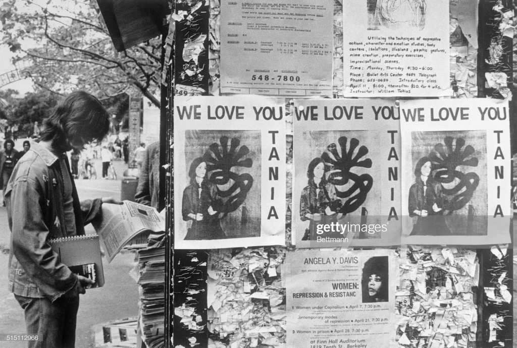
You know what I have never seen? An original “WE LOVE YOU TANIA” poster. Which might be easier to explain than you might think. If my own vintage photo captions are to be trusted, the photo of Patricia Hearst reborn as Tania of the Symbionese Liberation Army was only released on Wednesday, April 3, 1974, less than two months after her kidnapping. It accompanied a tape recorded statement by Tania, which was delivered to the offices of leading San Francisco counterculture/rock radio station KSAN, Jive 95. The photo ran on the front page of newspapers across the country on April 4th. [If I recall his Guggenheim clippings collection correctly, On Kawara read about it in the Washington Post.]
Getty’s original caption for the above image says, “Posters reading ‘We Love You Tania’ appear on bulletin boards at the University of California campus 4/15,” the day “she was identified by the FBI 4/15 as one of four armed women who took part in the robbery” of the Hibernia bank across the bay in San Francisco.
But the posters above and below Tania show events on April 11 and 7, respectively. So it seems more likely to me that Hearst’s Berkeley classmates posted their flyers–and they were photographed–soon after the Tania image was released, not, as it sounds, in celebration of the hours-old bank robbery. So this is a very narrow window in which to celebrate Tania’s revolutionary activities without celebrating her crimes. Or without at least using the security camera still of her from inside the bank.
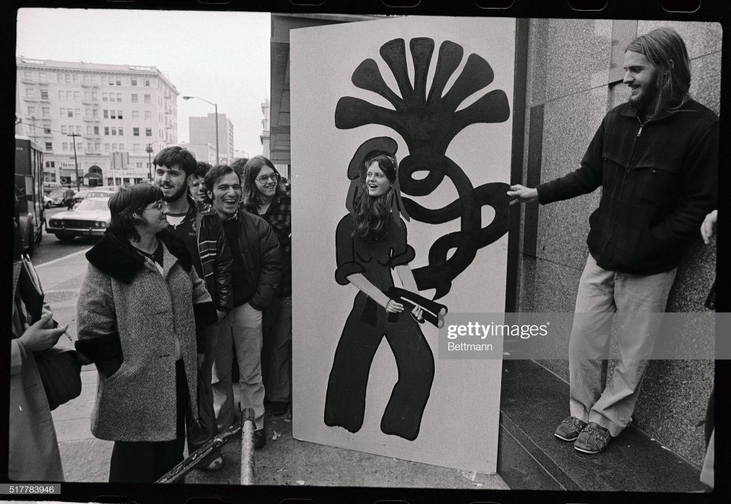
(Original Caption) Someone waiting in line to watch the Patricia Hearst trial 2/23 brought in a huge drawing depicting Patricia Hearst holding a weapon copied from a photo taken at the University of California at Santa Cruz, uses her head in the drawing for a photo.
Is it possible for a photo archive to be even less helpful in its archiving? The only thing Getty managed to record about this photo of an extraordinary life-sized cutout painting (not a drawing) on board of the Tania portrait is the date (February 23, 1976).
I can find no source for the claim that the Tania photo was taken at UCSC, and a great deal of documentation that the SLA didn’t get farther than Daly City before the Tania photo was released. And though it is unspecified, this installation photo must have been taken outside the Federal Courthouse in San Francisco. Was it the painting itself, perhaps, that came from Santa Cruz? [update from a new source: it was apparently the young woman in the cutout who was from UC Santa Cruz: one Jean Finley. It also says the drawing (sic) was brought by “someone,” and that the Tania photo comes from the Hibernia Bank robbery. Boomers made news hard.]
The photographer, and more importantly, the artist who made the cutout painting, and most importantly, the current status and location of the cutout painting at this moment, are all unknown. If you are the boatshoed man on the right, or know him–he would be in his mid-60s now–please do get in touch. There are works in progress.
UPDATE: The internet is not canceled yet.
Within hours of posting this, Bean Gilsdorf tweeted that perhaps this woman posing in the Tania painting was Jeanne C. Finley, the artist, filmmaker, and California College of the Arts professor who had attended UC Santa Cruz. A couple of quick, shocked, and bemused emails later, we knew. That is her, and the artist who painted that thing is Alison Ulman. Here I quote Finley:
[T]he fact of that image is that it is an incredible artwork by my very best friend from childhood, Alison Ulman, that she did when we were in college at UC Santa Cruz back in the truly experimental days of that institution. Alison was obsessed with Patty Hearst and we both attended the trial. She created that work as a public artwork (long before the idea of social engagement ever was a thing) that the public would engage in while they waited in line to get into the trial. On one side was Tanya with the 7-headed cobra, on the other side was Tanya as a debutante. Everyone wanted to have their photograph done on the 7-headed cobra side! We had to get in line at about 1am and sleep on the sidewalk until dawn because there was so much public interest in attending the trial and it was a great way to pass the time.If you try to google Alison all you’ll find is this 15-year-old website. (http://endlessprocess.com/) …She is an amazing artist, and lives a most unconventional life…not one that really intersects anymore with the art world, but that is really the art world’s loss. We’ve been best friends since 2nd grade where we lived two blocks from one another and spent every day together as kids. We decided we wanted to go to college together so we both applied to UC Santa Cruz because we read that there was co-ed nude sunbathing on the dorm roofs. Santa Cruz was really hard to get into then, so the other artists in art school with us were all pretty amazing people. I felt so lucky to be there and have the freedom to be an artist and do things like this with my best friend.