Previous mentions of Danh Vo do not begin to account for the extent to which his work has influenced the Facsimile Object project.
The Frenchness of the original Manet Facsimile Object drove me to decide the certificates of authenticity needed to somehow be French as well. I spent a couple of increasingly frustrated weeks looking for a calligrapher who could execute certificates in official 19th century French letter forms. Researching the history of French script, I kept running up against the realization that the image of French cursive in my mind had become Vietnamese.

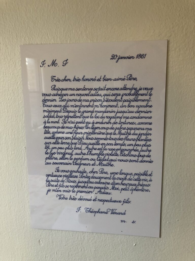
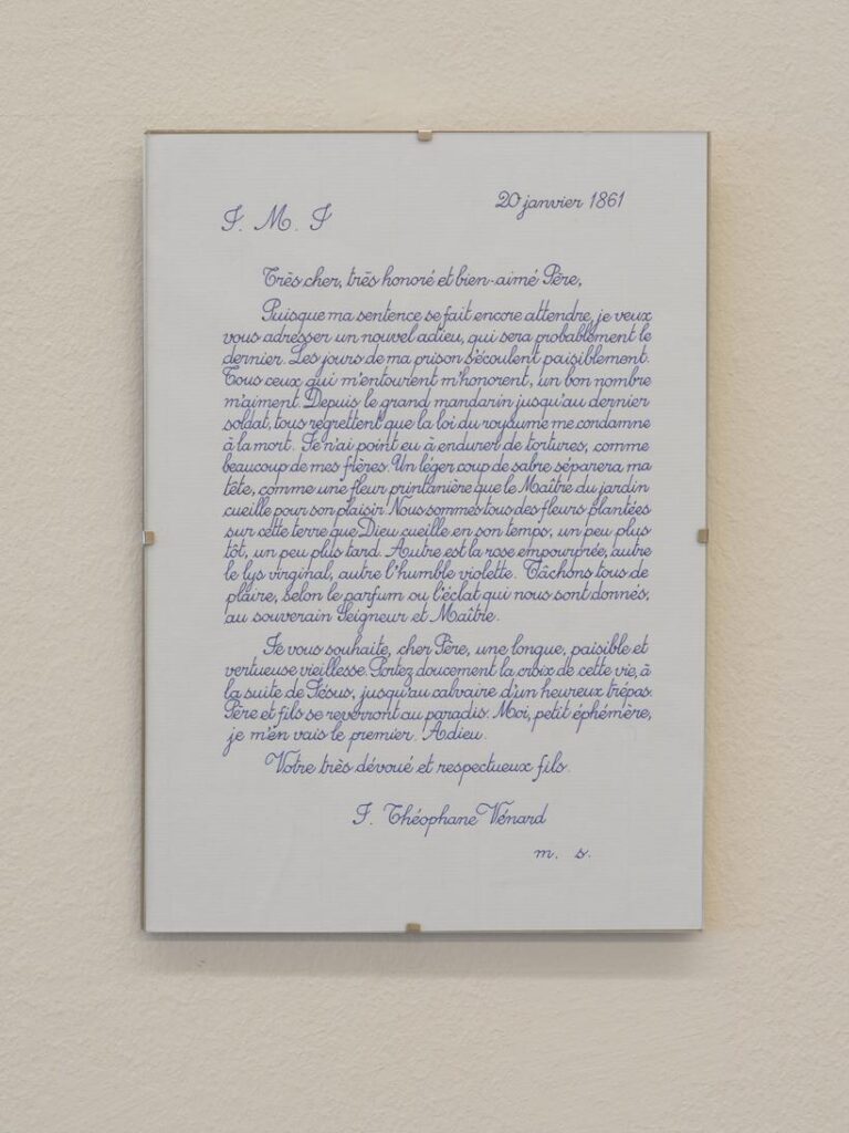
2.2.1861 (2009 – ) is one of Danh Vo’s simplest, most elegant, and most powerful projects. His father, Phung Vo, copies out editions of a farewell letter Jean-Théophane Vénard, a 19th century Catholic missionary wrote to his father on the eve of his beheading for proselytizing. Phung learned exquisite, French-style penmanship in school Vietnam during French colonial rule, and converted to Catholicism as a gesture of political solidarity with the South Vietnamese regime–but he doesn’t speak French. He’s reproduced the letter hundreds, if not thousands, of times, and Danh includes the letter in all his exhibitions. Phung’s letters will continue as long as he’s able. In the mean time, the father’s elaborate calligraphic texts have become an evermore prominent element of the son’s work.
After deciding not to try to get Phung Vo to make them, I ended up copying his letter for practice, and producing the Manet certificates myself. It’s a pattern I’ve kept since, using period German script for the Dürer certificates, and so on.

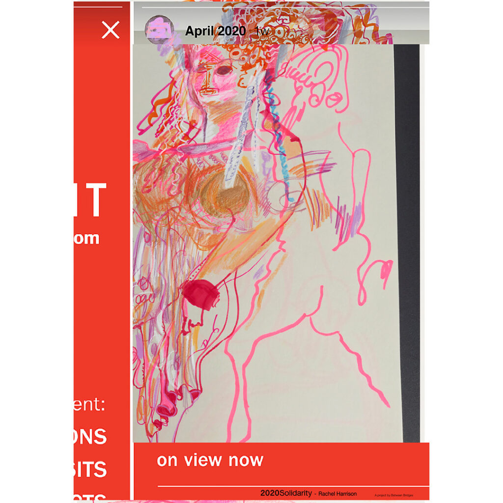
I think Vo’s creating 2.2.1861 as a time-bracketed edition, available until it’s not, also informed my own approach to the Facsimile Object editions. Though a bigger inspiration was clearly limited-time editions that arose during the pandemic, like Pictures for Elmhurst and Wolfgang Tillmans’ Between Bridges. They’re available as long as they’re needed, or useful, or relevant, or I don’t know what. It’s not like they’re meant to be disposable, but there is a finitude to them.
Anyway, as much as I love 2.2.1861, I’ve never put one up; they feel pretty intimate, but also pretty fragile, the less handling the better. While wishing Vo and his family all the health and safety in the world, the last year-plus had me thinking about mortality more regularly. And I decided to order a letter now, while I knew they were available. When it arrived–the lead time was several months–I immediately felt like I knew what had to be done, and so I made a Facsimile Object of it.
In a way, this Facsimile Object complicates the relationship between itself, the artwork, and a COA. What would a certificate of authenticity even look like here, but a less expert copy of the original work?
Within minutes of my taking the photo at the top of the post, the tape slipped, and the object guillotined to the floor. It was totally fine, and will be hanging again by morning. It is very sturdy. I can’t tell for sure in the dark, but it also seems to have a slight lack of focus, or a pixel-level distortion keyed to the tiny waverings of Vo’s line. It reminds me of the visual tension present in Richter’s stripe series. Those images are created not by stretching, but by replicating an almost imperceptibly narrow vertical strip of a painting. Will producing a facsimile object cause an unanticipated, slight distortion that’s only visible in person, close up? Daylight can’t come fast enough.
[update: it does! actually, it feels a little blurry. perhaps something about the scanning, or the surface of the paper. Anyway, fascinating.
Previously, related: Facsimile of Authenticity
Is it just the cover of the first printing of the exhibition catalogue for the 2018 Guggenheim show that doesn’t have DANH VO TAKE MY BREATH AWAY printed on top of the letter?
