Things don’t look good–and some things can’t be seen at all–in Jacob’s critical look at the BAFTA nominations. And the problem is the studios’ stupid MPAA-legacy DVD screener system.
Hero and Million Dollar Baby were left off top-10 lists and didn’t get a single nomination for anything, while House of Flying Daggers got nine. One possible reason? Studios didn’t send out DVD screeners at all.
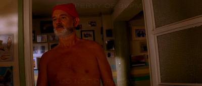
The Life Aquatic didn’t get any nods, either, even though Buena Vista Pictures Marketing sent out screeners to all BAFTA members. The only problem: those DVD’s had “PROPERTY OF BVPM” and “DO NOT DUPLICATE” burned into every one of Anderson’s fanatically composed frames.
Occasionally, this is amusing–in the last of those images [on Yankeefog.com], you’ll notice that the back of Cate Blanchet’s shirt seems to be advertising her new biography, “I, Cate”–but most of the time, it’s even more incredibly distracting than you’d imagine from looking at the still images above. In every one of Wes Anderson’s carefully planned tracking shots, the most noticeable element becomes those big, unmoving letters at the top and bottom of the screen. Every one of his carefully composed static shots is thrown out of balance by their presence. It becomes difficult to notice Bill Murray’s wonderfully subtle performance, or Owen Wilson’s understated humor, because your eye keeps being drawn to the giant words hovering in front of them.
As if it could get worse the texts aren’t in Futura, Wes Anderson’s font of choice.
Looking Where The Light Is Good [Yankeefog.com, via kottke]
Related: Wes Anderson’s Favorite Font [greg.org pointing at kottke. kottke, kottke, kottke!]

