Via some content artnet was putting into an architecture vertical, I came across some content Frank was putting out in 2019 to boost the Gehry brand via a collab with his son Sam. It was a house in Santa Monica that started as a spec house, but which became an age-in-place reboot of Gehry’s own house.
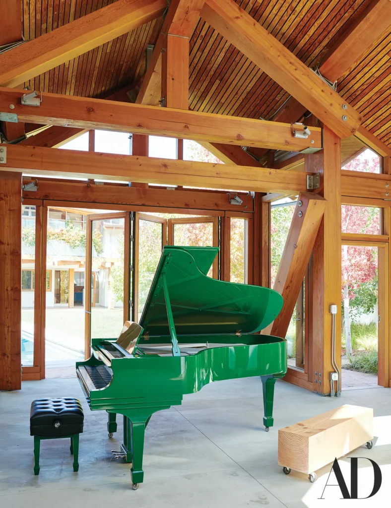
Which is all fine, I’m just setting the context for why I’m only seeing this 5-yo Architectural Digest photo now. Ignore the Kermit green Steinway [or file it away for an obscene trend piece; it’s a thank you gift from Michael Eisner, for the pavilion Gehry made him in Aspen], and focus in on that scooter/bench.
It’s so sick it makes me want to restart my dadblog.
I can find no mention of it. I’d have guessed it was an offcut, but the dimensions look bigger than the fir beams in the house itself. Was it a sample? How did this come to be?

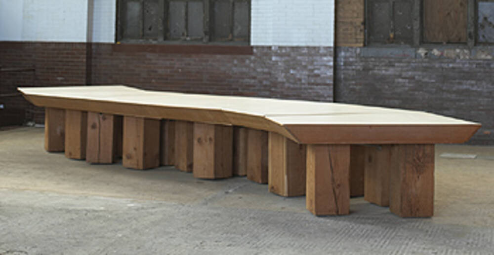
The closest analog I can find in Gehry’s oeuvre is just down the street in Venice, but ages ago: the giant wood block & roller skate legs on a modular conference table made for the fish room at Chiat/Day’s temporary warehouse/office in 1986. NGL, it feels like a stretch.
Step Inside Architect Frank Gehry’s Santa Monica Dream House [arch digest]
