A 1968 NY Times review of Robert Rauschenberg’s giant Autobiography edition by Hilton Kramer was titled “Art: Over 53 Feet of Wall Decoration.” And the abstract mentioned simultaneous installations at the Whitney and MoMA, so I was interested to see what else Kramer hated. Turns out it wasn’t a Rauschenberg or a Broadside Art project at all: it was Mason Williams’ Bus.
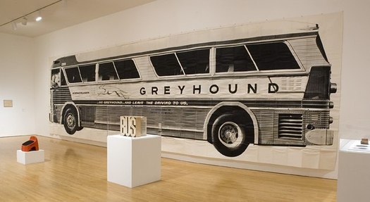
Mason Williams’ Bus is one of the most awesome photomural/artist book/oddball objects of the Los Angeles 1960s. I love it. It is a life-size photo of a Greyhound bus, folded up and put into a box. It was made in an edition of 200, but existed primarily as a joke, or a poster, or a decoration, and only rarely has it been perceived as an art object.
Which is hilarious–and hilariously wrong–because Williams is a childhood friend and longtime collaborator/co-conspirator with Ed Ruscha, whose deadpan artist books were busy not being recognized as art–or as proper books–at the same time.
This lack of critical appreciation may have something to do with Williams’ primary occupation, which was TV writing and composition; he was the head writer for The Smothers Brothers and wrote “Classical Gas.” Bus was an irreverent stunt, though he took it very seriously.
[For a rare, serious look at Bus, there’s no place better than Design Observer, where Lorraine Wild wrote about it in 2008; Michael Asher had donated his copy of Bus to MOCA, and the museum had just installed it. Wild has Williams’ making of story, the hilarity of which is only hinted at in the parodic text Williams included with each numbered edition:
Actual size photograph of an Actual bus.
10 ft. 3 1/2 in. x 36 ft. 2 in.)
Weighs 10 pounds, 7 ounces.
Conceived by Mason Williams.
Photograph by Max Yavno.
Enlargement made from a 16×20 print of a 4×5 negative. Printed on billboard stock in 16 sections by silk screen process. Printed by The Benline Process Color Company of Deland, Florida and Pacific Display of Los Angeles, Califfornia. [sic] Hand collated, rolled and transported early in the morning by three people (two men and one woman) in one car over a period of several days. Each copy individually hand assembled by three people, using hands, feet, tape sissors [sic] and a Barlow knife. Assembled with 120 ft. (per copy) of Scotch Brand double-faced tape (No. 666).
Folded by hand and foot by three people.
Assembled and folded quietly on television sound stages on Saturday mornings in Los Angeles, Califfornia [sic]. Assembly time, nine man hours per copy.
Cover concept by Bob Willis. Designed from a box found under his bed by his wife. Cover constructed of corrugated fiberboard, 200 lb. test, #1 white. Printed and fabricated by Nehms Company of Los Angeles, California.
Published on the 24th of February, 1967 in a limited edition of 200 copies.
Love that so much, I want to start silkscreening and double-taping life-size photos of things.
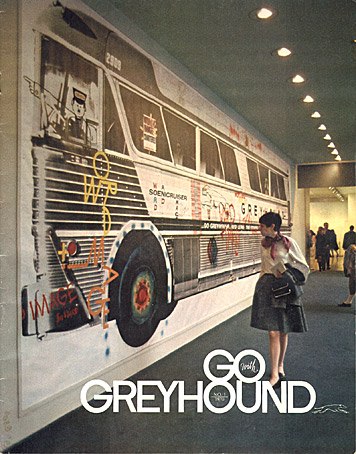
Anyway, MoMA installed a copy of Bus in the lobby in Jan. 1968, and then invited graphic designers participating in the Museum’s upcoming poster show to tag the bus with graffiti. Here’s a photo of the result, as seen on the cover of Go Greyhound magazine.

100%, Lorraine Wild [designobserver]
Art Projects by Mason Williams [masonwilliams-online]
Awesome LIFE Magazine photo of Bus at Reference Library
