
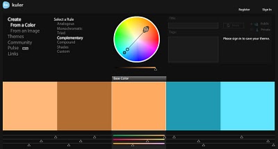
On his blog Into The Abyss, editor/filmmaker Todd Miro has an awesome, screencap-filled rant about the orange-and-tealification of Hollywood. In color theory, teal is the high-contrast opposite of flesh tone [as the palette Miro generated at kuler demonstrates] and so directors looking for an image to “pop” are jacking up the color contrast and narrowing their films’ palettes. In post.
While color adjusting has always been with us, Miro traces the problem to the Digital Intermediary, which has become the visual equivalent of AutoTune:
The Cohen brothers ushered in the new era of digital color grading with their excellent 2000 film, “Oh Brother, Where Art Thou.” This was the first feature film to be entirely scanned into a computer, a process known as “Digital Intermediary”, or DI. Once inside the computer, the colorist now had unheard of control over every element of the image. Imagine tweaking an entire movie with the tools and precision that one has with their still images using Photoshop, and you get some idea of what power was unleashed.
But was that power used for good… Nooooooooooooooo, or course it wasn’t!
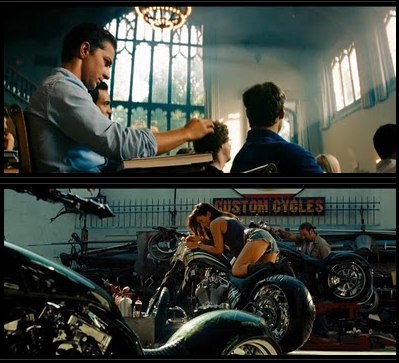
As in so many other ways, so it goes with orange & teal overkill: Transformers 2 turns out to be the worst of the worst.
Teal and Orange – Hollywood, Please Stop The Madness [theabyssgazes via afc]