I’m slow to take a closer look at the conservation project to restore the coloration to Mark Rothko’s badly faded Harvard Murals (1963) using computer-calibrated light projections. The project has been going for several years, but the last winter the lit paintings went on view for the first time in decades, and remain up until July 24th. Which was the trigger for the roundtable discussion in Artforum that piqued my interest. It’s fascinating all around, but I really liked that it included artists Rebecca Quaytman, David Reed, and Ken Okiishi, who ended discussing the fate of paintings and the use of projection on painting as a creative medium in itself.
Even before the conservator Carol Mancusi-Ungaro explained that the projection was tuned pixel by pixel to approximate Rothko’s intended colors, I found myself jonesing to get my hands on the image, and turn it into a work of its own. Called a compensation image, it’s made by calculating the chromatic differences between the paintings’ current state and the target state. It’s a map of everything the painting has lost, an accounting of how far it’s fallen from its (hypothetical) historical potential.
It’s the color that might have been. In the case of Rothko’s Harvard Murals, Mancusi-Ungaro explained that they weren’t seeking to return the paintings’ appearance to a new, “original” state, but simply to erase the damage caused by Harvard leaving the works to bake in the sun for 15 years. The target state was determined using color-corrected Ektachrome slides from 1964 and a sixth painting, excluded from the set, which has been in dark storage in the Rothko estate.
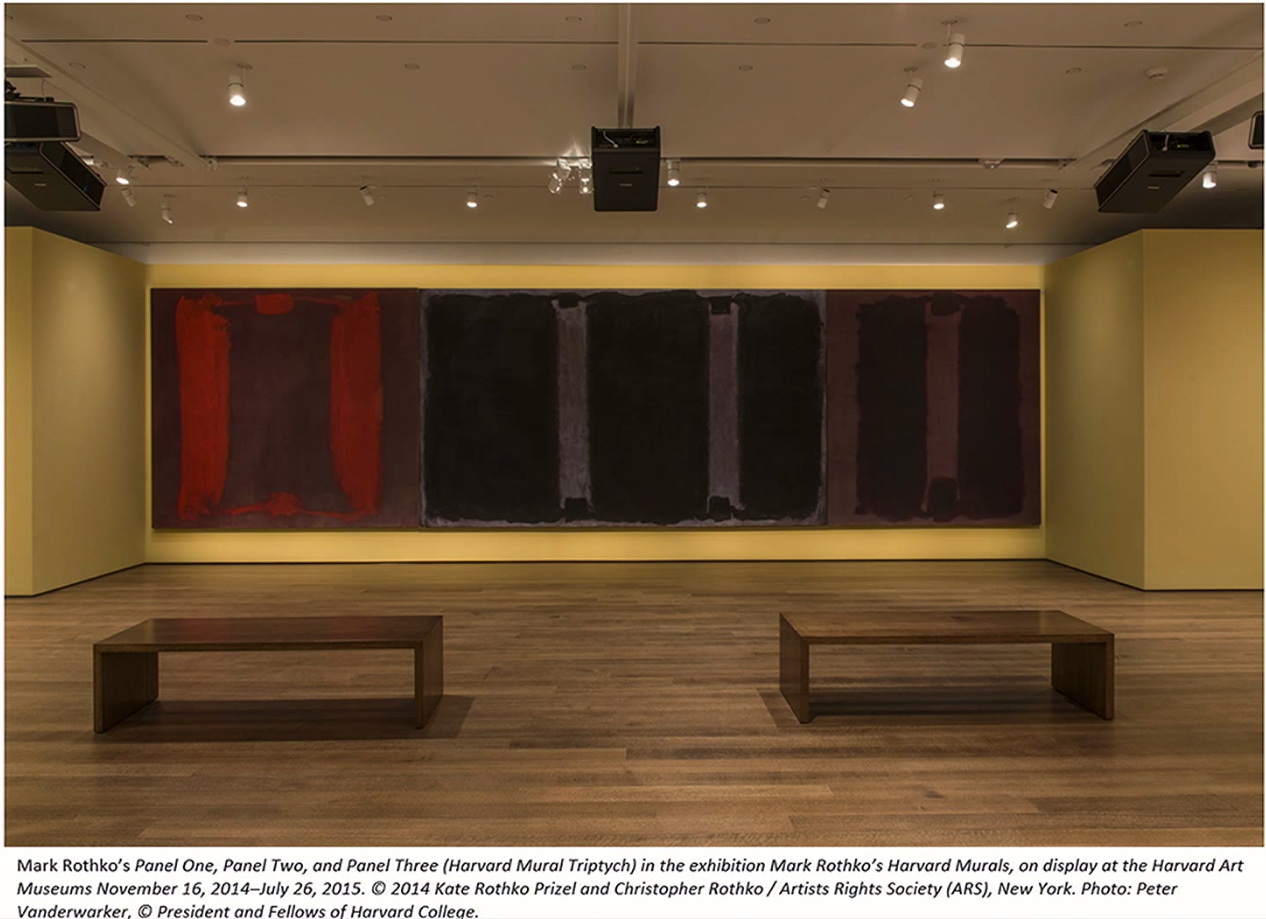
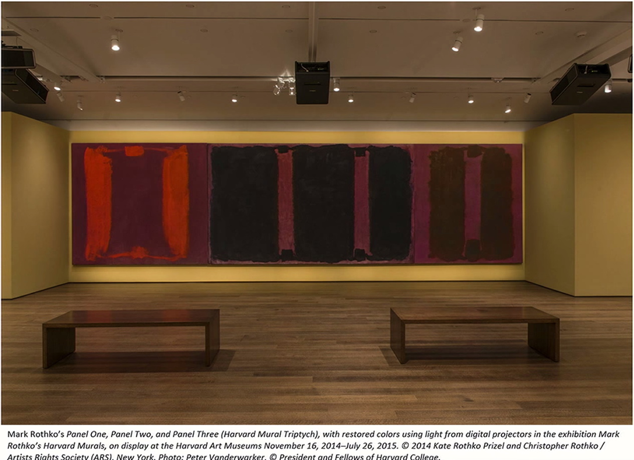
The images above showing three of the paintings with and without the corrective projection come from a TEDx talk given by Harvard conservator Narayan Khandekar. The dramatic reveal, when the museum turns off the projection, happens every day at 4 o’clock, and is by all accounts dramatic.

What is not shown is the compensation image itself. Here is a photo of part of it, when Khandekar holds some foamcore in front of the painting. I would like to see and use the entire thing. There may be a way.
In 2011 other Harvard conservator Jens Stenger published a report on the project at the International Committee of Museums triennial in Lisbon, which is circulating as an ICOM-CC newsletter pdf. In it, Stenger discloses that the team confected a small scale test of the light correction process by using identical materials (egg and pigment) to paint another Rothko and superfade and correct it.1, 2
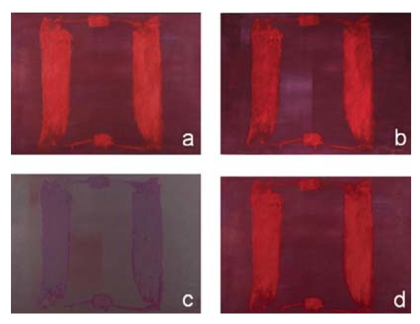
A is the Conservators’ Rothko. B is the painting after a few weeks under some tungsten lamps. C is the interpolated compensation image (A – B). D is the lit painting (A + C).
In an incisive essay last April, John Pyper likened the compensation image’s duplicative relationship to the painting as a similar to a print and a plate. Seeing it now makes me think of a color photo negative.
Which makes me think of Alma Thomas, who painted Watusi (Hard Edge) in 1963 [!] using the form from Matisse’s giant cutout, L’Escargot, but in the inverse colors. For Thomas the colors signaled a reversal of direction for cultural appropriation. What does the color of a compensation image represent? Here it is loss, a loss caused, let’s face it, by Harvard’s years of neglect, mishandling, and occasional abuse. [Actually, the projector project does not address the physical damage, dents, scratches and graffiti the paintings received in what was, after all, a campus dining room.] At least in this case, compensation feels too diplomatic; maybe we should call it a restitution image, or a reparations image.
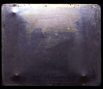
Now that I look at it a bit, the particular colors of the Rothko compensation image remind me of not just any photo negative, but the first photo/negative, made by Joseph-Nicéphore Niépce in 1826. And just because a projection is used to index and compensate for loss or aging now doesn’t mean that’s all it’s capable of. It turns out photography could do more than capture a view out a window.
1 I don’t think it’s a spoiler to say this outcome is literally the kicker from the Artforum discussion.
2 This is the second instance I’ve heard of conservators making post-war painting simulacra, and now I want some.
Stenger, J. et al., “Non-invasive Color Restoration of Faded Paintings Using Light from a Digital Projector” [icom-cc.org, pdf]
After Mark Rothko, American [printeresting.org]
Previously, and very much related: On Peter Coffin at the Hirshhorn, also Donald Moffett
other early Donald Moffett projections on paintings
Skip to content

the making of, by greg allen