

I didn’t notice it when I blogged about it last December, probably because I was so fixated on the heliostat. But a few weeks ago I gave a talk about stained glass, and the prolonged looking at Olafur Eliasson’s 2024 stained glass project, Window for moving light led to a realization.

“The geometric pattern of the stained-glass window installed in the Gothic eastern windows develops from diamonds and squares at the bottom to large overlapping circles above. The glass panels transition in color from red to yellow to transparent and blue at the top, creating a chromatic fade inspired by the palette of Caspar David Friedrich.”
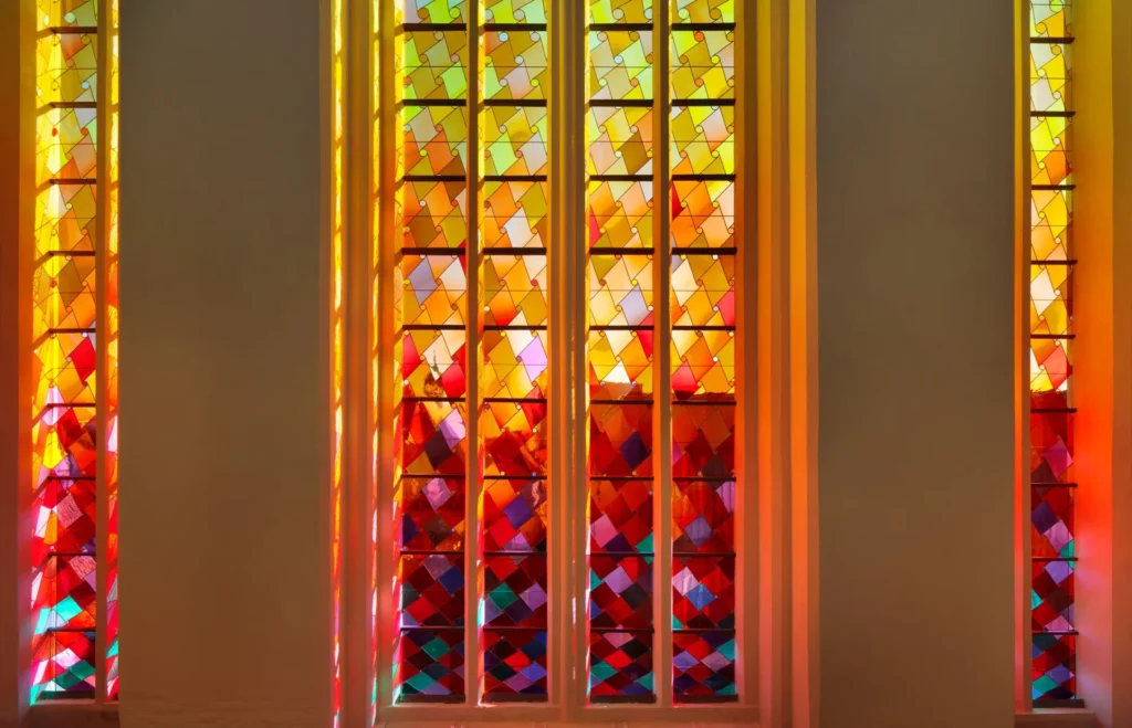
The color transitions, the pattern develops. From compressed, horizontal diamonds passing through squares at the very bottom, the shapes attenuate, and circles, tiny at first, emerge at the points. Near the top the larger circles intersect in chords that echo the pointed arches in the windows [shoutout to claudio who noticed this.]
Transitions and geometric patterns are areas for some of Eliasson’s most persistent and fruitful investigations. Incremental patterns are also a thing that emerged in 2004-5, with his mirrored spherical chandelier works, but that seems more to do with surface mapping a single pattern. The type of geometric shape shifting in St Nicholas’s is rare in Eliasson’s oeuvre.
The only other place I’ve seen it, I realized, is in a 2005 project that’s barely documented at all: Skyblue versus Landscape Green, the limited edition lap blanket Eliasson made for NetJets Europe.
Olafur and Hans Ulrich Obrist mentioned the blanket in a 2007 interview HUO conducted on a NetJets flight. But there was no pic, no other info. For many years, my 2009 blog post about that conversation, published in print the year before, was the only online mention of the blanket. It was clearly meant to fly below the radar.
I did get one, though. And years later, when one finally popped up on eBay, I had two. Now, years after that, there are several, including one unopened in its box, with its info card still attached. Immaculate. Perfect for the Olafur collector who has [almost] everything. Maybe they were a Marquis Jet cardholder, no slur intended.
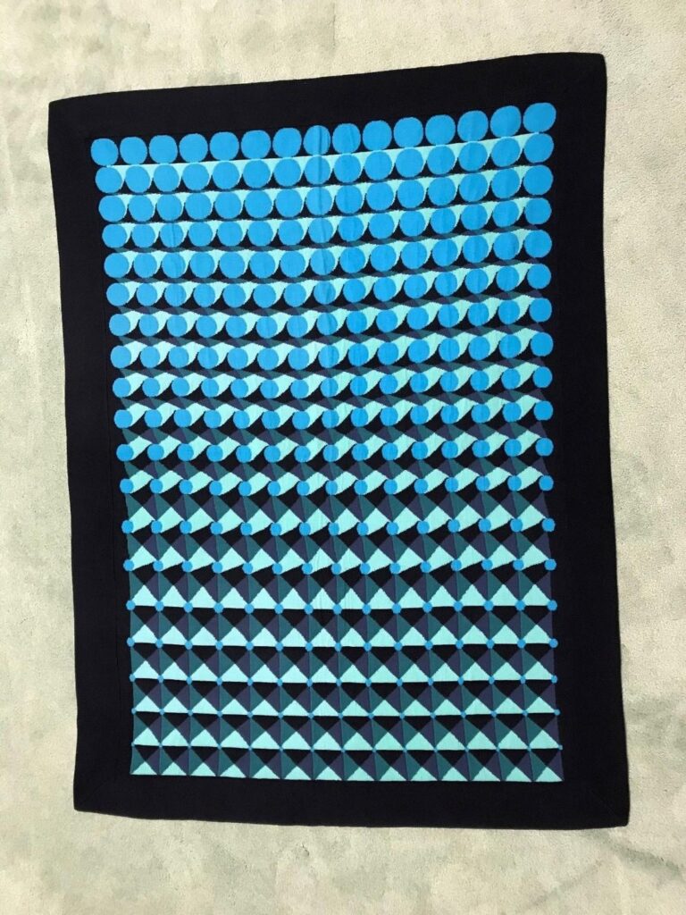
Anyway, the point is, Skyblue versus Landscape Green shifts across 20 rows from kite-like green triangles and squares to blue circles and curves. As with the stained glass window, the colors and shapes relate, less or more directly, to a world just outside. Other than that, and the fact that both projects are commissions, I can’t imagine the pattern shift indicated any actual relationship. Eliasson’s studio is constantly full of geometric explorations. Amidst all that production, it seems likely that a similar pattern strategy might succeed twice in twenty years. Twice, at least. Or that the geometric development that worked in a long ago context was revisited for a new, vastly different and more complex situation.
[Heliostat and] Window for moving light
Content Machine & Vessel Interview