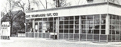
For some reason, I was thinking of totally livable, modernist gas stations yesterday [actually, it was because I heard fellow prefab gas station fan Mister Hoopty on the radio] and so I started digging, trying to find out more about Clauss & Daub, the architects of the 1931 porcelain-enameled steel Sohio station that Philip Johnson included in The International Style, his and H.R. Hitchcock’s era-defining exhibition/catalogue. [above]
Turns out there’s very little info at all online, except some references to the duo in an Architronic reminiscence of Cleveland. But it also turns out that Johnson was instrumental in getting his Mies-connected colleagues in touch with Standard Oil in the first place, via his own well-connected father. 40-200 of the Clauss & Daub stations were planned, but I have no idea how many were built or if any survive.
The idea of hanging industrial/commercial grade enamel, steel, and glass on steel girders fresh in my mind, I saw MDesign’s MCube Modular Prefab System as a tantalizing update of the technology that I could yield a fine, gas station-like home without the environmentally catastrophic site issues.
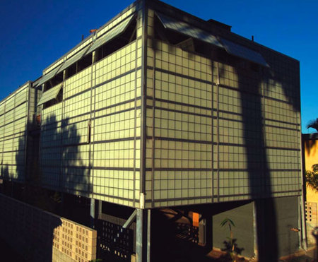
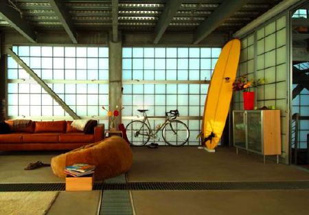
The MCube is based on a 10-foot post&beam module that’s endlessly flexible [sic] and affordable [$80/sf!], and Inhabitat’s description of Mark Baez’s design is unusually upbeat, even for Inhabitat:
Because the panels are translucent like Japanese shoji screens, rather than transparent like glass, they also protect privacy and block views into the interior. Better yet, each daylighting panel is moveable/operable like a shutter, allowing the occupants to open up any part of their little cube in order to let in the breeze. There aren’t any real glass “windows” per se in the house, but since each and every wall is essentially a window, there is no reason for separate windows in a house like this. To top it all off, the movable/removable wall panels allow for transformable space, so you can enjoy an ever-changing domestic space for years to come.
No “windows” “per se”? No problem!
I’m sure Baez’s patents are all in order, but a flexible, affordable, extruded aluminum cube-module-based house sounds almost exactly like George Nelson’s once-famous Industrialized House, which he proposed in 1958.
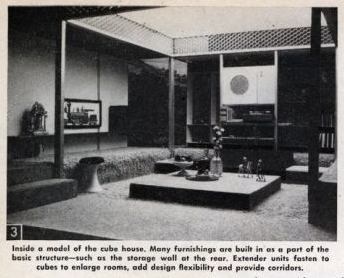
[The web dates this house to 1960, but only because that’s when Science and Mechanics Magazine published it. Architecture & Building had actually covered it two years earlier. It’s also depicted on the cover of Stanley Abercrombie’s monograph, George Nelson: The Design of Modern Design, too.]
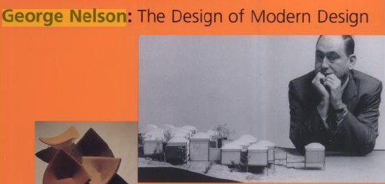
While being entranced by the Industrialized House a few months ago, I came across Mark Wigley’s discussion of the promise and reality of “total design” in an old Harvard Design Magazine. Wigley cited Nelson’s House, but he could just as easily be talking about the MCube, or any one of a dozen new prefab “systems”:
Clearly, the dream of the total work of art did not fade in modernism’s wake. On the contrary, all of the issues raised by architects and theorists of recent generations that seem, at first, to signal the end of the idea of the total work of art turn out to be, on closer look, a thin disguise of the traditional totalizing ambitions of the architect.
Fresh Herrings
Consider “flexibility,” the idea of an architecture that could assume any particular arrangement. Most flexible projects turn out to have inflexible aesthetic agendas. Or, more precisely, flexibility is itself a singular aesthetic. Look at the 1958 “Industrialized House” project by George Nelson, an architect who became famous as an industrial designer. The house is conceived as an industrial design product, a system of parts that can be infinitely rearranged. But Nelson never published more than one arrangement of the house, which included detailed color images of the model’s interior, complete with wall hangings, carpet, and dinnerware. At the very moment that he announces that the architect should provide only a framework for change, Nelson installs a total work of art. Likewise, Christopher Alexander’s 1977 A Pattern Language installs a singular aesthetic regime in the guise of a set of innocent building blocks that seem capable of infinite rearrangement. The last of these 253 “patterns” is an attack on “total design.” The hypocrisy of the attack is evident in the final lines that instruct the reader to hang personal things on walls rather than follow the dictates of designers. A designer claiming a total vision dictates that the totalizing instincts of all other designers should be resisted. The apparent flexibility of his system actually integrates all design into a transnational and “timeless” aesthetic pattern that can only be perceived by the master architect/manager. With systems theory, cybernetics, semiotics, and fractal geometry, the number of ways of absorbing difference into a singular structure continues to grow and to act as the totalizing architect’s best friend.
So I can’t hang a painting or look out a window because of “the totalizing ambitions of the architect”?
It seems almost easier–and more flexible–to rehab an old gas station.
Still, when an architect’s designing an off-the-shelf cube home for himself, he can be as totalizingly ambitious as he wants. Ralph Rapson’s family still uses the 1974 Glass Cube he built as their country retreat. It’s 26 cubed feet of glass awesome. Materialicio.us just pointed to Architecture Week’s excerpt on the Cube House’s construction from Rip Rapson’s book, Ralph Rapson: Sixty Years of Modern Design
