I Want To Live in A Cyklopen

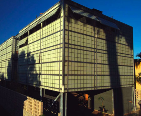
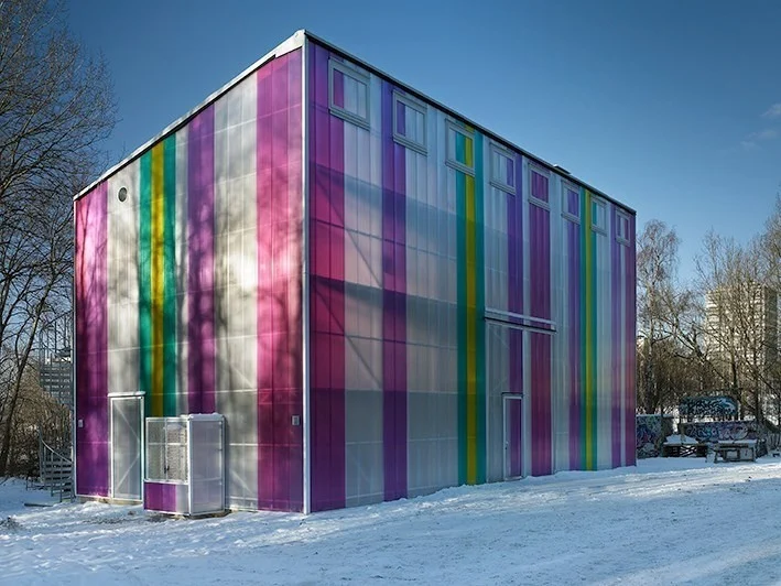
Cyklopen Kulturhas, 2013, Stockholm, design by Viktor Marx

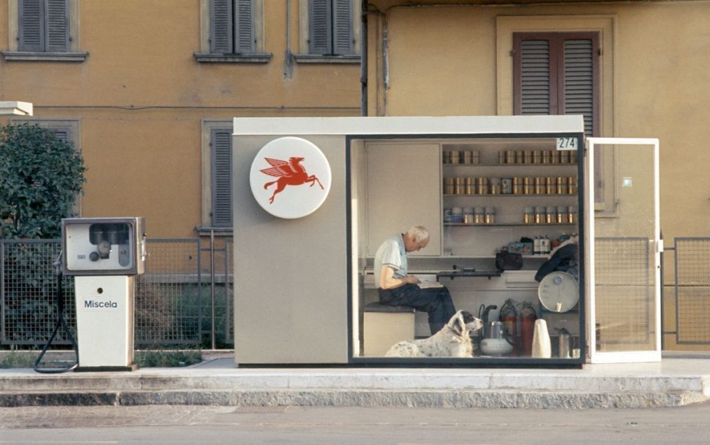
If the Eames House was not available, I decided it would be fine to live in a gas station felt like an appealingly modernist alternative. I’ve kept a list, to which I also added a decommissioned Minneapolis skyway, a temporary MoMA fire escape, and a reconstituted world’s fair pavilion or two. I would also add a greenhouse. There used to be a most excellent abandoned greenhouse on the roof of a building which you could see from the Roosevelt Island tram. Perhaps, I thought, Lacaton & Vassal could help me persuade the family, who, it turns out, really do not want to live in any of these repurposed industrial structures.
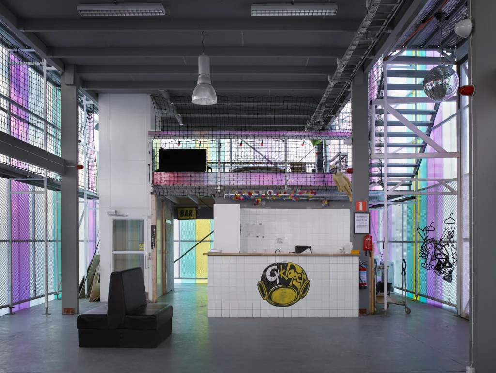
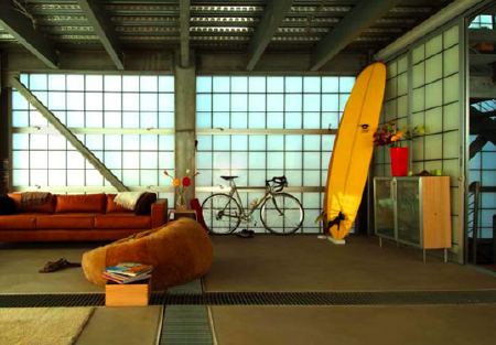
Cyklopen ground floor and mezzanine, image: archilovers

Now there is another. [shoutout Geraldine for the heads up] From 2011 until 2013 Stockholm architect and organizer Viktor Marx worked with Cyklopen, an autonomy-minded community organization, to rebuild their gathering space, which had been firebombed by neo-nazis. The result, Cyklopen Kulturhas is as spectacular as it is utilitarian.
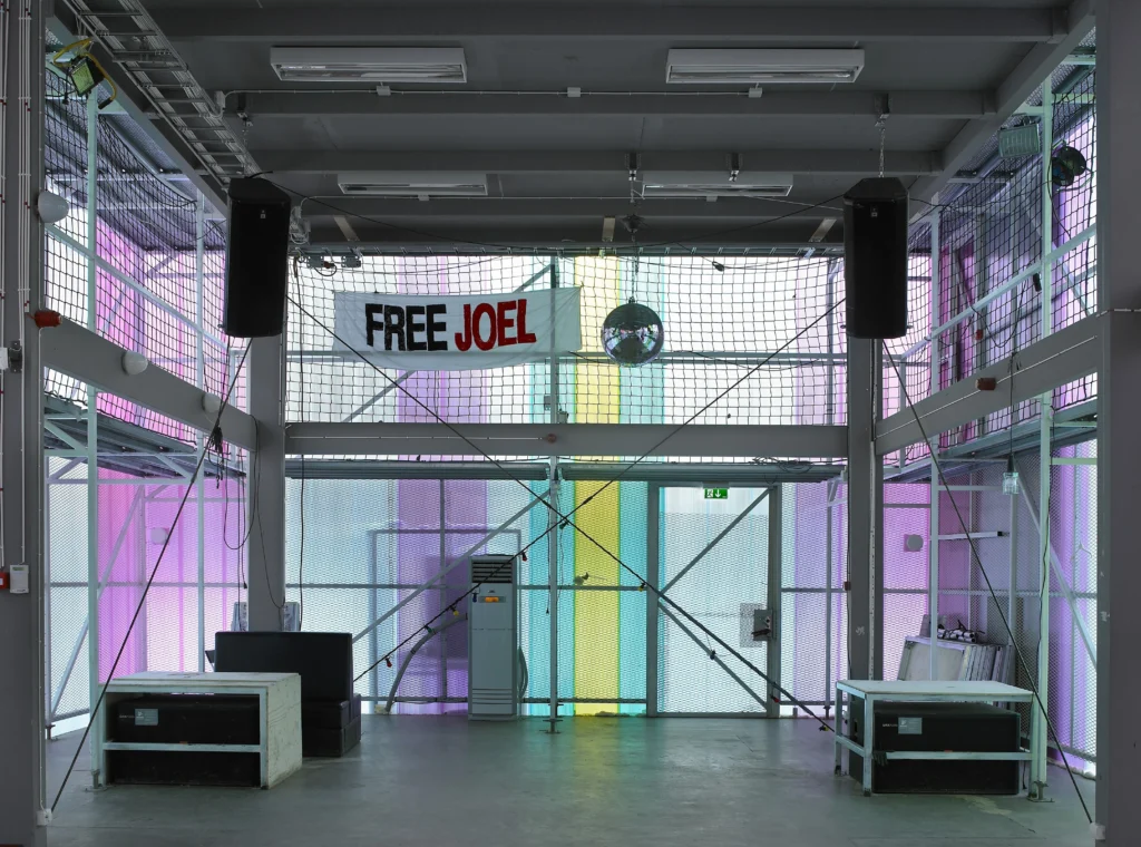
Cyklopen ground floor looking the other way, image: mies van der rohe prize

The 2-storey, 459 sq. m. structure was optimized for safety, for flexibility, and for the self-sufficient group’s donated labor. A laminated lumber core was raised by hand, Amish barn-style, and ringed with upscaled scaffolding, on which the greenhouse-style tinted polycarbonate skin was hung. The upper floor, aka The Box, is enclosed and climate controlled; the open ground floor and mezzanine space are not. Let’s say it’s responsive to the climate.
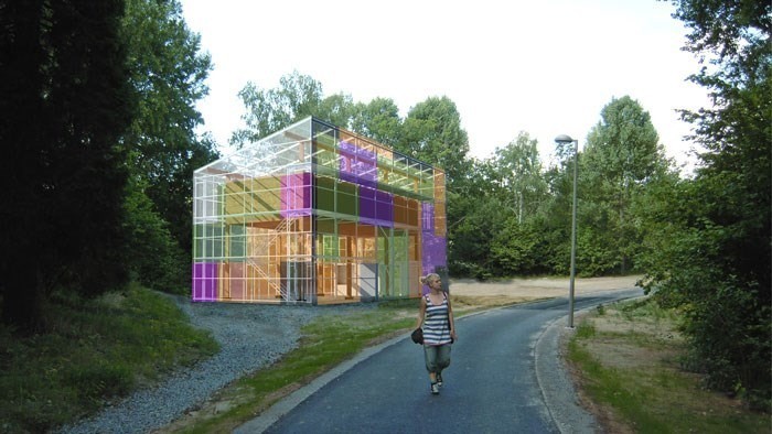
Cyklopen 2 concept art showing Tetris-style tint design, also how The Box fits

There is room to spend a little more than almost no money to bougie up the place without, I think, losing the adapted reuse credibility. Solar panels. Radiant floors. Some Kieran Timberlake-style Bosch Rexroth extruded aluminum beams. [It’s fascinating that even with some formalist similarities, KT’s Cellophane House was optimized for the diametric opposite factors to Cyklopen: high end components were pre-constructed offsite, then shipped and craned into place in midtown in a few days, with stupendous logistical complexity and expense.]
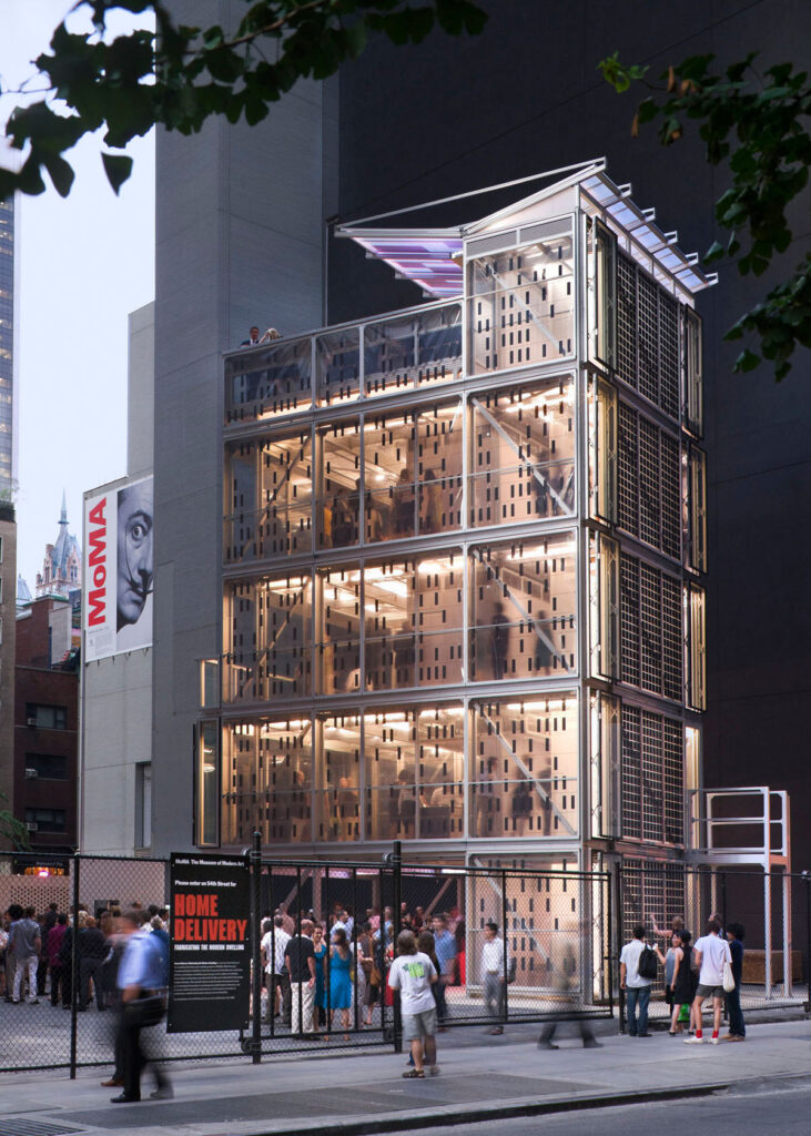
Kieran Timberlake’s Cellophane House, 2008, temporarily built on West 53rd Street for MoMA’s prefab show, Home Delivery, image: Aaron Peter at KT

Ultimately, I find what is holding me back from living the gas station/greenhouse/shed dream–besides the family buy-in, obviously–is the suburbanity, the single family house-ness of it all. I am a city person. We are city people, and a site where I could reasonably build a Swedish anarchist Bifröst greenhouse is nowhere near a subway–at least since MoMA built that Jean Nouvel supertower on the vacant lot next door. So I will add Cyklopen to the moodboard in my heart, and wish the original a bright and impactful future.

They accept donations, btw. [cyklopen.se, thanks to @geraldine@post.lurk.org for the heads up.]

All Minneapolis Skyways Must Go! Presidents Weekend Sale 106% OFF!

city_desk_skyway_in_situ.jpg
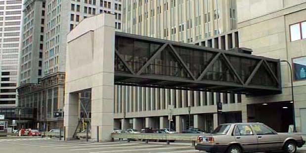
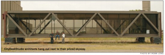
Skyway in situ, before the U of MN bought it for $1, and City Desk Studio bought it for $5,000
City Desk Studio is still selling the epic skyway they rescued in 2006. They originally planned to adapt it into a timeshared Skyway Retreat lakefront cabin for $1.2 million. Then when the economy imploded they offered it for sale for just $79,500. A year later they dropped the price to $49,500.
And now they’re willing to pay $5,000 to whoever removes it from the vacant lot near the UofM where it’s been parked for nearly a decade. There’s an RFP, and if no qualified bidder steps forward by the end of the month, the skyway is slated to be demolished.
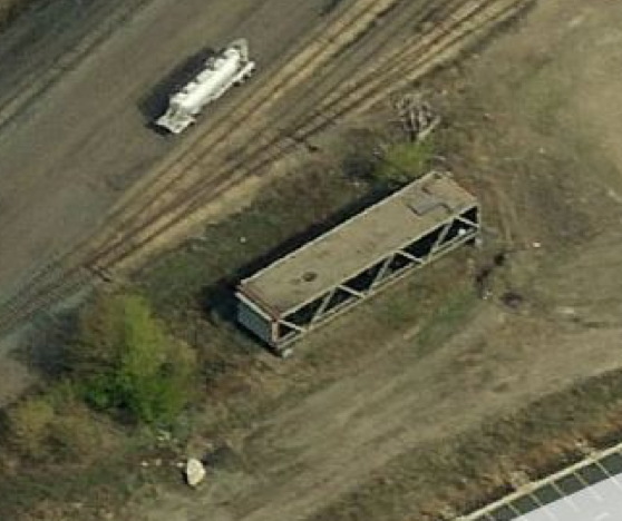
skyway_bing_scr.jpg
bird’s eye view via bing
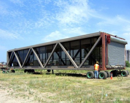
The skyway, designed by Ed Banks, the “father of the skyways,” is W20 x L83 x H14 ft and made of steel, glass and concrete. It weighs 280,000 pounds, roughly half of which had been attributed to the 12-inch concrete floor. But using the standard for reinforced concrete of 150 lb/cu ft, I get a weight for an 18×80 ft floor of 218,000, more than 75%. Maybe the floor’s not an actual foot thick. Or maybe it’s smaller than I’ve estimated. Either way, a significant weight reduction can be achieved by removing the concrete floor before transport.
Which is significant. Because City Desk Studio says it cost them more than their $5,000 purchase price to move the skyway two blocks from UMN to the vacant lot near the railyard where it still sits. But that means it had moved nearly four miles, and across the river, from Nicollet Mall & S 5th St to somewhere near the university stadium site. So put it on a barge and float it down the Mississippi.
load_skyway_onto_barge_here.jpg
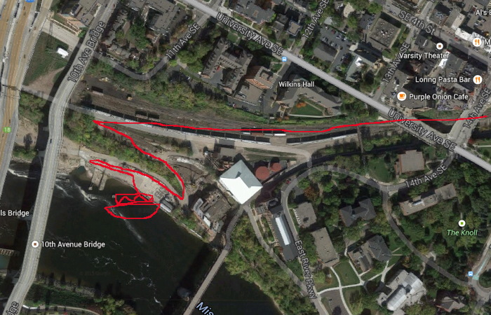
load_skyway_onto_barge_here.jpg based on google maps’ hunchback brother google earth
The train right of way goes west and gets very close to the river near a commercial/industrial waterfront site under the 10th Ave Bridge. That’s where you bring your barge and load it on. BAM. Your skyway is now connected to the entire world. You have two weeks to work out the details for removing it, and plenty of time after that to figure out where to take it.
I say you because I have been forbidden from pursuing this perfect plan. But it must happen, and soon. If you use my detailed schematic in your successful rfp, I expect an invitation to your skywaywarming.
Salvaged Minneapolis skyway could be your next home [startribune]
Previously:
2009: Minnesota NICE: Skyway For Sale On Craigslist
2010: That Minnesota Skyway For Sale Again/Still

For Months He Wanted To Live Between The Billboards

njtpk_signs_far.jpg
Can I just say how much I like the new aesthetic of the New Jersey Turnpike expansion project? I honestly cannot imagine that many people going to or from the Pennsylvania Turnpike; at least in my 10 years of DC-NYC shuttling, I’ve never seen that kind of volume, but aesthetically, I’m generally for it.
It’s not the only place that has it, and maybe it’s just the standard now in overpass and on- and off-ramp construction, but instead of bulky concrete pillars, the ramps are held up by huge, road-spanning I-beams. They all have a beautiful, oxidizing protective finish, too, like the best Richard Serras.
njtpk_signs_med.jpg
Even cooler, though, are the new electronic signs, which are constructed of square, Cor-Ten pipe, and they have meshed-in spaces for maintenance. Not just catwalks, or ledges, but actual spaces. What we perceive as a flat thing–a sign–turns out to be a space. Like the window halllways at Grand Central or Philadelphia 30th Street Stations. The Turnpike signs are New Jersey’s newest architectural icons, suspended across that state’s iconic landscape: a 12-lane highway.
And someone designs this stuff. Probably someone at PKF Mark III, the firm which the Turnpike Authority awarded three contracts in 2011, totaling over $44 million, for the “Installation of Variable Message Signs at New and Existing Locations on the Turnpike.”
njtpk_signs_cu.jpg
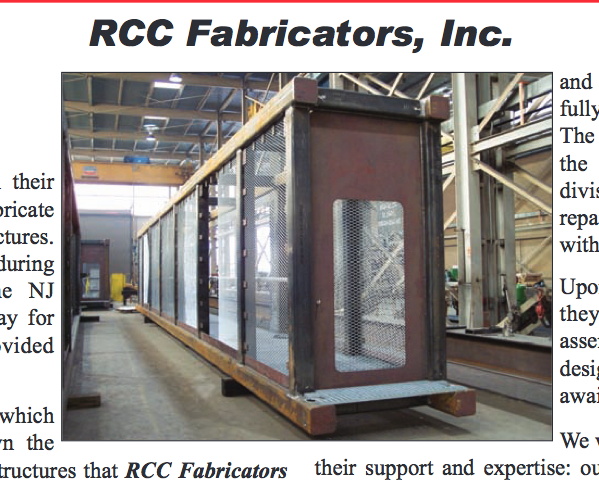
Oh wait, nope. Here it is, from the NJ Turnpike Interchange 6 to 9 Widening Program website: “Advanced Fabrication of Overhead Span Sign Structures for Variable Message Signs and Variable Speed Limit Signs,” awarded to RCC Fabricators, Inc., on August 13, 2009.
njtpk_rcc_fabricators.jpg
The project was one of the highlights in the 2011 newsletter for the Railroad Construction Company, Inc. family of companies [pdf, img above]. RCC Fabrication made 61 VSM sign structures, 41 for the Turnpike and 20 for the Garden State Parkway. The structures span up to 95 feet, and were built entirely off-site. I can’t tell from the acknowledgements who is actually responsible for this form, but it works.
The architect/sculptor Tony Smith famously described the revelatory experience of driving down the unfinished New Jersey Turnpike in 1951 [pdf]. Me, I would like to move in before it opens. And before it gets too hot.
Previously: Michael Ashkin, “For Months He Lived Between The Billboards”, 1993
Related infrastructure as domestic architecture: That Minnesota Skyway for sale again/still
Mies Gas Station

Esso De Cherbourg

esso_de_cherbourg.jpg
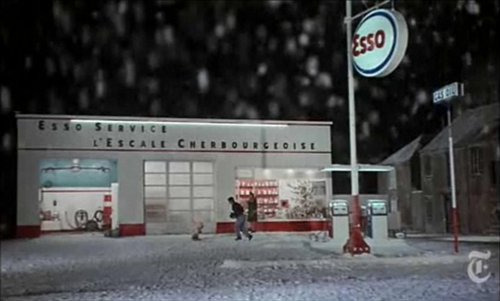
It may not be the absolute origin of my desire to live in a converted, modernist gas station, but AO Scott’s recent reminiscence reminds me that the Esso station at the end of Jacques Demy’s incomparable Les Parapluies de Cherbourg is one of my formative cinematic and architectural experiences.
I got completely blindsided by the film in the early 1990s when I basically wandered into the Time Warner screening room at MoMA and watched a preview of the restoration of the film spearheaded by Demy’s widow, Agnes Varda, who was on hand to discuss it. Truly not worthy, but there you go.
Uh-oh, something looks screwy with these prices; is there an issue with US availability of the DVD? [amazon]

Westinghouse World’s Fair Pavilion, Or Eliot Noyes’s Huge Shiny Balls

noyes_westinghouse_sfmoma.jpg
I love Eliot Noyes as much for his own designs as for his role as catalyst, instigator and patron for some of the greatest modernist objects and buildings of the postwar era.
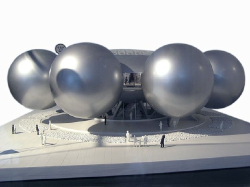
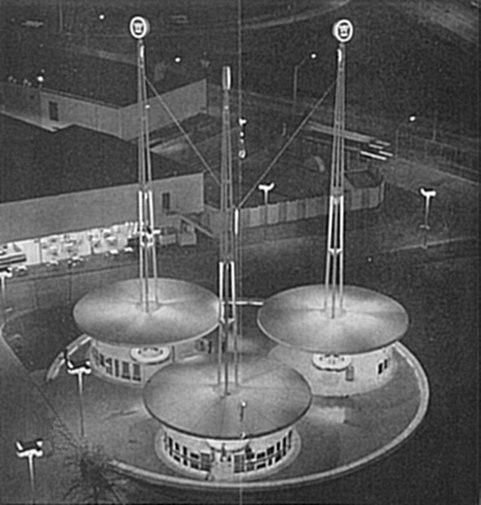
And yet somehow I hadn’t made the connection to his unrealized design for the Westinghouse Pavilion at the 1964 New York World’s Fair, which consisted of eight 45-foot diameter silver spheres floating off of a central domed foyer. Giant silver spheres in 1961? Wherever would the idea for such a form come from?
echo_satelloon_color.JPG
Thanks to dealer-turned-design curator Henry Urbach, SFMOMA acquired the Westinghouse maquette in 2006, but the museum’s description doesn’t make any reference to Project Echo or any design references at all.
noyes_westinghouse_gbruce.jpg
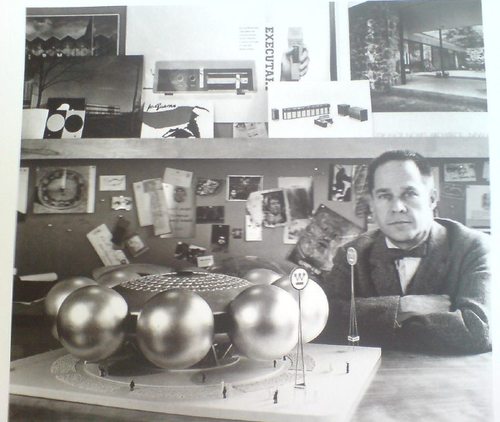
Next, I turned to Phaidon’s sleek-yet-frustrating Eliot Noyes monograph, written by Noyes’s longtime collaborator Gordon Bruce. Though it’s chock-full of info and photos [including the one above, of Noyes posing with his maquette], it turns out to be more bio snapshot than design history. There’s a little about the bureaucratic wrangling that nixed the pavilion [and replaced it with a second company time capsule, to match the 1939 one], but nothing about the design.
noyes_westinghouse_64_wf.jpg
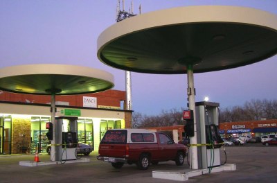
Oddly, there’s no mention at all of the scaled-down pavilion which was eventually built [image via], even though it has the maquette’s signage, and it looks awfully similar to the round gas station canopies Noyes would design for Mobil a couple of years later. [image via agilitynut.com’s great collection of gas station design photos]
mobil_agilitynut.jpg
update: indeed, Noyes & Assoc. are credited in the World’s Fair Time Capsule Pavilion Brochure, which turns out to be the uncredited source for Wikipedia’s image. That’s the torpedo-shaped time capsule right there, btw, suspended 50-ft above the ground by the three masts.
Eliot Noyes, Westinghouse Pavilion, 1961 [sfmoma.org]

That Minnesota Skyway For Sale Again/Still

skyway_for_sale_cds.jpg
In this difficult real estate environment, close followers of the used modernist Skyway market will note have reason to be optimistic. Even as asking prices have dropped nearly 40% in the last year,–from $79,500,to around $49,500–they are still way above 2002 and 2006 results of $1 and “a very small amount” that’s probably closer to $1 than $49,500, respectively.
city_desk_skyway_in_situ.jpg
SKYWAY FOR SALE – AGAIN!!! [minneapolis.craigslist.org, thanks sheree from aol]
City Desk Studio architects for all your used Skyway needs [citydeskstudio.com]

Mies Gas Station: I’m So Happy. Now I Have A Place To Put My Skyway


Mies gas station, originally uploaded by zadcat.

Alright, I know where I’m going to put my decommissioned Skyway: right next to my decommissioned Mies van der Rohe Esso Station.
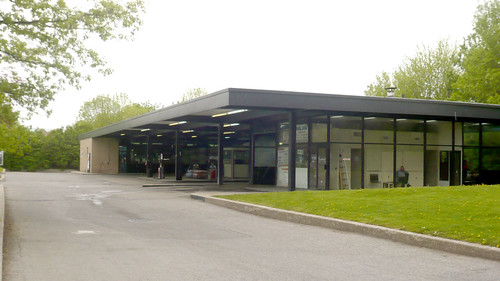
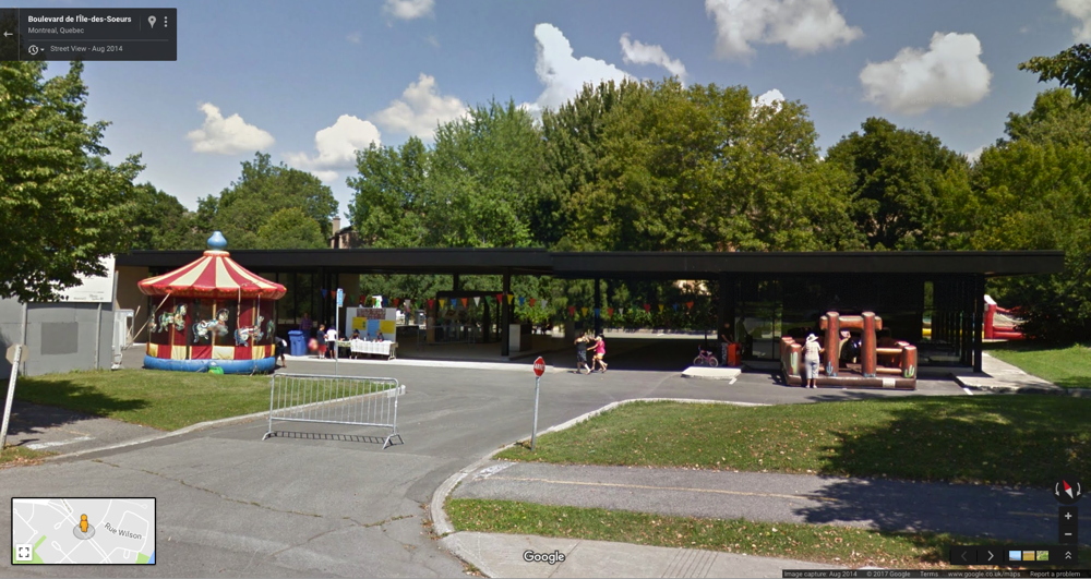
Mies’ office designed three apartment buildings on l’Ile des Soeurs in Montreal beginning in 1963, which were joined by a gas station in 1968, a year before he died. [here’s the Google Map of the gas station. There’s no streetview.2017 update: Oh yes there is. And it had a bouncy castle.]
mies_esso_station_streetview_2014.jpg
The building is on a corner, and is long and low and mostly a void. The most prominent feature, the black steel awning over the pumps, runs between a glass & buff brick box on one end [the store] and a glass & steel box on the other [the garage and office]. Looking at flickr member zadcat’s photos up close, the gas station looks mostly stock; there’s none of the material preciousness of, say, IIT’s custom profile I-beams, and forget about the Barcelona Pavilion’s meticulously matched marble, travertine, and onyx. This is a utilitarian building created by a mature architect’s office which, for better and worse, knew its way around the construction industry.
Tucked away on the far, quieter side of an already quiet residential island, the old school Esso station lost business to a newer, more amenity-filled competitor near the bridge, and it was recently closed. Now a debate is on about what to do with the property.
Toronto’s Globe & Mail reports that public hearings on the fate of the defunct building, now owned by some developer, were set for this week. There’s talk of a flower market which might leave the building pretty much as is, or maybe they make it into a youth center, which means destroying it by remodeling it.
The option that wasn’t mentioned in the paper–perhaps because the city peres in Montreal were graciously waiting for me to proffer it–is to let me have the building in exchange for dismantling it and removing it to a new site so I can live in it.
It’s already clear that even though it is his only gas station, its timing, and the process under which it was designed mean it is not a super-important example of Mies’s work. In other words, Montreal shouldn’t get too worked up about it.
And that same standard issue construction quality means you don’t necessarily need to sweat wrapping and numbering every brick and plate of glass.
Practically speaking, dismantling, moving, and rebuilding offers the aspiring gas station dweller like myself the best of all possible worlds: the sleek, authentic industrial architecture and space, in the ideal setting of your choice, with absolutely none of the environmental toxicity complications of the original site. The fact that you’re preserving and breathing new life into the work of a master of 20th century architecture is pure bonus.
But it’s the bonus that makes the whole concept possible. No run of the mill gas station is worth the irrational expense and hassle of dismantling, conservation, and reassembly. And while it’d be arguably cheaper and more practical, building a house from scratch that is a replica of a Mies van der Rohe gas station just seems sad and pathetic to me, like making yourself an exact copy of Southfork. No, saving a Miesian landmark provides the necessary conceptual cover to make an otherwise crazy plan seem rational, even imperative.
And then the Skyway can be my office and editing suite right next door.
You can come live with me, Ritz! The Ritz of gas stations looks for a new life [globe & mail, via archinect and tyler]
Chad loves Mies’s gas station [tropolism]
previous residential gas station fantasies here and here

Minnesota NICE: Skyway For Sale On Craigslist

skyway_for_sale_cds.jpg
Ho-ly smokes.
The Minneapolis architecture firm City Desk Studio just put a skyway up for sale on craigslist. A freakin’ skyway.
It’s a steel girder and glass box, 20 x 83 feet, and 14 tall, designed by architect Ed Baker [“the father of the skyways”] to connect JC Penney’s and Powers department stores. The 12-inch concrete floor accounts for about half of the skyway’s 280,000-lb weight. [That’s half a Richard Serra retrospective, for those keeping score at home.] It was apparently assembled in three sections and filled in with glass after it was installed.
City Desk Studio’s asking price is currently $79,500, which is a huge discount from the $1.2 million they expected to bring in by turning the skyway into the Skyway Retreat lakefront cabin and selling 12 4-week shares for $100,000 apiece.
skyway-dt-journal.jpg
And it’s probably a little more than they paid for it in 2006, when the architects bought it on a whim at a University of Minnesota blind auction. According to a report at the time, it cost them more to move it [two blocks] than to buy it.
Right now, the skyway is sitting somewhere “near the University of Minnesota Minneapolis campus,” and you’ll need to move it. Fortunately, the U of MN is on the Mississippi River, so if you could get the skyway onto a barge, you could float it down the river and into the Gulf of Mexico. From there, you could load it onto a freighter and sail it anywhere on the East Coast. Hell, you could sail it anywhere in the world.
Then plop it down right next to the smug schmuck who just topped off his shipping container house, the one with the 8-ft ceilings and the less-than-10-ft wide rooms. Then invite him over for a hot dish.
Skyway for sale – THAT’S RIGHT – AN ACTUAL SKYWAY! – $79500 (Minneapolis) [minneapolis.craigslist.org, via walker blog, thanks andy]
A Disconnected Skyway: Downtown architectural firm considers new options for an ‘icon’ of the skyline [2006 downtown journal article, pdf]
City Desk Studio Skyway Retreat (unrealized) [citydeskstudio.com]

So Apparently, We’re Moving To Strandvagen, Sweden


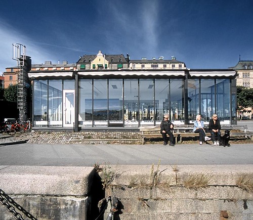
se/sthlm/swedish shell/04, originally uploaded by Hagen Stier.

where we’ll live in this unused 1954 Shell station by Peter Celsing. It’s so funny, I always imagined Sweden was cold and dark, but just look at this picture, taken at 3AM. Now we know that Ikea gets its blue from the color of the always-sunny Swedish sky.
[via andy]
Here are photos of the Shell station when it was still in use. [zlattes.com]
Previously: I want to live in a gas station

“Or, More Precisely, Flexibility Is Itself A Singular Aesthetic.”

gas_standard_1.jpg

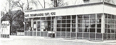
For some reason, I was thinking of totally livable, modernist gas stations yesterday [actually, it was because I heard fellow prefab gas station fan Mister Hoopty on the radio] and so I started digging, trying to find out more about Clauss & Daub, the architects of the 1931 porcelain-enameled steel Sohio station that Philip Johnson included in The International Style, his and H.R. Hitchcock’s era-defining exhibition/catalogue. [above]
Turns out there’s very little info at all online, except some references to the duo in an Architronic reminiscence of Cleveland. But it also turns out that Johnson was instrumental in getting his Mies-connected colleagues in touch with Standard Oil in the first place, via his own well-connected father. 40-200 of the Clauss & Daub stations were planned, but I have no idea how many were built or if any survive.
The idea of hanging industrial/commercial grade enamel, steel, and glass on steel girders fresh in my mind, I saw MDesign’s MCube Modular Prefab System as a tantalizing update of the technology that I could yield a fine, gas station-like home without the environmentally catastrophic site issues.

mdesign_mcube.jpg

The MCube is based on a 10-foot post&beam module that’s endlessly flexible [sic] and affordable [$80/sf!], and Inhabitat’s description of Mark Baez’s design is unusually upbeat, even for Inhabitat:

Because the panels are translucent like Japanese shoji screens, rather than transparent like glass, they also protect privacy and block views into the interior. Better yet, each daylighting panel is moveable/operable like a shutter, allowing the occupants to open up any part of their little cube in order to let in the breeze. There aren’t any real glass “windows” per se in the house, but since each and every wall is essentially a window, there is no reason for separate windows in a house like this. To top it all off, the movable/removable wall panels allow for transformable space, so you can enjoy an ever-changing domestic space for years to come.

No “windows” “per se”? No problem!

mcube_interior.jpg

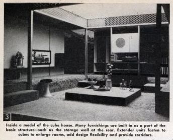
I’m sure Baez’s patents are all in order, but a flexible, affordable, extruded aluminum cube-module-based house sounds almost exactly like George Nelson’s once-famous Industrialized House, which he proposed in 1958.

cubehouse2.jpg

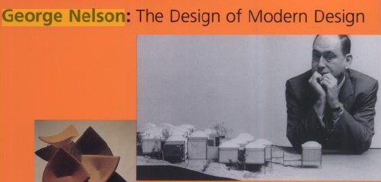
[The web dates this house to 1960, but only because that’s when Science and Mechanics Magazine published it. Architecture & Building had actually covered it two years earlier. It’s also depicted on the cover of Stanley Abercrombie’s monograph, George Nelson: The Design of Modern Design, too.]

george_nelson_cover.jpg

While being entranced by the Industrialized House a few months ago, I came across Mark Wigley’s discussion of the promise and reality of “total design” in an old Harvard Design Magazine. Wigley cited Nelson’s House, but he could just as easily be talking about the MCube, or any one of a dozen new prefab “systems”:

Clearly, the dream of the total work of art did not fade in modernism’s wake. On the contrary, all of the issues raised by architects and theorists of recent generations that seem, at first, to signal the end of the idea of the total work of art turn out to be, on closer look, a thin disguise of the traditional totalizing ambitions of the architect.
Fresh Herrings
Consider “flexibility,” the idea of an architecture that could assume any particular arrangement. Most flexible projects turn out to have inflexible aesthetic agendas. Or, more precisely, flexibility is itself a singular aesthetic. Look at the 1958 “Industrialized House” project by George Nelson, an architect who became famous as an industrial designer. The house is conceived as an industrial design product, a system of parts that can be infinitely rearranged. But Nelson never published more than one arrangement of the house, which included detailed color images of the model’s interior, complete with wall hangings, carpet, and dinnerware. At the very moment that he announces that the architect should provide only a framework for change, Nelson installs a total work of art. Likewise, Christopher Alexander’s 1977 A Pattern Language installs a singular aesthetic regime in the guise of a set of innocent building blocks that seem capable of infinite rearrangement. The last of these 253 “patterns” is an attack on “total design.” The hypocrisy of the attack is evident in the final lines that instruct the reader to hang personal things on walls rather than follow the dictates of designers. A designer claiming a total vision dictates that the totalizing instincts of all other designers should be resisted. The apparent flexibility of his system actually integrates all design into a transnational and “timeless” aesthetic pattern that can only be perceived by the master architect/manager. With systems theory, cybernetics, semiotics, and fractal geometry, the number of ways of absorbing difference into a singular structure continues to grow and to act as the totalizing architect’s best friend.

So I can’t hang a painting or look out a window because of “the totalizing ambitions of the architect”?
It seems almost easier–and more flexible–to rehab an old gas station.
Still, when an architect’s designing an off-the-shelf cube home for himself, he can be as totalizingly ambitious as he wants. Ralph Rapson’s family still uses the 1974 Glass Cube he built as their country retreat. It’s 26 cubed feet of glass awesome. Materialicio.us just pointed to Architecture Week’s excerpt on the Cube House’s construction from Rip Rapson’s book, Ralph Rapson: Sixty Years of Modern Design

rapson_glass_cube.jpg

Reston, Virginia: Modernism And The Homogenous Suburb

treehugger_lake_anne.jpg

I’ll come clean. We’ve started contemplating a dip of the toe into the real real estate market in Washington, DC. There’s precious little to choose from, though. DC’s longstanding status as an officetown means there are almost no industrial or commercial loft buildings [though there’s now no shortage of “lofts,” which is shabby developerspeak for “exposed ductwork.” Besides, thanks to unchecked flippery and speculation, the condo/co-op market is a zombie, unaware of its own death.]
What passes for modernist architecture in town, too, is either a McMansion tarted up in Richard Meier drag, or is located in an ever-to-revive? neighborhood of lackluster Sixties urban revitalization gone to seed, or is an aging suburban utopia [sic] of some kind.
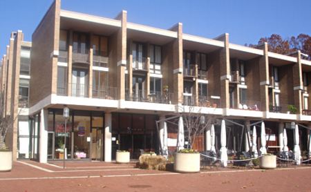
Almost any foray into DC mid-century-onward modernism includes stops in architect Charles Goodman’s various developments: the sylvan Hollin Hills along the Potomac and the much more ambitious, [sub]urban experiment of Reston, a city begun in the rural farmland of Virginia in the early 1960’s. Goodman’s densely packed, slightly rural-toned Interational Style homes, townhouses, and apartments are known as Hickory Cluster. They front on the manmade Lake Anne, and are connected by trails and bike paths to the rest of Reston [which has exploded into a car-centered, Galleria-style ring city of its own, ten minutes on a good day from Dulles.]
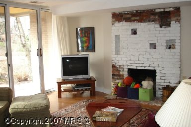
What might it be like to live in the perfect modernist suburbs, I wondered? The vintage interior photos of Hickory Cluster on the Reston Historical Trust and the Storefront Museum of Suburban History website offer a tantalizing–and tempting–glimpse.
On a clear day in Reston, for example, I might lounge in my Saarinen Womb Chair and look out past my palm trees across the valley to the mountains. Maybe I’ll even eat one of those grapefruits, picked this morning from my own tree out back.

Reston_INTERIO6.JPG

Or maybe I could do a little work in my home office/studio, maybe polish off a film project for my client, a large, international business machines manufacturer, then head, where? Over to Outback for a Bloomin’ Onion?

Reston_INTERI13.JPG

Can I just say that, my entire design-sentient life, I’ve dreamed of living in just such a space? Only somehow, I always thought it would be at the end of a narrow street, up against the hill, overlooking the ocean in, say, Pacific Palisades, California. That’s the freakin’ Eames House, people.
Reston looks like this, freakin’ shoeboxes with room for a dinette set and ceilings no taller than the 8′ patio door that is the only source of light.

reston_lake_anne.jpg

Does anyone know a good way to steam motor oil out of a concrete floor, because at this point, the only option for us is to live in a deconsecrated gas station.
[update: I’ve since visited Lake Anne, as the original core of Reston is known, and have learned that Hickory Cluster is actually a series of Goodman-designed townhouse neighborhoods on the other side of the ring road from the town square, which architect James Rossant designed to emulate–what else?–Portofino.
In at least one respect, he succeeded: apparently, the pedestrian-oriented center is dead in the non-summer, and businesses on the plaza can’t survive. Which is one factor driving a current government/development push for “revitalization.” The other most immediately obvious characteristic of Lake Anne is its Latino-ness. It’s like Reston Town Center for Mexicans, and visiting it makes me realize how overwhelmingly non-Latino the RTC crowds and target demographics are.
The only larger concentration of Latino Reston/Herndon residents I’d seen was in the parking lot at KMart, which serves as a kind of impromptu zocalo con coches. Rather than providing an idealized escape from the “problems” of the “inner cities,” such as density and a heterogeneous racial, cultural, and socio-economic population, Reston turns out to have [at least] two cultures and economic strata superimposed on each other, equal on the parkways, but separate on the town plazas. I wonder if anyone’s asked a Mexican about the Lake Anne “revitalization,” or is he the problem to be solved?]