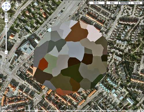
So I decided to make the Dutch landscape paintings I wanted to see made from those incredible security-obscured Dutch Google Maps I found a couple of weeks ago.
I’ll print the images out and paint over them. Since they are Dutch landscapes, I figure they’ll be nice, little domestic-sized paintings I can make on a table.
I’ve been trying to puzzle out how to get the paint on there and what it should look like. My first idea was to keep the process as mechanical as possible, both to produce crisp, sharp polygons, but also to mediate between the image and me–and my utter lack of painting experience or technique. But my brother-in-law, an excellent artist with an extraordinary sensitivity to technique and material, made the case for just painting the damn things with a brush.
So I’m convinced, though I’m still not quite settled on how I’ll do them. But we set out today to look upclose, extremelyclose, at some 17th century Dutch landscape and cityscape paintings, and see how they were done. Of course, we missed the much-hyped Dutch Cityscapes exhibition at the National Gallery last spring.
Here’s what we saw today at the National Gallery:
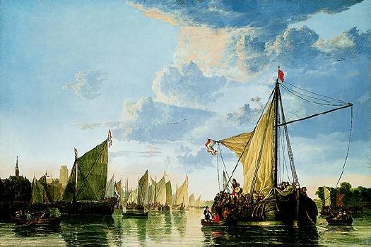
Aelbert Cuyp, The Maas at Dordrecht, 1650s [NGA.gov]
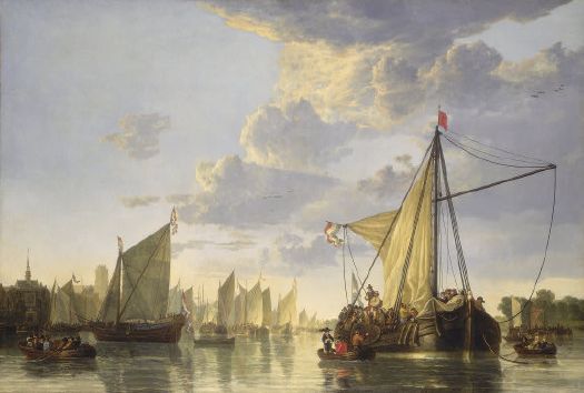
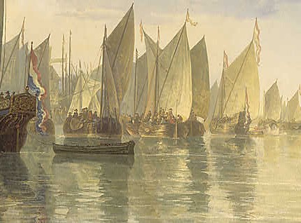
I was most interested in the way Cuyp handled the reflections of objects in the water. It’s an analogue, after all, for the way the camo algorithm distorts the underlying architecture. WOW, that is a horrible reproduction up there. Here’s a better one–with details!–from somewhere else on the NGA’s site:
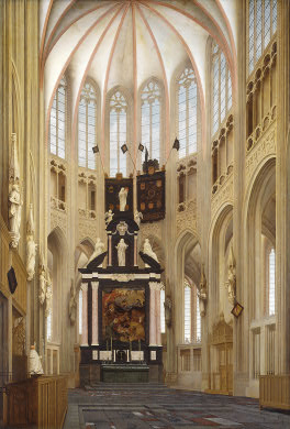
Pieter Jansz Saenredam, Cathedral of Saint John at ‘s-Hertogenbosch, 1646
[NGA]
This Saenredam is exactly what I was imagining for my crisp, clean, Dutch painting style. Unfortunately, it turns out to be basically a drawing, almost completely flat and dead on its surface. Good for what it is, maybe, but not for this.
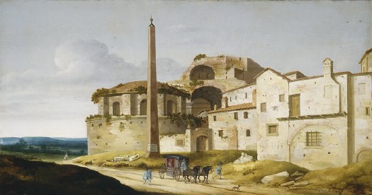
Pieter Jansz Saenredam, Church of Santa Maria della Febbre, Rome, 1629[NGA]
Surprisingly, this earlier Saenredam was more interesting, if a little hokey–and thoroughly un-Roman in any way. The stone walls of that church are surprisingly, pleasingly loose. The artist penciled in the different color areas, then basically filled them in. Whether pentimento has let the outlines show through, or they were left partially visible on purpose, I don’t know.
There was another church interior that was much, much more useful, but I can’ t find it now. At each painting, Benjamin would point out some particular brushstrokes or lines, especially edges, and talk about what shape of brush the artist used; the consistency of the paint; the gesture involved. It was engrossing, and I could literally feel the horizons of my paint ignorance stretching wider and farther away.
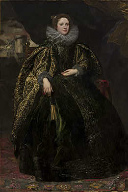
Sir Anthony van Dyck, Marchesa Balbi, 1623 [NGA]
HAHAHA, there is no way in two million years I’d ever even consider taking a cue from van freakin’ Dyck, are you kidding? We just went to stare in awe. Just truly incredible, jawdropping paintings. A whole gallery–and completely empty the entire time we were in there.
As we were walking out, I was explaining how I had the luscious, wet, clean partitions of a Ruth Root painting in my mind, too, maybe instead of landscape brushstrokes, I should be considering abstraction. Like Arthur Dove, whose abstracted landscapes suddenly popped into my head and felt right on. Does the NGA have any Doves on view, we asked?
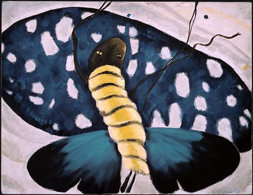
Yeah, well, no. They have some cockamamie mess of a Moth Dance in the East Building. What the hell is that thing? Looks like I’ll have to head over to the Phillips Collection this week, which has like the best collection of Doves anywhere.
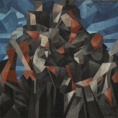
Francis Picabia, The Procession, Seville, 1912 [NGA]
The Dove wasn’t a total loss; it brought us past this rather unexpected Picabia–as if there were any other kind. A cubistic abstraction of a Spanish city hilltop, this Picabia is a remarkable approximation of Google Maps’ polygonal camo technique. From the thick, clearly articulated brushstrokes, though, I really felt that Picabia-size will be way too big for me.
It really is an unusual and rewarding way to look at art one brushstroke at a time. It turns out to be very different, even, from looking at an artist’s overall style. Or maybe it’s just any type of slow, careful looking that pays off so well. If nothing else came of this painting experiment, I’d already consider it a success.
