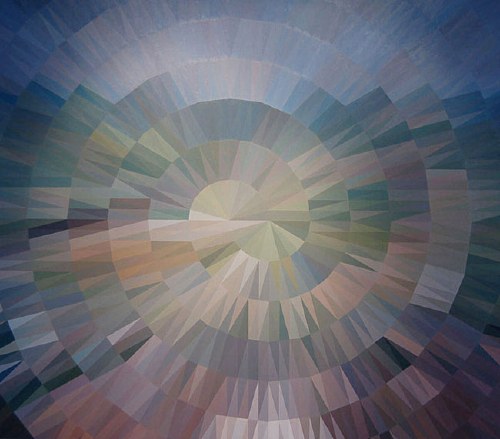
Though they’re pixelated abstractions, and though they’re almost as likely to be landscapes as people, Alex Brown’s paintings feel a bit like the opposite of what fascinates me about the Dutch Landscape paintings I’m working on.
From a q&a with Brown that accompanied his most recent show this February at Feature:
.who or what are some of the things that inspired your interest to have your work delve into the interdependent relationship of representation and abstraction? Lack of skill as a painter in a more traditional sense of the word? Unwillingness to give you a clear picture of what’s really going on in my brain?
That relationship is a direct result of the manner in which I have chosen to paint. I have always been confused by abstraction. Confused because of a lack of orientation. Taking something realized and turning it into something unrecognizable makes sense to me. I try not to think in those terms so much. They’re all just paintings and some look more like something that you’ve seen in your experience than others do. It all trickles down in varying degrees from a clear source image to finished painting. My abstractions are really just less than overly clear realizations.
Brown developed his approach after realizing he can’t paint straight; he deploys a grid and a filter on an undistorted source image, then painstakingly transfers the result to canvas. I imagine it’s a process similar to Chuck Close’s, whereby a photo is reconstituted, pixel-shaped abstract blob by pixel-shaped abstract blob.
But the distorting abstractions that unmoor the image from its specific subject and turn it into a painting are all Brown’s. The abstract polygons in these Dutch Camo Landscape images have all been put there by someone else–who wants to obscure and despecify the underlying representation. In an odd, inverted sense, paintings of them will look abstract, but will be representational.
Anyway, there are many more wonderful images of Brown’s work at Feature’s website. Above: Fairgrounds, 2008 [featureinc.com, thanks 2 coats of paint for the reminder]
