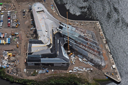
This is really a beauty of a Zaha Hadid takedown of her firm’s riverfront museum in Glasgow–and so much more.
I came for the roof-as-nth-facade condemnation:
And this futility just deepens… the building is an example of ‘Google Earth Urbanism’. That is to say; all this complexity can only really be seen from directly above. Without a spare helicopter, all you are really left with is the façade, which is marginally more interesting than your typical shed, and the blank slug-like form of the ‘swooshing’ S-shape, which meets the ground with all the elegance of a squished gastropod.
and stayed for the thorough routing of turn-of-the-century Stylist Modernism:
He says the competition-winning concept they had to work with was a system of ridges and valleys, which had to be translated into a structure.
Read that again.
So this is what has happened to the Modernists’ quest for a synthesis of the Engineer and the Architect in the last 80 years. Absolute disassociation. The architect wins the competition with a shape, which the brains then have to spend time figuring out how to solve. This isn’t exactly a full circle (the negation of the negation blah blah), but this is a very strange cultural position to be in, a truly postmodernist one. Now of course the Modernists’ quest for synthesis was vulgar and naïve, and of course this quasi-dialectical teleological view of the world and its cultural expressions had to be surpassed (ha!), but is this really where we’ve ended up, nearly forty years after Pruitt-Igoe and Complexity and Contradiction? The best architects in the world as decorators, as stylists? And what’s more – all that structure, all that difficulty, all of the real work of the building will be completely clad, both inside and out, expressed only as shape.
Zaha Hadid Architects – Purveyors of Architectural Melancholy [youyouidiot via things magazine]
