
I swear, I didn’t plan to go all Errol Morris and do three posts about one photo in one catalogue about one artwork. So look at this other photograph!
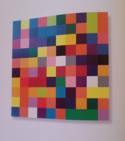
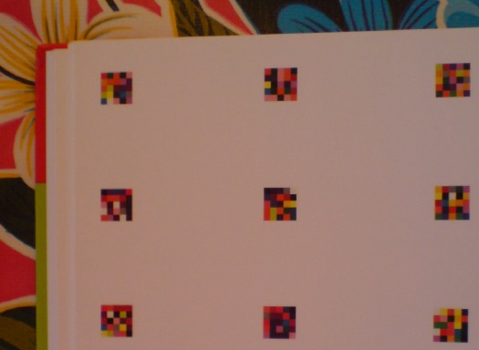
The second thing you notice–first if you just crack it open, second if you start from the front–in the Serpentine Gallery’s Gerhard Richter | 4900 Colours is what I bought it for: page after page of reproductions of the panels in all eleven possible configurations. The Serpentine’s own Version II comes first, with large, 2×2 assemblies shown, one per page.
With drop shadows. Seriously. Drop shadows. Are these photographs? Part of me wants to think that photos in a Richter book would all be taken under such perfectly identical lighting that it creates exactly identical shadows. But I am doubtful.
There is one squeegee painting reproduced, but it has no shadow, or frame, or any indication of three dimensionality. And it’s pretty obvious that all the other Versions of 4900 Colours are illustrated, not by photos, but computer graphics–diagrams. Does this matter? And if it doesn’t, what does it mean to simulate three dimensionality with dropshadows?
Buchloh, whatchagot?
The Diagram
A diagram is not a painting. It’s as simple as that…I can make a painting from a diagram, but can you? – Frank Stella [ed note: this is from an apparently cantankerous 1964 radio interview with Judd, included in Gregory Battcock’s “Minimal Art: A Critical Anthology.”]
…the diagram contributed a dissenting voice to the heroic chorus of abstraction, recognizing the degree to which the painter and the spectator as perceptual and desiring subjects are always already contained in systems of spatio-temporal quantification, control, and statistical registration.
Mhmm. I like this idea of diagrammatic abstraction and how it is an overlooked underdog. But could that just be my own subjective anti-subjectivity talking? Maybe I agree because I happen to have found my own “schemata of statistical data collection” to use as my “necessary and primary matrices determining a pictorial/compositional order”?
Also, I don’t see how Richter’s “low-tech colour production [could] subvert the new digital spectacularisation of colour [8]” while he simultaneously publishes more-perfect-than-real digital simulacra of his work, augmented with Adobe Illustrator’s systems of simulated tempo-spatiality.
I take issue with this. I also realize that I’m putting Buchloh on the hook directly and Richter, too, by implication, for tiny, seemingly peripheral-to-picayune issues I have with the catalogue that fall well within the scope of book design. But they transform the book from a documentation to a blueprint, a schematic. Which is fine. But drop shadows?
And anyway, why should any spectator’s seemingly arbitrary perceptual minutiae take a back seat to Buchloh’s, or anyone else’s?
Do my questions really and truly seem less germane than this spectacular footnote to the digital spectacularisation of colour–I mean, wow. Just wow–and tell me what is going on here?
[8] It is certainly not accidental at all that at the time of the writing of this essay, a new electronic device operates on the site of an advertisement for eBay Europe. Under the imperative appellation ‘CHOOSE YOUR COLOUR’ a field of randomly ordered colour chips appears, very much in the manner of one of Richter’s earlier colour chip paintings. The site’s digitally vibrating colour squares appeal to spectators to find precisely ‘their colour’, i.e., to comply with an order to suture their desire (performed on the computer’s touch pad) and to yet another commodity to be acquired.
A banner ad on eBay Europe! What does Benjamin Buchloh buy–or sell?!–on eBay Europe? It is certainly not accidental at all!
Meanwhile, the commodity that is 4900 Colours, 2007, was acquired by La Collection de La Fondation Louis Vuitton pour la creation. I don’t think I’ve enjoyed reading an exhibition catalogue this much in fifteen years.
Gerhard Richter: 4900 Colours