I’ve written before about the “clean and presumptively powerful” design of various government letterheads I’ve come across in my recent archive diving.
And I must not be doing it right, because my searches for the expansive survey of the history of such official design, and for the comprehensive sourcebook containing the thousands of seals and emblems of various government agencies and offices keep coming up empty.
![]()
I mean, Total Information Awareness, right? Somebody must be keeping a list. Anybody? Bueller?
So I’m reduced at the moment to random click trains through Wikipedia, or to search diving in the digitized collections at the National Archives. Not very productive.
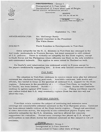
Though it has yielded some nice finds. Nothing spectacular, but then, that’s kind of the point of these designs. Up top, the United States Information Agency, once part of the State Department. That’s the director’s office letterhead there, with the smaller seal.
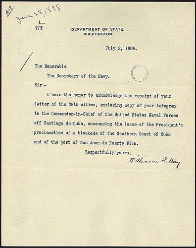
What I really like, in addition to the undesigned design, is how all the rest of the information is handled. Though a zip code does pop up occasionally, there’s almost never a street/mailing address. Or maybe there is; “Department of State comma Washington” would probably get you or your letter there in 2011 as easily as 1898.
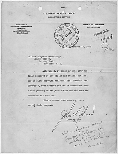
But it’s the way information accretes, the way the document functions, that’s kind of cool, too. The tiny instruction for answering and the reference number on the upper left of this 1922 Dept. of Labor letter, for example. And all the stamps! Check out that received stamp: not just the date, but the time, too.
Anyway, I made a little flickr photoset of a few examples I’ve found. I’m looking forward to having my scattered, amateur enthusiasm swamped by the exhaustive review of government logo and letterhead design that some expert has already compiled. And then we can start talking about what I’m looking at this stuff for.
Previously: The Great Letterpress of The United States
Skip to content

the making of, by greg allen