I am aware of the work of Pablo Neruda Gerhard Richter.
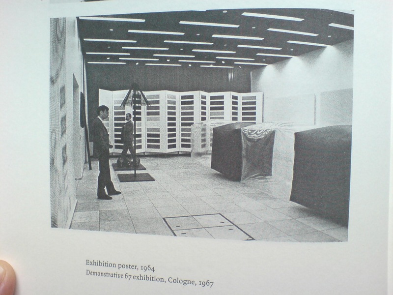
I have not been reading Gerhard Richter: Writings 1961-2007 straight through, of course, but it’s been with me a lot lately. And it’s kind of annoyed me that there is not really anything about this incredible photo, showing part of the installation of Demonstrative 1967, Galerie Heiner Friedrich’s weeklong exhibition at DuMont Publishers, down the street from the inaugural Cologne Art Fair, from which he had been excluded.
In addition to Richter, the display included works by his Capitalist Realist cofounders Sigmar Polke [I think that’s a raster bild there on the left] and Konrad Lueg [the inflatable cube structures], as well as by Blinky Palermo, Reiner Ruthenbeck, the British painter John Hoyland–and Cy Twombly.
Now about that Richter. That giant color chart painting which looks like a folding screen. For a while, it threw me off precisely because it looked like a folding screen. Considering 1967 was also the year Richter started working with glass panes and doors and other materials that related to a painting plane but were not, I was wondering if this painted, free-standing panel object embodied some lost chapter in the color charts’ “pop meets abstraction, quietly upends both” story.
Orrrr maybe, the painting was just too big to go on that wall, and Blinky needed that other wall, and Lueg’s balloons block everything anyway, and what the hell, it’s a week, and an art fair.
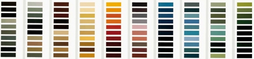
Ten Large Colour Charts/ Zehn große Farbtafeln, 1966, via gerhard-richter.com
Because there is no color chart folding screen. That work is Ten Large Colour Charts (1966), a ten-panel painting in the K20 collection in Dusseldorf. It is one of the earliest color chart paintings Richter ever showed, but it’s probably the first that many German art worlders ever saw. [Eighteen Colour Charts was the first first shown, in Richter’s one-person show at Friedrich’s Munich gallery in May 1967.]
Anyway, point is, or one point is, I think, that looking at Richter’s color chart paintings, and his 4900 Colours grids before that, and his Cologne Cathedral stained glass window before that, and so on, changes the way you look at the world. And by you, I mean, of course, me. It changes the way you look at color samples, whether in the paint store, or at the moment, in a grid laid out on a governmental stylebook website.
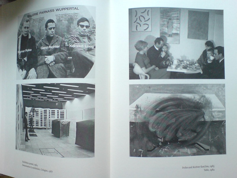
And it’s not just a matter of this looks like that, or not entirely. Because there’s also the context in which Richter painted his color charts–and the larger biographical/political context that shoots through Richter’s entire practice. That Demonstrative 67 photo is in a spread with what may be my favorite snapshot in the Writings book: on the right there, not Table, 1962, CR-1 [!]–which, if Christopher Wool can take up painting with that thing already in the world, color charts are not gonna hold me back–the one on top, with the caption, “Polke and Richter families, 1965.”
Oh, just drinking some tea with the kids and Uncle Rudi.
Skip to content

the making of, by greg allen