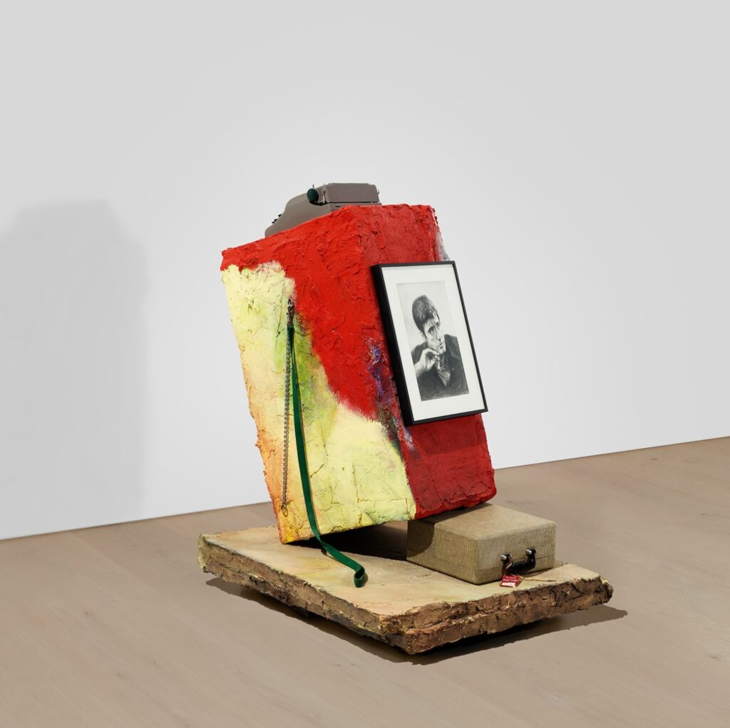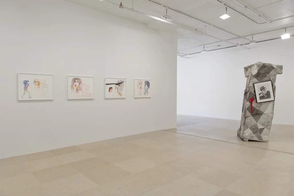
Fans of Rachel Harrison and Scarface who prefer their sculptures incorporate readymade framed scans of gifted Central Park tourist souvenir portraits of Al Pacino as Tony Montana without a bullet hole are in luck.

Whatever it means for an artist to have a recognizable style or practice, this is the first time I’ve noticed Harrison using a readymade object in at least two of her sculptures. But then, this particular object—a framed, print of a scan of the original drawing given to Harrison by a friend—is explicitly a copy, so why shouldn’t there be more than one? Does it have Deep Meaning that in addition to the 2012 sculpture, Valid Like Salad [whose later history of violence and conservation was discussed previously], Harrison used this movie star sketch in a 2011 work titled, Portrait of the Artist as a Young Man? You tell me.

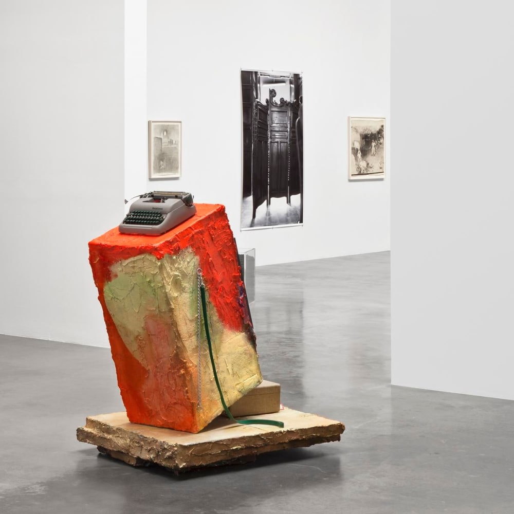
Because now that I’ve seen Harrison reuse a specific object at least twice, I can’t stop looking for other repetitions and patterns in her work. Portrait was exhibited in 2011 in estrella distante, a Roberto Bolaño-themed group show at kurimanzutto, organized in collaboration with Harrison’s LA gallery, Regen Projects. Though it would have been obvious because it was facing a doorway, the installation views of Portrait omit the Tony Montana picture—should we assume it was there?—and center the typewriter perched on top of the painted concrete block, which sits in turn upon the typewriter’s case.

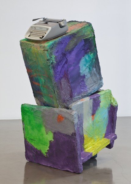
Which is itself a repeat of a move Harrison used in Structural Design (2010), a sculpture she showed at Regen Projects in 2010. Arguably, that work, or the keyboard of the Royal Safari portable typewriter it incorporates, gave the show its title, Asdfjkl;. The artist also makes an appearance in the press release, where the reference to typing hand position is described as “mentally tactile, as it speaks to the moment when one is just about to touch an object, or when one’s fingers have just had that physical encounter. The rapidly changing relationship to writing produced by the aid of machines is central to this title (the artist grew up without texting and is still not that good at it). Structural Design is a sculpture whose components are a Royal typewriter and painted forms balancing on the edge of the typewriter’s case, teetering in a moment between gravity and expression.”
Now these forms, both the boxes and the sheets, and the teetering, come into focus as elements of Harrison’s vocabulary. So does this strategy of separating two elements—a typewriter and its case—with sculptural forms. And hanging a framed photo on them. Or putting them on bases or plinths. And on and on. Seen in volume, and over time, a syntax appears, and a portrait of the artist does emerge in the work, or at least a portrait of the artist working.
