Nothing fuels one's quixotic pursuit of Cage's visual and aesthetic artifacts quite like being served a drink from what turns out to be John Cage's table.
I cannot say where or when I saw it. I cannot say who has it. I can only say I was told that it was Cage's table--really, John's and Merce's table--from their loft on 18th St, and that it came with instructions [conditions?] not to fetishize it. I believe that was the word used. Maybe it was valorize. Not to valorize it. At which point I joked that I did not fetishize it or whatever, I only coveted it. And I promised that, if asked, I would attest that it was not fetishized, and that if it was given to me, I would not fetishize it, either.
Upon reflection, it felt like a useful insight into Cage's perception of objects, the things around him which he knew, if he wanted or allowed them to, could garner attention or importance by virtue of being his. It's Buddhism 101, eschewing attachment to objects, but it's also an artistic position. No branding. At the very least, art was not a practice for generating objects, either for sale or veneration. Oh, maybe that's what it was not supposed be: venerated.
Yes, that's it. Veneration. Like saints and gurus. I could see why Cage would be sensitive to that. No problem. Since it was being used as a sloppy drinks table, I was going to happily attest that it was not being venerated in the slightest. No venerating here, nosiree.
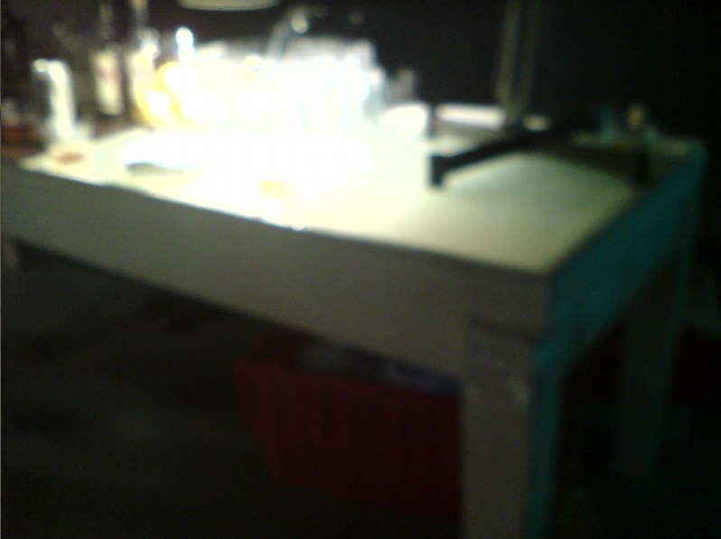
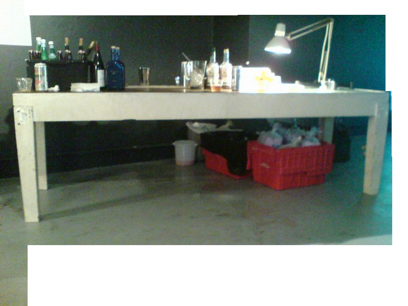
But let's just take a look at it instead, hmm? Because it does have some aspects which we might consider Cageian. It's rough, simple, not fancy, not precious, not worked, just made. It's painted white, like the original Mazza loft. It's utilitarian, or functional. Multi-functional. IT HAS A LIGHT BOX BUILT RIGHT INTO THE END, PEOPLE. So it was for working, meeting, and eating.
And it was made, not bought, found, or adapted. With some trace of intention. No chance operation produced the slight taper in those square wooden legs. And there's the nice little setback edge between the upper and lower halves.
Since the table was not immediately offered to me, and given its principled/conceptual encumbrances, the obvious thing was to make one myself. Which is why these photos exist, as documentation for this project, my second table. Table-shaped object. By-product of my performance of a score for a table. I really just want the table, mkay? I'm imperfect and unenlightened, and the Dalai Lama has his watch, I just want the table.
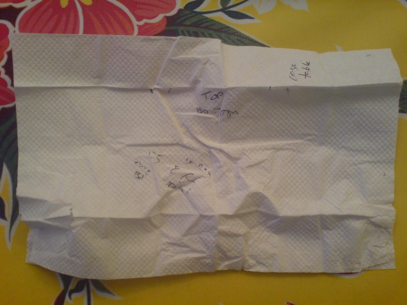
So as best I could, I took some measurements. I just found the napkin I used to scribble down some ad hoc data. What a dork I was right then and there. I hope I was at least amusing.
"Cage table"
those are the widths of the top and bottom of the legs, looks like about a 4/3, 1" taper.
"55 [?] chip Bd?
lt Box 8 ft Total"
That can't be right. Well, it's close. If the napkin's 10", the light box looks to be around 3', at least. [That was my unit of measure: napkinlengths.] I guess I figured I'd be able to feasibly extrapolate the other dimensions? Was that what I was thinking?
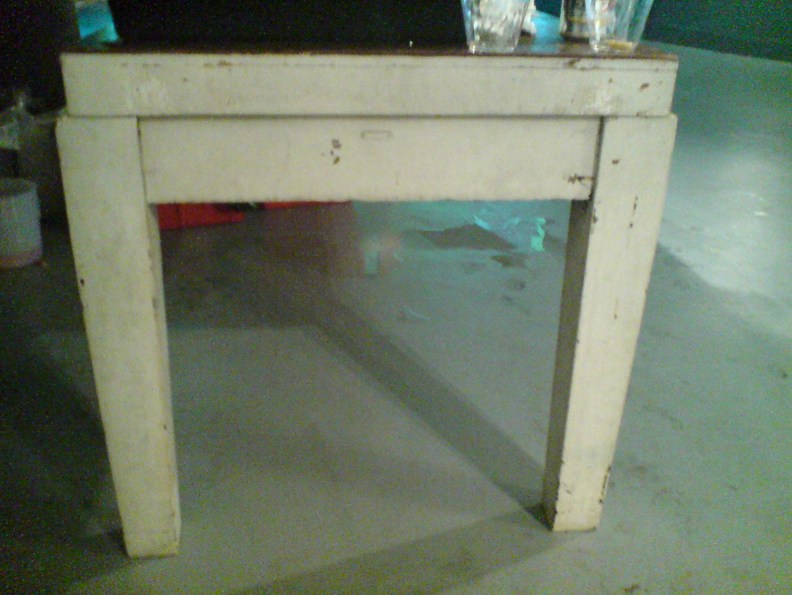
Hmm, maybe this was found, and hacked. Given a new top and a paint job. An old lab table or something. Because seriously, those legs are non-trivial. But then, those legs also look hammered. I won't fetishize or historicize the construction. Any deskilling will be my own.
Meanwhile, seriously, current non-venerator[s] of this table, if it's ever in the way, or under threat, or if you redecorate, or whatever, any reason, let me know, and I'll gladly clear it out in the least venerating way possible.
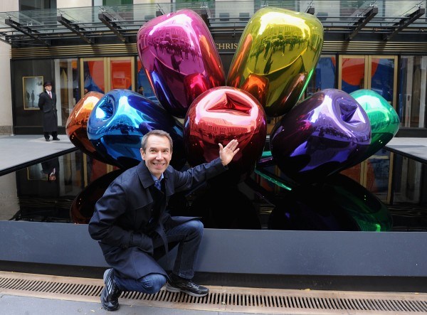
Why, he can promote this stuff one-handed. image: getty via gallerist ny
Though I was excited as could be by the invitation to what was billed as "an exceptional photo call," I did not attend Jeff Koons' appearance in front of his tulips, which were for sale last month in front of Christie's.
While the creation of the sculpture might be over, Mr. Koons is nonetheless still hard at work on crafting and maintaining his image. Despite having a broken wrist, which was in a cast (the result of a horseback-riding incident), he was charming and upbeat, much like a professional model, seeking the best angle, variously standing or sitting, feigning at turns surprise and conviviality, and even giving us some pointers: "Come around from here," and, "I can stand over there." Mr. Koons once again proved that he is his own greatest creation.
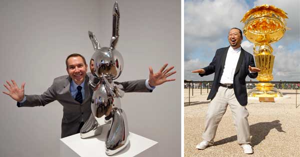
Koons may be the most manipulatively congenial about it, but he is by no means the only artist to ham it up for the cameras.
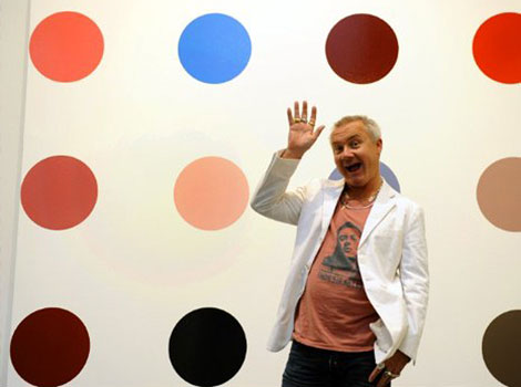
And move over, here's Damien Hirst at a photo opp for the Spot Challenge:
This is obviously a particular and not-unbiased sample. But there are a few inter-related things I'm seeing here. The least interesting is how these three all adopt roughly the same persona: the artist-as-minstrel-clown. Whether court jester is a step up, down, or a lateral move, it's just a LULZ-ier example of Jasper Johns' characterization of artists as the elite of the servant class.
Koons' work--and his workin' it--are revealing, though, and I mean literally. You can see the photo scrum right there, the wire service joes with their daily list of photo calls to make, reflected in the mirrored surface of his balloon tulips. Like GWB White House stagecraft manager Scott Sforza, Koons knows that all these guys want is their shot, and he is all too happy to help them get it. Koons' mugging and poses are the visual equivalents of his banal soundbites about his work; he's very much embodying, reflecting, transmuting into the sycophantic, celebrity- and money-driven mediated culture around him.
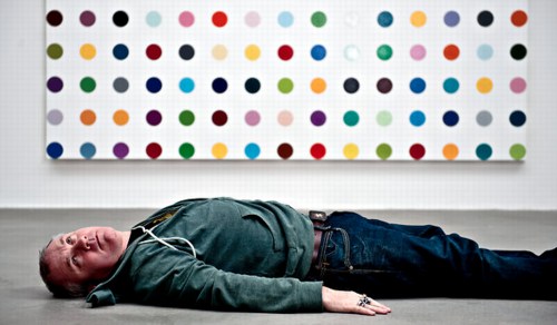
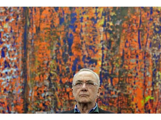
Gerhard Richter photo opp at the Ludwig in Köln, 2008, image: ddp via derwesten.de
The prevalence of this image genre and the media & publicity system that produces it inevitably colors our view of the art and the artists. I think most artists are very aware of that, and thus harbor anxiety or at least ambivalence toward the photo opp and feature experience. Managing the unpleasantness, wanting to support their own work, wanting not to be difficult, but really wanting to do almost anything else at that moment, they often acquiesce to these photographers' weird, stilted, or just clichéed compositions of The Artist Next To Her Work.
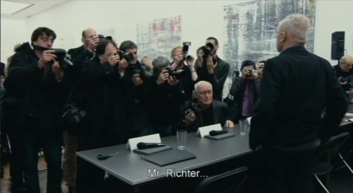
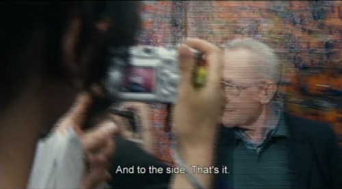
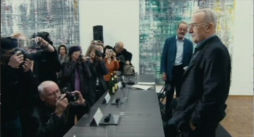
For some, it's an apparently unavoidable, barely tolerable evil. There's a stark, kind of ridiculous scene that interrupts Corinna Belz' Gerhard Richter Painting, a press preview of the artist's 2008-9 show of late/recent Abstrakte Bilder at the Museum Ludwig in Köln, where it's clear how much Richter hates the experience and the context. And the process ["I just want to get out of here."], and the pictures that result from it. ["Oh, just throw them all away."] I'm guessing that low shot above was taken by the bald guy in this screencap:
We're used to consuming such images without much concern, but hearing the artist's empty answers to the journalists' simultaneously preening and undermining questions, you really start to wonder. And by you, I mean, of course, me.
Deitch coming to MOCA, image: Lawrence K Ho for latimes
RP I'm misinformed about style. I always thought it had to do with being able to wear the same kind of a jacket for ten years. I don't know. What I wonder is . . . is it possible to have style and be unreasonable at the same time?
BK I think unreasonableness can mean any number of possible locations nearer or further away from the idea of reason. Because many of these positions are already coded, their shock value is tempered by style. A lot of times the idea of transgression really turns on a romantic conception of otherness; of a rebellion already tolerated. You know, the charming rogue, the picaresque cuteness of the bull in the china shop and in the art world, badness invades the atelier. Driving limos through heavy neighborhoods to look at the graffiti. Unstylish unreasonableness may be limited to the categories of the insane and the unpleasant (the poor, the unbeautiful, the unempowered). The non-romanticism of these kinds of otherness makes them unsightly and "vulgar" considerations for the polite company of international bohemia.
This image of limos driving "through heavy neighborhoods to look at the graffiti" is great in itself, but it also reminded me of an anecdote from, of all people, Jasper Johns.
Jasper Johns, Harlem Light, 1967, image "taken. It's not mine."
It's about the genesis of a motif that first appears in a 1967 painting, Harlem Light [above]. Here's the version from Michael Crichton's 1977 catalogue for Johns' Whitney retrospective, which is still the most engrossing Johns book I've seen. And I've seen a lot:
Johns was taking a taxi to the airport, traveling through Harlem, when he passed a small store which had a wall painted to resemble flagstones. He decided it would appear in his next painting. Some weeks later when he began the painting, he asked David Whitney to find the flagstone wall, and photograph it. Whitney returned to say he could not find the wall anywhere. Johns himself then looked for the wall, driving back and forth across Harlem, searching for what he had briefly seen. He never found it, and finally had to conclude that it had been painted over or demolished. Thus he was obliged to re-create the flagstone wall from memory. This distressed him. "What I had hoped to do was an exact copy of the wall. It was red, black, and gray, but I'm sure that it didn't look like what I did. But I did my best."
Explaining further, he said: "Whatever I do seems artificial and false, to me. They--whoever painted the wall--had an idea; I doubt that whatever they did had to conform to anything except their own pleasure. I wanted to use that design. The trouble is that when you start to work, you can't eliminate your own sophistication. If I could have traced it, I would have felt secure that I had it right. Because what's interesting to e is the fact that it isn't designed, but taken. It's not mine."
Crichton goes on to discuss the "small differences" that go unnoticed, and which are lost in creating from scratch. And of flagstones, like flags, an ideal Johnsian image," which are found and known and abstract and concrete. Seriously, I could just keep quoting from that book all day.
But instead, I'm going to try to make sense of Kruger's next sentence, "Unstylish unreasonableness may be limited to the categories of the insane and the unpleasant (the poor, the unbeautiful, the unempowered)."
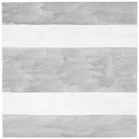
Untitled, 2004, Agnes Martin's last painting. Image via Phaidon
The visits that maybe stick in the mind are the ones where she would show me four versions of a single painting and she'd say to me. 'I think this is the best one, what do you think?' Invariably there was so little difference between them, it was so hard to say, they were all really beautiful. And then she'd say OK we're gonna keep that one and we're going to cut up the others. And I would help with a knife slice up the paintings. Those are the studio visits that I think are the sharpest, helping her destroy the work.
What goes through your mind the first time you hear something like that?
It's her work, and I'm a co-worker in the art field. . . but yeah. It is brutal. I was there at the end of her life and she said 'go down to the studio, there are three paintings. Hanging on the wall is the one I want to keep, I want you to destroy the other two.' So I went down to the studio. The two paintings she wanted me to destroy were magnificent - absolutely perfect. The one on the wall was a very stormy painting, unlike anything that she had made since the 60s. I certainly didn't want to destroy those two spectacular paintings but I did. I sliced them to ribbons and put them in the trash. When I came back. She said, 'did you do it?' I said, 'I did it.' And that was that. Our last conversation.
The Q&A is timed to the publication of Agnes Martin: Paintings, Writings, Remembrances by Arne Glimcher, an extraordinary collection of Martin's writings and correspondence, many works, and Glimcher's own snapshots and notes. He would take extensive notes during his studio visits with Martin in New Mexico, and then transcribe them on the plane home.
He expands on Martin's last request to destroy some of her work in March 2004:
A mystique exists that Agnes painted very few works but in actuality, she painted almost daily when inspired and that was with some frequency. However, only a relatively small amount of works exist from such a long and productive life because she destroyed most of the works she produced. Probably no artist has ever been a better editor than Agnes Martin. The rejected paintings were shredded with a mat knife. As she grew older, during the last few years, she enlisted the help of friends (myself included) to destroy the unacceptable works, as it was very hard to cut through the thick primed linen fabric. When I once asked her why she was destroying a particularly delicate and beautiful work, she said, 'It's too aggressive, and there's a mistake.' Most often that referred to a pooling of colour in one of the works that made the brushstrokes discontinuous. The mistake became an unwanted 'focus' in a non-compositional painting, which disturbed its serenity.
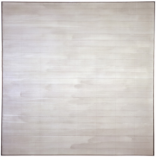
Trumpet, 1967, an earlier last painting by Agnes Martin, image via zwirnerandwirth
I drove to the studio where I found three grey paintings, all of which were beautiful. Using her mat knife, I reluctantly shredded two and spared the one that hung on the wall. It was unique, expressionistically painted with stormy grey asymmetrical brushstrokes covering the surface. Five thin pencil lines visually grounded the passionate wash to the canvas. There is only one other painting with such an expressionistic asymmetrical handling of brush work. It is called Trumpet and was painted in 1967, just before she took her long hiatus and first departure from painting. On first glance, in this last painting, Agnes appears to have taken a new direction. Comparing Untitled (2004) with Trumpet, it is clear that it was not so much a change in style as it was coming full circle home.
The two that I had to destroy were very dissimilar from the one that was left, which you saw the picture of. They were much more rigorous; they were less emotional paintings. They looked more like the 70s than they did the 90s, or the late work. They seemed to be a little bit out of context, but perfect paintings, really exquisite paintings. So I took the box cutter and sliced them to ribbons.
]
In reviewing "Five Decades," a 10-painting Zwirner & Wirth survey in 2003, Holland Cotter called the artist's practice, "a kind of yoga of painting." I'm still trying to think it through, and understanding why she destroyed so much of her work--or her paintings, really, and maybe that's the difference--but perhaps it involves a kind of yoga of looking as well.
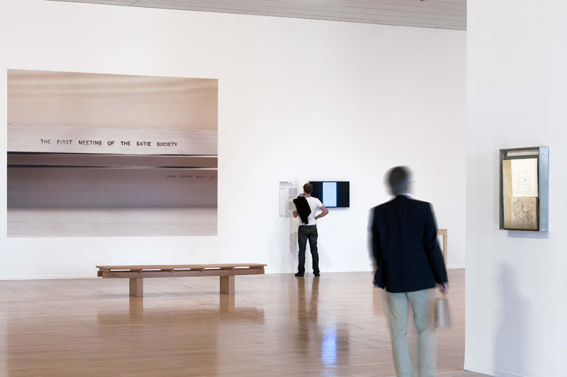
It's been a while since I had a good old-fashioned photomuralling around here, and this one comes from an unexpected source: John Cage. Mostly.
I'd seen installation photos before of MAC Lyon's Cage's Satie: Composition for Museum , an exhibition curated by Laura Kuhn from the John Cage Trust. The show includes several composition-related installations, and a gallery dedicated to The First Meeting of the Satie Society, (1985-1992),
Cage's stunning late-life collaborative merger of poetry, performance, visual art, sculpture, and music. This work was conceived as a collection of "presents" for Erik Satie, an invitation by John Cage to his esteemed artist friends to fill a Marcel Duchamp-inspired cracked glass valise with words and images bound into eight hand made books. Contributors in the visual aspects include Jasper Johns, Robert Rauschenberg, Sol LeWitt, Robert Ryman, and Cage himself.
But it wasn't until Alex Ross posted the top image that I realized what these giant wall pieces were: they're large-scale photos of close-ups of various texts imprinted on the steel Satie Society valise. That's the title, obviously. Here's another, "Some artists apparently want to be buried alive." which, hmm. I can't find any mention of the quote online, but given that it's incised on an indeterminate handful of mostly unpublished metal boxes scattered to the collecting winds, I guess that's not a surprise.
What is a bit surprising, though, is the visual boldness of the photos, which really dominate an otherwise spare, small-scale show in a vast space. As nice as they look, I guess they're an exhibition design, not things. Except, of course, that they are.
There's this atypical situation that I keep coming back to, the objects and artifacts of Cage. Things that, if he'd had a more materialist view of art, we might be able to consider from the perspective of art, if not to actually call them art objects.
This awkwardness is reinforced in a way by the surprisingly traditionalist view of artmaking that Cage held onto, at least for himself. However experimental or avant-garde his process--feather paintings, smoke drawings, a few prints, even this slightly affected Duchamp-related valise--the results were modest and old-school.
I guess I'm wondering, fantasizing, plotting, for a more interesting way to be a Cage collector when the available works, such as they are, are not that compelling. So I have questions about them, yes, but I also find these giant photo mural prints kind of sexy.
Painting from life: Life Magazine, image: gagosian
In trying to figure out the why, no seriously, WHY? of Bob Dylan's second [!] painting exhibition at Gagosian [!?], Gallerist NY's Michael Miller was left with the same Only Possible Explanation that's been dogging me since the musician's first baffling Gagosian gig in October 2011:
All I could come up with was a conspiracy theory cooked up by a friend, that both of Mr. Dylan's shows at Gagosian are actually the work of Richard Prince using "Bob Dylan" as a pseudonym, making the ultimate statement on art and artifice, and proving once and for all that Bob Dylan is whoever you want him to be.
Exactly! It makes perfect sense. Explains everything. Clear as day. All evidence points to it. Every piece of evidence there is. I will go so far as to say that wars have been started with less evidence than this. If Richard Prince were Iraq, we'd have invaded him and pulled him out of his Dylanholes by now, is what I'm saying.
Let's look at the facts. Or rather, let's look at the facts while entertaining the possibility that Prince is performing as Dylan the visual artist.
The 2011 show, The Asia Series, were originally presented as--and understood as--a tour documentary. We're on the bus, walking the street, just hanging, seeing the world as Dylan sees it:
He often draws and paints while on tour, and his motifs bear corresponding impressions of the many different environments and people that he encounters. A keen observer, Dylan works from real life to depict everyday phenomena in such a way that they appear fresh, new, and mysterious.
And if this fantasy come true weren't enough, Dylan's real life turns out to be as exotic and mysterious as we'd always imagined The Orient to be:
The Asia Series, a visual journal of his travels in Japan, China, Vietnam, and Korea, comprises firsthand depictions of people, street scenes, architecture and landscape, which can be clearly identified by title and specific cultural details, such as Mae Ling, Cockfight, The Bridge, and Hunan Province. Conversely, there are more cryptic paintings often of personalities and situations, such Big Brother and Opium, or LeBelle Cascade, which looks like a riff on Manet's Le Déjeuner sur l'Herbe but which is, in fact, a scenographic tourist photo-opportunity in a Tokyo amusement arcade.
That was the setup, the view that held for the first few days before Dylan's paintings were revealed to be copies, tracings of old photographs. Whether the source was as famous as Henri Cartier-Bresson, as prominent as a new Magnum photo [licensed, apparently, after the fact], or as anonymous and obscure as a collection of 19th century, hand-tinted lantern slides scanned and uploaded to flickr, they had two things in common: 1) they were entirely unacknowledged, and 2) they were thoroughly and inevitably trackable.
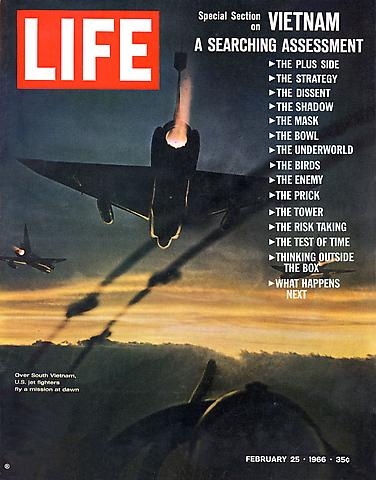
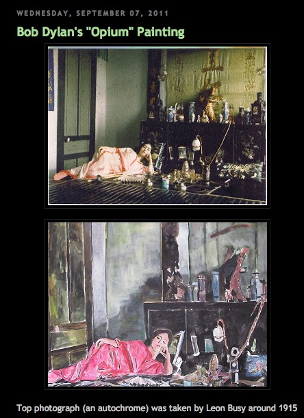
In fact, Dylanologists were already on the case; they'd puzzled over the sudden change in Dylan's painting style as evidenced by the images Gagosian was teasing the show with: a 1966 LIFE magazine cover slightly altered with "pulp references," and a scene in an opium den which was quickly traced to a 1915 Leon Busy photo by the curator of the Opium Museum.
And then the plagiarizingshit hit the fan. I'm no conspiracy theorist, but the media freakout over Dylan's Asia Series paintings was so out of proportion to their obvious reality, it seemed staged.
Instead, it's the kind of thief/appropriation/credit criticism that has followed Dylan throughout his entire career. Which should give him and Prince something to talk about.
"Welcome to Bob Dylan's world, Soba-san!" [image: expectingrain.com]
After the photo-based painting controversy broke, Gagosian tweaked the press release: "Dylan works from real life" became "Dylan is inspired by everyday phenomena," and "a visual journal of his travels" became "a visual reflection," which is no longer considered "firsthand." But then, in these mediated days, what is?
I think the key to Dylan's show is to be found here, in the reality gap between how something is "billed" or presented, and how it is received. Because as Dylan turns out to have told MoMA Chief Curator-turned-Gagosian adviser John Elderfield in the show's catalogue interview, photographs are part of real life:
A number of the paintings--such as Emperor, La Belle Cascade, Cock Fight, and Shanghai--show very complex scenes. Were these done from sketches, or do you paint from photographs--or from drawings made from photographs--some of the time?
I paint mostly from real life. It has to start with that. Real people, real street scenes, behind-the-curtain scenes, live models, paintings, photographs, staged setups, architecture, grids, graphic design. Whatever it takes to make it work.
But besides the knack for appropriation-fueled outrage, what does any of this have to do with Richard Prince?
It's true that the outsized criticism of Dylan's photo-based painting struck me as ridiculous at the time, Fall 2011, when the Cariou v. Prince verdict and appeal were getting increased attention, and when the Corinna Belz' documentary Gerhard Richter Painting and Richter's retrospective were both receiving rapturous acclaim. Oh, and when John "yes, that John, right in the middle of it all," Elderfield was taking his victory lap at MoMA with the last and greatest painting show of his career, the Willem de Kooning retrospective.
And I knew that Prince was involved--maybe implicated was the better word--because I saw he'd written a piece in the Asia Series catalogue, in which he mentioned D.H. Lawrence's paintings, and compared Dylan's La Belle Cascade to--holy crap--Cezanne's Bathers:
The paintings that Dylan showed me out in L.A. were paintings from his travels in Asia. Some of them looked too big for him to have painted them while he was there, so maybe he had done them from memory or a photograph or a sketch or a drawing. I didn't ask. I didn't ask a lot of things. I didn't need to. I just enjoyed the experience. I liked a painting called La Belle Cascade because it looked to me like one of Cézanne's Bathers. And Cézanne's Bathers are some of my favorite works of art
And when that essay was republished on the NY Review of Books after the controversy broke, I started wondering about the possible differences between "Dylan's paintings" and "The paintings Dylan showed me," and this equivocation about Dylan's studio suddenly seemed a lot less benign than it had previously:
Dylan's studio. I think it was Dylan's studio. I'm still not sure. It didn't look like any artist's studio I'd ever been in.
Someone was working to not be pinned down. Prince knew what was up, and so, for that matter, did Elderfield. And so did anyone who looked at a 4-ft, vintage photo-based painting and wondered how the hell anyone, much less Bob Dylan, ever painted it on a Thai tour bus.
But it wasn't until a few months later, when I was deep in my own Destroyed Richter Paintings project, and I unrolled the first shipment of canvases from Chinese Paint Mill, that I recognized the painting style--as Bob Dylan's. The same flatness, the same traced-over-projection line, the same filled-in spaces. Whether he'd ordered them from Chinese Paint Mill or from somewhere/one else, it now seemed obvious that Dylan did not paint his paintings.
Not that outsourcing his fabrication would grant Dylan anything greater than general admission at the contemporary art ball. Fling an iPhone in Chelsea, and you're bound to hit an outsourcer, a fabricator, or both. These paintings aren't any less "Dylan's" or "Dylans" for having been painted by someone else. And are they any more Prince's or Princes for him having made them? Or having them made? Are those Koonses actually Sarah Morrises? Are those Morrises actually by [names of her painters who call to chat and dish redacted]? That Richter painting Kippenberger table: was or is? Construction with J.J. Flag or Short Circuit?
As long as Dylan signs his paintings--whoops, he doesn't--well, as long as they're presented as his, under his name.
And he's obviously on board with the project. If not, who would have engineered it? At Gagosian? Would Prince have claimed to have visited Dylan's studio [sic] if it hadn't happened? Well, yes. But would Elderfield have claimed to have interviewed him? And written two essays for two shows? For a Henry Codax-style, ghost Dylan?
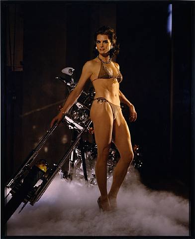
This past Summer, while working on a live restaging of Prince's Canal Zone lawsuit, I started to sense that outsourcing, or hands-off production, was as important to his own practice as appropriation itself. The hand-off of his Cowboys film to commercial processors was an early example. It stuck when he testified about not meeting a now-grown Brooke Shields in 2005 when Sante D'Orazio shot her for a recreation of Spiritual America [above]:
Q. You just weren't there?
A. I just--well, I wasn't there by purpose.
Q. Okay. What was the purpose?
A. To transform the image.
Q. The photo--
A. Yes.
Q.--that Mr. D'Orazio took?
A. Yes. [M]y not being there is a transformative--the absence of the author is I believe a way to transform an image.
[Prince noted that his "contribution" also included selection, or "editing" D'Orazio's 300 shots down to the one that would get printed. And then he showed it, as an unpublicized surprise, to guests at a private dinner held in the Rivington St. storefront where the original Spiritual America was first shown.]
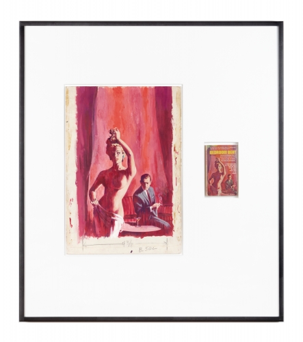
In his Fall 2009 deposition Prince also testified of tracking down the original illustrations used for pulp fiction book covers, such as those used in his Nurse paintings. He'd begun pairing these drawings & paintings with the books themselves. Untitled (Original), as the series is called, are featured at Fulton Ryder, Prince's bookstore. Where, upon close inspection, it is immediately obvious that "the originals" in Untitled (Original)s are actually copies of the covers, which he has created. Or has had created. Commissioned.
And the Charlie Company paintings [above] he showed in St. Barth at the Eden Roc hotel in 2008? Same thing. They look like reworked details and collages of various he-man adventure pulp covers? But they're not paint on inkjet, but acrylic on canvas. Different process. Entirely fabricated, Princes painted to order.
Which all brings us to this year's Dylan show at Gagosian, improbable under the most craven, degraded, celebrity-worshipping cultural best circumstances, Revisionist Art. I confess, I haven't seen the paintings in person, but from the artists I know who have seen them, I'm better off for it. [I will get to the show, though, before it closes.]
As image/objects, these large, supposedly "silkscreen on canvas" paintings are apparently jaw-droppingly awful. One person called them "wretched," and couldn't begin to see how they were silkscreened at all. The only explanation he could come up with was "silkscreen" as a technically accurate description of the 4-color Photoshop separation & printing process. They're cheap and dead. As objects. And they're puerile and unfunny and lame as content. Which makes them all the more befuddling and exasperating in their hallowed--or at least blue-chip--context.
Prince had written of the Asia paintings, "I think [they] are good paintings. They're workmanlike and they do their job." For the new show, this assessment serves as a lowered bar not to cleared, but to be mamboed under.
And all of which makes me even more certain of Prince's involvement in Dylan's painting project, and which makes me suspect that this reaction, the very experience of the paintings and the show, is the artist[s'] central focus.
In such a view, address labels for "Richard Staehung" and "Ricardo Wellhung" are not just sophomoric jokes, they're signatures. By the guy who makes joke paintings. And autographs.
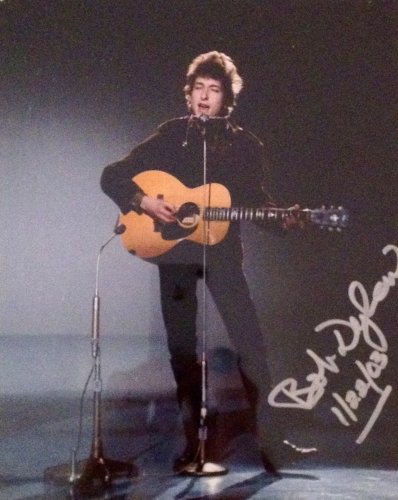
Bob Dylan with guitar and harmonica, signed photo, dated 1/22/03, POR, via fultonryder
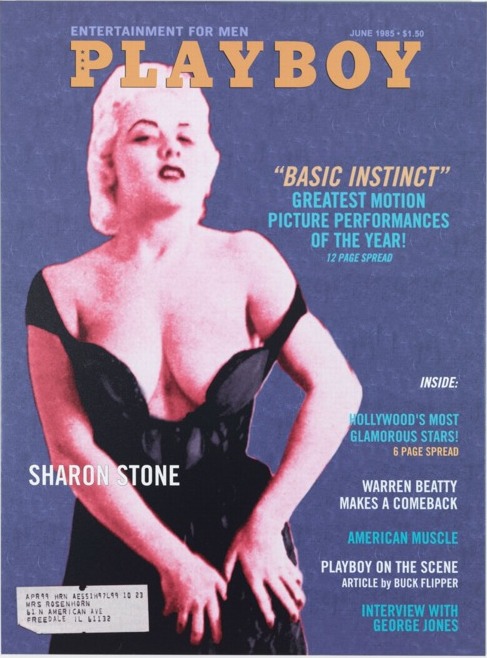
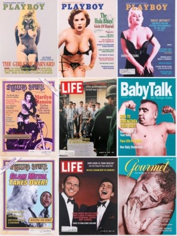
And then you start seeing Prince connections everywhere. The model, for instance, on the mockup cover of Playboy looks like she was photographed en route to an OCTPFAS read-in at "Mr. P's" shop.
Over the summer, Fulton Ryder's blog featured this Birdtalk, Prince's term for the short appropriated texts and aphorisms he's published throughout his career:
Daniel Boorstin says in his book The Image: A Guide to Pseudo-Events in America: that American life is becoming increasingly organized at every level, and that spontaneous events are being replaced by "pseudo-events". We find ourselves in a situation where we accept reality as it is reported rather than as it really is: "We become so accustomed to our illusions, our images, that we mistake them for reality." - Birdtalk
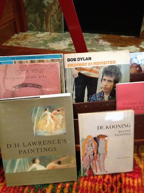
And this Fulton Ryder grouping was posted in September and again in November, just before Dylan's opening. The titles displayed could be a poetic artist statement for the show:
Bob Dylan
Highway 61 Revisited
Wallace Berman Verifax C[ollages]*
De Kooning Recent Paintings
D.H. Lawrence's Paintings
Fuck You
A magazine of the arts
Easy Guitar & Harmonica Edition
* few days later update: I realize I'd skipped the Berman reference, which is nuts, because Berman's Verifax collages are ground zero here.
Because something is happening here
But you don't know what it is
Do you, Mister Jones?
To be honest, I looked at John Dogg and Howard Johnson, and, I thought Bob Dylan was just Prince's giant middle finger to the screwed up art system that doesn't give enough of a damn to look at what it's buying and selling and fawning over. Not just the death of the author, but his murder, and the propping up of the author's corpse, Weekend At Bernie's-style, in order to keep cashing his checks.
A magazine of the arts: Revisionist Art images ganked from some Danish Dylan messageboard
But then as I was walking it back, trying to see, if not why, then where and when a Prince-for-Dylan relationship might have begun, I hit 2007, the year of Dylan's first art exhibitions [of overpainted printouts of scans of pages from Drawn Blank, a 1994 book of tour sketches, which, mhmm]. And also the year of Todd Haynes' remarkable movie I'm Not There, where six different actors portray six different Dylans and various times of his life.
Haynes spent seven years on the project, and a surprising amount of it feels captured in Robert Sullivan's 2007 tagalong for the New York Times, which is one of the most sensitive and insightful making of stories I've ever read.
And I'll steal Sullivan's amazing hook here because it'll only make you want to read the whole thing. It's about being on the set for the identical mug shots of the Dylans which open the film [they're in the trailer, too, above]:
Then Haynes took [Ben] Whishaw's seat on the empty set and, in the video monitor, happened to perfectly align his head with those of all of his Dylans. When I stepped from the wings to look through the camera itself, I saw, in one semimystical, semirevealing moment, the artist as one with the artist he was trying to artificially reassemble.
Because Todd Haynes' Dylan film isn't about Dylan. That's what's going to be so difficult for people to understand. That's what's going to make "I'm Not There" so trying for the really diehard Dylanists. That's what might upset the non-Dylanists, who may find it hard to figure out why he bothered to make it at all. And that's why it took Haynes so long to get it made. Haynes was trying to make a Dylan film that is, instead, what Dylan is all about, as he sees it, which is changing, transforming, killing off one Dylan and moving to the next, shedding his artistic skin to stay alive. The twist is that to not be about Dylan can also be said to be true to the subject Dylan.
I think that's what Prince is trying to do here. To be Dylan, to make a show and art that is what Dylan is all about. To make something real, whatever it takes, in the middle of a screwed up world. To confound and infuriate as you create, and to transform yourself in the process. And suddenly the answer to "Why??" becomes so crystal clear, I'm embarrassed to have even asked: "Because he could, and given the chance, you would, too."
After I started taking this speculation seriously, and researching and relooking--I guess I could have started with this, but then where's the fun?--I've been sort of, I don't know, reached out to. [Not by the artist(s), who, how would you be able to believe either one in a situation like this? They'd just add one more refraction of ambiguity.] And holy smokes, people. About this one thing, at least, Prince's centrality to Dylan's paintings and shows, I don't wonder anymore.
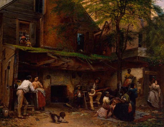
Eastman Johnson, Negro Life in the South, 1859, NYHS
Just getting in touch with my black roots, putting a stake in the ground here on part of Eleanor Jones Harvey's discussion with Tyler Green about her show, "The Civil War and American Art," which just opened at the Smithsonian American Art Museum.
About 43:00 into the show, Harvey talks about Eastman Johnson's 1859 painting [above], Negro Life In The South. Which she argues is a critique of slavery via a complicated, carefully articulated exposure of the South's precarious and untenable concept of race and power. It's basically a beautiful mosaic of skin tones resulting from generations of interracial sexual relationships.
Harvey calls attention to the two women, one white-skinned, one darker, stepping tentatively through the door on the right, and the precarity of passing, the risk that if a master's light-skinned daughter's slave parentage were found out, then her life, her rights, her freedom, all that the front house represents, would be taken away.
"To my mind," says Harvey, "what Eastman Johnson has done is, on the eve of civil war, painted a referendum on skin color as an arbiter of your legal status: At what point on a sliding scale, from white to black, do you segue from being a person to being property?"
It's this clash of a binary and a spectrum that caught me short and made the challenges of multi-racial ancestry in American history much more crucial and much less abstract or academic. It's the kind of thing that even if by 1859 they were well within the color scale of the main house, my descended-from-a-17th-century-free-African-Virginian Mozingo ancestors would have spent over 250 years internalizing.
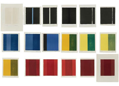
Barnett Newman, from the statement included in 18 Cantos, a set of lithographs produced in 1963-4 with ULAE:
I must explain that I had no plan to make a portfolio of "prints." I am not a printmaker. Nor did I intend to make a "set" by introducing superficial variety. These cantos arose from a compelling necessity--the result of grappling with the instrument.
To me that is what lithography is. It is an instrument. It is not a "medium"; it is not a poor man's substitute for painting or for drawing. Nor do I consider it to be a kind of translation of something from one medium to another. For me, it is an instrument that one plays. It is like a piano or an orchestra; and as with an instrument, it interprets. And as in all the interpretive arts, so in lithography, creation is joined with the "playing"--in this case not of bow and string but of stone and press. The definition of lithograph is that it is writing on stone. But unlike Gertrude Stein's rose, the stone is not a stone. The stone is a piece of paper.
I have been captivated by the things that happen in playing this litho instrument, the choices that develop when changing a color of the paper size. I have "played" hoping to evoke every possible instrumental lick. The prints really started as three, grew to seven, then eleven, then fourteen, and finished as eighteen. Here are the cantos, eighteen of them, each one different in form, mood, color, beat, scale, and key. There are no cadenzas. Each is separate. Each can stand by itself. But its fullest meaning, ti seems to me, is when it is seen together with the others.
I joked about 18 Cantos this morning; it's one of my absolute favorite print works ever. [And no, I don't have a copy, so no, I will not be breaking it up and giving it away to random Twitter followers.]
But it just occurred to me that Newman's perception of the lithograph stone as an instrument to be played, not a medium to be translated, is very similar to Richard Prince's early approach to photography.
Here's just one example from Prince's Canal Zone deposition, when questioned about a 2003 Artforum Q&A where he said he "played the camera":
I was extremely--to tell you the truth, I was extremely conservative, on the other hand, in terms of my artistic attitude.
And I knew that in order to maybe discover something new I had to change a bit and take on another persona. And I felt that by playing, quote, as I said in the interview, the camera, just like a punk rock guitarist who picks up a guitar, seven days later he's playing on stage. He doesn't know how to play the guitar, but it's his inability which shines through, which is really exciting. And the fact that he's not a virtuoso--it's the very limitations I think that make--can actually make great art.
Since 2001 here at greg.org, I've been blogging about the creative process—my own and those of people who interest me. That mostly involves filmmaking, art, writing, research, and the making thereof.