January 2013 Archives

So, Gerhard Richter and Richard Prince. They've both had their way with photography, and painting, and even squeegeeing, but do we ever consider them together? I mean, I've tweaked on each of them for several years now, and even I have to admit, I haven't thought of their work in relation to each other, until this instant:

richter_small_bather.jpg

Gerhard Richter's 1996 photo edition, Small Bather, is based on an identically titled painting from a couple of years earlier.

And yes it's the blur, but it's also maybe the towel on Mrs. Richter's head, but when I saw it in the Christie's catalogue for next month's London sale, the first thing I thought was "Whoa, Nurse Painting."

prince_piney_woods_nurse.jpg
Richard Prince, Piney Woods Nurse, 2002, image: oh, it's around

Seriously, how awesome would that be? I mean, the Chapmans worked over those Goya prints; and Kippenberger turned that Richter into a coffee table. I mean, sure you could paint over an inkjet of the thing, and flag your est. £40,000 - £60,000 for other things. But why?

On his site, Richter shows Small Bather, above, as it was published: "Cibachrome photograph, fixed on stiff, white cardboard, framed, behind glass."

This example at Christie's, though, is only shown cropped to the c-print, and is only listed as on the "artist's mount," which, that's where it's signed and numbered, so. So? So if some chucklehead compromised this particular piece by taking it out of the artist's frame, why not use it as an ingredient in a new work? There are presumably still at least 53 others out there to carry on.

Contemporary Day Sale, Feb. 14, 2013 Lot 183: Gerhard Richter, Kl Badende, Small Bather, est. £40,000 - £60,000 [christies.com]
Kl. Badende | Small Bather, 1996 [gerhard-richter.com]

rprince_arizona_fizz.jpg

That Richard Prince, he's got more secrets than a busload of priests heading for the border.

I just heard from a tipster [publicist] that under the busy photocollaged label of each can of the limited edition AriZona Beverage Richard Prince Lemon Fizz, the artist has hidden his signature, and one of his dumb jokes.

So when the samples the tipster so kindly FedExed me arrived, I peeled one off, and sure enough:

Two cannibals were eating
a clown. When one turned to
the other and said, "Does he
taste funny to you?"

RP~~~~
My Lemon.
Richard Prince

Which, holy smokes, these look approximately one million percent better. Why do we not have beverages in plain aluminum cans, with whatever text mumbo jumbo is required printed on the bottom? Or at least let us strip our beverages of their branded skins like this more often.

There are apparently five different jokes hidden under Richard Prince Lemon Fizz, which means Prince/AriZona collectors will need to keep buying and peeling them until they're sure they've got the complete set. And only then can they stockpile the still-wrapped versions.

prince_dogg_final_curtain.jpg

It also poses a problem for the artist John Dogg, who'll have to decide which version of the can to use in his signature doorway curtains.

As for me, I'll take my cue from Willem de Kooning's assessment of Leo Castelli, as told by Jasper Johns: you give this son of a bitch two Lemon Fizz cans, and I'll sell'em.

January 16, 2013

Levi's Street View

Whether the uncanny valley is the right metaphor, or seeing a dog walking, something still feels weird about seeing store interiors on Google Street View. I'm sure that'll change, and one day we'll all be holoshopping without ever leaving our pods, our purchases delivered by robot Google vans, and people will struggle to remember the last time they even looked at the Street View part of Street View, much less actually went anywhere.

gsv_levis_08.jpg

But that day is not yet. And the workings of Store View are still odd and/or unknown, and thus interesting. For example, here is the Levi's store on West 34th St, tweeted by @ManBartlett.

Maybe the making of is interesting only in contrast to the entire concept of a surfable depopulated chain store filled with mountains of indistinguishable jeans. Or is it just me? Can you barely contain your excitement for the day when you can virtually fall into all 5,000 Gaps?

gsv_levis_09.jpg

Anyway, let's look around. They have image date now [Feb. 2012]. Is that new? Obviously, with high merchandise turnover, you'd want to keep that relatively fresh. Store View will become just one more monthly/seasonal expense for a retailer. I see they don't blur the faces of either the models or the mannequins. It'd be kind of cooler if they did. Even ironically?

Or better if the Street View blur turned up in someone's IRL in-store/ad campaign. Oh, damn, there's your pitch right there, creative director: some street style photoblogger is "captured" at work by the GSV car. A Street [View] style blog. BAM. Embed those shoots all over town. A viral bonanza.

Look at me, revolutionizing advertising when I'm supposed to be reviewing pano stitching algorithms. These panos sure are distortion-free. A major advance? The benefit of shooting undisturbed in ideal conditions? Hey, what's that at the bottom of the picture up there? A tripod leg.

gsv_levis_07.jpg

And here's the whole, stitched thing. That is very nice. Here it is again, this time with a shadow.

gsv_levis_03.jpg

This is not a camera on wheels. It's on the tripod, single vantage point for every pano, operator out of the way. That's why there are no distortions. And the only evidence of the process is the legs.

gsv_levis_01.jpg

Which, again, are rather nice. Kind of kaleidoscopic, with a blend of in-focus tips and blurry legs. Soon enough, these Matrix deja vu cat-level distortions will disappear, and the differences between real and virtual will be mistaken for mist, or heat waves rising from the sidewalk.

gsv_levis_06_cu.jpg

Zooming right into Grotjahn country here. This is sweet. Looks like this pano sphere has maybe 48 slices, each 7.5 degrees? In satelloonmaking, they're called gores. What do they call them in panoramic photos?

gsv_levis_05_cu_lg.jpg


gm-c_walls_paper_01.jpg

Gordon Matta-Clark only created one artist book, and this is it. Walls Paper was self-published by Buffallo Press in 1973 in an edition of 1,000. Matta-Clark's photos of abandoned tenements in the Bronx wrap the cover, and colored offset prints of his photos of the ruined wallpaper in these apartments fill the horizontally cut, mix-and-match pages inside.

gm-c_walls_paper_03.jpg

There was a show of Wallspaper at 112 Greene St. in 1972, and a privately published newsprint edition of the photos that fall.

gm-c_walls_paper_04.jpg

Last fall, I found that I had two copies. It was much less expensive back in the day. They're both beautiful, but the other one's signed.

gm-c_walls_paper_02.jpg

So I put this one on eBay the other day at a price that seems enticingly lower than the two copies already out there, but probably dealbreakingly high for a flipper. Story of my life, though, always stuck in the gap between retail and wholesale.

Anyway, you can buy it on eBay right now, or before Jan. 19th. Or if you have a better idea, email me.

January 15, 2013

Brought A Trailer

tysons_trailer_01.jpg

I hate malls in general, Tyson's in particular, and Tyson's at Christmas most of all. So I was beyond annoyed that it was the nearest/soonest Genius Bar appointment when the foot came off my laptop.

All was forgiven, though, when I saw this slightly amazing portable building. An office module on a trailer.

tysons_trailer_02.jpg

I do not know what it was for--I didn't notice that now-obvious sign by the steps. And I don't know whether to put it in the tiny home, prefab, shipping container, or cabin porn category.

tysons_trailer_03.jpg

It's really one space on the inside. With a window unit A/C, a little bit of a hack. It looked a little shabby, i.e., used, broken in, so it presumably wasn't [just?] a materials/color mockup for reskinning a nearby office building.

tysons_trailer_04.jpg

If it's a temporary building, though, such as one might find on a giant construction site like the one enveloping the entire Tyson's Corner area, we should definitely give credit where it's due; this thing is far sweeter than the standard issue site office.

The sad part is, now that I've insulted their mall, I feel bad about calling and asking what it's for. Maybe someone else can be the citizen journalist here and cold call the mall with a, "What's this awesome thing I saw on the internet?? You guys are so awesome!"

pussy_riot_matrioschka.jpg

We spent a day in Frankfurt a couple of weeks ago, where I spotted these Pussy Riot matryoshka dolls with real, little knit hats, in the window of Galerie La Brique on Braubachstraße.

They're by Manfred Stumpf, it seems, an edition for which 20% of the 350 EUR sale price goes to Amnesty International. I don't have much sense of Stumpf's work, except to note that these seem atypical.

Manfred Stumpf [galerie-la-brique.de]

January 9, 2013

Supreme Sforza

ussc_gtmo_loeb_afp.jpg
image: protestor in front of the US Supreme Court on Jan. 8, 2013, the 11th anniversary of the opening of the Guantanamo prison. by Saul Loeb for AFP/Getty

I've been meaning for a couple of weeks now to post a photo of the extraordinary construction scrim on the front of the US Supreme Court, which has a full-scale photo reproduction of the actual building. Here we go, since this tweet:

I had no idea. So I looked it up. And was troubled by the fact that I had no idea it had been in place since last May. During the 21-month west facade stone restoration project, "The scaffolding and ongoing conservation work will be concealed by a scrim that will mimic the Court's architecture."

The Supreme Court building was designed by Cass Gilbert with John Rockart, and completed only in 1935. From its overall classical Greek temple design to the sculptures on the facades to the smallest ornamentations of the bronze flagpoles and handrails, is highly symbolic. As Chief Justice Charles Evans Hughes said at the laying of the cornerstone in 1932, its very creation and existence are symbolic:

The Republic endures and this is the symbol of its faith...the national ideal of justice in the highest sphere of activity.
So it is entirely appropriate, then, to take a symbolic view of the scrim as well, and its illusionistic simulation of Equal Justice Under Law. As symbolic curtains go, it's the most inadvertently damning drapery since Colin Powell covered up the UN Security Council's Guernica tapestry in 2003.

The anniversary of Guantanamo coincided with the unreleased ruling in the hearing on Pvt. Bradley Manning's illegal and abusive detention without charge. The cancer of vengeance and torture that the US government first directed only toward foreign others has spread to its treatment of our country's citizens.

And so the thing that gets me about Saul Loeb's photo above is not the hooded Abu Ghraib/GTMO/Fort Meade protestor, or the Court's photogenic tarp, but the police officers spread long the steps between them.

Interesting, related, and surprisingly full of scare quotes for a 2009 show: Ben Street's review of Goshka Macuga's Whitechapel installation about Guernica, which included the UN tapestry.

January 7, 2013

If He Did It: Johns Edition

Alright, let's get all these together in one place:

edkd_eda_unmatted.jpg

After claiming for more than 40 years that he had drawn it himself, Robert Rauschenberg acknowledged in 1999 that, in fact, Jasper Johns, who "lived upstairs," created the graphite text label collaged onto Erased de Kooning Drawing. Or as one person who knew the work when it was made told me last year, "Bob made it, but Jasper made it art."

Thumbnail image for rauschenberg_minutiae.jpg
Minutiae

Jasper Johns in 1999, as published on the site of the artist's Foundation for Contemporary Arts [and first quoted here in 2011, in discussing collaboration and Jacob Kassay, actually]:

In 1954 I had helped Bob Rauschenberg a bit with his Minutiae set, his first for Merce Cunningham, and I continued to assist him with most of his stage work through 1960.
Rauschenberg is credited with costumes and/or set design for at least 10 works for the Merce Cunningham Dance Company between 1954 and 1960, including the iconic painted backdrop/leotards of "Summerspace" (1958). Johns's first actual credit doesn't appear until 1968.

rr_jj_summerspace_walker.jpg

Oh, but look, on this walkeradmin tumblr [? ;)], a detail from the "Johns/Rauschenberg backdrop for "Summerspace." I'm glad it's not just me.

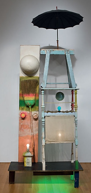
Of the 18 works Rauschenberg is credited with between 1954-58 for the Paul Taylor Dance Company, 17 were for costumes, and one, "The Tower," (1957) was for set design. Jasper Johns is credited with making the costumes for "The Tower."

rauschenberg_tower.jpg
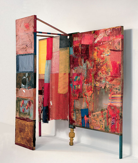
The Tower, by Rauschenberg & neighbor

The Tower, a 1957 Rauschenberg combine created for the dance set, which depicts a couple, was described by the Christie's representative trying to sell it in 2011 as both "autobiographical" and "cryptic," which, for these two, is redundant. For composer John Cooper's part, the Feb 10, 1957 program said he had been considering the "pastoral themes of the Adonis-Persephone myth." [Persephone and Aphrodite both fell in love with Adonis while babysitting him. So, yeah. Not sure what to do with that.]

rr_gold_painting_1956_menil.jpg
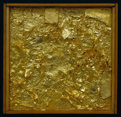
Untitled (Gold Painting), 1956, Menil Collection

I recently met someone who owned a Rauschenberg Gold Painting. The collector said that once Jasper saw it, and said, "Oh, yes, this is one I did." 10 existing gold paintings predate 1954, the year of Johns's and Rauschenberg's meeting, but according to Walter Hopps' 1991 catalogue, "two or three" were made afterward, at the "special request" of friends. Alison Gingeras included Untitled (Gold Painting), 1955, in "Unpainted Paintings," her 2011 show at Luxembourg & Dayan. The Menil's gold painting [above] dates from 1956.

In 1977, in the SoHo Weekly, art historian Roberta J.M. Olson had posed to Johns this kind of remarkable question:

During his early days in New York City Johns and Robert Rauschenberg shared a closely knit friendship of cross-fertilization...It has been said [it has?? -ed.] that during this period the two artists also painted works in each other's styles.
I asked whether any so-called "Johns paintings by Rauschenberg existed in collections today?

JJ: No, but there is one "Rauschenberg" by Johns. Really, though, it is a Rauschenberg because after I finished it, Bob fooled around with it and I do believe that he eventually signed it. It was a small painting and I don't know its whereabouts today...The only time I remember Bob actually working on a painting of mine was when he picked up the red paintbrush and went to work on one of the white stripes in a flag painting" [...]

One? Just one? Does no one ever ask follow-up questions? No, no one ever does.

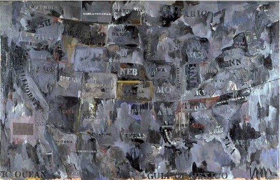
Johns told Calvin Tomkins in 2005 that in 1960 Rauschenberg, who had been using maps as an element in his combines as early as Small Rebus (1956), "simply gave" him mimeographed maps of the US, which he painted on directly, and later enlarged into paintings like Map (1960).

UPDATE: In fact, Rauschenberg painted on maps as early as 1950, when he created Mother of God, which was part of SFMOMA's massive 1998 acquisition.

johns_map_moca.jpg
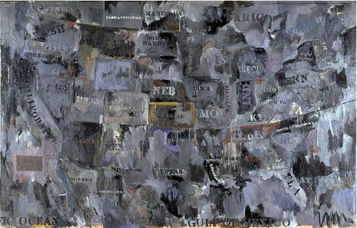
Map, 1962, image via moca.org

In 1988, Deborah Solomon told a version of Johns's Flag dream story that somehow includes direct quotes from--and a co-starring role by--Rauschenberg:

One day in 1954, Johns casually mentioned to Rauschenberg that he'd had a crazy dream the previous night. ''How crazy was it?'' Rauschenberg asked. ''Well,'' Johns replied, ''in this dream I was painting the American flag.'' The American flag? Rauschenberg didn't think it was crazy at all. ''That's a really great idea,'' he said.
And this all is aside from the Short Circuit saga; and the fact that Flag looks like it's constructed like a combine; and his paintings from the earliest canvas & fabric, drawer, canvas, fork, spoon, flashlight, plate, and letter set are essentially combines, too, only we don't call them that--even though Johns says he came up with the term.

There is so much we don't know about how these two artists worked and collaborated. So much that doesn't get asked, or is known and doesn't get written. So much about the similarities and cross-references and resonances in their work that has been overlooked, dismissed or deflected for so long.

From the earliest days, curators like Alan Solomon and critics were assiduous about keeping these two oeuvres separate and distinct. Whenever asked about influence, Johns would say he always tried to stay aware and move away from it. Rauschenberg would emphasize how diametrically opposite their personalities were, and that was that. Whatever the forces at work, whether the closet, the AbEx legacy of the lone genius artist, or the market's willful self-delusion, the work they made and discussed side by side, alone with each other, for six foundational years, is almost only ever considered in isolation.

1954: more than a decade before BMPT, and two decades before Prince & Levine [And multiple generations before Codax, BHQF, and Dylan]. What would it mean for the concept of authorship to find out Johns and Rauschenberg were making each others' work?

update: And while the PMA's amazing collaboration-related show has absolutely gotten me off my duff to post about this subject, I swear, I had no idea that Alistair Macaulay would publish his email q&a with Johns about his work with Merce Cunningham this morning. Great minds.

Since 2001 here at greg.org, I've been blogging about the creative process—my own and those of people who interest me. That mostly involves filmmaking, art, writing, research, and the making thereof.

Many thanks to the Creative Capital | Warhol Foundation Arts Writers Program for supporting greg.org that time.

comments? questions? tips? pitches? email
greg [at] greg [dot ] org

find me on twitter: @gregorg

about this archive

Posts from January 2013, in reverse chronological order

Older: December 2012

Newer February 2013

recent projects, &c.


our_guernica_cycle_ivanka_320px_thumb.jpg
Our Guernica Cycle, 2017 –
about/kickstarter | exhibit, 2017


pm_social_medium_recent_proj_160x124.jpg
Social Medium:
artists writing, 2000-2015
Paper Monument, Oct. 2016
ed. by Jennifer Liese
buy, $28

madf_twitter_avatar.jpg
Madoff Provenance Project in
'Tell Me What I Mean' at
To__Bridges__, The Bronx
11 Sept - Oct 23 2016
show | beginnings

chop_shop_at_springbreak
Chop Shop
at SPRING/BREAK Art Show
curated by Magda Sawon
1-7 March 2016

do_not_bid_or_buy_iris_sidebar.jpg
eBay Test Listings
Armory – ABMB 2015
about | proposte monocrome, rose

shanzhai_gursky_mb_thumb.jpg
It Narratives, incl.
Shanzhai Gursky & Destroyed Richter
Franklin Street Works, Stamford
Sept 5 - Nov 9, 2014
about | link

therealhennessy_tweet_sidebar.jpg
TheRealHennessy Tweets Paintings, 2014 -
about

sop_red_gregorg.jpg
Standard Operating Procedure
about | buy now, 284pp, $15.99

CZRPYR2: The Illustrated Appendix
Canal Zone Richard Prince
YES RASTA 2:The Appeals Court
Decision, plus the Court's
Complete Illustrated Appendix (2013)
about | buy now, 142pp, $12.99

weeksville_echo_sidebar.jpg
"Exhibition Space" @ apexart, NYC
Mar 20 - May 8, 2013
about, brochure | installation shots


HELP/LESS Curated by Chris Habib
Printed Matter, NYC
Summer 2012
panel &c.


drp_04_gregorg_sidebar.jpg
Destroyed Richter Paintings, 2012-
background | making of
"Richteriana," Postmasters Gallery, NYC

czrpyr_blogads.jpg
Canal Zone Richard
Prince YES RASTA:
Selected Court Documents
from Cariou v. Prince (2011)
about | buy now, 376pp, $17.99

archives