
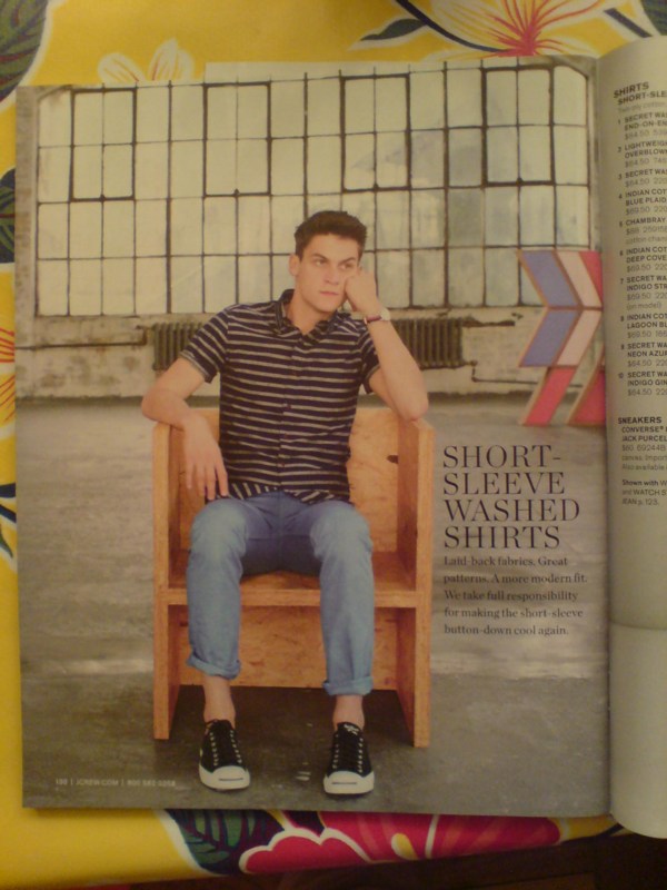
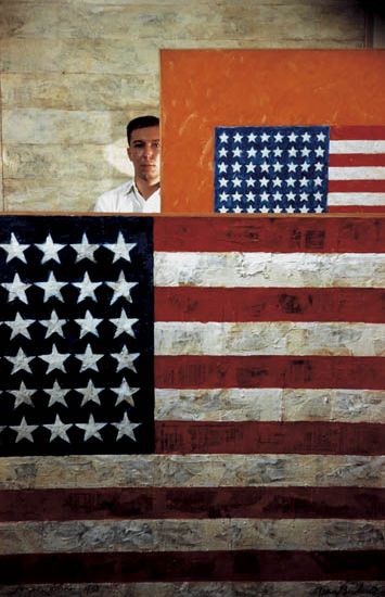
Nice placement, fellas. Looks like J. Crew's trying to capture a little bit of the RO/LU magic for their own branding goodness.
February 25, 2013
Nice placement, fellas. Looks like J. Crew's trying to capture a little bit of the RO/LU magic for their own branding goodness.
February 25, 2013

When I first met Richard Serra in 1994 or so, we talked a lot about the Internet. Soon after, I began trying to imagine what a Richard Serra web project would look like. Given the way his sculptures rather definitively reconfigured the space they inhabited, I envisioned a Serra site as a single, massive, interlaced GIF, that rendered in your browser with excruciating, megalithic slowness, controlling time and processing power as well as screenspace.

I mention this now because I think that, after my nearly 20 years online, the Embroidery Trouble Shooting Guide page at sewingandembroiderywarehouse.com comes closest to Serra's work in terms of its spare, dauntless power.
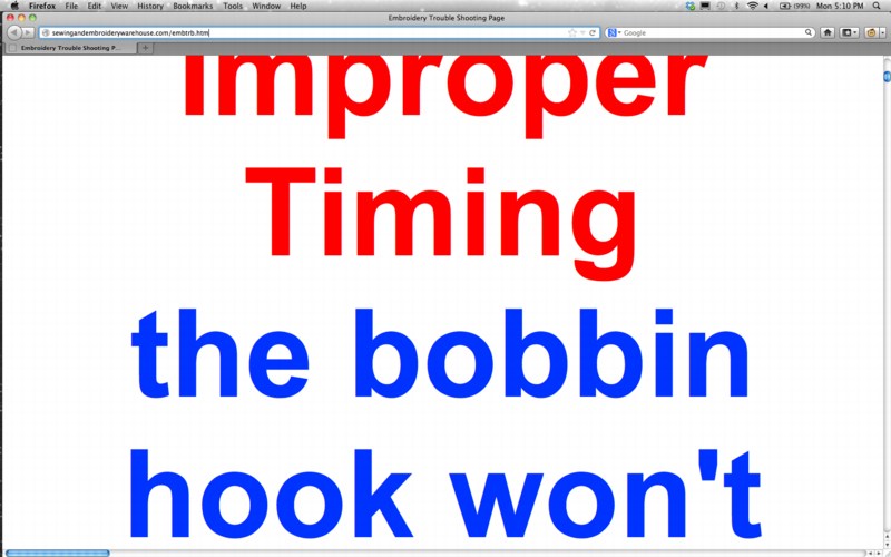
ETSG is created in Microsoft FrontPage. None of the HTML headings tags are closed, so the text, as Rob at boingboing puts it, grows "inexorably in size until the greatest website in the world is achieved."

This kind of webby, self-referential recursiveness is similar to, though the inverse of, Moonwalk, Martin Kohout's standout YouTube video which was a conceptual standout at the Guggenheim's YouTube Play competition/exhibition a couple of years ago.

ETSG's scrolling text is also reminiscent of Serra and Carlotta Fay Schoolman's 1973 video piece, Television Delivers People.
But of course, it's all unintentional, even unnoticed. Apparently, the SEW folks say the page renders just fine in Internet Explorer.
February 23, 2013
Last month, after putting together a list of all the times Johns and Rauschenberg mentioned working on each others' work, and wondering, "SERIOUSLY, DOES NO ONE ASK FOLLOW-UP QUESTIONS?" I decided to start asking follow-up questions.
In particular, I've been asking around, trying to document the early history of Erased de Kooning Drawing (1953-5). Remember, the first public exhibition of it wasn't until 1964; its measurements seem to have changed over the years; and the first known image of it didn't come until 1970.
So I wondered how people knew or saw it in that first decade. And I really wanted to know whether folks knew that Johns had helped finish the work. Which, presumably, would only have happened while they were together, between 1954-59 or 1960 or so. Right?
And so far, my results are fascinating but mixed.
Johns told me that Erased de Kooning Drawing was actually included in a show in 1958, which was the impetus for his contribution. He helped conceive of the frame and label, and then drew the label while Bob got a store-bought frame.
The show was at Poindexter Gallery, a group drawing show in Dec 1958 - Jan 1959. Ellin Poindexter had been working with Charles Egan Gallery for a few months, but ended up opening her own space. This big group drawing show was one of her first.
Which is all HUGE, I figured. [Johns had a work in the show, too, apparently. A footnote in Fred Orton's Figuring Jasper Johns mentions a Flag drawing with 64 stars, which seems like a lot of stars. It also seems not to exist anymore; so maybe Johns destroyed it. He didn't say one way or the other.]
I went diving in the Poindexter Gallery papers at the Archives of American Art, but there's nothing at all about the show. There is no documentation of it anywhere, that I can find. Well, that's not quite true. Dore Ashton reviewed the show for the NY Times, but she didn't mention Rauschenberg or Johns. I asked her if she remembered seeing Erased de Kooning Drawing in the show, and she didn't. She didn't recall the first time she saw the work, either, except that she did figure it was probably in Bob's studio.
I asked around a bit more, looking for any documentation of this show--maybe one of the dozens of other artists has saved a checklist in a box somewhere? And it turns out I'm not the only person Johns has mentioned this exhibit to; it's just that no one can find documentation to back it up.
Which makes me realize that there is an entire layer of art historical information out there, stuff that people who know know, but can't write about. I wonder how much of this information gets lost before it's written or published or transmitted somehow.
Anyway, the other day, while surfing along through a Swann's photo auction catalogue I came across the great Dan Budnick portrait of Johns from 1958. Budnick's a Magnum photographer and still alive, and he was clearly on the scene at the right time. So I started poking around. And BAM.
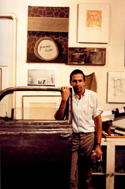
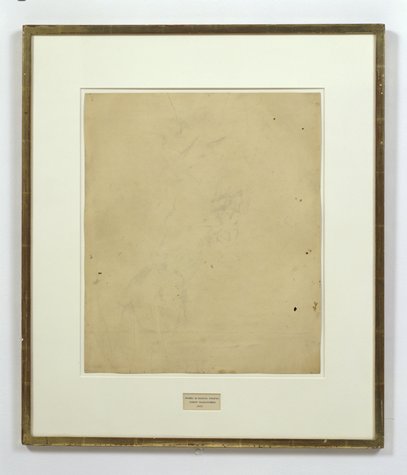
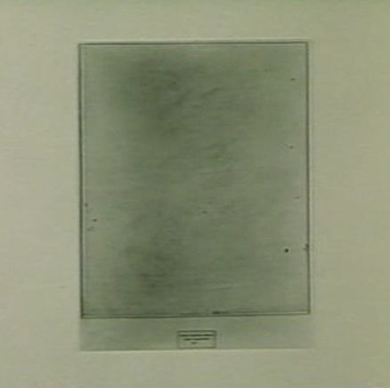
Budnick did take pictures of Rauschenberg, too. This Budnick photo of Bob in his studio, in fact, is listed as 1958. And what is that behind the car door? Does that not look like Erased de Kooning Drawing? In a mat and frame? Case closed. Also, check the frame profile; it IS different from the current one.
Except that that is not the Front Street studio; it's Broadway. And so that is not 1958. It's probably 1964-5. Because that's when and where Alexander Lieberman took this very similar photo of Rauschenberg. [Which, amazingly, Matt from RO/LU had posted just a day or two before I found it. Eerie.]
Even though the photo of Merce dancing is tacked in the same place, Lieberman's bigger shot doesn't include Erased de Kooning Drawing. There's an early 50's painting from his Betty Parsons show in its place. [There's also a little plastic American flag hanging to the left. A memento, perhaps?]
Which is all a way to say that if you--or more likely, your artist grandfather--was in this Poindexter Gallery show in 1958-9, and has some checklists or installation photos, definitely drop a line.
February 20, 2013
I really like Richard Prince's Hoods; they felt like thoughtful work of their time--I'm thinking of the Loaded Neo-Minimalism of the early 90s, though they bracket that--and they were an unabashedly beautiful standout series at the Guggenheim in 2007. If they're not under-known, I think they are, Randy Kennedy's valiant efforts notwithstanding, under-appreciated. [Prince's comment via Kennedy about not seeing a distinction "between his making and collecting practices" was a huge kick in the pants for me in 2007, btw. More on that another time.]
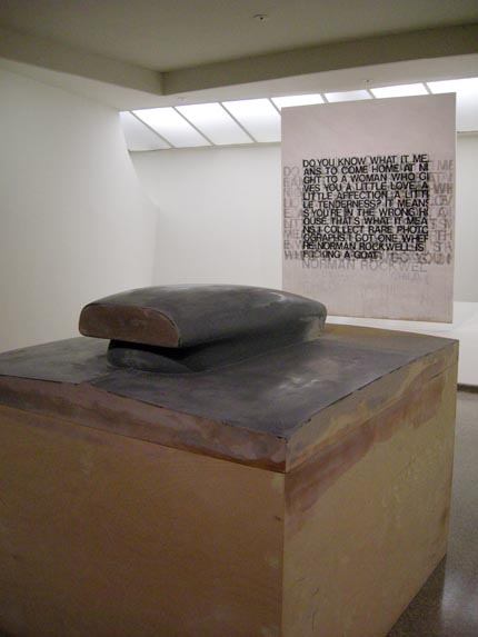
A friend's sweet Prince Hood at "Spiritual America," 2007, image: artobserved
Maybe it's kind of hard to discuss them when the artist pretty much wrapped them up so sweetly himself:
It was the perfect thing to paint. Great size. Great subtext. Great reality. Great thing that actually got painted out there, out there in real life. I mean I didn't have to make this shit up. It was there. Teenagers knew it. It got 'teen-aged.' Primed. Flaked. Stripped. Bondo-ed. Lacquered. Nine coats. Sprayed. Numbered. Advertised on. Raced. Fucking Steve McQueened.That's typically cited as coming from 2003, from an interview with Jeffrey Rian published in Phaidon's Richard Prince monograph, but the Q&A was actually first published in March 1987 in Art in America.
I totally get the car culture finish fetish approach, but I wonder why I like the messier, Bondo-ier ones a little better? Some kind of vestigial taste for the painterly? An unacknowledged prejudice against outsourced fabrication? A closer link to the aesthetic brilliance of the hoods' found, unfinished driveway project origins?
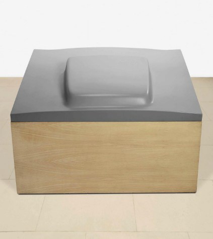
Untitled (SB Hood #1), 1989, "acrylic, cast fibreglass and wood," sold for £313,250 last week at Christie's.
I was pondering on this very question when I saw this hood coming up at Christie's, where it sold last week. [For my money, I've always liked the painting-style, wall-mounted hoods best--the hung-whole ones, not the ones embedded in canvases, which seem superfluous and accede too much for me--but the floor models are Juddful and irreverent, no doubt. Oh, except this one at Larry's, which, um, Matthew Barney. But the installation does make one think maybe the hoods are only under-appreciated in public discourse. Maybe in their proper context, surrounded by enough architecture and acreage, they're beloved.]
Anyway, as I'm reading the critical texts at hand--the auction catalogue's lot notes--I see this:
Inspired by a trip to Los Angeles in 1987, Prince takes the molds of cars he has always admired--Mustangs, Challengers, Chargers, all masculine uber American models-- and paints them, celebrating the simultaneous engineering of the American machine and his own sculptural prowess.And I'm like, wait what? Did Prince take fiberglass molds of car hoods to celebrate his sculptural prowess? I thought the whole point was not having any sculptural prowess, so he ordered them from the back of Hot Rod magazines. Time for a cross-check.
Professor Phillips de Pury, you sold Pro Street (1992-2002), the most expensive Car Hood to date, for $744,000 in 2006; what do you have to say on the matter?
Pro Street is unique amongst Richard Prince's car hood series; it spans the entire ten years [...I- -ed.] he was in production with the other examples from the series. Inspired by a trip to Los Angeles in 1987, Prince takes the molds of cars he has always admired--Mustangs, Challengers, Chargers, all masculine uber American models--and paints them, celebrating the simultaneous engineering of the American machine and his own sculptural prowess.Yes, well then. That seems appropriate.
Now if we could just clear up a question about the materials. It says Untitled (SB Hood #1) is "acrylic, cast fibreglass and wood." But when it sold in 1995 it was listed as "Wood & oil, body compound, cast fiberglass." So I'm just, I know it seems nitpicky, but--you know what, never mind how it's made or from what, I guess the important thing is it made the reserve.
February 11, 2013
"In the future, everyone will be a foundation." --@bhqf in an art-nerdy new post by @phillipsauction: ow.ly/hrgnW
— Artsy (@artsy) February 5, 2013
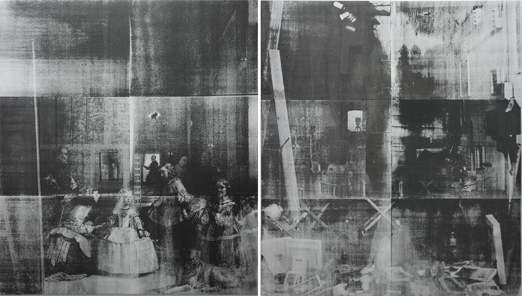
From said "art-nerdy post," "Mining the Past with Bruce High Quality Foundation," published last week by Phillips on Artsy:
The overt appropriation in this work, unabashedly titled Las Meninas, is multifarious in terms of the iconographic and the aesthetic. First, with analogous titles, the left panel of the diptych is a reproduction of the 17th-century painting by Diego Velázquez. The group portrait of the Spanish royal family (and the inclusion of a self-portrait of the artist at the easel) is iconic and stands as the Velázquez's most famous work. As Velázquez presents himself in Las Meninas (circa 1656) as an unrivalled painter welcomed into the royal sphere, the appropriation of the work refers back to BHQF's rejection of the "celebrity artist." Las Meninas (2011) is juxtaposed with a silkscreened photograph of the BHQF studio, notably absent of any artist, however, scattered with materials of art production. Both versions of Las Meninas are paintings regarding notions of the artist and ultimately reveal the processes of art-making.Which, yes, here is Lot 28, Bruce High Quality Foundation, Las Meninas, 2011, ESTIMATE £150,000 - 250,000:Formally, the black on silver silkscreening application of BHFQ's Las Meninas serves as a visual allusion to Andy Warhol's seminal silkscreens of the sixties. By using visual codes, BHQF's specific reference to Warhol is used to further articulate the role of the artist. Warhol serves as the clear precursor to the contemporary status of superstar artists with fame, celebrity and notoriety delineating key themes in Warhol's work. Thus, through appropriation of iconography and style from icons of the past, BHQF formulates a cohesive dialogue about contemporary art practice today.
"It's been important for us to think of art history as a material, as more stuff to work with, whether it's to honor or to disparage it. It's as much a material as anything else, wood or plaster." (BHQF in an interview with Cameron Shaw, 'Enter the Afterlife: A Conversation with the Bruce High Quality Foundation', Art in America, March 2009).
Las Meninas will be offered in our Contemporary Art auction, 14 February 2013, in London.
The overt appropriation in the present lot, unabashedly titled Las Meninas, is multifarious in terms of the iconographic and the aesthetic.How can anyone say there's a crisis in arts writing, when art marketing companies are tweeting about blog posts by auction houses republushing the lot descriptions excerpting artist q&a's from art magazines owned by collectors, in their massive, coffee table-sized catalogues literally every quarter?First, with anal...&c. &c.
Given the nature of the work itself, I say we should celebrate this vivid example of the Bruces' influence on Phillips' et al's appropriationist literary practice as a synergistic triumph, and wish them well as they seek to clear the ambitious reserve price this week.
May 2013 Update: So I guess the 181,250 GBP this diptych brought in London inspired a collector in New York, or maybe they just realized their Bruce was just one of [several? many? a few? two?], because there is another BHQF Las Meninas coming up at auction at Sotheby's on May 15. It's the same screens, but with different pulls. Also, a lower estimate ($80-120k), presumably to target the underbidder from Phillips.
February 7, 2013
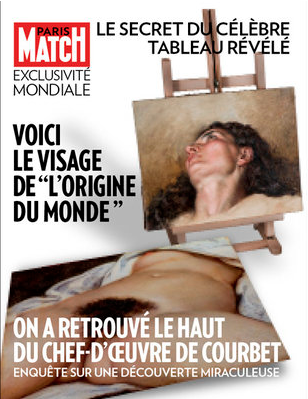
Amazing. Paris Match is reporting that Courbet's l'Origine du Monde (1866) has a head. That it was part of a larger painting, which was cut down by Courbet, or perhaps by his private client for the explicit painting, the Ottoman ambassador Khalil Bey. And that some "amateur" art aficionado found the head, and after two years of research it's been authenticated. Here's their interview with Courbet Catalogue raisonné editor Jean-Jacques Fernier:
But there are so many pieces missing from the story. Like, seriously, what are the odds? Where does one even look for something like this? Or even begin to think that, "Oh, maybe this antique store bauble goes on one of Courbet's most famous paintings, I'll buy it for EUR1200". Which means, was this amateur looking for the head? Did we all just never realize the canvas in l'Origine is rotated 45 degrees? Will we ever see a reconstitution of the painting fragments, like the National Gallery did with Manet's Execution of Maximilian?
Paris Match also has a recap of the underground painting's history. Duchamp and Picasso were both involved in the secret unveiling ceremony Jacques Lacan and his wife Sylvia Bataille cooked up for it in the mid-1950s?
Not sure how it happened, but it is seriously racy old-timer season here on greg.org right now.
"L'Origine du monde" : Le secret de la femme cachée [parismatch via artnet]
HAHA GIANT NOT SO FAST UPDATE:: Other French experts say the whole thing's crazy.
February 4, 2013
Oh so many people are talking about Roberta Smith and Jerry Saltz's joint call for museums to stop segregating so-called "Outsider Art" in the presentations of their collections.
Here, here, aux armes, storm the ramparts, &c.
Even before Roger Cardinal promoted the term with his 1972 book, "Outsider Art" has been used as a challenge, a counterpoint, to the existing theories and structures of the art world.
And especially during this Groundhog Day season, it's important to revisit and learn from earlier "Outsider Art" inclusiveness controversies. Though filed in 1987, Andy Grundberg's NY Times report, "When Outs Are In, What's Up?" certainly sounds like it could be torn from today's headlines:
For such ''outsider'' art to take center stage within the art world suggests a change in the prevailing perception of what art should be, and do.Certainly the Mary Boone Gallery is a very different place than it was when it first opened 10 years ago. ''In the beginning, it was as if it were Julian Schnabel's gallery,'' Mary Boone recalled in a recent interview at her gallery on West Broadway in SoHo. ''To most people, the only artist I showed was Julian Schnabel. Or not even Julian Schnabel, but 'the guy who did the broken plates.' '' Schnabel's departure in early 1984, for Pace Gallery on 57th Street, may have put a chink in the gallery's cachet, but it allowed Miss Boone to shift the profile of her gallery to a less ostentatious, less brash kind of art -one that could include artists like [Barbara]Kruger and [Sherrie] Levine.
February 4, 2013
Have you read me?
Art today is in a precarious position. In order to survive artists must participate in an elaborate system that is increasingly becoming a point at which Wall Street, Madison Avenue and government converge. The embarrassment and the corrosive effects of such a system may well prove to be dangerous to creative life in our culture.Those are a couple of the opening paragraphs of "The Selling of American Art," an unsigned, undated, unmarked, 9-page essay I came across the other day in a miscellaneous clippings section of Dore Ashton's collection at the Archives of American Art. I can find absolutely no mention or reference to it online, and I don't just mean Google....
Evidence of the interlocking elements that make up the art world today is obvious in reports of increased corporate investment in painting and sculpture as a hedge against inflation, and a new interest on the part of individual buyers in the business value of art. For a long time there have been wry comment in the artists' milieu about a kind of elegant decorative painting that can be called art-for-banks. Now those banks are advising individual clients to follow their example.
Obviously, it sounds like it could have been written yesterday, but the paper's references to Harold Rosenberg's last published interview [In Portfolio, vol. 1, 1979] and the December 1980 edition of Artworkers News [!] probably hint at its actual date.
It's a pretty incisive and prescient indictment of the emerging art system, right up until the somewhat incongruous suggestion that then-underappreciated [or under-collected?] painters like Richard Diebenkorn and "the late Philip Guston" represented an alternative path out of the corporate art trap.
Ashton was a rare critical defender of Guston throughout the artist's lifetime, and his inclusion makes me think she is also the author of "The Selling of American Art." I really should have asked her about it when I had her on the phone.
February 4, 2013
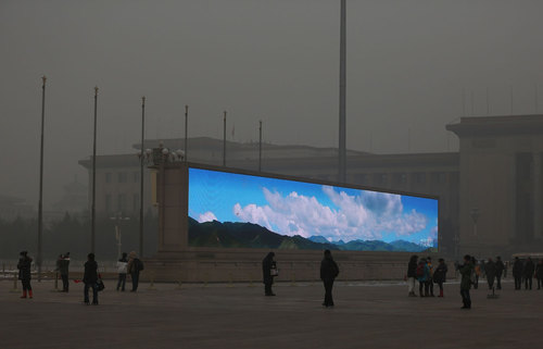
Photojournalist Feng Li has some truly epic images of Tienanmen Square in the recent post on Beijing pollution at In Focus. Like the giant video wall above, which feels like a cross between Blade Runner and Happy Together.

And this extraordinary image of a flag-raising ceremony just out of frame, which sure? Whatever you need to say in order to get that amazing gradient.
If Frederic Edwin Church were alive today, he'd be wearing a panda mask and painting in Beijing.
China's Toxic Sky [see fullsize images by Feng Li/Getty at The Atlantic]
Previously, related: Kodak Colorama
February 2, 2013
I swear I did not know about this when I put up the last Jack Smith/Flaming Creatures post.
The Central Utah Arts Center has filed a federal civil rights lawsuit against the City of Ephraim in Sanpete County and its mayor, alleging official censorship and discrimination. CUAC was evicted last summer from the city-owned building it had restored and occupied for nearly two decades, and its city funding and school-based programs were canceled after various public officials complained about offensive content in at least two art exhibitions.
The one that started the censor ball rolling, it seems, was a 2011 traveling exhibition which included Jack Smith's Flaming Creatures. In CUAC's court complaint, they quote an email where the mayor of Ephraim calls the showing not "Sanpete appropriate." The City Manager and Economic Development Director of the City then emailed "to share my disgust with the 'art' on view." "I know there are places in the world where smut like this is tolerated but the last place I expected to see it was in Ephraim." And there it was!
The city had filed suit against CUAC after evicting them, and approved turning the building over to a newly formed arts group, one which promised not to show "abstract 'contemporary art' that many residents found esoteric and difficult to understand."
CUAC is seeking damages, restitution, and attorneys fees, as well as to be reinstated in its former premises. This, even though the organization and its director Adam Bateman have fled to that notorious den of permissiveness, Salt Lake City.
Ephraim art center founder says censorship behind eviction [sltrib via artforum]
February 2, 2013
While huh, wtf? investigating the backstory of this tweet this morning, I was reminded of the time Strom Thurmond screened Jack Smith's Flaming Creatures at the US Senate in 1968:
Some mailboxes that were confiscated by police when Jack Smith mailed his Beautiful Book. Collection, Fulton Ryder. twitter.com/RichardPrince4...
— Richard Prince (@RichardPrince4) February 2, 2013
Which, wow, has it really been two years since "Hide/Seek"? I found videos of the symposium presentations I was stunned by in 2011:
Jonathan D. Katz on Agnes Martin, abstraction & sexuality, and Zen ["and though she was not a practicing Buddhist, she did her best to both look and sound like one," strikes me now as a heckuva hook, but keep watching]:
Dominic Johnson on disgust and Jack Smith's Flaming Creatures, and the context for the Senate hearings and screening, which had been "confirmed" by the courts as obscene:
I assume Johnson's book Glorious Catastrophe: Jack Smith, performance and visual culture, includes more information on the Thurmond screening. No reviews or discussion of the book yet? Really?
UPDATE With this recollection of that paragon of traditional virtue that was the late segregationist senator from South Carolina, we note the passing of Ms. Essie May Washington, 87, Strom Thurmond's secret daughter, who was born to his family's 16-year-old African American maid when Thurmond was 22.


