June 2014 Archives

June 27, 2014

Uncle Sam's Club

uncle_sams_club_s1-visit-az-lg.jpg

The Department of Homeland Security released this photograph of Secretary Jeh Johnson and Arizona Governor Jan Brewer and their respective entourages visiting the Males 16-17 aisle in the Nogales Placement Center, where several hundred ? thousand? unaccompanied minors are being detained, after being arrested while crossing into the US.

I'm going to be Gurskying up images of these juvenile prison warehouse stores as I find them. I just cannot even right now.

Readout of Secretary Johnson's Visit to Arizona [dhs.gov/news]

bigblack-tif_screenshot.jpg

Here you go, now you can print yourself a whole art fairful: bigblack.tif (after Wade Guyton), 2014. [dropbox greg.org, 45mb]

wade_guyton_fire_studio_07.jpg

A couple of commentators crystallize what is becoming the conventional wisdom about Wade Guyton's Instagram provocation last month, a few days before one of his paintings headlined a heavily hyped sale at Christie's. It's the idea, first expressed by a giddy Jerry Saltz, that Guyton is trying "to tank his own market by flooding it with confusing real-fake product."

wade_artmkt_uu_thumb.jpg

Marion Maneker expressed concern that the Guyton's "threat" to create "a whole series of works from the previously unique printing of an image file" had backfired, and if we were all obsessed with his market now instead of his work, it's basically Wade's fault. From Art Market Monitor:

It's hard to tell whether Wade Guyton is inadvertently steering the conversation away from his art and toward his market or whether the artist has simply fallen prey to the Barbra Streisand effect where the more one tries to deflect attention to an event, the greater the interest.
I just don't buy it.

As Guyton's own Instagram photo above showed, the Times [and Christie's themselves] had already made him the poster child for anxiety marketing for a auction that was actually full of guarantees and third-party pre-bids. If Guyton really wanted to destabilize his market, he could just pull a Cady Noland and demand the auction house remove his name from a work. This did not happen. Instead he reaffirmed the central element of his practice: that his paintings are each machine-printed renderings of infinitely reproducible digital files, whose uniqueness derives from the circumstances of their production. And record resale prices continued apace.

loicgouzer_firesale.jpg

[How uncontroversial was Guyton's backup copy situation? Christie's auctioneer Loic Gouzer made--and signed--his own batch and sold it as an edition of 10, with proceeds going to Leonardo diCaprio's favorite shark conservation charity.]

If it did anything, Guyton's Instagram posts served as public critique of the Auction Week hype. It was a way to align himself critically against the system of relentless commodification--and to inoculate his work against the charges of speculation and cynicism that are leveled against auction stars. Even while his work was jostling around in the center of the hypercapitalist scrum.

Perhaps it's not fair to blame Maneker for toeing Carol Vogel's NY Times line, but he did it again in the very next paragraph, about the art market's very next get-together. In her Art Basel roundup, Vogel made a lot of hay about Guyton giving each of five dealers "a black painting, all the same size and all made from the same disk." Guyton calls it "a way of talking about the repetitive experience of seeing similar artworks throughout a fair and embracing that aggressively by showing almost identical works."

Which is taken by Maneker to be the artist's "ploy" to "orchestrate his market" and emphasize the arbitrage-friendly chasm between the insider/primary vs speculator/secondary channels. Except that's exactly how almost every artist deals with auction spikes, as any art market monitor would know.

guyton_tif_rothkopf_os.jpg

And there's another salient fact that's missing: Guyton makes all his black paintings from the same "disk," or as we call it nowadays, a "file." It's called bigblack.tif, and there's a screenshot of it in Scott Rothkopf's essay for the Whitney's 2012 OS exhibition catalogue.

guyton_crousel_2008_install.jpg
installation view, 2008 Black Paintings show, Galerie Chantal Crousel

And he makes them in groups that at first seem indistinguishable. In 2007-8, he made three shows in a row, at Friedrich Petzel (NY), Chantal Crousel (Paris) and Portikus (Frankfurt) of nearly identical black paintings, installed identically. Just this spring, he recreated his entire 2008 show at Crousel, black plywood floor and all. Everything was the same. Except for the things that weren't.

guyton_crousel_2014_install.jpg
installation view, 2014 Black Paintings show, Galerie Chantal Crousel

John Kelsey wrote in the 2010 Black Paintings catalogue:

What this work displays is the difference between sending information and receiving aesthetic objects in the gallery, or what happens when "black" moves from desktop to printer to museum, and whatever is lost along the way. The monochrome is a record of circulation. As it is copied and communicated, discrepancies are produced. And these are what now stand in for painting.
Guyton: it's the little differences. And those are precisely what is lost when paintings are seen one at a time, in auction catalogues, art fair slideshows, and drifting by in infinite Instagram scrolls. Guyton's inky black paintings cast a harsh light on the impoverished experience of art-as-shoppertainment, of paintings decontextualized from the artist's practice and the flow in which they were conceived, and remerchandised as, well, merchandise. Paintings remain ruthlessly efficient units of exchange even though they're often no longer optimal units of aesthetic experience. That divergence marks what's lost when painting becomes nothing more than, as Ben Davis's timely quote of John Berger puts it, "a celebration of private property."

But it also marks a shift in artistic practice. Guyton's just one of many artists who create on the scale of the series, the installation, the context, the network, not the lone object. Rather than throw up his hands, or lalalala pretend it's not happening, Guyton's recent actions show him to be conscious of the art market's experiential crisis, and actively seeking out a way to engage or overcome it without throwing his paintings on the fire.

June 21, 2014

The Red-Blue Proposition

albert_mertz_bluered_abelow.jpg

The late Danish artist Albert Mertz spent decades working with what he called "The Red-Blue Proposition."

Mertz died in 1990, and was reincarnated as a YouTube video uploading quality assurance tech at Google Zurich.

Albert Mertz, 'Watch Red-Blue TV," Jan-Mar 2014 [tifsigfrids]
image of unidentified installation via art blog art blog
Previously, uncannily related: Webdriver Torso as Found Painting System

June 18, 2014

On Kawara Data

kawara_journals_66-2010.jpg

I've had this image of a spread from On Kawara's Journal on my desktop for months now. I love the reduction of the Today Series paintings to desk calendar size. There is one binder journal for each year since 1966, when the series began. [chungwoo has more images and details the content and format of the journal. In Korean.]

on_kawara_boites_trilogy_didier.jpg

Anyway, while surfing through Michele Didier's site just now, Kawara's Trilogy stood out for a couple of reasons. First, and obviously, is its sculptural presence. They look so Juddy, especially with the sliding front covers on.

on_kawara_boites_closed_didier.jpg

Kawara's not necessarily known as a sculptor, but then, it's not just these boxes, is it? The paintings are objects in boxes, too. And books and binders and CDs, however unreadable their information, always read as physical objects. [The file name on this image even turned out to be on_kawara_boites.jpg,]

Didier published the Trilogy over four years: I Met (2004), I Went (2007), and I Got Up (2008). Each twelve volume set is an edition of 90, with 10 APs. I Met is now only available as part of Trilogy.

kawara_i_got_up_didier.jpg
I Got Up, detail. Wait, so will there also be a I Photographed Postcards? How did he get pictures with postmarks? Did he get the cards back? This is no small task. [images: micheledidier]

The sets overlap in time, an 11.5-year period from May 10, 1968 to September 17, 1979. Actually, I Went, in which Kawara traces his movements on a map of whatever city he's in, didn't start until June 1st. Which now makes me curious. Did it take a couple of weeks to figure out? Did the idea only come once he'd started logging his interactions [the people he met and the ones to whom he sent his wake up postcards]? Did he have somewhere to hide?

on_kawara_i_went_1973_didier.jpg

Or to use Didier's term, "the information within [I WOKE UP] intersects with the facts reported in I MET and I WENT." Information and facts. Data. Kawara was logging by hand exactly the kind of information our computers and phones now track automatically. As metadata. For Kawara, metadata is the data. The difference, of course, is that he's tracking himself, intentionally marking his passage through time and space, and across his social matrix. [btw, does I Met include the cashier at the deli? Does he live in a doorman building? Is his partner in there? His hookups? What do these maps of Kawara's mindfulness communicate?]

eric_doeringer_I_went_after_kawara.jpg

The takeaways here are clear: What IS it like maintaining such total personal information awareness? Since Kawara's not talking publicly about it, we can turn to Eric Doeringer, who has re-enacted three Kawara projects, including I Got Up (2008-13) and I Went (2010) [above].

Also, who's going to digitize the 14,000 pages of Trilogy to create the On Kawara Database Beautiful boxes of books are great, but information wants to be free of the box. Why flip through a book when we could be reliving Kawara's 1970s day by day on Street View? At a time when we're all unwitting, indifferent, or dispirited subjects of constant surveillance, the lessons of Kawara's project have never been more important.

UPDATE: Or it might be the exact opposite, hard to say.

gps_sloth_kong_wallygpx.jpg

June 17, 2014

On Roman Balls

garbatella_balls_of_rome.JPG

I was looking up something else entirely when I came across this post at the travel blog, Rome the Second Time, an architecture professor explaining how giant balls are a "very fascist" architectural element, which were popular starting in the 1920s.

The photo above is of a fascist-era housing complex in Garbatella, for example, and there are several more great examples.

http://greg.org/archive/struth_pantheon.jpg

Which, on the one hand, good to know, because seven years ago, when I first mapped out the world for places that could accommodate showing a 100-foot-diameter satelloon as an art object, the Pantheon in Rome was one of only a handful of possibilities. In concept, in fact, it seems like it'd be the perfect choice. [Eventually the Grand Palais in Paris joined the list, too.] But if spheres read to Romans as fascistic artifacts, you'd need to take that into account.

richter_sphere_iii_12769.jpg

The perfection the fascists loved also made Gerhard Richter very skeptical of spheres. He complained that with spheres it's "impossible to get any closer to perfection," and so you stop. Except when you don't; 16 years after he said this Richter created his own shiny steel sphere editions.

The Balls of Rome [romethesecondtime]

previously:
If I Were A Sculptor, But Then Again...
Les Sateloons du Grand Palais
Shiny Balls by Gerhard Richter

rick_perry_gays_drunks_gop_ap.jpg
Republicans: Gays, Drunks, Let God Sort'em Out, image: AP/Rex C. Curry via TPM

Yesterday I tweeted about Texas governor Rick Perry wearing his "Smart Glasses" and standing "in front of a Richard Prince mural" in San Francisco where he was condemned for comparing homosexuality to alcoholism.

This morning Mr. Prince tweeted the following, which, like most tweets that don't mention me, I assumed to be about me:

Upon further review, it turns out the photograph of Governor Perry was actually taken last Thursday at the Texas GOP Convention in Fort Worth, where the party was condemned for endorsing anti-gay "conversion therapy."

rick_perry_gay_cure_gop_ap.jpg
images ap/ray c. curry via chron

The image projected behind Gov. Perry is Lone Rider, Texas, a 1974 photo by William Albert Allard, originally published in National Geographic Magazine.

rick_perry_allard_natgeo_crop.jpg
detail of "West Texas Cowboy," Allard's National Geographic wallpaper

It is one of the first five results on Google Image search for "texas cowboy riding," and given the saturation levels and pixellation, I suspect Gov. Perry's people got their jpg from the National Geographic wallpaper collection and cropped out the copyright info and logo,

allard_west_texas_cowboy_natgeo.jpg

and not from the C-prints for sale in Allard's gallery.

allard_lone_rider_steven_kasher.jpg

Allard was one of the original photographers for the Marlboro Man and Marlboro Country ad campaigns after they switched from models to real cowboys in the 1970s. Prince would begin rephotographing these print ads around 1980. As far as can be discerned, this image has not appeared in a Marlboro ad, and has not been rephotographed by Mr. Prince. Yet.

greg.org regrets the error.

Here is an interview [in Danish, subtitled] with Danh Vo, on the making and exhibition of We The People (Detail), his full-scale copy of the Statue of Liberty. Many of the 400+ pieces of We The People were rotated and stored at the Statens Museum for Kunst in Denmark in 2012-13.

I am enthralled with this work; it strikes me as one of the smartest, most elegant, and provocative sculpture projects in years, and yet it didn't occur to me until Vo mentioned it that Gustave Eiffel, who designed a steel armature to support Bartholdi's copper repousse skin, did not see the Statue of Liberty installed in the US.

centennial_exhib_liberty_torch_stereogram.jpg

But reading up on the Statue's history, it turns out the entire statue was assembled in Eifell's factory in France, and then disassembled for shipping. Also--and I did know this and should have remembered it--the statue began as parts, exhibited. Bartholdi made the statue's arm and torch, which traveled to the US for the 1876 US Centennial, and which remained installed in Madison Square Park for several years afterward. And the head was exhibited at the Paris World's Fair in 1878, all as part of a fundraising, promotional effort for the project.

SMK TV: Danh Vo - We the People [smk.dk youtube via @aservais1]

stapler_deleted_from_weibo_barkcheekmark.jpg

Rohit Mahajan tweeted tonight that this was one of the images deleted from Weibo on June 4th. It's an amazing photo, though apparently not amazing enough to elude interpretation.

If I'm reading this correctly, it also seems that the weibo user, with the name Freedom Abib/barkcheekhandle is posting from the US, not from within China. FWIW. morning after update: and now the account, which I'd seen via the tw.weibo.com site, has been deleted.

Screen Shot 2014-06-06 at 8.10.14 AM.png

[via @heresrohit]

OK, this is quite good. Tom Murphy 7 just released ARST ARSW, all the dialogue of STAR WARS Episode IV: A New Hope re-edited into alphabetical order.

I just watched the whole thing while clearing my inbox, and it is surprisingly interesting. Surprising, I guess, because the concept's instant graspability seems seductively complete. You think you get it.

Auerbach_Alphabetized_Bible.jpg

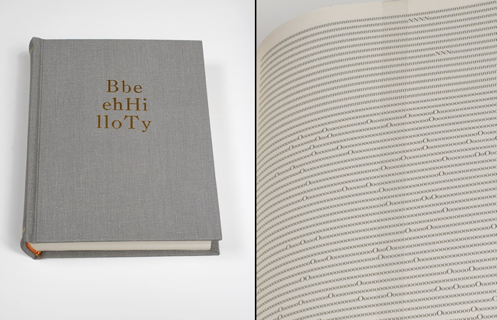
Tauba Auerbach's Alphabetized Bible (2006) [above] is a bit like that. By alphabetizing the letters instead of the words, Auerbach atomizes not just the meaning of the text, but any hope of meaning at all. It becomes an object made of symbols, signifying nothing.

But that's not what Tom 7's film turns out to be. Even chopped so finely, the text, plus the film image and sound, still carry a lot with them. And since the fulltext of Star Wars saturates people more fully than the fulltext of the Bible, the experience of watching ARST ARWS is one of constant recollection and recognition. It feels like watching an actual movie, even though its structure has been obliterated. Not obliterated, but replaced. And that structure turns out to have surprises, tension, and meaning of its own.

arst_arsw_a.jpg

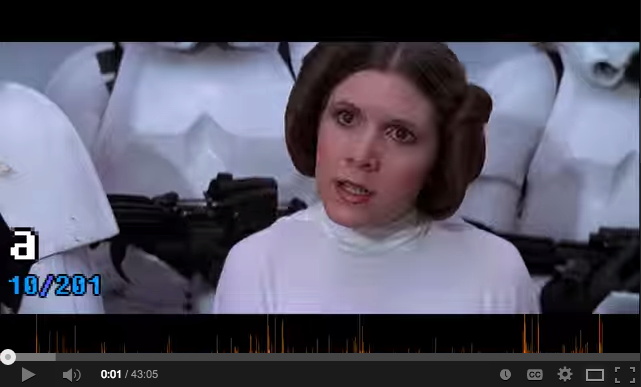
To be honest, it starts out slow and kind of muddled with "a," a word that barely gets its sound right in 201 citations. The first real drama, as Kenny Goldsmith noted, comes with the 20 mentions of "Alderaan."

arst_arsw_here.jpg

arst_arsw_there.jpg

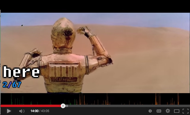
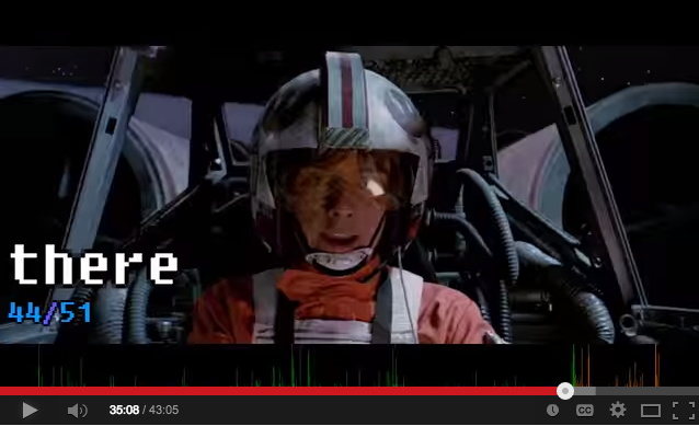
I did not expect it, but "hey" [19], "here" [67], and "there" [51] were very exciting, appearing in scenes of recognizable cinematic immediacy.

arst_arsw_father.jpg

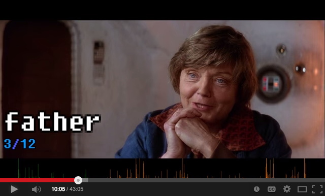
"Father" [12] was almost always said with unhurried purpose, which makes sense, but not with any systematic foreshadowing, which would have been brilliant. [And not beyond notice. According to Wookieepedia, Lucas tweaked the audio in a line of Aunt Beru's for the 1997 Special Edition: "The line 'Luke's just not a farmer Owen. He has too much of his father in him.' There is a slight pause before she says father and the word "father" is changed to sound more worrisome." There are, however, no pauses in ARST ARSW, so this change is difficult to register here.]

arst_arsw_sir.jpg

arst_arsw_threepio.jpg

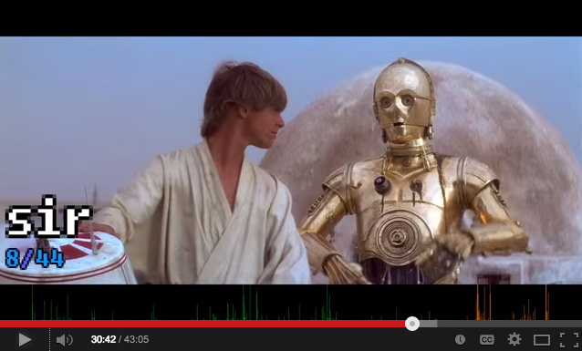
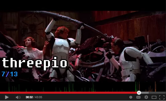
And there are a couple of standout solos [no pun]: C3PO's "sir" [44] aria gets a response a few minutes later when mostly Luke mostly screams "Threepio" [13]. And though it's only said once by anyone, Han really makes "worshipfulness" count. Tom 7 himself notes that "lightsaber" also only appears one time. "Death Star," meanwhile, is two words, and so it dissolves into "Death" [6, but at least one is "death sentence" from the cantina], and "Star" [11].

Like any good film, ARST ARSW leaves you wondering how it was made and eager to see what comes next. The project has yet to appear on Tom 7's site, but I expect the making of involved some tricky data scrubbing to sync each word with each clip. I'm guessing the subtitle file was used, but anything beyond that's still in the movie magic category for me. [update: YOW, in the YT comments, Tom says he labeled all the words manually using purpose-built software!]

What I would like to see, though, is the data. Now that every word is synched to every clip, it can be released for remixing. Turn Star Wars into a database for generating whatever text you can imagine.

This has already happened, of course, with news footage, where there's a whole genre of YouTube videos of remixed presidents saying things they didn't originally say. The ultimate example for me is still Dan Warren's 2011 breakthrough, Son of Strelka, Son of God, a mythical epic woven out of Barack Obama's audiobook recording of Dreams of My Father.

If Tom 7's process for turning movies into words can be scaled, we won't need to stop at Star Wars; we could turn every clip of everything into the raw material for anything.

ARST ARSW: Star Wars sorted alphabetically. [youtube]
Son of Strelka, Son of God, by Dan Warren

njtpk_signs_far.jpg

Can I just say how much I like the new aesthetic of the New Jersey Turnpike expansion project? I honestly cannot imagine that many people going to or from the Pennsylvania Turnpike; at least in my 10 years of DC-NYC shuttling, I've never seen that kind of volume, but aesthetically, I'm generally for it.

It's not the only place that has it, and maybe it's just the standard now in overpass and on- and off-ramp construction, but instead of bulky concrete pillars, the ramps are held up by huge, road-spanning I-beams. They all have a beautiful, oxidizing protective finish, too, like the best Richard Serras.

njtpk_signs_med.jpg

Even cooler, though, are the new electronic signs, which are constructed of square, Cor-Ten pipe, and they have meshed-in spaces for maintenance. Not just catwalks, or ledges, but actual spaces. What we perceive as a flat thing--a sign--turns out to be a space. Like the window halllways at Grand Central or Philadelphia 30th Street Stations. The Turnpike signs are New Jersey's newest architectural icons, suspended across that state's iconic landscape: a 12-lane highway.

And someone designs this stuff. Probably someone at PKF Mark III, the firm which the Turnpike Authority awarded three contracts in 2011, totaling over $44 million, for the "Installation of Variable Message Signs at New and Existing Locations on the Turnpike."

njtpk_signs_cu.jpg

Oh wait, nope. Here it is, from the NJ Turnpike Interchange 6 to 9 Widening Program website: "Advanced Fabrication of Overhead Span Sign Structures for Variable Message Signs and Variable Speed Limit Signs," awarded to RCC Fabricators, Inc., on August 13, 2009.

njtpk_rcc_fabricators.jpg

The project was one of the highlights in the 2011 newsletter for the Railroad Construction Company, Inc. family of companies [pdf, img above]. RCC Fabrication made 61 VSM sign structures, 41 for the Turnpike and 20 for the Garden State Parkway. The structures span up to 95 feet, and were built entirely off-site. I can't tell from the acknowledgements who is actually responsible for this form, but it works.

The architect/sculptor Tony Smith famously described the revelatory experience of driving down the unfinished New Jersey Turnpike in 1951 [pdf]. Me, I would like to move in before it opens. And before it gets too hot.

Previously: Michael Ashkin, "For Months He Lived Between The Billboards", 1993
Related infrastructure as domestic architecture: That Minnesota Skyway for sale again/still
Mies Gas Station

Has anyone ever bought artist wallpaper from Maharam Digital Products? Or have you ever seen it installed? 1 I'm kind of fascinated to know when, where, and who. Because is it seems to exist in this unusual space between pattern, image and object, between art and decoration. It has that visual punch, but compared to an artwork artwork, it's pretty cheap. [I think it starts at around $5-10,000 per installation.] Also, it's consumable, a one-time deal. You can't take it with you, and perhaps more importantly, you can't really resell it.

guyton_walker_maharam.jpg

So it really is for love. But it's also a little weird, like a counterfeit somehow. It feels strange that it's so customizable, a servicey product. Some artists' wallpaper feels close to their "actual" work. Some really tried to get into the essence of wallpaper as a tradition and a medium. I'm undecided which is the better approach.

Guyton/Walker's Orange_Lemon_Chex looks like it came straight out of an installation. But then if you just had wallpaper, wouldn't you wonder where the rest of the stuff is?

mccollum_maharam.jpg

Allan McCollum's The Shapes Project uses each of his 31 billion or whatever shapes only once, so each wallpaper installation will be technically unique.

minter_maharam.jpg

Goldkicker is one of two Marilyn Minter wallpapers, and I think it'd really, really hold a room. Part of me wonders how hard it'd be to have art in a room with artist wallpaper, though.

tomaselli_maharam.jpg

Which is ironic. The degree with which an artist's artwork can be replaced by a wallpaper version of it has some critical implications. Also, it might cut into his market. Or maybe the price points are just so different, it's not an issue. Fred Tomaselli probably hopes so.

welling_maharam.jpg

James Welling's Glass House May, 2008, meanwhile, is similar enough to one of my favorite photomurals, the rare, surviving photomural that started it all [or at least my interest in photomurals]: a 1966 triptych of Mies van der Rohe's Barcelona Pavilion.

Maybe artist wallpaper is closer to architecture than to art.

Maharam Digital Products [maharam.com]

1 [I realize I have seen at least one installation before: L&M Arts had Paul Noble's wallpaper in its offices a while back. But maybe it wasn't this one; it seemed more city than ruin.]

Since 2001 here at greg.org, I've been blogging about the creative process—my own and those of people who interest me. That mostly involves filmmaking, art, writing, research, and the making thereof.

Many thanks to the Creative Capital | Warhol Foundation Arts Writers Program for supporting greg.org that time.

comments? questions? tips? pitches? email
greg [at] greg [dot ] org

find me on twitter: @gregorg

about this archive

Posts from June 2014, in reverse chronological order

Older: May 2014

Newer July 2014

recent projects, &c.


our_guernica_cycle_ivanka_320px_thumb.jpg
Our Guernica Cycle, 2017 –
about/kickstarter | exhibit, 2017


pm_social_medium_recent_proj_160x124.jpg
Social Medium:
artists writing, 2000-2015
Paper Monument, Oct. 2016
ed. by Jennifer Liese
buy, $28

madf_twitter_avatar.jpg
Madoff Provenance Project in
'Tell Me What I Mean' at
To__Bridges__, The Bronx
11 Sept - Oct 23 2016
show | beginnings

chop_shop_at_springbreak
Chop Shop
at SPRING/BREAK Art Show
curated by Magda Sawon
1-7 March 2016

do_not_bid_or_buy_iris_sidebar.jpg
eBay Test Listings
Armory – ABMB 2015
about | proposte monocrome, rose

shanzhai_gursky_mb_thumb.jpg
It Narratives, incl.
Shanzhai Gursky & Destroyed Richter
Franklin Street Works, Stamford
Sept 5 - Nov 9, 2014
about | link

therealhennessy_tweet_sidebar.jpg
TheRealHennessy Tweets Paintings, 2014 -
about

sop_red_gregorg.jpg
Standard Operating Procedure
about | buy now, 284pp, $15.99

CZRPYR2: The Illustrated Appendix
Canal Zone Richard Prince
YES RASTA 2:The Appeals Court
Decision, plus the Court's
Complete Illustrated Appendix (2013)
about | buy now, 142pp, $12.99

weeksville_echo_sidebar.jpg
"Exhibition Space" @ apexart, NYC
Mar 20 - May 8, 2013
about, brochure | installation shots


HELP/LESS Curated by Chris Habib
Printed Matter, NYC
Summer 2012
panel &c.


drp_04_gregorg_sidebar.jpg
Destroyed Richter Paintings, 2012-
background | making of
"Richteriana," Postmasters Gallery, NYC

czrpyr_blogads.jpg
Canal Zone Richard
Prince YES RASTA:
Selected Court Documents
from Cariou v. Prince (2011)
about | buy now, 376pp, $17.99

archives