May 2016 Archives

May 27, 2016

Monochrome House

monochrome_house_dc_dr1.jpg
Study for Monochrome House Red, 2016

I'm consistently amazed at the photos in real estate listings, which turn someone's private space and life inside out and propagate it across the web, where it just stacks up. It makes the case for real estate staging and swapping out all your belongings that much stronger; the photos may be intrusive, but at least they're not intruding on you.

There's another way, though.

While flipping quickly through the listing of a nearby house, I was stopped by an extraordinary artwork on the dining room wall: a bright red monochrome. Which, what?

monochrome_house_dc_lr2.jpg
Study for Monochrome House Beige, 2016

Scroll back, and there is a beige monochrome in the living room. The master suite has two monochromes in different shades of blue. Except for a couple of posters in the rec room, in fact, all the art in the house is monochromes. It looks fantastic.

monochrome_house_dc_mbr2.jpg
Study for Monochrome House Blue #1, 2016

Way better than the "Art Panels" offered by that NY stager last year, which I think are basically giant sheets of gatorboard, the merest ghosts of actual objects.

informedspace_plastic_furniture_2.jpg
Nothing. Meh. Keep scrolling.

No, these monochromes can really hold their walls.

monochrome_house_dc_br1.jpg
Study for Monochrome House Green, 2016, this one has a serious Prina vibe

Kudos to the photoshop artist who devised this solution for the seller, who did not care to have his actual-and, for DC, surprisingly not insubstantial-art collection blasted out to the world in such an exhibitionistic/voyeuristic way. And if the seller, or the eventual buyer of the house wishes, I'm glad to realize the whole houseful of monochromes in time to close the deal.

May 24, 2016

Unjust Desserts

richard_prince_tell_me_everything.jpg

While running SFMOMA's cafe, Blue Bottle Coffee pastry chef Caitlin Williams Freeman designed a whole bunch of artwork-inspired desserts, including a cookie platter that could be assembled into various Richard Serra Prop sculptures-which the artist did not like, not. one. bit.

Tell me everything, the world said, and so Freeman published a book, Modern Art Desserts.

And now they're doing her act.

When SFMOMA closed for their Snohetta renovation, they required Blue Bottle to rebid for the cafe contract, and then they awarded it to McCalls, who ran the ground floor cafe, instead.

Now the SF Chronicle reports that on her first visit to the new museum, Freeman found McCalls serving knockoff versions of the art desserts, in her old space, with no credit at all. And the McCalls guy punted the paper's queries to the Museum. Which makes me think SFMOMA figured because it owns the artworks, it owns the dessert interpretations, too.

If SFMOMA wants to serve art-inspired desserts, fine. But give credit where it's due. I bought Freeman's book, and tried her recipes. Those things are hard. It's not just throwing grey frosting on a cupcake and calling it a Lead Splatter.

If they're going to stiff-arm Blue Bottle entirely, though, then pick new artworks to base desserts on. Aren't there a couple hundred new Kellys and Richters to copy now? Why not make a frosted cookie printed with Richard Prince's joke painting? The fact that they don't own it seems even more on point right now.

The Richard Serra Cookie Incident

Murphy_Boatdeck_install.jpg

I thought about it again after seeing Nicole Eisenman's fantastic, crisp, woke paintings at Anton Kern. But the first time I wanted to remake a destroyed Gerald Murphy painting was in 2011, sometime after seeing the photo of Boatdeck, the epic 18x12-foot canvas he pwned the Salon des Indépendants with in 1924

Boatdeck dominated and outraged the Salon with its scale, style, and subject matter, and led to the resignations of several selection committee members. Murphy made a small number of normal-sized and amazing paintings for several years, but stopped in 1929, when his son got tuberculosis and the stock market crash threatened his family business. Boatdeck is one of eight that were lost or destroyed.

gerald_murphy_boatdeck_1924_beinecke.jpg
Boatdeck, 1924, photo: Gerald & Sara Murphy Collection, Beinecke Library, Yale

In 1921 Gerald Murphy and his wife Sara got their start collecting, then painting scenery for the Ballets Russes. It's where they met their painting teacher, the exiled Blau Reiter and Futurist Natalia Goncharova. Genial, rich, and happy to work for free, Gerald would touch up backdrops and such by Diaghilev collaborators like Goncharova, Matisse, and Picasso.

The biggest Picasso in the world is a curtain for "Parade," a 1917 production for which the artist also designed the costumes, and Cocteau and Satie the music. It inspired Apollinaire to coin the term sur-realisme. The 11x14-meter curtain was shown at the Pompidou Metz in 2012.

Picasso_Train_Bleu_frontcloth_nga_700px.jpg

The biggest Picasso I've ever seen, though, wasn't even painted by him. Le Train Bleu (1924), is a 10x11-meter curtain created by Prince Alexander Schervachidze, another Russian exile, who enlarged a Picasso gouache so skillfully that the artist decided to sign it. Le Train Bleu was a ballet about the flashy, new, beachy Cote d'Azur lifestyle, and had costumes by Coco Chanel. It was not really a hit.

And it was Picasso's last collaboration with Diaghilev, who nonetheless kept using that curtain all the time. It is pretty beat, especially compared to everyone's favorite Picasso Ballets Russes curtain, le Tricorne (1919), which used to live in the hallway of the Four Seasons.

Train Bleu and Goncharova's amazing 1926 backdrop for The Firebird were the climaxes of the National Gallery's 2013 exhibit of the Diaghilev/Ballets Russes collection of the V&A. They absolutely dominated their galleries in the North Tower, which was then closed for gut renovations. The museum's hilarious no-photo policy for the show left me with nothing but sneaky, wonky pocket shots of the painting's feet. But it is awesome, and it made me want to remake things with brushes the size of brooms, too.

jetty_fndn_lg.png

A couple of days ago I received a check. Actually, The Jetty Foundation, of which I am the president, received a check. It was from the State of Utah for fifty dollars, an overpayment of a filing fee for annual withholdings taxes.

[I created The Jetty Foundation as a not-for-profit corporation in 2011 in order to bid on the lease for state-owned land underneath Spiral Jetty. Though the Foundation's bid was not accepted, the terms we proposed ended up getting baked into the renewed lease the state signed with the Dia Foundation, so that was nice.

The Jetty Foundation was not party to any of the negotiations or activities of Dia and its new local Utah partners, and has had no formal activities since 2011. Recently, though, I have discussed making a publication of historical documents related to the Jetty and its site. And also the feasibility of conducting open-access conservation surveys. For these possibilities and any others, that might arise, I have maintained the corporate entity in good standing. Corporations are people, too, after all.]

Alas, this corporate person does not have a bank account, and cannot sign over its check to me, the president, who paid the fee in the first place. And it seems kind of ridiculous to set up a corporate bank account solely to deposit one check.

I considered offering the check as an artwork, a unique work on paper, whose worth might surpass its face value. I thought of copying it a bunch of times as an edition. I half-joked on Twitter of just gathering a bunch more money for the Foundation, enough to make opening a bank account worth the effort. Well, no one's laughing now.

greg.org is pleased to announce A Very Special Episode of Better Read, an adaptation of Chris Burden's 1979 radio work, Send Me Your Money, benefitting The Jetty Foundation, as re-performed by a robot.

[Just as I am not interested in the various art student re-performances of Burden's more physically extreme early works, the several other human re-performances of Burden's Send Me Your Money kind of bored me. I did find it interesting that the robot voice cut nearly fifteen minutes off Burden's time, even after I tried to manipulate its pacing. But It was listening to a pledge drive on a local public radio station tonight that sealed the deal; this is audio vérité.]

Download Better_Read_Jetty_Fndn_SendMeYourMoney_20160513.mp3 from dropbox greg.org [mp3, 41min, 59mb, via dropbox greg.org]

richter_albertinum_proofsheet_dorotheum_sm.jpg

There's an interesting selection of unusual Gerhard Richter swag coming up for auction in Vienna, an assortment of unnumbered editions and test prints that look like many years' worth of artist gifts to a collaborating printer, publisher, or assistant.

The greatest, though, has to be this one, a veritable one-page Atlas of Richter's greatest hits. It is a proofsheet of the color plates in the catalogue for Richter's 2004-5 exhibition at the Albertinum in Dresden. Besides the artist's annotations, it is also signed and dated in the corner. The auction description says it "is the only signed edition paper by Gerhard Richter for the Albertinum Exhibition." Which, uh, sure? Maybe? Unlikely?

richter_albertinum_proof_candles.jpg
image of Two Candles (CR:499-2), 1982, with artist annotation, image: dorotheum

With an estimate of EUR25,000 - 30,000, the auction house is certainly hoping it comes across as an actual edition, or an art work at all, for that matter. But I am uncertain.

Actually I am just being polite. I think this falls squarely into what Hubertus Butin, the co-editor of Richter's print catalogue raisonné calls, "star autographs." In a 2007 Getty symposium on early Richter, Butin's co-editor Stefan Gonert discussed the implications of the artist's very hands-on management of his catalogue raisonné. And there is a whole category of objects, mostly gifts, that are recognized as "authentic," but are nonetheless excluded from the CR.

There's another category of objects that are signed, and that's it:

These can only be described as signatures added as favors, which have the value of an autograph. Classified simply as reproductions, these prints have the same status as postcards or posters not designed by the artist, which he sometimes autographed."
Sounds bleak.

richter_albertinum_proof_chalet.jpg
Sils Maria, 2003, was struck from the exhibition, but at least it's still in the CR. (882-1). Image:dorotheum, detail.

But wait. For into this lowly pot fell at least one set of out-of-edition gift prints which Richter had apparently signed and numbered, and which were originally included in Butin's CR appendix. And postcards, posters, and offset prints are all media RIchter has actively used for both source material and recognized works. And remember, Butin threw down this simple "reproduction" shade before Richter conceived of his massive facsimile object program, where thousands of numbered-but-unsigned photo prints of paintings appear to be buoying up the museum benefit edition industry.

So who knows what status this 70x100cm framed sheet will end up with? It is awesome at any price. Though personally, I'd expect it to be about 95% less expensive.

Lot 782 Gerhard Richter, offset print, estimate EUR 25,000 to 30,000 [dorotheum]
UPDATE: It appears that most or none of this swag collection sold.
UPDATE AGAIN I stand happily corrected, this object apparently sold for EUR 15,000, including fees, which is remarkable.

May 11, 2016

Free As In America

jeb_bush_america_screenshot_sm.jpg

The thing about Cassandra was she was right.

budweiser-america-label_inbev.jpg

In the Summer of 1990 Michèle Cone talked with Cady Noland about the intimations of violence in her works:

Michèle Cone: Practically every piece I have seen of yours in group shows or in your one-person shows projects a sense of violence, via signs of confinement -- enclosures, gates, boxes, or the aftermath of accident, murder, fighting, boxing, or as in your recent cut-out and pop-up pieces -- bullet holes.

Cady Noland: Violence used to be part of life in America and had a positive reputation. Apparently, at least according to Lewis Coser who was writing about the transition of sociology in relation to violence, at a certain point violence used to describe sociology in a very positive way. There was a kind of righteousness about violence -- the break with England, fighting for our rights, the Boston Tea Party. Now, in our culture as it is, there is one official social norm -- and acts of violence, expressions of dissatisfaction are framed in an atomized view as being "abnormal."

Cone: There are clear references to extreme cases of violence in the United States, Lincoln and Booth, Kennedy and Oswald, Patricia Hearst, etc. . . .

Noland: In the United States at present we don't have a "language of dissension." You might say people visit their frustrations on other individuals and that acts as a type of "safety valve" to "have steam let off." People may complain about "all of the violence there is today," but if there weren't these more individual forms of venting, there would more likely be rioters or committees expressing dissatisfaction in a more collective way. Violence has always been around. The seeming randomness of it now actually indicates the lack of political organization representing different interests. "Inalienable rights" become something so inane that they break down into men believing that they have the right to be superior to women (there's someone lower on the ladder than they) so if a woman won't dare them any more they have a right to murder them. It's called the peace in the feud. In this fashion, hostility and envy are vented without threatening the structures of society.

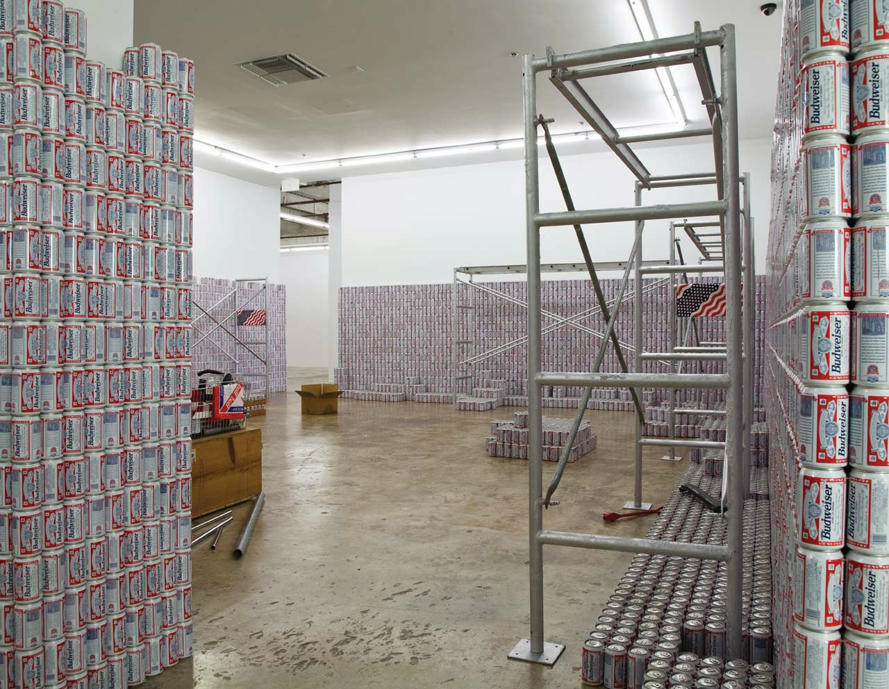
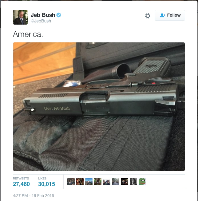
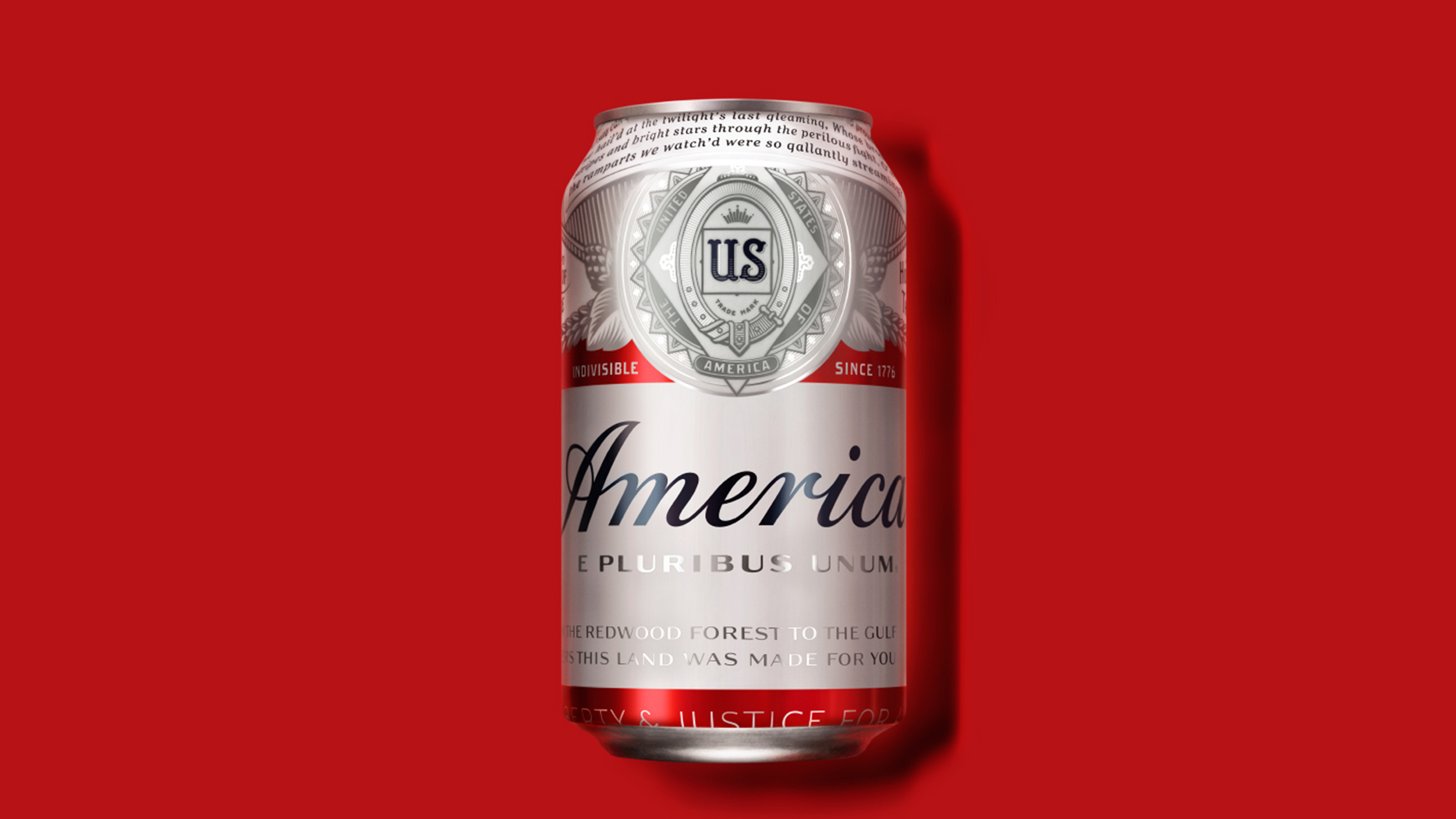
And so it is that in the Summer of 2016 Anheuser-Busch InBev has announced that, for promotional purposes, from Memorial Day until the US presidential election in November, it is renaming and relabeling Budweiser, its flagship beer, America.

noland_piece_no_title.jpg

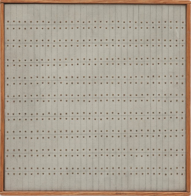
Budweiser bottles and cans are prominent elements of many of Noland's works, from small baskets and milk crates of detritus to the epic 1989 installation, This Piece Has No Title Yet, where six-packs of Budweiser stacked 16 high line the walls. Noland saw already that Budweiser was America. Or that it inevitably would be.

cady_noland_bloody_mess_sothebys.jpg
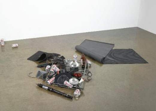
Bloody Mess, 1988, carpet, rubber mats, wire basket, headlamp, shock absorber, handcuffs, beer cans, headlight bulbs, chains and police equipment, dimensions variable

And so as a tribute to Noland's foresight and to America's future, I am honored to announce Untitled (Free As In America). For this series I will replicate any Noland sculpture that uses Budweiser, using America cans or bottles, and I'll do it for cost. The series will be available during InBev's America campaign, and will obviously be subject to the availability of America brand cans, bottles, and cartons.

cady_noland_chicken_basket_skarstedt.jpg
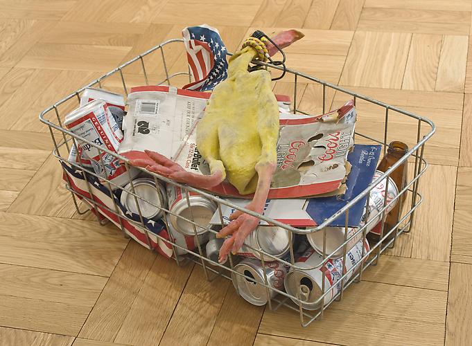
Chicken in a Basket, 1989, "twenty-seven elements, wire basket, rubber chicken, boxes, bottle, flags, baster, bungee and beer cans", offered for sale this afternoon at Christies, image via Skarstedt

I am obviously not recreating Nolands a la Triple Candie, but I don't want to merely approximate them, either. So I'll only make pieces based on Nolands whose elements are suitably documented, such as in photographs and auction catalogue copy:

Noland once described America as a gestalt experience...In the case of Bloody Mess, disparate objects, including Budweiser cans, car parts, police equipment, and rubber mats collectively comprise a quintessential American image. These cans of "The Great American Lager," for instance, are scattered to the outreaches of the piece, so as to provide a sort of abstract framework around the inner compilation of a paraphenalia [sic] law enforcement and an uncanny selection of automobile parts.
If substitutions are needed, they will be considered on a case-by-case basis. Every work, in fact, will be devised, specced and costed out individually, in consultation with the collector. So get in touch, and God Bless America.

A-B InBev Looks to Replace Budweiser With 'America' on Packs [adage]

flw_taliesin_square_steinerag.jpg
examples of Taliesin Square Papers from the Frank Lloyd Wright Library at Steinerag

Welcome to Better Read, an intermittent experiment at greg.org to transform art-related texts into handy, entertaining, and informative audio. This text is excerpts from a pamphlet essay by Frank Lloyd Wright, "In the Cause of Architecture: The "International Style" (Soft Cover), published by Taliesin Fellowship in February 1953. It would be the last of what were called the Taliesen Square Paper Series. The editorial was republished in the July 1953 issue of House Beautiful magazine with the title, "Frank Lloyd Wright Speaks Up." Wright was 85 years old at the time, and he hated hated the International Style.

I could not find print copies of either of these publications available anywhere. Library holdings of House Beautiful are spotty and incomplete. When I tried the authoritative-seeming, five-volume Frank Lloyd Wright Collected Writings, I also came up short. There are only five copies of Vol. 5 (1949-1959) listed in libraries in the US. How could this be? I ended up buying a used copy for a couple of bucks from Goodwill in Michigan, which turned out to have been deaccessioned by the library in a federal prison. Anyway, the text comes from there [pp. 66-69].

I wanted to find this text because it is the source of two popular zingers from Wright: the great opening line, "The 'International Style' is neither international, nor a style," and saying supporters of modern architecture are not only totalitarians, fascists, or communists, they "are not wholesome people." This line came up, for example, in a recent Atlas Obscura article about Hollin Hills, a nice but innocuous mid-century modernist subdivision near Washington DC.

I wanted to see the fuller context of Wright's criticisms, partly because one of the objects of his scorn, the MoMA-affiliated architect Philip Johnson, was actually a Nazi and an aspiring leader of US fascism at one point. [I've come to think Johnson recognized the disadvantages of political affiliation for his real interest: himself and his career, and that his devotion for the rest of his life to establishment power was quite sincere, but that's not the point right now.]

The main reason is because Wright's communist and anti-modernist bogeymen sounded familiar, like they might resonate with the conservative or rightist campaigns against everything modern, from abstraction to Brutalism to Post-Modernism, to Tilted Arc to the Culture Wars, Wojnarowicz, you name it. Wright's architecture has been generally assimilated into our historical narrative, but, I thought, it's come at the cost of our understanding of the political context in which he created it, and from which he attacked those who didn't ascribe to his own views, or pursue his particular agenda.

Anyway, Wright's text is after the jump, or you can listen to the text read by a robot.

better_read_frank_lloyd_wright_intl_style_20160505.mp3 [dropbox greg.org, 18mb mp3, 13min or so]

agnes_martin_the_wave_christies.jpg
Agnes Martin, The Wave, 1963, being sold at Christie's next week

I am unexpectedly interested in Agnes Martin's toy/sculpture/object, The Wave, which is coming to auction next week at Christie's. The Wave is one of five such objects, a small (11x11 inch) shadowbox with tinted plexiglass, in which dozens of blue beads roll across a grid incised in the wooden base, making a roiling sound of the title. The first was created for a Christmas 1963 group show organized by Jock Truman at the Betty Parsons Gallery. It was listed for $300.

This example has Robert Elkon in the provenance, which suggests it was purchased, not in the Toys show, but later. The late owner Daniel Dietrich II also bought some Martin paintings from Elkon, her dealer at this foundational moment in her career.

agnes_martin_the_wave_toy_elkon_soth2007.jpg
Robert Elkon's Agnes Martin The Wave, which his family sold at Sotheby's in 2007.

Other examples of The Wave went to Elkon himself, Parsons herself, and Lenore Tawney, which leaves just one unaccounted for. But that tight grouping makes them very much a friends & family-type object.

agnes_martin_little_sister_1962_nails_gugg.jpg
Agnes Martin, Little Sister, 1962, oil, ink, brass nails on canvas over wood, around 10x10 in.

At first it felt like a novelty, and the novelty show it was created for didn't help. But sitting with it (in my tabs, at least), The Wave feels a lot closer to Martin's work than I thought, especially her work in 1962-3. She had found her 72x72-inch format by then, but she was also still producing small paintings, too, 12x12-inch grids of pencil on canvas. A couple of them also use brass nail heads as dots among her dashes. The Guggenheim has one of these works from 1962 called Little Sister [above].

agnes_martin_untitled_1962_nails_mcasd.jpg

Another similar 1962 work, Untitled, 12x12in., at the Museum of Contemporary Art San Diego, is shown on Artsy with the slat frame. The San Diego connection is interesting but probably irrelevant, at least from Martin's perspective, but not mine. I am sure that seeing Robert Irwin's handheld paintings from the late 1950s at the Hirshhorn led me to notice The Wave which I don't remember seeing in either Whitney 1992 or 2015. [Is there really one in the Tate/LACMA show? Or is it just in the catalogue?]

Anyway, the premise of The Wave as a plaything made for a show for kids belies the respect Martin had for children, who she regularly praised for their openness to inspiration. Inspiration was the constant goal of Martin's artmaking, and the experience she sought to facilitate through her work, and intellect and the chaos of the world were the constant obstacles. Without any evidence beyond her friend and dealer Arne Glimcher's recollection that she "meditated daily," I can now totally picture Martin in her studio, rolling The Wave back and forth in her hands until she felt ready to lose herself in painting.

The ocean is deathless
The island rise and die
Quietly come, quietly go
A silent swaying breath

I wish the idea of time would drain
out of my cells and leave me
quiet even on this shore.

May 10, 2016, Lot 26 B, The Wave, 1963, est. $400,00 - 600,00 [christies.com]
The Archives of American Art has digitized most of the Parsons Gallery's records about "Toys By Artists" [aaa.si.edu]
[note: That last quote is usually attributed to Martin, and she did include it in a note she sent to Glimcher. But at least one source attributed it to the critic Jill Johnston. Johnston was a friend of Martin in NY in the 60s; both were gay, also schizophrenic, which is not necessarily where I thought to end this post.]

Since 2001 here at greg.org, I've been blogging about the creative process—my own and those of people who interest me. That mostly involves filmmaking, art, writing, research, and the making thereof.

Many thanks to the Creative Capital | Warhol Foundation Arts Writers Program for supporting greg.org that time.

comments? questions? tips? pitches? email
greg [at] greg [dot ] org

find me on twitter: @gregorg

about this archive

Posts from May 2016, in reverse chronological order

Older: April 2016

Newer June 2016

recent projects, &c.


our_guernica_cycle_ivanka_320px_thumb.jpg
Our Guernica Cycle, 2017 –
about/kickstarter | exhibit, 2017


pm_social_medium_recent_proj_160x124.jpg
Social Medium:
artists writing, 2000-2015
Paper Monument, Oct. 2016
ed. by Jennifer Liese
buy, $28

madf_twitter_avatar.jpg
Madoff Provenance Project in
'Tell Me What I Mean' at
To__Bridges__, The Bronx
11 Sept - Oct 23 2016
show | beginnings

chop_shop_at_springbreak
Chop Shop
at SPRING/BREAK Art Show
curated by Magda Sawon
1-7 March 2016

do_not_bid_or_buy_iris_sidebar.jpg
eBay Test Listings
Armory – ABMB 2015
about | proposte monocrome, rose

shanzhai_gursky_mb_thumb.jpg
It Narratives, incl.
Shanzhai Gursky & Destroyed Richter
Franklin Street Works, Stamford
Sept 5 - Nov 9, 2014
about | link

therealhennessy_tweet_sidebar.jpg
TheRealHennessy Tweets Paintings, 2014 -
about

sop_red_gregorg.jpg
Standard Operating Procedure
about | buy now, 284pp, $15.99

CZRPYR2: The Illustrated Appendix
Canal Zone Richard Prince
YES RASTA 2:The Appeals Court
Decision, plus the Court's
Complete Illustrated Appendix (2013)
about | buy now, 142pp, $12.99

weeksville_echo_sidebar.jpg
"Exhibition Space" @ apexart, NYC
Mar 20 - May 8, 2013
about, brochure | installation shots


HELP/LESS Curated by Chris Habib
Printed Matter, NYC
Summer 2012
panel &c.


drp_04_gregorg_sidebar.jpg
Destroyed Richter Paintings, 2012-
background | making of
"Richteriana," Postmasters Gallery, NYC

czrpyr_blogads.jpg
Canal Zone Richard
Prince YES RASTA:
Selected Court Documents
from Cariou v. Prince (2011)
about | buy now, 376pp, $17.99

archives