March 2017 Archives

destroyed_on_kawara_text_ptgs_gugg.jpg

In 1965, before he figured out his Today Series date paintings, On Kawara experimented with several other types of paintings about language, text, and information. They contained a word or phrase, or a graphically encoded text. The National Gallery has a triptych, Title, that weren't, but most of them were destroyed. [image from the Guggenheim's exhibition catalogue via ig/mondoblogo]

gregorg_untitled_fashion_island_2_nm.jpg
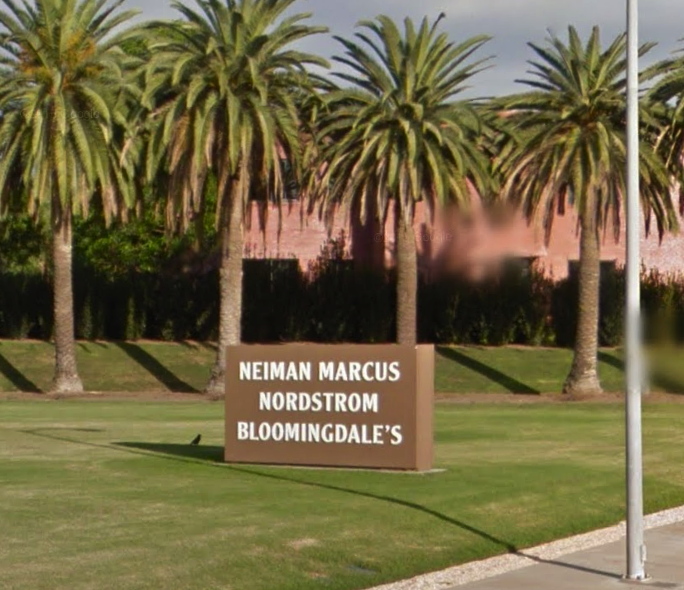
Untitled (Newport Center Monument) IV, 2017, 72 or 84-in. x 108 or 156 in. by 12 in., Ruddy Oak and Bright White on panels, installation image: gmaps

In 2011 The Irvine Company installed two identical monument signs in the grassy quarter-rounds on the East Coast Highway entrance of Fashion Island and Newport Center. They feature the names of three major tenants each, on both sides. Seven feet tall and 13 feet wide, they exceed the maximum dimensions (6' x 9') permitted under the Sign Standards of the Newport Beach Zoning Code, and required a variance. [In person the other day, I would never have guessed they were 7x13; they definitely feel like 6x9. Is it possible they were reduced in size after the permit was granted?]

gregorg_untitled_fashion_island_1_macys.jpg
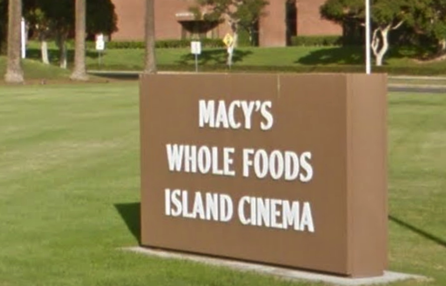
Untitled (Newport Center Monument) III, 2017, 72 or 84-in. x 108 or 156 in. by 12 in., Ruddy Oak and Bright White on panels, installation image: gmaps

Though they also exceed the Code's letter size limits, the signs comply with the requirement that letters be "individually fabricated" and of high contrast for easy legibility. At least at their genesis, they were specified to be finished with Reflective Coating #1460 Bright White from Axon Aerospace, Inc.

dunn_edwards_ruddy_oak_newport_ctr.jpg
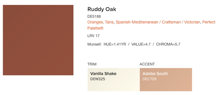
No aesthetic delectation here, Ruddy Oak! hashtag Spanish-Mediterranean, hashtag Craftsman, hashtag Perfect Palette®, image: dunnedwards.com

The 2011 permit application [pdf] describes the new signs as having "a faux plaster finish," but they sure looked painted to me. They match the color specified on plans [pdf] for a similar sign for an adjacent Irvine Company office building: a reddish brown from a local manufacturer, Dunn-Edwards Ruddy Oak (DE5188).

I can find no public record of this color being specified or required in either Newport Beach or Irvine Company codes or styleguides, but it is in heavy use for shopping center and commercial signs within the boundaries of The Irvine Ranch. It also appears on the permitted color lists of at least eight homeowners associations (HOA) in coastal Southern California.

gregorg_untitled_fashion_island_towers.jpg
Untitled (Newport Center Monument) I, II, 2017, 43 x 4 ft each, Ruddy Oak and Bright White on substrate, installation image: gmaps

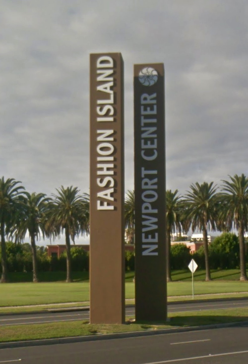
They also match the color and finish of the main signs at the East Coast Highway entrance, a pair of 43-foot-tall pylons installed in 1985. Which is also the first year The Irvine Company used the "sunwave" logo. Over time the text on the signs has changed to reflect the evolving brand distinctions between Newport Center, a massive, multi-use development, and Fashion Island, the vast mall at its center.

For their part, the Newport Center signs also exceed the 20' height limit for pylon signs by 115%, but I presume they predated the creation of the code, and/or that no one will tell The Irvine Company what it can't do in Newport Beach. Their letters are individually fabricated.

There are at least eleven other signs at other entrances to Fashion Island/Newport Center, but they're more architectural than sculptural, with concrete plinths and stucco-finished capitals. Only the four signs on the ECH exhibit this rigorous, minimalist aspect.

gregorg_untitled_fashion_island_install.jpg
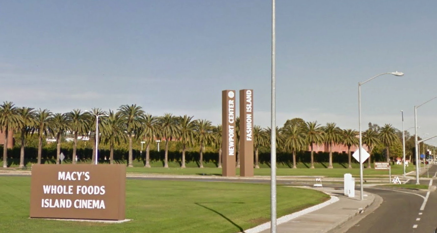
[l. to r.] Untitled (Newport Center Monument) III, I, II & IV, 2017, installation view, image: gmaps

Fashion Island was and remains a leader in the mall industry for experiential design. In an essay called, "The Archaeology of 'Shoppertainment,'" Matthew Cochran and Paul Mullins wrote about RTKL/ ID8, a mall interior design company which worked on the Fashion Island Experience. They quote an RTKL brochure:

[Mall experience is] about storytelling. Great places tell stories, and people love to find themselves in those stories. Often this has less to do with the way a building or a district is assembled and more to do with how we read it...Experience is in the details. If a place tells a story, then the details of that place make the story interesting. The smallest elements-from manhole coves to water features-conspire to create a dynamic, authentically human environment.
What story do these signs tell? What authenticity do they conspire to create, with their approved colors from a gated community on a bluff? Can the gestalt of the minimalist object be achieved from your car, at speed, as you pass the mall, or do you have to turn in?

This ID8 quote, too, turns out to have more to do with how I read it:

What makes us linger, pause, sit and think? The building blocks of place probably have less to do with the buildings and more to do with the spaces between those buildings.
In 2002, the day they flipped the switch, architect Gustavo Bonevardi explained how he and John Bennett arrived at their solution for what became the Tribute of Light World Trade Center memorial:
We're not reconstructing the towers in their original size, but the distance between the two squares of light is the same as the distance between the actual towers. So in effect, we're not rebuilding the towers themselves, but the void between them.
Because I cannot look at the Newport Center signs, and their proportions, and their void, and not see the World Trade Center.

But maybe that's just me. I invite you to visit, view, linger, think, and pause at this installation of new work and pursue your own authentic, dynamic, human experience.

Previously, unexpectedly related, c. 2002: On reading (between) the lines
On's Location

mclaughlin_makin_mirror_lacma.jpg

Just got back from a quick trip to Los Angeles. The John McLaughlin show is as transcendent as everyone said, and all the museums that didn't take it are as clueless as everyone feared. The chairs are a bit twee, though, to be frank, but the sentiment is welcome. If I'd been alone, maybe I would have put them to longer use, but then, I also preferred standing right in front of the paintings. Too many paintings had frames that covered the edges; the subtly different painted edges were my absolute favorite part of the Phillips Collection's McLaughlin. Otherwise, everything about McLaughlin and his work and practice is heartening, even though he's chronically underseen.

The Picasso Rivera show was revelatory. Chris Burden's Metropolis II is still great. Broad's giant Serra Band is like a bunch of holding cells and not in a good way. Turns out you can screw up something that big. Which, we did not go in the Resnick Pavilion at all. Artists give unusual work to this museum; it really feels very local.

The Moholy Nagy show was a labyrinthine confusion in this version, but so much wonderful stuff, including all three of the "Telephone Paintings". The label still says there were five. I guess I will need to look into that situation now.

robert_watts_pearl_necklace_moma.jpg

I looked at a lot of Robert Watts while researching and writing about his friend Aaron Kuriloff. I really liked it. MoMA has some very nice and interesting chrome Watts pieces on view right now in the 1960s hang of the permanent collection galleries, but I have never seen this in person. Pearl Necklace is a 1:1-scale photo mounted on wood. The wire makes me think it had to have been designed for wearing, which is awesome. In 1967 Kuriloff had his last show, of 1:1-scale photos of office furniture and equipment he called "photo-factuals." He'd been making them for a couple of years, and I'm pretty sure he and Watts were up on/involved in each other's work. I, for one, would like to know and see more.

Robert Watts, Pearl Necklace, c. 1967, acquired 2008 from the Silverman Fluxus collection [moma.org]
Which, yes, My dive into the history of Aaron Kuriloff is in the Spring 2017 issue of ArtNEWS [artnews]
Previously, related: More Aaron Kuriloff, Please

jodi_ebay_bag_exstrange_edition.jpg
jodi, eBay shopping bag (#exstrange edition), screenshot: ebay

#exstrange is an art project of, on, and about eBay. Curators conceived and launched #exstrange by inviting artists to create "artworks as auctions" that use "the entire listing (descriptive text, images, pricing, and categories) as material to build the artwork." Occasionally some of those artworks even involve objects.

Marialaura Ghidini and Rebekah Modrak began the #exstrange exploration, and they are involved in the website and book [forthcoming] documenting and discussing the project. But by its nature, #exstrange also exists-and eventually disappears-on eBay, as a hashtag/search term that is ultimately beyond the curators' control.

There is no shortage of art on eBay, nor of conceptual stunts, often designed for shock or novelty that, it is hoped, will generate interest and a sale. While there are immediately appealing objects, too, like a stamped eBay shopping bag edition by the net collective Jodi, some of #exstrange's most interesting works are designed to exploit the parameters of eBay's system and the expectations of its users.

joana_moll_exstrange_ebay.jpg
Joana Moll, Google trackers in North Korea official webpage, 2017, image: exstrange.com

In her listing Joana Moll pitched "Google trackers in North Korea official webpage" as "living proof of US colonization over the Asian country." The opening bid was $30. But because the Barcelona-based artist used the US site, her sale was subject to US law, which prohibits trade of North Korean goods. And so the listing was canceled by an embargobot which couldn't discern the nuances of selling a screenshot of a txt file showing Google Analytics code embedded in the DPRK's (presumably homegrown) html. No problem, though, because the delisting is part of Moll's piece.

Lloyd1__exstrange_Jan17_956_717.jpg
Lloyd Corporation, Bankrupt. Bulk Buy. Liquidation. Repossession #exstrange, 2017, exstrange.com

Lloyd Corporation, meanwhile, appropriated the texts and images from listings by a bankruptcy liquidation specialist, and sold inattentive bargain hunters boxes of junk that nevertheless literally met the listing's descriptions and caveats. Don't worry how it turned out, though: the angry correspondence unraveling the sale became part of the work.

As the project propagates, others are jumping in and glomming on. Whether the curator-controlled website follows the free-range hashtag or diverges from it remains to be seen. #exstrange could remain an esoteric label, or it could follow the arc of "eames era" as a genre-specific default search term that dilutes its specificity to homeopathic levels of uselessness. In the mean time, I will definitely be courting some of those conceptual art bidding' eyeballs by throwing it into my title description of my next eBay sale,. To paraphrase Rauschenberg, "this is an #exstrange if I say so."

#exstrange, co-curated by Marialaura Ghidini and Rebekah Modrak [exstrange.com via someone one twitter, thanks! probably regine]
Previously, related: eBay Test Prints: DO NOT BID OR BUY
DO NOT BID OR BUY Meets DO NOT LIST OR SELL

brian_bress_paf_rodney_hyperallergic.jpg
Brian Bress, Consonance and Dissonance in Four Parts for Times Square, in Times Square for Public Art Fund, image: hyperallergic

Recently Seph Rodney wrote for Hyperallergic about the Public Art Fund's Commercial Break series, which places "interruptions" by 23 artists within the advertising programming of large-scale public screens in NYC. The project ended last weekend, but from Rodney's account, you probably wouldn't have noticed either way:

the project's images are not so much a break as a pause -- in some cases, by my count, a four-second interlude in which I'm not even sure what I'm looking at and not sure it's all that different from what came before and what comes after.
It turns out to be difficult for an artist to create a successful art experience entirely within the visual context of a cacophonous commercial cityscape.

Rodney cites several historical antecedents, including Marilyn Minter and Chris Burden's TV commercials, Creative Time & MTV's artist spots in the 80s, and PAF's own Messages To The Public (1982-1990), which inserted artist messages on a billboard in Times Square. Oddly, there's no mention of Creative Time's 59th Minute (2000-07), which did the same thing on the same spot, but with the new screen sponsor, Panasonic.

Vik_Muniz_george_stinney_OVERRIDE_artnews.jpg
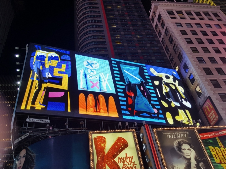
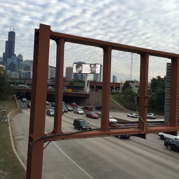
Vik Muniz, George Stinney, Jr. (2016), seen on a billboard for OVERRIDE, Expo Chicago, image: Meg Handler/Artnews

Context is hard anyway, but advertising is especially unforgiving. It all reminded me of the problematic billboard Vik Muniz made last year for Override, the public art program of Expo Chicago. Dushko Petrovich dug into it for Art News. Everyone who ever contemplates making or curating ad-related art for the public sphere needs to read about this mess.

Expo Chicago had invited several artists to submit images of works to be broadcast in rotation on electronic billboards around the city during the art fair. Muniz's George Stinney, Jr. was a still photo from a video piece he'd made in 2015 that told the story of the youngest person ever executed in the US. That moving backstory was lost, though, to passersby who just saw the mug shot of a 14-year-old African American boy flash across a billboard.

None of the Override works were presented with any kind of introduction or identification to distinguish them as art. This lack of framing allowed the other works their surprise and titillation. But with the Stinney mugshot, mystery presented a problem: if viewers didn't know it was art, how were they supposed to know it was a critique? What did it mean to see this image without preparation or context?

Thousands of random people were seeing it all over Chicago, but there was no way to identify these unwitting viewers, much less talk to them.

Well, Facebook. Dushko spoke with Chicago residents who were baffled, disturbed, and angered by the Stinney image; it didn't help, but it's worth noting that this sounds very close to Muniz' own reaction when he first discovered Stinney's story.

In 2010 I said that Google's nascent AdWords-style market for buying TV commercials should be a boon for artists. "We're all Chris Burden Now," I said. Well, I was wrong, and it's probably for the best that we all didn't take my advice, because the blunders would have been off the hook. But if you're going to make ad-related public art, just give it some thought, mkay? It's tricky in the best of times, and these are not those times.

Aiming to Disrupt Ads in New York City, Artworks Instead Blend In [hyperallergic]
In the Context of No Context: A Digital Billboard in Chicago Raises Questions About Art in the Public Sphere [artnews]
Previously, related: We're All Chris Burden Now
Starting With Chris Burden's TV Ad, Through The Night Softly

cage_table_gregorg_02.jpg

I am not sure why, but I just remembered that I once wanted John Cage's table in a totally non-venerating way, or, barring that, that I wanted to make it, and had thus recorded the score [sic] for the table on a bar napkin at one point.

Previously: Scoring John Cage's Table

March 4, 2017

Why Not...

kalus_vaerslev_dress_armory.jpg
"@klausbiesenbach recommended dress code for #armoryartsweek comments please"

throw your bought-in Fredrik Vaerslev over your shoulders like a cape and shop it around the pier in the afternoon?

heini_favorita_picasso_light_1989_chema_conesa_tdc.jpg
Untitled (Picture Light), 2017, picture light, gilt frame, Picasso, installation view, 1989. image: Chema Conesa via The Art Newspaper

In 1989 Baron and Baroness von Thyssen-Bornemisza brought a dining chair out to the terrace of Villa Favorita to sit for a portrait by photographer Chema Conesa. The Baroness sat. The Baron stood, with his right hand on his wife's shoulder. Someone seems to have had the idea to add Picasso's Harlequin with a Mirror to the composition.
It it not clear where the 1923 painting was hanging, but it was. A white-gloved manservant apparently took it off the wall and marched it outside. He holds it on the right corner as it rests on the bare brick ground. The Baron stabilizes the other corner by resting his left forearm on the frame. The brass picture light is still attached.

The Baron bought Harlequin with a Mirror in 1979. X-rays show that Picasso originally painted a self-portrait, possibly as a Cupid/Eros combo, before replacing his face with the mask-like stare of the harlequin. William Rubin and Pierre Daix linked the early state of the harlequin to Picasso's 1923 frustrated infatuation with Sara Murphy, of the Cap d'Antibes Murphys. The series marked the end of Picasso's so-called Classical phase. It is currently unclear when, where, or why the Baron bought it, though.

thyssen_madrid_picasso_nytmag_1992.jpg
The Thyssen-Bornemiszas at home in Madrid with Harlequin with a Mirror and possible picture light detail, 1992, image via NYT

By 1992, the Thyssen-Bornemiszas had decamped to Madrid, anticipating the opening of the Museo Thyssen-Bornemizsa across the street from the Prado and Reina Sofia, to which they had loaned (or rather, rented) more than 800 works, not yet including Harlequin. From the opening of a NY Times Magazine profile:

Baron Hans Heinrich Thyssen-Bornemisza is pouring himself another drink in front of a Picasso on the living room wall of his Madrid mansion. He is making the point that he has always been a tough businessman, the kind who won't let anything get in the way of a good deal.
From the Baroness's posture to the Baron's hand, to the Harlequin photobomb, the Times' image lacks only an art handler to complete its homage. A tiny black spot at the edge of the page gives me hope that the Harlequin made the trip from Lugano to Madrid with his picture light intact. It did not, however, survive the trip into the Museo.

So whether it overlooks Lake Lugano or the Paseo del Prado, this sculptural situation of a picture light on a Picasso sitting nonchalantly and unmediated on a terrace is exceptional, and will likely never occur again. So this work probably exists only in retrorsum im memoriam. Still gives me chills, though.

Pablo Picasso, Harlequin with a Mirror, 1923 [museothyssen.org]
Playing The Art Game For High Stakes [nyt mag, 04 Oct 1992]

superflex_hospital_vonbartha_insta_s-chanf.jpg
Superflex, Hospital Equipment, 2014- , von Bartha S-chanf installation shot via ig/superflexjakob

"Sometimes context is everything," SUPERFLEX's Jakob Fenger wrote, as he Instagrammed a photo of the latest installation of Hospital Equipment in von Bartha's hyper-rustic gallery in the Swiss skiing village of S-chanf. [pronounced as it's spelled, it turns out.]

The Danish collaborative calls Hospital Equipment a "readymade upside down," because it pulls objects into an art context, only to send them on their way to a new context, as functional objects. The objects are surgical tables and operating room equipment, and their post-readymade destination is a hospital in a Middle East conflict zone. The first iteration of Hospital Equipment in 2014-16 was realized at a hospital in Gaza. This time, the work will be realized in Syria.

Collectors of the $90,000 work--Superflex calls their things tools rather than artworks or projects--receive a photo and a certificate for the privilege [sic, which] of funding the object's purchase, travel, and installation in a place where it's actually, not just symbolically useful.

superflex_hospital_equipment_03.jpg
ceci n'est pas un readymade non plus: Hospital Equipment's equipment installed at al Sharif Hospital, Gaza, Palestine, 2015-16. image: superflex

von Bartha's exhibition announcement identifies a lot of issues:

The work questions not only our divergent reaction to the heavy stream of media and humanitarian fundraising campaigns involving the Syrian conflict, it also challenges the concept of contemporary art practice, collections and ownership. SUPERFLEX refers to the work as a 'readymade upside down'. Transitioning from a Duchampian 'readymade' to a potentially lifesaving medical instrument, the equipment oscillates between artwork and functional object, highlighting the role of context in the definition of artistic practice - and the will of the individual mind to make direct change in the world we are living. The equipment consists of a state-of-the-art surgeon's table, a mobile surgery lamp and a surgical instrument table, that has been carefully selected for the Salamieh hospital. Hospital Equipment is an act of exchange.
"We want to challenge collecting itself. Do you have to have the object, or can it be just as valuable to you that it be activated somewhere else?" said Bjørnstjerne Christiansen last year.

superflex_hospital_equipment_02.jpg
Superflex Hospital Equipment, 2014- , installation shot of the photo of the installation at den Frie, Copenhagen. image: superflex

For some objects like operating tables, and some places like much-covered conflict zones in which your own society is somewhat implicated, there is value in knowing that your effort or expenditure helped activate something somewhere else. But a photo is an object. A COA is a marker of value. The art world is a context that confers that value. Engagement with art as a maker, seller, and collector also confers social value. Let's acknowledge that but continue to consider the questions Superflex is raising. But, "Is the money spent on an art object better spent somewhere else?" ends the exercise too quickly.

Given Superflex's constellation of privilege, money, access, attention, prestige, moral authority, relationships, aesthetics, entrepreneurialism and relationships, and the particulars of the platform and situation they faced in 2014, what is an appropriate response?

Because in 2014 Superflex was awarded the Carl Nielsen og Anne Marie Carl-Nielsens Legat, a biennial prize for Danish sculptors which includes an exhibition at Den Frie Centre in Copenhagen, and a prize of 600,000 kronor (then $US105,000.)

Superflex realized Hospital Equipment in collaboration with PalMed, a EU-based NGO for Middle Eastern doctors, who helped pick the equipment and identify and coordinate with the hospital; the WHO, who helped with logistics; and a Danish training tech firm called Area9, whose founder was the only collector of three to be publicly identified. Thus through the jiu jutsu of the readymade, the transformation of an operating table into an art object and back again is incidental to the leveraging of art capital and its trappings for international humanitarian philanthropy.

And now it is happening again, this time with Syria. And a private gallery on the road to Gstaad. Will the media streams and aesthetic impulses and capital flows align again so that Superflex can make some more direct change in the world? I guess we all hope so.

But the financial and logistical convolutions involved in Hospital Equipment strike me as an inefficient and ultimately unsustainable way to meet real medical needs. They're the geopolitical conflict equivalent of Americans trying to stave off medical bankruptcy via a GoFundMe campaign. Faced with a real, looming crisis, I can't say these efforts shouldn't happen; they're imperative, though they often fail, and leave the systemic contextual problems intact. Superflex's Hospital Equipment may succeed again; it has certainly achieved a high level of awareness, or publicity. Is that the extent of its conceptual reach, though? Does the readymade transubstantiation really only need to occur in the mediated image of the project? Or even only in our minds? Maybe its greater impact should be exposing the tenuity of the art world's own self-reinforcing system, whose currency, increasingly, can only be exchanged for the occasional self-congratulatory gestures of a handful of aesthetically inclined multi-millionaires seeking the approbation of an even smaller coterie of hedging billionaires.

SUPERFLEX Hospital Equipment, Feb 16 - Mar 18, von Bartha, S-CHANF, Basel [vonbartha via artnet]
Hospital Equipment, 2014 [superflex.net]
Carl Nielsen og Anne Marie Carl-Nielsens Legat 2014 [denfrie.dk]

Since 2001 here at greg.org, I've been blogging about the creative process—my own and those of people who interest me. That mostly involves filmmaking, art, writing, research, and the making thereof.

Many thanks to the Creative Capital | Warhol Foundation Arts Writers Program for supporting greg.org that time.

comments? questions? tips? pitches? email
greg [at] greg [dot ] org

find me on twitter: @gregorg

about this archive

Posts from March 2017, in reverse chronological order

Older: February 2017

Newer April 2017

recent projects, &c.


our_guernica_cycle_ivanka_320px_thumb.jpg
Our Guernica Cycle, 2017 –
about/kickstarter | exhibit, 2017


pm_social_medium_recent_proj_160x124.jpg
Social Medium:
artists writing, 2000-2015
Paper Monument, Oct. 2016
ed. by Jennifer Liese
buy, $28

madf_twitter_avatar.jpg
Madoff Provenance Project in
'Tell Me What I Mean' at
To__Bridges__, The Bronx
11 Sept - Oct 23 2016
show | beginnings

chop_shop_at_springbreak
Chop Shop
at SPRING/BREAK Art Show
curated by Magda Sawon
1-7 March 2016

do_not_bid_or_buy_iris_sidebar.jpg
eBay Test Listings
Armory – ABMB 2015
about | proposte monocrome, rose

shanzhai_gursky_mb_thumb.jpg
It Narratives, incl.
Shanzhai Gursky & Destroyed Richter
Franklin Street Works, Stamford
Sept 5 - Nov 9, 2014
about | link

therealhennessy_tweet_sidebar.jpg
TheRealHennessy Tweets Paintings, 2014 -
about

sop_red_gregorg.jpg
Standard Operating Procedure
about | buy now, 284pp, $15.99

CZRPYR2: The Illustrated Appendix
Canal Zone Richard Prince
YES RASTA 2:The Appeals Court
Decision, plus the Court's
Complete Illustrated Appendix (2013)
about | buy now, 142pp, $12.99

weeksville_echo_sidebar.jpg
"Exhibition Space" @ apexart, NYC
Mar 20 - May 8, 2013
about, brochure | installation shots


HELP/LESS Curated by Chris Habib
Printed Matter, NYC
Summer 2012
panel &c.


drp_04_gregorg_sidebar.jpg
Destroyed Richter Paintings, 2012-
background | making of
"Richteriana," Postmasters Gallery, NYC

czrpyr_blogads.jpg
Canal Zone Richard
Prince YES RASTA:
Selected Court Documents
from Cariou v. Prince (2011)
about | buy now, 376pp, $17.99

archives