August 2017 Archives

cartier-bresson_moma_nuns_ludwig.jpg
Henri Cartier-Bresson, In front of a painting by Henri Matisse at The Museum of Modern Art, New York, 1964, "Fotografien auf Holz," print mounted on [painted] wood panel, 1967, collection Museum Ludwig

One thing I've been thinking about since visiting the Museum Ludwig a couple of weeks ago is their photography collection. A new, dedicated photography space had a show of Henri Cartier-Bresson and Heinz Held, who met through Photokina curator and collector L. Fritz Gruber. The 200+ prints from Gruber's 1967 exhibition of Cartier-Bresson at Kun­sthalle Köln are now in the Ludwig's collection. And they're all mounted on wood panels.

This shifts the perception from image to object, not just by the material, dimensional difference between paper and panel, but by averring the connoisseurial paradigm of darkroom artistry and editioning, and the painterly tradition of framing. These photographs were purpose-built for public display, not exchange. I'd imagine they felt important, but not precious. Now, of course, they're older and a bit rough, which, for me anyway, made them feel rare and interesting.

family_of_man_entr_inst.jpg

Because we don't do this anymore. I mean we don't do this anymore. Photos are mounted on aluminum, printed on aluminum, and facemounted on acrylic. Every Wal-mart and Costco will print a photo on canvas an "gallery wrap" it into a thick slab.

steichen_berlin_family_moma.jpg

But the Ludwig's style of mounting, which is probably Gruber's style, has been superseded. It reminds me of the exhibition design of Family of Man, Edward Steichen, Wayne Miller, and Paul Rudolph's show that traveled the world in the 1950s. Gerhard Richter saw it in West Berlin in 1955. The last remaining traveling copy of Family of Man, with its giant, mounted prints, is on permanent view in Luxembourg.

I'd like to see some exploration of this. It feels like just the thing Christopher Williams would be into. Hey, doesn't he live in Cologne?

Also related: Peter Bunnell's 1970 MoMA exhibition "Photography Into Sculpture", which was revisited in 2014 Hauser & Wirth in a show called "The Photographic Object, 1970", by Olivier Renaud-Clément.

isa_genzken_kinder_filmen_ludwig.jpg
Isa Genzken, Kinder Filmen, 2005, image: Lee M. via globe-m.de

The first thing I always want when I go to the Museum Ludwig is the floors. Their endless end grain tiles are my 2nd favorite museum floor after the Menil.

This visit, the first work we saw was Isa Genzken's 2005 sculpture Kinder Filmen, which neatly subsumed the crew deinstalling a giant, wall-mounted Charlotte Posenenske next to it in the main hall.

It put me in a frame of mind such that when we came upon this extraordinary doorway next to Cy Twombly's Crimes of Passion II, I had to have it. It's weird and uncomfortable to think that way, that declaring a work, seeing a work, realizing a work, is somehow possessing it. Really, it's the opposite. I like this idea of realizing a work, though; it involves awareness and recognition. Even declaring feels a little suspect right now.

ludwig_twombly_genzken.jpg
Untitled (after Genzken), 2017, installed in Museum Ludwig, Köln next to Cy Twombly's Crimes of Passion II, 1960

In any case, the situation of this plastic and tape and lathing, these stanchions, the translucency and the layers, the sheer provisionality of these gestures, and next to this gorgeously worked over Twombly, it just felt all of a piece. And I have to think it was because of seeing that Genzken first.

The realization was immediate and obvious, and it only got complicated after we left the gallery. In the next space there were two more blocked off doorways, far more elaborate and functional than this one. And it posed a problem. Would I really just wander through the museum realizing works when there are already plenty of works to see? Maybe it's a little foolish, or maybe that self-consciousness is just part of the process. The daily practice of realizing.

ludwig_door_diptych_2.jpg

These doorway installations were more elaborate, with airlock-like zipper passages in them; they were used as doors to a construction space, where the first one I'd seen was just to seal it off. In terms of indexing the operations of the museum as space and institution, they were all equal. If it mattered to realize all three, or to realize one + a diptych, to see them in series, they're there, but in the moment it felt unnecessary, if not superfluous. It also felt salient that they were next to a late Pollock and a late deKooning. It's a grouping you'd never turn down, of course, but it didn't resonate like the Twombly. [I decided it was best not to crop it out, but I'm very deliberately not mentioning the Arnulf Rainer; just let me have this moment, please, don't ruin it.]

ludwig_door_diptych_1_jp_edek.jpg

Chapman_Insult-to-Injury_Great-deeds-against-the-dead-2003.jpg
Insult to Injury, 2003

I did not like Jake & Dinos Chapman's work to begin with, so I was not inclined to like their project Insult to Injury, where they drew animal and clown faces on a suite of actual Goya etchings, when it debuted in 2003. And I haven't thought much about it, or looked at it since.

But I have come around. Working on the Our Guernica Cycle project has sent me looking back at Goya's big Fifth of May paintings, and their influence on Guernica, and that inevitably brings the Disasters of War prints back into the mix.

Goya_Los_Desastres_de_la_Guerra_-_No._39_-_Grande_hazaña,_con_muertos.jpg
Plate 39 - Grande hazaña! Con muertos! (A heroic feat! With dead men!)

Things I didn't really pay attention to stand out now. Like Goya making prints during a war and a famine when materials were so scarce, and the situation so uncertain, that he had to reuse and destroy the copper plates from other prints. And making a series of 80+ prints over the course of years, which he finally expected to never publish in his lifetime. And which were only published decades after his death. And which were then republished over and over again, in seven editions, over 70 years, including a "final" edition in 1937 to support the Republic in the Spanish Civil War, nearly 1,000 sets in total, plus hundreds of proofs. [That's the one the Chapmans bought to use.]

Goya_Los_Desastres_de_la_Guerra_-_No._37_-_Esto_es_peor.jpg
Plate. 37 - Esto es peor. (This is worse.)

Things like Goya drawing such devastating connections between revered fragments of classical sculpture, like the Belvedere Torso, and the tortured and dismembered bodies of the war's victims. Neo-classicism was hot at the time, in the Napoleonic era, and Goya impaled it on a tree.

chapman_insult-to-injury_2003.jpg

And then there's the Chapmans, whose project was sparked by the Bush/Blair Iraq war machine which marched in front of their already Goya-soaked practice. Here is Fiachra Gibbons writing about Insult to Injury in The Guardian:

Although they are both against the current war, the Chapmans say they are not making a statement about it. Insult to Injury is more about the inadequacy of art as a protest against war. Art can't stop wars, they insist, just as Picasso's Guernica was a "pathetic" statement in the face of the oncoming second world war.

"Not to be too glib, but there's something quite interesting in the fact that the war of the peninsula saw Napoleonic forces bringing rationality and enlightenment to a region that was marked by superstition and irrationality," Jake Chapman said. "Then you hear George Bush and Tony Blair talking about democracy as though it has some kind of natural harmony with nature; as though it's not an ideology."

I was not this pessimistic in 2003; maybe I just needed some time.

And now to look at Disasters of War again, and Insult to Injury again, and more closely, and as I "embellish" my own prints I'd once expected were "finished," I realize the Chapmans were right. The reflexive disapproval of their alteration of another artist's work is specifically misplaced and unnecessary. Even Jonathan Jones is right about something. It's all a pretty big shock, tbh. And even when it feels necessary, art still doesn't make these disasters any better.

Insult to Injury, 2003 [jakeanddinoschapman.com]
The 2004 Steidl edition of Insult to Injury is pretty remarkable, actually [amazon]

to be continued:

trump_stalin.jpg

trump_stalin_02_flynn.jpg

trump_stalin_03_spicer.jpg

trump_stalin_04_priebus.jpg

trump_stalin_05_bannon.jpg

[cf. stalin & friends; original image of Trump talking to Vladimir Putin on Jan. 28, 2017 via @yashar]

untitled-turbinengradient_700px.jpg

While driving along the autobahn yesterday near Stuttgart, we passed many wind turbines. Some of them have been painted at the base with a gradient of various greens or browns. This is an attempt to minimize their visual intrusiveness on the landscape.

It was only by the time we passed the second installation that a clear enough photo could be taken. Then I realized that not all turbines were painted, and each painted turbine was painted differently.

image.jpeg

By the third cluster of turbines it was clear that each painted turbine was painted in an approximation of its own site, as viewed, fleetingly, from the vantage point of the freeway itself. The gradient is a representation of the landscape, in the landscape.

palermo_untitled_1968_green_textile_luxembourg.jpg
Grand Duc Jean loaned his Palermo, Untitled (1968), to MoMA's Color Chart show in 2008. image: jens ziehe via x-traonline

They recalled to me at the time the textile works of Blinky Palermo, but as I see the photos now, their similarity to Gursky's Rhein seems more direct. In any case, so far I have found little discussion of these word, or the principles of their production. When I get back to a computer, though, I will update this post with some coordinates so you can hurtle past them, too.

UPDATE: they're a corporate trademark. See below.

derek_jarman_loft_skycapes_1971.jpg

It's an accident of timing that I've kept thinking of Derek Jarman as a filmmaker with a painting hobby. He was still alive when I saw my first Jarman film, Edward II, and when Blue blew me away. And I felt I knew his story, so I've been slow to read his early autobiography, or other books about him; my job was to just catch up and see all his earlier films. It didn't help that I didn't really like the paintings shown after his death. His notebooks were more relevant.

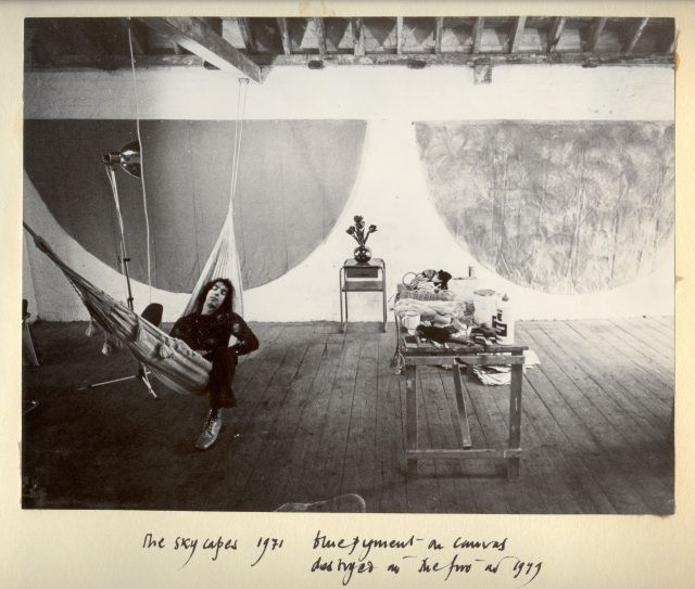
But I just saw this photo which changed all that. I wasn't 100% wrong, but I was close: Jarman's painting was more formative and influential-and interesting-than I realized. The photo's from 1971, and it is captioned in Jarman's dramatic hand:

"The Skycapes 1971 blue pigment on canvas
destroyed in the fire in 1979"

Skycapes has been a Google dead end, or rather a cul de sac for this caption. But capes, capes is where it's at. In his 1999 biography of Jarman Tony Peake traced the form and concept of the cape to Jarman's theatrical work, particularly his ideas for a production of The Tempest:

Capes are both practical and sensual, especially when cloaking nakedness. They are geometric: if hung on the wall, they form a half circle. They have mythic overtones: by donning a cape, the wearer can effect a transformation. These qualities, particularly the latter, had considerable potency for Jarman, who now set about working and reworking this new possibility until the capes he produced-and began to hang on the walls of his studio-no longer resembled design, but approached the condition of painting or sculpture.
Now the timing's a little confusing, because Jarman made a film version of The Tempest in 1979. But Peake notes the project had interested Jarman for years. And Jarman made a clear, laminated cape scattered with dollar bills [or pound notes, maybe?] for the 1969 production of Peter Tegel's surrealist play Poet of the Anemones. Peake said the two met at Lisson Gallery.

And the walls of Jarman's riverside loft were lined with extraordinary capes when filmmaker Ken Russell visited and asked him to design the sets for The Devils, a project that consumed most of Jarman's waking hours in 1970. Exhausted and dissatisfied by the film project and wary of commercial film industry entanglements, Peake wrote, Jarman "chose to concentrate on his capes, some of which he now began to paint, in two main colours, black and blue, but mainly blue: 'simple sky pieces to mirror the calm.'"

That quote's from Jarman's own 1984 memoir, Queerlife, which was published in the US with the title Dancing Ledge in 1993:

1971. The Oasis
The intervening year was spent painting a series of blue capes, which hung on the walls at Bankside. They were simple sky pieces to mirror the calm that returned after the frenzied year of The Devils. That summer was an idyll, spent sitting lazily on the balcony watching the sun sparkle on the Thames. When I wasn't painting I worked on the room and slowly transformed it into paradise. I built the greenhouse bedroom, and a flower bed which blossomed with blue Morning Glories and ornamental gourds with big yellow flowers. On Saturdays we gave film shows, where we scrambled Hollywood with the films John du Can brought from the Film Co-op- The Wizard of Oz and A Midsummer Night's Dream crossed with Structuralism. There were open poetry readings organized by Michael Pinney and his Bettiscombe Press. Peter Logan perfected his mechanical ballet, and MIchael Ginsborg painted large and complicated geometrical abstracts.
An oasis paradise indeed, replete with all the essential elements of Jarman's subsequent accomplishments. Which is, at least, how he himself saw it when he looked back from 1984.

undergroundinteriors_derekjarman_loft_obertogili-2.jpg

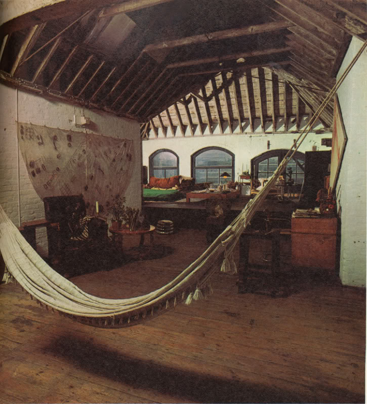
Here is a 1971 photo by Oberto Gili of Jarman's amazing Bankside loft, the top floor of a 19th century wheat warehouse. Which had the floors, the ceiling, the views, the space, but not the plumbing or the heat (thus the greenhouse bedroom). There's the hammock from the first photo, and a laminated cape which had tools, weeds, and detritus retrieved from the abandoned waterfront. [How far do the similarities go between Jarman and other gay pioneer artists like Robert Rauschenberg? Jarman would've spit at the comparison; in a 1984 interview at the ICA he slammed Jasper Johns for being a tool of the CIA. #freequeerstudiesdissertationtopics]

matisse_vence_chasubles_helene_adant.jpg
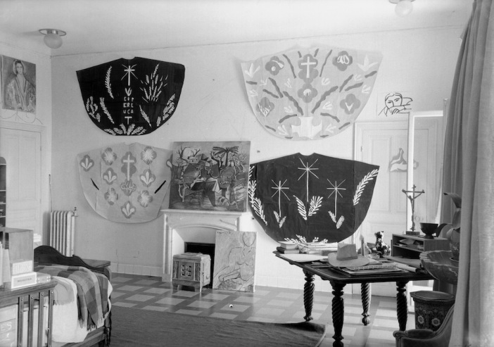
Henri Matisse cutout designs for priests' chasubles for Vence Chapel, 1951, photographed in his studio surrounding a Picasso painting, by Helene Adant. image: tate.org.uk

In Ken Russell's telling of their first cape-filled visit, Jarman "was getting ready for an exhibition called "Cardinal's Capes." It's a phrase which turns up nowhere else, but which makes me think of Henri Matisse, who designed amazing chasubles for priests to wear in his chapel at Vence. They began as cut-outs, and were translated into fabric, and changed with the seasons.

In 1970-71 Jarman had two solo shows, including capes, at the then-new Lisson Gallery, but he grew to disdain the gallery system. He also hated Pop and bristled at working in the long shadow David Hockney cast over the London art scene. He opened his studio for his own damn show in 1972, which Peake says was disappointing [though he sold some work and celebrities turned up for the opening, so what greater success could art hope for?]

He included new capes made from black lacquered newsprint [Rauschenberg?] in a 1984 mid-career exhibition at the ICA. [He was 42.] And in that public talk, he described funding his early features by selling paintings and raising money from his painting collectors.

Anyway, are there any Jarman capes left to be seen? I can't find any. In 2015, the ICA screened Jarman's super8 documentation of his 1984 show for the first time, but there's no visual trace online. And as the caption to the original photo mentions, his earlier capes, including what he called his Skycapes, were destroyed along with Jarman's and others' studios in 1979.

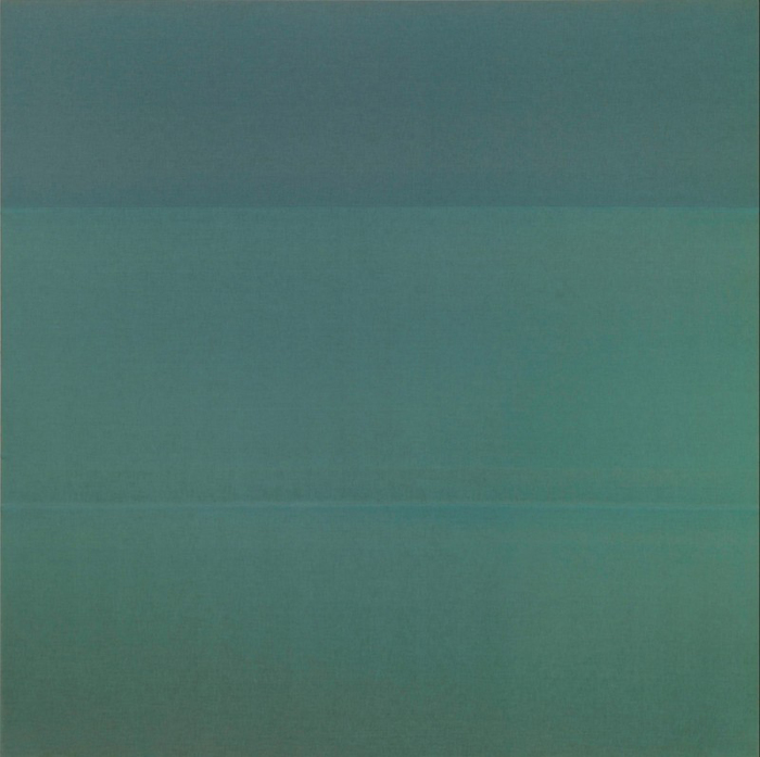
By retrospectively titling them with the sky, and using the term "blue pigment" instead of paint, Jarman also seems to be linking the capes to one of his clearest references, Yves Klein. Klein the outrager who said his first artwork was signing the sky. Whose International Klein Blue appeared throughout Jarman's notebooks in the 80s. Jarman filmed an IKB monochrome painting and projected a loop of it for a 1987 live poetry/music performance event he called Bliss, which became his last, greatest film, Blue, in 1991-3.

klein_uecker_marriage_1962.jpg

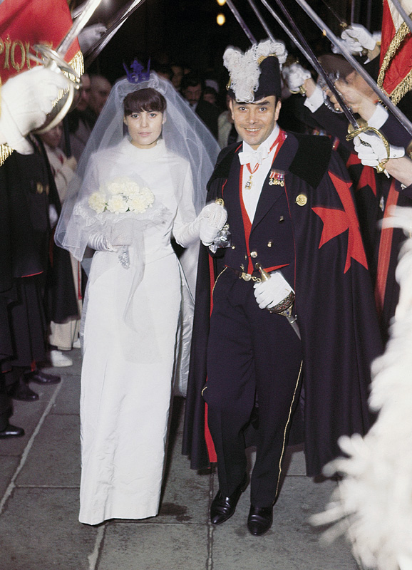
Here is Klein at his wedding on January 21, 1962. Rotraut Uecker is wearing an IKB crown, and he is wearing a cape emblazoned with a Maltese cross. They are processing through the raised swords of the Chevaliers of the Order of St. Sebastian. So at least I know what my dissertation will be about. But first we have to solve the problems that there are almost no Jarman Super-8s online; that Klein's wedding was filmed, and that's not around, either. And then, of course, all these destroyed capes. There is a lot of work to do.

Previously, 2013: International Jarman Blue
2004:
It's not just Derek Jarman's Blue
2002?:
As I lay typing

Since 2001 here at greg.org, I've been blogging about the creative process—my own and those of people who interest me. That mostly involves filmmaking, art, writing, research, and the making thereof.

Many thanks to the Creative Capital | Warhol Foundation Arts Writers Program for supporting greg.org that time.

comments? questions? tips? pitches? email
greg [at] greg [dot ] org

find me on twitter: @gregorg

about this archive

Posts from August 2017, in reverse chronological order

Older: July 2017

Newer September 2017

recent projects, &c.


our_guernica_cycle_ivanka_320px_thumb.jpg
Our Guernica Cycle, 2017 –
about/kickstarter | exhibit, 2017


pm_social_medium_recent_proj_160x124.jpg
Social Medium:
artists writing, 2000-2015
Paper Monument, Oct. 2016
ed. by Jennifer Liese
buy, $28

madf_twitter_avatar.jpg
Madoff Provenance Project in
'Tell Me What I Mean' at
To__Bridges__, The Bronx
11 Sept - Oct 23 2016
show | beginnings

chop_shop_at_springbreak
Chop Shop
at SPRING/BREAK Art Show
curated by Magda Sawon
1-7 March 2016

do_not_bid_or_buy_iris_sidebar.jpg
eBay Test Listings
Armory – ABMB 2015
about | proposte monocrome, rose

shanzhai_gursky_mb_thumb.jpg
It Narratives, incl.
Shanzhai Gursky & Destroyed Richter
Franklin Street Works, Stamford
Sept 5 - Nov 9, 2014
about | link

therealhennessy_tweet_sidebar.jpg
TheRealHennessy Tweets Paintings, 2014 -
about

sop_red_gregorg.jpg
Standard Operating Procedure
about | buy now, 284pp, $15.99

CZRPYR2: The Illustrated Appendix
Canal Zone Richard Prince
YES RASTA 2:The Appeals Court
Decision, plus the Court's
Complete Illustrated Appendix (2013)
about | buy now, 142pp, $12.99

weeksville_echo_sidebar.jpg
"Exhibition Space" @ apexart, NYC
Mar 20 - May 8, 2013
about, brochure | installation shots


HELP/LESS Curated by Chris Habib
Printed Matter, NYC
Summer 2012
panel &c.


drp_04_gregorg_sidebar.jpg
Destroyed Richter Paintings, 2012-
background | making of
"Richteriana," Postmasters Gallery, NYC

czrpyr_blogads.jpg
Canal Zone Richard
Prince YES RASTA:
Selected Court Documents
from Cariou v. Prince (2011)
about | buy now, 376pp, $17.99

archives