September 2017 Archives

mnuchin_gallery_OTA_title_page.jpg
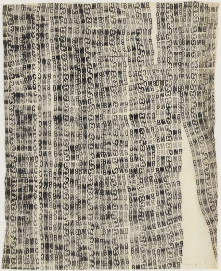
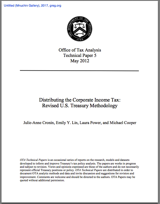
Untitled (Mnuchin Gallery), title page, 2017, 34-page pdf

Untitled (Mnuchin Gallery) is a 2017 work comprising a 2012 technical paper by four economists in the United States Treasury Department's Office of Tax Analysis. The paper explained a revision to the Treasury's methodology for analyzing the impact of corporate income taxes on companies, owners, and workers. It did this by examining the type of income (capital or labor/wage) and the distribution of those income sources across the entire taxpayer population. It was found, for example, that the top 1% of households accounted for 49.8% of total capital income, but only 11.5% of labor income.

The purpose of the study was to understand the impacts of tax-related policies and forecasts more accurately, and in greater detail, in the hope that more accurate data will lead to better-crafted policy and legislation.

Treasury Secretary Steven Mnuchin has spent several months making claims about lowering corporate income tax rates that are directly contradicted by the findings of the study, and the calculations of Treasury Department's career economists. So he had the study removed from the US Treasury website, and a spokesman has disavowed the methodology as "the dated staff analysis of the previous administration." No alternate methodology or analysis has been offered.

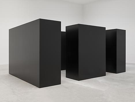
Steven Mnuchin, like his father Robert Mnuchin, was a partner at Goldman Sachs. Like is father, he collects modern and contemporary art. One Mnuchin is in the business of conferring relevance on objects by exhibiting them, the other by suppressing and disappearing them. This work is a family reunion of those two tactics.

Untitled_Mnuchin_Gallery.pdf [34pg, pdf, via wsj]

tony_smith_maze_la_install_1.jpg
Tony Smith, Maze, 1967/2014, steel units 7x10 feet and 7x5 feet, installed at Matthew Marks LA

When it was first shown at Finch College Gallery in 1967, Grace Glueck said Tony Smith's The Maze "evokes the feeling of an endless forest."

When he published it in Brian O'Doherty's editions 5+6 of Aspen: The Magazine in a Box, Smith said it was "a labyrinth rather than a monument," and gave anyone who wished permission "to reproduce the work in its original dimensions (in metal or wood).

I would now like to tie it all together by giving anyone who wishes permission to reproduce The Maze in its original dimensions in fake boxwood hedge walls.

Make-Be-Leaves-7ft_UV_Boxwood_Hedges.jpg

Most off-the-rack fake boxwood hedge walls are eight feet tall and often include a fake planter base. Most are also 15 inches thick. A real fake boxwood hedge wall The Maze will observe Smith's original specifications, and use fake boxwood hedge walls seven feet high and 30 inches thick. Two will be five feet long, and two will be ten. They should not have a planter base.

There are many fake boxwood hedge wall solutions providers out there, but might I suggest you consider Make Be-Leaves, who already seems 3/4 of the way there with the 7-ft walls above?

Make-Be-Leaves-Manhattan-UVBoxwood_Terrace.jpg
fake UV boxwood hedge plantscape...

Among their many successful installations is this fake boxwood hedge plantscape on the CPK vu terrace of a Madison Avenue real estate investment firm. And yet it manages to be only the second greatest fake thing in sight. What the actual f.

hfz_fake_koons_dog.jpg
... with a fake Koons balloon dog made from, what, garbage bags [?], image: makebe-leaves.com

And here I thought I'd end this post with the Tony Smith Die made out of fake rock veneers.

eldorado_admire_work.jpg

The Maze, (1967/XXXX), Tony Smith [greg.org]
The Maze Collection
Previously, shockingly related Tony Smith moment: The Allure of Permanence
Not related: Jon Rafman stickin' his VR in a flimsy astroturf hedge maze [thestar, thx @briansholis]
Aall thanks go to @ftrain, whose tweet of an aerial photo of a Google corporate event was filled with an extravagant architecture of fake boxwood hedge walls.

September 27, 2017

Erased Kassay JPEG

kassay_diptych_christies_screenshot.jpg
Lot 247: Jacob Kassay, Untitled, 2010, two 14x10 silver on acrylic (not gesso?) canvases, est $10-15,000 [image via christies]

Scanning the catalogue for this month's Christie's sale turned up something unexpected: an affordable Jacob Kassay painting. Two of them, in fact. After his ominously seductive debut show opened at Eleven Rivington in the wake of the 2008 financial crisis, Kassay's silvered gesso canvases were transmuted into auction gold. Shiny objects reflecting distorted images of their viewers, Kassay's paintings were the first to get churned and flipped in a frenzied art market obsessed with declaring-and cashing in on-a steady stream of new stars.

It's the kind of limelight that can wreck a girl's practice, if not her complexion, and Kassay has been reticent, even diffident sometimes, of the hype. He's generally refused to engage the art market star process, at least on anything other than his own terms. For a while he refused to have his picture taken. His website, a kaleidoscope of semi-transparent images, would kick you off after a few seconds, presumably when you're just tryna do some research for an upcoming auction.

Kassay has also always been fairly specific about images of his shows, especially photos of his silvered paintings. So it should make all the sense in the world that he'd care about the proliferation of auction-related reproductions of his work. What was more surprising, though, was the apparent removal of all images of his work from Phillips' website.

phillips_kassay_screenshot_gregorg.jpg

Sotheby's has done this for a while now, removing images of works shortly after the sale is completed, but this is the first time I've seen all of an artist's images removed from a site. Or should I say, replaced. If you thought Kassays all looked the same before, well, brother, you're in for a treat. I'd like to see these in mirror finish, please.

kassay_diptych_phillips_screenshot.jpg

[FWIW, this particular pair, from 2010, was flipped at Phillips in 2011 for $104,500. If there's anything more alluring than a shiny object, it's two. And if there's anything more seductive than that, it's a 90% discount. [Update: indeed, they sold for $8,000 bid, $10,000 with premium. That is some Cady Noland-level collector anxiety inducement and value erasure. Well played.]

Sept 28, 2017, Lot 247: Jacob Kassay diptych, 2010, est. $10-15,000 [christies]
8 Nov 2011, Lot 205: Jacob Kassay, Untitled diptych, est. $30-40,000, sold for $104,500 [phillips]

asawa_bmc_laundry_stamp_1948-49.jpg
Ruth Asawa, Untitled (BMC.76, BMC laundry stamp), 1948-49, image via: hyperallergic

You rarely get to see more than one Ruth Asawa wire lobe sculpture, and you almost never get to see works on paper. So get to David Zwirner's place, because they have it all right now. It is probably the biggest assemblage of Asawa's work since the 2006 show at the de Young Museum in San Francisco.

And I guess I wasn't attuned to it at the time, but Asawa's rubber stamp drawings from Black Mountain College are extraordinary. Here's one made with the BMC laundry stamp. Her sculptures have always felt like line drawings in space, and these feel like word sculptures on paper.

Another thing I was not paying enough attention to in 2007: one of Asawa's BMC laundry stamp drawings was used as the basis for a mattress ticking? How did that happen?

Ruth Asawa, thru Oct 21, 2017 [davidzwirner]
Ruth Asawa, a Pioneer of Necessity, by John Yau [hyperallergic]
Ruth Asawa's Black Mountain Work [ruthasawa]

explosions_slam_laurie_lambrecht.jpg
Laurie Lambrecht, Explosion, Slam, photo composition of Roy Lichtenstein's Hand Written Word List and comic book clipping source material, made in the artist's studio between 1990 and 1992. image via lensculture

Why did Roy Lichtenstein make word lists is not really my question. How did Roy Lichtenstein's word lists end up in the list of his artworks catalogued by the Lichtenstein Foundation?

Both lists date from 1990. The first Handwritten Word List, feels like it fits right in. It appears to be a compilation, or a selection, of the onomatopoetic word graphics Lichtenstein famously adapted from comic books for his paintings. This list appears in at least two pictures taken between 1990 and 1992 by Laurie Lambrecht, a photographer who worked as an assistant to Lichtenstein in his studio. In the composition above, titled Explosion, Slam, it is surrounded by comics clippings. Her account of this time, inventorying Lichtenstein's studio in preparation for his 1993 Guggenheim retrospective, mentions Polaroids, "bulging notebooks," and a "scrapbook full of 'Crying Girls,'" none of which apparently made the leap from archive to corpus that these lists did.

The second, Typed Word List, are all adjectives "of praise," in an alphabetical order. Did he create it for a work? A series? A lecture? Would he consult the list when artist friends asked his opinion about their show? I mean, you could probably get away with it on the phone, but it could get awkward to use such a prompt in person. ["What'd you think?" (Pulls out list.) "Neato."]

Or maybe he came up with the list after a heated conversation with Richard Serra, who was like, "You can't have the verbs, Roy, they're mine!" And Roy was like, "Fine!"

In any case, they're both pretty beat up, well-used, and have no discernible aesthetic embellishment. I won't say they're not aesthetic, because they are what they are.

Download Better_Read_016_Roy_Lichtenstein_Word_Lists.mp3 [2:25, 1.3mb, greg.org]
Hand Written Word List, 1990 [imageduplicator.com]
Typed Word List, 1990 [imageduplicator.com]
Inside Roy Lichtenstein's Studio, photos by Laurie Lambrecht [lensculture]

kara_walker_better_read_015_usa_idiom_sjco.jpg
Kara Walker, Detail of U.S.A. Idioms, 2017, image via sikkema jenkins & co

It feels unusual to feature a current text on Better Read, but then, these are unusual times.

It strikes me that Kara Walker's artist's statement for her current show at Sikkema Jenkins & Co. has not been considered in an expanded context. An artist's statement, in a press release, is already fighting with two critical hands behind its back. Yet the press release is actually the artist's title for her show. The impetus for writing any of this is presumably well understood, but here, the specific circumstances of Walker's work, her practice, and the shitshow of a world we're living in right now should, I believe, upend our complacent expectations.

I myself found it too easy to make quick judgments about these texts and their implications when I saw the ad for Walker's show in Artforum, which contained the show's title, which I'd previously ignored, because I'd taken it for a glib press release. I let the order of reception, my own subjectivity, influence my judgment, in ways that I might not have noticed without further, in-depth consideration. And yet Walker had anticipated it all.

Download Better_Read_015_Kara_Walker_20170914.mp3 [6:57, 3.3mb, via greg.org]
Kara Walker exhibition page [sikkemajenkinsco.com]
Sikkema Jenkins' press release with Kara Walker's texts [pdf, sikkemajenkinsco.com]

Clip-on-Man-Cady-Noland_1989.jpg

You may know Beach Packaging Design from such seemingly random-but-incredible blog posts as The Weirdly Banal Canadian Marlboro Man Ad Was Created To Stymie Philip Morris's Marlboro Man Campaign, Because PM Doesn't Own The Marlboro Trademark In Canada.

Now BPD's tracked down the source image for one of Cady Noland's silkscreened aluminum panel works. Clip-On Man (1989), features a guy with a beer hack: two six-pack loops attached to his belt, with one can of Budweiser left [yeah, packaging!]

Charles-Gatewood-Mardi-Gras-couple_Sidetripping.jpg

Turns out it was from Charles Gatewood's 1975 photobook of the American underbelly, Sidetripping, with a text by William Burroughs. Gatewood had been taking surreal, wacked out photos of the counter-culture since 1964. And in 1972, when he went to shoot Burroughs [sic, heh] in London for Rolling Stone, Gatewood pitched his own project, a dummy of his book, and asked Burroughs to write a text for it. From Gatewood's memoir:

Burroughs moved to London in 1965. Despite the success of Junky (over 100,000 copies were sold) and the notoriety of Naked Lunch (banned in Boston), Burroughs was not especially well known in America. His "cut-up" novels -- including The Soft Machine, Nova Express, The Ticket That Exploded -- were non-linear in structure and difficult to understand. Bob Palmer hoped our Rolling Stone story would "give Burroughs the mainstream exposure he deserved."

Our first surprise was Burroughs' modest one-bedroom apartment. The walls were almost bare, and the place looked way too neat and clean. The only hint of weirdness was the life-size cut-out of Mick Jagger standing next to a Uher tape recorder (and the faint smell of hash smoke perfuming the room).

[bold added on the part that also sounds like Cady Noland. I don't believe it for a second, she does so much more, but what if-just what if-Cady Noland's project got its start in the gonzo [sic] image/cultural stylings of peak Rolling Stone magazine? When Sidetripping dropped, she was 19. And 18 when Patty Hearst went down.] I have not, as yet, found a picture of a life-sized cutout of Mick Jagger, Burroughs's or anyone else's. But when I do, you know I'll post it here. And probably print it on aluminum.

Cady Noland's 1989 Clip-On Man [beachpackagingdesign, s/o @br_tton]
William S. Burroughs, Charles Gatewood, and Sidetripping [realitystudio]
While their art historical value remains under-appreciated, copies of Sidetripping are egregiously low-priced [amazon]
Previously: Namess (Cowboy) 2016

Since 2001 here at greg.org, I've been blogging about the creative process—my own and those of people who interest me. That mostly involves filmmaking, art, writing, research, and the making thereof.

Many thanks to the Creative Capital | Warhol Foundation Arts Writers Program for supporting greg.org that time.

comments? questions? tips? pitches? email
greg [at] greg [dot ] org

find me on twitter: @gregorg

about this archive

Posts from September 2017, in reverse chronological order

Older: August 2017

Newer October 2017

recent projects, &c.


our_guernica_cycle_ivanka_320px_thumb.jpg
Our Guernica Cycle, 2017 –
about/kickstarter | exhibit, 2017


pm_social_medium_recent_proj_160x124.jpg
Social Medium:
artists writing, 2000-2015
Paper Monument, Oct. 2016
ed. by Jennifer Liese
buy, $28

madf_twitter_avatar.jpg
Madoff Provenance Project in
'Tell Me What I Mean' at
To__Bridges__, The Bronx
11 Sept - Oct 23 2016
show | beginnings

chop_shop_at_springbreak
Chop Shop
at SPRING/BREAK Art Show
curated by Magda Sawon
1-7 March 2016

do_not_bid_or_buy_iris_sidebar.jpg
eBay Test Listings
Armory – ABMB 2015
about | proposte monocrome, rose

shanzhai_gursky_mb_thumb.jpg
It Narratives, incl.
Shanzhai Gursky & Destroyed Richter
Franklin Street Works, Stamford
Sept 5 - Nov 9, 2014
about | link

therealhennessy_tweet_sidebar.jpg
TheRealHennessy Tweets Paintings, 2014 -
about

sop_red_gregorg.jpg
Standard Operating Procedure
about | buy now, 284pp, $15.99

CZRPYR2: The Illustrated Appendix
Canal Zone Richard Prince
YES RASTA 2:The Appeals Court
Decision, plus the Court's
Complete Illustrated Appendix (2013)
about | buy now, 142pp, $12.99

weeksville_echo_sidebar.jpg
"Exhibition Space" @ apexart, NYC
Mar 20 - May 8, 2013
about, brochure | installation shots


HELP/LESS Curated by Chris Habib
Printed Matter, NYC
Summer 2012
panel &c.


drp_04_gregorg_sidebar.jpg
Destroyed Richter Paintings, 2012-
background | making of
"Richteriana," Postmasters Gallery, NYC

czrpyr_blogads.jpg
Canal Zone Richard
Prince YES RASTA:
Selected Court Documents
from Cariou v. Prince (2011)
about | buy now, 376pp, $17.99

archives