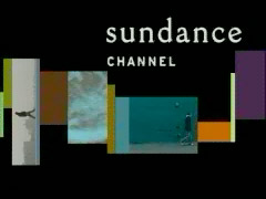
 A few weeks ago, the new identity system for The Sundance Channel caught my eye.
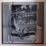
Built on a string of images and boxes that pulses, tugs, and scrolls leftward off the screen, the system cleanly embodies the idea of a TV channel as a programmer, a curator of a continuous stream of content in time. It also reminded me of a non-linear editing timeline like in Final Cut Pro, and of the timeline-like installation of artist Jeremy Blake's 2003 painting show at Feigen in NYC.
Anyway, I recently spoke with Keira Alexandra, VP, Creative Director at The Sundance Channel, who came up with the design, which launched in late January (to coincide with the Sundance Film Festival).
On April 29, Alexandra will talk in depth about the project at MOVE: Stories In Motion, a conference organized by the NY chapter of AIGA.
GA: What was your brief for the Channel [thatís what we call it, you know. Sundance=the Festival.]?
KA: The problem I had to solve was creating clarity for the channel itself. TV being a very linear medium, it has to be something that works over time and whenever someone tunes in.
I also wanted consistency and multiplicity. Every element we'd created before--promos and bumpers and navigation and brandingóhad come from different places, so we really needed continuity.
Content-wise, weíre redefining and expanding what our content isóweíre doing more original productions and film acquisitions. Itís always changing. I wanted to create a system that could be expanded through time.
It sounds very different from MTV, where thereís a constant churn of new elements from all over the place. Iíve had several friends whoíve done promos for MTV, and itís almost a rite of passage for animators or designers [like being on Law & Order is for a NY actor, although I wasnít quick enough to say that in the interview.]
At MTV, itís fun and you get a chance to do great work, but it's so big and there's no bigger solution youíre working towards. The thinking there is, they're creating content more than anything. And their brand is more established.
So how do you describe the system you came up with?
I think curation is the best metaphor. Itís basically the gallery walls for whatever we went forward with. Itís linear and moves left-to-right, and in that way itís motivated by film editing and timelines. I also look at it as a universe or a galaxy. The Sundance Channel always appears in the black, floating in the upper space.
Iíd think the reference to film editing software like Final Cut or Avid could resonate with both the filmmaking community, especially independents, and with a film-savvy audience.
Well, the intention wasn't meant to be such an insider influence; it was more a structural influence, a similar way to organize the visual information. And it's not a more literal reference, like software buttons or icons, I donít know, we saw it more as a principle.
It's sort of an organizing principle meets snap problem-solving, meets time, meets design. I love having as many problems to solve for as possible. I started as a print designer, and moving into TV created more variables, but it also created more restrictions.
So how does it actually work?
I can give you a little detail on the structure. When you start a break, and the movie has ended, it actually comes up from the beginning of the timeline and grows, and at the end of the break, it does the opposite. All the pieces in between get broadcast as separate pieces, every element, during the break.
I see some of them are the programs themselves, but there are also elements of landscape footage in the stream that looks like Sundance.
You mean Sundance the resort?
Exactly. Again, it's non-specific, but it's also recognizable, or at least evocative.
The sense of place comes up a lot because there are very few channels that have actual space on the planet. I went back to the library for this, though; I didnít create any new footage; we used a lot of stuff from a bunch of different filmmakers.
What was the process like to come up with the design? Did you spend a lot of time evaluating various concepts?
No, the solution was almost instantaneous. Because Iíd been at Sundance already a year and a half, it was in my head. It was in my head, and then it was on the channel. That's the beauty of in-house: instant gratification.

