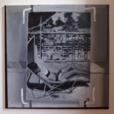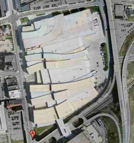
The first place I remember hearing the idea of the roof as a "fifth facade" was Peter Eisenman talking about his Columbus Convention Center, from 1989, but completed in 1993.
With an awkward, constrained site sandwiched between downtown and a tangle of freeways, Eisenman recognized that the most important vantage points for the building were from the air--from passing motorists, conventioneers' hotel rooms, and arriving airplanes. So he translated his program of entry lanes and loading bays sculpturally across the building.
You'd think the triumph of the rendering and virtual formmaking software and the whole, architecture as sculpture/object era would have heightened sensitivity to 360-degree design. But Google Maps makes it immediately clear that architects can be divided into those who consider the roof, and those who consider the roof an easy place to hide the air conditioner. Well, it ain't hidden any more, folks.
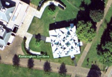
I was reminded of this while surfing through pmoore66's vast collection of aerial views of modern and contemporary architecture. While there are definitely wholly considered designs that look good on Google Maps, there are a very few--like Toyo Ito's 2002 pavilion for the Serpentine--which seem to give special attention to the bird's eye view.
On the one hand, it seems obvious that this vast, global audience should be factored into the creation of architecture. But on the other, it seems absolutely insane to design a structure, a space, for people who won't be anywhere near it, but sitting in front of some screen on the other side of the world.
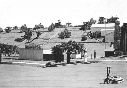
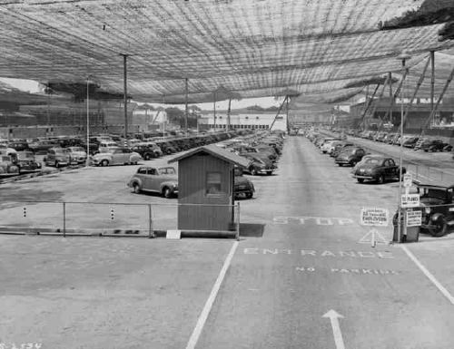
Maybe the next Bilbao Effect, sure to appeal to striving cities in these difficult budgetary times, will be to commission grand architectural designs purely for the benefit of the Google Maps audience. Like the rural streetscape camouflage which was applied to the roof of the Lockheed airplane factory in Burbank to thwart Japanese bombers during WWII, cheap, easy, flexible Potemkin roof structures could really put a town on the map, so to speak.
