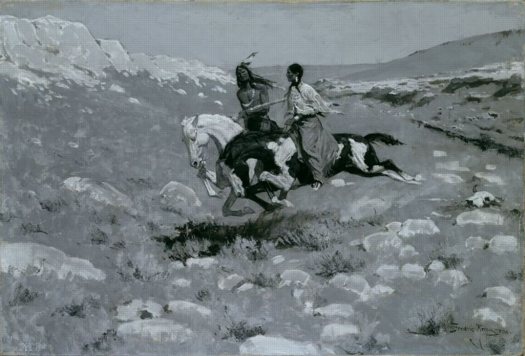
Frederic Remington, Ceremony of the Fastest Horse, c. 1900 [art institute of chicago]
Look, I'm as surprised as you are that I was stoked to see a Frederick Remington painting, but here we are.
As a card-carrying East Coast Art World Elitist, I've never given Remington's work a second's thought, not even an ironic revisionist, "Well, he's alright, but he's no Norman Rockwell!" Which is exactly where I placed him art historically, buried somewhere in Appendix B of Janson.
But we were at the State Department the other night, at a dinner held in the Diplomatic Reception Rooms, and a Remington painting was the freshest, most modern thing around.
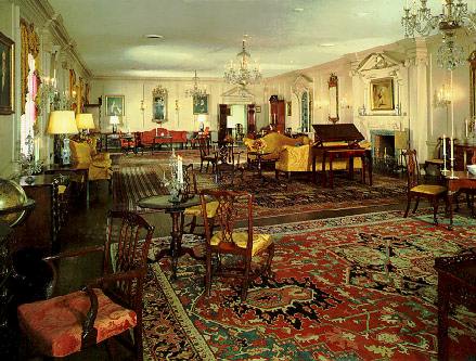
When they opened in 1961, "The Rooms" looked like typical, International Style boardrooms of the period, which, oddly for a government agency housed in a 2 million-sf pile, the State Department thinks is a slam:
Then they were very much like the rest of this modern State Department building, with wall-to-wall carpeting on concrete floors, brown panelled [sic] walls such as those found in offices, and unattractive acoustical ceilings. The exterior walls of the entire eighth floor (where the Diplomatic Rooms are located) were floor-to-ceiling plate glass with explosed [sic] steel beams.In 1969, Nixon's newly appointed ambassador to Britain, Walter Annenberg, initiated a vast, classical makeover, replacing the steel and glass with 18th- and early 19th century-style woodwork and antique furnishings.
They're a spectacle--the bathrooms are absurdly fantastic--but complete artifice. [Though all the artifacts are real enough. It was incredible to see the Treaty of Paris just sitting there on the desk.] Many wall texts in The Rooms and on most pages of the DRR's website --which was also apparently last remodeled in 1969--are relentlessly dismissive of modernism:
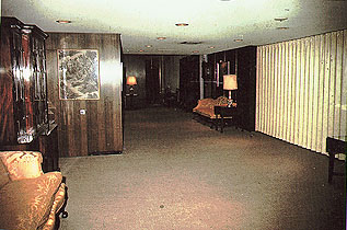
Once paneled in brown plywood, with oppressively low ceilings and wall-to-wall carpeting on concrete, the hall is now a handsome space with thirteen-foot high ceilings and a Tabriz rug on a mahogany floor.
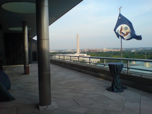
It's amazing, because the building's lobby, which is all chrome and glossy black stone and linoleum, with a giant, glass-enclosed garden and phalanxes of security desks, gives off a nearly pitch-perfect aura of cool, postwar power. And The Rooms' balcony has round skylights in the overhang, and reads like an amped up homage to the terrace for the Member's Lounge in Goodwin & Stone's original MoMA building.
Edward Durrell Stone had finished 2 Columbus Circle in 1964 [even abandoned, the top floor's superluxe mahogany paneling, travertine, and bronze made me want to have our wedding party there], and he was working on the Kennedy Center nearby, which would open in 1971. And in 1960, Eero Saarinen was finishing his US Embassy in London, and in 1962, his soaring terminal at Dulles opened--named after Eisenhower's Secretary of State, no less! True, looking back, Establishment Modernism of the late 60's doesn't pack the punch of the heyday works a decade earlier, but it should've been good enough for government work, right? And yet in 1969, modernism apparently had no one able to challenge Annenberg's transformation of America's seat of diplomatic power into the American Wing at the Met.
But anyway, back to the Remington. Unsurprisingly, it's not on The Rooms' website, and I didn't take a photo or even note the title. But it was a landscape, of the West somewhere, with some guys on some horses, crossing some river, all not important. What struck me was that it was painted in black and white. Or more precisely, it was painted in a fascinating, dynamic range of grays. It was too painterly to be a Mark Tansey, but it could have been an early Gerhard Richter.
I had no idea Remington often painted in monochrome, but when you realize why he did, it makes total sense. It's not that he was painting from photographs, although he often did, and the 19th century paintings' resemblance to 20th century photographs is striking; what's awesome was that Remington was painting to photographs. He was usually making images on assignment for Harper's Weekly or some other weekly publication, which only printed in one color. Deeply interested in reproduction technologies, Remington would optimize his work for the particular medium, whether lithography or, in this case, photoengraving.
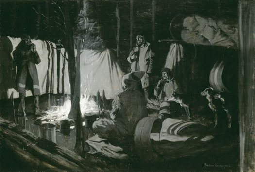
First and Best Camp of the Trip, 1895 [artic.edu]
Critics chided Remington for painting from photographs--and he equivocated about it himself, and periodically claimed to have given up the practice--but it's precisely this cross-pollination of photography and painting that made Remington's painting feel so modern. Photography's role in defining the American West has been explored to death, but I can't remember Remington ever coming up in those exhibitions or discussions. And yet he was the one who almost literally created the cowboy as an archetype, and it was his images--or the photo-like, photo-processed reproductions of his images--which enjoyed the widest audience and had the most formative influence on the popular culture.
Other painters were using photography at the time, too; Eakins and Sargent both come to mind. But Remington seems to have gone beyond those two in his experimentation. All three treated photos as source documents and reference tools. Remington gets credit for accurately depicting in paint what Eakins' friend Edweard Muybridge proved photographically: that a galloping horse's feet all leave the ground at once.
But Remington also explored painting using innovations like flash photography and artificial lighting. And by optimizing his painting for mechanical reproduction instead of naturalistic or visual authenticity, it feels like he took a significant conceptual leap before anyone knew what conceptualism was.
The Art Institute of Chicago has many monochromatic Remington paintings [artic.edu]

